Summary:
For this exercise I have;
– Stated the settings used on my camera, the camera and lens type, as well as
– Explaining where the images were shot and how they were taken, including the variety of focal length settings.
– Briefly covered the difficulties faced while shooting in a busy environment and the knowledge I have gained by completing this task, such as the impact zoom has on the depth of an image.
– Analysed the imagery taken, documenting what I found within each shot visually alongside the technical strengths.
– Inserted a slideshow to show the idea of moving through a scene without actually moving.
– Cropped an image to show how zoom can affect the context of an images, before exploring
– The history of pixel art in gaming and the comparison between peoples preference for clearer graphics in games and sharp HD images in digital photography, versus nostalgia and aesthetics.
– Made notes on the power of a pixel within an image and they importance of the detail within an image before
– Reflecting on the exercise as a whole and what I found both difficult, or interesting.
Brief:
‘Find a scene that has depth. From a fixed position, take a sequence of five or six shots at different focal lengths without changing your viewpoint. (You might like to use the specific focal lengths indicated on the lens barrel.) As you page through the shots on the preview screen it almost feels as though you’re moving through the scene. So the ability to change focal lengths has an obvious use: rather than physically move towards or away from your subject, the lens can do it for you. But zooming is also a move towards abstraction, which, as the word itself tells us, is the process of ‘drawing things away’ from their context.‘ (Bloomfield, 2018)
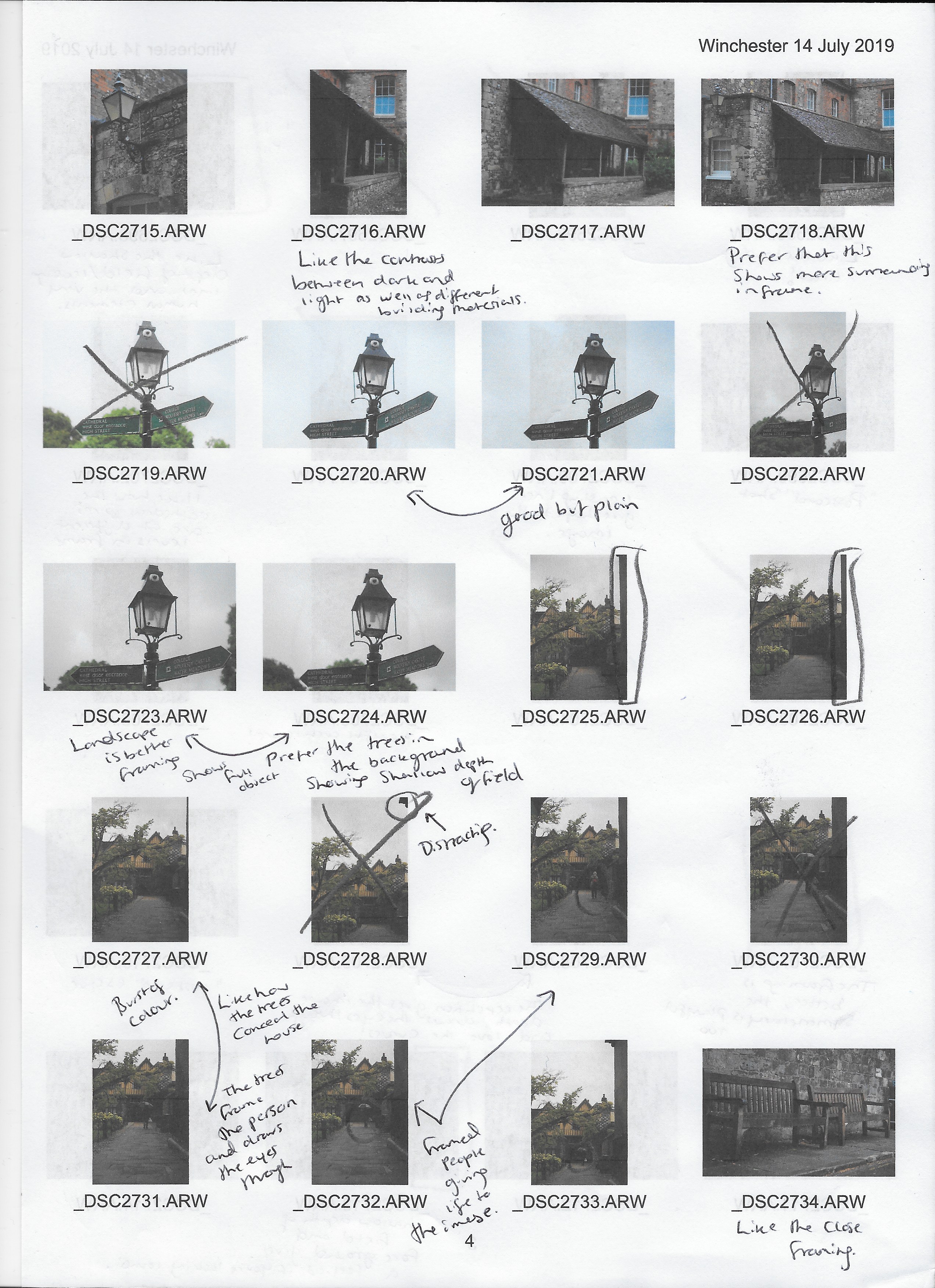
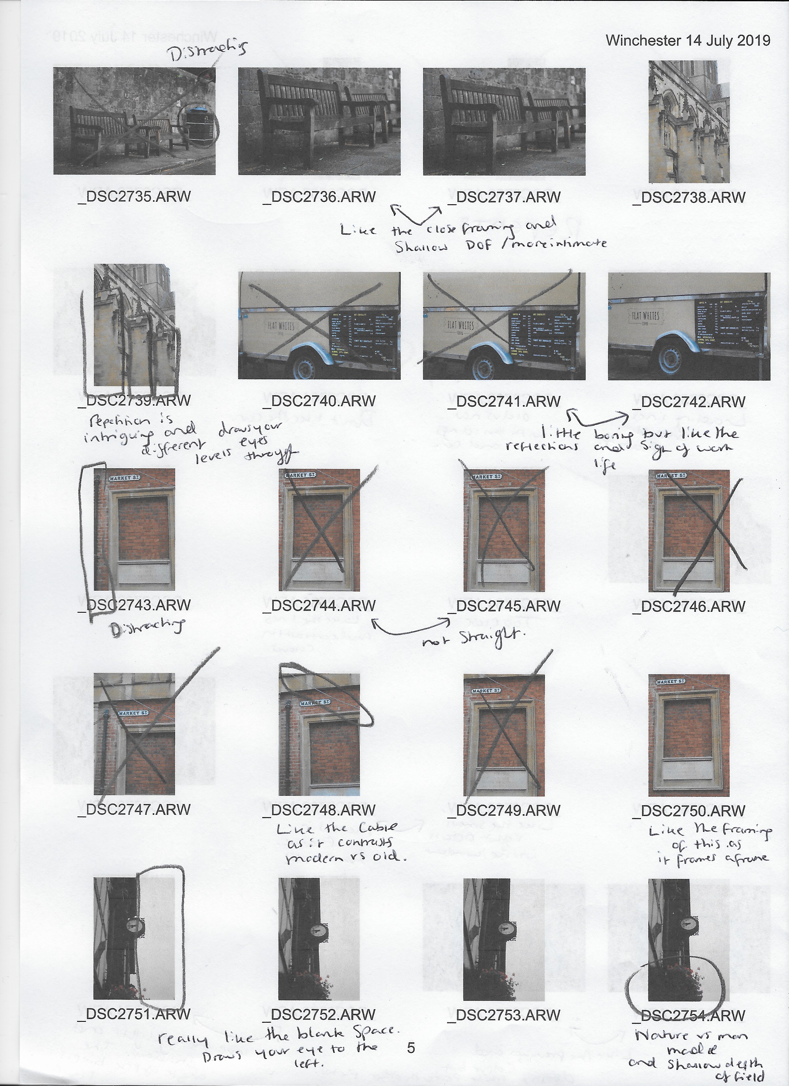
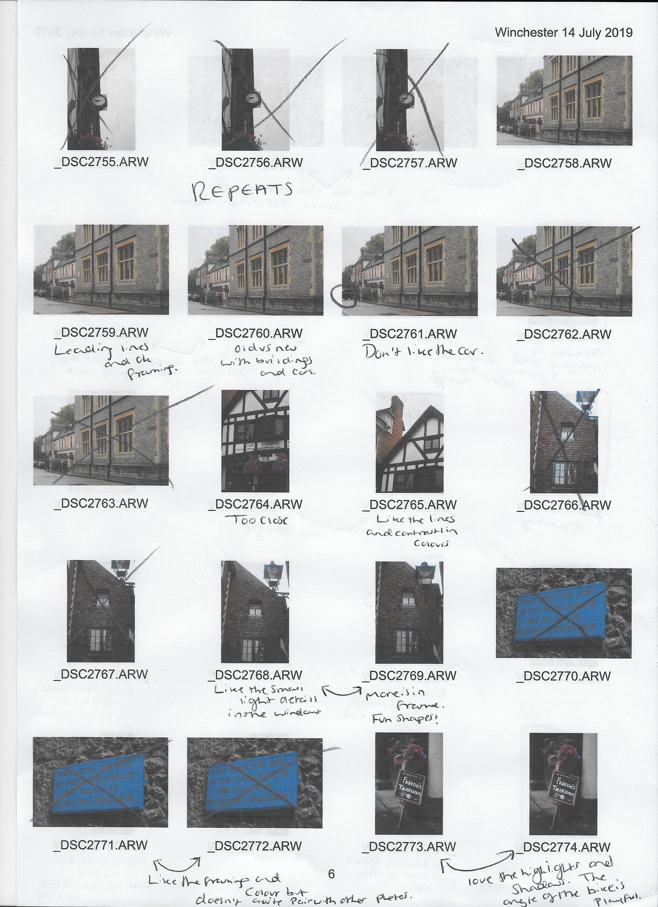
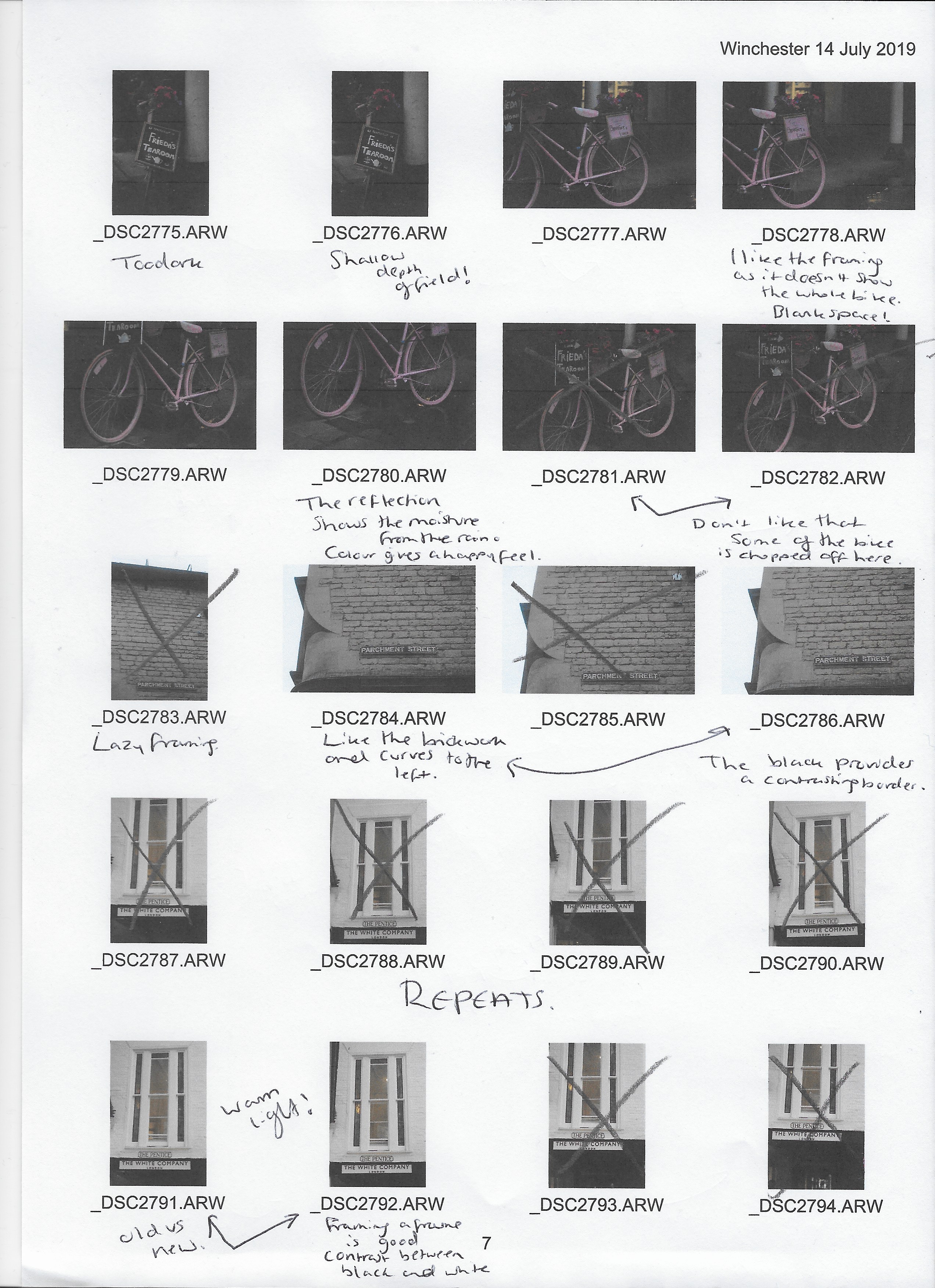
Before starting this exercise, I made sure that my Sony A57 was set to aperture priority mode as requested at the start of Imaginative Spaces, as well as switching the SONY 18-55 3.5-5.6 SAM lens and camera body to manual focus, to avoid relying on autofocus to sharpen the image correctly.
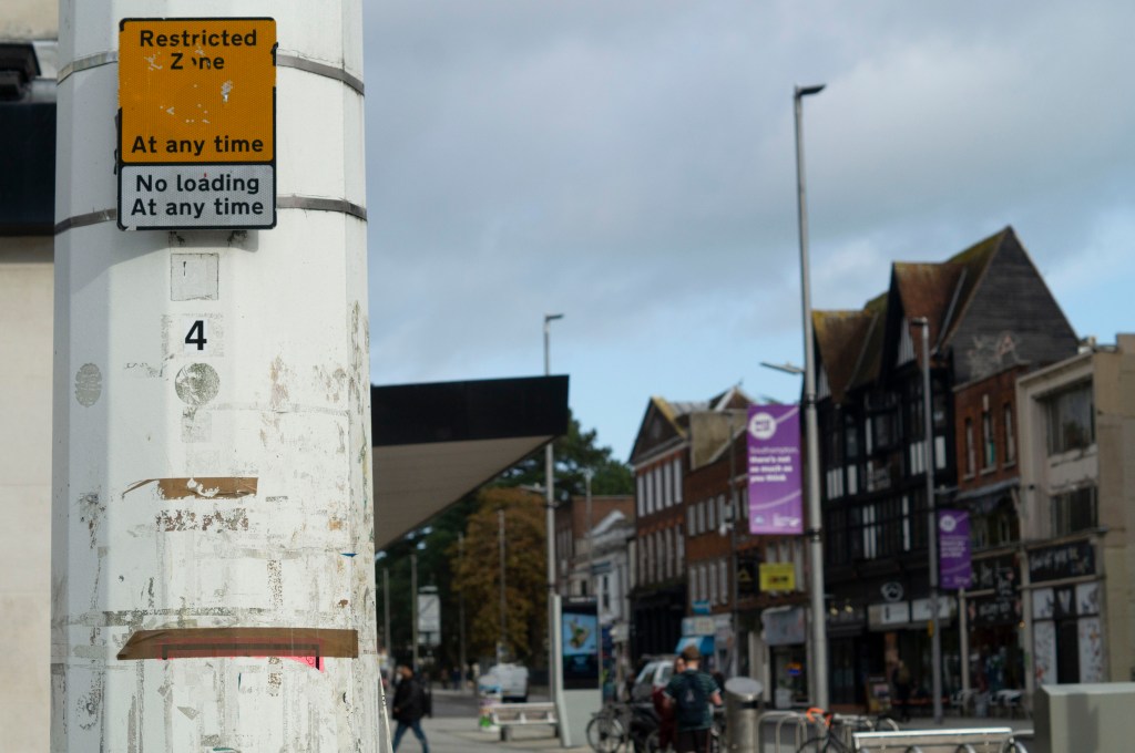
I decided to take these images while out and about in my local town, therefore I didn’t have a tripod with me purely out of convenience. However, to make sure the position was fixed I crouched to keep my feet firmly in one place and used my knees to keep the camera balanced. Due to how busy the environment was, a few attempts had to be made, as members of the public were walking in and out of the frame, blocking the main focal point at the end of the walkway and disturbing the abstraction.
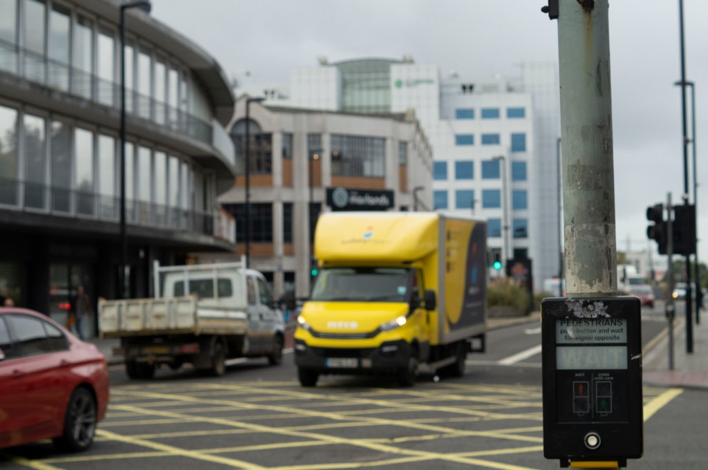
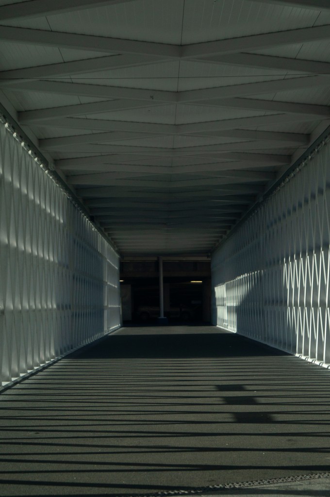
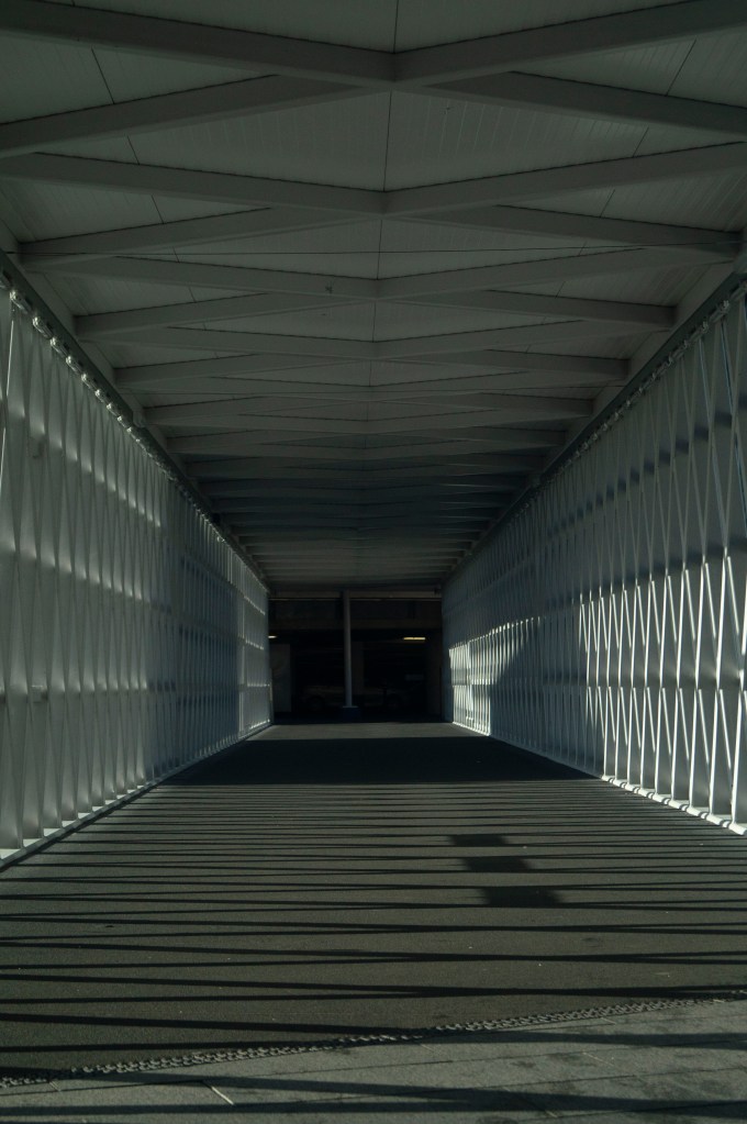
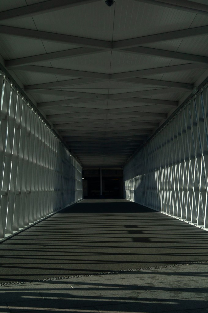
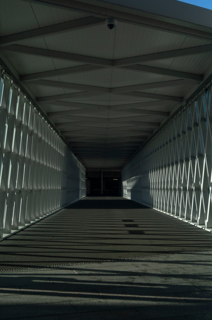
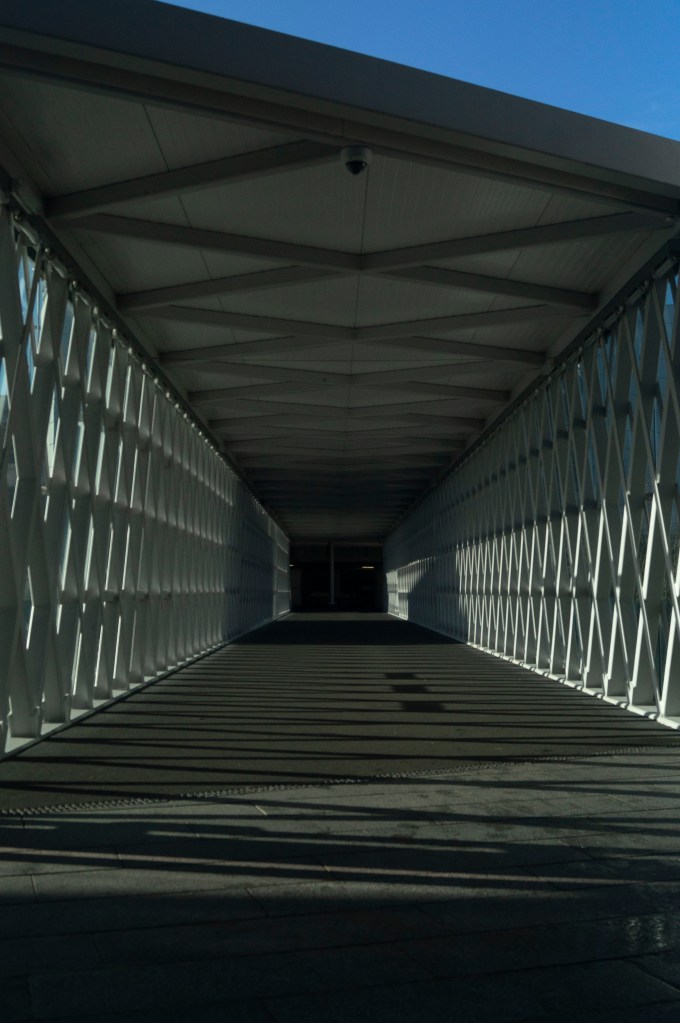
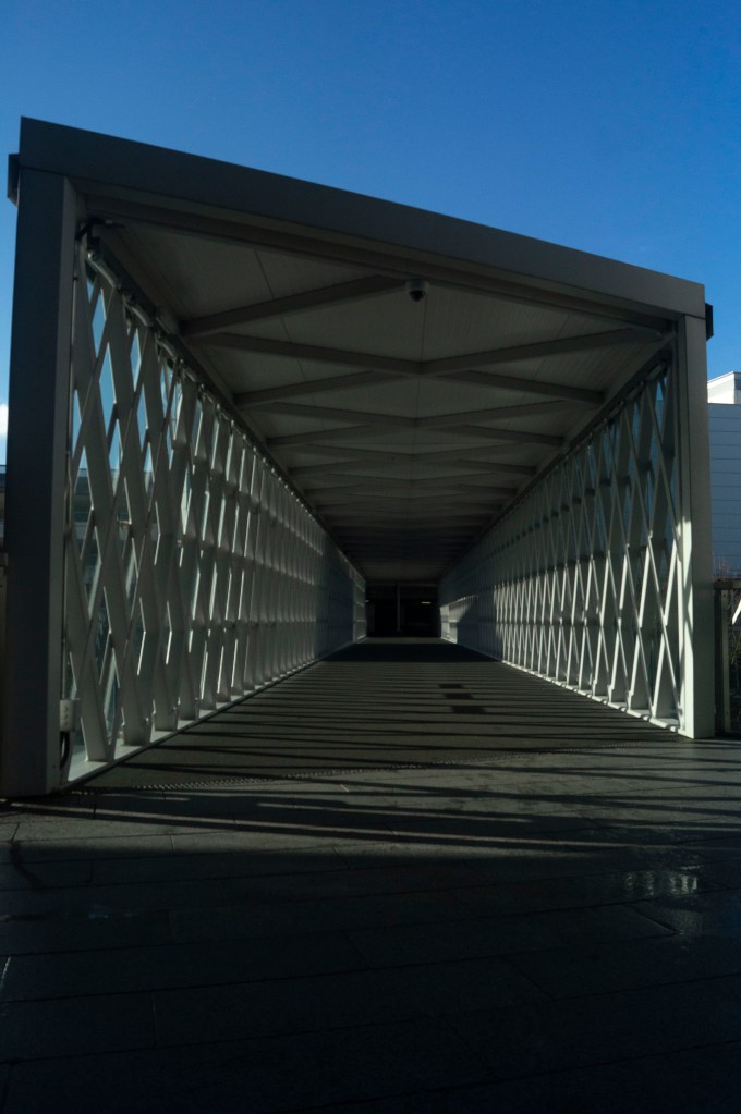
There are 5 focal lengths labelled on the lens ring (55mm, 35mm, 28mm, 24mm, 18mm) however I used these as a rough guide to show a gradual difference in the zoom settings. The focal lengths used were 55mm, 45mm, 35mm, 30mm, 26mm and 18mm, which created a fairly even spread as can be seen below.
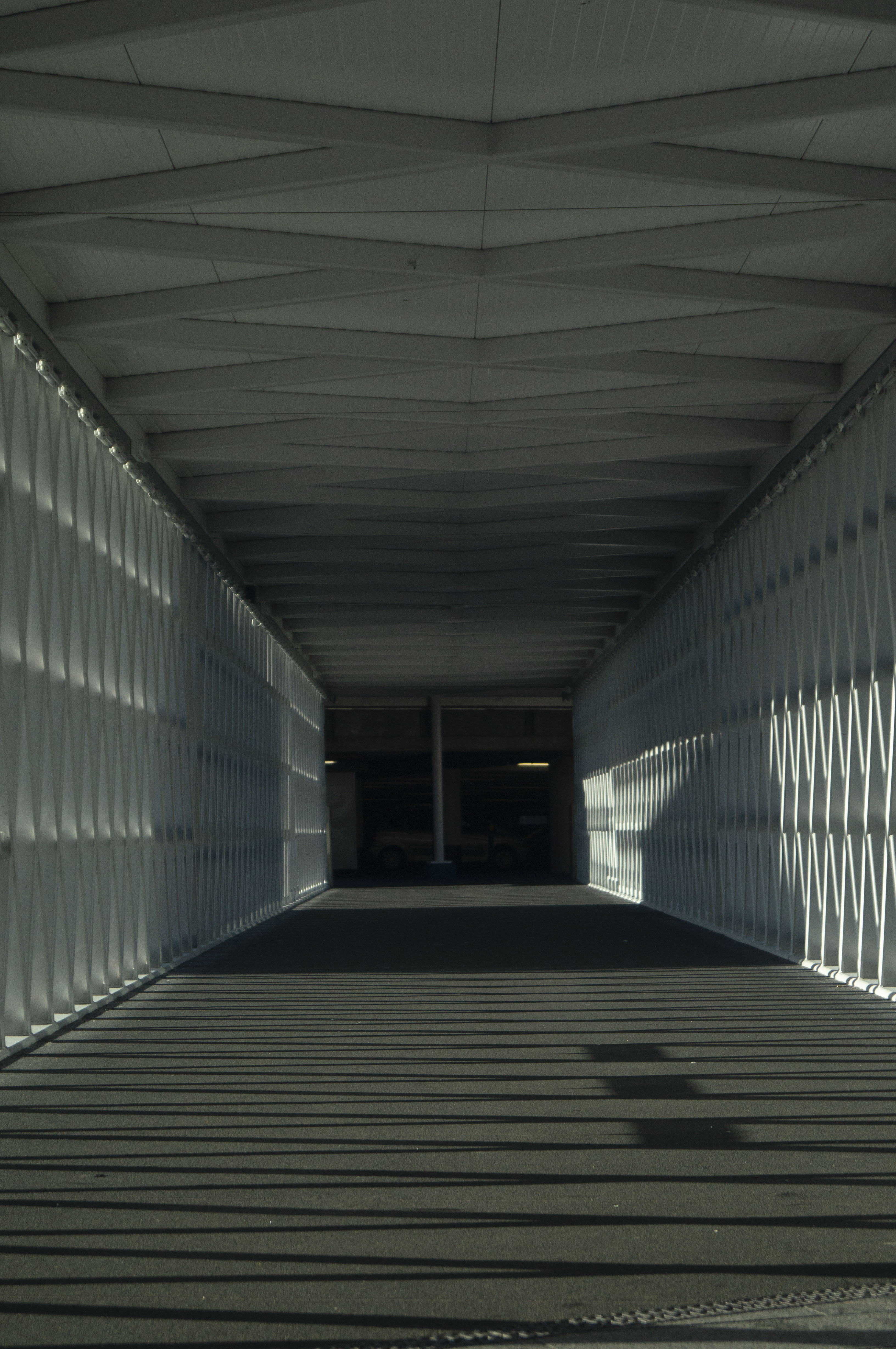
Fig. 1. Lens 1 (2020)
1/1600 sec; f/5.6; ISO 400; 55mm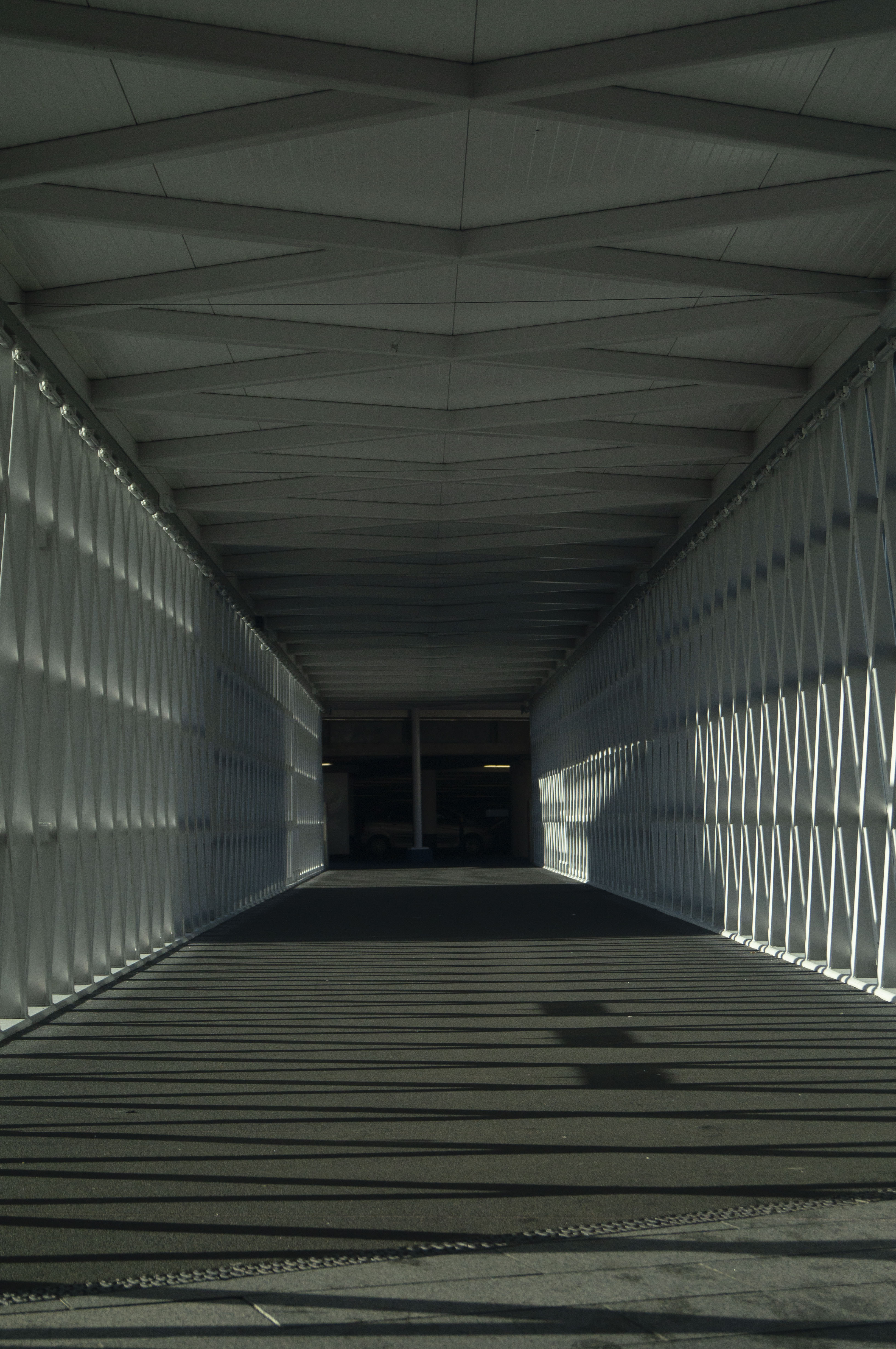
Fig. 2. Lens 2 (2020)
1/2000 sec; f/5.6; ISO 400; 45mm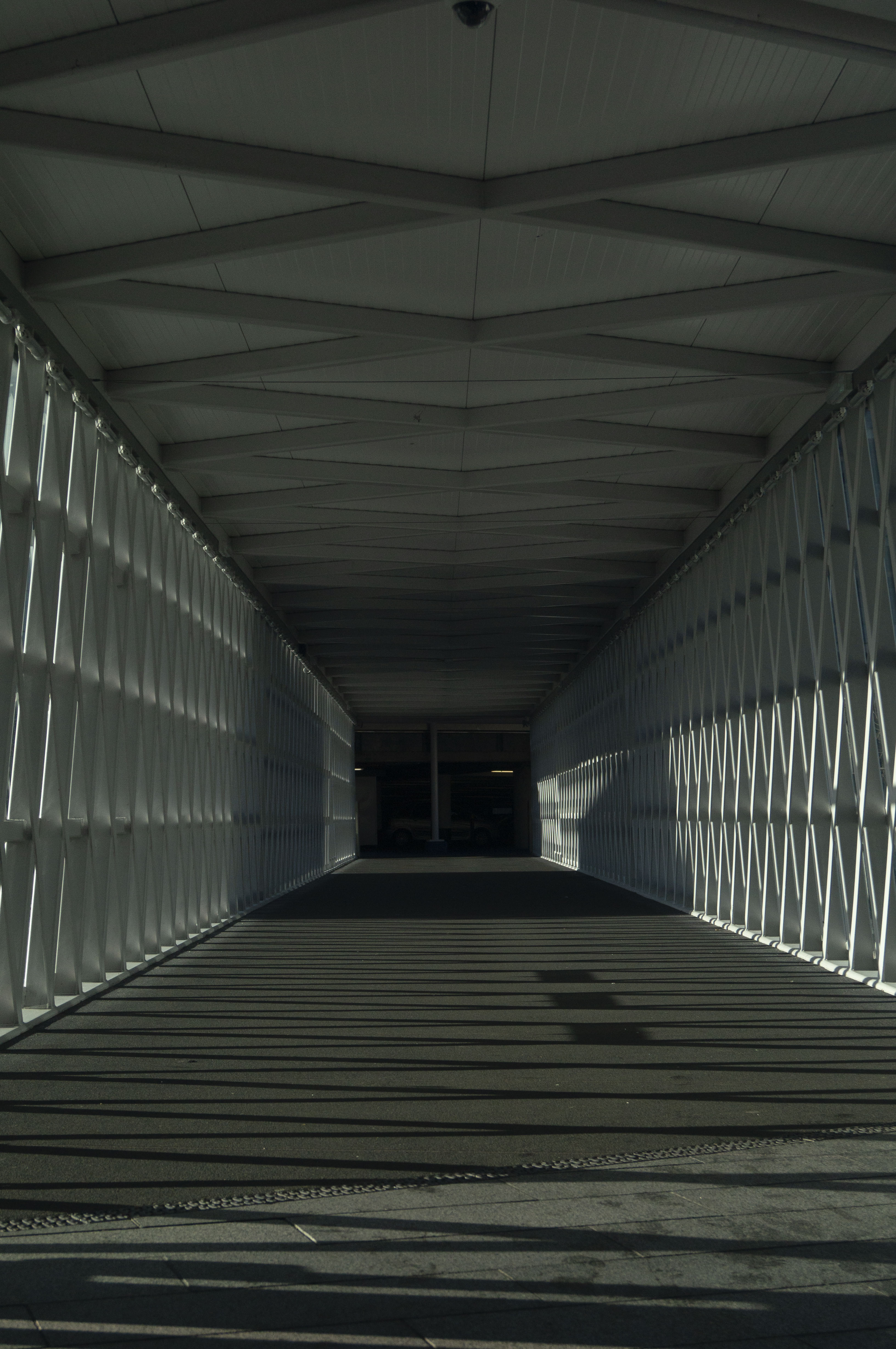
Fig. 3. Lens 3 (2020)
1/2000 sec; f/5.6; ISO 400; 35mm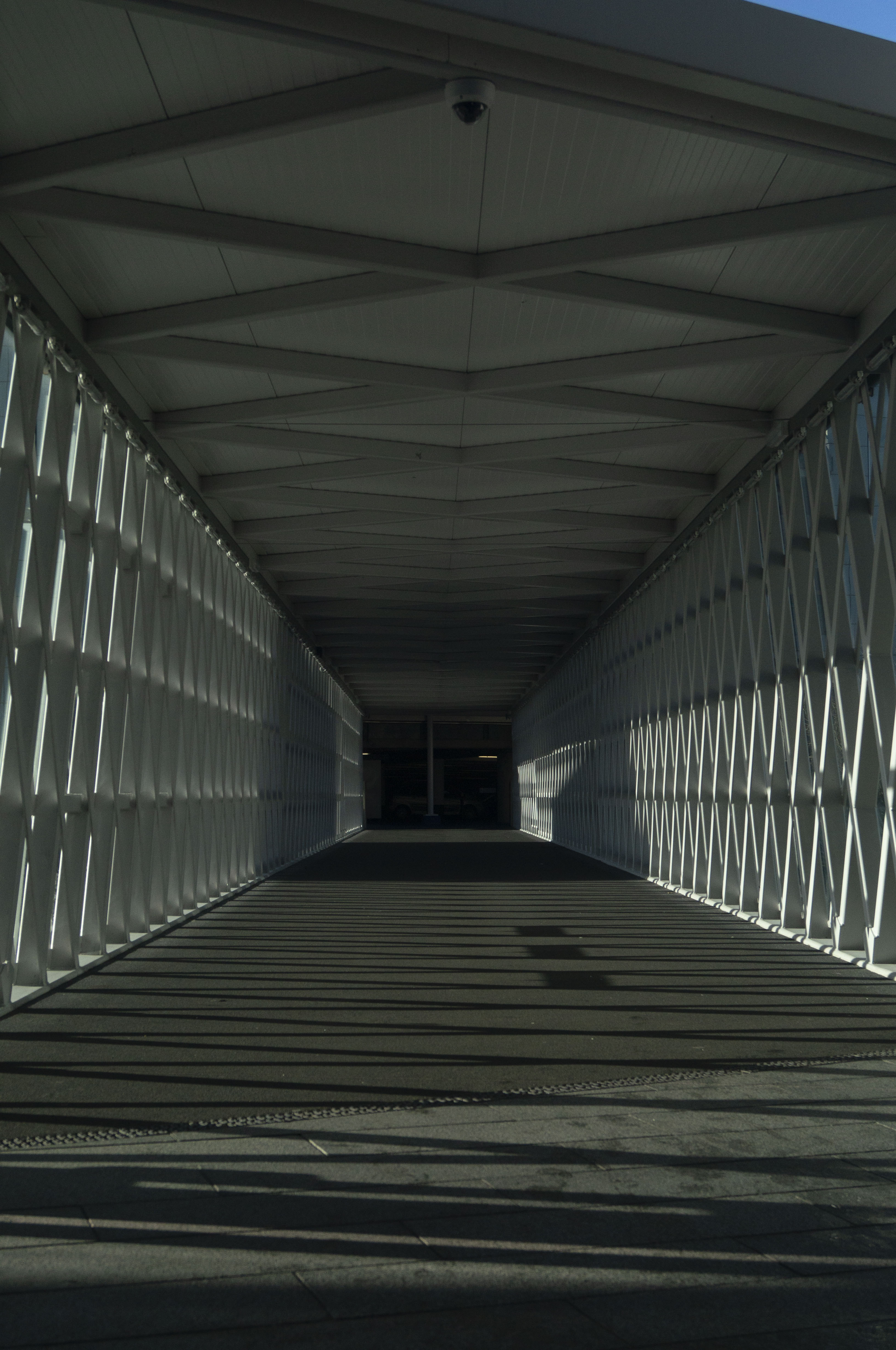
Fig. 4. Lens 4 (2020)
1/2500 sec; f/5.6; ISO 400; 30mm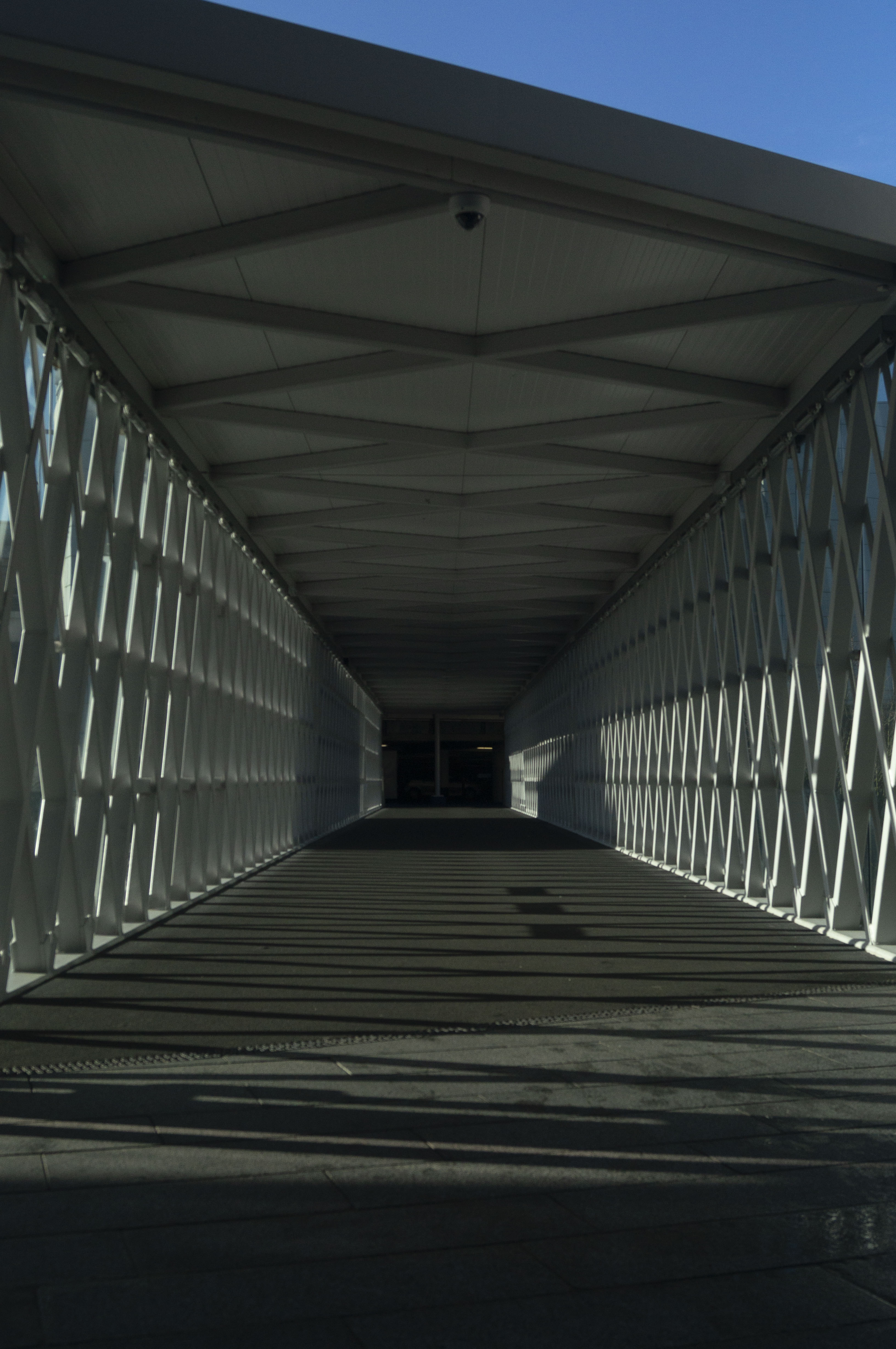
Fig. 5. Lens 5 (2020)
1/2500 sec; f/5.6; ISO 400; 26mm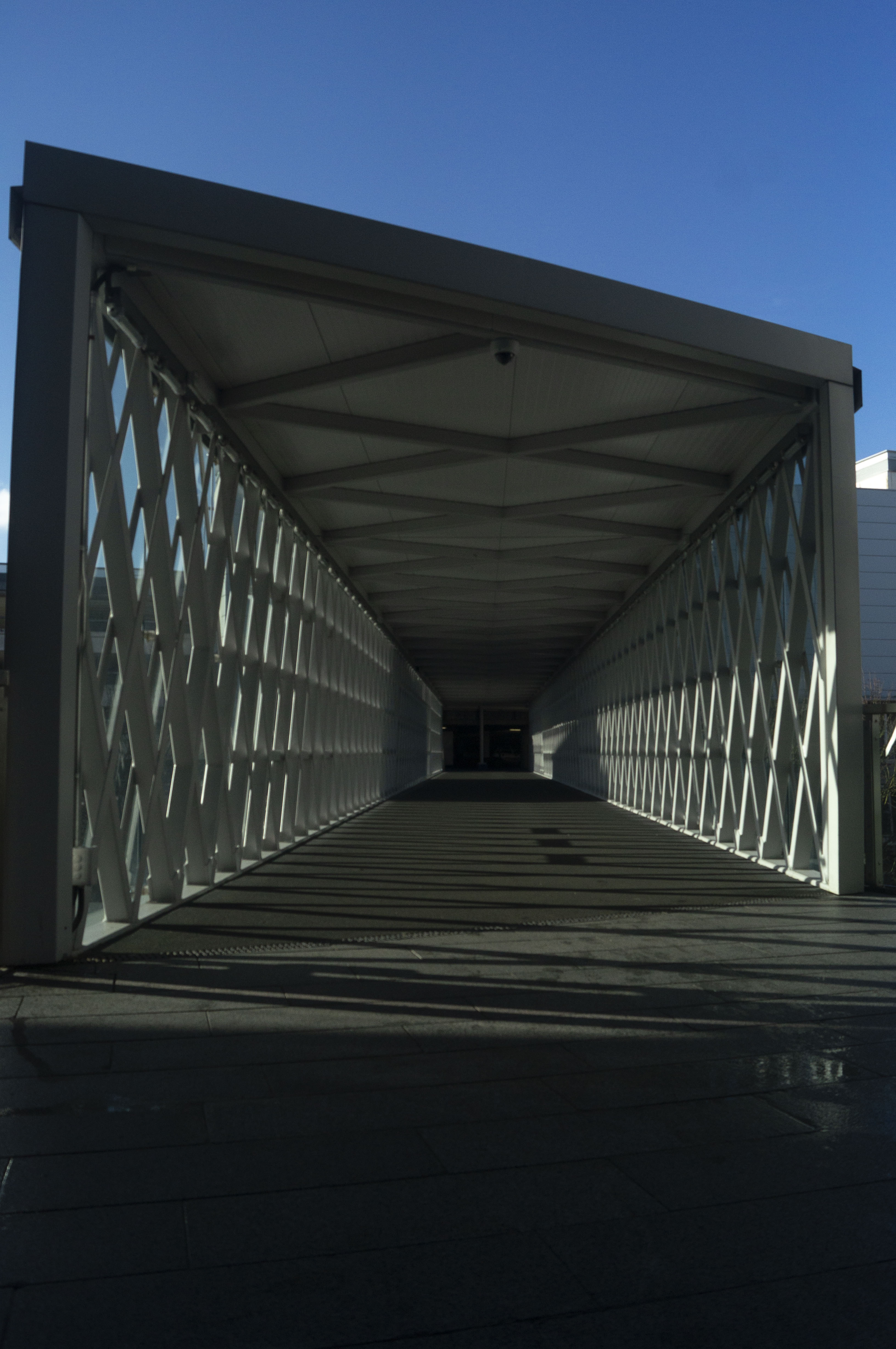
Fig. 6. Lens 6 (2020)
1/3200 sec; f/5.6; ISO 400; 18mm
For a few years I have been using prime lenses and have learned the importance of being able to move your body to get the image you want, therefore switching back to a zoom lens and being able to ‘move’ through a scene via the lens has reminded me of the difference perspectives you can achieve if you vary the lenses and settings.
The longer the focal length is, the more cropped and out of context the subject (see Fig. 1.) becomes having eliminated the true length of the walkway. However, you can find much more detail within the scene such as the walls and poles in the car park that you can’t see as clearly with the shorter focal length. As you pan through each image, the shorter the focal length gets the more it creates the sense of backing out of the small box of darkness at the end of the tunnel, into a bright and open space showing the true extent of the path. The shot taken at 26mm (see Fig. 5) is the most accurate portrayal of what I could see in person, a combination of shadows and highlights from the midday sun, a clearer view of the latticed walls, the true length of the path and a small slither of blue sky, therefore looking at how much detail is captured in the 18mm shot shows how powerful zoom can be. The last image (see Fig. 6) is an expanded shot, almost like a vertical panorama showing more of the sky, bringing more colour and light into the frame than could be seen in person, bringing the viewer about 2 metres further back from the position of the camera, providing more height to the image and showing the full framework of the walkway.
Considering my camera lens couldn’t zoom in any further than 55mm, I created the last image in Photoshop by repeatedly zooming in and cropping the image shot at 18mm, taking screenshots of the process. This created a very abstract final product, focusing more on the details of the images up close than as a whole.
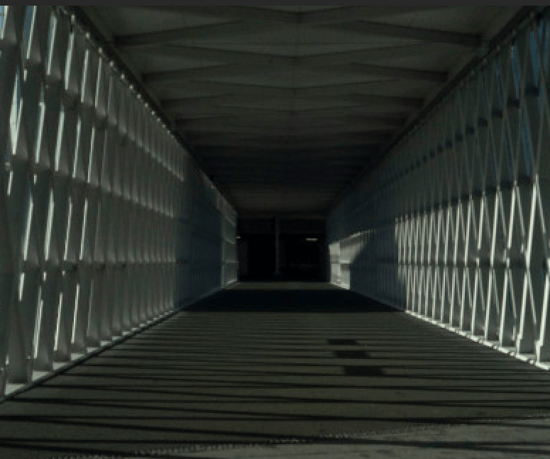
Fig. 7. Cropped (2020) 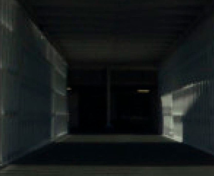
Fig. 8. Cropped and zoomed (2020) 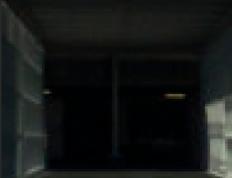
Fig. 9. Cropped, zoomed and cropped again (2020)
This process reminded me of pixel art and how the early era of game producers, used this style despite the lack of technology and experience, to create simple yet fun games by using simple shapes to represent certain objects or characters, relying on the ‘imagination of players to fill in the blanks’ (Griffiths, 2017).
Over the years the style evolved due to the advance in technology, while they were still restricted, 8-bit games such as Super Mario Bros. 3 (see Fig. 10) explored the idea of turning pixel blocks into more recognisable characters, as well as including backgrounds and inserting cut scenes, ultimately fleshing out the game and making it more interactive and immersive as a whole (Griffiths, 2017).

In modern times, however, pixel art is mostly used for the retro aesthetic and challenging imagination more so than a technical choice, mainly because games with higher graphics and 3D elements seem to be more appealing to most players due to the realism.
This is very similar to the development of digital cameras and lenses, to help capture more high definition imagery via digital pixels, in comparison to pinhole and film cameras which are instead made up of noisy grains. Much like old games, “vintage” cameras are used by a lot of people these days for nostalgic and visual purposes rather than the technical elements.
More and more people are becoming interested in the latest technology and capturing more detailed and crisp photographs, almost as if you were looking at it in person, however at the end of the day no matter how high the resolution may be, the closer you zoom into the details you will see that every image is made up of individual pixels or grains. The final image I have created may not be the most appealing to the eye, but the distorted out of context blocks all add up to create the full photograph in a frame. Not every image has to be clear or aesthetically pleasing, as long as you have the imagination to see the deeper details within a simpler, abstracted piece.
Reflection
Despite the fact this exercise took a few attempts to get right, I’m pleased that it allowed me to re-explore the power of zoom lenses, what details can be captured in the frame, what changes and how the perspective can be altered just by changing the focal length. The position of the camera within a scene, the settings you choose and the lens you pick, can affect the outcome of an image which is something I had forgotten due to the restrictions of fixed focal lengths.
It also helped me look at my images in closer detail, by experimenting with extreme zoom and cropping to discover the tiny details that build the whole image.
References :
Bloomfield, R., 2018. Photography 1: Expressing your Vision. 4th ed. [pdf] Barnsley: OCA, p. 40. Available at: https://www.oca-student.com/course/photography-1-expressing-your-vision [Accessed 3 February 2020].
Griffiths, D. (2017) ‘The History Of Pixel Art – The Factory Times’. [online] Available at : http://www.thefactorytimes.com/factory-times/2018/9/27/the-history-of-pixel-art (Accessed 29 January 2020)
List of Images :
Figure. 1. Powell, L. (2020) Lens 1 [image] In possession of: Lauren Powell: Eastleigh.
Figure. 2. Powell, L. (2020) Lens 2 [image] In possession of: Lauren Powell: Eastleigh.
Figure. 3. Powell, L. (2020) Lens 3 [image] In possession of: Lauren Powell: Eastleigh.
Figure. 4. Powell, L. (2020) Lens 4 [image] In possession of: Lauren Powell: Eastleigh.
Figure. 5. Powell, L. (2020) Lens 5 [image] In possession of: Lauren Powell: Eastleigh.
Figure. 6. Powell, L. (2020) Lens 6 [image] In possession of: Lauren Powell: Eastleigh.
Figure. 7. Powell, L. (2020) Cropped [image] In possession of: Lauren Powell: Eastleigh.
Figure. 8. Powell, L. (2020) Cropped and zoomed [image] In possession of: Lauren Powell: Eastleigh.
Figure. 9. Powell, L. (2020) Cropped, zoomed and cropped again [image] In possession of: Lauren Powell: Eastleigh.
Figure 10. Nintendo. (n.d) ‘Super Mario Bros. 3 (1988): Level 5-3‘. (2013) [Gameological, screenshot] Available at: http://gameological.com/2013/05/super-mario-bros-3-1988-level-5-3/index.html (Accessed 29 January 2020)