(In)decisive moment practitioner research

Assignment 3

Summary:

For this post I have;

– Researched the (in)decisive moment and compared it to the decisive moment.

– Summarised the differences and similarities between the two moments.

– Written about Nick Waplington, Martin Dietrich and Nigel Shafran, their lives, careers and approaches to their work.

– Analysed one of each image from each practitioner, exploring the techniques and messages I have gathered from their work.

– Reflected on the research as a whole.

Indecisive moment:

Unlike Henri Cartier-Bresson’s ‘Decisive Moment’, the (in)decisive moment seems to challenge the belief of a singular moment being the most important and unique by exploring the idea that all moments are just as important as the other and no less unique. Even if the moment doesn’t capture the most exciting of moments, as long as it means something and shows a passage of time, it’s still special.

Another difference between the two moments is that the (in)decisive moment tends to remove expression and gesture, by documenting “deadpan” moments, or the banalest of subjects. The lack of clear emotion may cause more questions to arise from the viewer as it may not be as clear as to how the subject is feeling or what is happening. ‘..the works’ bland expressions and lack of visual triggers, such as gesture, confound our expectations of discovering a person’s character through their appearance’ (Cotton, 2014, p. 106). For me, this ability to form questions, makes the imagery more flexible and interesting than a decisive moment, that more often than not, cuts straight to the point in terms of context and meaning. 

While some planning takes place for a decisive moment, for example, setting up the camera in preparation for the perfect moment to fall within the frame at any given point, the photographer doesn’t have much control over the event or outcome of the image. The (in)decisive moment, however, feels like a more hands-on and regimented approach, whether that is through manipulation of movement, poses, expression, location or amount of images taken within a particular time.

Despite these differences, the two moments appear to be interchangeable and overlap in concept, for example, both require some form of planning and awareness of the outcome you’re hoping for, as well as the active decision to press the camera shutter at a specific time rather than spontaneously. Bearing these things in mind, I’m not sure if they can be considered two separate approaches or not?

Nick Waplington – (1965- )

Nick Waplington is a British artist; based between London and New York, mostly known for his contemporary photography practises but not limited to, as a painter, sculptor and has explored the world of video. Boundaries have been pushed and explored throughout his work, shown by the juxtaposition of traditional and new media (1972 Agency, 2020). Waplington’s collaborations with artists such as Alexander McQueen, Miguel Calderón and David Shrigley, further confirm this desire to create and work with those who produce something out of the ordinary. 

The topics documented throughout his work, range from the daily lives of working-class people, youth culture, his family, businesses or organisations expanding globally (1972 Agency, 2020). Subjects like these may seem mundane to some but are without a doubt, impactful once you start to analyse the meaning or feelings Waplington is trying to portray. 

Living Room (1991) is the first project Waplington published as a young man, shortly followed by an exhibition in 23rd Street Gallery, New York and then globally for a few years after. The prints were put into storage and requested to be destroyed, ‘having moved on to new projects’ (Juxtapoz, 2019). However, it was discovered in 2018 that Waplington’s gallerist Holly Solomon never got rid of the prints, were still in possession of her son Thomas and have since been presented by Little Big Man for the first time in 26 years.

Fig. 1. Living Room (1991)

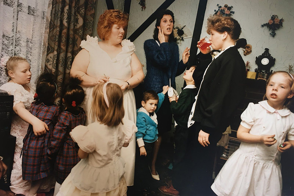
Living Room (1991), is a series of images taken across four years, documenting the daily life of two families who lived on the same council estate as his grandparents in Nottingham. 

It gives us an insight into the lives of people we have no connection with, as well as capturing the struggles and differences that families faced due to industry collapse, unemployment and poverty caused by a decade of a neglectful conservative government (Bint photoBooks, 2016). 

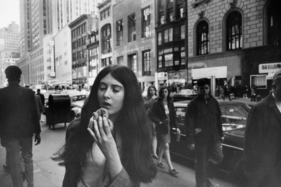
The chaos portrayed (see Fig. 1) encapsulates the historical turmoil going on at the time. A time full of uncertainty and disorganisation, mixed emotions and lack of stability in the area. Waplington’s use of a fast shutter speed has frozen at least eight different moments in time, if not more that we cannot see directly. The child on the right, has a deadpan expression, distracted by something out of the frame, are they talking to somebody? Has someone caught their attention? We aren’t aware of the cause, allowing us as the audience to explore further and try to put the pieces together, using the rest of the picture as context. Midframe, we have someone who seems to be in conversation with another person, again, outside of the frame, but it isn’t clear how they are feeling or whether they are aware of the two children trying to either get their attention or grab the bag that is at an arms reach. The worried face of the child to the left is somewhat humorous. It feels as if they are trying to prevent the curtains from being pulled down or other mischievous events occurring while the adults are distracted by other things. There is a faint orb-like blur to the bottom right of the image, perhaps created by a light source just outside of the frame, smoke from the right, a smudge on the lens, or a small imperfection with the film or printing process. Waplington has shot this image at a very slight angle; whether that is intentional or not, the tilt enhances the mayhem shown in the photograph, ‘imperfect’ and unbalanced, much like daily life. Saturated colours and the grainy nature of film photography, not only shows the difference in photography practises and cameras from just a few decades ago, but makes the images feel much more intimate, soft and nostalgic. They’re not crisp, vibrant pieces that uniquely grab the viewers eye. Instead, the imagery is natural, full of life and movement, but still unique.

Martin Dietrich – (1980’s – )

Martin Dietrich is a Fine Art Photographer based in Frankfurt, Germany, mostly known for his architectural and street photography. Dietrich’s journey with photography started in 2009, as a way to balance his day to day job which is ‘full of numbers’ as a tax auditor (Dietrich, 2016), something that has only continued to grow and help other young artists besides himself with the Neoprime International Fine Arts label, founded in 2014. 

Abstract, minimalism and geometrics within nature, are Dietrich’s main focus areas, continually explored through his architectural and street photography. Exploring the locations in question, inspires him to come up with concepts that may not be suitable for the chosen surroundings, in turn creating abstract compositions that allow multiple and endless paths for the viewer to explore. According to Dietrich, removing a subject out of its usual context can hide the original story or meaning behind the image, therefore creating a whole new picture, whereas minimalist images are straight forward, reduced to one subject or exciting element, a complete juxtaposition to his abstract work (Dietrich, 2016). 

Growing up in a city has meant that urban life is extremely familiar and has fascinated him for years. Street photography documents real moments ‘frozen in time forever and yet offers so many different interpretations, stories and meanings. Street Photography is by no means artificial, it’s the real world, with real characters and real moments’ (Dietrich, 2016).

Dietrich’s double exposures have been created by using slow shutter speeds, in combination with moving the camera to create what he calls an ‘abstract sketch’ (Dietrich, 2016). 

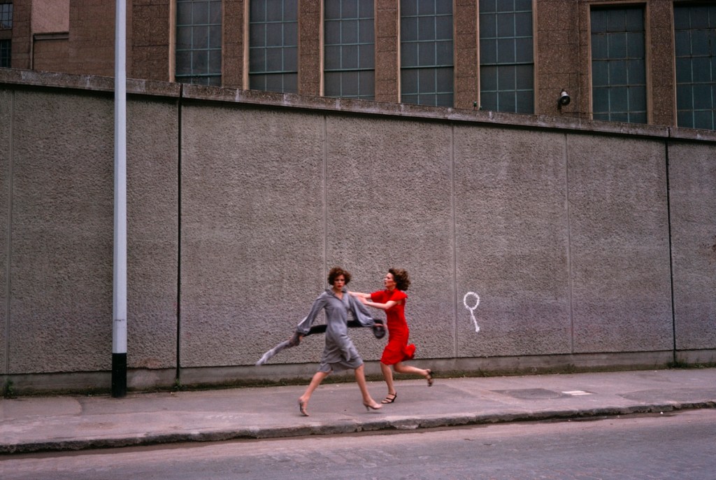
The Ghosts That Carried Us Away (2014), consists of 7 black and white double exposures of various people riding an escalator and climbing the stairs, documenting movement, time and indecisiveness. All double exposures were shot in-camera using a Fujifilm X-Pro 1.

Fig. 2. The Ghosts That Carried Us Away (2014)

This image (see Fig. 2) combines both abstract and minimalism into one complete frame. The lack of expression and context given from the blurred silhouettes in the background, due to their backs facing the camera, formulates a list of questions. Are they a couple? Are they strangers? Are they happy? Angry? In conversation? What are they doing? Where are they going?

Dietrich has perfectly backed up his view of abstract work and how removing part of a subject, can carve out multiple paths for the viewer to go down and explore. Black and white photography, not only enhance the highlights and shadows, the textures and shapes within the frame, but it also removes the influence that colour may have on the picture. It could be a beautiful sunny day, but without the help of colour, for me, this composition documents a gloomy day, in what feels like a silent city. 

By isolating the escalator, a small part of a building and capturing the negative space surrounding them on the left, allows me to understand that the subjects are in an urban location and shows the minimalist elements within the photograph. 

However, the position of the camera in comparison to the people prevents us from seeing anything else beyond that. We could assume they’re on top of a building or walking into a mall, but we cannot be sure without further information, that’s what makes it so interesting. The rule of thirds and leading lines work perfectly together, as the eyes are drawn from the bottom of the frame, right up to the main focal point at the top, taking you on a journey and moving the viewer through the image as an escalator would do. Slow shutter speeds don’t freeze a moment, they follow the moment and capture the path taken during the time the shutter is open, so instead documents multiple ‘invisible’ moments in one frame and is something I would consider to be indecisive.

Nigel Shafran – (1964 – )

Nigel Shafran is a well-known photographer and artist based in the UK, having established himself as one of the most respected fashion photographers in the 1990s (James Hyman Gallery, n.d). Much like Nick Waplington, Shafran is passionate about capturing day-to-day life, the ordinary and overlooked subjects that surround us. Unlike most photographers who have explored the decisive moment and aim to capture the unique, the extraordinary and ‘never to be seen again’ moments in time, Shafran explores the beauty in the mundane and accepting what we have around us.

His work is so casual, so familiar and domestic but still beautiful, full of life and uniqueness.

Washing up (2000) is a series of images taken across an unknown time, capturing the chaos and daily findings of a kitchen. Something all of us can relate to and find comfort in, making this project somewhat personal without it being so.

The consistent framing between these two images implies that a tripod was used, or some form of stable surface for the camera to sit on to document the changes within this kitchen without having to change location or composition. They are very much the same, yet different. 

001washing_up see Fig. 3) looks to have been taken while the sun was fully out and out of reach of the window, creating a cold atmosphere due to the lack of sunbeams, blue tones and grey shadows within the picture. Tinsel is hanging off of the wires, just above the red teapot, enhancing the fact that this photograph could’ve been taken on a cold winters day. To the right, is a potted plant that seems to be dormant and withering away, the natural circle of life. There is crockery everywhere, in the sink, on the draining board, a knife has been left out on the side and the pots and pans in the top right are screaming indecisiveness and chaos. 

013washing_up (see Fig. 4) is slightly more organised, tidier and warm. In comparison to Fig. 3. this image appears to have been taken during the morning, just as the sun is rising. Shadows in this composition are soft, as is the light on the walls and surfaces, making it feel more homely and welcoming. Despite the differences between the two photographs, the mess, the lack of decision making and the reality of the busy lives we lead, the pictures on the walls are still the same, the blue figurine on the plug socket is still in its usual place, the kettle and rubber gloves are where they belong. 

They may not be the most outstanding photographs taken, but they document life, the changes that we make, the life and death of nature, the rise and fall of the sun. These pictures have captured time and how it evolves, which I think is just as important as capturing one unique moment in time.

Reflection:

– The (in)decisive moment doesn’t have to be something extraordinary or unique and is very much similar to the decisive moment, in terms of planning and setting the camera up to capture the moments.

– The ordinary can be the most beautiful and interesting subjects to capture and explore.

– No one moment is unique and all capture important moments in time.

– The ‘Decisive’ moment is the moment you decide to capture, when and where.

– The (in)decisive moment doesn’t mean you don’t have to prepare and look for fruitful moments.

– The (in)decisive moment captures a period or path of time, rather than one moment.

References:

1972.agency. (2020) Nick Waplington Biography – 1972. [online] Available at: https://1972.agency/artists/nick-waplington/bio (Accessed 2nd February 2021).

Cotton, C. (2014) The Photograph As Contemporary Art. 3rd ed. London: Thames & Hudson.

Bint photoBooks. (2016) Views & Reviews A Tribute to the Family as a wild Tribe Living Room Nick Waplington Photography. [online] Available at: http://bintphotobooks.blogspot.com/2016/05/views-reviews-tribute-to-family-as-wild.html (Accessed 15th February 2021).

Dietrich, M. (2016) From Experimental to Ordinary: LomoAmigo Martin Dietrich Tests the Minitar-1 Art Lens [online] Available at: https://www.lomography.com/magazine/317995-from-experimental-to-ordinary-lomoamigo-martin-dietrich-tests-the-minitar-1-art-lens (Accessed 22nd March 2021).

James Hyman Gallery. n.d. Nigel Shafran [online] Available at: http://www.jameshymangallery.com/artists/14896/biography/nigel-shafran (Accessed 22nd March 2021).

Juxtapoz. (2019) Exhibition unearths Nick Waplington’s long thought destroyed “Living Room” prints. [online] Available: https://www.juxtapoz.com/news/photography/exhibition-unearths-nick-waplington-s-long-thought-destroyed-living-room-prints/ (Accessed 15th February 2021).


List of images

Figure. 1. Waplington. N. (1991) Living Room [image] Available at: https://loeildelaphotographie.com/en/nick-waplington-living-room-bb/ (Accessed on 15th February 2021).

Figure. 2. Dietrich. M. (2014) The Ghosts That Carried Us Away [image] Available at: https://www.behance.net/gallery/14029499/The-ghosts-that-carried-us-away (Accessed on 22nd March 2021).

Figure. 3. Shafran. N. (2000) Washing up [image] Available at: http://nigelshafran.com/category/washing-up-2000-2000/page/2/ (Accessed 22nd March 2021).

Figure. 4. Shafran. N. (2000) Washing up [image] Available at: http://nigelshafran.com/category/washing-up-2000-2000/ (Accessed 22nd March 2021).


Further research on the Decisive Moment + practitioner research

Assignment 3, Notes, Online Research, Practitioner Research

Summary:

For this post I have;

– Researched the ‘Inspired’ moment, written by Olivier Duong, to further understand the Decisive Moment in a slightly simpler form.

– Written three detailed paragraphs about Henry Cartier-Bresson, Garry Winogrand, Bruce Davidson and KayLynn Deveney, exploring their career history, what they capture and why.

– As well as writing a short analysis for one or two images from each practitioner, stating what I enjoyed about their work and what I took from it.

– Before reflecting on the post as a whole.

The ‘Inspired’ Moment

The Decisive Moment for me is one of those topics that I believe is clear to understand at first until I find myself questioning it once more, therefore I have found a definition that strips the technique down to the bare basics.

Olivier Duong also struggled to piece together the elements that make up a Decisive Moment, so took it upon themselves to break it down into their own words, or as they call it ‘The Inspired Moment’ (Duong, 2013). A diagram of the Inspired Moment (see Fig. 1.) shows the alignment of the photographer’s eye, the photograph, the heart and the mind, a combination of compositions, emotions and thoughts that pull together to create that ‘perfect’ moment (Duong, 2013).

Fig. 1. Decisive Moment (2013)

Duong continues to describe the Decisive moment in terms of time; Chronos and Kairos time. Chronos being ‘linear time’ and a much more definitive view on time, whereas Kairos is opportune and varies, as is the Decisive Moment. A Decisive Moment can happen at any time, hence you have to grab it when it arises or you will miss it, ‘you could not catch him by the hair because he is bald from the back’ (Duong, 2013). You must always be responsive and ready for any given moment, see it and shoot, have your camera settings ready to avoid missing the shot.

In summary, you must see the image in your mind’s eye, be ready both physically, mentally and technically and shoot before you miss. 

Henri Cartier-Bresson (1908-2004)

Henri Cartier-Bresson was a photographer, painter, filmmaker and prisoner of war, well known for being a master of street photography and the Decisive Moment. Cartier-Bresson had a strong interest in surrealism, an art movement that inspired the direction of his photographic work. Peter Galassi explains in his book Henri Cartier-Bresson, The Early Work, that the surrealists ‘…approached the street: with a voracious appetite for the usual and unusual…’ (Galessi, 1987:33), meaning they saw more than an ordinary photograph and understood the deeper meanings and unplanned situations.

In 1952, upon his return to Europe after a three-year stream of travelling, Cartier-Bresson published Images à la Sauvette or as we know it, The Decisive Moment. This book provides the viewer with a collection of images that were taken in an instant, with intuition and ‘in visual terms, questions and decides simultaneously’ (Cartier-Bresson, n.d.). 

‘Cartier-Bresson did not “point and shoot” to achieve this effect. He often framed a picture in the viewfinder of his Leica, and then waited for the perfect event to occur, normally a person passing through the scene’ (Huxley Parlour, 2017). 

Huxley Parlour provides a perfect example of this approach, shown in Behind the Gare Saint-Lazare (1932), a frozen yet slightly blurred silhouette of a figure leaping over what seems to be a rain-sodden ground, a result of ‘luck’ as Cartier-Bresson calls it in the documentary L’amour Tout Court. It was almost a matter of fate due to the fact he slotted his camera in between the planks, just barely managing to fit the lens through, meaning he could not see the composition (L’amour Tout Court, 2001). The image is beautifully balanced and perfectly timed, the feet of the person just inches from the ground before splashing into the water below. We know what is going to happen without the documentation of the result, this is achieved by intuition. Ripples surrounding what looks like a wooden ladder implies that it may have fallen or at least been disturbed recently. The dark pile of rubble next to the hoops on the floor, brings further texture to the image, contrasting the wet, shiny water. Cartier-Bresson placed a lot of emphasis on the ‘geometry’ of an image, an element that will enable the composition to be proportionate (L’amour Tout Court, 2001). Despite his lack of sight for this piece, the balance was still maintained as the silhouette is framed within the far right of the frame and as a result achieves the rule of thirds. A small figure in the background of the shot may pose a few questions for the viewer. Are they in front or behind the railings? Is that a police officer or a civilian looking at them? Or are they even looking? The motion blur implies a fast movement, however, we are unaware as to why they are leaping, or whether they are running from or to something. The tensions throughout this artwork create intrigue and have helped me understand the true power of a decisive moment, intuition and awareness. 

Garry Winogrand (1928-1984)

Garry Winogrand was a New York based photographer who captured the hustle and bustle of busy streets, airports, people at rodeos and animals in the zoo (Fraenkel Gallery, 2012).

A number of his works have been exhibited in museums and galleries across the world, as well as being published to accompany the exhibitions. Winogrand’s work is considered highly influential in the street photography genre, having provided slices ‘… of 20th-century American culture, replete with all the nightlife, excitement, heartbreak, trauma, and banality…’ (artnet, 2011) that makes up the foundations of life. 

Documenting monumental events that have taken place due to the social issues in the U.S., enabled Winogrand to excel and become one of very few artists that stand out in the world of street photography.

Winogrand worked as a freelance photojournalist, as well as exploring the world of advertising in the 50s and 60s, before teaching the subject in the ’70s. Following his death it was discovered that a huge majority of his older works had been left undeveloped, no proofed exposures or only got as far as being made into contact sheets (MoMA, 2009).

One image that stands out for me is New York1969, (see Fig. 2.) part of the Women are Beautiful series, a collection of images taken in various locations of women in their natural state, observing, partying or otherwise occupied in some way. In the foreground we are presented with a woman in her early 20’s perhaps, her thick hair is down, resting naturally against her shoulders, seemingly unaware of the photographer taking her picture just a distance away. The shot has been taken just before the pretzel in her hand reaches her mouth, freezing time and showing the process of a decisive moment, showing the neutral emotion of eating while on the move in a busy environment with no time to savour the event. In the background we see multiple darker figures of people passing by, the natural light not quite reaching them like the woman closest to the camera. They’re noticeable of course, adding movement and providing context for the location, as well as their acknowledgement of the camera, potentially questioning what is happening. That being said, they don’t stand out because they are not the subject in question, the woman in front is, she is the focal point of this composition. A variety of tones run through the photograph, adding depth to the shot, enhancing the brickwork in the architecture and the natural marking of the lighter buildings, dirtied by pollution, animals or other such elements. The horizontal and vertical structures, create leading lines for the viewer to explore the street behind the bustling pavements and roads, drawing the eyes further into the background towards the left before leading out of the image. Balance is maintained by the use of the rule of thirds, as the woman in question is placed perfectly within the lines of the left intersections of a camera grid, complimented by the shallow depth of field that further encourages the eyes to focus. As previously mentioned, the Women are Beautiful series documents women in various situations, dressed to the nines or in her casual wear. Conceptually this may be exploring the pressure that women have been put under for centuries. Using the decisive moment to photograph women without any makeup on, their hair flowing naturally, eating what may be considered ‘junk food’, showing the true nature of women in the comfort and without the mask of societal norms influencing the moment. A compelling statement and a chance to empower women, quirks and all. 


Fig. 2. New York (1969)

Bruce Davidson (1933 – )

Bruce Davidson is an American photographer based in New York, a member and contributor to Henri Cartier-Bresson’s Magnum Photos. Davidson began taking photos from the age of 10, the catalyst for studying and furthering his knowledge on the subject at Rochester Institute of Technology and Yale University (Magnum Photos, 2008). 

After returning from the army in 1957, Davidson began doing freelance work for LIFE magazine before creating a variety of influential works such as The Dwarf, Brooklyn Gang and Freedom Rides (Magnum Photos, 2008).

Davidson has exhibited in many museums and galleries over the years, one of them being the Museum of Modern Art, New York, where East 100th Street was displayed following its publication at Harvard University and St. Ann’s press in 1970. Most of the work produced by Davidson documents events or situations within society, capturing the different walks of life through the lens of a camera, much like his friend Henri Cartier-Bresson did years before him. Many pieces of work from the past 50 years have been published in monographs and reside in both public and private fine art collections worldwide (Magnum Photos, 2008). 

“If I am looking for a story at all, it is in my relationship to the subject — the story that tells me, rather than that I tell” (Bruce Davidson, n.d.).

One example that explores the above statement, is Woman on tube holding flowers, London, 1960 (Davidson, 1960) a photograph that seems to show no sense of the relationship between Davidson and the people on the train. Of course, the connection between the members of the public is unknown, however, the fact we know that the photographer is outside of the train, most likely positioned on the station’s platform while the woman looks onward down the cabin, implies that she is unaware anyone is watching her. The woman has a fairly neutral face however, a slight hint of anger or confusion shines through with her subtle furrowed brow and puckering of the lips. We are unaware of what this person is thinking, what is in front of her as the scene is tightly framed, creating a mystery for the viewer. Is she in deep thought? Has someone said something to make her angry? Is she even angry or is this how her expression naturally falls? Her posture seems relaxed, hands overlapping each other gently while holding the bunch of flowers, so perhaps she is just in deep thought. Who are the flowers for? Again we don’t know and have to piece our own story together with our imagination due to this lack of information. The cabin is brightly lit and contrasts with the dark body of the train creating balance in the composition, as well as drawing our attention to others on the tube. The man to the left is leaning forward with a confused or shocked face, as if he’s missed his stop, while the man to the right grabs his head in his hands, maybe from stress or despair? Meanwhile, the woman next to him seems blissfully unaware as to what is going on, as her head bows down over a book or a newspaper? 

There are a lot of stories that can be told throughout this image, not necessarily accurate to the facts of what happened when this was shot, but a story none-the-less. All of the elements within this photograph, create intrigue, keep the viewer interested, forms tension and captures the natural state of people within seconds, a recipe for a successful decisive moment. 

As Davidson stated in the quote above, he has let the story tell itself, rather than placing it into our hands. 

KayLynn Deveney (1967- )

KayLynn Deveney, born in Albuquerque, New Mexico is a photographer and lecturer now based in Belfast, Northern Ireland. 

Deveney studied and earned a bachelor’s degree for journalism while living in Albuquerque, before becoming a staff photographer for the Albuquerque Tribune for 9 years, covering a wide range of topics across that period (KayLynn Deveney Photography, 2015). 

In 1999, Deveney and her boyfriend travelled to the UK where she furthered her education by going to graduate school and going on the earn a masters degree in documentary photography at the University of Wales, Newport in the early 2000s. In 2009, she completed her Ph. D. in Photography, exploring how ‘contemporary and historical photographic diaries and self-books address myths of domesticity’ (KayLynn Deveney Photography, 2015). 

Since her many years of education, Deveney’s work has been exhibited across the world, as well as being held in permanent exhibitions at The Museum of Contemporary Photography in Chicago, Illinois, Light Work in Syracuse, New York and the Portland Art Museum in Oregon (KayLynn Deveney Photography, 2015). 

Deveney’s first photography book was released in 2007, capturing the life of an elderly man called Albert Hastings within his home and local area in Wales. Following their first meeting in 2001, she began to learn about Bert’s history, his memories of WWII and his many interests, albeit simple. This encouraged Deveney to document the mundane aspects of daily life, the familiar items or routines that make life what it is and what makes a home, a home.

When the images were presented to Bert, Deveney began to realise that they had differing opinions regarding their perspectives. Art is subjective after all. The captions that are written throughout the series, come from Bert Hastings himself, some of which match the photographer’s intentions for the image, while others contribute a more ‘critical second perspective’ (Deveney, 2015).

While this series is only a small window into someone’s life, it is still incredibly powerful. Documenting someone’s life, no matter how brief, provides a little bit of context as to how they live, how they act, how they respond to the banalest of things. It shows intimacy and peels back the privacy barrier we all have; whether it’s intentional or not, which allows us or at least try to understand the life of others. 

Fig. 3. Far Sun (n.d.)

One image that stood out for me was Far Sun, n.d. (see Fig. 3.) as it feels so out of place, humorous and not something you see every day, something I believe the concept of the decisive moment encourages. Regarding the balance of the composition, Bert’s body is positioned perfectly within the bottom left box and his head directly on the 1st vertical line of the grid. Not only does this draw the eyes to the left from the start, but it also follows Cartier-Bresson’s ‘rule’ of maintaining balance and being aware of the geometry within the frame. The first point of interest for myself is Bert; which makes complete sense as the series is about him, however, in comparison to the dark tarmac and brick wall in the background, he stands out like a sore thumb with a bright blue and pink towel to support him. You can’t miss him. Moving on to the second point of interest, the black car; that is positioned in between the middle right and bottom right of the grid, provides a little bit of context as to where this may be taking place. Is this in a car park? Why is he in a car park? Also, why is he sunbathing on the tarmac when it looks like it is about to rain? Juxtaposition; as previously mentioned in my post The Decisive and (In)decisive moment, 2020, is another strong element to consider when documenting decisive moments. It creates a conversation and a list of questions for the viewer, making them think about what is in front of them for a little bit longer. The moment seems so unique and whacky, that it feels staged, but I don’t think it was due to the fun personality that comes through in the candid shots of Albert. As an outsider looking in, with very little knowledge of this person, it feels like a very Bert thing to do, especially if he didn’t have a garden or local beach to visit. 

The captions make the images a touch more personal, something I feel brings the collection together and may help the audience understand the photographs more, or at least learn about Bert’s thought process.

Reflection: 

– The Decisive moment doesn’t necessarily mean dropping everything, to capture the perfect moment.

– As long as you are aware of your surroundings and what is happening around you, that is what matters.

– You can set up your camera to get the composition you want, to provide balance and understanding of what is in front of you, then wait for the moment to come to you at the right time. 

– Be intuitive and be ready for the ‘perfect’ moment to come, before you miss it.

– The subject may be aware of your presence, but as long as you make them feel comfortable or blend into the background, you can document some incredibly candid and personal moments that may have otherwise been missed.

– Don’t just focus on one subject, be observant about EVERYTHING.

– Street photography allows for some very unique moments, however, they aren’t restricted to this form of photography or location type.

References:

Artnet. (2011) Garry Winogrand | artnet [online] Available at : http://www.artnet.com/artists/garry-winogrand/ (Accessed 23rd November 2020).

Cartier-Bresson, H. (n.d) Henri Cartier-Bresson – Fondation [online] Available at : https://www.henricartierbresson.org/en/hcb/ (Accessed 23rd November 2020).

Davidson, B. (n.d.) Bruce Davidson . Photographer Profile . Magnum Photos [online] Available at: https://www.magnumphotos.com/photographer/bruce-davidson/ (Accessed 23rd November 2020).

Davidson, B. (1960) Woman on Tube Holding Flowers, London, England, 1960 [image] Available at: https://huxleyparlour.com/works/woman-on-tube-holding-flowers-london-england-1960/ (Accessed 23rd November 2020).

Deveney, K. (2015) The Day to Day Life of Albert Hastings [online] Available at: https://kaylynndeveney.com/the-day-to-day-life-of-albert-hastings (Accessed 23rd November 2020).

Duong, O. (2013) How to understand the Decisive Moment | INSPIRED EYE [online] Available at: https://www.theinspiredeye.net/street-photography-tips/decisive-moment/ (Accessed 23rd November 2020).

Galassi, P. (1987) Henry Cartier-Bresson: The Early Work [pdf] (Accessed 23rd November 2020).

H. Cartier-Bresson: l’amour tout court (2001) Directed by O’Byrne, R. [online video] Available at: https://vimeo.com/106009378 |(Accessed 25 March 2020).

Huxley Parlour. (2017) Henry Cartier-Bresson [online] Available at: https://huxleyparlour.com/artists/henri-cartier-bresson/ (Accessed 23rd November 2020).

Fraenkel Gallery. (2012) Garry Winogrand | Fraenkel Gallery [online] Available at: https://fraenkelgallery.com/artists/garry-winogrand (Accessed 23rd November 2020).

KayLynn Deveney Photography. (2015) Bio – KayLynn Deveney Photographer [online] Available at: https://kaylynndeveney.com/bio (Accessed 23rd November 2020).

Magnum Photos. (2008) Bruce Davidson . Photographer Profile. Magnum Photos [online] Available at: https://www.magnumphotos.com/photographer/bruce-davidson/ (Accessed 23rd November 2020).

MoMA. (2009) Garry Winogrand | MoMA [online] Available at: https://www.moma.org/artists/6399 (Accessed 23rd November 2020).

Cartier-Bresson, H. (2015) Henri Cartier-Bresson. Behind the Gare St. Lazare. 1932 [image] Available at: https://www.moma.org/collection/works/98333 (Accessed 23rd November 2020).

Winogrand, G. (2013) Women are Beautiful | Fraenkel Gallery [image] Available at: https://fraenkelgallery.com/portfolios/women-are-beautiful (Accessed 23rd November 2020).

List of Images:

Figure 1. Duong. O. (2013) Decisive Moment [image] Available at: https://www.theinspiredeye.net/street-photography-tips/decisive-moment/ (Accessed 23rd November 2020).

Figure 2. Winogrand, G. (1969) New York [image] Available at: https://fraenkelgallery.com/portfolios/women-are-beautiful (Accessed 23rd November 2020).

Figure 3. Deveney, K. (n.d.) Far Sun [image] Available at: https://kaylynndeveney.com/bert-grid (Accessed 23rd November 2020).


The Decisive and (In)decisive moment

Assignment 3, Online Research

Summary:

For this post I have;

– Made bullet points on what I found in the slideshow provided by Robert Bloomfield, regarding the Decisive and (in)decisive moment.
– Reflected on what I have found from this slideshow, quick scans of the artists suggested and imagery included.
– Stated the differences and similarities between the decisive and (in)decisive moment, interpreting what I read in the slideshow.
– Briefly mentioned how I am still undecided on the path I will take for this assignment, therefore more research needs to take place.

Before beginning my mind-map for this assignment, I am first going to have to properly understand what decisive and indecisive moments are to make sure I am creating images with a more definite knowledge of what I need to achieve.

Robert Bloomfield ran a meetup earlier on this month which I didn’t attend myself; however, a PDF of the slideshow became available in the PHEYV email thread. I will make short bullet points reflecting on what I have found from both this slide to summarise the meaning of both techniques for easy access when future referencing.

Decisive Moment :

– DM is usually street photography, so will need to be altered for the UK lockdown.

– DM is when you take the current event and the forms into consideration at the same time, forming a balance between the two. Don’t just focus on the form; think about the surroundings and vice versa.

– Be aware of what is happening around you and anticipate what may happen to capture the unique moment before it changes.

– Basic elements of DM, Gesture, Juxtaposition and Moment. 

– ‘Well sometimes the pictures disappeared and there is nothing you can do’ (Cartier-Bresson, 1973). In other words, the moment is there in a second and once it’s gone, that’s it. 

– ‘The difference between a good picture and a mediocre picture is a question of millimeters, a small, small difference, but its essential’ (Cartier-Bresson, 1973). Find the balance, be aware of how each detail fits with one another. Recognise what is in front of you.

– Shoot pictures of people who aren’t aware you are there, capturing them in their natural state rather than posed to evoke questions and feeling. Study them and try to understand who they are, rather than just taking a snapshot without studying or thinking. 

– Establish contact when taking portraits, to pose some questions to create a slight connection and reaction.

– Don’t overshoot, the picture you may have wanted may have already gone when you just snap away, be more selective with your shooting (Cartier-Bresson, 1973).

– You need to forget about yourself for a while; otherwise, if you get involved too much, you may start to try and push a point which isn’t necessary. 

– The juxtaposition in photography evokes questions and emotion due to the contrasts between the different events or subjects. To capture these elements can add to the image and supply some sort of statement.

– Be intuitive and know when to click the camera, ‘that is the moment the photographer is creative’ (Cartier-Bresson, 1957).

– Observe and find something interesting in an ordinary space (Erwitt, 1999).

Indecisive moment:

– To remove expression or visual triggers such as gesture can confuse the viewer’s expectations to understand someone’s character (Cotton, 2018:106). 

– Instead of juxtaposing the imagery, Paul Graham captured a connection between the two or threes compositions to create tension or surprise, rather than contrasting the subjects. The center of the photographs shows movement in turn, encouraging the viewer to focus on the event that is soon to be gone, implied by the images (Bloomfield, n.d). 

– Guido Guidi captures the ordinary and overlooked, things people usually rush past and don’t naturally observe. He often presents images in a sequence, showing slight changes in time for the viewer to pick up on (Higgins, 2018).

– ‘Chance is important’ (Guidi, 2018).

– ‘All moments are decisive – and none’ – (Guidi, 2018). He doesn’t necessarily agree with Cartier-Bresson’s idea that a single moment can encapsulate the impact of an action or scene. Instead, he captures a moment which is one of many. 

– There is something more outside of the image, and there is always more to discover. 

– Photographs are monuments that show the passing of time, single moments that hold importance. 

– Memory and the photograph are inseparable; they capture a memory than can be seen whenever needed. 

– Every moment is significant in their way. 

Reflection

After looking through the slideshow and reading a few articles suggested within, I now understand much clearer the difference between a decisive and an indecisive moment. A decisive moment is to be vigilant and capture a few unique moments that we feel cannot reoccur. Observe and snap someone in their natural state, without them knowing you’re there to avoid an influenced reaction. Find balance within the composition and be aware of how each element fits with one another. Juxtapositions formulate a contrast, consequently evoking questions to be made and enhance the impact of the event taking place, for example, a wealthy person walking past a homeless person. Try not to overshoot to prevent missing that ‘moment’ and remove yourself from the scene to stop your ideas from taking over your thinking.

An indecisive moment is more flexible, as each moment is significant and doesn’t have to be a spectacularly unique event. Instead of juxtaposing, you can connect the imagery by showing the differences that have taken place within a period, slices of time that show a procession of actions. The photographer has more control of the composition, maybe directing the models to look a certain way or move the subject to a particular place, rather than relying on fate to hand it to you. You have more chances with the indecisive moment than you would with the decisive, which can seem like the more appealing route depending on how you view it. Although, to observe the ordinary and find something interesting in it, takes time and a sense of awareness that isn’t as easy as first thought. 

One thing that the two have in common, however, is being open to what you are photographing and taking time to observe or capture a shot. Albeit planned or otherwise. 

I am yet to decide whether to focus on the decisive or the indecisive moment as of yet, but considering the UK is restricted as to what they can do and where they can go, the likelihood of me being able to capture a decisive moment indoors may not be possible. Further research needs to take place for this decision to be made.

References

Bloomfield, R. (2020). INDECISIVE MOMENT EYV MEETUP REDUCED [pdf] (Accessed 31 March 2020).

Cartier-Bresson, H. (1973) Words by Henry Cartier-Bresson (1973) – AMERICAN SUBURB X [online] Available at: https://americansuburbx.com/2009/07/theory-words-by-henri-cartier-bresson.html (Accessed 31 March 2020).

Cotton, C. (2018) The Photograph As Contemporary Art, 3rd ed. London: Thames and Hudson.

Erwitt, E. (1999). Life According to Elliot Erwitt [online] Available at: https://www.magnumphotos.com/arts-culture/society-arts-culture/elliott-erwitt-life/ (Accessed 31 March 2020).

Guidi, G. (2018) Guido Guidi: ‘Many times I’m not looking when I press the shutter’ [online] Available at: https://www.theguardian.com/artanddesign/2018/nov/05/guido-guidi-interview-photographs-suburban-italy (Accessed 31 March 2020).

Higgins, C. (2018) Guido Guidi: ‘Many times I’m not looking when I press the shutter’ [online] Available at: https://www.theguardian.com/artanddesign/2018/nov/05/guido-guidi-interview-photographs-suburban-italy (Accessed 31 March 2020).


Exercise 3.1 – Freeze

Part 3, Reflection on coursework

Summary:

For this exercise I;

– Documented the brief and my initial thoughts about it, stating my nerves towards it alongside my plans for the task.
– Stated the camera settings used, fitting what was requested in the brief as well as personal choices to reflect the light levels in my home.
– Provided annotated contact sheets of the images shot during this exercise, before selecting a few examples with technical details, to show what was captured, the strengths and weaknesses of each and the images I felt were the strongest.
– Reflected on my initial thoughts and how these have changed having done the exercise, as well as what I have learnt from this task and how the techniques may influence me in the future.

Brief:

Start by doing some of your own research into the photographers discussed above. Then,
using fast shutter speeds, try to isolate a frozen moment of time in a moving subject.
Depending on the available light you may have to select a high ISO to avoid visible blur
in the photograph. Add a selection of shots, together with relevant shooting data and a
description of process (how you captured the images), to your learning log
‘ (Bloomfield 2018).

Initial thoughts

After researching the suggested photographers, I was slightly apprehensive as to how to experiment with shutter speed due to the lack of an electronic flash that can help with freezing a moment and supply extra light if needed.
However, despite the lack of equipment, I took into consideration the encouragement to step out of the comfort zone and go ahead with the idea that may not have been the easiest to execute.

‘The key to a successful third assignment is simple – the depth of your experimentation in the practical exercises …’ (Bloomfield, 2018:57).

One idea that came to mind was to try and capture a subject flicking their hair with a variety of shutter speeds, to see if any motion blur would occur or whether the movements would be frozen completely. After much thought, this approach seemed too easy to use as I have done this previously for personal work, hence my decision to freeze the process of making a cup of coffee with the challenge of restricted light.

As instructed in the course handbook, I set my SONY A57 to shutter priority mode, continuous shooting and set the ISO to 6400 to allow for a faster shutter speed to be used, without causing too much grain in the images. Despite these settings, the exposure was still slightly too dark; therefore, I made small adjustments in post-production so the imagery was much clearer to study.

For this exercise, I placed my camera onto a tripod and positioned it firmly on the table, making sure the lens was facing directly above the cup. To avoid any distraction from the tripod legs and jugs used to pour the liquids, I adjusted the SONY 18-55 3.5-5.6 SAM lens the longest focal length of 55mm and in turn, tightly framed the coffee cup.

Using a ring light to provide extra light, didn’t make any difference at all due to the natural light already in the room; consequently I decided to go ahead with the daylight already available and kept the exposure in mind when altering the shutter speeds. As seen above, the selected speeds to experiment with were 1/500, 1/640, 1/800, 1/1000 and 1/2000, allowing me to capture a range of shots to compare and understand frozen moments in time.

Unfortunately, the fastest shutter speed I could use was 1/2000, before the exposure started to get darker due to the camera’s light sensitivity limit. While I would’ve liked to have used an even higher setting, the chosen speeds still provided me with a distinct, frozen set of shots to complete this exercise.

Fig. 9. Freeze 1 (2020)
1/500 sec; f/16; ISO 6400

A shutter speed of 1/500 captures the small splash of liquid, showing the forceful impact the milk had on the coffee after being poured from a height of 15 centimetres (see Fig. 9). If the milk were poured gently from a reasonable height, there would be fewer droplets, little to no splashes and as a result, wouldn’t create such an intense surface tension. While the majority of the shot is crisp, there is some motion blur just below the droplets and surrounding the crown of liquid, therefore does not freeze the action in its entirety and proves that a faster shutter speed is more appropriate for this experiment.

Fig. 10. Freeze 2 (2020)
1/640 sec; f/13; ISO 6400

The water droplets in this image (see Fig. 10) are seen to be connected with thinner links of liquid in between each sphere, showing how a stream of water isn’t always as smooth as the naked eye would see. Each droplet is a different shape and warps from the gravity and height of the kettle compared to the cup. Once again, the shot isn’t entirely crisp due to some motion blur surrounding the water, however, is slightly better than the previous image and as a result, shows how small changes in shutter speed can affect the result of a shot significantly.

Fig. 11. Freeze 3 (2020)
1/800 sec; f/9; ISO 6400

Using a shutter speed of 1/800 enabled me to capture a much smoother stream of milk (see Fig. 11), as opposed to heavy droplets of liquid as seen in previous images which were interesting to see, as this is a more accurate visual of what we would see in the flesh. Due to the shallow depth of field, however, the flow isn’t as sharp and shows the downside of using a faster shutter speed at this particular angle as the aperture becomes wider to allow more light in, yet reduces the area of focus and distorts the shot. Despite this, we can focus on the small ripples created in the coffee not seen in previous shots as the imagery wasn’t as clear as this, allowing the viewer to discover a whole new layer of movement.

Fig. 12. Freeze 4 (2020)
1/1000 sec; f/10; ISO 6400

Comparing this image (see Fig. 12) to the first example shows how vital shutter speed can be when it comes to freezing movement as the droplets are precise, crisp and utterly void of motion blur. However, once again, the shallow depth of field prevents an entirely in-focus shot. Due to a wider aperture, the exposure is brighter than previous shots and has reduced the grain created by the ISO. While the earlier settings did capture movement that would be difficult to see clearly with the naked eye, it is clear to see that shutter speeds above 1000 are the most successful if you want to completely freeze the most minute of moments in it’s sharpest form.

Fig. 13. Freeze 5 (2020)
1/2000 sec; f/7.1; ISO 6400

Even though the shallow depth of field has once again prevented the image from being fully in focus, it enhances the details we can see and directs our eyes towards the clear droplets mid-frame (see Fig. 13). Instead of a frozen sphere, the camera has managed to capture the water breaking and flattening due to gravity which we wouldn’t usually see without slow-motion technology or fast shutter speeds. After reviewing the whole shoot, this is the most prominent and unique as the physics of the water has been visibly documented, which is fascinating.

Fig. 14. Freeze 6 (2020)
1/1000 sec; f/11; ISO 6400

This example (see Fig. 14) is more of an ‘outtake’ than anything else, however was an image I wanted to include to reflect back on the idea of fragmenting time. Due to the height of the milk jug, it was extremely difficult to keep the liquid pouring in one fluid stream especially as it began to run out, causing the milk to break in flow and splash down the side of the cup. This event isn’t something that the viewer would’ve seen if not included in this set, therefore is a slice of time that could remove context from the shooting process.

Reflection

Despite my apprehension at the start of this exercise, these images have helped me to understand both the importance and impact of shutter speeds, how time can be frozen, and we can discover the most minute details because of it.

There is only so much you can see with the naked eye that if you blink, you can miss the most spectacular moments created in milliseconds, yet we can freeze and keep these moments forever with just a click of a button. Capturing these moving subjects help challenge the viewer’s perception of movement and all of the elements that make up one constant motion, as well as being able to admire the beauty of a frozen moment and its intricacies.

It is fascinating to see the individual phases of event and the small details we can discover within, that we may not have noticed before.

References:

Bloomfield, R., 2018. Photography 1: Expressing your Vision. 4th ed. [pdf] Barnsley: OCA, p. 61. Available at: https://www.oca-student.com/course/photography-1-expressing-your-vision [Accessed 16 March 2020].

List of images:

Figure. 1. Powell, L. (2020) Contact sheet 1 [scanned document] In possession of: Lauren Powell: Eastleigh.

Figure. 2. Powell, L. (2020) Contact sheet 2 [scanned document] In possession of: Lauren Powell: Eastleigh.

Figure. 3. Powell, L. (2020) Contact sheet 3 [scanned document] In possession of: Lauren Powell: Eastleigh.

Figure. 4. Powell, L. (2020) Contact sheet 4 [scanned document] In possession of: Lauren Powell: Eastleigh.

Figure. 5. Powell, L. (2020) Contact sheet 5 [scanned document] In possession of: Lauren Powell: Eastleigh.

Figure. 6. Powell, L. (2020) Contact sheet 6 [scanned document] In possession of: Lauren Powell: Eastleigh.

Figure. 7. Powell, L. (2020) Contact sheet 7 [scanned document] In possession of: Lauren Powell: Eastleigh.

Figure. 8. Powell, L. (2020) Contact sheet 8 [scanned document] In possession of: Lauren Powell: Eastleigh.

Figure. 9. Powell, L. (2020) Freeze 1 [image] In possession of: Lauren Powell: Eastleigh.

Figure. 10. Powell, L. (2020) Freeze 2 [image] In possession of: Lauren Powell: Eastleigh.

Figure. 11. Powell, L. (2020) Freeze 3 [image] In possession of: Lauren Powell: Eastleigh.

Figure. 12. Powell, L. (2020) Freeze 4 [image] In possession of: Lauren Powell: Eastleigh.

Figure. 13. Powell, L. (2020) Freeze 5 [image] In possession of: Lauren Powell: Eastleigh.

Figure. 14. Powell, L. (2020) Freeze 6 [image] In possession of: Lauren Powell: Eastleigh.

Collections in photography – Artist research + test shoot plan

Assignment 2, Online Research, Practitioner Research, Thoughts & Ideas

Summary:

For my practitioner research I;

– Stated Walter Benjamin’s view on what a collection is for future reference to see if I agree with this after researching various artists.

– Drew on the work of Barry Rosenthal, a fine art photographer and sculptor who collects rubbish found on the shore before organising them into groups and bringing them back to life in the studio. 

– Briefly analysed Rosenthal’s work to explore what concepts I could find within his imagery and the techniques I felt he used, such as deep depth of field and studio lighting.

– Explored the work of Sam Oster, who uses medium black and white film to shoot typologies (inspired by the Becher’s) of abandoned electrical equipment to emphasise the relationship between humans and their electronic consumption. 

– Analysed both her typologies and moving images to gather inspiration from her visual and technical approaches, such as the use of form, texture and various depths of field.

– Studied the work of Jim Golden, a still life photographer who shoots for commercial companies by stripping the products down to their most natural forms.

– Analysed his bold compositions to understand his use of bold colours, organised arrangements and studio lighting to enhance the collections he is shooting.

– Reflected on each artist and how they both compare or differ, visually, technically and conceptually.

– Stated whether I believe these artists reflect the views of Walter Benjamin, as well as

– Summarising my test shoot plan and how I’d like to implement the inspiration gathered by the chosen photographers.

‘Fragments of a vessel which are to be glued together must match one another in the smallest details although they need not be like one another.’ (Walter Benjamin, [1936] 1999, p.79).

Walter Benjamin expresses that although a collection should link in concept and small details, they don’t have to be identical. Therefore making sure there are differences throughout, subtle or keep a collection exciting and engaging. 

Using this idea as a guideline, I have decided to research a selection of photographers who have shot a collection of various items to see how they have executed it to see whether their artistic approach differs from the view of Benjamin. Taking influence from these artists will help me decide on how this assignment develops.

Barry Rosenthal 

Barry Rosenthal is a fine art photographer and sculptor who has become well known globally for his “Found in Nature” work. The project began in 2007 as a side-project to his Botanical series. It has since developed from a small collection of objects found on the ocean shore into a series of large scale images that capture and display the impact littering has on the planet (Rosenthal, 2012). 

After collecting trash from the shore of New York Harbour, Rosenthal separates the items into groups, determined by colour, theme, type, or otherwise, bringing objects that have been beaten out of shape and have lost their purpose back to life in his studio. Using a combination of photography and sculpting, he can form a narrative that confronts the viewer with ‘the way humanity is managing its relationship with nature and the oceans in particular’ (Rosenthal, 2012).

Rosenthal appears to use a deep depth of field as the objects are crisp, and there is no focal point to direct the viewer around the frame. The use of a plain background helps the textures, shapes, colours stand out on their own. The reflections and shadows on the items suggest side lighting by artificial lighting such as studio lights. A birds-eye view flattens the object’s form allowing the viewer to focus on the narrative told via the arrangement, something that may not have been achieved if shot at an angle. The shapes and sizes of each item complement one another without the collection becoming cluttered and unorganised. Subtle changes are made throughout his series, keeping the images fresh, unique yet consistent in concept.

Sam Oster

Sam Oster is an Australian based photo-media artist who has experience in stills photography, moving images, lecturing, film and documentaries. 

Oster has exhibited in both solo and group shows across the years including Art Images Gallery, Adelaide (2014); Shimmer Photographic Biennale, Southern Australia (2012) and Duckspool Photographic Centre, England (2001). 

Short Circuit‘ was created in 2009 to investigate the consumption of electrical items and the ever-growing issue of consumerism and competition between companies, which can create a conflict between what is ‘trash and treasure’ (Oster, 2019). 

Bernd and Hilla Becher’s typologies of industrial buildings and structures heavily inspired her; however, Oster used portable electrical items as her subject instead of permanent structures. 

Oster captured electrical items found in rubbish dumps, neatly arranged in individual cabinets to examine the form and function of the objects in the grid. However, the moving image time-lapses represent the idea of electrical dependency and its impact on the environment, for example, a fan placed in a sea of metal in front of an ocean’s horizon (Oster, 2019). 

The work shot on a medium format black and white film are hand processed and printed. These pieces have the same grainy post-industrial effect the Becher’s achieved.

A collection of discarded irons (see Fig. 3.) are framed centrally in a square cabinet, forming a grid of 9. This composition cleverly splits the image into sections without having to take individual photographs. There is an even contrast between light and dark, shown through the metal, scratches, age marks, shape of the subject and the plugs. The lighter irons are aligned down the middle of the collection, framed by different tones of grey and black. While they are the same in function, their forms, the impact of time and usage make them unique, providing the viewer with change. A deep depth of field may have been used for this image, as the items, geometric lines, and the extent of the cabinets are clear.

Unlike the typologies, these moving-image time-lapses feature one item each, however, once paired they form a collection of discarded electrical items in various landscapes. A shallow depth of field may have been used in Cooling Down (see Fig. 4.) due to the subtle blur in the foreground directing the viewer’s eyes to the fan. Deep depth of field seems to have been used to shoot Boiling Over (see Fig. 5.); however, the kettle placed slightly off centre on a rock in the muddy water creates a focal point and direction. These small details call back to the idea of electrical dependency impacting the earth, global warming and the loss of lush green growth, clear waters and land.

Jim Golden

Jim Golden is a still-life and product photographer based in Portland and shoots subjects in their purest forms to avoid applying artificial beauty. Golden is artistic and stylistic in his photography, capturing inanimate objects in a bold or quirky way while keeping the subject accurate to what it is.

He learnt photography by joining the fast-paced world of New York advertising, specialising in high-end retouching and visual effects (Jim Golden Studio, n.d.).

Golden’s enthusiasm and ‘sense of humour’ (Jim Golden Studio, n.d.) reflects throughout via bright colours, exciting subjects, and thorough planning.

Golden may use deep depth of field in his work due to the sharp, crisp and geometric forms created by the arrangement of the items. There are many leading lines throughout the imagery, the spaces between the subjects outline the shapes and sizes of each item, allowing the viewer’s eyes to follow around the composition with no end to the line. Like Rosenthal, Golden shoots his subjects from above from a height or using a wide-angle lens, using studio lighting to light the items. A soft halo in the middle of collection of sewing stuff  (see Fig. 6.) and the few harsh shadows in both images caused by taller items may imply lighting from above or behind. Creating shapes that relate to the collected items, using the products and making the image pop with intense colour may represent happiness, playfulness, love or other positive emotions. 

Overall thoughts:

All of the artists above vary from one another visually. Oster uses a mixture of B&W film and coloured imagery, using the background to frame the items. Rosenthal uses monochrome backgrounds and uses the collection to add colour and depth. In contrast, Golden uses bold colours, leading lines and negative space to enhance the objects. 

However, they are alike technically as their images are crisp and in focus, suggesting a deep depth of field. Sharp shadows and bright highlights imply artificial lighting, and they all share a meticulous approach to the composition and framing of their subjects. 

Contextually Rosenthal and Oster focus on political issues, such as the impact of human nature and consumerism on the planet. The way they execute this is by collecting disposed electrical products, plastic from the ocean and dumps. Oster’s choice to shoot with B&W film creates a raw emotion by enhancing the aged and shiny, textural details on the metal irons, while the rusty browns and muddy waters evoke thoughts of decay and neglect. Her choice of discarded electrical items reflects the waste caused by a lack of appropriate recycling resources. Rosenthal’s use of a black background creates a contrast between the colourful plastics and their battered forms, helping them stand out; this shows how time has affected the product’s shape but is mostly still intact and beautiful. The way items form shapes such as a man on a boat, link back to humanity’s relationship with the ocean. These elements, when combined, form a narrative about the negative correlation between land and ocean pollution, and human activity. 

On the other hand, Golden shoots a selection of brand new goods and electronics, documenting products that show human progress, and a positive, appealing side to consumerism. The use of vibrant colours and shapes brings playfulness, contrast the vintage products, implying how style and inventions have evolved. Arranging individual components when put together become a working product, for example, the gaming cartridges wouldn’t be playable without the console, which wouldn’t be functional without the wiring, celebrates human creativity and growth.

Each artist has formed a cohesive series by keeping visual changes to a minimum or at least make sure they are complimentary to avoid jarring the viewer and being consistent with the overall concept, and in turn support Walter Benjamin’s view on collections very well.

After researching these practitioners and the concepts behind their work I have decided to explore what ‘necessity’ means. I will develop on this by collecting various items based on the responses gathered in my online survey and personal list group them by theme, form or function if possible, before looking for juxtapositions or similarities within the collection.

Keeping the framing and position of the subject consistent, as Oster does in Apparatus Electralia Planus, is something I will apply when composing my shoot to avoid breaking the fluidity. The choice of black and white or colour can impact the overall mood of the images; therefore I will experiment with the use of colour to decide how I want to evoke emotion or enhance details in the shot. Shadows and highlights can affect the form of a subject as well as the depth so I will consider using artificial light during my test shoot to decide whether I’d like to achieve a soft or sharp visual style. Shooting from a birds-eye view isn’t something I do very often and is something I would like to try out for this assignment, taking influence from Rosenthal and Golden as a guide for creating successful compositions. Deep depth of field assures that everything in the frame is crisp and in focus, so even though I would like the items to stand out, the rest of the composition will be just as essential to provide context; therefore, I will use a narrow aperture. 

The final selection of images can make or break the set and how they knit together, so I will be meticulous when it comes to formulating the collection as a whole. During my test shoots, I would like to take influence from Oster and experiment with grid work and typologies; this may determine how I present my final selection.

Summary of the shoot plan :

– Experiment with B&W and colour.

– Vary the lighting used to see what works best.

– Test different angles, focal lengths and apertures.

– Consider the framing and positioning of the selected items.

– Play around with cropping and grid work.

– Be thorough when choosing final camera settings.

– Consider the relationship between each image when it comes to the final selection.


References: 

Benjamin, W. ([1936]1999) Illuminations. London: Pimlico

Jim Golden Studio. (n.d.) ‘About Jim’. [Online] Available at: https://www.jimgoldenstudio.com/INFO-AND-CONTACT/ABOUT-JIM/1 (Accessed 13 February 2020).

Oster, S. (2019) ‘Short Circuit – Sam Oster Portfolio – The Loop’. [Online] Available at: https://www.theloop.com.au/project/silvertrace/portfolio/short-circuit/17421 (Accessed 13 February 2020).

Rosenthal, B. (2012) ‘BARRY ROSENTHAL PHOTOGRAPHY – Info’. [Online] Available at: http://barryrosenthal.com/info/ (Accessed 12 February 2020).

List of Images: 

Figure 1. Rosenthal, B. (2013) Blue Ocean [image] Available at: http://barryrosenthal.com/found-in-nature/single-gallery/16729872 (Accessed 12 February 2020).

Figure 2. Rosenthal, B. (2012) Clear Glass Jars and Bottles [image] Available at: http://barryrosenthal.com/found-in-nature/single-gallery/13950856 (Accessed 12 February 2020).

Figure 3. Oster, S. (2009) Apparatus Electralia Planus [image] Available at: https://www.theloop.com.au/project/silvertrace/portfolio/short-circuit/17421 (Accessed 13 February 2020).

Figure 4. Oster, S. (2009) Cooling Down [image] Available at: https://www.theloop.com.au/project/silvertrace/portfolio/short-circuit/17421 (Accessed 13 February 2020).

Figure 5. Oster, S. (2009) Boiling Over [image] Available at: https://www.theloop.com.au/project/silvertrace/portfolio/short-circuit/17421 (Accessed 13 February 2020).

Figure 6. Golden, J. (2019) collection of sewing stuff in shape of a sewing machine [image] Available at: https://www.jimgoldenstudio.com/IMAGERY/STILL-LIFE/7 (Accessed 13 February 2020).

Figure 7. Golden, J. (n.d.) vintage video game consoles and cartridges on a yellow background [image] Available at: https://www.jimgoldenstudio.com/OVERVIEW/COLLECTIONS/1 (Accessed 13 February 2020).

Community Survey + Personal Research Results for ‘Things’

Assignment 2, Notes, Online Research, Thoughts & Ideas

Summary:

For this personal research post I;

– Briefly explained my reasoning for gathering anonymous responses for this assignment and
– Provided the results of the online survey via screenshots.
– Listed my research, taken over the space of a few days to see how they correlated with the online survey results.
– Reviewed the collection of results as a whole, explored what I was surprised and glad to see from the responses
– Before suggesting a few areas I may look further into throughout this assignment like privilege, luxury and necessity e.t.c.

Instead of solely relying on my own opinions and views about the necessities in life, I wanted to see what others felt were necessary items in their daily life to hopefully build selection to experiment with when it comes to shooting my imagery.
Therefore, as part of my research for this assignment, I decided to gather some non-biased responses from anonymous persons using an online survey by asking ‘What everyday items do you consider are a necessity? (Something you need)’ (Powell, 2020).

Here are the responses:

I also took part in the research, noting down items I used daily and what I considered a necessary item (see Fig. 3) before comparing it with the survey responses. The note-taking was quite interesting for me to do, as it made me more aware of what I use and how often, something we don’t necessarily tend to do when items become a part of daily life.

Here is my response to the question:

Fig. 3. Necessity List (2020)


Review of the responses:

After comparing the two sets of responses (see Fig. 1. and Fig. 2), it is clear that there is a common theme of items to work with, such as clothing, money, keys, hygiene products, medication as well as a few extras that I hadn’t thought about.

Initially, I didn’t expect to see so many people list phones, laptops and other electrical items as a necessity, however, it does make sense when you consider the modern way of communication, technology in careers and education. Without technology, many people would struggle to contact loved ones, reach emergency services or access their money due to banks going digital. Even hospitals use technology to save people’s lives, so while we may feel phones and such are a luxury, they are becoming a necessity more and more.

Those with good health may not have to be concerned about glasses or medications, however, some people wouldn’t be able to navigate safely or survive comfortably without such items that show privilege by not having to rely on prescriptions.

One item that reflected my research in the survey responses is sanitary products for those who have periods (see. Fig. 2). There has been controversy surrounding the tampon tax and free sanitary products in bathrooms, schools and shops for those who cannot afford it. Periods are a part of nature and cannot be prevented without the pill or other forms of contraception, therefore sanitary products should be widely accessible for people so they can go about their daily life comfortably and cleanly. It shouldn’t be a case of who has money or not, as it isn’t a matter of choice that highlights areas of inequality in society.

Other items that were interesting to see were cigarettes, a lighter and concealer (see. Fig. 2.). A lot of people would probably consider these items as unnecessary, however, without being in that person’s shoes you have no idea why these products are essential whether you agree with it or not. This may be due to situations such as addiction, insecurities, social pressures or self-satisfaction.

Final thoughts:

This research has given me a wide range of paths to experiment with and explore, such as politics, privilege and equality. Depending on my artist research I may decide to group up items that share the same concept, visuals and technical approaches but conflict with one another when placed together as a collection e.g Luxury vs Necessary, or Electrical vs Manual. The overriding theme that has been discovered through this research is that necessities are subjective and highlights individuality and diversity. This will allow me to form a cohesive concept for the images I wish to shoot, which I am yet to decide on.


References :

Powell, L. (2020) ‘Necessary Everyday Items’. [online] Available at : https://www.surveymonkey.com/r/KWWFQGM (Accessed 11 February 2020).

List of images :

Figure 1. Powell, L. (2020) Survey Monkey 1 [Survey Monkey, screenshot] In possession of: Lauren Powell: Eastleigh.

Figure 2. Powell, L. (2020) Survey Monkey 2 [Survey Monkey, screenshot] In possession of: Lauren Powell: Eastleigh.

Figure 3. Powell, L. (2020) Necessity List [Ballpoint pen on paper] In possession of: Lauren Powell: Eastleigh.

Project 2 – Lens Work – Research Point

Online Research, Part 2, Practitioner Research

Summary:

For this research point I;

– Draw on the work of Wim Wenders, who shoots dynamic imagery to document history and signs of civilisation by using a deep depth of field to capture fully focused shots.
– Challenge the view that deep depth of field prevents the viewer from focusing on one point, by providing evidence of specific focal points in Wenders work.
– Analyse how the specific aesthetic codes may affect how the image is interpreted as well their ability to enhance the work.
– Draw on the work of Mona Kuhn, who uses shallow depth of field to provide a sense of intimacy within her imagery.
– Analyse how her compositions reflect her ability to connect with the subject and create a comfortable atmosphere, that even the viewer can feel through her delicate series of photographs.
– Draw on the work of Guy Bourdin who creates images that are sexual and shocking in nature, to grab the viewers attention and make them question the concept of an advertisement.
– Reflect on his use of deep depth of field and meticulous planning of compositions, what they may portray and why.
– Selected an image from my personal archives to show the aesthetic code of intimacy, much like Mona Kuhn, an aesthetic choice I made at the time to enhance the warmth of the fire and coziness of being wrapped up on a winters night.

Brief:

Read around the photographers above and try to track down some of the quotations. Write up your research in your learning log‘ (Bloomfield, 2018)

This research point explores how the different depths of field can influence how an image is perceived. For example, a photographer may choose to shoot a portrait in a busy town with a shallow depth of field to direct the viewers eyes to the focal point and provide tension between the subject and blurry background, or instead use a deep depth of field to prevent the eyes from focusing on one specific point in the image and allowing the viewer to take control of their journey through the image.

These different aesthetic codes could be used to explore the idea of memory, politics, imagination for the viewer, intimacy and history, whether the artist is aware of that at the time or not.

Photographer research:

Wim Wenders

Wim Wenders, born August 14, 1945, was one of the first to venture into New German Cinema and is one of the most well-known figures for contemporary German film. Wenders specialities consist of scriptwriting, directing, producing, photography and being an author, which has led to a substantial collection of work in the form of ‘documentaries, photo exhibitions, monographs, films and books’ (Royal Academy, 2018).

A broad collection of Wenders’ photographic works have been exhibited in multiple galleries across the world such as the Ronald and Rita McAulay Gallery, London (2019); the Museum of Contemporary Art, Sydney (2003); Museum of Contemporary Photography, Thessaloniki, Greece (2006); and in his birth city, Museum Kunstpalast, Düsseldorf, Germany 2015.

A recurring concept throughout the photography Wenders shoots, is a sense of journey, memory and life, either through the subjects captured in the frame or the composition of imagery.
For example, a summary of the time capsules. by the side of the road (Wenders, 2015) exhibition Germany suggests, the imagery ‘alludes to the relationship between memory and photography’ (Blain Southern, 2015), therefore showing how photography is a powerful medium that can capture a moment in time and keep it preserved for the future.

America and Germany are locations that are important to Wenders due to how much time he has spent between the two for both work and living. Being able to document the changes, events and effects of human nature seem to be something that drives Wenders in his work as he claims ‘in those landscapes, German or American, I’m still looking for the traces of civilization, of history, or people’ (Wenders, 2015). A great example of Wenders capturing traces of history and the effects of human activity is shown below (see Fig. 1.)

Fig. 1. time capsules. by the side of the road (2015).

As quoted by Broomberg and Chanarin in 2008, directly from the book The Act of Seeing: Essays and Conversations, Wenders states that ‘The most political decision you make is where you direct people’s eyes.’ (Wenders, 1997).

While he doesn’t use a shallow depth of field to direct the viewer’s eyes to a focal point, the centralisation of the fallen aircraft enhances it’s prominence in the foreground, almost teasing the viewer as to what the most important part of the image is, similar to politics. Another visual element that draws the eyes towards the centre, is the contrast between the deep red of the desert land and the bright whites in the paintwork, highlighting the clean and aerodynamic shapes of the plane in amongst the dirt and dust, helping it stand out from the rest.
Wenders’ choice to shoot this image as a panorama expands the shot and provides the viewer with more context by being able to explore the environment behind the aircraft. The dry clumps of grass, the empty road curved by the panorama, the vast plains and rocky mountains in the background, emphasise how abandoned the area may be. We as the viewer don’t know how this crash occurred, or what happened to the remains after this shot was taken which goes back to the idea that the relationship between memory and photography can be very important when it comes to preserving the past and showing signs of civilisation or lack thereof.

Despite his use of deep depth of field, there is seems to be a clear focal point, which challenges the idea that fully focused and sharp images ‘remove that direction.’ (Bloomfield, 2018).

Mona Kuhn

‘I like to cherish the body as a source of inspiration, as a platform for metaphors, for intimacy and complexities of human nature, hoping to use the visual impact of provoking the viewer’s imagination to encourage thoughts beyond what is revealed. – MK’ (Kuhn, 2013).

Mona Kuhn was born in São Paulo, Brazil, 1969 and is of German descent. Currently residing in the US, having moved in 1989 to start her higher education at The Ohio State University and the San Francisco Art Institute.

Kuhn is well known for her large-scale photographs of the human body, capturing people in their most natural state and presenting the nude as a ‘contemporary canon of art’ (Kuhn, 2013).
A consistency throughout her work is the reflection and encapsulation of the need for human connection and being united, which is beautifully achieved due to Kuhn’s close relationships with the subjects. This allows them to be intimate and comfortable in their skin, which is incredibly inspiring due to the negativity that has surrounded nudity.

Using a shallow depth of field and translucency as a visual choice, challenges the viewer’s ability to connect to the environment, those within it and what is happening (Kuhn, 2013). However, due to how soft and comfortable the compositions are, the tension doesn’t feel uncomfortable in any way, portraying Kuhn’s strong ability to respect and form an attachment with the subject and present that throughout her work.

A wide collection of Kuhn’s work is displayed both publicly and privately across the world such as the Flowers Gallery, New York; Jackson Fine Art, Atlanta, Georgia; Camerawork, Berlin, Germany; Elkis Gallery, São Paulo, Brazil and many more.

Kuhn not only forms a connection between the people in her series but also with the environment, the colours, different elements of nature and in turn creating metaphors from the imagery. This can be seen in her Native series, shot in Brazil.

By using a shallow depth of field, the focal point is brought forward in the frame and the case of Spring (see Fig. 2.). It shows the delicacy of the curling leaves and thin twigs, gently lit by the natural light in what looks like a tropical forest, however, slightly unsure due to the blurred background. This forms a tension between the subject, background and viewer and forces a little bit of imagination to be able to connect with the image. The pale greens are subtle and fresh, signifying the lushness of nature and potentially a metaphor for the start of new beginnings. The inconsistencies in the leaves and direction of the growth exhibit how different and unique nature can be. Much like the model in Marina (see Fig.3.) who we may assume, however, cannot confirm, is an indigenous person whose facial features and complexion differ from those of a different ethnicity or race, which is a beautiful thing. Her bare torso stands out and warms what is a crisp and cold background, the blur created by a wide aperture compliment the fragility and softness of the skin.

While intimacy isn’t shown through the appearance of breasts and genitals, instead it is presented by the lack of makeup and clean skin, therefore showing vulnerability and openness. The model’s gentle gaze and deep brown eyes almost draw the viewer in to connect with her soul, more so than her appearance, which is a whole different level of human understanding.

As previously mentioned, not all images show a connection between a group of people, but the similarities between the natural growth of plants and humans. They share imperfections, there are different shapes, sizes and textures throughout. The compatibility of greens, whites, golds and browns, mix and pair up so naturally. Both images are simple, draw the eyes directly to a focal point to help you form a relationship with the subject.

The series as a whole is comforting and celebrates the beauty of people of colour, their home and the importance of connecting with those from all walks of life regardless of our differences.

Guy Bourdin

French fashion photographer Guy Louis Banarès, widely known as Guy Bourdin was born in Paris, in 1928 and was one of the most ‘radical and influential fashion photographers of the twentieth century’ (Michael Hoppen Gallery, 2015).

Bourdin pushed the boundaries of standard advertisements by creating sexual and shocking imagery, to draw the viewer in, steering away from the common product shot and instead exploring surrealism to create discomfort and intrigue.
He understood that fashion seduces people, as does the fantasy of it, which I believe refers to the ability to turn into someone or something completely new through the clothes worn (Michael Hoppen Gallery, 2015). Therefore his provocative compositions marry together with the feeling fashion creates.

Due to the lack of digital advances we have today, Bourdin had to plan in great depth to make sure his work fit the format of the printed page, as well as pushing the models and himself to the limits to capture the desired effect (Michael Hoppen Gallery, 2015).

He was one of the first to tell stories through imagery, putting more emphasis on the importance of the image than the product being advertised. The thoroughly planned compositions, interesting cropped elements, both in black & white and bold colour sometimes made it difficult for the viewer to understand and distinguish what the narrative was trying to say, which made Bourdin’s work even more ludicrous (Louise Alexander Gallery, 2014).

Fig. 4. Vogue Paris, August 1975 (1975)

“Thanks to depth of field, at times augmented by action taking place simultaneously on several plane, the viewer is at least given the opportunity in the end to edit the scene himself, to select the aspects of it to which he will attend” (Bazin (1948) quoted in Thompson & Bordwell, 2007).

At first glance, it seems as if the image has a particular direction set in place due to the bright red dress, therefore providing a potential focal point. However, the white graffiti to the right of the models creates some sort of distraction and breaks the direction, causing the eye to start exploring the various leading lines in the composition such as the pathway, the white pole to the left, the edges of the brickwork and the framing of the windows. Due to the way the camera has been positioned, there are subtle angle differences that can be seen between the path and the top of the wall causing an uncomfortable illusion for the eye and forms questions. Are the models going uphill, downhill or neither?

The unsettling feeling Bourdin wanted to create, stands out through the motion blur of the two models, in comparison to the sharp surroundings. The viewer is unaware as to why they are moving, whether they’re running, being pushed or what they look like as their faces cannot be seen clearly which can be anxiety-inducing or confusing for some. Red is the colour of danger and lust, so this scene could potentially represent two lovers either parting ways or reuniting, making a nod to the use of sexual imagery, or representative of the danger that can occur when you’re not looking.

Bourdin’s use of deep depth of field allows the viewer to explore the whole image as they wish, in detail and gather their own story from it. For example, I got distracted by the graffiti and started looking around the image from there, however, this may be different for the next viewer. The image isn’t too busy, which can be an issue with some images shot with a narrow aperture, however, enough is going on to keep the eyes from being drawn to one area.

Research point continued :

Now look back at your personal archive of photography and try to find a photograph to
illustrate one of the aesthetic codes discussed in Project 2. Whether or not you had a similar
idea when you took the photograph isn’t important; find a photo with a depth of field that ‘fits’
the code you’ve selected. Add a playful word or title that ‘anchors’ the new meaning
‘ (Bloomfield, 2018).

When it comes to personal work, I use a shallow depth of field very often, therefore, have begun to understand how the aesthetic code of intimacy can be applied, whether that is presented through the people in the shot, the pose, clothing, surroundings or by the deeper message.

The image of choice from my archives, now named Fireside (see Fig. 5.) was shot a few years ago during Christmas which for most, but not all, is a comforting time of year to reconnect with loved ones, as well as looking after oneself. The shallow depth of field directs the viewer to the thick winter socks on the feet of the subject, complemented by the soft outline of a fire in the background. While you don’t see the subjects face, the dimmed lighting, haziness of the background and cropped framing provides that sense of sleepiness, intimacy and warmth, which a lot of people can associate with.

Fig. 5. Fireside (2017)
1/8 sec; f/1.8; ISO 200


References :

Bazin, A. (1948) ‘Observations on film art : Do filmmakers deserve the last word?’. [online] Available at : http://www.davidbordwell.net/blog/2007/10/10/do-filmmakers-deserve-the-last-word/ (Accessed February 5 2020).

Blain Southern. (2015) ‘Exhibitions, Blain|Southern’. [online] Available at : https://www.blainsouthern.com/exhibitions/time-capsules-by-the-side-of-the-road (Accessed February 3 2020).

Bloomfield, R., 2018. Photography 1: Expressing your Vision. 4th ed. [pdf] Barnsley: OCA, pp. 47, 55. Available at: https://www.oca-student.com/course/photography-1-expressing-your-vision [Accessed 7 February 2020].

Kuhn, M. (2013) ‘Bio/CV | MONA KUHN‘. [online] Available at : https://www.monakuhn.com/pages/bio (Accessed February 5 2020).

Louise Alexander Gallery. (2014) ‘Guy Bourdin – Louise Alexander Gallery’. [online] Available at : https://www.louise-alexander.com/artist/guy-bourdin/ (Accessed March 16 2020).

Michael Hoppen Gallery. (2015) ‘Guy Bourdin | Michael Hoppen Gallery‘. [online] Available at : https://www.michaelhoppengallery.com/artists/30-guy-bourdin/overview/ (Accessed February 5 2020).

Royal Academy. (2018) ‘Wim Wenders | Artist | Royal Academy of Arts’. [online] Available at : https://www.royalacademy.org.uk/art-artists/name/wim-wenders-hon-ra (Accessed February 3 2020).

Wenders, W. (2015) ‘Wim Wenders | time capsules. by the side of the road. Wim Wenders’ recent photographs‘. [online] Available at : https://www.wim-wenders.com/photo/time-capsules-by-the-side-of-the-road-wim-wenders-recent-photographs/ (Accessed February 3 2020).

Wenders, W. (1997) ‘Text – Unconcerned But Not Indifferent – Broomberg and Chanarin’. [online] Available : http://www.broombergchanarin.com/text-unconcerned-but-not-indifferent (Accessed February 3 2020).


List of Images :

Figure 1. Wenders, W. (2015) time capsules. by the side of the road [image] Available at : https://www.wim-wenders.com/photo/time-capsules-by-the-side-of-the-road-wim-wenders-recent-photographs/ (Accessed February 3 2020).

Figure 2. Kuhn, M. (2009) Spring [image] Available at : https://www.monakuhn.com/portfolio/works/detail/1809/ (Accessed February 5 2020).

Figure 3. Kuhn, M. (2009) Marina [image] Available at : https://www.monakuhn.com/portfolio/works/detail/1785 (Accessed February 5 2020).

Figure 4. Bourdin, G. (1975) Vogue Paris, August 1975 [image] Available at : https://www.louise-alexander.com/artist/guy-bourdin/ (Accessed February 5 2020).

Figure 5. Powell, L. (2017) Fireside [image] In possession of : Lauren Powell : Eastleigh.

Exercise 2.4 Woodpecker

Notes, Part 2, Reflection on coursework

Summary:

For the final exercise in this project I;

– Noted the restrictions caused due to the space available to me in my chosen location and how the camera settings were changed to deal with this minor issue.
– Documented the variety of camera settings used and how I took the images, for example, resting the camera on my knees to reduce camera shake and maintain the framing,
– Analysed the visual differences between each shot, how the different focal ranges helped enhance certain details that couldn’t be seen in the other.
– As well as exploring the lack of focus caused by using a small aperture and focusing on a midpoint, making the composition quite messy.
– Acknowledged the importance of a focal point and aperture, depending on the kind of image you’re trying to achieve.

Brief :

Find a subject in front of a background with depth. Take a very close viewpoint and zoom in;
you’ll need to be aware of the minimum focusing distance of your lens. Focus on the subject
and take a single shot. Then, without changing the focal length or framing, set your focus to
infinity and take a second shot.


As you review the two shots, how does the point of focus structure the composition? With
a shallow depth of field the point of focus naturally draws the eye, which goes first of all to
the part of the image that’s sharp.

Again without moving the camera, select a very small aperture (perhaps one stop above
the minimum to avoid diffraction) and find a point of focus that will give you acceptable
sharpness throughout the entire field, from foreground to infinity. Take a third shot and add
it to the first two to make a set.’
(Bloomfield, 2018)

Due to the lack of space between the subject and I, the longest the focal length could be with the SONY 18-55 3.5-5.6 SAM lens was 26mm keeping in mind the minimum focal distance and being able to frame the fence appropriately. The aperture on my Sony A57 was set to it’s widest at f/5.6 to provide a clear difference between the foreground and background. To assure the framing was consistent, the camera was balanced on my knees as there was no space for a chunky tripod.

Focusing on the subject means that the eyes are drawn towards the outer edges of the frame as the trellis fence fills the space (see Fig. 1). We are also able to see the grain of the wood, the moss and twigs that cover and intertwine the fence, which cannot be seen when the focus is set to infinity. The fence also frames the blurred background and creates a balanced composition by cutting the scene into individual sections. Infinity mode draws the eyes into the image and through the frame, rather than around it. This provides more depth due to the layering of objects and buildings behind one another. More detail can be seen in Infinity (see Fig. 2), making it interesting for the eye as the individual sections provide more context, texture and colour than the first image. Despite the busy background, the composition remains balanced due to the blurred foreground dividing the frame.

For the final image (see Fig. 3), I set the aperture to f/25 and made sure that as much of the image was in focus as possible. This took a couple of attempts as the camera was set to manual focus, meaning it is very easy to be slightly out of focus when adjusting it by hand.

Comparing this image to the previous two, I can see quite clearly how important aperture, viewpoint and focal length can be when composing a shot. This is an extremely busy image, too much is going on for the eyes to take in and feels messy as a whole. The balance between foreground and background achieved in the first set is much more comfortable for the eye than this shot as everything just blends, so the depth is lost.

References:

Bloomfield, R., 2018. Photography 1: Expressing your Vision. 4th ed. [pdf] Barnsley: OCA, p. 46. Available at: https://www.oca-student.com/course/photography-1-expressing-your-vision [Accessed 6 February 2020].

List of images:

Figure. 1. Powell, L. (2020) Focus on subject [image] In possession of: Lauren Powell: Eastleigh.

Figure. 2. Powell, L. (2020) Infinity [image] In possession of: Lauren Powell: Eastleigh.

Figure. 3. Powell, L. (2020) Midpoint focus [image] In possession of Lauren Powell: Eastleigh.

Exercise 2.3 Focus

Part 2, Reflection on coursework

Summary:

For exercise 2.3 I;

– Mentioned the choice of location and my reasoning for changing positions, in terms of safety while making sure I still covered what was asked in the brief.
– Stated the camera settings and my approach to the task by adjusting my focal lengths, in addition to my own personal distance from the model.
– Analysed the images briefly to understand the visual elements created by the various settings before
– Reflecting on the task as a whole, the difficulties faced while executing it and the importance of going out of you comfort zone.

Brief:

Find a location with good light for a portrait shot. Place your subject some distance in front
of a simple background and select a wide aperture together with a moderately long focal
length such as 100mm on a 35mm full-frame camera (about 65mm on a cropped-frame
camera). Take a viewpoint about one and a half metres from your subject, allowing you to
compose a headshot comfortably within the frame. Focus on the eyes and take the shot.
‘ (Bloomfield, 2018)

Taking into consideration I had to focus on the subject’s eyes, I adjusted her position so the direct sunlight was shining on the side of her face to avoid eye strain, yet providing enough light for the portrait. My SONY A57 was already set at a wide aperture of f/5.6 from the previous exercise, the SONY 18-55 3.5-5.6 SAM lens only reaches 55mm so, unfortunately, it was the longest the focal length could be. Therefore I stood about a metre away instead of one and a half to make sure she was framed appropriately.

The model was positioned roughly 3 metres away from an old brick wall at the bottom of our local town, which towers over a pathway and forms a heavy shadow. As well as the background being soft and blurred due to the wide aperture and distance between the subject, the intensity of the sunlight and the dark shadows help the subject stand out even more, making sure she is the main focal point.

It’s interesting how the soft focus creates an illusion of the background being a studio backdrop right behind the model, however, in reality, it is quite a distance away. While you can see subtle shapes and colours, it’s difficult to decipher what is behind the subject which creates a little bit of surface tension between the two.

Reflection:

I use a wide aperture regularly for personal work, so I knew what kind of effect this exercise was meant to achieve. However, direct sunlight isn’t something I have challenged myself with before due to how intense the highlights and shadows can be. These exercises are all about testing your abilities and pushing your comfort zone, which is why I decided to shoot at midday and stop avoiding the fear of intense light.

While it took a little while to figure out which position was best for the model and me, in the end, it worked out better than I expected. In conclusion, exploring different locations, lighting and subjects is something I need to do more.

References:

Bloomfield, R., 2018. Photography 1: Expressing your Vision. 4th ed. [pdf] Barnsley: OCA, p. 45. Available at: https://www.oca-student.com/course/photography-1-expressing-your-vision [Accessed 5 February 2020].

List of images:

Figure. 1. Powell, L. (2020) Focus [image] In possession of: Lauren Powell: Eastleigh.

Exercise 2.2 Viewpoint

Part 2, Reflection on coursework

Summary:

In this exercise I;

– Documented the camera and lens type, along with the settings used.

– Explained the process taken to take these images, the use of direct sunlight and the difficulties faced.

– Briefly analysed the various shots to compare the differences in background, depth of field and distortion.

– Reflected on the difficulty of remembering the difference between long and short focal length, how I handled this and noted the contrasts between the two compositions.

Brief

Select your longest focal length and compose a portrait shot fairly tightly within the frame in front of a background with depth. Take one photograph. Then walk towards your subject while zooming out to your shortest focal length. Take care to frame the subject in precisely the same way in the viewfinder and take a second shot. Compare the two images and make notes in your learning log.‘ (Bloomfield, 2018)

Just like the previous exercise, I used a SONY A57 with the SONY 18-55mm 3.5-5.6 SAM lens, set the aperture to a wide aperture of f/5.6 to provide a subtle blur behind the model and kept the camera on manual focus to avoid relying on autofocus for a crisp image.

These images were taken in direct sunlight, as all other areas of the town were too dark to capture a crisp portrait, which is why my model is looking sideways rather than forwards. While I preferred the eyes facing the lens, we had to consider eye safety first.

For Viewpoint 1 (see Fig. 1), I zoomed the lens all the way in at 55mm, standing roughly a metre or so away from the model and making sure her upper torso fit tightly within the frame. The background is close yet soft and out of focus, assuring that the person in the frame is the primary focus with minimal distractions from the surroundings. The wall subtly frames the model and doesn’t “cut” through her head. You can see that the image is at eye level, not from above or below, meaning the models face isn’t warped in any way.

For Viewpoint 2 (see Fig. 2), I zoomed out to 18mm and had to stand extremely close to the model to frame the image as accurately as I could to match the previous shot. Despite the wide aperture, the background is much clearer and more in focus than its partner. The buildings are much further away, showing even more of the wall to the right and featuring a whole new building to the left. Unlike the first image, this shot looks as if it has been shot from a lower angle and has distorted the models face in a way a fisheye lens would.

Reflection:

It was difficult for me to actively remember the difference between long and short focal length while taking these images. Usually, I refer to it as zooming in or out. Therefore, I noted that longest = the large number, shortest = the smaller number. These exercises are helping me to push my technical knowledge even further, which is helpful when it comes to comparing the imagery.

The differences between the two images are immense, which I wasn’t expecting even after looking at the example images provided with the brief. It was intriguing to see how small changes can impact the subject and its surroundings in a way that results in two opposing shots.

Hopefully, this experience will challenge me to be more aware of my camera settings and the viewpoint I take an image from, experimenting a little if initially they don’t work out or look ‘right’.

References:

Bloomfield, R., 2018. Photography 1: Expressing your Vision. 4th ed. [pdf] Barnsley: OCA, p. 44. Available at: https://www.oca-student.com/course/photography-1-expressing-your-vision [Accessed 22 February 2020].

List of images:

Figure. 1. Powell, L. (2020) Viewpoint 1 [image] In possession of: Lauren Powell: Eastleigh.

Figure. 2. Powell, L. (2020) Viewpoint 2 [image] In possession of: Lauren Powell: Eastleigh.