Summary:
For my practitioner research I;
– Stated Walter Benjamin’s view on what a collection is for future reference to see if I agree with this after researching various artists.
– Drew on the work of Barry Rosenthal, a fine art photographer and sculptor who collects rubbish found on the shore before organising them into groups and bringing them back to life in the studio.
– Briefly analysed Rosenthal’s work to explore what concepts I could find within his imagery and the techniques I felt he used, such as deep depth of field and studio lighting.
– Explored the work of Sam Oster, who uses medium black and white film to shoot typologies (inspired by the Becher’s) of abandoned electrical equipment to emphasise the relationship between humans and their electronic consumption.
– Analysed both her typologies and moving images to gather inspiration from her visual and technical approaches, such as the use of form, texture and various depths of field.
– Studied the work of Jim Golden, a still life photographer who shoots for commercial companies by stripping the products down to their most natural forms.
– Analysed his bold compositions to understand his use of bold colours, organised arrangements and studio lighting to enhance the collections he is shooting.
– Reflected on each artist and how they both compare or differ, visually, technically and conceptually.
– Stated whether I believe these artists reflect the views of Walter Benjamin, as well as
– Summarising my test shoot plan and how I’d like to implement the inspiration gathered by the chosen photographers.
‘Fragments of a vessel which are to be glued together must match one another in the smallest details although they need not be like one another.’ (Walter Benjamin, [1936] 1999, p.79).
Walter Benjamin expresses that although a collection should link in concept and small details, they don’t have to be identical. Therefore making sure there are differences throughout, subtle or keep a collection exciting and engaging.
Using this idea as a guideline, I have decided to research a selection of photographers who have shot a collection of various items to see how they have executed it to see whether their artistic approach differs from the view of Benjamin. Taking influence from these artists will help me decide on how this assignment develops.
Barry Rosenthal
Barry Rosenthal is a fine art photographer and sculptor who has become well known globally for his “Found in Nature” work. The project began in 2007 as a side-project to his Botanical series. It has since developed from a small collection of objects found on the ocean shore into a series of large scale images that capture and display the impact littering has on the planet (Rosenthal, 2012).
After collecting trash from the shore of New York Harbour, Rosenthal separates the items into groups, determined by colour, theme, type, or otherwise, bringing objects that have been beaten out of shape and have lost their purpose back to life in his studio. Using a combination of photography and sculpting, he can form a narrative that confronts the viewer with ‘the way humanity is managing its relationship with nature and the oceans in particular’ (Rosenthal, 2012).
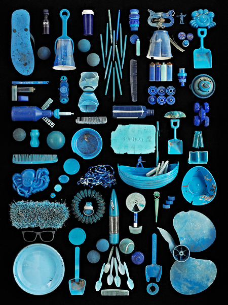
Fig. 1. Blue Ocean (2013) 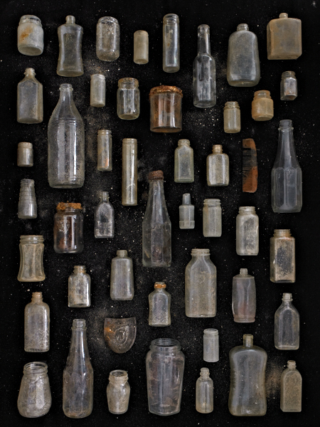
Fig. 2. Clear Glass Jars and Bottles (2012)
Rosenthal appears to use a deep depth of field as the objects are crisp, and there is no focal point to direct the viewer around the frame. The use of a plain background helps the textures, shapes, colours stand out on their own. The reflections and shadows on the items suggest side lighting by artificial lighting such as studio lights. A birds-eye view flattens the object’s form allowing the viewer to focus on the narrative told via the arrangement, something that may not have been achieved if shot at an angle. The shapes and sizes of each item complement one another without the collection becoming cluttered and unorganised. Subtle changes are made throughout his series, keeping the images fresh, unique yet consistent in concept.
Sam Oster
Sam Oster is an Australian based photo-media artist who has experience in stills photography, moving images, lecturing, film and documentaries.
Oster has exhibited in both solo and group shows across the years including Art Images Gallery, Adelaide (2014); Shimmer Photographic Biennale, Southern Australia (2012) and Duckspool Photographic Centre, England (2001).
‘Short Circuit‘ was created in 2009 to investigate the consumption of electrical items and the ever-growing issue of consumerism and competition between companies, which can create a conflict between what is ‘trash and treasure’ (Oster, 2019).
Bernd and Hilla Becher’s typologies of industrial buildings and structures heavily inspired her; however, Oster used portable electrical items as her subject instead of permanent structures.
Oster captured electrical items found in rubbish dumps, neatly arranged in individual cabinets to examine the form and function of the objects in the grid. However, the moving image time-lapses represent the idea of electrical dependency and its impact on the environment, for example, a fan placed in a sea of metal in front of an ocean’s horizon (Oster, 2019).
The work shot on a medium format black and white film are hand processed and printed. These pieces have the same grainy post-industrial effect the Becher’s achieved.
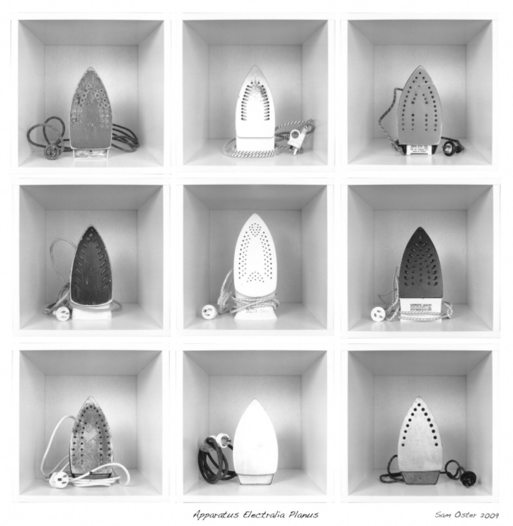
Fig. 3. Apparatus Electralia Planus (2009)
A collection of discarded irons (see Fig. 3.) are framed centrally in a square cabinet, forming a grid of 9. This composition cleverly splits the image into sections without having to take individual photographs. There is an even contrast between light and dark, shown through the metal, scratches, age marks, shape of the subject and the plugs. The lighter irons are aligned down the middle of the collection, framed by different tones of grey and black. While they are the same in function, their forms, the impact of time and usage make them unique, providing the viewer with change. A deep depth of field may have been used for this image, as the items, geometric lines, and the extent of the cabinets are clear.
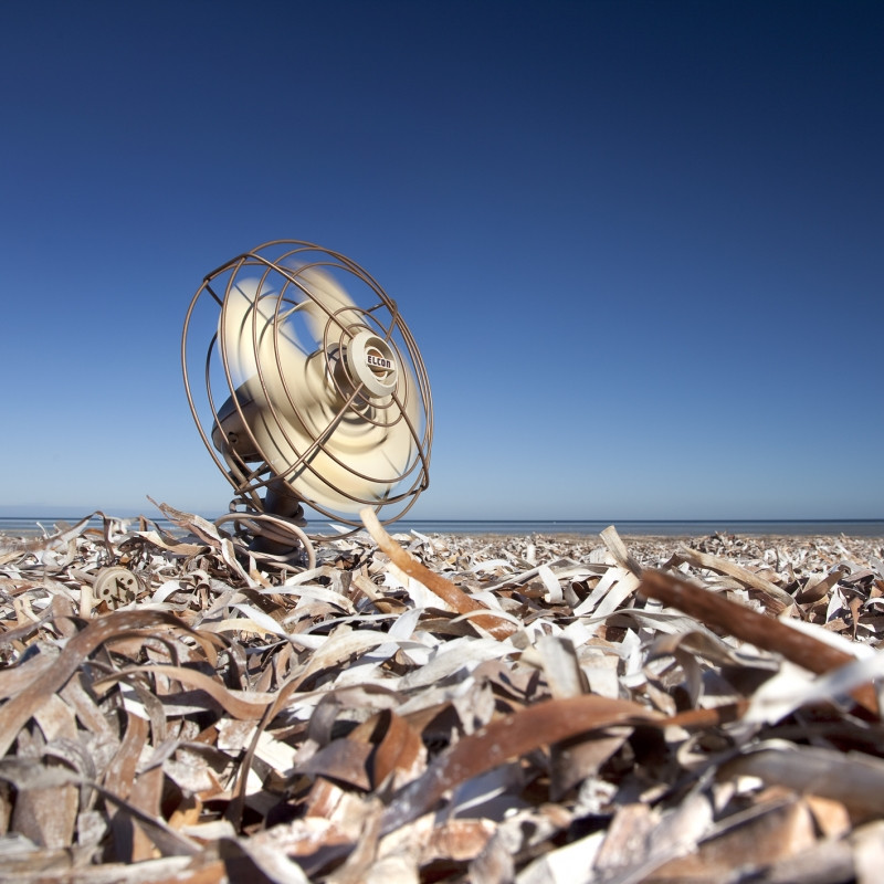
Fig. 4. Cooling Down (2009) 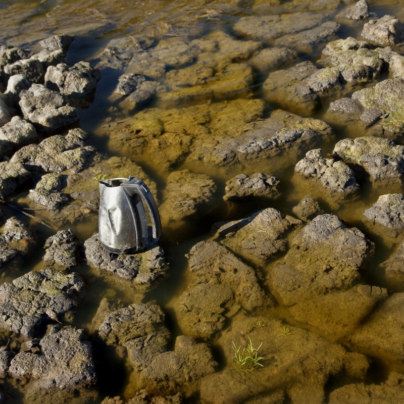
Fig. 5. Boiling Over (2009)
Unlike the typologies, these moving-image time-lapses feature one item each, however, once paired they form a collection of discarded electrical items in various landscapes. A shallow depth of field may have been used in Cooling Down (see Fig. 4.) due to the subtle blur in the foreground directing the viewer’s eyes to the fan. Deep depth of field seems to have been used to shoot Boiling Over (see Fig. 5.); however, the kettle placed slightly off centre on a rock in the muddy water creates a focal point and direction. These small details call back to the idea of electrical dependency impacting the earth, global warming and the loss of lush green growth, clear waters and land.
Jim Golden
Jim Golden is a still-life and product photographer based in Portland and shoots subjects in their purest forms to avoid applying artificial beauty. Golden is artistic and stylistic in his photography, capturing inanimate objects in a bold or quirky way while keeping the subject accurate to what it is.
He learnt photography by joining the fast-paced world of New York advertising, specialising in high-end retouching and visual effects (Jim Golden Studio, n.d.).
Golden’s enthusiasm and ‘sense of humour’ (Jim Golden Studio, n.d.) reflects throughout via bright colours, exciting subjects, and thorough planning.
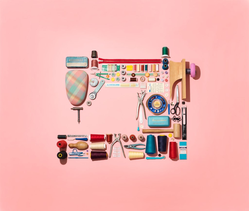
Fig. 6. collection of sewing stuff in shape of a sewing machine (2019) 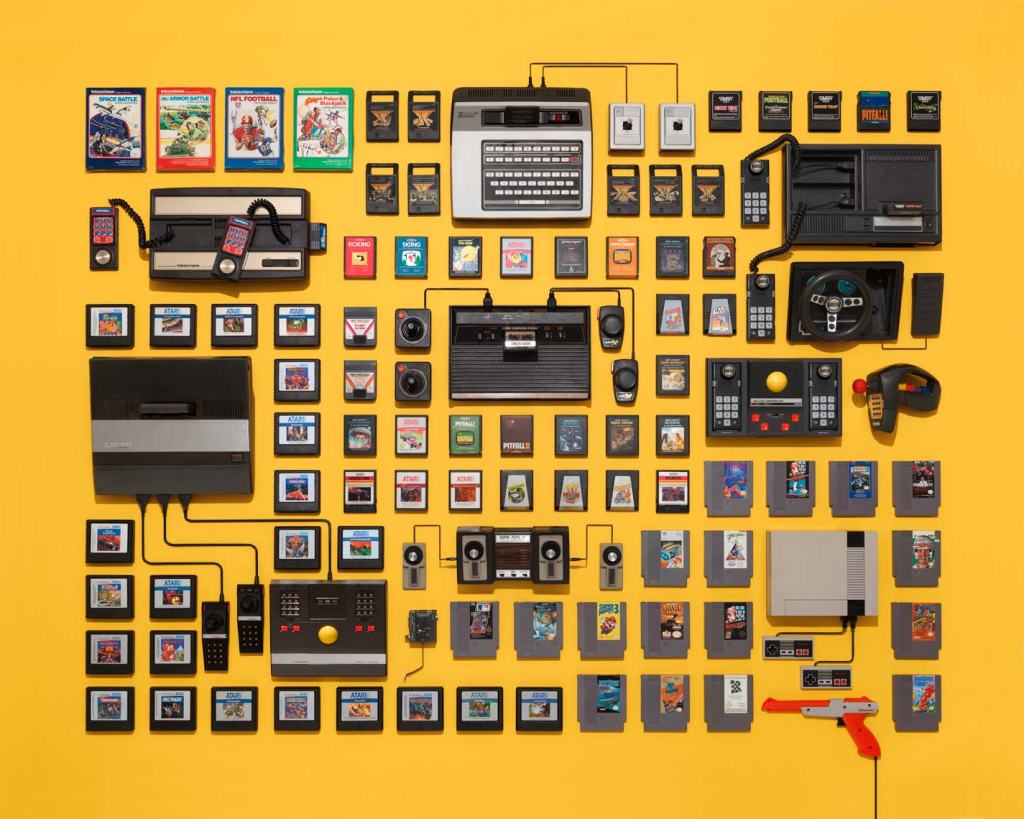
Fig. 7. vintage video game consoles and cartridges on a yellow background (n.d.)
Golden may use deep depth of field in his work due to the sharp, crisp and geometric forms created by the arrangement of the items. There are many leading lines throughout the imagery, the spaces between the subjects outline the shapes and sizes of each item, allowing the viewer’s eyes to follow around the composition with no end to the line. Like Rosenthal, Golden shoots his subjects from above from a height or using a wide-angle lens, using studio lighting to light the items. A soft halo in the middle of collection of sewing stuff (see Fig. 6.) and the few harsh shadows in both images caused by taller items may imply lighting from above or behind. Creating shapes that relate to the collected items, using the products and making the image pop with intense colour may represent happiness, playfulness, love or other positive emotions.
Overall thoughts:
All of the artists above vary from one another visually. Oster uses a mixture of B&W film and coloured imagery, using the background to frame the items. Rosenthal uses monochrome backgrounds and uses the collection to add colour and depth. In contrast, Golden uses bold colours, leading lines and negative space to enhance the objects.
However, they are alike technically as their images are crisp and in focus, suggesting a deep depth of field. Sharp shadows and bright highlights imply artificial lighting, and they all share a meticulous approach to the composition and framing of their subjects.
Contextually Rosenthal and Oster focus on political issues, such as the impact of human nature and consumerism on the planet. The way they execute this is by collecting disposed electrical products, plastic from the ocean and dumps. Oster’s choice to shoot with B&W film creates a raw emotion by enhancing the aged and shiny, textural details on the metal irons, while the rusty browns and muddy waters evoke thoughts of decay and neglect. Her choice of discarded electrical items reflects the waste caused by a lack of appropriate recycling resources. Rosenthal’s use of a black background creates a contrast between the colourful plastics and their battered forms, helping them stand out; this shows how time has affected the product’s shape but is mostly still intact and beautiful. The way items form shapes such as a man on a boat, link back to humanity’s relationship with the ocean. These elements, when combined, form a narrative about the negative correlation between land and ocean pollution, and human activity.
On the other hand, Golden shoots a selection of brand new goods and electronics, documenting products that show human progress, and a positive, appealing side to consumerism. The use of vibrant colours and shapes brings playfulness, contrast the vintage products, implying how style and inventions have evolved. Arranging individual components when put together become a working product, for example, the gaming cartridges wouldn’t be playable without the console, which wouldn’t be functional without the wiring, celebrates human creativity and growth.
Each artist has formed a cohesive series by keeping visual changes to a minimum or at least make sure they are complimentary to avoid jarring the viewer and being consistent with the overall concept, and in turn support Walter Benjamin’s view on collections very well.
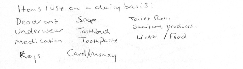
After researching these practitioners and the concepts behind their work I have decided to explore what ‘necessity’ means. I will develop on this by collecting various items based on the responses gathered in my online survey and personal list group them by theme, form or function if possible, before looking for juxtapositions or similarities within the collection.
Keeping the framing and position of the subject consistent, as Oster does in Apparatus Electralia Planus, is something I will apply when composing my shoot to avoid breaking the fluidity. The choice of black and white or colour can impact the overall mood of the images; therefore I will experiment with the use of colour to decide how I want to evoke emotion or enhance details in the shot. Shadows and highlights can affect the form of a subject as well as the depth so I will consider using artificial light during my test shoot to decide whether I’d like to achieve a soft or sharp visual style. Shooting from a birds-eye view isn’t something I do very often and is something I would like to try out for this assignment, taking influence from Rosenthal and Golden as a guide for creating successful compositions. Deep depth of field assures that everything in the frame is crisp and in focus, so even though I would like the items to stand out, the rest of the composition will be just as essential to provide context; therefore, I will use a narrow aperture.
The final selection of images can make or break the set and how they knit together, so I will be meticulous when it comes to formulating the collection as a whole. During my test shoots, I would like to take influence from Oster and experiment with grid work and typologies; this may determine how I present my final selection.
Summary of the shoot plan :
– Experiment with B&W and colour.
– Vary the lighting used to see what works best.
– Test different angles, focal lengths and apertures.
– Consider the framing and positioning of the selected items.
– Play around with cropping and grid work.
– Be thorough when choosing final camera settings.
– Consider the relationship between each image when it comes to the final selection.
References:
Benjamin, W. ([1936]1999) Illuminations. London: Pimlico
Jim Golden Studio. (n.d.) ‘About Jim’. [Online] Available at: https://www.jimgoldenstudio.com/INFO-AND-CONTACT/ABOUT-JIM/1 (Accessed 13 February 2020).
Oster, S. (2019) ‘Short Circuit – Sam Oster Portfolio – The Loop’. [Online] Available at: https://www.theloop.com.au/project/silvertrace/portfolio/short-circuit/17421 (Accessed 13 February 2020).
Rosenthal, B. (2012) ‘BARRY ROSENTHAL PHOTOGRAPHY – Info’. [Online] Available at: http://barryrosenthal.com/info/ (Accessed 12 February 2020).
List of Images:
Figure 1. Rosenthal, B. (2013) Blue Ocean [image] Available at: http://barryrosenthal.com/found-in-nature/single-gallery/16729872 (Accessed 12 February 2020).
Figure 2. Rosenthal, B. (2012) Clear Glass Jars and Bottles [image] Available at: http://barryrosenthal.com/found-in-nature/single-gallery/13950856 (Accessed 12 February 2020).
Figure 3. Oster, S. (2009) Apparatus Electralia Planus [image] Available at: https://www.theloop.com.au/project/silvertrace/portfolio/short-circuit/17421 (Accessed 13 February 2020).
Figure 4. Oster, S. (2009) Cooling Down [image] Available at: https://www.theloop.com.au/project/silvertrace/portfolio/short-circuit/17421 (Accessed 13 February 2020).
Figure 5. Oster, S. (2009) Boiling Over [image] Available at: https://www.theloop.com.au/project/silvertrace/portfolio/short-circuit/17421 (Accessed 13 February 2020).
Figure 6. Golden, J. (2019) collection of sewing stuff in shape of a sewing machine [image] Available at: https://www.jimgoldenstudio.com/IMAGERY/STILL-LIFE/7 (Accessed 13 February 2020).
Figure 7. Golden, J. (n.d.) vintage video game consoles and cartridges on a yellow background [image] Available at: https://www.jimgoldenstudio.com/OVERVIEW/COLLECTIONS/1 (Accessed 13 February 2020).