Summary:
For my final selection I;
– Provided annotated contact sheets of my final shoot to show the images I preferred or eliminated, along with any changes I’d like to make like cropping.
– Explained how I executed this shoot, including camera type and settings, before exploring how the various techniques helped or hindered my imagery.
– Drawn on the influence I gathered from Barry Rosenthal and Sam Oster, explaining why.
– Stated how my selection process went, what programmes I used, and the minor changes made to improve the quality of the work,
– Before explaining the reasoning of my grid work and the groups made what messages they may imply for the viewer.
– Briefly reflected on what I felt worked well during the shoot and selection process, as well as my thoughts on the final selection.
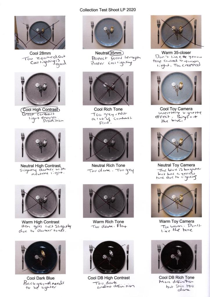
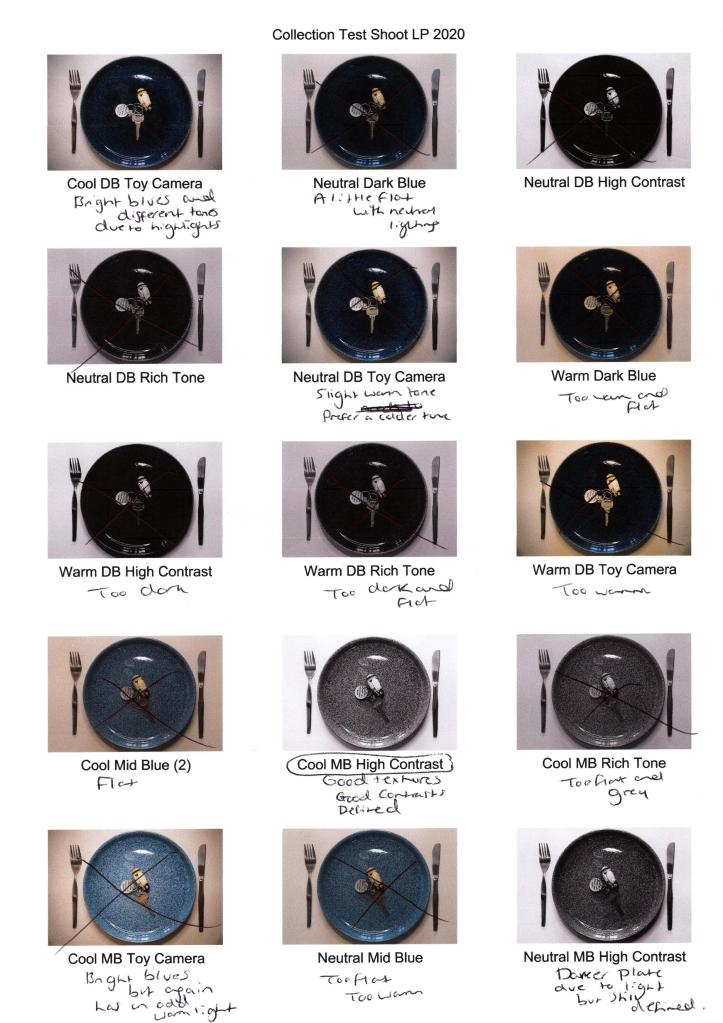
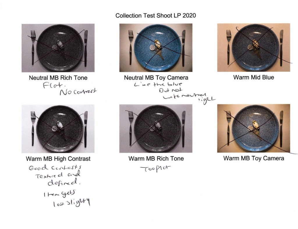
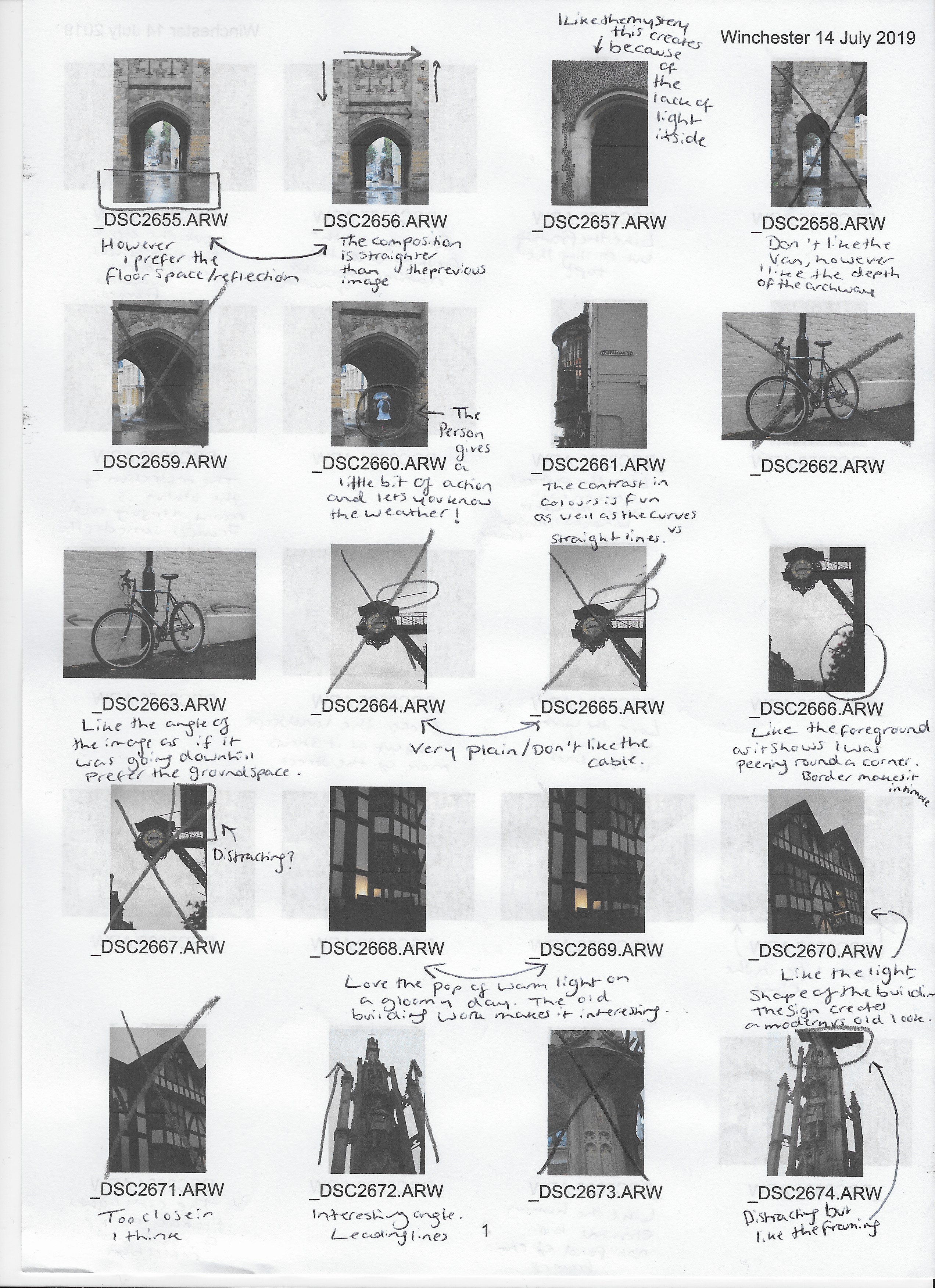
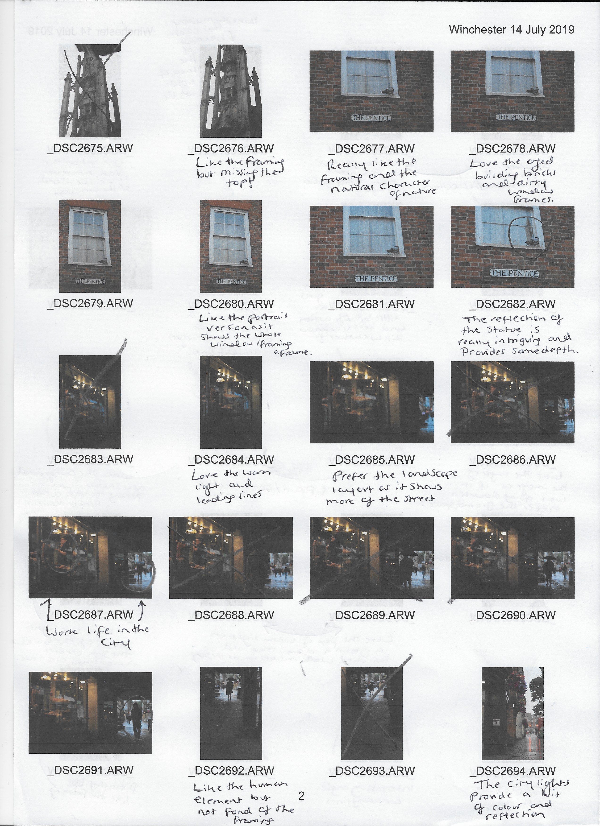
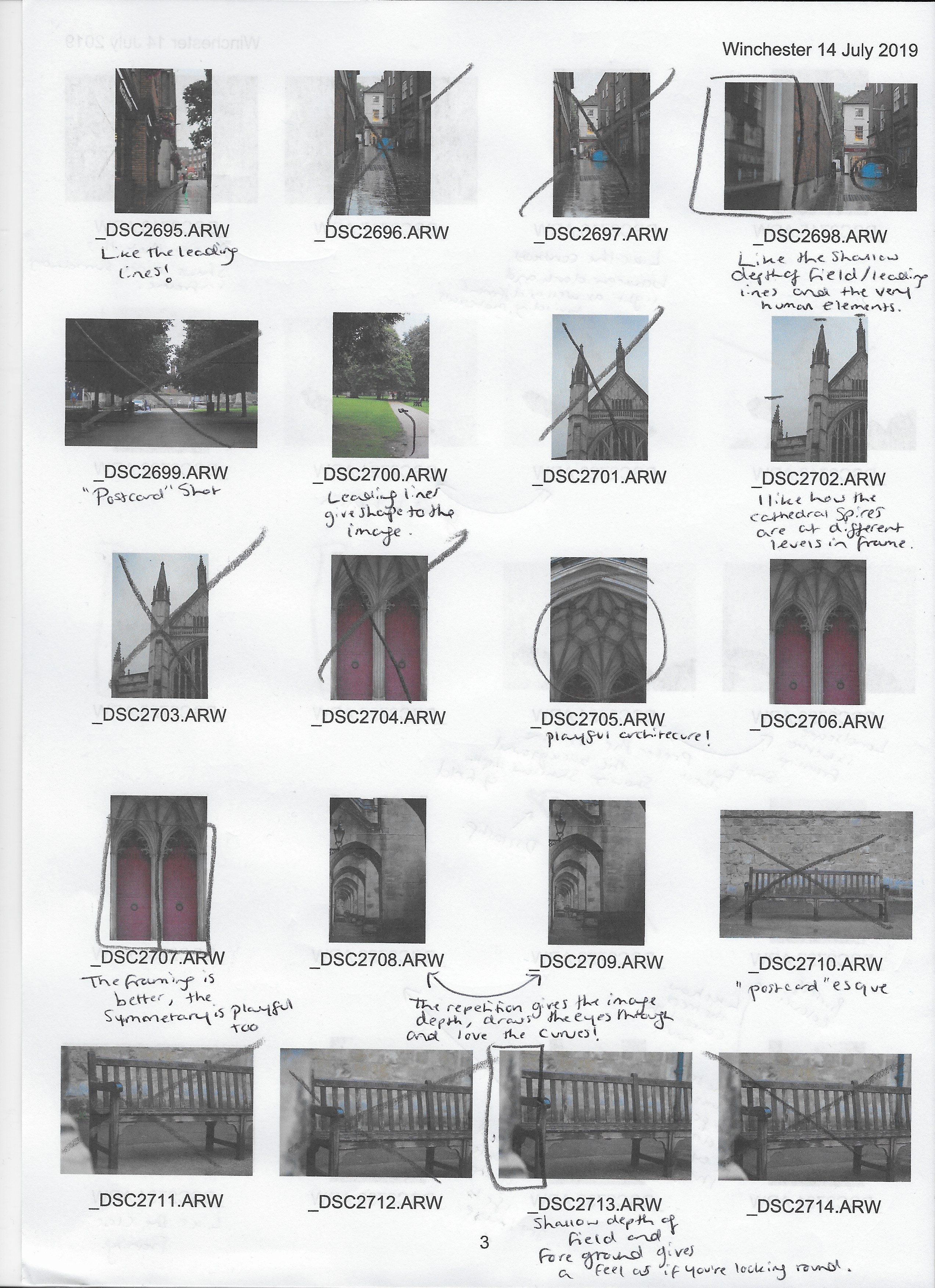
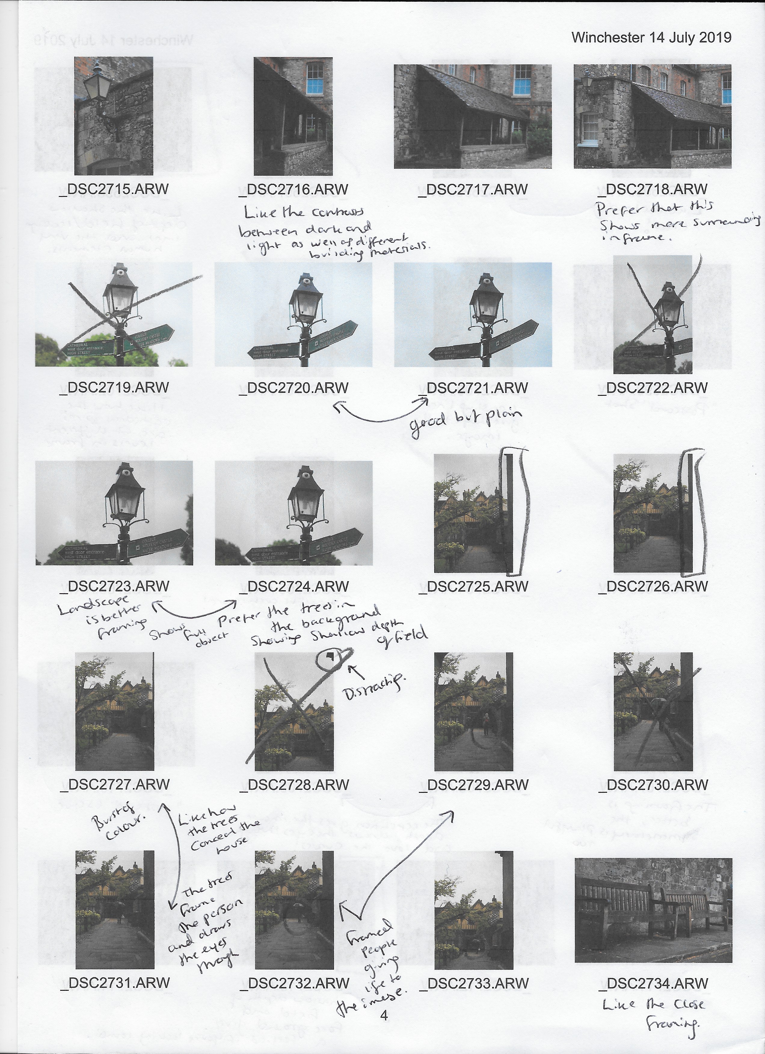
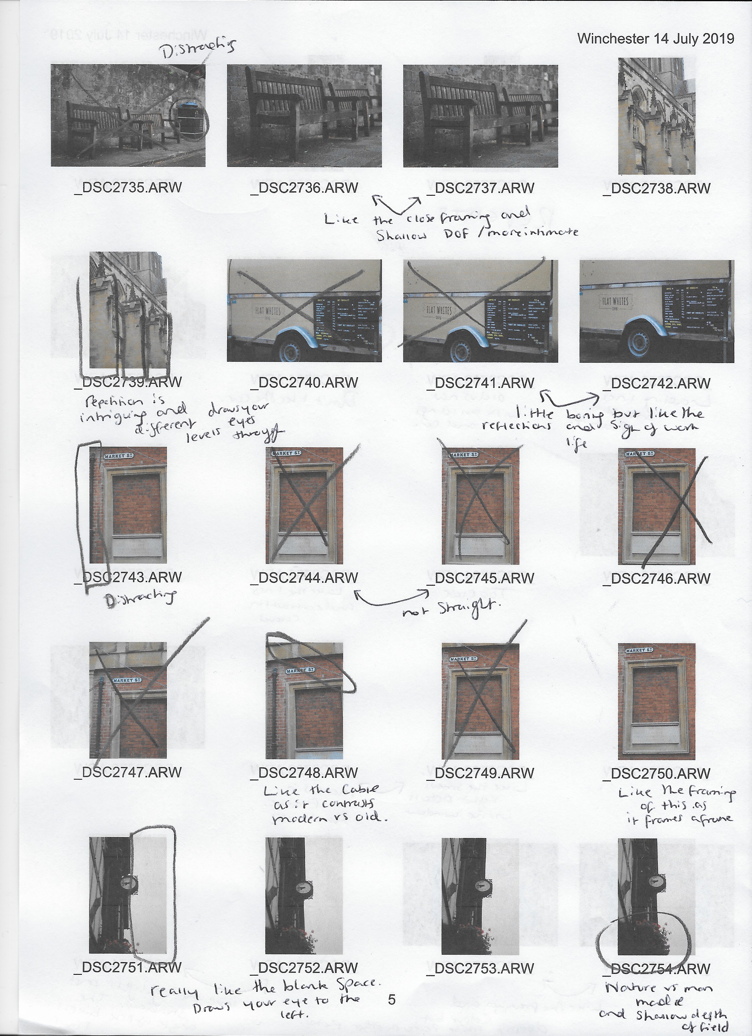
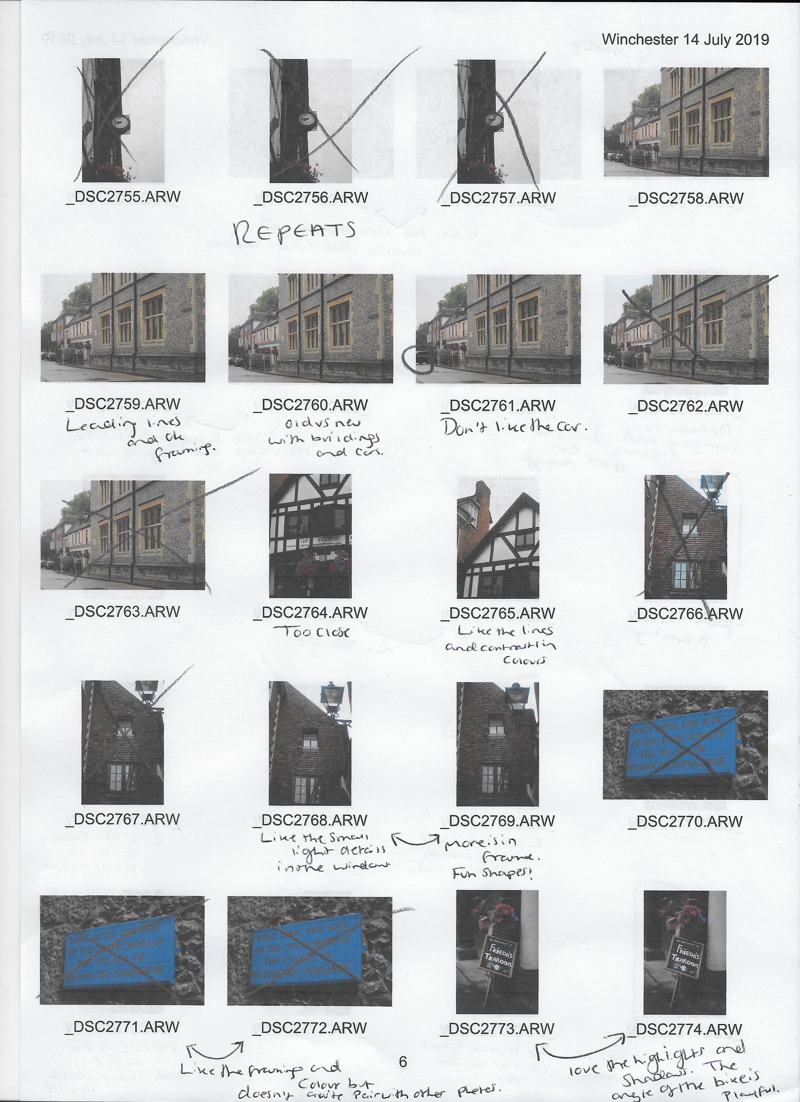
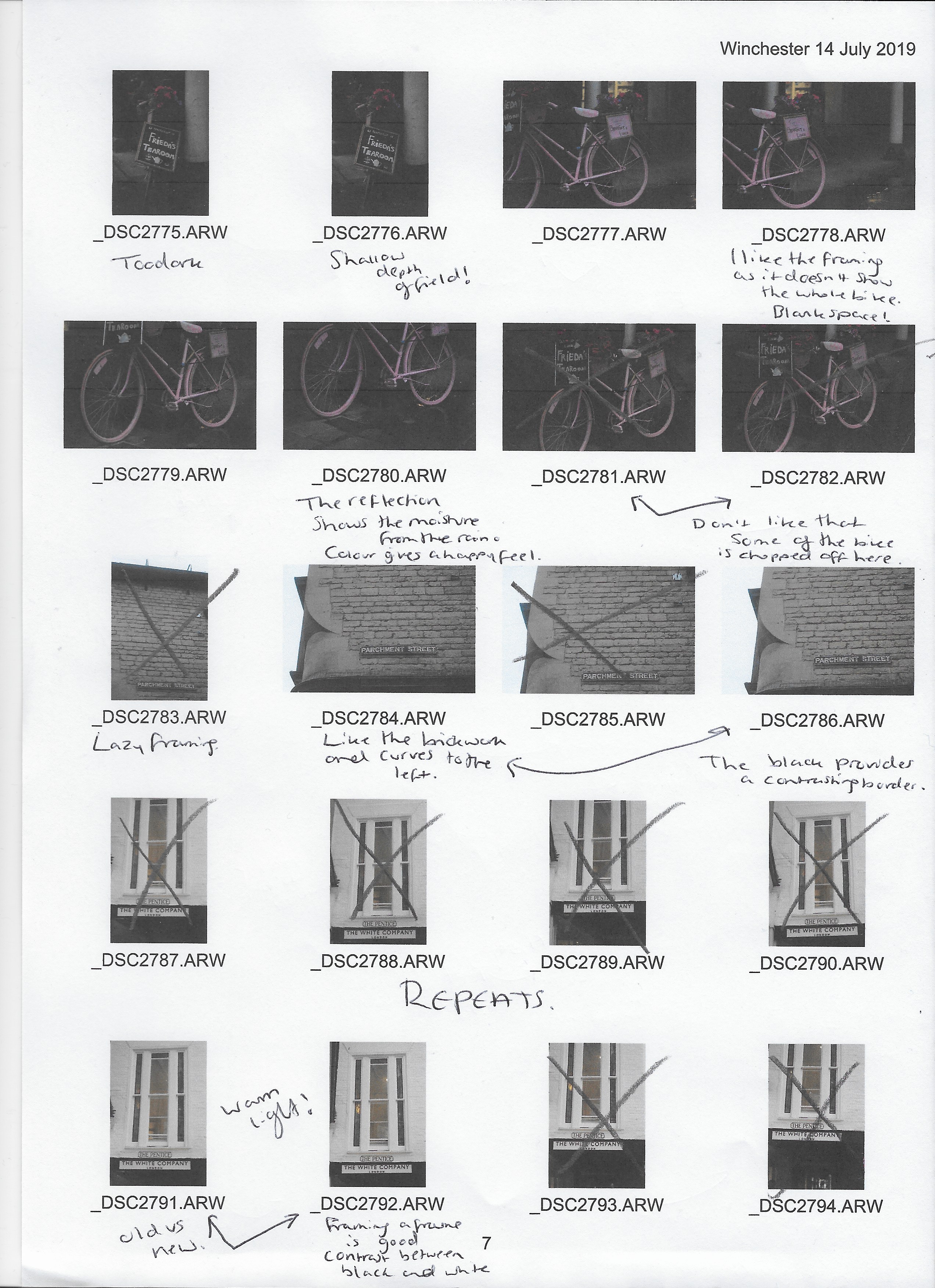
Before selecting my final images the contact sheets were printed off, annotated and analysed to figure out which shots were strongest visually, technically and conceptually when placed together as a group.
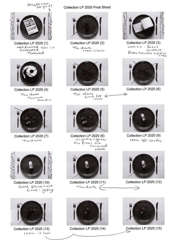
Fig. 1. Contact sheet 1 (2020) 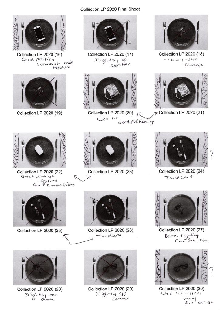
Fig. 2. Contact sheet 2 (2020) 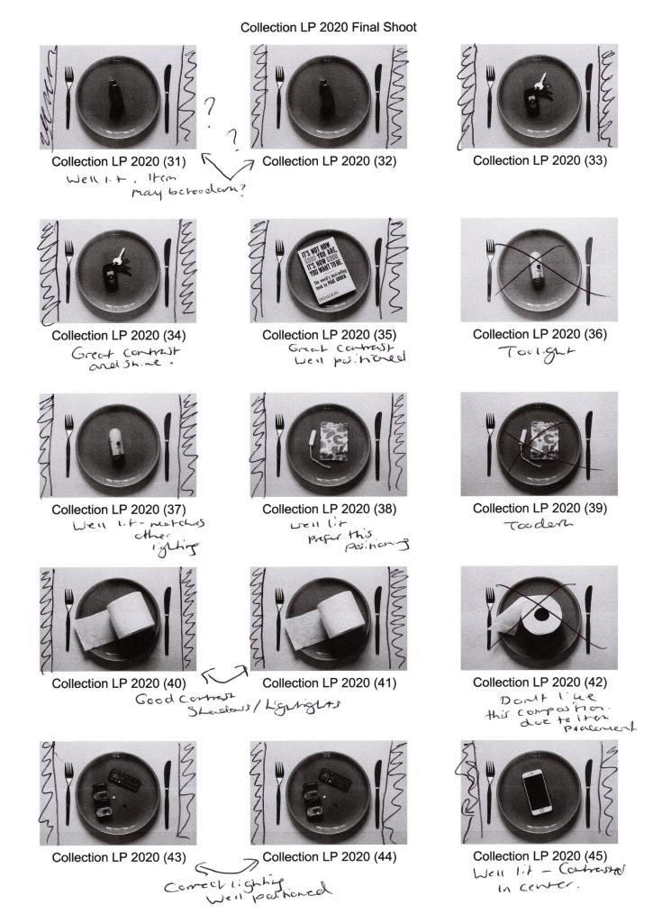
Fig. 3. Contact sheet 3 (2020) 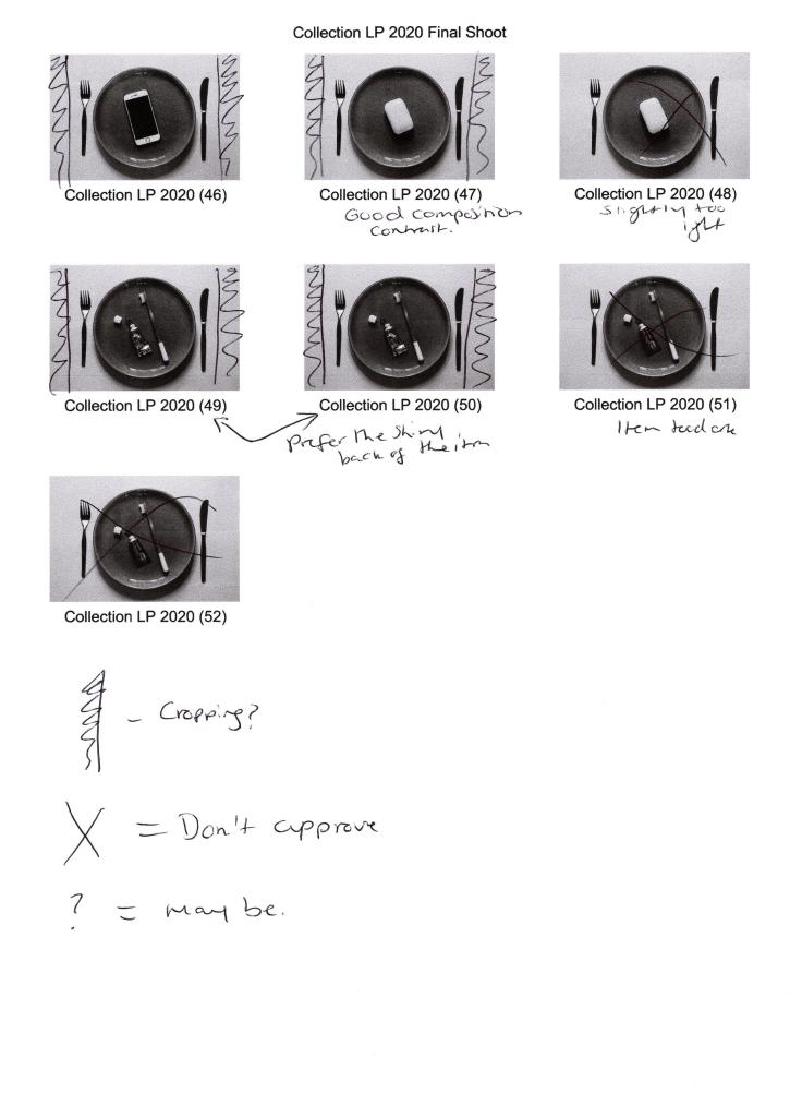
Fig. 4. Contact sheet 4 (2020)
While shooting, I made sure to refer to the techniques listed on my shoot plan to make sure I shot my images as intended and the camera settings were suitable for the lighting.
Setting my Sony A57 to manual focus allowed me to make sure everything was as crisp and accurate as possible. At the same time, a narrow aperture of F/14 prevented unwanted blur and provided enough light. I did use an ISO of 400 to boost the light levels slightly, enabling me to use the slowest shutter speed of 1/4 to get a well-lit shot, avoiding bulb mode or a wider aperture.
Placing my camera on a tripod meant the framing was consistent and stable throughout, while everything was in the frame when using a focal length of 35mm. Backlighting my images was a wise decision, as it enhanced the 3D form, however, due to uncontrollable natural light coming from behind, the images were lacking in shadows or became too dark, exampled in Collection LP 2020 (2) and Collection LP 2020 (36) (see Fig. 1. and Fig. 3).
Using the High Contrast B&W setting in camera provided the definition and contrast I wanted to achieve, some subjects, however, were difficult to decipher and can be seen with Collection LP 2020 (2), Collection LP 2020 (5) and Collection LP 2020 (18) (see Fig. 1. and Fig. 2). This camouflaging was due to the plate colour, so experimenting and shooting the items on both plates was vital to give me a chance to capture each subject successfully.
Taking inspiration from Barry Rosenthal and collecting various items allowed me to experiment with different textures such as smooth, soft, wet, rough and hard, which juxtapose one another. However, as a whole, the subjects contextually link together when it comes to theme and functionality, such as electrical, health and hygiene. It also gave a more extensive range of products to choose from when selecting my final images and didn’t restrict in any way that concerned me as I wanted the set to be cohesive yet unique.
Making sure the plate was in the same place throughout and placing the subjects as close to the centre as possible, decreasing the chance of the set flow being distracted by a sudden change in composition. It also created a controlled and cold mood that compliments the crisp black and whites, making the images look profound.
After analysing the contact sheets and selecting the best images, I went into Photoshop to crop and tidy up some blemishes the could be seen on the white background when enlarged on the screen. Cropped photos provided a suitable amount of negative space to frame the subject while emphasising the importance of the items in the shot. Enlarging the canvas and adding a solid 1-inch frame around the image reflect Sam Oster’s use of white boxes in her typologies which appealed to me.
Adobe Bridge enabled me to create a grid and rearrange my edited images to form a cohesive set of images, split into three groups juxtaposing in type and functionality. On the other hand, they complement one another in terms of concept, contrast and composition, forming a solid link between the collection.
Inspiration from Sam Oster and Barry Rosenthal lead me to experiment with a narrow aperture to achieve a sharp focus. B&W photography enhanced the details and shooting overhead instead of straight on. These techniques pushed me beyond my comfort zone and tested my ability to be selective when creating a typology.
Visually this set is powerful due to the variety of tones providing depth to the composition, contrasting highlights and shadows emphasise the subjects 3D form, allowing them to be more prominent. Keeping the product placement consistent creates repetition but stays fresh due to the change in object and colour of the plates. Balance is maintained by using an even amount of background to frame the items and being evenly cropped. Artificial lighting creates harsh shadows that define the details within the plate and products; a cooler colour temperature intensifies the white background preventing the image from being flat with grey tones. Providing a focal point enables the viewer’s eyes to be drawn to the middle of the frame, focusing on the chosen objects that form a narrative when connected, varying between each individual.
The use of black and white restricts the viewer from being distracted by any colours that may confuse their overall understanding of the set, created a conflict between calm and danger, warm and cold, sadness and happiness. Enhancing the forms, textures, details allows the viewer to focus on and explore the purpose of the object rather than how it makes them feel.
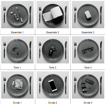
Looking at the groups that have emerged, there is a set of three hygiene products, three tangible metal items and three objects that are all completely different in functionality (see Fig. 5). They are all “things” that people use which is what connects them as a set, however, are they all a necessity? Are there some items that you feel are a luxury? Do you use all of these items, and if so what do they mean to you if anything? Do you see this set as everyday, ordinary items or do they represent a particular message for you?
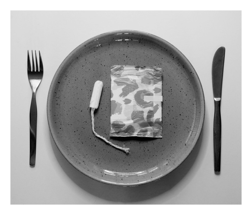
Fig. 6. Divide 1 (2020) 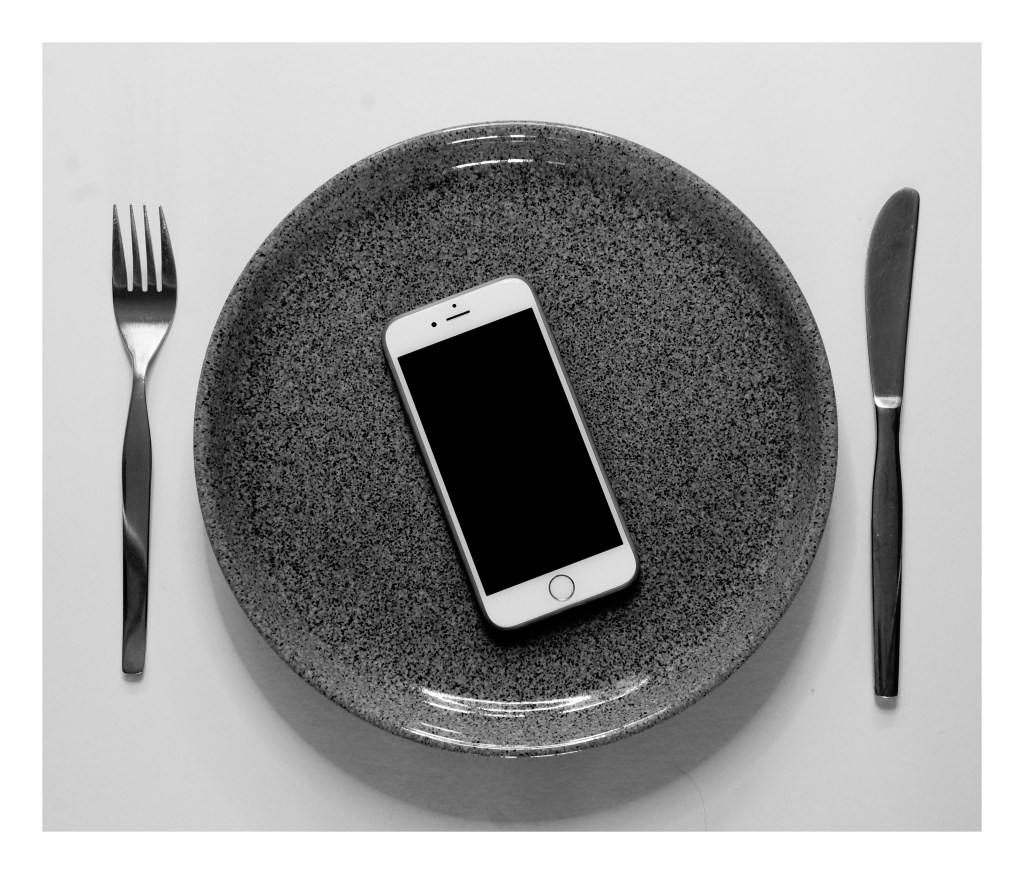
Fig. 7. Divide 2 (2020) 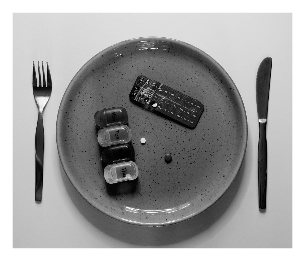
Fig. 8. Divide 3 (2020) 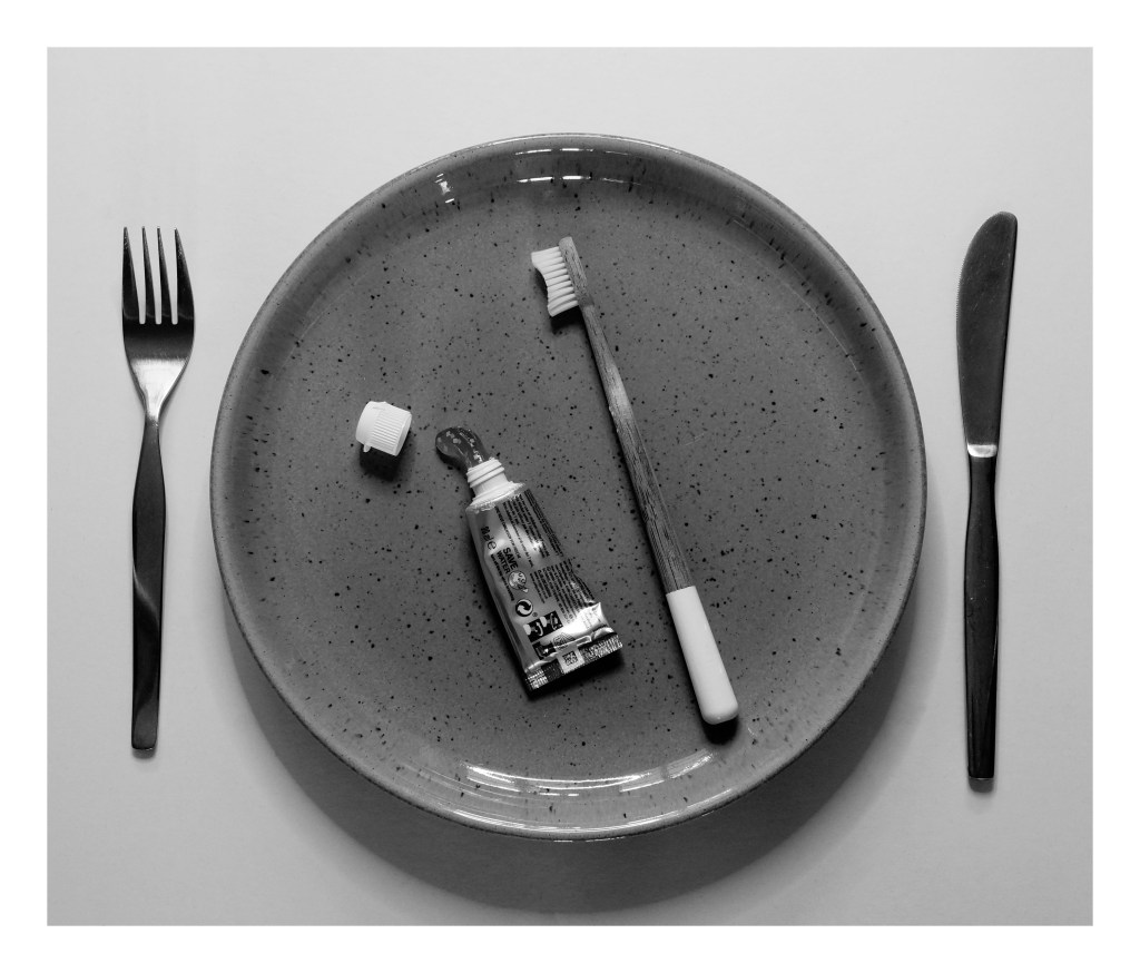
Fig. 9. Essentials 1 (2020) 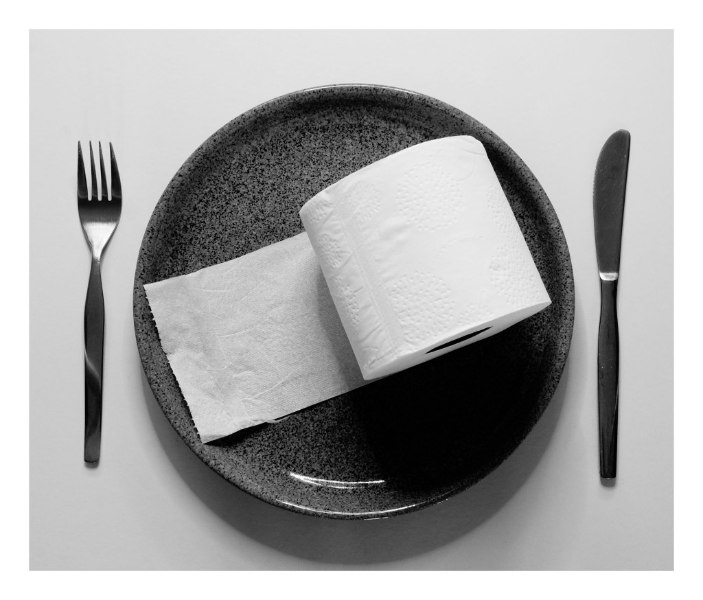
Fig. 10. Essentials 2 (2020) 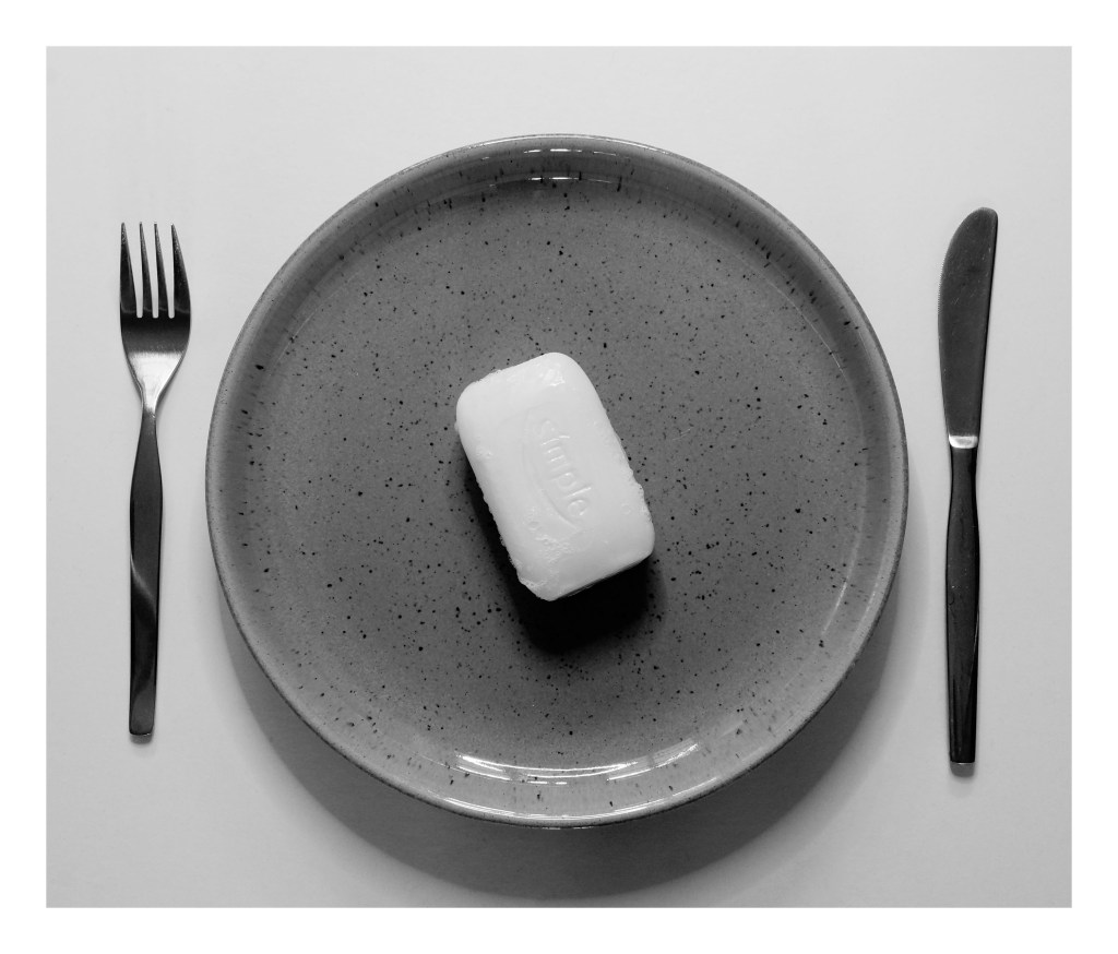
Fig. 11. Essentials 3 (2020) 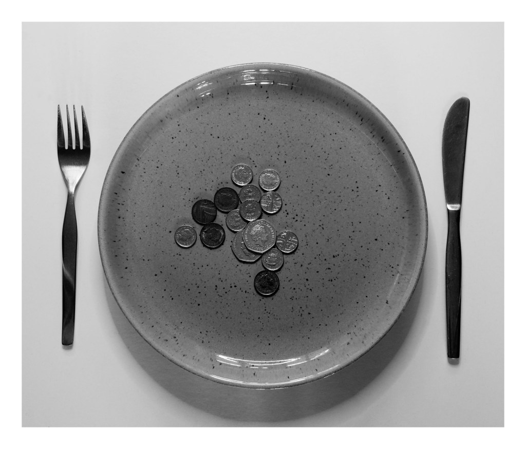
Fig. 12. Tools 1 (2020) 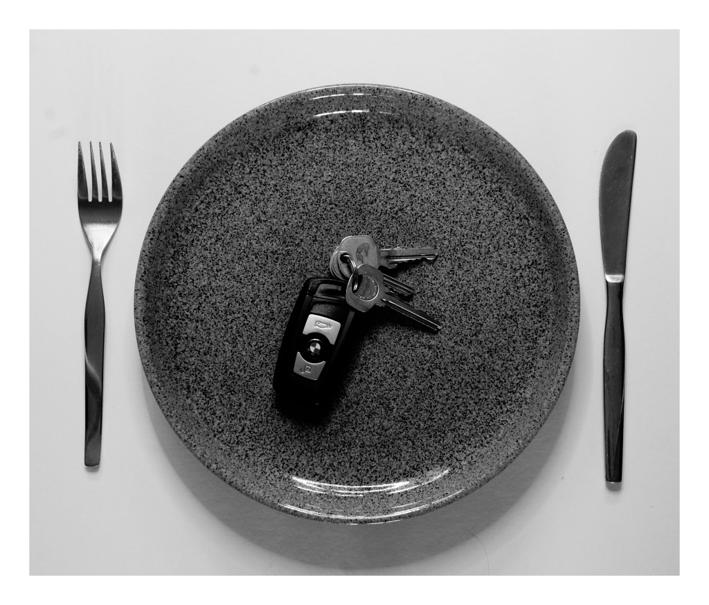
Fig. 13. Tools 2 (2020) 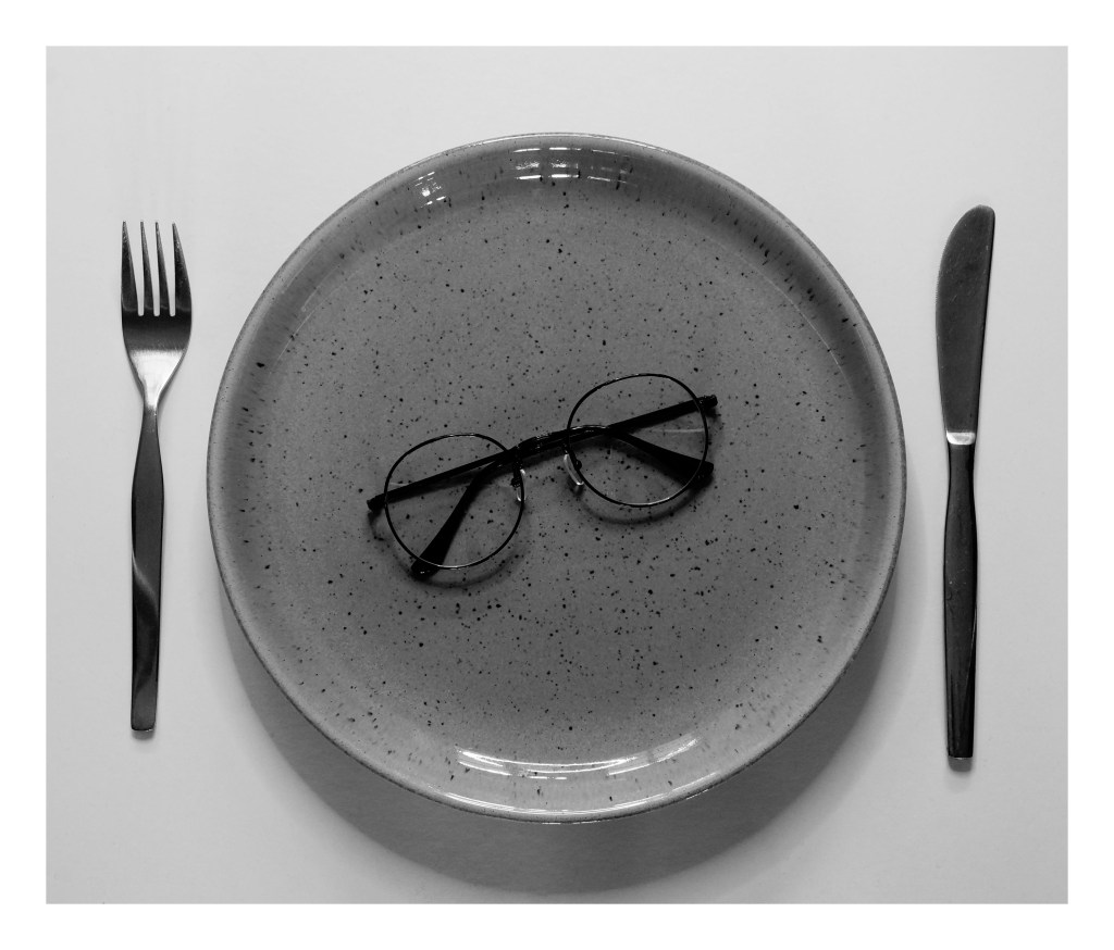
Fig. 14. Tools 3 (2020)
I feel positive about my final selection and have enjoyed exploring the different collections that we can find around us, even if it isn’t as apparent at first glance. The one issue I did have with this shoot was the influence the natural light had on my imagery, meaning I had less to choose from, however did not ruin the whole selection.
List of images:
Figure. 1. Powell, L. (2020) Contact sheet 1 [scanned document] In possession of: Lauren Powell: Eastleigh.
Figure. 2. Powell, L. (2020) Contact sheet 2 [scanned document] In possession of: Lauren Powell: Eastleigh.
Figure. 3. Powell, L. (2020) Contact sheet 3 [scanned document] In possession of: Lauren Powell: Eastleigh.
Figure. 4. Powell, L. (2020) Contact sheet 4 [scanned document] In possession of: Lauren Powell: Eastleigh.
Figure. 5. Powell, L. (2020) Typology [pdf, screenshot] In possession of: Lauren Powell: Eastleigh.
Figure. 6. Powell, L. (2020) Divide 1 [image] In possession of: Lauren Powell: Eastleigh.
Figure. 7. Powell, L. (2020) Divide 2 [image] In possession of: Lauren Powell: Eastleigh.
Figure. 8. Powell, L. (2020) Divide 3 [image] In possession of: Lauren Powell: Eastleigh.
Figure. 9. Powell, L. (2020) Essentials 1 [image] In possession of: Lauren Powell: Eastleigh.
Figure. 10. Powell, L. (2020) Essentials 2 [image] In possession of: Lauren Powell: Eastleigh.
Figure. 11. Powell, L. (2020) Essentials 3 [image] In possession of: Lauren Powell: Eastleigh.
Figure. 12. Powell, L. (2020) Tools 1 [image] In possession of: Lauren Powell: Eastleigh.
Figure. 13. Powell, L. (2020) Tools 2 [image] In possession of: Lauren Powell: Eastleigh.
Figure. 14. Powell, L. (2020) Tools 3 [image] In possession of: Lauren Powell: Eastleigh.