Summary
In this post I;
– Included the brief for this exercise.
– Researched Sato Shintaro and Rut Blees Luxemberg’s work before analysing one image of theirs very briefly.
– Provided a small description about my camera and shoot preparation
– Before including the contact sheets for this particular exercise.
– I then chose 5 images from the shoot and analyses each one in terms of technique and the quality of light within them
– And finished the post with a short reflection of the exercise as a whole.
‘Capture ‘the beauty of artificial light’ in a short sequence of shots (‘beauty’ is, of course, a subjective term). The correct white balance setting will be important; this can get tricky but interesting – if there are mixed light sources of different colour temperatures in the same shot. You can shoot indoors or outside and the light can be ambient or handheld flash‘ (Bloomfield, 2018).
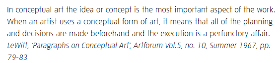
Sato Shintaro – (1969- )
Sato Shintaro is a Japanese freelance photographer who graduated from Tokyo College of Photography (1992) and Waseda University, School of Letters, Arts and Sciences (1995). Shintaro is well known for his brightly lit Tokyo cityscapes, Night Lights (1997-9), one of many photo series (Shintaro, 2020).
Shooting during dusk allows any surroundings lit by artificial light to stand out in ways daylight cannot. The tones are much crisper, while shadows are significantly darker and highlights are glaring. While this is possible with direct sunlight, the colours are usually more washed out and have a greater risk of overexposure, causing the images to blow out. The main difference between day and night photography is that daytime images are usually warmer in temperature and contrast.
Shintaro’s work is well balanced so that the viewer has much to look at in detail. Light bounces off all of the subjects around without becoming a black block due to underexposure. The colours are vibrant, busy and fill the frame, which encapsulates the hustle and bustle of city life without including people in the shots. Asian culture is beautiful and striking; seeing such elements and the traditional decorations throughout these images is delightful.
Nakano (1997-9) is possibly one of my favourite images from Shintaro, as the composition is warm and cosy as the bright yellows and reds help the white lights be less harsh on the eyes. The alleyway feels close, compact and welcoming, much like the restaurant on the left. The photograph is balanced, full of geometry from the rectangular signs and buildings, a mixture of vibrant colours and cool nighttime tones on the pavement below. Some of the bulbs higher up have created lens flares but emit softer rays than crisp glaring ones. In my opinion, this shot represents the many Asian people who welcome others into their culture and communities through their friendly, enthusiastic personalities and traditions.
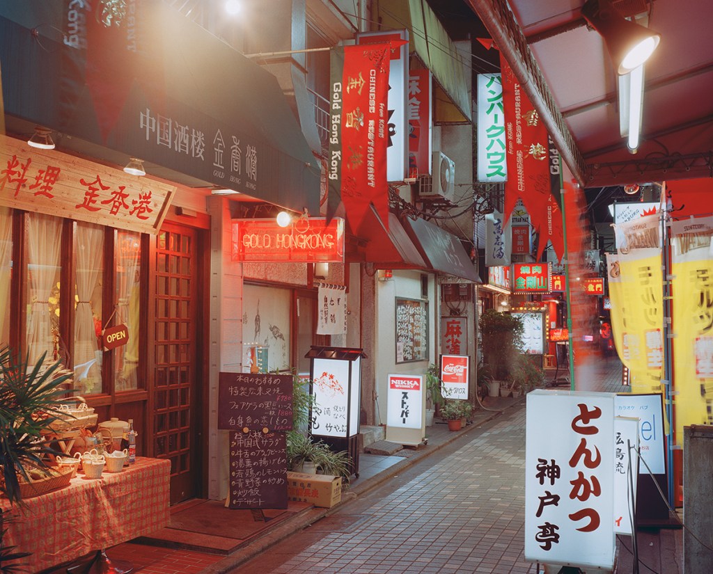
Rut Blees Luxemberg (1967 – )
Rut Blees Luxemberg is a German-born photographer based in the UK, well known for her urban photography work (Artimage, 2017). Much like Shintaro, Blees Luxemberg shoots at night when capturing urban landscapes as, ‘The night is a space of freedom, where certain demands of the day are temporarily suspended’ (Blees Luxemberg, 2018).
The reduction of movement captures different energies in comparison to busy high streets or buildings lit by daylight. Instead, evidence of life features throughout illuminated buildings, lit streets and items/natural elements left behind ‘But photographs are not just a record of a moment passed, they can also be an imagination or visual premonition of possible futures’ (Blees Luxemberg, 2018).
Her aesthetic is consistent throughout the images, ranging from greens to greys to cool hues, warm yellows and oranges. The combination of colours emits an eerie and grungy mood through her works which seems quite fitting for the series titled Liebeslied, My Suicides.
In Deeper (1999) was shot from what looks like multiple sets of stairs but could also be a few small steps towards a small platform. We are unaware of the location due to the lack of context within the black shadows of this photograph. Reflections in the frame imply that it has rained or flooded due to the water in the background. The texture is prominent throughout this work, from the stone steps, ageing walls or brickwork from the building on the left, the water and ripples we can see in the yellow light shining in from the right of the frame. Leading lines, a slightly shallow depth of field in the foreground, draw the eyes downstairs towards the lights and water in the background. ‘In Deeper‘ may suggest that this is a picture of a river, sea or flood, purely because of how deep the water looks and how far the reflection of light continues.
Compared to Shintaro, Blees Luxemberg’s work is much warmer in white balance than the white bulbs and LED’s featured in Shintaro’s Night Lights (1997-9). The photographs featured in My Suicides (1997-2000) are much darker and higher in contrast. With these different aesthetics in mind, this helped make my shoot for this exercise even more exciting, as I was able to explore a range of photographic techniques in one swoop.
Camera preparation
As it is now springtime, I had to wait until around half past eight at night to head out and take photographs for this particular exercise. My Sony A57 was already preset to manual mode, but I had to reset the white balance to auto to prevent any unwanted colour casts in the images taken during blue hour. An ISO of 200 enhanced the brightness without causing too much grain in the darkest areas. A large aperture of F1.8, allows for more light to enter the camera, ideal for night photography as it reduces the need for too slow a shutter speed if the camera isn’t on a tripod.
The shoot plan was simple as I took a short walk around my local area, observed the light from artificial light sources and how it shone on its surroundings and effects had on any subjects in the frame.
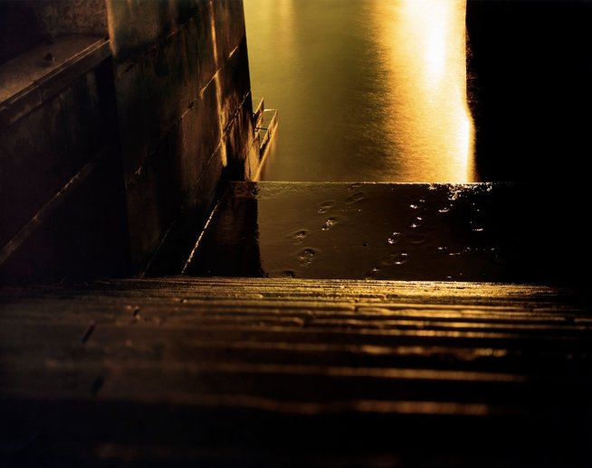
Fig. 3. Contact sheet 1 (2021) 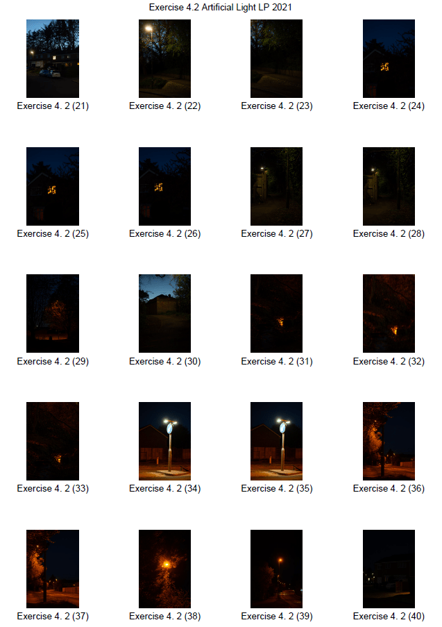
Fig. 4. Contact sheet 2 (2021) 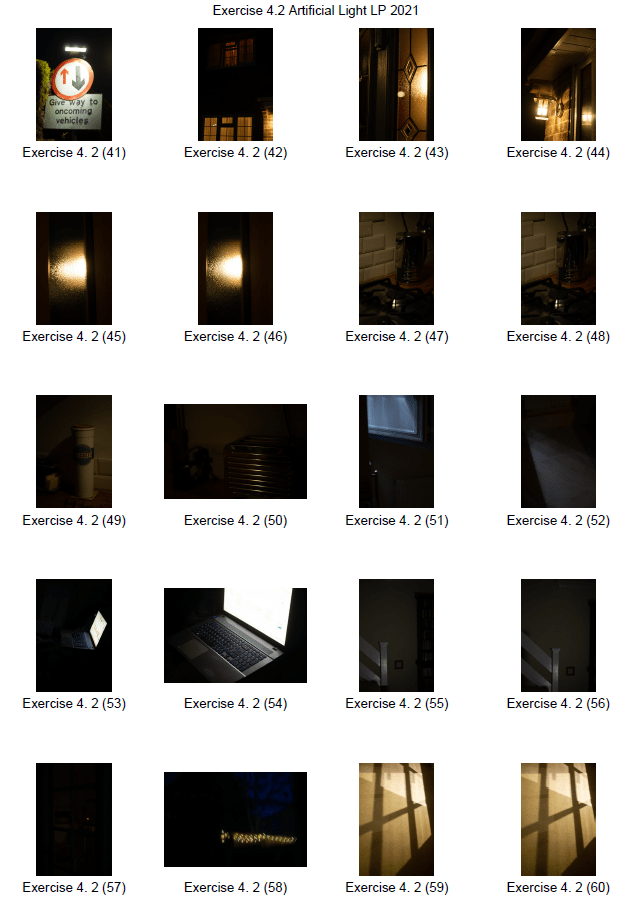
Fig. 5. Contact sheet 3 (2021) 
Fig. 6. Contact sheet 4 (2021)
Images for analysis
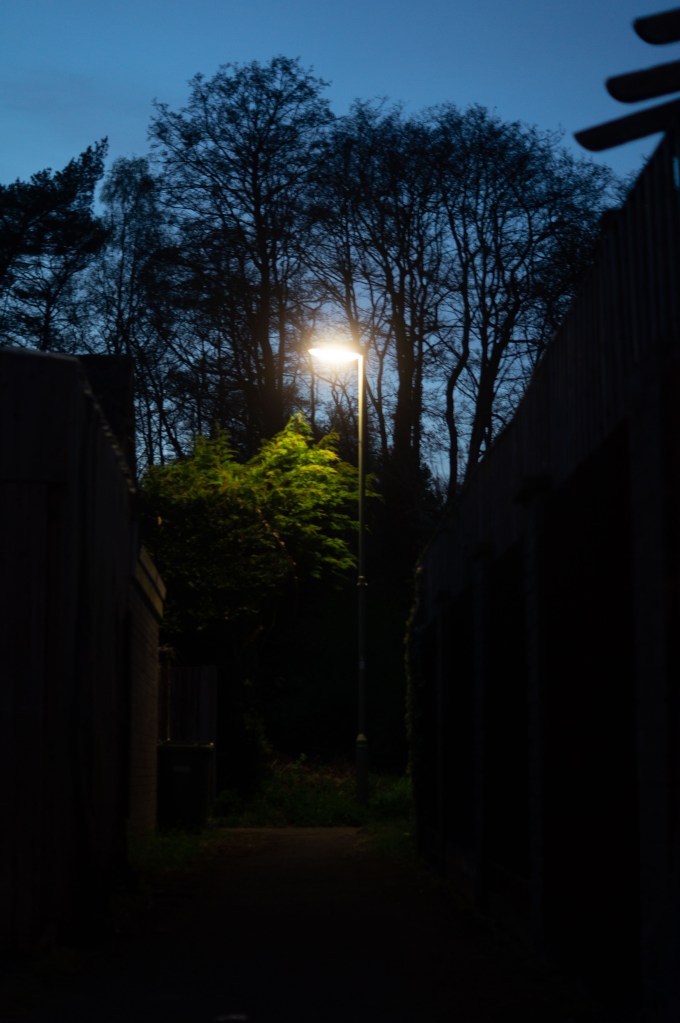
Fig. 7. 1 (2021) 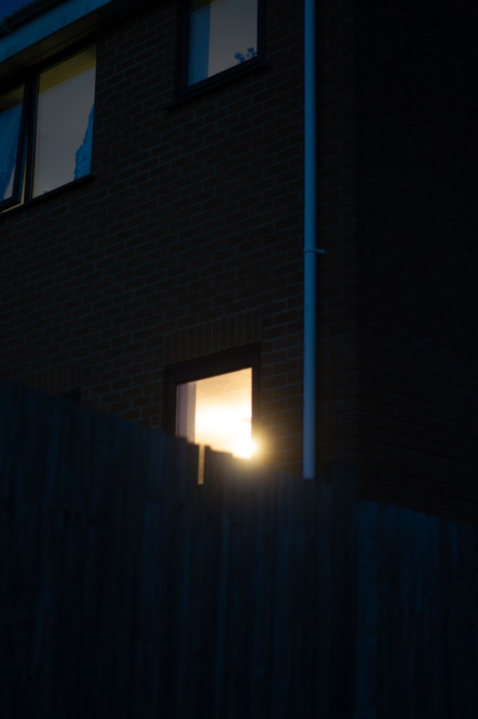
Fig. 8. 2 (2021) 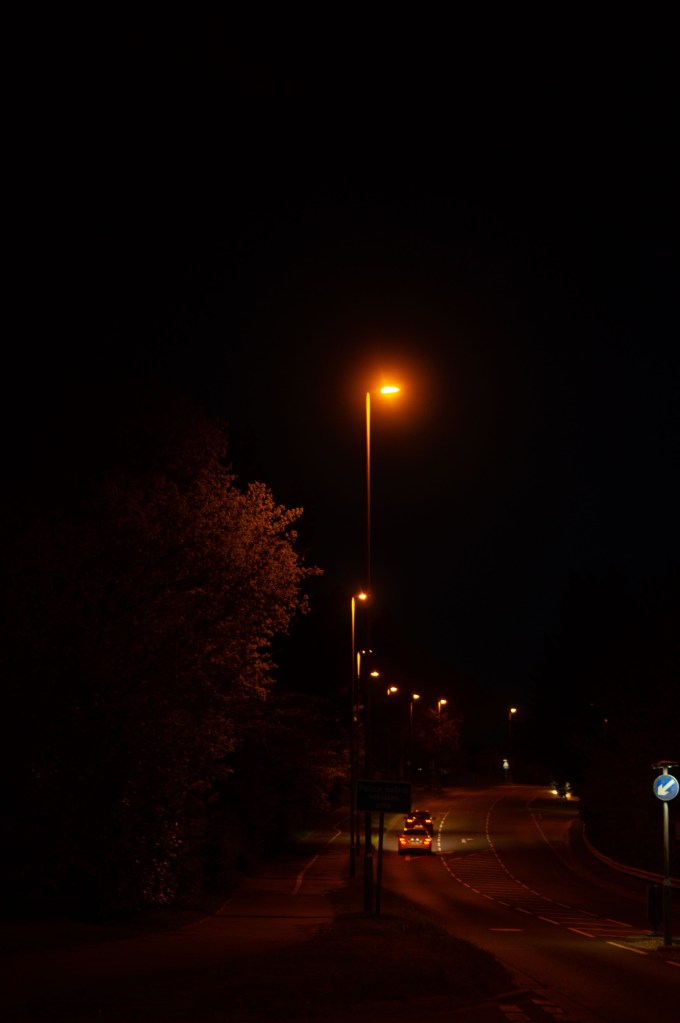
Fig. 9. 3 (2021) 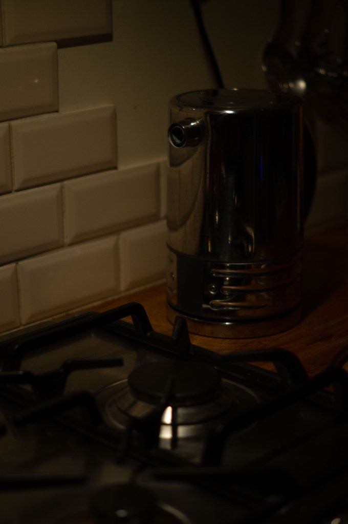
Fig. 10. 4 (2021) 
Fig. 11. 5 (2021)
1 – Despite taking the image during the blue hour, the period after sunset or just before sunrise, there is very minimal light to illuminate the buildings in the foreground. Secluded areas struggle to be lit during the evening regardless of artificial light due to the obstacles blocking most light sources. If I were to take the image during the day with a more powerful light level, we would see the buildings in their entirety. The sky brings a burst of colour to the composition, emphasising the shape of the buildings in the alleyway. Houses have helped frame the image nicely and document the lack of space that is in the shot. Focal pointwise, the bright white bulb from the streetlamp and the top of the tree leaves towards the background stand out before the eyes are drawn towards the soft spotlight below, lighting the pathway. The mood is mysterious and allows the brain to wonder was is around the corner or where this is.
2 – This building is in an open space, so the remaining light just after sunset was able to light the brickwork of the flats in the frame, as well as the fencing surrounding it. Added details such as these provide a context of location, type of building, how long it’s been there for; e.g. a partly broken fence implies it’s been up for a long time and endured some wear and tear. Reflections add both texture and depth to the composition, rather than it being a flat 2D image. A warm light source from the window just below the mid-frame brings a sense of home to the photograph and welcomes the viewer into a comforting space. The camera’s position compared to the fence and light source caused a lens flare to occur. As a result, it looks as if there were a torch pointing directly towards us. The tonal range is cold and suits the crisp spring evening while documenting blue hour well.
3 – With the blue hour long gone, the warmer streetlights can fully light the main road for the cars and pedestrians walking past, as seen in the far background. The white balance was changed to daylight for these shots to enhance the temperature of the bulbs and reflect Blees Luxemberg’s yellow/orange hues. Streetlights may be higher from the ground than most light sources, but they’re powerful enough to light the paths below like daylight would, just a lot softer in appearance. Headlights from cars are blinding for a good reason. Not only do they assist drivers to see where they’re going and if there are any obstacles ahead, but for the safety of other drivers so they’re aware of cars surrounding them. The contrast between the white light patch midframe and the yellow light brings balance to the frame, preventing it from looking like a sepia image, which I dislike as a photographic technique. The images leading lines draw the viewers eyes from the softly lit tree on the left, up and around the curves of the road swallowed by the black night sky.
4 – For image number 4 the light source comes from the cooker hood that is purposely brighter where the oven hobs are but much softer to the sides. Reflections from the kettle and oven top provide texture and context to the materials and shape of these objects. For example, the curves of the tiles reflect in the round kettle body. A small patch of the wooden worktop has warmed the frame up and made it feel more homely like a cottage kitchen would. Light coming from the left has created a soft shadow on the right-hand side of the frame, gently illuminating the utensils on the wall, making the kettle the main focus of the composition.
5 – This area has been fully lit by the light from the ceiling, allowing us to see the worktops, cupboards, windows and other items on the side. The door has light shining through, so we can see the cold metal handle and carved details in the window frames, which is a subtle detail to see. More context allows the viewer to understand a bit more about the subjects, where it is and the lifestyle of the people living there, much like Sato Shintaro’s works. Due to the light source coming from the right and straight out the door, means that the walls to the left are just out of range, full of shadows, bringing depth to the image. The composition is full of shapes, geometric or otherwise, as well as being warm and welcoming.
Reflection
Artificial and natural light can range from intense to soft depending on the light source, its position and the location, however, the majority of the images taken during this exercise have been dimly lit, creating softer and mysterious compositions compared to a brightly lit photograph taken in daylight where we have further context. No source of light is more superior to the other, as each is important. Without artificial light, we wouldn’t have the privilege of travelling at night or navigate around our homes in the dark. I prefer to work with natural light as I enjoy the softly lit compositions rather than harsh highlights and shadows from studio lights. This exercise, however, has made me appreciate artificial light much more and the kinds of images you can capture. Sato Shintaro’s work is a prime example of breathtakingly beautiful night photographs, full of life and detail.
References:
Blees Luxemberg, R. (2018) London: A visual love song [online] Available at: https://www.1854.photography/2018/02/rut-blees-luxemburg-modern-project-liebeslied/ (Accessed 26 April 2021).
Bloomfield, R., 2018. Photography 1: Expressing your Vision. 4th ed. [pdf] Barnsley: OCA, p. 87. Available at: https://www.oca-student.com/course/photography-1-expressing-your-vision [Accessed 27 April 2021].
Shintaro, Sato. (2020) Profile [online] Available at: https://sato-shintaro.com/profile/ (Accessed 26 April 2021).
List of images:
Figure. 1. Shintaro, S. (1997-9) Nakano, Tokyo [image] Available at: https://sato-shintaro.com/work/night-lights/ (Accessed 26 April, 2021).
Figure. 2. Blees Luxemberg, R. (1999) Nach Innen / In Deeper [image] Available at: https://rutbleesluxemburg.com/liebeslied-2 (Accessed 26 April 2021).
Figure. 3. Powell, L. (2021) Contact sheet 1 [pdf, screenshot] In possession of: Lauren Powell: Eastleigh.
Figure. 4. Powell, L. (2021) Contact sheet 2 [pdf, screenshot] In possession of: Lauren Powell: Eastleigh.
Figure. 5. Powell, L. (2021) Contact sheet 3 [pdf, screenshot] In possession of: Lauren Powell: Eastleigh.
Figure. 6. Powell, L. (2021) Contact sheet 4 [pdf, screenshot] In possession of: Lauren Powell: Eastleigh.
Figure. 7. Powell, L. (2021) 1 [pdf, screenshot] In possession of: Lauren Powell: Eastleigh.
Figure. 8. Powell, L. (2021) 2 [pdf, screenshot] In possession of: Lauren Powell: Eastleigh.
Figure. 9. Powell, L. (2021) 3 [pdf, screenshot] In possession of: Lauren Powell: Eastleigh.
Figure. 10. Powell, L. (2021) 4 [pdf, screenshot] In possession of: Lauren Powell: Eastleigh.
Figure. 11. Powell, L. (2021) 5 [pdf, screenshot] In possession of: Lauren Powell: Eastleigh.