Summary:
For this research point I;
– Draw on the work of Wim Wenders, who shoots dynamic imagery to document history and signs of civilisation by using a deep depth of field to capture fully focused shots.
– Challenge the view that deep depth of field prevents the viewer from focusing on one point, by providing evidence of specific focal points in Wenders work.
– Analyse how the specific aesthetic codes may affect how the image is interpreted as well their ability to enhance the work.
– Draw on the work of Mona Kuhn, who uses shallow depth of field to provide a sense of intimacy within her imagery.
– Analyse how her compositions reflect her ability to connect with the subject and create a comfortable atmosphere, that even the viewer can feel through her delicate series of photographs.
– Draw on the work of Guy Bourdin who creates images that are sexual and shocking in nature, to grab the viewers attention and make them question the concept of an advertisement.
– Reflect on his use of deep depth of field and meticulous planning of compositions, what they may portray and why.
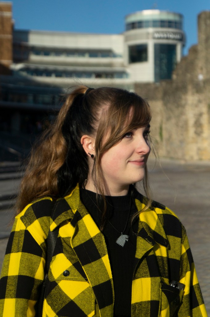
– Selected an image from my personal archives to show the aesthetic code of intimacy, much like Mona Kuhn, an aesthetic choice I made at the time to enhance the warmth of the fire and coziness of being wrapped up on a winters night.
Brief:
‘Read around the photographers above and try to track down some of the quotations. Write up your research in your learning log‘ (Bloomfield, 2018)
This research point explores how the different depths of field can influence how an image is perceived. For example, a photographer may choose to shoot a portrait in a busy town with a shallow depth of field to direct the viewers eyes to the focal point and provide tension between the subject and blurry background, or instead use a deep depth of field to prevent the eyes from focusing on one specific point in the image and allowing the viewer to take control of their journey through the image.
These different aesthetic codes could be used to explore the idea of memory, politics, imagination for the viewer, intimacy and history, whether the artist is aware of that at the time or not.
Photographer research:
Wim Wenders
Wim Wenders, born August 14, 1945, was one of the first to venture into New German Cinema and is one of the most well-known figures for contemporary German film. Wenders specialities consist of scriptwriting, directing, producing, photography and being an author, which has led to a substantial collection of work in the form of ‘documentaries, photo exhibitions, monographs, films and books’ (Royal Academy, 2018).
A broad collection of Wenders’ photographic works have been exhibited in multiple galleries across the world such as the Ronald and Rita McAulay Gallery, London (2019); the Museum of Contemporary Art, Sydney (2003); Museum of Contemporary Photography, Thessaloniki, Greece (2006); and in his birth city, Museum Kunstpalast, Düsseldorf, Germany 2015.
A recurring concept throughout the photography Wenders shoots, is a sense of journey, memory and life, either through the subjects captured in the frame or the composition of imagery.
For example, a summary of the time capsules. by the side of the road (Wenders, 2015) exhibition Germany suggests, the imagery ‘alludes to the relationship between memory and photography’ (Blain Southern, 2015), therefore showing how photography is a powerful medium that can capture a moment in time and keep it preserved for the future.
America and Germany are locations that are important to Wenders due to how much time he has spent between the two for both work and living. Being able to document the changes, events and effects of human nature seem to be something that drives Wenders in his work as he claims ‘in those landscapes, German or American, I’m still looking for the traces of civilization, of history, or people’ (Wenders, 2015). A great example of Wenders capturing traces of history and the effects of human activity is shown below (see Fig. 1.)
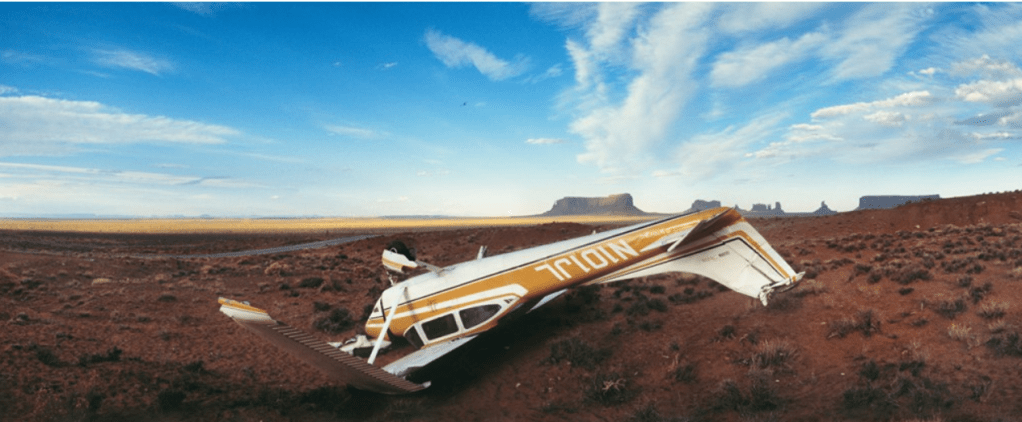
As quoted by Broomberg and Chanarin in 2008, directly from the book The Act of Seeing: Essays and Conversations, Wenders states that ‘The most political decision you make is where you direct people’s eyes.’ (Wenders, 1997).
While he doesn’t use a shallow depth of field to direct the viewer’s eyes to a focal point, the centralisation of the fallen aircraft enhances it’s prominence in the foreground, almost teasing the viewer as to what the most important part of the image is, similar to politics. Another visual element that draws the eyes towards the centre, is the contrast between the deep red of the desert land and the bright whites in the paintwork, highlighting the clean and aerodynamic shapes of the plane in amongst the dirt and dust, helping it stand out from the rest.
Wenders’ choice to shoot this image as a panorama expands the shot and provides the viewer with more context by being able to explore the environment behind the aircraft. The dry clumps of grass, the empty road curved by the panorama, the vast plains and rocky mountains in the background, emphasise how abandoned the area may be. We as the viewer don’t know how this crash occurred, or what happened to the remains after this shot was taken which goes back to the idea that the relationship between memory and photography can be very important when it comes to preserving the past and showing signs of civilisation or lack thereof.
Despite his use of deep depth of field, there is seems to be a clear focal point, which challenges the idea that fully focused and sharp images ‘remove that direction.’ (Bloomfield, 2018).
Mona Kuhn
‘I like to cherish the body as a source of inspiration, as a platform for metaphors, for intimacy and complexities of human nature, hoping to use the visual impact of provoking the viewer’s imagination to encourage thoughts beyond what is revealed. – MK’ (Kuhn, 2013).
Mona Kuhn was born in São Paulo, Brazil, 1969 and is of German descent. Currently residing in the US, having moved in 1989 to start her higher education at The Ohio State University and the San Francisco Art Institute.
Kuhn is well known for her large-scale photographs of the human body, capturing people in their most natural state and presenting the nude as a ‘contemporary canon of art’ (Kuhn, 2013).
A consistency throughout her work is the reflection and encapsulation of the need for human connection and being united, which is beautifully achieved due to Kuhn’s close relationships with the subjects. This allows them to be intimate and comfortable in their skin, which is incredibly inspiring due to the negativity that has surrounded nudity.
Using a shallow depth of field and translucency as a visual choice, challenges the viewer’s ability to connect to the environment, those within it and what is happening (Kuhn, 2013). However, due to how soft and comfortable the compositions are, the tension doesn’t feel uncomfortable in any way, portraying Kuhn’s strong ability to respect and form an attachment with the subject and present that throughout her work.
A wide collection of Kuhn’s work is displayed both publicly and privately across the world such as the Flowers Gallery, New York; Jackson Fine Art, Atlanta, Georgia; Camerawork, Berlin, Germany; Elkis Gallery, São Paulo, Brazil and many more.
Kuhn not only forms a connection between the people in her series but also with the environment, the colours, different elements of nature and in turn creating metaphors from the imagery. This can be seen in her Native series, shot in Brazil.
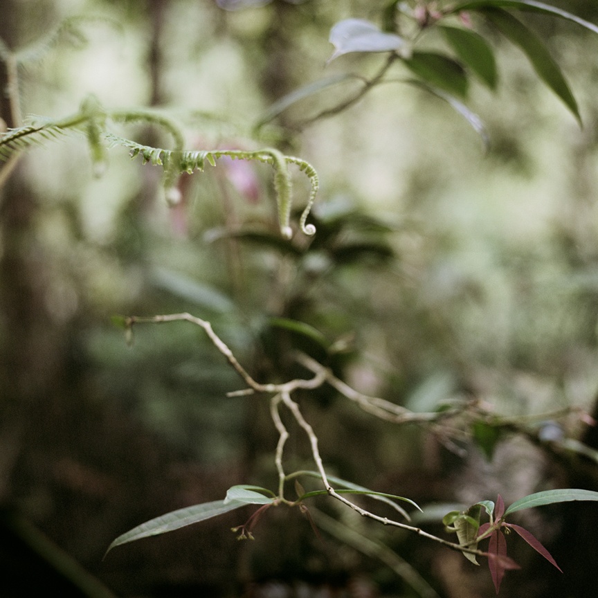
Fig. 2. Spring (2009) 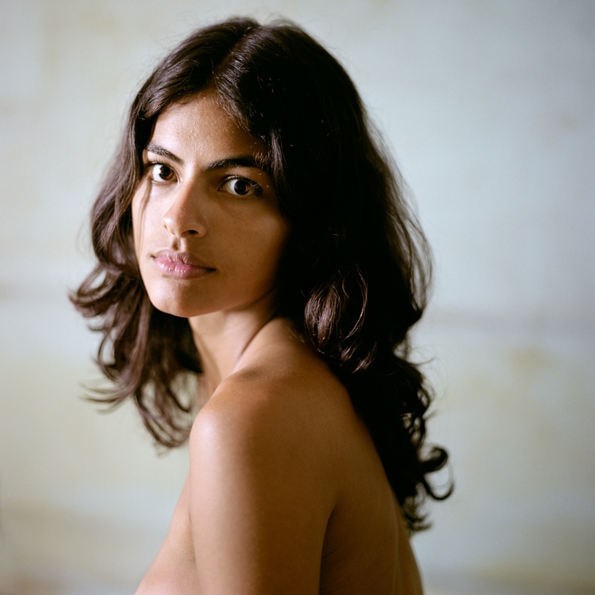
Fig. 3. Marina (2009)
By using a shallow depth of field, the focal point is brought forward in the frame and the case of Spring (see Fig. 2.). It shows the delicacy of the curling leaves and thin twigs, gently lit by the natural light in what looks like a tropical forest, however, slightly unsure due to the blurred background. This forms a tension between the subject, background and viewer and forces a little bit of imagination to be able to connect with the image. The pale greens are subtle and fresh, signifying the lushness of nature and potentially a metaphor for the start of new beginnings. The inconsistencies in the leaves and direction of the growth exhibit how different and unique nature can be. Much like the model in Marina (see Fig.3.) who we may assume, however, cannot confirm, is an indigenous person whose facial features and complexion differ from those of a different ethnicity or race, which is a beautiful thing. Her bare torso stands out and warms what is a crisp and cold background, the blur created by a wide aperture compliment the fragility and softness of the skin.
While intimacy isn’t shown through the appearance of breasts and genitals, instead it is presented by the lack of makeup and clean skin, therefore showing vulnerability and openness. The model’s gentle gaze and deep brown eyes almost draw the viewer in to connect with her soul, more so than her appearance, which is a whole different level of human understanding.
As previously mentioned, not all images show a connection between a group of people, but the similarities between the natural growth of plants and humans. They share imperfections, there are different shapes, sizes and textures throughout. The compatibility of greens, whites, golds and browns, mix and pair up so naturally. Both images are simple, draw the eyes directly to a focal point to help you form a relationship with the subject.
The series as a whole is comforting and celebrates the beauty of people of colour, their home and the importance of connecting with those from all walks of life regardless of our differences.
Guy Bourdin
French fashion photographer Guy Louis Banarès, widely known as Guy Bourdin was born in Paris, in 1928 and was one of the most ‘radical and influential fashion photographers of the twentieth century’ (Michael Hoppen Gallery, 2015).
Bourdin pushed the boundaries of standard advertisements by creating sexual and shocking imagery, to draw the viewer in, steering away from the common product shot and instead exploring surrealism to create discomfort and intrigue.
He understood that fashion seduces people, as does the fantasy of it, which I believe refers to the ability to turn into someone or something completely new through the clothes worn (Michael Hoppen Gallery, 2015). Therefore his provocative compositions marry together with the feeling fashion creates.
Due to the lack of digital advances we have today, Bourdin had to plan in great depth to make sure his work fit the format of the printed page, as well as pushing the models and himself to the limits to capture the desired effect (Michael Hoppen Gallery, 2015).
He was one of the first to tell stories through imagery, putting more emphasis on the importance of the image than the product being advertised. The thoroughly planned compositions, interesting cropped elements, both in black & white and bold colour sometimes made it difficult for the viewer to understand and distinguish what the narrative was trying to say, which made Bourdin’s work even more ludicrous (Louise Alexander Gallery, 2014).
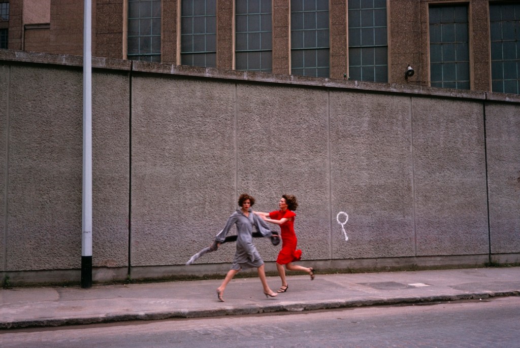
“Thanks to depth of field, at times augmented by action taking place simultaneously on several plane, the viewer is at least given the opportunity in the end to edit the scene himself, to select the aspects of it to which he will attend” (Bazin (1948) quoted in Thompson & Bordwell, 2007).
At first glance, it seems as if the image has a particular direction set in place due to the bright red dress, therefore providing a potential focal point. However, the white graffiti to the right of the models creates some sort of distraction and breaks the direction, causing the eye to start exploring the various leading lines in the composition such as the pathway, the white pole to the left, the edges of the brickwork and the framing of the windows. Due to the way the camera has been positioned, there are subtle angle differences that can be seen between the path and the top of the wall causing an uncomfortable illusion for the eye and forms questions. Are the models going uphill, downhill or neither?
The unsettling feeling Bourdin wanted to create, stands out through the motion blur of the two models, in comparison to the sharp surroundings. The viewer is unaware as to why they are moving, whether they’re running, being pushed or what they look like as their faces cannot be seen clearly which can be anxiety-inducing or confusing for some. Red is the colour of danger and lust, so this scene could potentially represent two lovers either parting ways or reuniting, making a nod to the use of sexual imagery, or representative of the danger that can occur when you’re not looking.
Bourdin’s use of deep depth of field allows the viewer to explore the whole image as they wish, in detail and gather their own story from it. For example, I got distracted by the graffiti and started looking around the image from there, however, this may be different for the next viewer. The image isn’t too busy, which can be an issue with some images shot with a narrow aperture, however, enough is going on to keep the eyes from being drawn to one area.
Research point continued :
‘Now look back at your personal archive of photography and try to find a photograph to
illustrate one of the aesthetic codes discussed in Project 2. Whether or not you had a similar
idea when you took the photograph isn’t important; find a photo with a depth of field that ‘fits’
the code you’ve selected. Add a playful word or title that ‘anchors’ the new meaning‘ (Bloomfield, 2018).
When it comes to personal work, I use a shallow depth of field very often, therefore, have begun to understand how the aesthetic code of intimacy can be applied, whether that is presented through the people in the shot, the pose, clothing, surroundings or by the deeper message.
The image of choice from my archives, now named Fireside (see Fig. 5.) was shot a few years ago during Christmas which for most, but not all, is a comforting time of year to reconnect with loved ones, as well as looking after oneself. The shallow depth of field directs the viewer to the thick winter socks on the feet of the subject, complemented by the soft outline of a fire in the background. While you don’t see the subjects face, the dimmed lighting, haziness of the background and cropped framing provides that sense of sleepiness, intimacy and warmth, which a lot of people can associate with.

1/8 sec; f/1.8; ISO 200
References :
Bazin, A. (1948) ‘Observations on film art : Do filmmakers deserve the last word?’. [online] Available at : http://www.davidbordwell.net/blog/2007/10/10/do-filmmakers-deserve-the-last-word/ (Accessed February 5 2020).
Blain Southern. (2015) ‘Exhibitions, Blain|Southern’. [online] Available at : https://www.blainsouthern.com/exhibitions/time-capsules-by-the-side-of-the-road (Accessed February 3 2020).
Bloomfield, R., 2018. Photography 1: Expressing your Vision. 4th ed. [pdf] Barnsley: OCA, pp. 47, 55. Available at: https://www.oca-student.com/course/photography-1-expressing-your-vision [Accessed 7 February 2020].
Kuhn, M. (2013) ‘Bio/CV | MONA KUHN‘. [online] Available at : https://www.monakuhn.com/pages/bio (Accessed February 5 2020).
Louise Alexander Gallery. (2014) ‘Guy Bourdin – Louise Alexander Gallery’. [online] Available at : https://www.louise-alexander.com/artist/guy-bourdin/ (Accessed March 16 2020).
Michael Hoppen Gallery. (2015) ‘Guy Bourdin | Michael Hoppen Gallery‘. [online] Available at : https://www.michaelhoppengallery.com/artists/30-guy-bourdin/overview/ (Accessed February 5 2020).
Royal Academy. (2018) ‘Wim Wenders | Artist | Royal Academy of Arts’. [online] Available at : https://www.royalacademy.org.uk/art-artists/name/wim-wenders-hon-ra (Accessed February 3 2020).
Wenders, W. (2015) ‘Wim Wenders | time capsules. by the side of the road. Wim Wenders’ recent photographs‘. [online] Available at : https://www.wim-wenders.com/photo/time-capsules-by-the-side-of-the-road-wim-wenders-recent-photographs/ (Accessed February 3 2020).
Wenders, W. (1997) ‘Text – Unconcerned But Not Indifferent – Broomberg and Chanarin’. [online] Available : http://www.broombergchanarin.com/text-unconcerned-but-not-indifferent (Accessed February 3 2020).
List of Images :
Figure 1. Wenders, W. (2015) time capsules. by the side of the road [image] Available at : https://www.wim-wenders.com/photo/time-capsules-by-the-side-of-the-road-wim-wenders-recent-photographs/ (Accessed February 3 2020).
Figure 2. Kuhn, M. (2009) Spring [image] Available at : https://www.monakuhn.com/portfolio/works/detail/1809/ (Accessed February 5 2020).
Figure 3. Kuhn, M. (2009) Marina [image] Available at : https://www.monakuhn.com/portfolio/works/detail/1785 (Accessed February 5 2020).
Figure 4. Bourdin, G. (1975) Vogue Paris, August 1975 [image] Available at : https://www.louise-alexander.com/artist/guy-bourdin/ (Accessed February 5 2020).
Figure 5. Powell, L. (2017) Fireside [image] In possession of : Lauren Powell : Eastleigh.