Summary:
In this post I
– Discussed my shoot plan, the research and practitioners I have decided to gather inspiration from
– How I intend to shoot my images and the concept behind the project as a whole
– Mentioned the lighting settings I was going to use for the photoshoot and why
– Before inserting a contact sheet of the images I ended up with, along with a brief list of annotations for the images not making the final cut
– Chose my final images, presented them as individual shots, as well as a group in typology form
– With analysis for each photograph without explaining my intentions for the images
– Reflected on the shoot as a whole, exploring my intentions for the final set in further detail to explain what went right or wrong.
Shoot plan
Reflecting on the minimalist work of Ziqian Liu and past instant photography research, I chose to create a project surrounding body image via the lens of an Instax camera.
Liu’s work is so intimate and soft visually that ‘we as the audience begin to appreciate and connect with the limbs or skin’ (Powell, 2021). Body image and accepting the skin that we are in is not as simple as just loving yourself or applying self-care to your daily routine as a fix-all. The body is complex, full of intricate organs, veins and skin cells that make us what we are. Much like the camera and its lens, the light used to fill the camera once the shutter opens is complicated and detailed, so to label it ‘simple’ would be a lie.
I intend to capture close-ups of the human body, the skin and specific features to show the imperfections, the journey it has been on and how difficult it can be to document that within a set of images. Unlike Liu, I will not be using flowers or such delicate props to compliment the subjects I am taking images of; instead, I will use a bed and sheets to reference the intimacy and privacy she explores within her work.
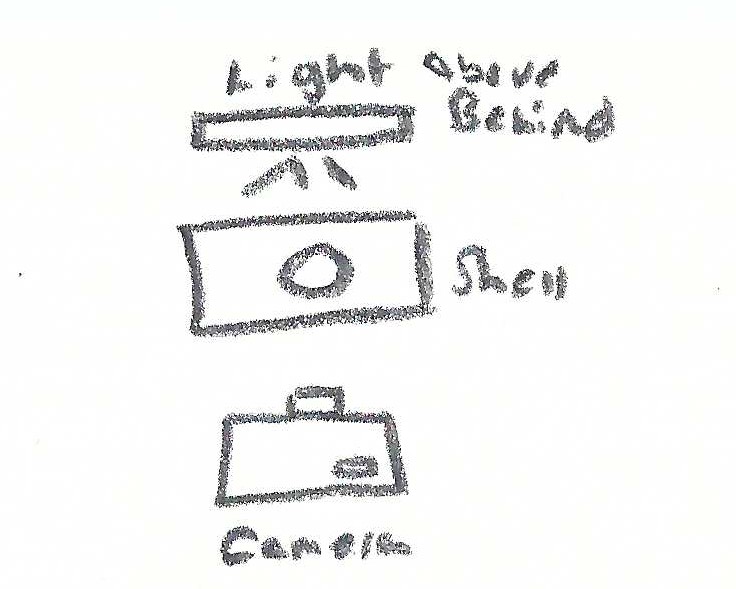
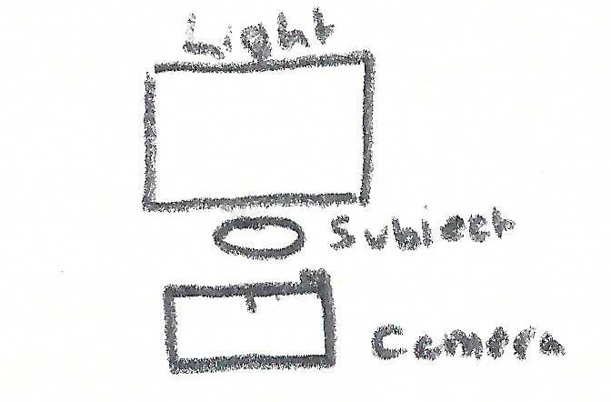
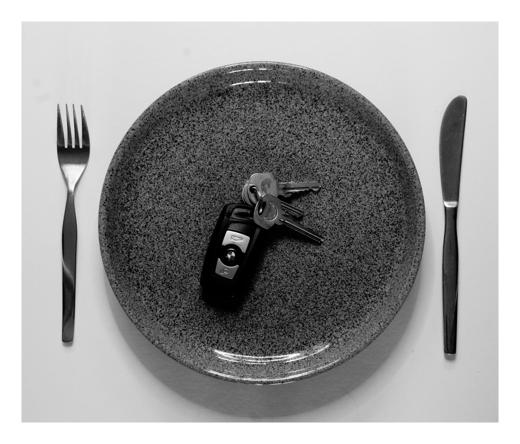
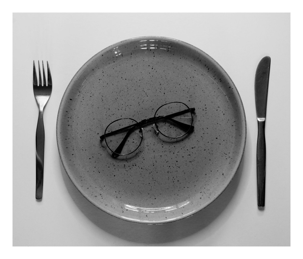
As explored in my test shoot, the Instax Mini 8’s light settings will be set to Hi-Key as it is the ‘brightest of all lighting choices, resulting in a lighter and softer image’ (Adorama, 2021). A brighter light setting will allow me to shoot on any given day, no matter what the weather is like outside. Shooting without knowing what the composition looks like will be a challenge, which I wanted to do for this assignment to push the boundaries of ‘simple’.
After I have gathered a collection of final images, I will use my SONY A57 to convert them into a set of digital images to mix my media, combining the limited reality of instant cameras and the flexibility of digital photography.
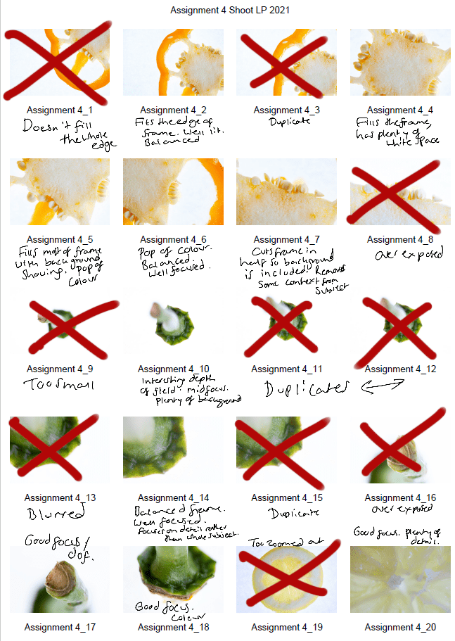
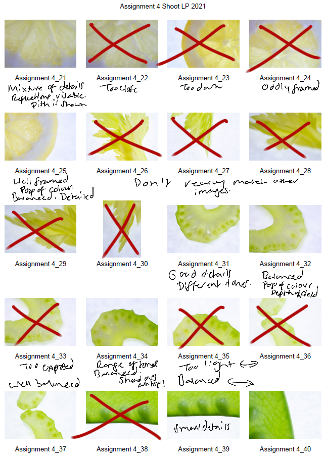
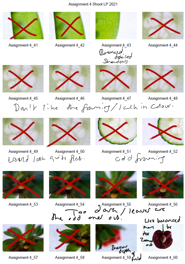
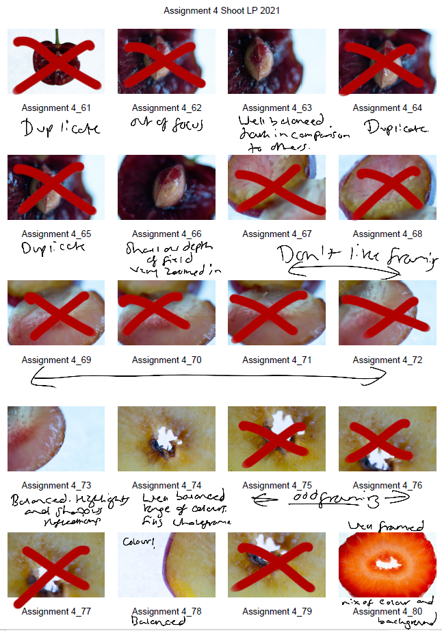
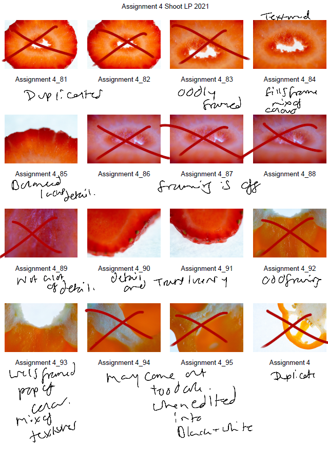
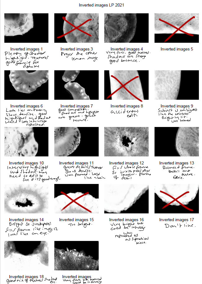
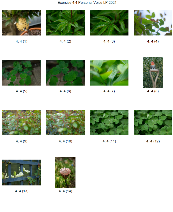
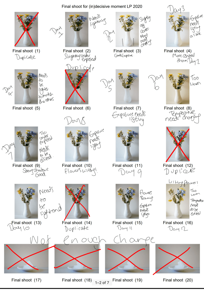
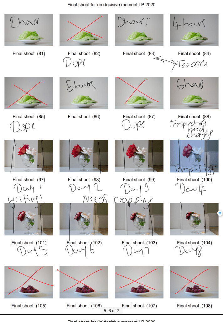
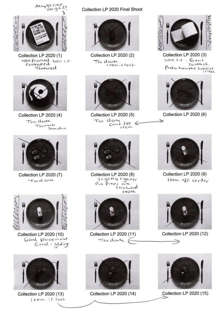
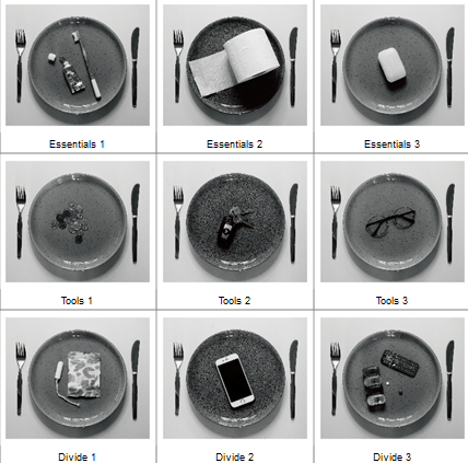
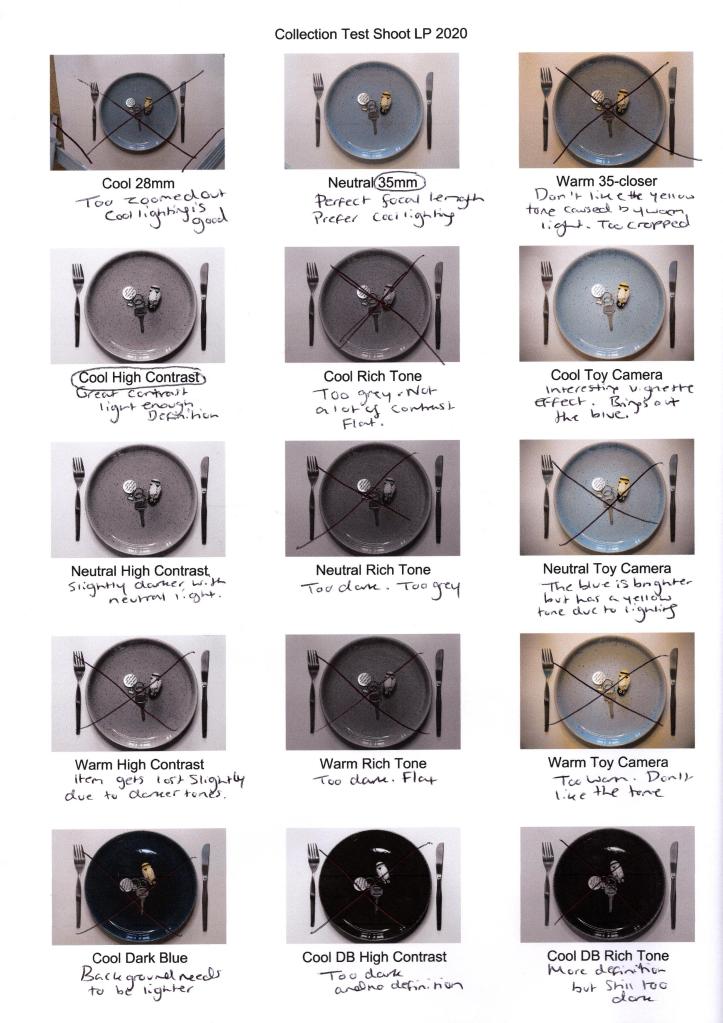
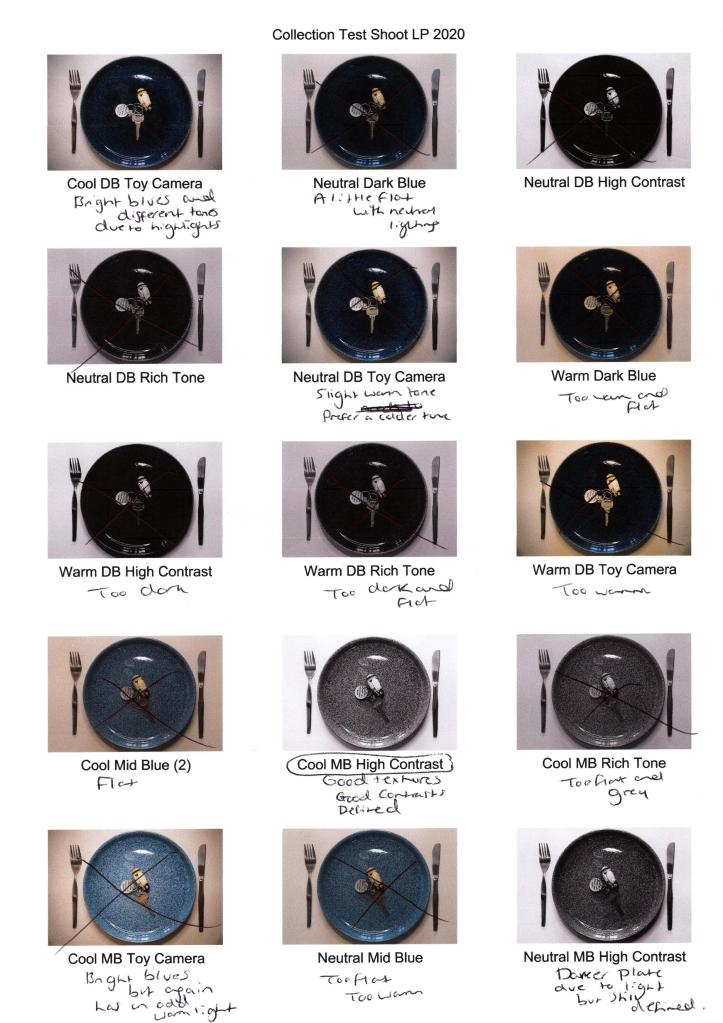
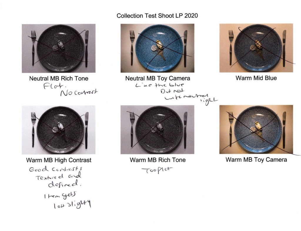
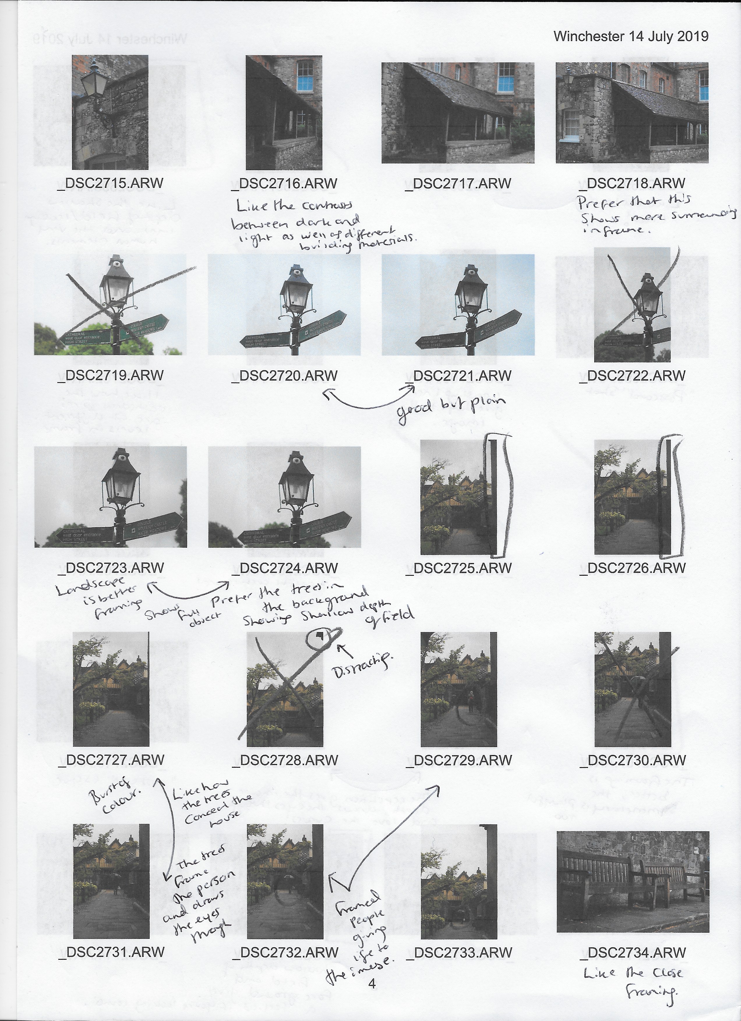
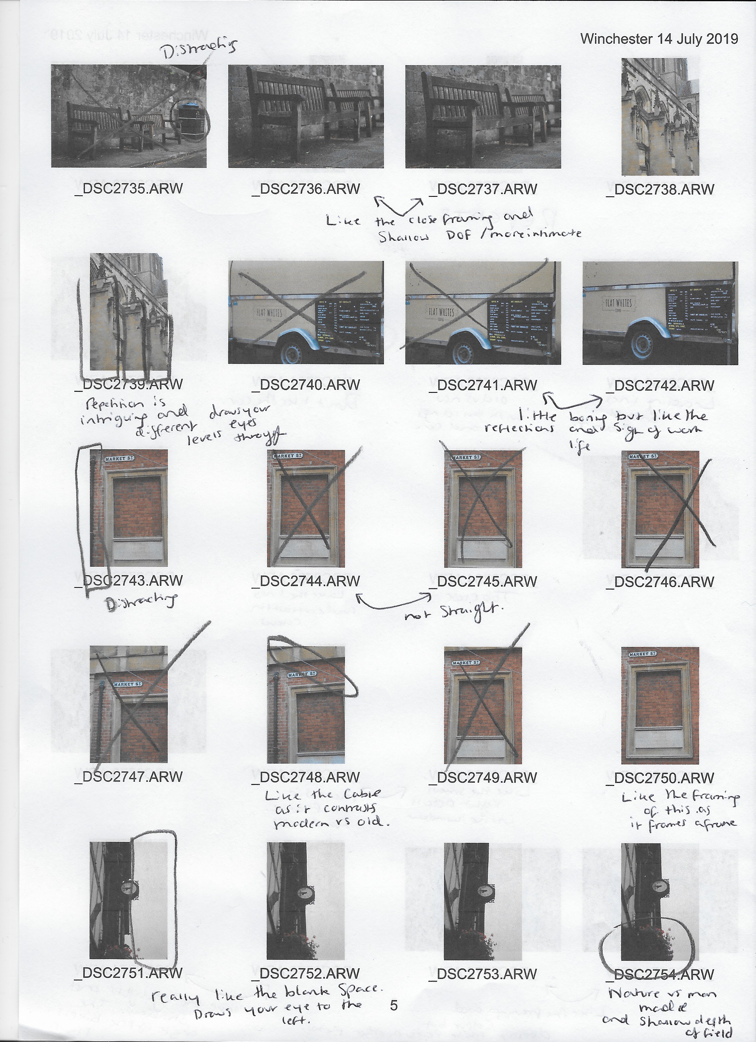
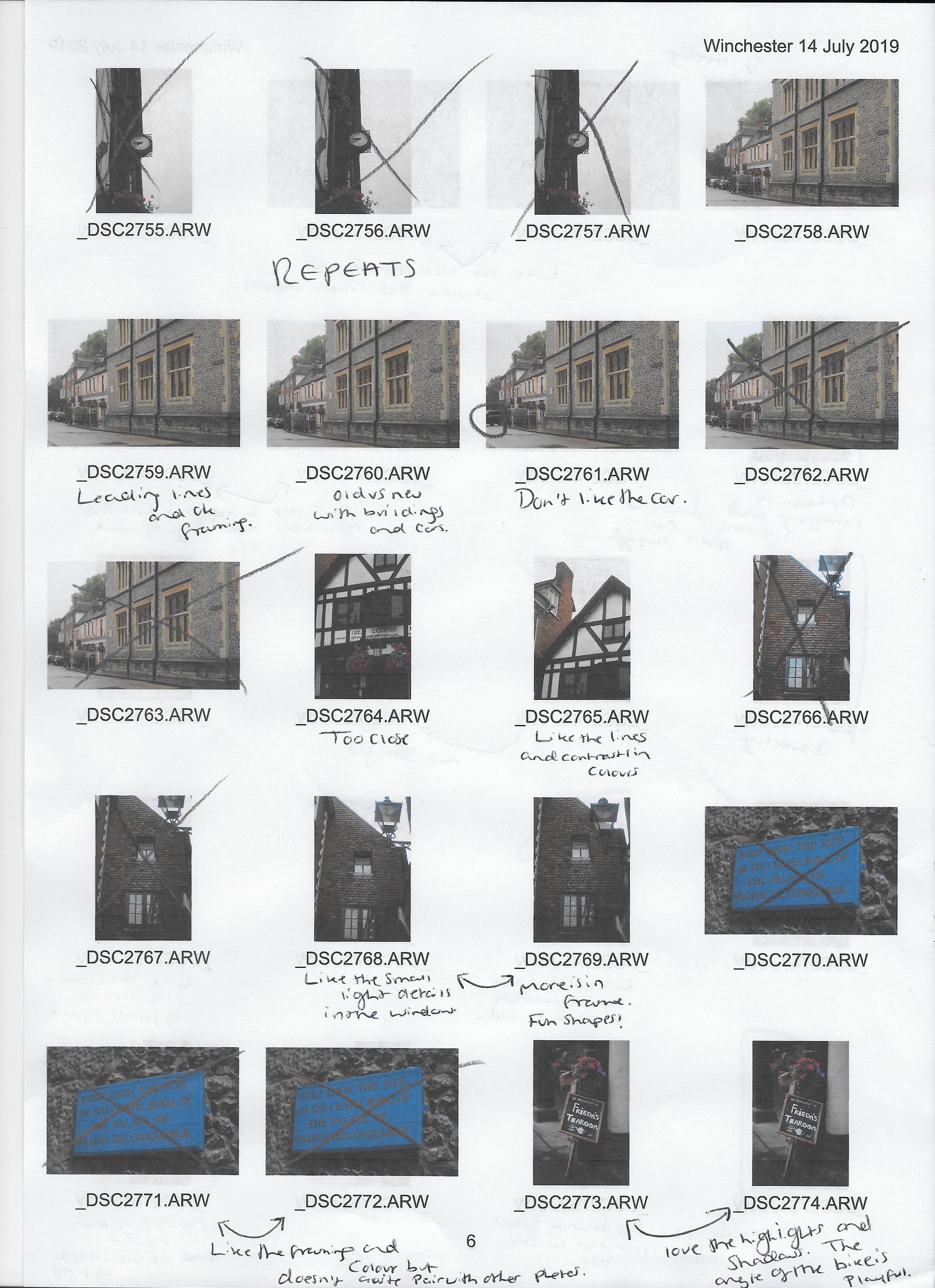
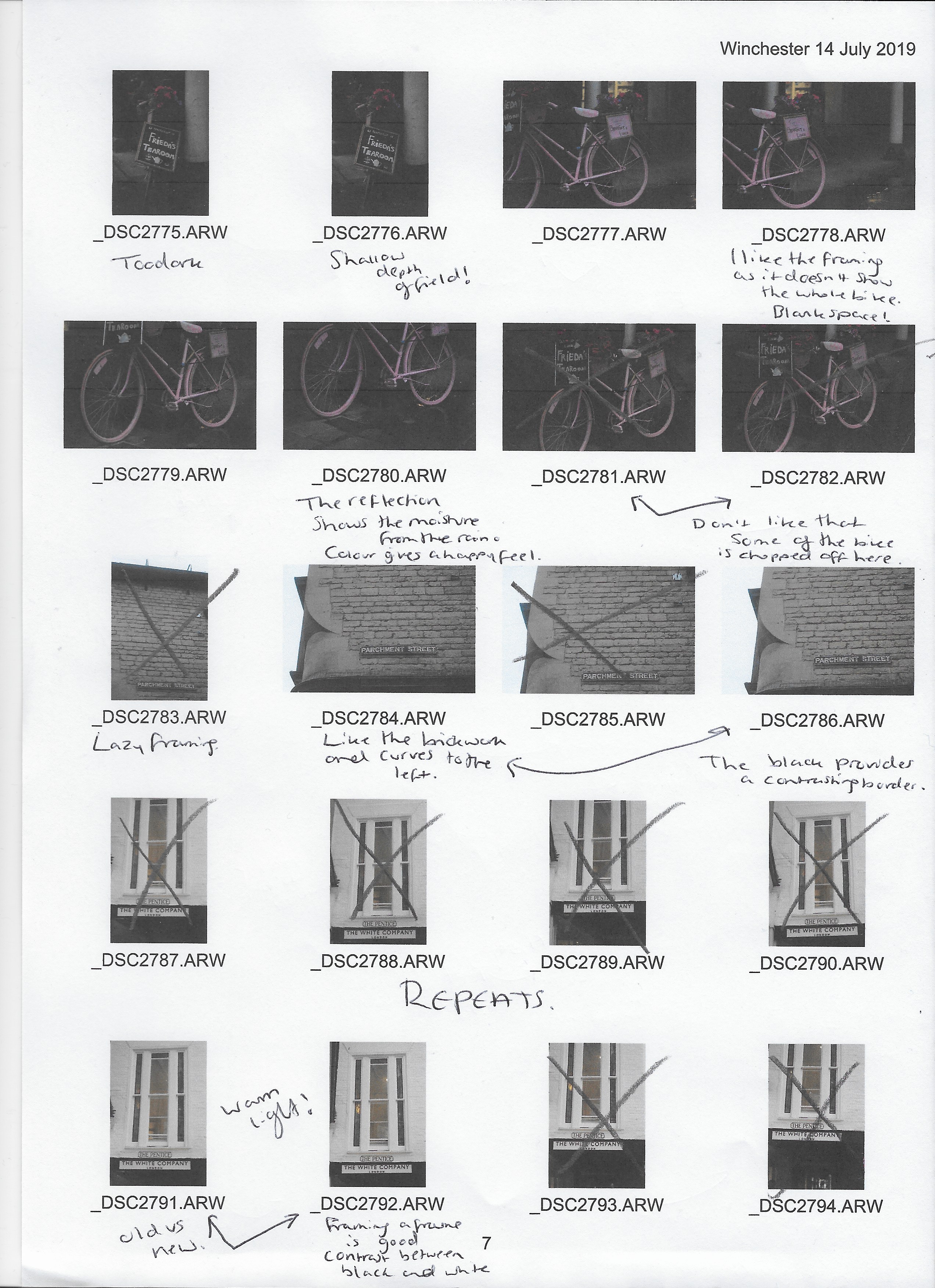
‘Contact sheet’
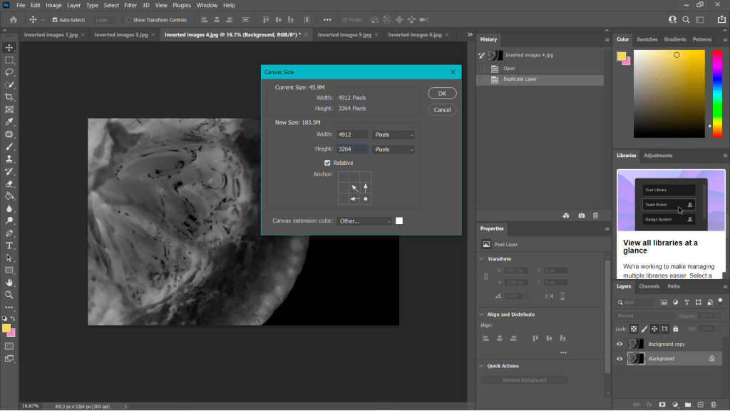
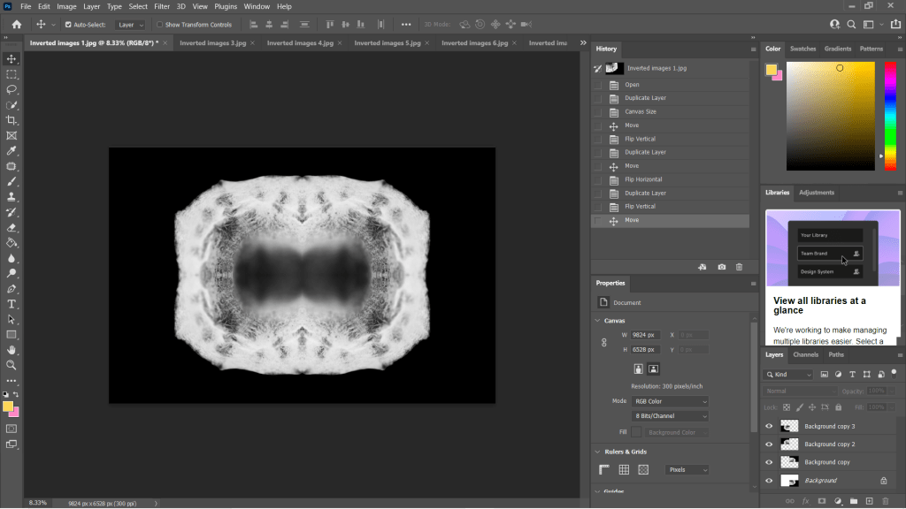
This is not my typical contact sheet as the images were physical, meaning I could not import them into Adobe bridge and annotate them as I usually would. Instead, I placed all the prints I took on a white card and took a digital picture using my Sony A57 to show all of the results from my shoot before labelling them using photoshop.
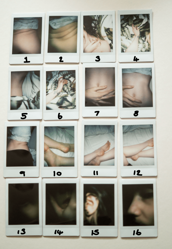
Contact sheet annotations
(See Fig. 1) for reference.
Images 1 and 2 are too tightly cropped, blurred and not what I was expecting, therefore, they will not feature in my final selection.
Image 6 is ok, but the positioning of the arm is slightly odd and was not what I intended to shoot. There is also a tiny interference at the bottom of the frame.
Image 8 is not cropped in the way I wanted, as the crop top is in the frame. It is not awful, but I would rather it was not there.
Images 11 and 12 are ok, but the black leggings in image 12 were not intentional and are distracting. I like image 11 but prefer image 10 in terms of tone much more.
Image 16 did not turn out as expected as I did not want the eye to be within the frame.
Final selection
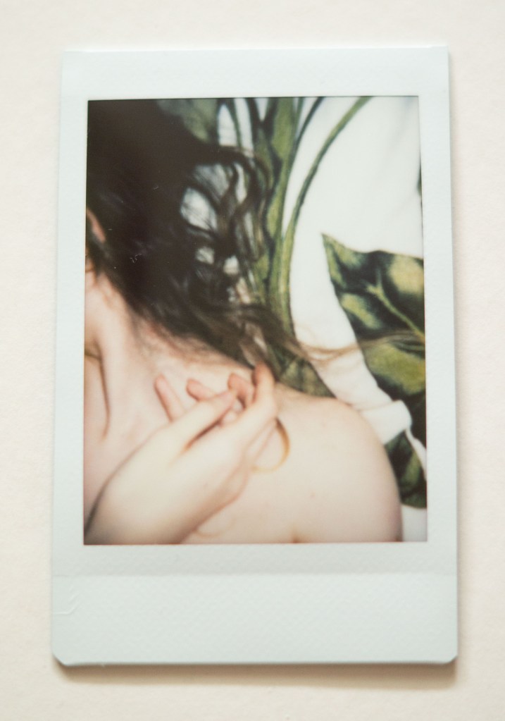
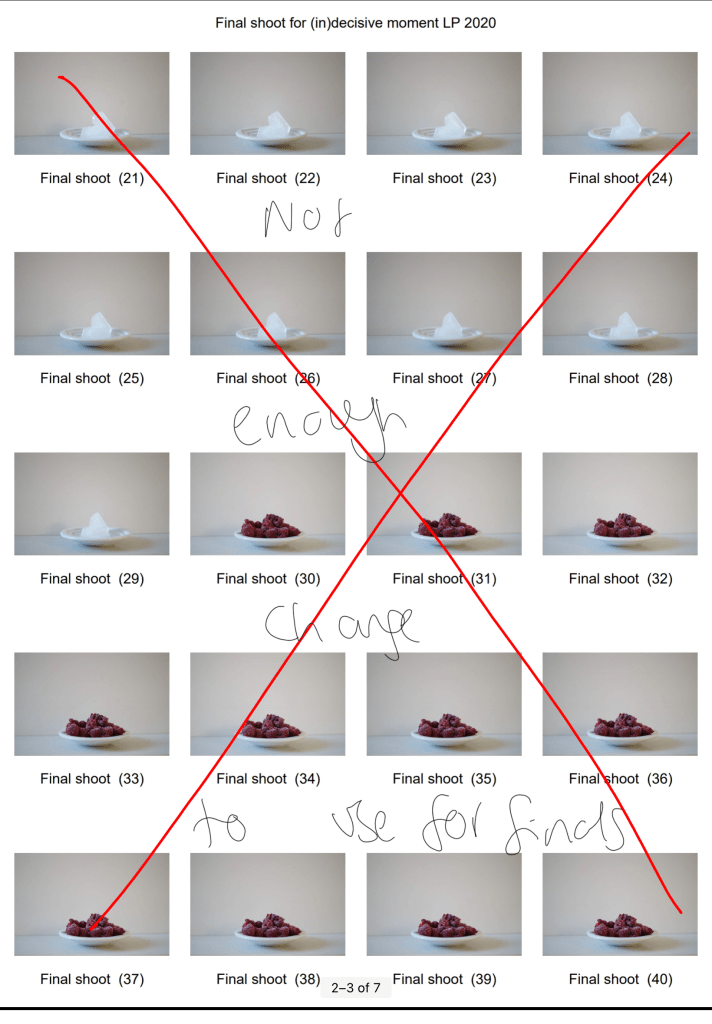
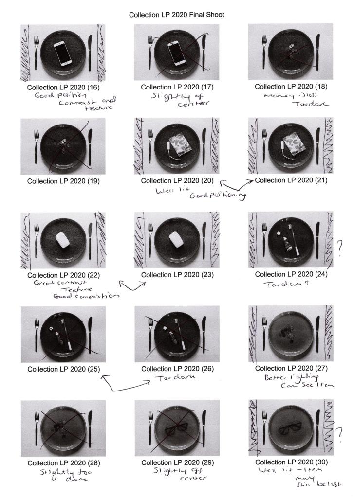
Fig. 2. Photography is simple 1 (2021) 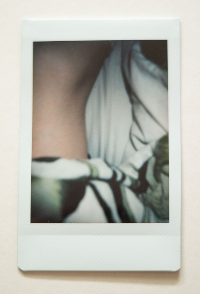
Fig. 3. Photography is simple 2 (2021) 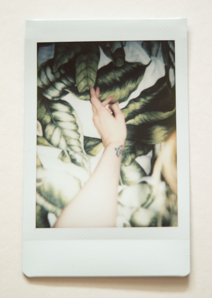
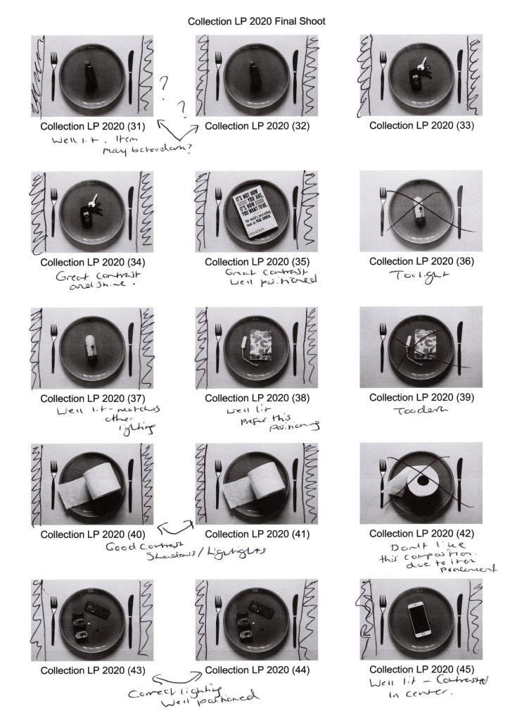
Fig. 4. Photography is simple 3 (2021) 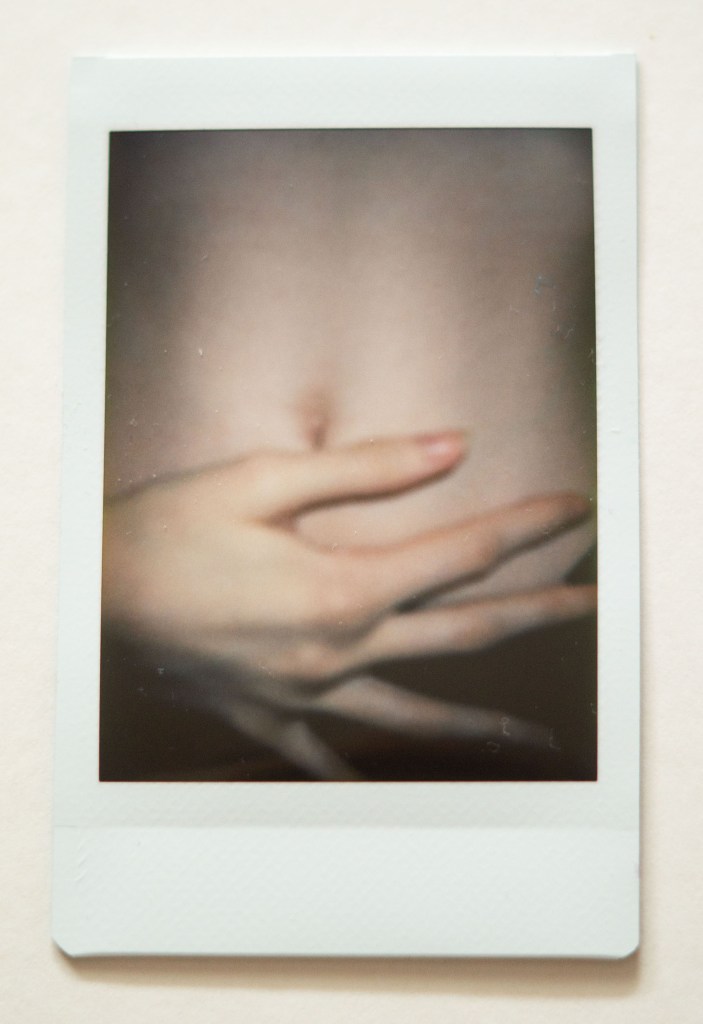
Fig. 5. Photography is simple 4 (2021) 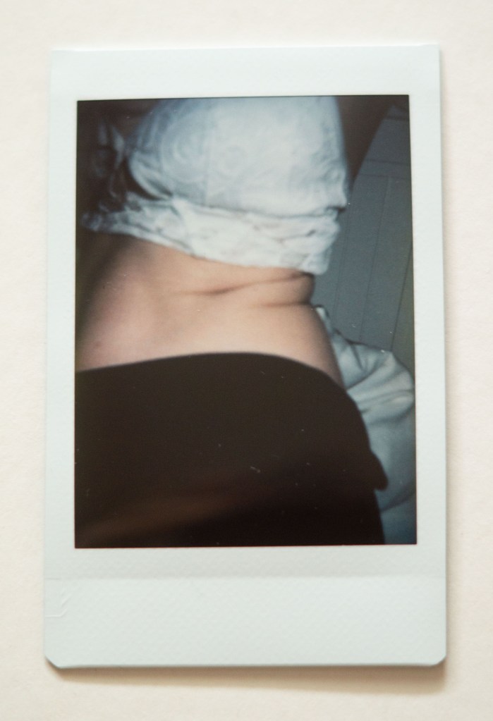
Fig. 6. Photography is simple 5 (2021) 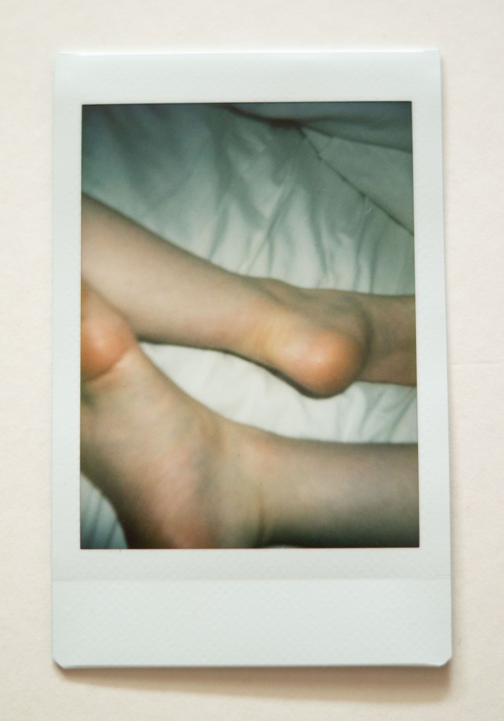
Fig. 7. Photography is simple 6 (2021) 
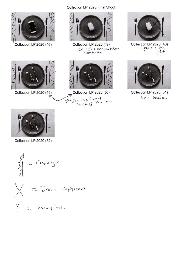
Fig. 8. Photography is simple 7 (2021) 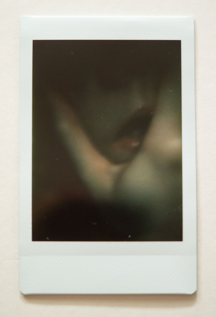
Fig. 9. Photography is simple 8 (2021) 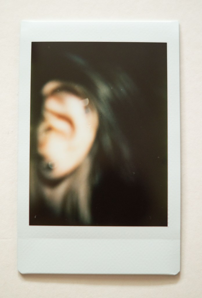
Fig. 10. Photography is simple 9 (2021) 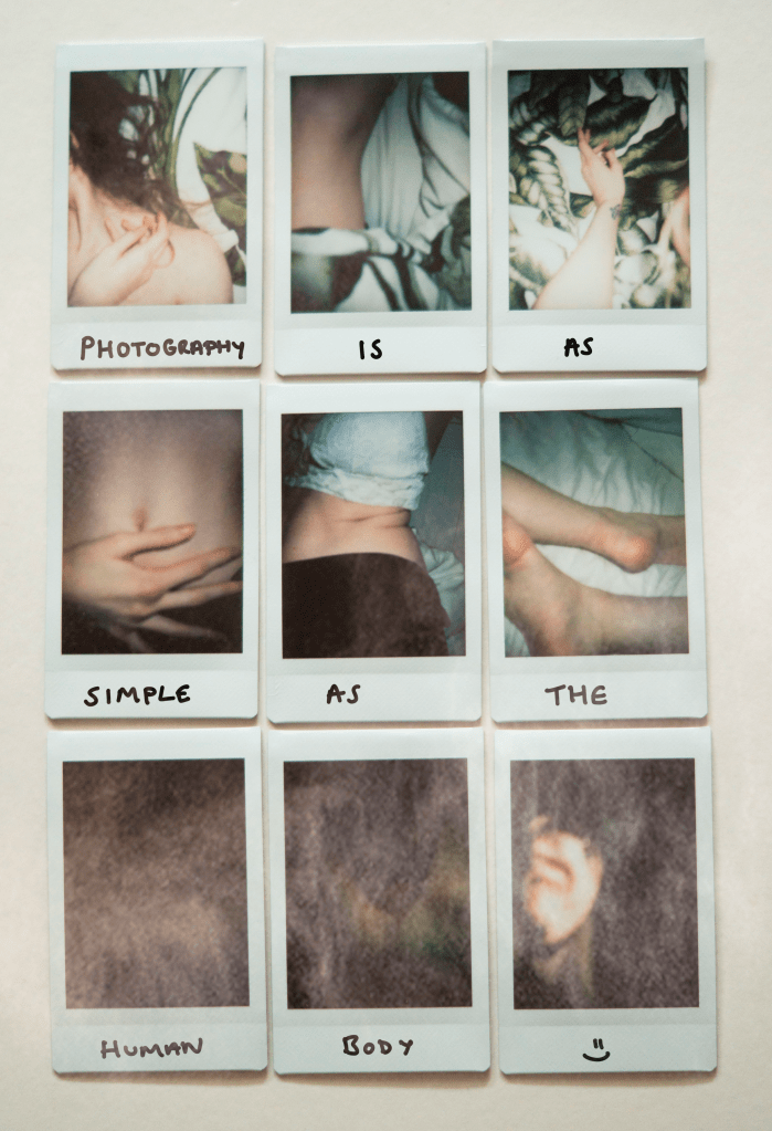
Fig. 11. Photography is as simple as the human body (2021)
Analysis
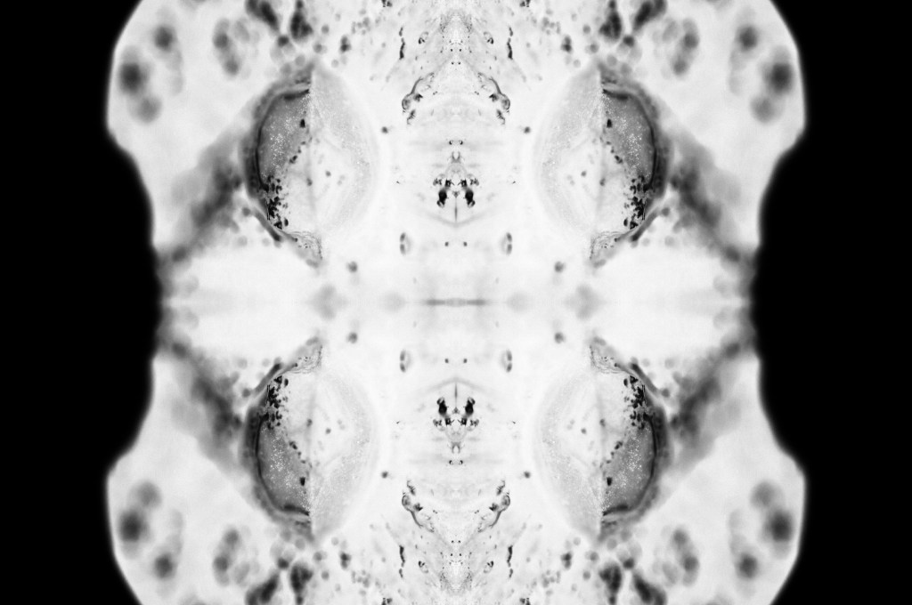
Photography is simple 1 (see Fig. 2) is minimalist in terms of tones and colour, the pop of green brings nature into the composition without controlling the emotion of the image or distracting from the main subject. The hair spread across the sheets underneath provides shape and texture to the shot as the curls twist in multiple directions away from the persons face. Are they turning their head away mid-shot, are they posed? We are unaware of any emotion shown outside the frame as the face is not visible, taking that element of context away from the audience. The focal blur adds privacy to the photograph, making it soft and less detailed than it may look if taken with a digital camera. The shot was lit by the cameras inbuilt flash brightening the skin and keeping the contrast reasonably balanced preventing any harsh highlights or shadows. Contextually were unaware of the exact location due to the framing of the shot, are there two people in the frame or just one? Removing the vital elements that could provide more knowledge for the audience makes the photograph more interesting and secretive.
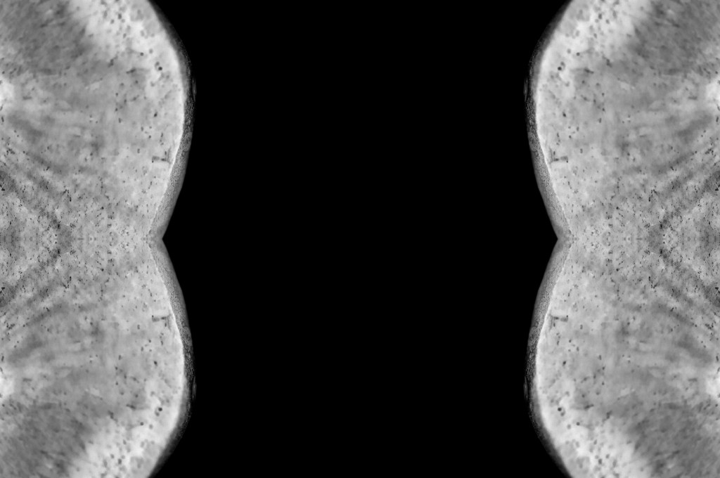
Photography is simple 2 (see Fig. 3) is slightly more muted than the previous shot, as shadows have diffused the intensity of colour, lowering the exposure. The body part within the photograph framed by the material used to cover the subject emphasises the curved form and the intriguing gap in the middle of the composition. Are two people back to back? Is this a leg or an arm? Cropping the subject pushes the brain to explore the piece in further detail to figure out what is going on. The image is much softer in terms of contrast, as the lighting is not as bright and has not reflected the whiter elements in the shot. Conceptually this image explores the desire to cover ourselves up and hide away from the eyes of others rather than embrace what we have.
Photography is simple 3 (see Fig. 4) is brighter and slightly overexposed due to the flash reflecting off the skin closest to the lens. The arm cutting through the middle of the frame provides a leading line for the viewer, starting from the bright flash at the bottom towards the evenly lit and relaxed hand in the top third of the image. A monochrome colour palette of white and green brings a fresh and innocent feel to the composition. The angle of the arm adds depth as if the hand is reaching into the leaves below. Placing the subject in the centre of the frame, in full view rather than shooting it up close, juxtaposes the previous images as there is slightly more context as to what the photo is. This image feels delicate and indicative of someone reaching out towards someone or something.
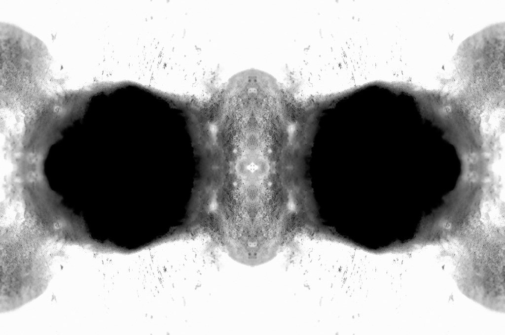
Photography is simple 4 -6 (see Fig. 5-7) are cooler in temperature and more monochrome in terms of colour, with a simple colour palette of black and white. The subjects are well focussed and provide slightly more context to the viewer than the previous three images. They explore the textures within the skin, the soft elements, wrinkled areas and natural rolls of the body. Shadows and highlights are balanced, accentuating the body shape and enhancing the fragility of the skin through diffused light casts. It looks as if the images were shot in a dark room or on an overcast day due to the blue-ish grey tones surrounding the subject, however, the viewer cannot be sure without further information. These images feel the most personal and real as they explore the natural parts of the human body, the parts that we can feel ashamed of and learn to resent.
At first glance, Photography is simple 7 (see Fig. 8) looks like a failed underexposed image, however, once you take a closer look you can see the whites of an eye and the reflection of the light bouncing off of the cheekbone. The shadows are dark and contrasted causing the highlights to be more diffused and subtle to the eye, making the subject in the frame softer and hidden. Negative space surrounding the eye draws the viewer to look closer at the small area of light provided to them and explore what is going on. Context is removed completely for this shot as we are unaware of the location, who this person is and whether the shot was intentional. Instead of the eye being covered it is the only thing shown and is the opposite of privacy, perhaps implying the idea of feeling exposed and seen by others?
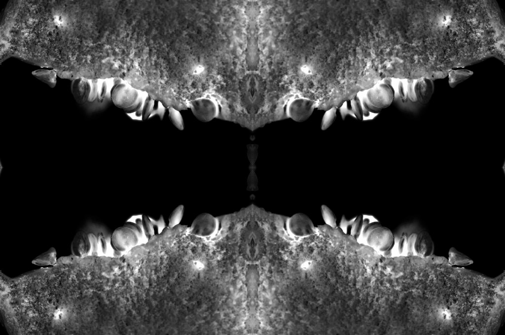
Photography is simple 8-9 (see Fig. 9-10) have heavy contrasted shadows with small yet strong sources of light to create a focal point for the images. The light casting on the hand in 8 frames the mouth within the shot, drawing attention to the shiny texture on the lip. Contextually the viewer is unaware of why the hand is there, whether it is the model’s hand or someone else’s, however, the close cropping and framing isolates this facial feature and highlights the delicate nature of the skin. There is little colour within these images besides the red of the lips, as a result, this makes the photographs feel mysterious and eerie compared to the brightly lit, freshly coloured shots. Out of focus shots add intimacy and prevent the eyes from understanding what is happening at first glance, pushing the audience to get up close and personal to appreciate the subject. Are these images hinting towards the way we see ourselves, the way we or others speak about us, or perhaps what we hear in the media about what is considered beautiful or not? Maybe they are reflecting the way we only show the parts of ourselves that we want others to see.
Photography is as simple as the human body (see Fig. 11) shows the range of images documented throughout the entire project. It portrays how diverse photography is, from the lighting used, to the framing, subjects chosen and colours featured throughout, that can shape an image as a whole. People may view photography as being ‘simple’ especially as we can take a decent image without much thought with our smartphones, however, composition, concepts, shapes, shadows and textures are just a slither of what makes photography complex and an adventure.
As the assignment requires 10 images, rather than presenting a strong set of nine final images as a typology, this shot finalises the set by capturing a single image that documents an entire collection in one. The writing on the picture combines digital photography and drawing to tell the story of these images as a whole. Applying a ‘smoke’ overlay over the top of the image to include post-production and photo manipulation, represents the evolution of photographic development. It also removes the element of simplicity that was a clear display of images. It can be so easy to edit digital work compared to the more traditional film photography that can take hours or days. Some images are better left untouched to allow us to enjoy what is.
Reflection
This shoot was more successful than I thought it would be. The privilege of seeing the images we are taking before we press the shutter button as well as being able to reshoot and delete any images that did not work makes you thankful for the evolution of photography and the cameras we have today.
Shooting these photographs knowing that I had a limited amount of film and the ability to see what the final result may look like once it developed, making this both exciting and challenging at the same time. As discussed in my initial thoughts for this assignment, I wanted to use ‘trickier techniques to oppose the word simple’ (Powell, 2021), so using an Instax Mini 8 camera allowed me to achieve this.
There were a few images that I did not intend to take or did not expect them to turn out the way they did, but ended up being my favourite shots. Photography is simple 7 (see Fig. 8) was one of these images, as I expected the eye to be brightly lit and the flash to bounce off of my skin, however, it did the complete opposite and captured a ‘peeping’ eye. Some may consider that image to be bad and unusable, but bearing in mind I wanted to explore minimalism, intimacy and how we view the human body, it felt like the perfect intentional shot to represent this idea. Photography is simple 2 (see Fig. 3) is another image I did not intend on capturing in the way I did. The sheets framed my body in such a way that it looked as if someone was led next to me despite the fact no one was. As someone who has struggled with body image, sharing the ‘exposed’ parts of myself is a terrifying concept. Capturing an image that could potentially reflect the ability to share yourself with others, was incredibly powerful to me as a photographer viewing my images from a cold point of view.
I feel as if I have managed to successfully show how accepting our bodies and documenting them with limited resources is not as simple as we may think it is. Nothing is simple.
References:
Adorama. (2021) How to Use the Fujifilm Instax 8 [online] Available at: https://www.adorama.com/alc/how-to-use-the-fujifilm-instax-8-everything-you-need-to-know/ [Accessed 21 June 2021].
Powell, L. (2021) RESEARCH FOR ‘PHOTOGRAPHY IS SIMPLE’ + MINDMAP [online] Available at: https://laurenpowelloca.photo.blog/2021/06/14/research-for-photography-is-simple-mindmap/ [Accessed on 21 June 2021].
Powell, L. (2021) INITIAL THOUGHTS ON ‘PHOTOGRAPHY IS SIMPLE’ [online] Available at: https://laurenpowelloca.photo.blog/2021/06/14/initial-thoughts-on-photography-is-simple/ [Accessed on 21 June].
List of images:
Figure. 1. Powell, L. (2021) Contact sheet [image] In possession of: Lauren Powell: Eastleigh.
Figure. 2. Powell, L. (2021) Photography is simple 1 [image] In possession of: Lauren Powell: Eastleigh.
Figure. 3. Powell, L. (2021) Photography is simple 2 [image] In possession of: Lauren Powell: Eastleigh.
Figure. 4. Powell, L. (2021) Photography is simple 3 [image] In possession of: Lauren Powell: Eastleigh.
Figure. 5. Powell, L. (2021) Photography is simple 4 [image] In possession of: Lauren Powell: Eastleigh.
Figure. 6. Powell, L. (2021) Photography is simple 5 [image] In possession of: Lauren Powell: Eastleigh.
Figure. 7. Powell, L. (2021) Photography is simple 6 [image] In possession of: Lauren Powell: Eastleigh.
Figure. 8. Powell, L. (2021) Photography is simple 7 [image] In possession of: Lauren Powell: Eastleigh.
Figure. 9. Powell, L. (2021) Photography is simple 8 [image] In possession of: Lauren Powell: Eastleigh.
Figure. 10. Powell, L. (2021) Photography is simple 9 [image] In possession of: Lauren Powell: Eastleigh.
Figure. 11. Powell, L. (2021) Photography is as simple as the human body [image] In possession of: Lauren Powell: Eastleigh.