
Summary:
In this post I
– Included the brief for assignment 5 ‘Photography is simple’
– Before discussing my initial thoughts on the title and the ideas it brought to mind
– Listed a variety of concepts and techniques that could be explored throughout this assignment
– Reflected on the post as a whole and my preferred ideas that I will take forward for research
Brief:
‘So photography is simply viewpoint and moment… but what about the subject? The simplest subject is the moment. You can record the moment with a snapshot, but when you review the photograph later you find you didn’t actually record the moment, you just recorded the ‘event of photography’. It might take a very long time to simplify the whole world and its infinite framings into a subject that makes sense to you. Robert Adams said, ‘Sooner or later one has to ask of all pictures what kind of life they promote’ (Grundberg, 1999, p.34). For now, though, you should just feel comfortable with your subject. It should say something about you and, in the end, you like it! The final assignment is an open brief. Take a series of 10 photographs of any subject exploring the theme ‘Photography is Simple’. Each photograph should be a unique view; in other words, it should contain some new information, rather than repeat the information of the previous image.‘ (Bloomfield, 2018).
Initial thoughts
This assignment title reminds me a lot of the statement “photography is easy, you just aim the camera and shoot”, a common phrase I’m sure plenty of photographers have heard over the years. The knowledge we have allows us to understand that this comment is far from the truth. The complexity of the camera and its settings are the first of many photographic elements that take time to appreciate and learn.
In terms of the brief, its flexibility and potential for various topics to be chosen make it a touch more exciting as much as it is challenging.
List of possible assignment ideas:
Going back to basics – use a kit lens, use an automatic mode and view photography from a beginners standpoint.
Simple subjects – Landscapes, floral photography, sunsets, the ocean, ‘postcard’ shots of ‘unoriginal’ things.
Opposites – Photographing complex subjects, or using trickier techniques to oppose the word ‘simple’.
Out of my depth – Using a technique or visual style I’ve not used before to challenge myself, avoiding simplicity and comfort.
Minimalism – Monochrome images, singular items, black and white photography, sticking to one or two techniques etcetera.
Reflection:
Throughout this course, I have learnt the importance of challenging yourself, whether that is through the choice of technique, concept or style. It pushes you to go that extra mile and learn from it, rather than sticking within your comfort zone.
Bearing this in mind, I think the Opposites and Minimalism concepts are the most attractive assignment paths at this point in time. Pushing the boundaries of the word ‘simple’ by doing the opposite breaks the meaning of the word, as nothing is simple when you think about it. Simple is merely a word people use to describe something that doesn’t light them up inside.
Photography isn’t simple, there are so many layers to it. Everything has more to it than meets the eye, making it extraordinary.
References:
Bloomfield, R., 2018. Photography 1: Expressing your Vision. 4th ed. [pdf] Barnsley: OCA, p. 111. Available at: https://www.oca-student.com/course/photography-1-expressing-your-vision [Accessed 13 June 2021].
Exercise 5.3 – Looking at photography
Notes, Online Research, Part 5, Practitioner Research, Reflection on coursework, Thoughts & IdeasSummary:
In this post I
– Included the exercise brief to re-visit Henri Cartier-Bresson’s photograph Behind the Gare Saint-Lazare (1982)
– Before inserting the image and explaining the point within the image I felt was the most signification and why.
– Referenced one of my own images to give context to the use of a focal point and the rule of thirds.
– Included a short reflection on the importance of understanding the pivotal points within a piece of art.
Brief:
‘If photography is an event then looking at photography should also be an event.
Look again at Henri Cartier-Bresson’s photograph Behind the Gare Saint-Lazare in Part Three.
(If you can get to the Victoria & Albert Museum in London you can see an original print
on permanent display in the Photography Gallery.) Is there a single element in the image
that you could say is the pivotal ‘point’ to which the eye returns again and again? What
information does this ‘point’ contain? Remember that a point is not a shape. It may be a
place, or even a ‘discontinuity’ – a gap. The most important thing though is not to try to
guess the ‘right answer’ but to make a creative response, to articulate your ‘personal voice’.
Include a short response to Behind the Gare Saint-Lazare in your learning log. You can be as
imaginative as you like. In order to contextualise your discussion, you might want to include
one or two of your own shots, and you may wish to refer to Rinko Kawauchi’s photograph
mentioned above or the Theatres series by Hiroshi Sugimoto discussed in Part Three. Write
about 300 words.‘ (Bloomfield, 2018).
Behind the Gare Saint-Lazare re-visit:
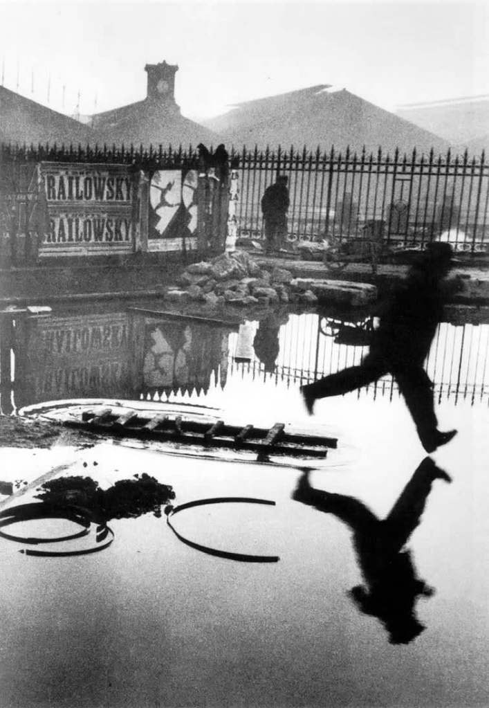
Behind the Gare Saint-Lazare is extraordinary as Cartier-Bresson shot it through a small gap in the wall, unaware of the activity going on behind it. The pivotal point for this shot is the movement. Despite the composition being full of details, textures and shapes becoming a playground for the viewer to explore, the eyes are always drawn back to the blur within the shot. It stands out from the rest, a frozen backdrop in black and white while the mysterious shape to the right flies through the frame.
You are made aware of the direction of movement and the travel speed without being there in the moment. It’s an image that tells its own story, a moment of urgency on a wet day as they jumped over or through the puddles below. You want to know where they are going, why they are running and if something exciting or disastrous happened outside the frame.
The tonal balance within this picture is mixed, with the majority of them being light greys and white. Meanwhile, the silhouette and items nearby are heavily contrasted, making it difficult to ignore.
There is life within the frame, a definitive moment that took place and was unique in photographic execution. Not many images can document a piece of history intriguing enough for the audience to stay and observe it for a length of time over and over. While there may not be a clear leading line, there is an obvious focal point pushing the eyes to look and appreciate it whether they want to or not. It’s so powerful.
An example of drawing the eyes towards a particular point without a leading line features in one of my product images (see Fig. 1) through the use of the rule of thirds.
Reflection
Re-visiting an image can help you appreciate the piece of work, especially if you have more knowledge to hand. Understanding what ‘makes’ an image and shapes it, encouraging the viewer to look deeper and sit with the art for longer solidifies the importance of composition, balance and intent.
References:
Bloomfield, R., 2018. Photography 1: Expressing your Vision. 4th ed. [pdf] Barnsley: OCA, p. 109. Available at: https://www.oca-student.com/course/photography-1-expressing-your-vision [Accessed 13 June 2021].
List of images:
Figure. 1. Cartier-Bresson, H. (1932) Behind the Gare Saint-Lazare [image] Available at: https://en.wikipedia.org/wiki/Behind_the_Gare_Saint-Lazare#/media/File:Henri_Cartier-Bresson_-_Behind_the_Gare_Saint-Lazare,_1932.jpg [Accessed 13 June 2021].
Figure. 2. Powell, L. (2021) Sloth [image] In possession of: Lauren Powell: Eastleigh.
Exercise 5.2 Homage – Research point
Notes, Online Research, Part 5, Practitioner Research, Reflection on courseworkSummary:
In this post I;
– Included the research point brief and my response to it by referencing the text throughout.
– Inserted the exercise brief for ‘Homage’.
– Wrote a short paragraph about Carol Sharp and how she connects with her subjects while photographing
– Before comparing one of her images with my own as a homage
– Alongside a brief analysis of my response and the context
– Inserted a couple of extra images to show how I paid homage to Sharp’s work
– Included a past image from my archive, with a short analysis of the message and context behind it
– Before reflecting on what this exercise taught me
Research
‘For a short introduction to how context operates in relation to photographs, read Terry Barrett’s essay ‘Photographs and Context’: terrybarrettosu.com/wp-content/uploads/2017/08/B_PhotAndCont_97.pdf [accessed 25/01/18]. Barrett suggests that we interpret pictures according to three different types of information: information in the picture, information surrounding the picture and information about the way the picture was made. He calls these the internal context, the external context and the original context‘ (Bloomfield, 2018).
Images can be incredibly flexible in terms of context, based on the environment, the subjects within the frame, the colours or lack thereof. However, the context of a photograph can alter depending on whom it reaches. For example, in Terry Barrett’s Photographs and Contexts (Barrett, 1985) a photograph of a pair sat outside a bar taken by Robert Doisneau was given different contexts; to Gisele Freund’s knowledge, up to five times by various magazines, brochures and galleries. A few examples of this consist of accusations of sex work, alcohol abuse and seduction (Barrett, 1985).
The initial context behind Doisneau’s shot was simply a moment of charm as he enjoyed cafe’s and seeing the couple together was enjoyable.
‘Texts that surround the photograph eliminate any residual ambiguity’ (Barrett, 1985). If we were to put a picture of a beef burger on the front of a vegan magazine, it would probably cause some shock before going on to talk about the environmental effects and immoral behaviour of the industry, however, on the front of a restaurant menu, people would be enticed and seduced by how good it looked.
Images are used for other things, different to their initial intent. Pictures of lungs on a cigarette packet are used to encourage smokers to stop smoking before too much damage occurs but are initially used for scientific and medical research.
The placement of an image is another factor to consider for context. The display of a picture of people in poverty may glorify the situation for the benefit of art and a famous gallery rather than portraying the horrific effect on lives in a place you would expect to see such circumstances.
No matter where you are in the world or what language you speak, photography can be a source of communication for some people (Sander, 1978 referenced in Barrett, 1985:114), whether an artist is documenting their mental state or an audience expressing feeling by sending a photographic meme. Despite the global interaction with these photographs, they may not provide the same message to one person in the way it did to another. Context is still subjective depending on the viewer.
Internal context includes the image, title, date and maker. External context would be the presentational environment, so where it’s displayed. The original context is the ‘causal environment’, in other terms, the physical and psychological elements available to the photographer at the time of capture (Barrett, 1985).
To understand the context as an audience, we need to look deeper and consider everything, including what the photographer may have been doing or thinking at the time. These things combined will help us appreciate the make-up of the image a lot more.
Brief:
‘Select an image by any photographer of your choice and take a photograph in response to it. You can respond in any way you like to the whole image or to just a part of it, but you must make explicit in your notes what it is that you’re responding to. Is it a stylistic device such as John Davies’ high viewpoint, or Chris Steele Perkins’ juxtapositions? Is it an idea, such as the decisive moment? Is it an approach, such as intention – creating a fully authored image rather than discovering the world through the viewfinder? Add the original photograph together with your response to your learning log. Which of the three types of information discussed by Barrett provides the context in this case? Take your time over writing your response because you’ll submit the relevant part of your learning log as part of Assignment Five.‘ (Bloomfield, 2018).
Carol Sharp
“Carol Sharp is an award winning photographer and fine artist, renowned for her lyrical composition, attention to detail and her delicate touch with light.” (Carol Sharp, n.d.)
Sharp is UK based photographer who has over 20+ years of professional photographic experience, has featured in Chelsea Flower Show posters in the past. Her exploration of the world and its plants is a way to encourage society to reconnect with nature and empathise with it.
“I use different types of perception to not only see their form, but to understand the meaning of the form and to reveal its ‘gesture’. which means having a communion with my subjects and a desire to feel their very life force.” (Sharp, n.d.). Unlike the majority who may pass by a flower or tree without much notice, Sharp truly connects with her subjects to understand them and appreciate them. I think this shines through in her work as the framing is cropped and intimate as shallow depth of field emphasises the soft petals and delicacy of the foliage and flowers in the composition. Vibrant colours bring life to the images, subtly getting the viewer to realise that this life source is living, thriving and a powerful part of our world. Flowers, trees, moss and other forms of plants keep this world functioning, helping us live and grow. It’s important to be grateful for what is around us, something Sharp does very well.
Due to how Sharp talks about her work and the passion for her subjects, I would say that the original context is the most prominent context type in these images. Bearing in mind the importance to the maker, it heavily influences how the viewer sees the subject, making it feel more personal and ripe with life. The images are not just another simple set of shots of a bunch of flora and fauna as time and energy have been taken by the creator to capture the beauty.
The selection of images I paid homage to for this exercise came from the Plant Portraits (n.d.) album.
My SONY A57 camera was on manual mode, the aperture was at F/1.8, the shutter speed was 1/250 and ISO was set to 100. The shooting process was simple as I took a walk around my garden during dusk, capturing a few of the flowers available to me. The response to this exercise was to keeping original context at the forefront of my mind by analysing the subjects and connecting with them before pressing the shutter. A creamy shallow depth of field and cropped framing were two of the most important visual and technical elements to include during this shoot.
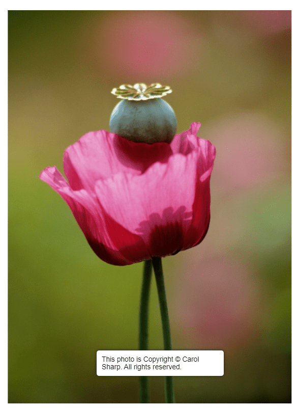
Fig. 1. Plant portraits (n.d.) 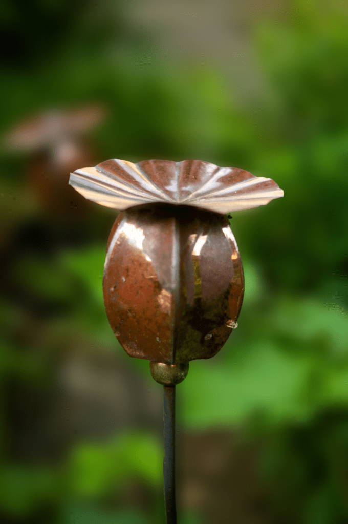
Fig. 2. Homage 3 (2021)
Homage 3 (see Fig. 2) referenced the feature of a poppy seed head in Sharp’s image (see Fig. 1.) by capturing the metal sculpture in my garden, a permanent piece of art, unlike an actual poppy. Using an aperture of F/1.8 enabled me to get the creamy bokeh effect that flows throughout Sharp’s work so beautifully; focal points draw the eyes of the audience to the subject, all of its details, the textures and colours. Cropping the frame brings the object closer to the camera lens, allowing the viewer to observe it more intimately and connect with what is going on within the composition. Contextually, this metal poppy head was a gift to my dad from my mum for his birthday, so holds a deeper meaning for me, much like Sharp attaches to her subjects to appreciate it more. The colours within Plant portraits are vibrant, warm and full of life, while tones within my homage are earthy, so despite it being artificial, the subtle connection to nature and its rich soil is a clever addition to my piece. From a conceptual point of view, the relationship between the two shots juxtaposes despite a few similarities. Sharp embraces the life and death of plants, reconnecting to their importance for our survival as living beings. On the other hand, I have captured a replica of a pollinating plant that will never pollinate, an unintentional parody of how humans keep making things that do not benefit the world environmentally.
Original context brings more personality to photographs as you understand why it was taken, how it made the creator feel, what was going on at the time and the image that was achieved as a result. It pushes the audience to explore it to understand it as a whole composition rather than a simple picture. The work I shot may be unoriginal visually, but the extra level of information lifts it and makes it a rich piece of art.
The internal and external context is just as important but feels less characteristic for some artworks in my opinion as it allows the viewer to come up with their own story as to what the photograph contains and what it may be portraying. Some photographs need that extra bit of information to steer the observer in the right direction.
Here are a few other images I took for this exercise:
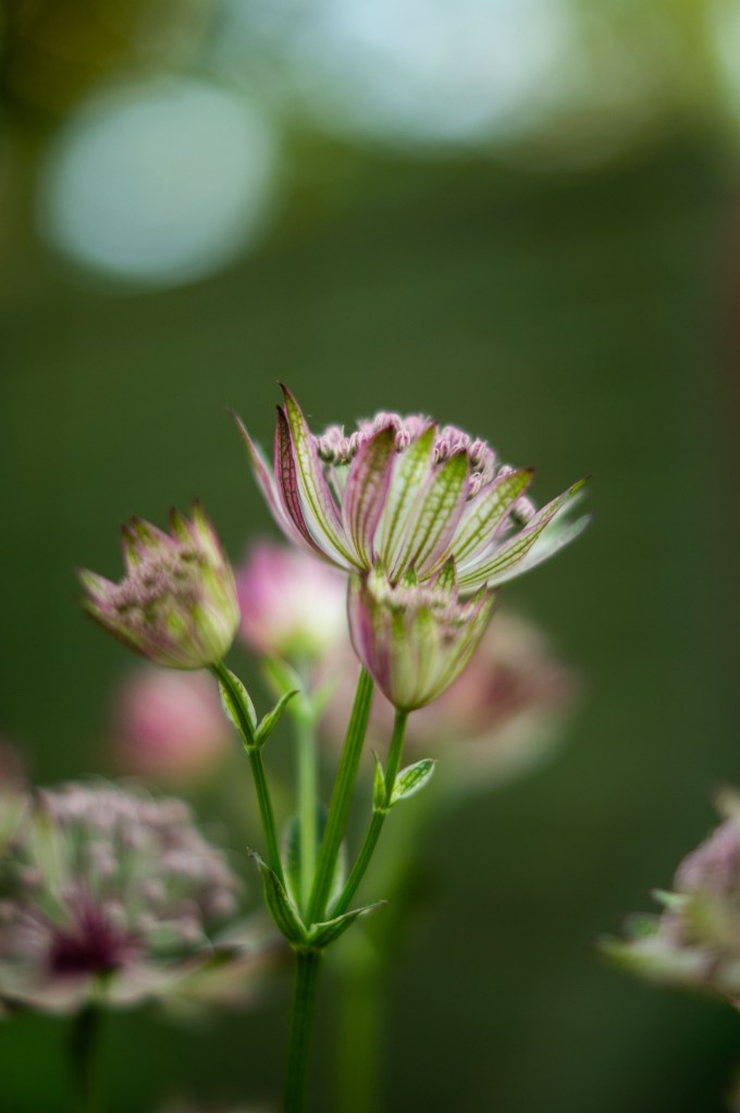
Fig. 3. Homage 1 (2021) 
Fig. 4. Homage 5 (2021)
Homage example from past archive:
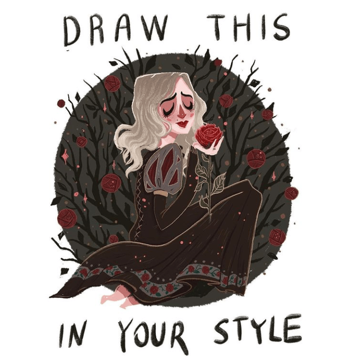
Fig. 5. Draw this in your style (2019) 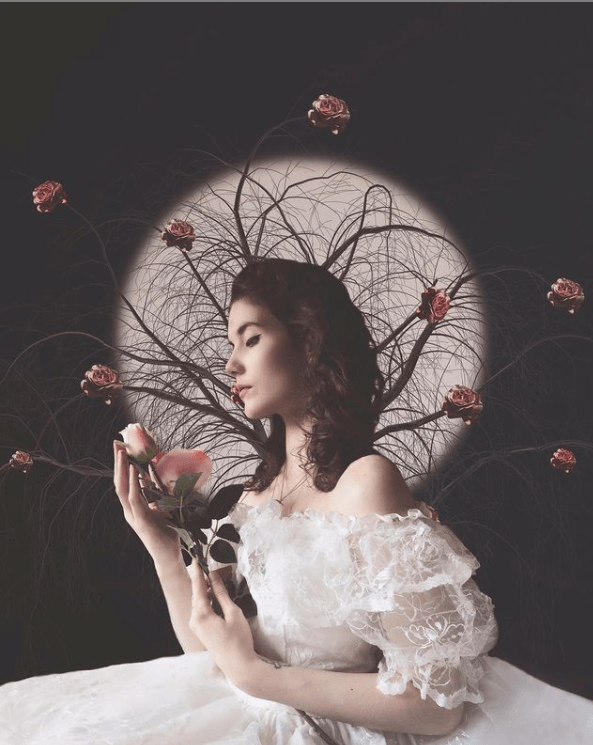
Fig. 6. Rose (2019)
While this isn’t a homage inspired by a photographer, it was an image I created as a tribute to the Draw this in your style (2019) drawing by Ellie Goldwine on Instagram. My response to this piece was approached with intent, having complete control over the props used, outfits and makeup worn, as well as the background, pose and editing. It became a reversed image of the original piece (see Fig. 5), the dress chosen for my composition (see Fig. 6) was the opposite colour creating a juxtaposition between the two. Rather than red roses, light pink roses were used and the circular framing around the drawing in my piece represented the full moon. Everything about the photograph I created was intentional, as the brief was to create something in your style from the reference given.
The context for this piece was internal, as it was inspired by the Draw in your style title and image. Without this information, I may not have been encouraged to replicate it at all.
Reflection
This research point and exercise helped me understand the importance of context, the different types and how the portrayal of images original intent can be influenced. An images original message can be changed through the way it is displayed, the environment in which it’s found, the title and other such information. The original context is a type that features heavily in my work when given the chance, as personality and background mean a lot to me when it comes to creating a piece of work.
References:
Barrett, T., 1985. Photographs and Contexts. [pdf] pp. 110-116. Available at: http://terrybarrettosu.com/wp-content/uploads/2017/08/B_PhotAndCont_97.pdf [Accessed 13 June 2021].
Bloomfield, R., 2018. Photography 1: Expressing your Vision. 4th ed. [pdf] Barnsley: OCA, p. 106. Available at: https://www.oca-student.com/course/photography-1-expressing-your-vision [Accessed 13 June 2021].
Elliegoldwine. (2019) Draw this in your own style [online] Available at: https://www.instagram.com/elliegoldwine/ [Accessed 13 June 2021).
Sanders, A. (1978) ‘Photography as a Universal Language’ In: Photographs and Contexts. [pdf] p. 114. Available at: http://terrybarrettosu.com/wp-content/uploads/2017/08/B_PhotAndCont_97.pdf [Accessed 13 June 2021].
Sharp, C. (n.d.). Biography – Carol Sharp [online] Available at: https://www.carolsharp.co.uk/biography [Accessed 13 June 2021].
Sharp, C. (n.d.). Plant portraits – Carol Sharp [image] Available at: https://www.carolsharp.co.uk/biography [Accessed 13 June 2021].
List of images:
Figure. 1. Sharp, C. (n.d.) Plant portraits [Carol Sharp, screenshot] Available at: https://www.carolsharp.co.uk/plant-portraits [Accessed 13 June 2021).
Figure. 2. Powell, L. (2021) Homage 3 [image] In possession of: Lauren Powell: Eastleigh.
Figure. 3. Powell, L. (2021) Homage 1 [image] In possession of: Lauren Powell: Eastleigh.
Figure. 4. Powell, L. (2021) Homage 5 [image] In possession of: Lauren Powell: Eastleigh.
Figure. 5. Elliegoldwine. (2019) Draw this in your own style [Instagram, screenshot] Available at: https://www.instagram.com/elliegoldwine/ [Accessed 13 June 2021].
Figure. 6. Powell, L. (2019) Rose [image] In possession of: Lauren Powell: Eastleigh.
Exercise 5.1 – The Distance Between Us
Part 5, Reflection on coursework, Thoughts & IdeasSummary:
In this post I
– Included the brief for this exercise
– Listed my initial plans, concepts and why
– Shared my camera settings and technical information
– Before providing the contact sheets for my shoot
– Inserted 6 of my favourite shots from the set and explained why through analysis
– Chose my ‘select’, analysed the image
– Before discussing why I chose it as the strongest image, the unintentional and conceptual elements discovered
Brief:
Use your camera as a measuring device. This doesn’t refer to the distance scale on the focus ring. Rather, find a subject that you have an empathy with and take a sequence of shots to ‘explore the distance between you’. Add the sequence to your learning log, indicating which is your ‘select’ – your best shot. When you review the set to decide upon a ‘select’, don’t evaluate the shots just according to the idea you had when you took the photographs; instead evaluate it by what you discover within the frame (you’ve already done this in Exercise 1.4). In other words, be open to the unexpected. In conversation with the author, the photographer Alexia Clorinda expressed this idea in the following way. Look critically at the work you did by including what you didn’t mean to do. Include the mistake, or your unconscious, or whatever you want to call it, and analyse it not from the point of view of your intention, but because it is there. (Bloomfield, 2018)
Initial plans
I didn’t want to give too much thought about what to take images of to give myself a challenge; instead, I read the brief and decided to pick the first subject that came to mind in terms of empathy. As a result, the deforestation and increase of littering within my local woodland popped up first.
Growing up next to woodland is something to be grateful for as nature is right on your doorstep and isn’t something everyone has the privilege of having. Unfortunately, I’ve watched this beautiful area be the victim of mass deforestation and urbanisation to allow room for more homes. Building on land to cover the rise in population isn’t so much the problem, but the littering, lack of care taken after trees and foliage removable are.
It’s not satisfying to go on a nature walk, to find metal barriers up that are yet to move, piles of logs and leftover branches scattered around the place with signs and ripped tape on the floor. Seeing all the changes happen and watching it decline since childhood makes me feel empathetic toward the animals that live within those woods, the insects, trees and the pedestrians who want to observe this place.
I used my SONY A57, set my aperture to F/2.8, the focus and camera settings to manual before heading out on a walk around the woods. Not knowing what I was going to find made this exercise more challenging as I wasn’t sure whether there would be enough around to gather a substantial amount of images to choose from, although, wasn’t the case as seen below in my contact sheets.
Contact sheets
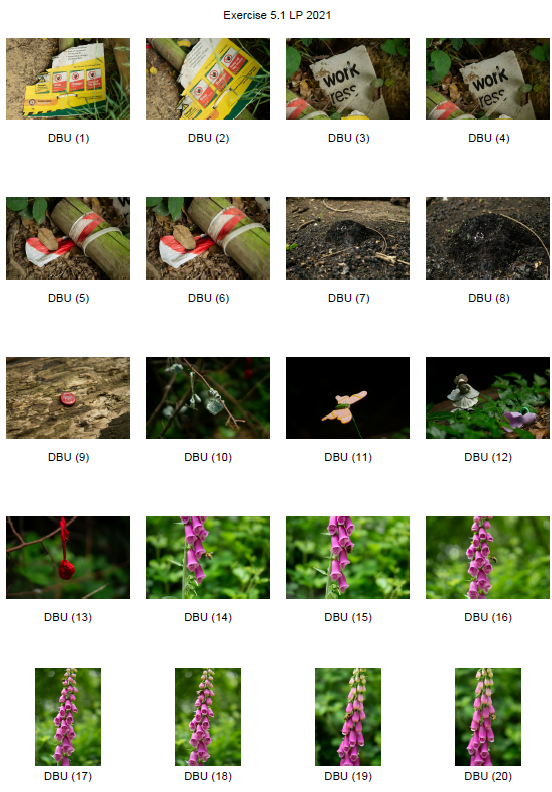
Fig. 1. Contact sheet 1 (2021) 
Fig. 2. Contact sheet 2 (2021) 
Fig. 3. Contact sheet 3 (2021)
A selection of favourite images:
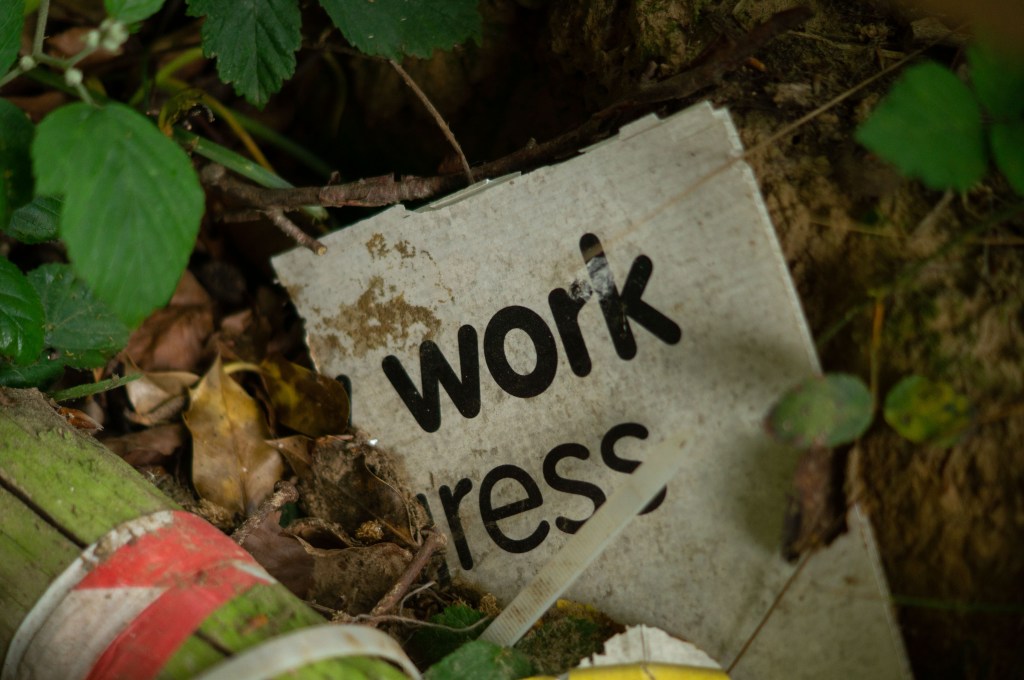
Fig. 4. DBU 4 (2021) 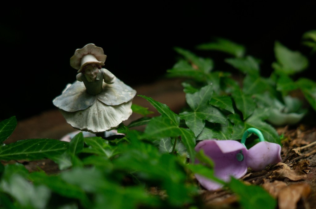
Fig. 5. DBU 12 (2021) 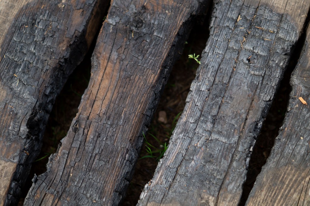
Fig. 6. DBU 34 (2021) 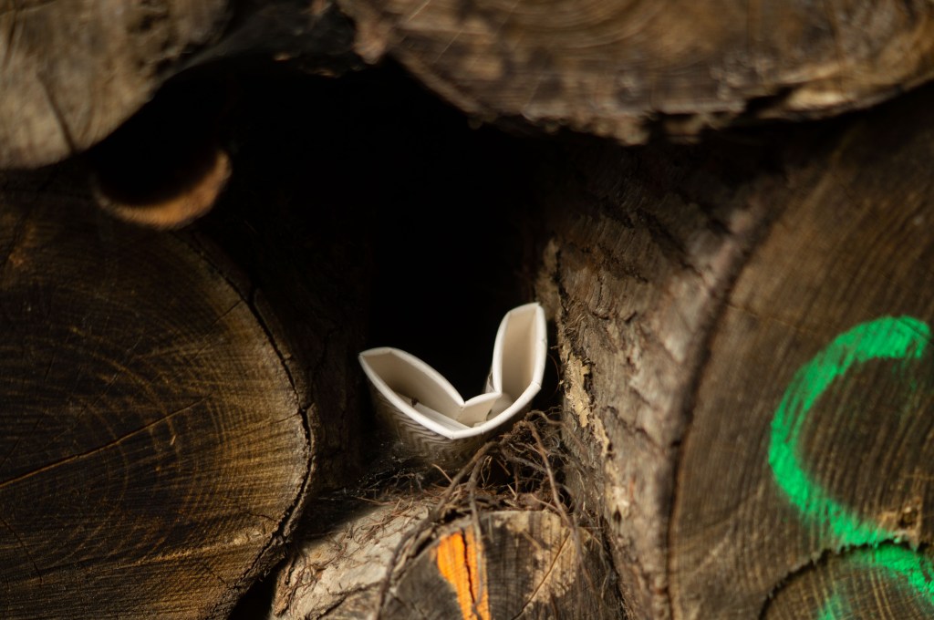
Fig. 7. DBU 37 (2021) 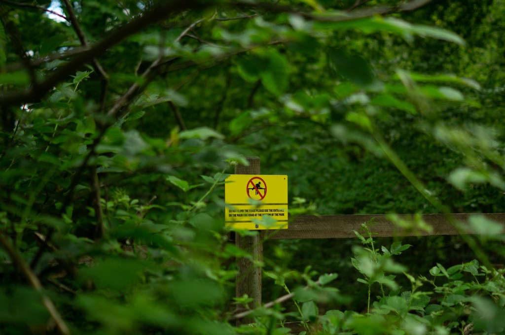
Fig. 8. DBU 39 (2021) 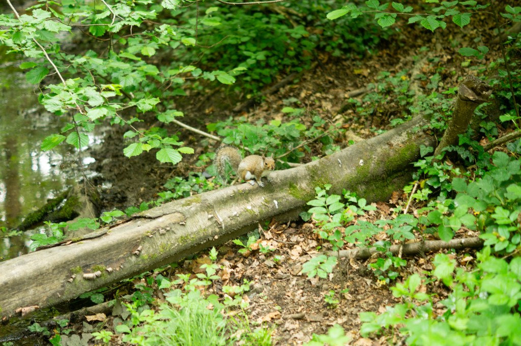
Fig. 9. DBU 49 (2021)
The selection of the six images above is visually strong, well framed and clearly show where the focal points are. Earthy tones perfectly reflect the life and death of nature, rich soil and crisp green foliage. Tonal differences throughout the compositions provide a steady balance between the dark shadowy areas, well lit vibrant sections and shapes that supply a contrast between the organic and more structural man-made subjects featured. Using natural overcast light allowed me to capture diffused shadows and highlights that made the shallow depth of field creamer and smooth, complimenting the fragility of the nature I was documenting. Contextually and conceptually, they present the various elements found within our woodland, from rubbish, to work signs, animals navigating through their home despite it. It may encourage the viewer to think about our effect on the area we live in, how people treat it and the results of these actions. The juxtaposition between nature and man-made objects or situations is jarring as it doesn’t belong and evokes a powerful reaction.
My final ‘select’:
While that collection of photographs were powerful contenders for my ‘select’ and final image, the shot that spoke the most to me was DBU 16 (see Fig. 10). This picture surprised me the most, as it doesn’t necessarily present the idea of deforestation and the massive effect on nature at first glance. Unlike the other compositions, there aren’t any man-made subjects within the frame indicating building work, littering or burnt wood and foliage. Tonally it is balanced, as the shadows and highlights are soft rather than heavily contrasted, while the colours are vibrant and pleasant to look at. Everything about this shot is organic, fresh and full of life, soft due to the natural light and shallow depth of field; a complete juxtaposition to the darker, grittier photographs of old cups, spray-painted trees and plastic items. However, conceptually it still connects with my initial idea of capturing the woodland and its effects on nature and humans etcetera.
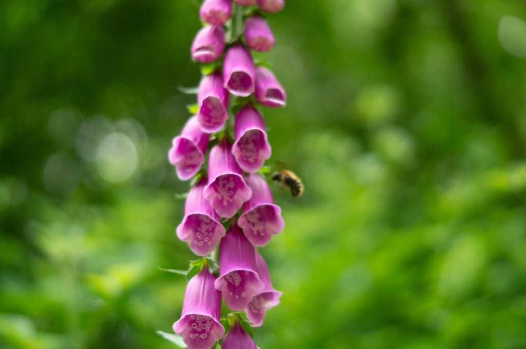
When I saw the foxglove growing in between the grass down a thin, closed off path, I was inclined to capture it even though I felt it didn’t ‘fit’ the aesthetic or context behind this exercise. This flower was in the most secluded area, away from the set path, in the middle of trees and tufts of long grass. Despite the destruction and interactions that have taken place in the area, this piece of nature has thrived. Its petals were vibrant, silky and undamaged, while leaves from the trees behind were crisp, fresh and thriving. Initially, I just thought I was taking a pretty picture, quite a simple shot which some may call a ‘postcard shot’, but when I looked at it closely there was a bee in the background. Nature continues to live on no matter what we’re doing, doing its job, much like the bumblebee in this shot. It wasn’t intentional to have a bee in the frame as the focal point was on the foxglove but it’s added an extra layer to the composition as a whole. Without bees and other insects, we wouldn’t have flowers, trees and a healthy abundance of nature to help us survive. The fact that its wings blurred despite the fast shutter speed and its convenient placement within the shallow depth of field in the background feels like a clever reference to the decrease in bees and the danger they face due to the lack of plants that allow them to pollinate. If the bee was further back we would barely see it; it would disappear in the blur.
The distance between humans and nature isn’t far at all, we need it more than we think.
Reflection:
This exercise was interesting as it lightly linked back to assignment 1, where I revisited important places from childhood to see how they had changed. My final image wasn’t one I was expecting to choose, purely because of the initial plan to explore the destruction and man-made influences within the local woodland. Giving myself a challenge by picking the first idea that came to mind made me focus more on the location which is what photography is all about. It was a risk, but it worked.
The distance between us has taught me that photographs may look simple, plain and just become another pretty picture, but if you take a deeper look you may find something you weren’t anticipating. When selecting images, it’s important to choose those that are compelling even if it’s not one of your favourites to start with. In future, I will be more flexible when it comes to picking a final set and presentation.
References:
Bloomfield, R., 2018. Photography 1: Expressing your Vision. 4th ed. [pdf] Barnsley: OCA, p. 103. Available at: https://www.oca-student.com/course/photography-1-expressing-your-vision [Accessed 13 June 2021].
List of images:
Figure. 1. Powell, L. (2021) Contact sheet 1 [pdf, screenshot] In possession of: Lauren Powell: Eastleigh.
Figure. 2. Powell, L. (2021) Contact sheet 2 [pdf, screenshot] In possession of: Lauren Powell: Eastleigh.
Figure. 3. Powell, L. (2021) Contact sheet 3 [pdf, screenshot] In possession of: Lauren Powell: Eastleigh.
Figure. 4. Powell, L. (2021) DBU 4 [image] In possession of: Lauren Powell: Eastleigh.
Figure. 5. Powell, L. (2021) DBU 12 [image] In possession of: Lauren Powell: Eastleigh.
Figure. 6. Powell, L. (2021) DBU 34 [image] In possession of: Lauren Powell: Eastleigh.
Figure. 7. Powell, L. (2021) DBU 37 [image] In possession of: Lauren Powell: Eastleigh.
Figure. 8. Powell, L. (2021) DBU 39 [image] In possession of: Lauren Powell: Eastleigh.
Figure. 9. Powell, L. (2021) DBU 49 [image] In possession of: Lauren Powell: Eastleigh.
Figure. 10. Powell, L. (2021) DBU 16 [image] In possession of: Lauren Powell: Eastleigh.
Assignment 4 – Languages of Light – Write up
Assignment 4, Reflection on assignments, Thoughts & IdeasFor this assignment, we had to revisit one of the exercises from part four of this course and develop it into a formal piece. The exercises explored natural light, artificial light or controlling light, from which I chose the last. Photographers can use the light provided to them at the time or take it into their own hands to get the shadows and highlights they require.
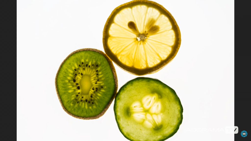
The final images for my assignment were black and white, 360-degree mirrored images of the cross-sections of fruit and vegetables. I took the techniques from exercise 4.3, ‘Egg or stone’, lit the subjects from underneath with a light pad to create a highly contrasted yet 2D image full of detail to prevent the work from being flat and lifeless.
Doug McKinlay made a tutorial on capturing slices of fruit, vegetables, flowers and other translucent items with a lightbox and macro lens. Overexposing the images by one or two stops prevents the background from being dull and grey (McKinlay, 2017), enhancing the bright whites and colours of the subject. McKinlay shot his images without a tripod by bumping the ISO up enough to allow for a fast shutter speed, avoiding camera shake. I intended to use a tripod for my photoshoot to prevent any blur, yet, the lens was not close enough to the slices, forcing me to go handheld and use the advice from the YouTube tutorial.
Andy Ellison is an MRI technician who tested his MRI scanner settings by scanning the cross-section of an orange. He was so impressed by the results that he created an entire series of images from fruits and vegetables, both static and animated Gifs of the scans. The scans inspired me to explore the idea of black and white film negatives, but on a much larger scale. Film negatives are the opposite of a fully developed print, ghostly yet beautiful. The denser areas are white or light grey, while exposed areas are dark grey or black, much like medical scans.
I combined ‘the use of lightbox and macro photography technique from McKinlay’s tutorial, Ellisons MRI scans and presenting them as individual prints like Gomez’ lumen prints; while keeping it unique’ (Powell, 2021). My SONY A57 settings were manual, with an ISO of 1600, aperture of F/2.8., a range of shutter speeds depending on the subject and the light intensity.
The light source for the photoshoot was an A4 LED light pad, set to the highest setting and covered by a sheet of white paper to block out the dots on the surface. Overexposing the image like McKinlay suggested prevented the background from going grey and dulling the slices of food. Shooting from above flattened the subject while keeping the shadows and highlights balanced. Using a shallow depth of field caused the camera to focus on the areas closer to the lens. As a result, it created a soft eerie effect on some of the images when converted to black and white. The macro lens allowed me to examine the fruit and vegetables more intimately, enhancing the small details within the flesh and how they are grown.
Using photoshop to invert the images and convert them to black and white using a B&W filter and gradient map allowed me to achieve the ‘negative film’ and scan effect that I was hoping to replicate. Enlarging the canvas and duplicating the individual shots to create a 360-degree symmetrical piece intensified the details and shapes within the photographs selected from my shoot.
The final images are complex, highly contrasted, full of texture and shapes, much like an MRI scan or x-ray would be of the body. The context for these pieces is limited. Viewers can analyse and come to their conclusions about the images, what they mean, what the subject is, similar to Hermann Rorschach’s inkblot tests where people describe what they see within the abstract art. Each response is different depending on the person, making the art more captivating.
Presenting the photographs as strong individuals allows each piece to be appreciated, rather than a pair of average images complementing one another to create a set. The vertical order of the pictures enables the collection to become a powerful group of ‘scans’ from head to toe.
The most compelling images for me are Scan 1 and Scan 3, as they are ripe with texture, contrast, shapes and details. They look like flesh, with the addition of tougher and denser areas throughout, balancing the composition as a result. Heavy black areas represent the bright white areas created by the light pad placed underneath the translucent slices. Intense white areas show the thicker and less exposed elements within the fruits and vegetable makeup. Even though the photographs are flat and two-dimensional, the artificial arrangement of the images creates a complex and exciting art piece from what were individual shots.
Taking images of the fruits and vegetable so closely filled the frame and included little background, causing some of the photographs to be too bright when inverted and providing little or no dark areas to frame the subject like most of my final pieces. Making sure the arrangements balanced before pressing the shutter, resulting in a better finish. Taking a little more time to compose is something I would consider doing more if I were to do this shoot again.
This assignment has been fascinating to explore as I pushed myself out of a comfort zone, experimented with controlled light and discovered the incredible results it could achieve. Every light source is just as good as the other if you know how to use each one efficiently.
References:
McKinlay, D. (2017) Light Box Art: Stay Focused with Doug McKinlay [Video] Available at: https://www.youtube.com/watch?v=kWiL5N-b4YM (Accessed 28th May 2021).
Powell, L. (2021) Further research and shoot plan [Blog post] Available at: https://laurenpowelloca.photo.blog/2021/06/07/further-research-and-shoot-plan/ (Accessed 7th June 2021).
Final image analysis and contact sheets
Assignment 4, Reflection on assignmentsSummary
In this post I
– Discussed the post-processing that took place to edit my final images, how it was achieved and why
– Included screenshots of the editing process before discussing which images were stronger and the weaknesses of others
– Inserted the annotated contact sheet including the final image edits and the pictures I was considering for presentation
– Included all of the final images as individuals in vertical order, allowing the images to be viewed as a group.
– Explored my reasoning for presentation, where my inspiration for the final pieces came from and the strengths and weaknesses in a short analysis
– Before reflecting on the process as a whole.
Post-processing
To create my final images I took my black and white inverted shots, enlarged the canvas by 4 (See Fig. 1), before creating three duplicates of the photographs and changing the orientations of each to mirror one another (See Fig. 2). As a result, this created multiple 360-degree pieces out of what was one image. The inspiration for these compositions came from Andy Ellison, an MRI technician who scanned fruits and vegetables as a way to test his MRI machine settings (Insider, 2013). Ellison’s work influenced me to produce a photograph that looked ‘beautiful, ghostly … like they could be part of the human body’ (Powell, 2021).
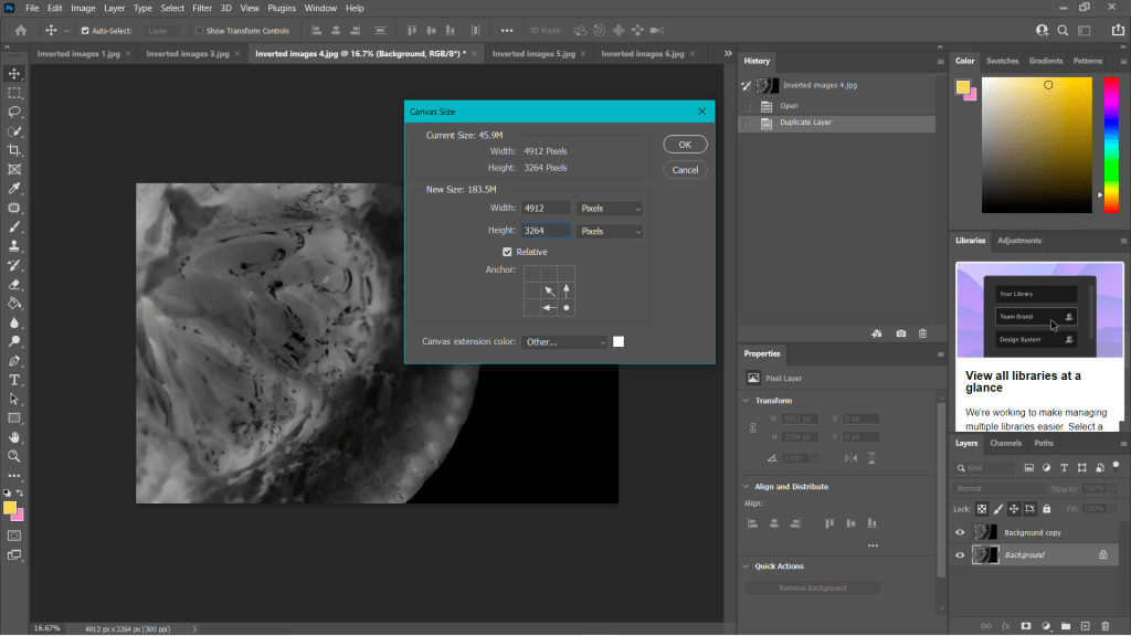
Fig. 1. Canvas (2021) 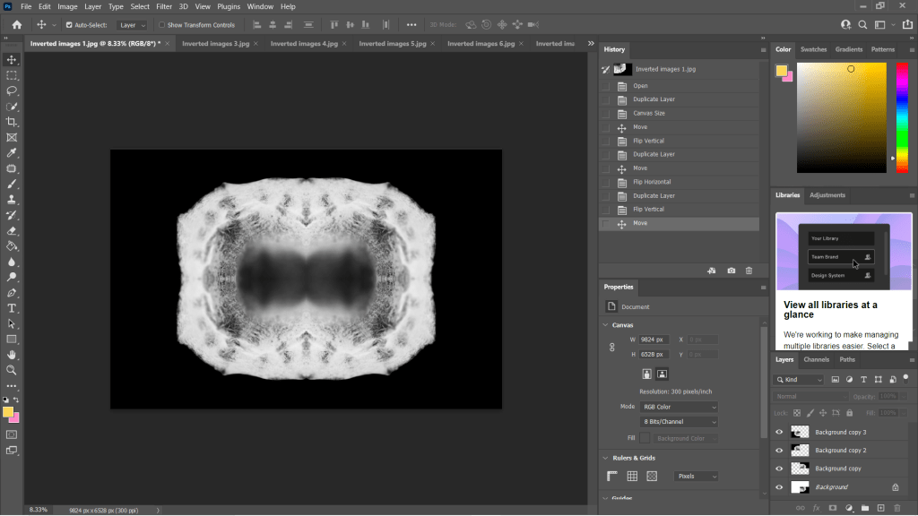
Fig. 2. Duplications (2021)
Some of the individual images weren’t strong enough when duplicated and turned into a mirrored image, as can be seen in my annotated contact sheet for these edits (See Fig. 3). Scan edit 5, was interesting in terms of texture and symmetry but wasn’t as exciting as the others due to the lack of shape, contrast and detail. On the other hand, scan edit 9 was overexposed, lacked texture and detail but had an interesting eye shape. Edits 12 and 13 were good composition-wise as the frame was full, juxtaposing the other images and documenting highlights more so than shadows. However, those particular images wouldn’t have been fitting when presented with the rest of the group because of this big difference; it would be quite jarring to look at.
The pieces with the red above them are the images I felt are the best of the collection, not only because of their comparisons contrast and details wise, but they each look like an individual body part. The similarities pull them together as a set, but the shapes and subjects allow them to be unique enough to tell their own story.
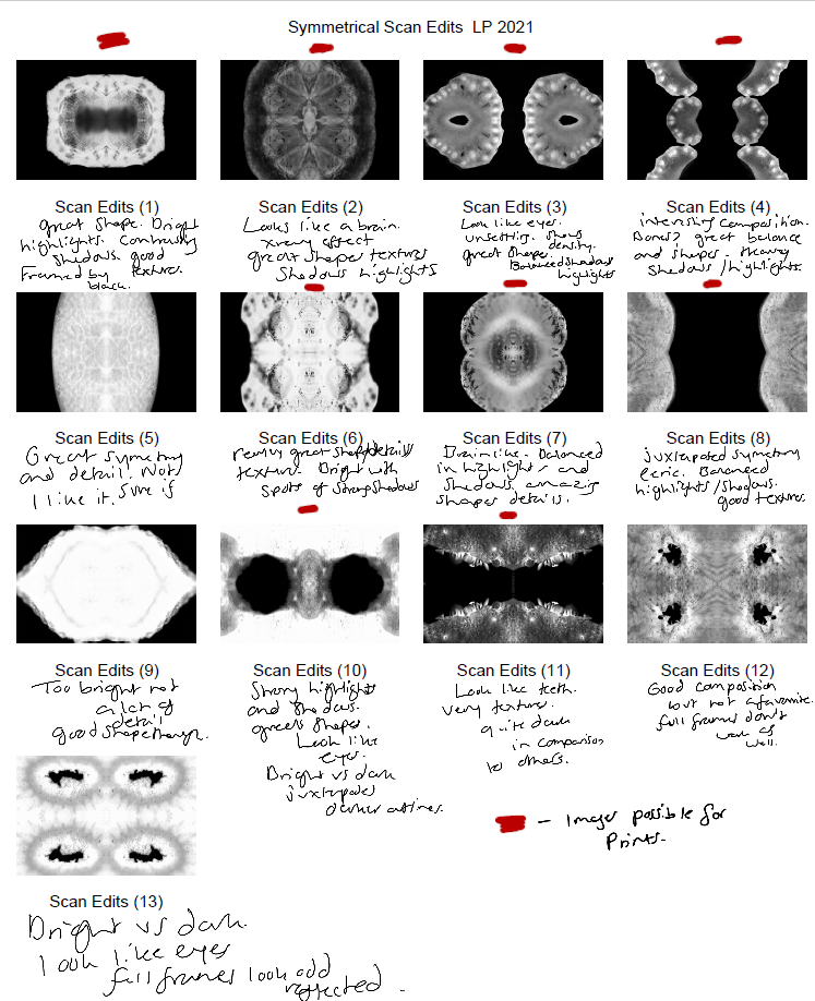
Final images
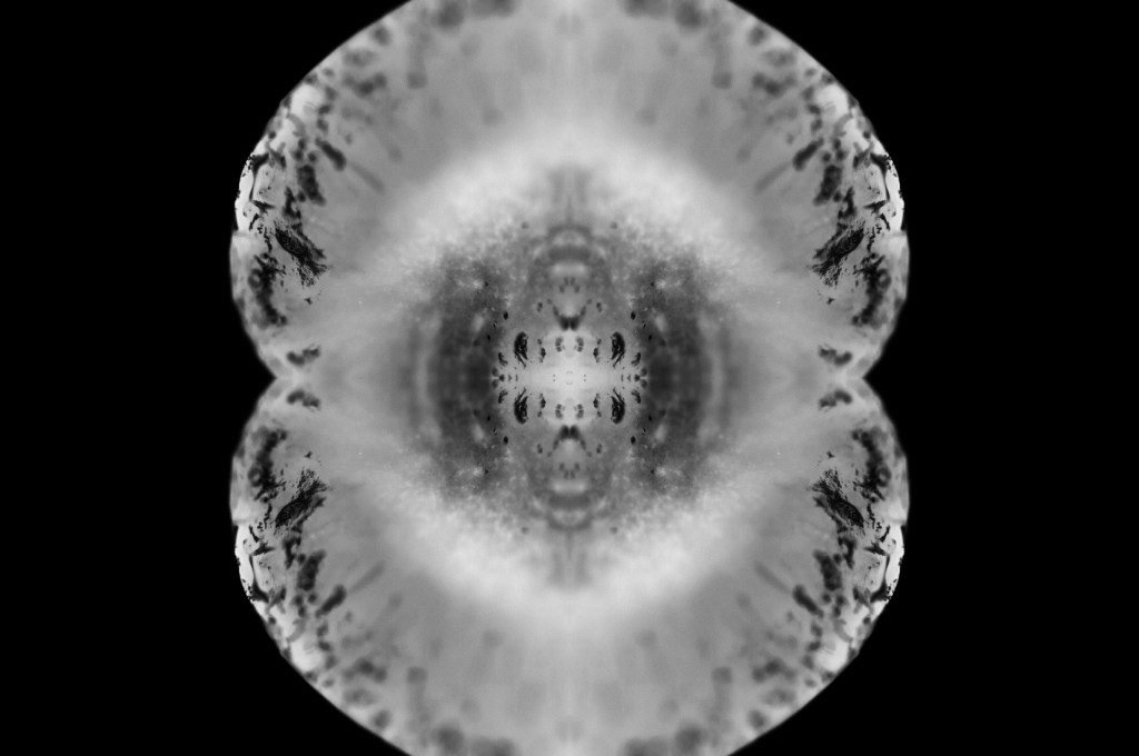
Fig. 4. Scan 1 (2021) 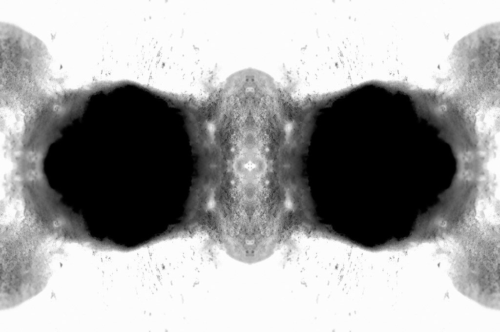
Fig. 5. Scan 2 (2021) 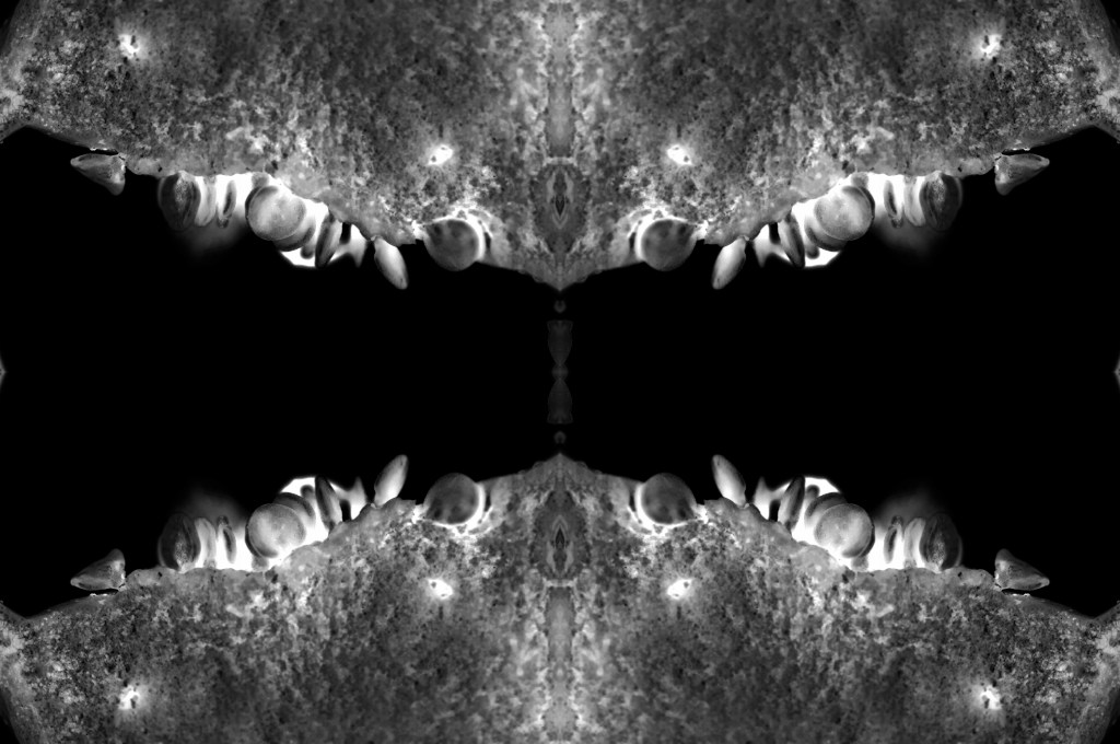
Fig. 6. Scan 3 (2021) 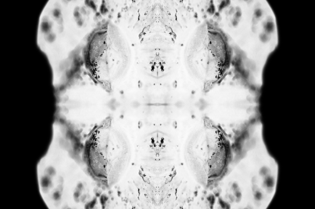
Fig. 7. Scan 4 (2021) 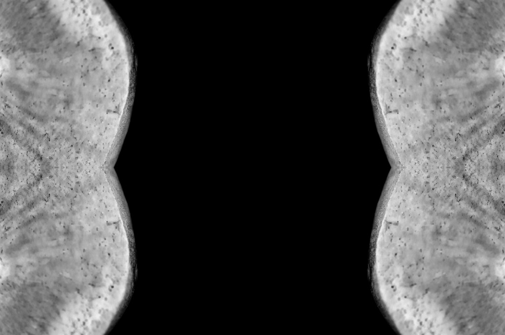
Fig. 8. Scan 5 (2021) 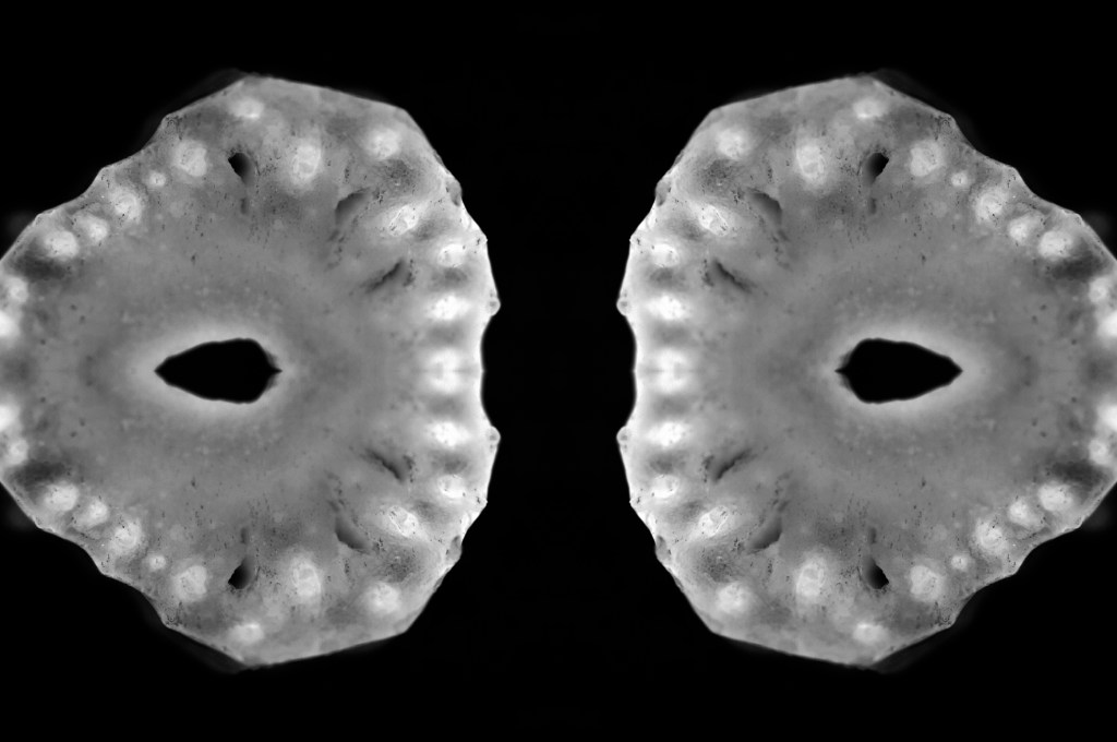
Fig. 9. Scan 6 (2021) 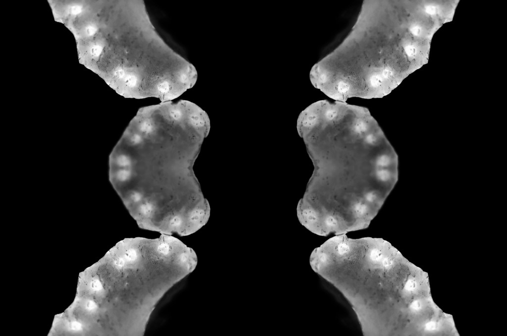
Fig. 10. Scan 7 (2021)
This assignment requires 6-10 high-quality photographic prints if you’re planning to submit for assessment, therefore, the editing for this particular set of images is important. The way your images are presented could heavily influence the way a viewer looks at the pieces and what they get from them. If you pick an art piece that isn’t as strong as the rest, the entire group could be less impactful and draw fewer people in.
I chose the presentation, and the order of my photographs was by referring back to my practitioner research and shoot plans. I wanted to explore the ‘aesthetic’ of film negatives, lumen prints and how ghostly they look after development. Instead of producing an image that reflected a typical black and white photographic print, the edits were inverted to represent an enlarged version of a negative film or black and white lumen print. The final edits reflected my study of MRI scans from Andy Ellison that document the thin and dense areas of the subject via heavy contrasts. Scans can ‘show the thicker areas that are blocking out most of the light or rays via a white or light grey image … ‘ (Powell, 2021) but aren’t limited to this, as denser areas can be darker while the thin areas remain whiter in some MRI’s or x-rays.
While looking at the final images, I noticed how much they looked like body parts or at least a mutated version of a body part. Printing the chosen images off allowed me to arrange the photographs in multiple orders to see what worked best and why. Eventually, I decided on the order shown above and sat with it for a few days before confirming that this was the arrangement I felt was suitable for this set. From the top downwards, we have images that look like the brain, eyes, a set of teeth, spine, torso, hips and legs.
The final set is balanced with shadows and highlights, full of detail, a range of textures and shapes. The shallow depth of field enhances the eerie effect seen throughout each image, especially in Scan 1 (see Fig. 4). There is a soft grey area just below all the crackled black areas around the edge of the fruit, that frames the middle of the image, enhancing the details within that area and the surrounding edges. Smudgy dark marks can be seen on the outer edges of Scan 4 (see Fig. 7) that look like an inkblot painting, bleeding into the paper and symmetrical all around. Scan 3 (see Fig. 6) is the strongest piece in my opinion, due to the range of tones throughout, bright highlights, dark shadows and mid-grey’s. The shapes look sharp in some places and blunt in others, the block of black in the middle of the frame intensifies the scary form of the fruit. Grooves and dents within the subject, give the image a fleshy texture, as a result providing some context as to what the object may be or how it may feel.
Reflection
This assignment has been interesting to explore as I pushed myself out of my comfort zone, experimented with controlled light and the results that could be achieved. I have managed to combine the use of lightbox and macro photography techniques from McKinlay’s tutorial, Ellison’s MRI scans and presenting them as individual prints like Gomez’ lumen prints; while keeping it unique and making it my work by taking influence from a past light project of mine from 2015.
The final images are strong, complement one another and present an interesting idea that doesn’t have a lot of context to it, unless you knew what the subject was and how the pieces were put together. This set allows the mind to analyse what is happening, inspect all of the details and paths within the photographs and the meaning behind them. It is a complex group of pieces that challenge the stereotypical use of controlled light and studio photography.
References
Insider (2013). Andy Ellison X-Ray Scans of Food. [online] Available at: https://www.businessinsider.com/andy-ellison-x-ray-scans-of-food-2013-3?r=US&IR=T (Accessed 28 May 2021).
Powell, L (2021). Further research and shoot plan. [online] Available at: https://laurenpowelloca.photo.blog/2021/06/07/further-research-and-shoot-plan/ (Accessed 7 June 2021).
List of images
Figure. 1. Powell, L. (2021) Canvas [Photoshop, screenshot] In possession of: Lauren Powell: Eastleigh.
Figure. 2. Powell, L. (2021) Duplications [Photoshop, screenshot] In possession of: Lauren Powell: Eastleigh.
Figure. 3. Powell, L. (2021) Contact Sheet [Adobe Bridge, screenshot] In possession of: Lauren Powell, Eastleigh.
Figure. 4. Powell, L. (2021) Scan 1 [image] In possession of: Lauren Powell, Eastleigh.
Figure. 5. Powell, L. (2021) Scan 2 [image] In possession of: Lauren Powell, Eastleigh.
Figure. 6. Powell, L. (2021) Scan 3 [image] In possession of: Lauren Powell, Eastleigh.
Figure. 7. Powell, L. (2021) Scan 4 [image] In possession of: Lauren Powell, Eastleigh.
Figure. 8. Powell, L. (2021) Scan 5 [image] In possession of: Lauren Powell, Eastleigh.
Figure. 9. Powell, L. (2021) Scan 6 [image] In possession of: Lauren Powell, Eastleigh.
Figure. 10. Powell, L. (2021) Scan 7 [image] In possession of: Lauren Powell, Eastleigh.
Contact sheets for photoshoot and edited images
Assignment 4, Notes, Reflection on assignmentsSummary
In this post I
– Described my shoot setup, the camera settings I used and any issues faced.
– Provided annotated contact sheets for the images taken for this photoshoot
– Before briefly explaining the annotations and why I chose those images to edit
– Included the contact sheets for the images I selected to convert into black and white
– As well as screenshots to show how it was done, referring back to my previous research
– Finishing the post off with a brief reflection on the images I shot and what I intend to do going forward
Shoot setup
For this shoot I initially intended to set my camera up on a tripod to keep the camera steady as the macro lens is quite heavy, however, this meant that the camera wasn’t as close to the cross-sections as I wanted them to be. As a result, I boosted the ISO to 1600 to allow for a faster shutter speed and a brighter exposure level. The weight of the lens made the process slightly more challenging as I had to manual focus too, but it was thankfully successful. To make the focal points more prominent when photographing any details the aperture was F/2.8 to allow for a shallow depth of field if taken at an angle to blur any background features. Overexposing the images slightly enhanced the brightness of the white background, like Doug McKinlay, suggested in his lightbox tutorial Light Box Art: Stay Focused (2017), preventing the image from looking dull and textured from the paper underneath.
Rather than using a large lightbox, I purchased an A4 light pad which is much smaller and thinner, but bright enough to do the job. A variety of fruits and vegetables were bought in advance and sliced to provide me with a range of colours, shapes, textures to play around with when composing the image.
Contact sheets for photoshoot
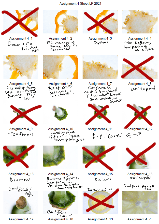
Fig. 1. Contact sheet 1 (2021) 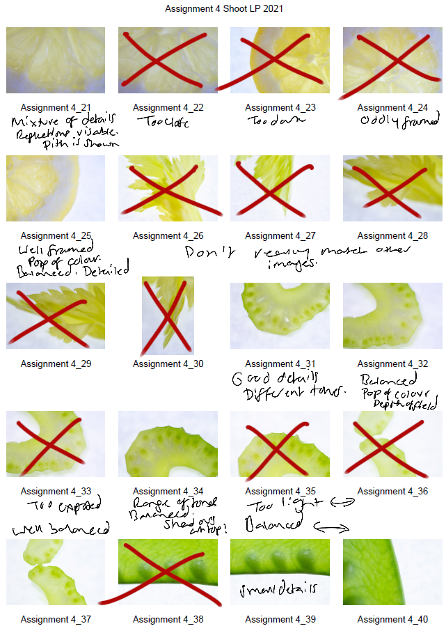
Fig. 2. Contact sheet 2 (2021) 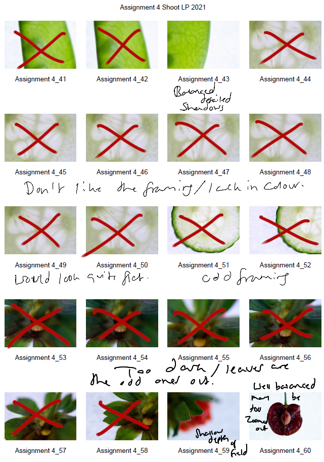
Fig. 3. Contact sheet 3 (2021) 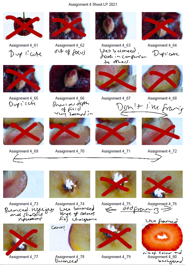
Fig. 4. Contact sheet 4 (2021) 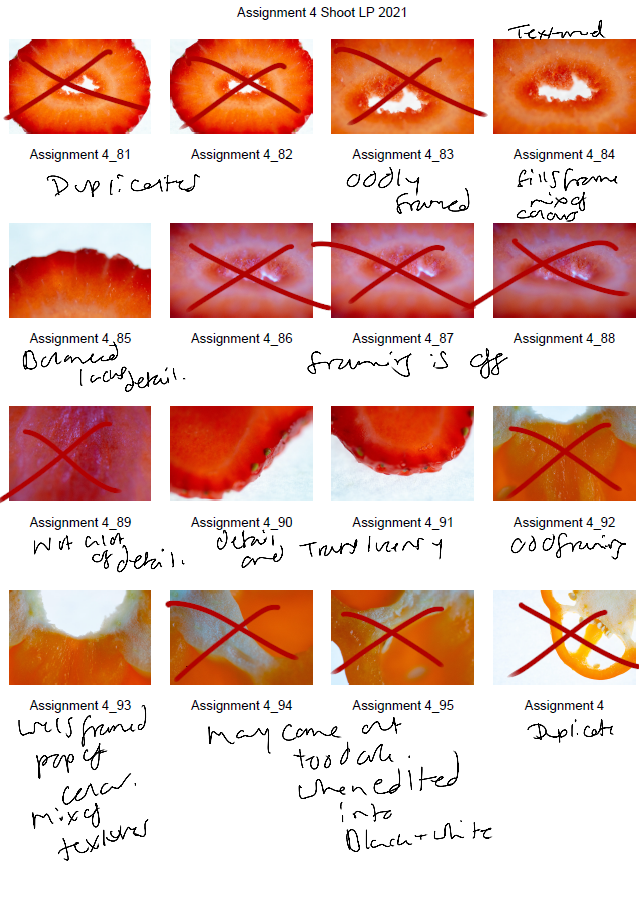
Fig. 5. Contact sheet 5 (2021)
The first set of contact sheets are for the shoot itself, including brief annotations to explain what I like about each particular shot, why I have crossed a majority out and what may become of them in post-production. After annotating and selecting my favourites from the entire photoshoot, I then took these images into photoshop and edited them to see what they would look like in black and white.
The images are as follows:
Contact sheet for edits
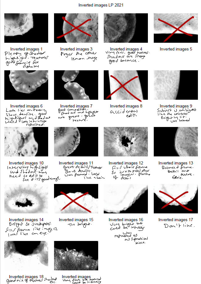
Fig. 6. Contact sheet 6 (2021)
To get the results shown in my contact sheets, I lightly corrected some of the shadows and highlights in the images that needed retouching before converting them to black and white. To change the colour is used the B&W tool and selected ‘blue filter’ (See Fig. 1) to enhance the contrast. To mimic an inverted image and MRI, I then used the gradient tool in reversed black and white (See Fig. 2).
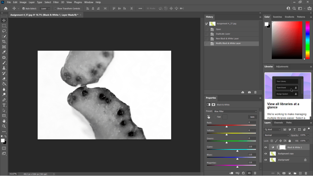
Fig. 7. Black and White (2021) 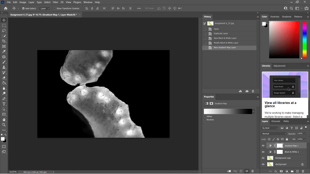
Fig. 8. Gradient Map (2021)
I wanted to choose a range of images to use in my final image edits, so I made sure to select shots that were heavily black in some areas and bright white in others, highly detailed or minimally textured for the remaining few. This gave me a wide selection to experiment with and create strong symmetrical compositions from. Showing variety was important to me for this photoshoot, appreciating multiple fruits and vegetable structures and juxtaposing between the imagery and reference the different kinds of scans as discussed in my previous research, ‘some scans may vary and present the denser areas in black or grey…’ (Powell, 2021).
Reflection
This photoshoot helped me appreciate the structures of the food we grow and eat, the minuscule details within them and how beautiful they are. I was able to be flexible with my plans for this shoot, not letting the weight of my camera ruin the imagery and changing the settings to work with what I had. Reviewing the images shown on my contact sheets allowed me to reduce the number of photographs needed in the initial post-production process and once again after they’d been edited to black and white.
Understanding the process in detail before doing the shoot, rather than briefly researching a concept and making things up as I go, helped this project to flow a lot smoother and resulted in some powerful images.
The final images will be in a separate post from this one, but I am thrilled with the selection chosen.
References
McKinlay, D (2017). (2017) Light Box Art: Stay Focused with Doug McKinlay [YouTube, screenshot] Available at: https://www.youtube.com/watch?v=kWiL5N-b4YM (Accessed 28 May 2021).
Powell, L (2021). Further research and shoot plan [online] At: https://laurenpowelloca.photo.blog/2021/06/07/further-research-and-shoot-plan/ (Accessed 28 May 2021).
List of images
Figure. 1. Powell, L. (2021) Contact sheet 1 [pdf, screenshot] In possession of: Lauren Powell: Eastleigh.
Figure. 2. Powell, L. (2021) Contact sheet 2 [pdf, screenshot] In possession of: Lauren Powell: Eastleigh.
Figure. 3. Powell, L. (2021) Contact sheet 3 [pdf, screenshot] In possession of: Lauren Powell: Eastleigh.
Figure. 4. Powell, L. (2021) Contact sheet 4 [pdf, screenshot] In possession of: Lauren Powell: Eastleigh.
Figure. 5. Powell, L. (2021) Contact sheet 5 [pdf, screenshot] In possession of: Lauren Powell: Eastleigh.
Figure. 6. Powell, L. (2021) Contact sheet 6 [pdf, screenshot] In possession of: Lauren Powell: Eastleigh.
Figure. 7. Powell, L. (2021) Black and White [Photoshop, screenshot] In possession of: Lauren Powell: Eastleigh
Figure. 8. Powell, L. (2021) Gradient Map [Photoshop, screenshot] In possession of: Lauren Powell: Eastleigh
Further research and shoot plan
Assignment 4, Online Research, Reflection on assignments, Thoughts & IdeasSummary
In this post I
– Discussed lightbox and food photography, following a short YouTube tutorial from Doug McKinlay
– Explored the details of his shoot set-up, camera settings and lighting choices
– Suggested the differences I would make if I were shooting this project and the type of subjects that can be used
– Before briefly analysing a screenshot of his work from the lightbox shoot.
– Researched the concept of MRI’s scans and the use of fruit and vegetable cross-sections
– Discussed the idea behind Andy Ellison’s scans and why he did them
– Explained the similarities between MRI’s and negative film, what they pick up and the differences we can find
– With a brief analysis of Ellison’s work and the contrasts between the two.
– Explored the technical approach for symmetrical and asymmetrical images, the balance and elements that make them what they are.
– While referencing a past project I did in 2013 and analysing an image from it to explain my understanding of the technique.
– Provided bullet points for my shoot plan for this assignment and a reflection on this post as a whole
– What it taught me and what I’d like to implement in my work.
Lightbox and food photography
Following my techniques research where I looked at macro, abstract photography and lumen prints, I decided to focus on lightbox photography and using a macro lens to explore my chosen subject in a more intimate, up close and personal way.
Doug McKinlay, a UK based photographer released a short YouTube tutorial in March of 2017, exploring lightbox art and ways to achieve some impressive shots from the comfort of your home. McKinlay’s set-up consisted of a large lightbox, placed on a few stools to avoid the camera being too close to the subjects, in turn causing the macro lens to struggle with focus. He gathered a variety of fruit and veg, sliced them into thin pieces and arranged them in a way that he felt was great for a strong composition. Using transparent or translucent items are ideal for this project, as light can pass through and highlight the details, rather than blocking light and becoming solid shapes.
McKinlay decided to set the aperture on his camera to F/8 allowing the depth of field to be even across the frame, however, suggested if the shutter speed isn’t high enough to shoot handheld then boost the ISO slightly without causing too much grain. I would use a tripod to steady the camera if the aperture was slightly wider and the shutter speed too slow to avoid handheld motion blur. Another tip that was suggested was overexposing by 1 or 2 stops, to avoid the camera light meter from turning the bright white light into a duller grey (McKinlay, 2017).
Depending on what you decide to photograph, their makeup and the thickness will influence the end product in a variety of ways, as can be seen in the screenshot I took from McKinlay’s tutorial (see Fig.1). The denser areas are darker and lack texture, whereas the thinner, more translucent elements of the fruit are lighter and full of texture, detail and colour. Being able to capture the tiny details and structure of the subject is fascinating, as it allows you to appreciate what it is made up of, how it holds itself together and what it might feel like if you weren’t already aware. In terms of composition, this isn’t my favourite as the layout isn’t the most exciting, however, the cold citrus colours and asymmetric segments, seeds and shapes make up for quite a simple subject placement. Overexposing the shot helped the background be crisp and white, preventing the background from looking dull and affecting the fruit slices as a result.
If I were doing this project, I would get closer to the subject, focus on the smaller details within the frame rather than the slices as a whole. Exploring the areas we don’t normally look at in much detail, removing context from the composition by cropping out some familiar elements with the lens, may encourage the viewer to appreciate what they are viewing for a little while longer.
MRI’s on fruit and veg research
Andy Ellison is an MRI technician at Boston University Medical School, who has produced multiple scans of the cross-sections of fruit and vegetables, following an MRI machine settings test with an orange slice (Insider, 2013). While fruit and vegetables aren’t at risk of tumours or bleed as a brain maybe, they’re still complex, held together by their fibres and flesh much like the human body. Lemons, for example, are made up of segments and have little fleshy pockets of juice within, while human skin is made up of cells that are all connected to create many thin layers to protect us.
Ellison’s scans are beautiful, ghostly and look like they could be part of the human body which wonderful to see how incredible nature is and the patterns that can be found within something that has grown from a tiny seed.
Much like photographic negatives, MRI’s I’ve briefly googled, tend to show the thicker areas that are blocking out most of the light or rays via a white or light grey image, while the more exposed areas show up as dark grey or black. Some scans may vary and present the denser areas in black or grey, while the emptier or thinner areas are represented with light grey or white, similar to a developed film print.
As seen in the scan of the pomegranate (see Fig. 2) the fleshier, cell-like seeds are bright white, while the thicker skin is grey. The shape of the fruit is asymmetric, defined, full of texture and detailed around the outer edges especially. Heavy shadows within the translucent seeds imply that there is a small yet thicker seed or pip inside. Removing colour allows the viewer to come up with their conclusion as to what is in front of them.
The MRI of the melon is the complete opposite (See Fig. 3) as the tougher, opaque part of the fruit is a lighter white whereas the transparent seeds in the middle remain dark black to imply overexposure. There are tiny veins that can be seen if you look at this photograph closely, something that makes the composition more exciting as the details are subtle, allowing the eyes to look further. The middle section of the melon seems to reflect itself too which may be an interesting concept to look into.
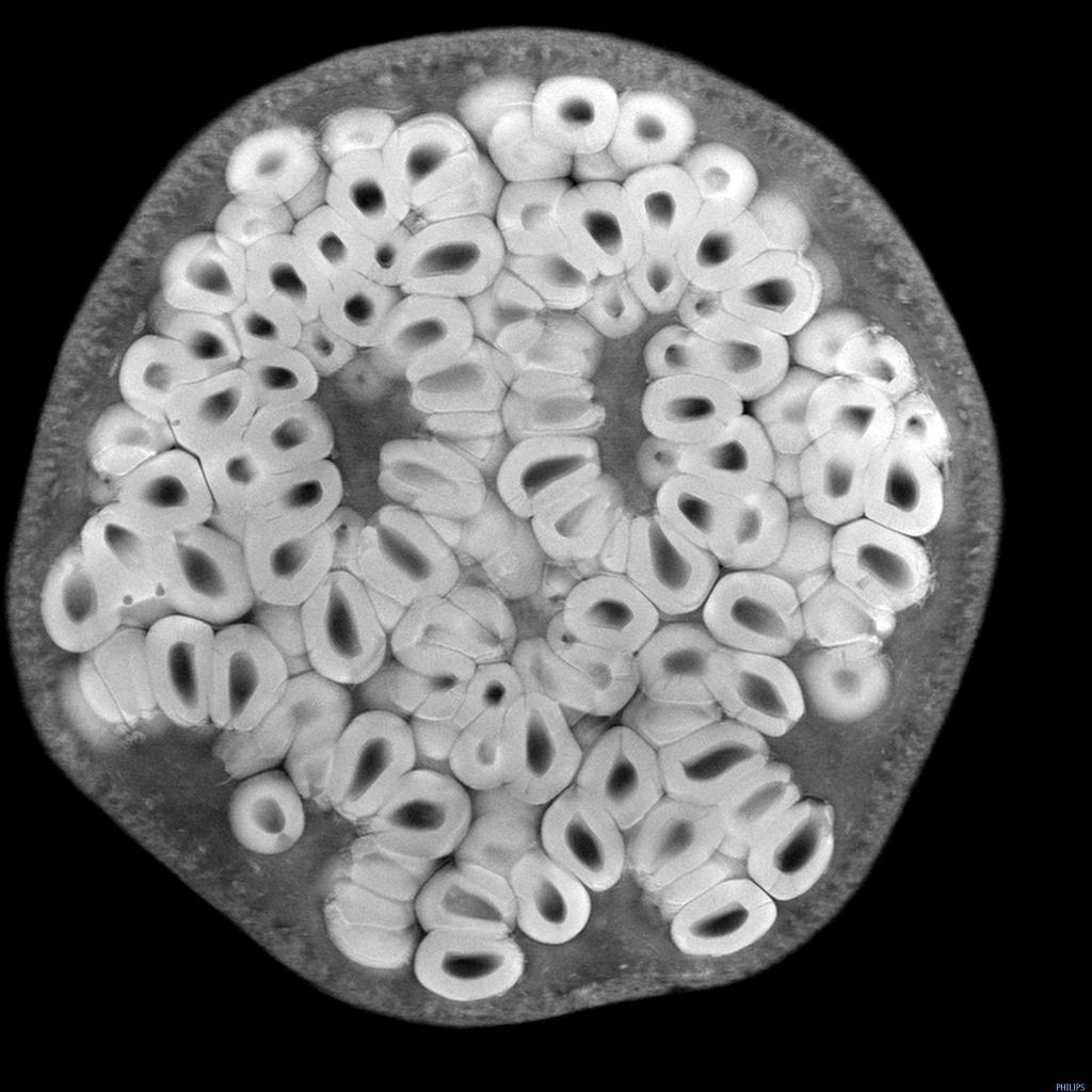
Fig 2. Pomegranate (n.d) 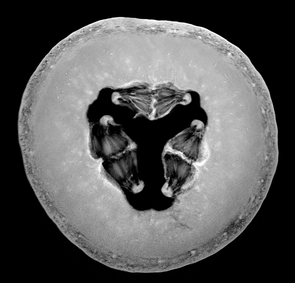
Fig 3. Melon (n.d)
Symmetry and reflection examples
As previously mentioned above symmetry and asymmetry is an interesting concept to consider within photography as it creates a sense of balance and intrigue to the composition. It would be possible to explore either one or both of these techniques when photographing fruits, flowers and any other object that naturally features a constant similarity pattern throughout.
Symmetrical photography is pretty straightforward and explains itself. The image is equally balanced all around, each section complimenting the other without having to be identical in detail all the time. For example, one half has a different shaped window frame to the one on the right-hand side of the image, but it’s still balanced and appealing.
Asymmetrical photography is a lot more clever and isn’t noticed straight away, which makes it more effective in my opinion. Helen Kantilaftis wrote for the New York Film Academy about photographic balance. They explained that despite an image having differences in shape and size, it is still balanced via the highlights, shadows and interesting use of filling space, making it an asymmetrically balanced image (Kantilaftis, 2014).
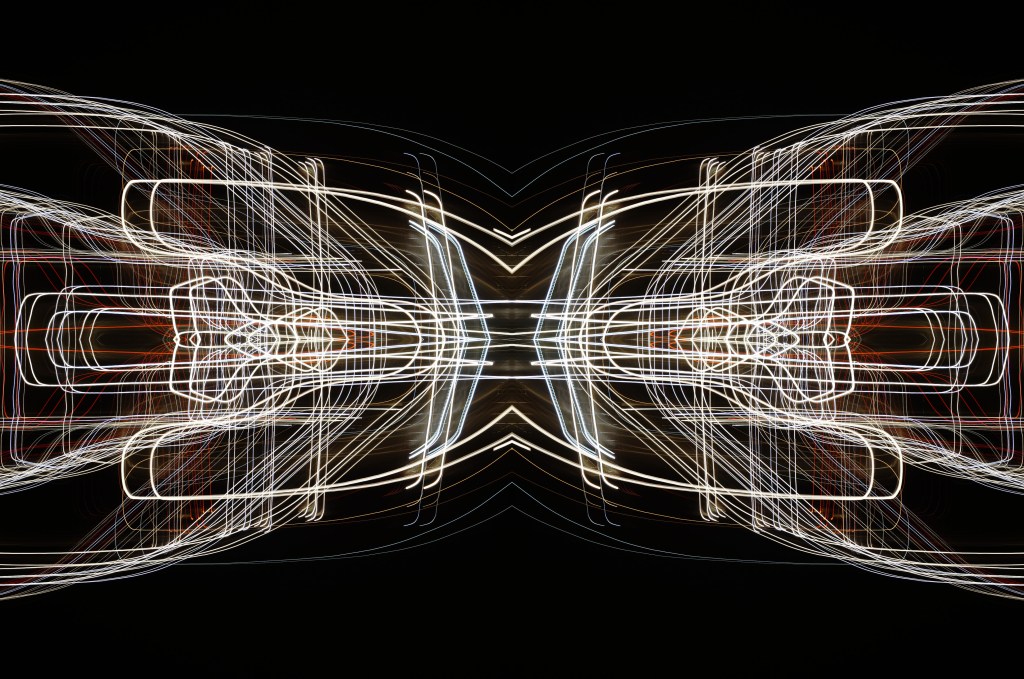
I’ve explored symmetrical photography in post-production (see Fig. 4), for a project that featured light paths from moving cars at night. After enhancing the highlights and shadows within the original image, boosting the contrast of the blacks and coloured lights, I copied it 3 more times and changed the orientation to create a 4 way mirrored image. This drew more attention to the shapes, curves of the light and the various colours, turning it into a bigger photographic light drawing. Negative space framed the busier details, preventing the composition from being too energetic and balancing it back out. Contrast is the ratio between the highlights and shadows, an element that is also levelled out within this photograph to avoid the lights being over or underexposed. If the original image hadn’t been mirrored, it would most like be asymmetric or diagonal in symmetry due to the negative space in the other half of the image.
Shoot plan:
– Take images of the cross-section of fruits and vegetables, backlit by a light pad or lightbox to emphasise the shape, details and light passing through the translucent areas.
– Focus on the details and lesser photographed elements of the subject with a macro lens set to manual.
– Maybe use a tripod to stabilise the camera, but make a judgement while shooting.
– Place white paper underneath the objects to enhance the background and prevent the camera from focusing on the reflection of the glass from the lightbox/pad.
– Set up the shoot in the conservatory on the floor to allow for different focal distances to be achieved, without having to stand on steps if it were shot on a higher surface.
– Edit the images in photoshop to black and white, before inverting the image or adding a gradient to mimic an MRI or X-Ray.
– Once the original image has been edited, copy and paste the photograph to create a quadruple mirrored image, to see what exciting results I can get.
Reflection
All of the research above has solidified what images I want to shoot, the subject I want to use and how I am going to use controlled light to create some strong compositions at the end of this assignment. The set-up may be fairly easy and cheap in terms of equipment, but planning and composing the image to draw the eyes in will take a lot of thinking, experimenting and technical knowledge to succeed. Pushing myself further by using a macro lens alongside a ‘studio’ light is going to help me grow both creatively and technically moving forward. In terms of presentation for this assignment, we are required to provide high-quality digital prints, so making sure I pick the correct images and layout will be something I’ll have to look into in more depth once the shoot is done.
References
Insider (2013). Andy Ellison X-Ray Scans of Food. [online] Available at: https://www.businessinsider.com/andy-ellison-x-ray-scans-of-food-2013-3?r=US&IR=T (Accessed 28 May 2021).
Kantilaftis, H (2014). Five Kinds of Photography Balance You Need To Understand. [online] Available at: https://www.nyfa.edu/student-resources/five-kinds-photography-balance-you-need-to-understand/ (Accessed 28 May 2021).
McKinlay, D (2017) Light Box Art: Stay Focused with Doug McKinlay [online video] Available at: https://www.youtube.com/watch?v=kWiL5N-b4YM (Accessed 28 May 2021).
List of images
Figure. 1. McKinlay, D. (2017) Light Box Art: Stay Focused with Doug McKinlay [YouTube, screenshot] Available at: https://www.youtube.com/watch?v=kWiL5N-b4YM (Accessed 28th May 2021).
Figure. 2. Ellison, A. (n.d.) Pomegranate [image] Available at: http://insideinsides.blogspot.com/p/high-resolution-still-images.html (Accessed 28th May 2021).
Figure. 3. Ellison, A. (n.d.) Melon [image] Available at: http://insideinsides.blogspot.com/p/high-resolution-still-images.html (Accessed 28th May 2021).
Figure. 4. Powell, L. 2015. Symmetry I [image] In possession of: Lauren Powell: Eastleigh.
Technical research and ideas
Assignment 4, Books & Magazines, Online Research, Reflection on assignments, Thoughts & IdeasSummary
In this post I have
– Briefly discussed my mind-map post
– Explained how my preferred concepts led me to research via YouTube and books
– Before explaining three techniques, how they’re done and the results you can get
– Including screenshots and scans of the examples from the research
– Finishing the post with a short reflection about these techniques and what I plan to do as a project.
In my last post, I briefly discussed my mind-maps for both artificial light and controlled light, the multiple techniques, concepts and possible subjects that could be explored, along with their pros and cons. The ideas ranged from cityscapes to light casts, streetlamps and their shadows, light drawings, spotlight photography, commercial and lightbox photography.
As mentioned in my initial thoughts I sat with the ideas I was interested in most, which were silhouette and lightbox photography. While these ideas were in the foreground of my mind, I searched YouTube for further ideas and tutorials for lightbox, abstract and macro photography, as well as referring to an experimental photography book. This helped me figure out the direction I want to take for this assignment while pushing me to explore techniques I’d not done before or in a long time.
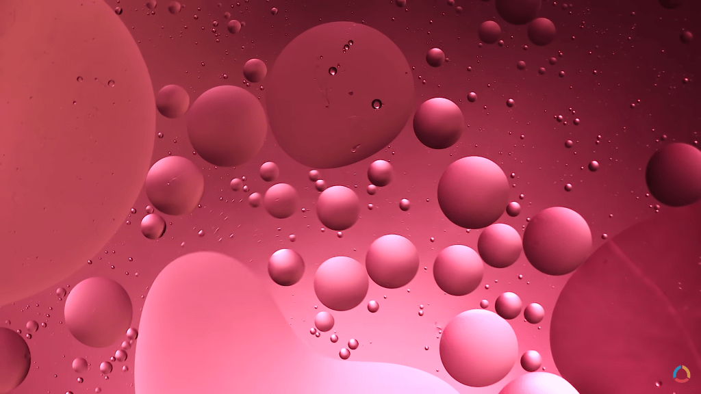
Oil and water
One of the first concepts I thought of when exploring the idea of using a lightbox, was oil and water macro photography, a simple set-up with incredibly unique results. Lighting the subject from behind (or below if it’s flat on a surface) and lifting the subject high above the light source intensifies the shallow depth of field, diffusing the colours below and making sure the main focal point is the bubbles in the frame. You can adjust the colours used underneath, the direction they’re pointing and the shape of the oil bubbles by stirring it and manipulating the mixture (Adaptalux, 2019). Ben from Adaptalux inserted videography of his results at the end of the YouTube tutorial, which I was able to take a screenshot of (See Fig. 1) for future reference.
Having more control over the process, can result in some incredible shots and allow you to get the exact outcome you’re looking for, however, it is possible to let gravity and chemistry take control of the subject while you focus on the light. This technique is full of flexibility, depending on what you prefer to do, but not so much so that you don’t have to plan or take control of what is going on. While this would be perfect to use for a controlled light project, it is also a concept I’ve explored myself in the past, so isn’t ideal for pushing myself further. The set-up and technical information regarding light placement, filters and stability for the camera/subject from this specific tutorial have still been beneficial for me to consider for this assignment, so worth the watch and research time.
Abstract paper photography
Another tutorial I saw from Adaptalux on YouTube, was an abstract photography project with nothing but lighting and paper. Much like the previous project with the oil and water the lighting is coming from underneath the subject (backlit when it’s flat on a surface) via the use of a lighting arm and some diffusion filters for additional colour. Before shooting, the camera is set up on a tripod and the focus is set beforehand so all that has to be changed is the paper folds, positioning or lighting direction/colour. The height of your camera and the focal range of your lens can result in an extremely close frame or a wider shot depending on your preference, making this another flexible technique to try out (Adaptalux, 2020). You can either fold the paper, roll it up, use one sheet or multiple sheets and manipulate their shape to get a variety of styles to shoot. Despite being lit from below, due to the curves in the paper, soft shadows are captured as opposed to a silhouette or flat image of the item in the frame.
Shooting the cross-section of paper is much more interesting than I first imagined it would be, as it cuts the camera frame into multiple sections and is ambiguous in terms of the subject (see Fig. 2). Abstract art is meant to be ambiguous and cause questions to be asked, in turn making it a much more complex idea to explore and play around with.
I’ll definitely consider exploring this particular technique, even if it’s not chosen for this assignment.

Lumen prints
Despite not having the products needed for this particular experiment, looking through Thames & Hudson’s book Experimental Photography (Bendandi et al., 2015) gave me something to think about in terms of photographic presentation and technical choices made in photography. The contact printing frame used for this experiment (see Fig. 3) looked similar to a light pad, a thin LED glass pad used for tracing for art and other such things, while the lumen print Francisco Gomez managed to produce (see Fig. 4), reminded me of a photographic film after they’ve been developed. Placing the leaves on a piece of photographic paper, blocked those specific areas from the light, much like objects do when shooting with film. The denser subject is shown via a ghostly silhouette; with a few shadows to define the details where light has seeped through, while the open areas are much darker to show how much light the paper was subjected to during the experiment. By ‘inverting’ the print with Photoshops gradient map, the image looks like a typical sepia print, which has got me thinking about the possibility of creating digital ‘negatives’ for this assignment and how light can affect the results of an image.
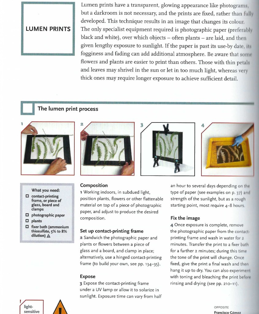
Fig. 3 Lumen Prints (2015) 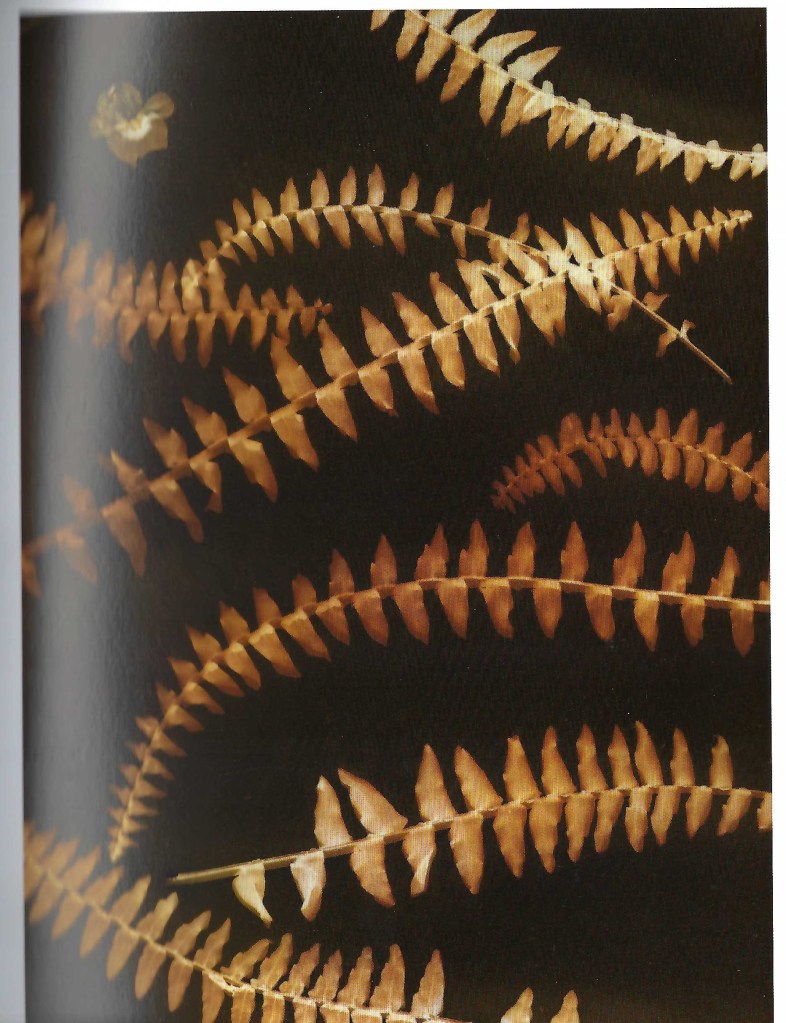
Fig. 4 Lumen Print (2013)
Reflection
The techniques explored in this post have helped me understand a variety of techniques that can be used for this particular assignment, including macro photography, inverting photographs and experimenting with light, colour and its subjects. Abstract photography is unique and results in a never-ending list of outcomes, especially if the subject is constantly moving, such as oil bubbles in the water. Despite having total control of the light it doesn’t mean that you are in control of everything which I like. Lumen prints could be similar if you measure the exact amount of time the paper is exposed for, but the subjects used to make the composition are most likely to be different, even by a millimetre.
This has me thinking about film photography and how you have a restricted amount of time to get the desired image. Over or underexposure could make or break an image, influencing the mood or details of the subject. One second out, or one wrong move and you could’ve missed the ‘perfect’ composition. Light levels are shown on a negative via the translucent and opaque areas; the lighter areas are caused by denser objects that have been less exposed to light, in comparison to the darker areas such as a clear sky or another strong light source.
For my Languages of light assignment, I may explore the use of a light pad or lightbox to illuminate subjects from the bottom, how lens filters or gels could affect the overall image and how to create digital ‘negatives. Further research is needed to make this decision.
References
Adaptalux, 2019. Oil & Water Bubble Photography & Videography Tips | Macro Photography Tutorial. Available at: https://www.youtube.com/watch?v=mixLIIQ5N00&t=678s [Accessed 18 May 2021].
Adaptalux, 2020. How to shoot beautiful abstract photography using paper!. Available at: https://www.youtube.com/watch?v=2oM41u3JyCc&t=335s [Accessed 18 May 2021].
Bendandi, L., Minniti, S., Gómez, F., Lungarella, G. and Antonini, M., 2015. Experimental photography. 1st ed. London: Thames & Hudson, pp.34-35.
List of images
Figure. 1 Adaptalux. (2019) Oil and Bubble videograph by Adaptalux [YouTube, screenshot] Available at: https://www.youtube.com/watch?v=mixLIIQ5N00&t=678s [Accessed 18 May 2021].
Figure. 2 Adaptalux. (2020) Abstract photography with paper by Adaptalux [YouTube, screenshot] Available at: https://www.youtube.com/watch?v=2oM41u3JyCc&t=335s [Accessed 18 May 2021].
Figure. 3 Gómez, F. (2013) Lumen Prints [Scanned page] In: Bendandi, L., Minniti, S., Gómez, F., Lungarella, G. and Antonini, M. (2015) Experimental photography. 1st ed. London: Thames & Hudson, p.34.
Figure. 4 Gómez, F. (2013) Lumen Print [image] In: Bendandi, L., Minniti, S., Gómez, F., Lungarella, G. and Antonini, M. (2015) Experimental photography. 1st ed. London: Thames & Hudson, p.35.
Assignment 4 – Initial Ideas (Mind-Maps)
Assignment 4, Reflection on assignments, Thoughts & IdeasSummary
In this post I
– Included the brief for this assignment and
– Listed my initial thoughts, reasonings for choosing a specific path
– Before attaching two mind-maps with various ideas/concepts
– Then listing the pros and cons for each technical approach
– With a short reflection on my ideas and how I will come to decide what I want to do for Languages of Light.
Brief
‘Revisit one of the exercises on daylight, artificial light or controlled light from Part Four (Ex 4.1, Ex 4.2 or Ex 4.3) and develop it into a formal assignment submission. The submission requirement for this assignment is a set of between six and ten high-quality photographic prints‘ (Bloomfield, 2018).
Initial thoughts
As I’ve used natural light a lot for personal work and past assignments, I feel it’s necessary to push myself out of my comfort zone and explore either artificial or controlled light for this particular assignment. Both 4.2 and 4.3 were interesting to do as well as the analysis of the results and what they taught me, so choosing the exercise I would like to revisit may take a little longer than anticipated.
I’ve gathered together multiple ideas for each technical approach and formulated two individual mind-maps, allowing me to figure out the subjects or projects that stand out to me most over the next few days. I plan to sit with these ideas for 2-3 days, see which ones come back to mind most and begin researching the different techniques or approaches, before exploring the chosen project in more detail.
Mindmaps
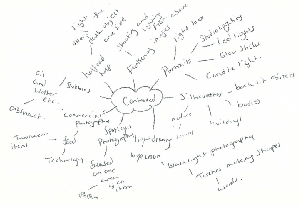
Fig. 1 Controlled (2021) 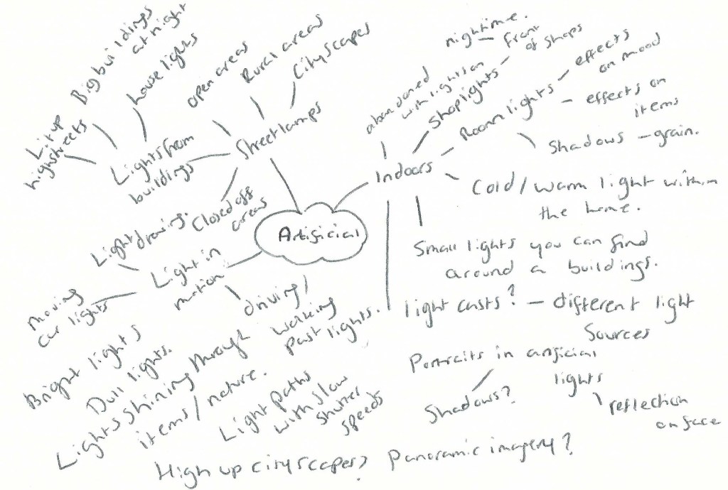
Fig. 2 Artificial (2021)
Artificial light
– Shooting with artificial light will remove the option for me to control how the light falls, forcing me to capture it in an interesting way from what is available.
– Working outside would be more realistic currently, given the slow ease of lockdown restrictions.
– If I didn’t want to go outside, there is always the possibility to explore artificial light within the home e.g. lamps, lights from house windows, lights from technology etc.
– Shooting during the night would mean fewer people around so wouldn’t have to worry about social distancing and could capture shop windows/high streets in a way we may not see usually. Ghosttown-esque?
– Could experiment with light paths by capturing images from a moving vehicle or by moving around the light source. Abstract?
– Capturing cityscapes and working at night isn’t something I usually do so would be interesting to explore.
– Portraits would be interesting to take at night, as I’ve never done that before and could result in some really interesting shots depending on location and light source.
– It’s nearing summertime so would have to work much later than expected, which isn’t as ideal.
– May have to travel to photograph cityscapes or highstreets, so would have to plan transport.
– Lighting within the home is possible, but more restrictive and not pushing myself further.
Controlled light
– I have control of the light and how it falls on the subject, which could result in some really interesting shots.
– Would push me far out of my comfort zone, having avoided studio lighting for many years.
– Trying out various light sources would be interesting and provide me with much more knowledge than before.
– Could work within the home which is ideal for social distancing purposes and removing the need to travel.
– Silhouette work would be interesting to explore, as they may have the ability to be much more defined than if I were to shoot using a duller artificial light.
– I could make a set-up within the home or garden, which is easier to do than setting up outside with no electrical sources etc.
– Lightbox photography is something I’ve explored briefly before and could link in with silhouette photography, combining multiple ideas.
– If I wanted to use a model for this project, I would have to consider social distancing still if the set-up was indoors.
– Space would be more restrictive working within the home which may not be ideal, depending on what I decide to shoot.
– May have to invest in more lights for this project, as I have very limited options in my pre-existing kit.
Reflection
There are pros and cons for each exercise, ranging from lack of kit to the planning of travel and considering the time of day. Despite all of this, there are some strong ideas that I’d be more than happy to explore and willing to take the time to gather equipment or plan. Silhouette photography, the use of a lightbox and creating abstract images are currently the strongest contenders for me. If I wanted to use a model for this assignment and work around social distancing, I could either model myself with a tripod set up or ask a family member. Sourcing a variety of lights is also possible with a little bit of research and asking around, but still doable.
Any struggles that may occur during this assignment are making me more excited to explore and shoot for Languages of light, as it will push me to work with what I’ve got, find a way around the difficult stages and grow from it.
Still undecided on whether to use artificial or controlled light, but I have plenty of ideas to think about and research in the meantime. Looking forward to this assignment and what results will come from it.
References
Bloomfield, R., 2018. Photography 1: Expressing your Vision. 4th ed. [pdf] Barnsley: OCA, p. 97. Available at: https://www.oca-student.com/course/photography-1-expressing-your-vision [Accessed 18 May 2021].
List of images
Figure. 1 Powell, L (2021) Collection [Ballpoint pen on paper] In possession of: Lauren Powell: Eastleigh.
Figure. 2 Powell, L (2021) Artificial [Ballpoint pen on paper] In possession of: Lauren Powell: Eastleigh.
