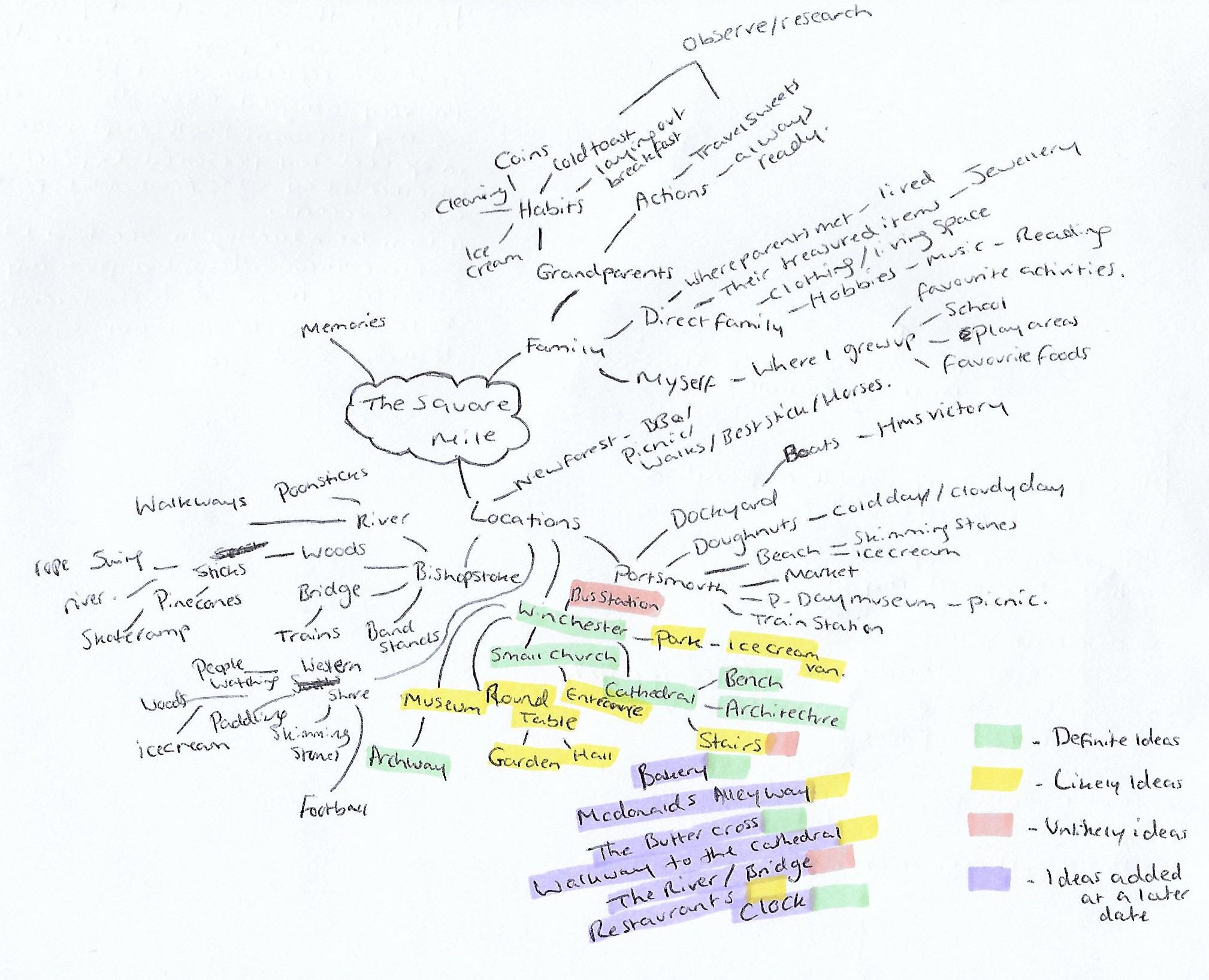
Summary:
For the final exercise in this project I have;
– Documented my initial thoughts about the exercise.
– Stated how I was out of my comfort zone and the difficulties faced while using the grid, alongside the knowledge gained from it.
– Explored my process for shoot and my lack of a fixed plan to encourage a natural exploration, as well as the steps I took to select my final images.
– For example, I cut out the images and arranged them in a grid to find the best combination.
– Provided a PDF version of the contact sheet for this task, along with the final images for the Gestalt and the technical settings for each.
– Reflected on my recurring theme of city life and the use of different signs, in addition to the visual elements documented throughout, such as colour, texture and signs of life.
Brief:
‘Take a good number of shots, composing each shot within a single section of the viewfinder grid. Don’t bother about the rest of the frame! Use any combination of grid section, subject and viewpoint you choose.
When you review the shots evaluate the whole frame not just the part you’ve composed. Looking at a frame calmly and without hurry may eventually reveal a visual coalescence, a ‘gestalt’.
Gestalt: an organised whole perceived as more than a sum of its parts. (Google Search using the define: operator)
Select six or eight images that you feel work both individually and as a set and present them as a single composite image. Add to your learning log together with technical information such as camera settings and two or three lines containing your thoughts and observations.‘ (Bloomfield, 2018)
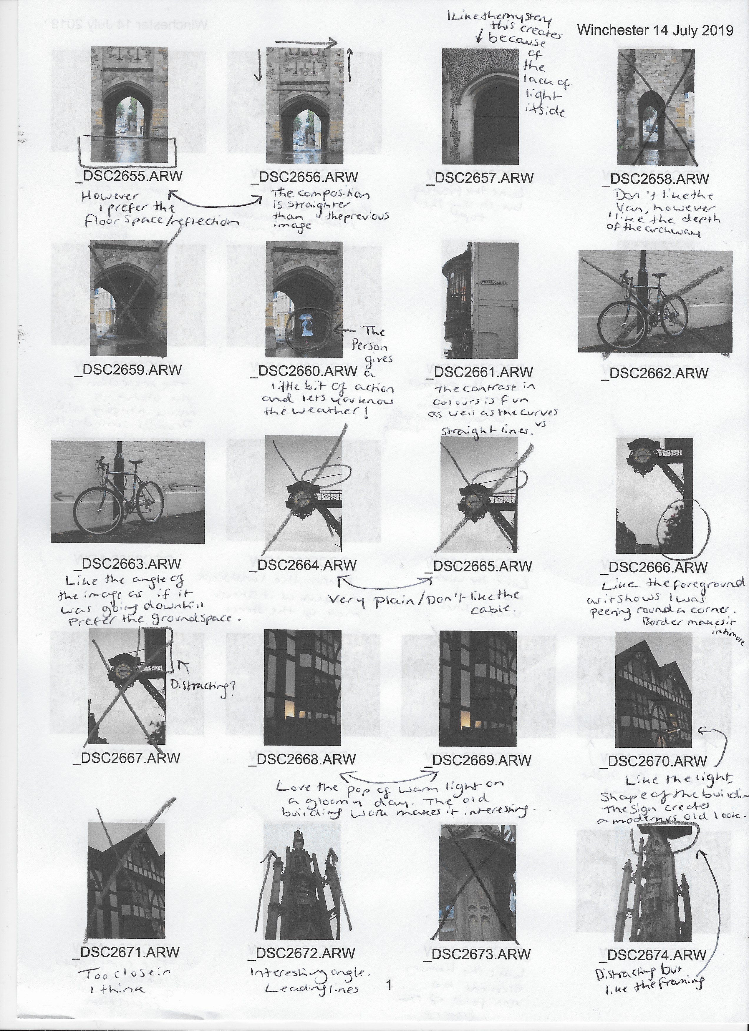
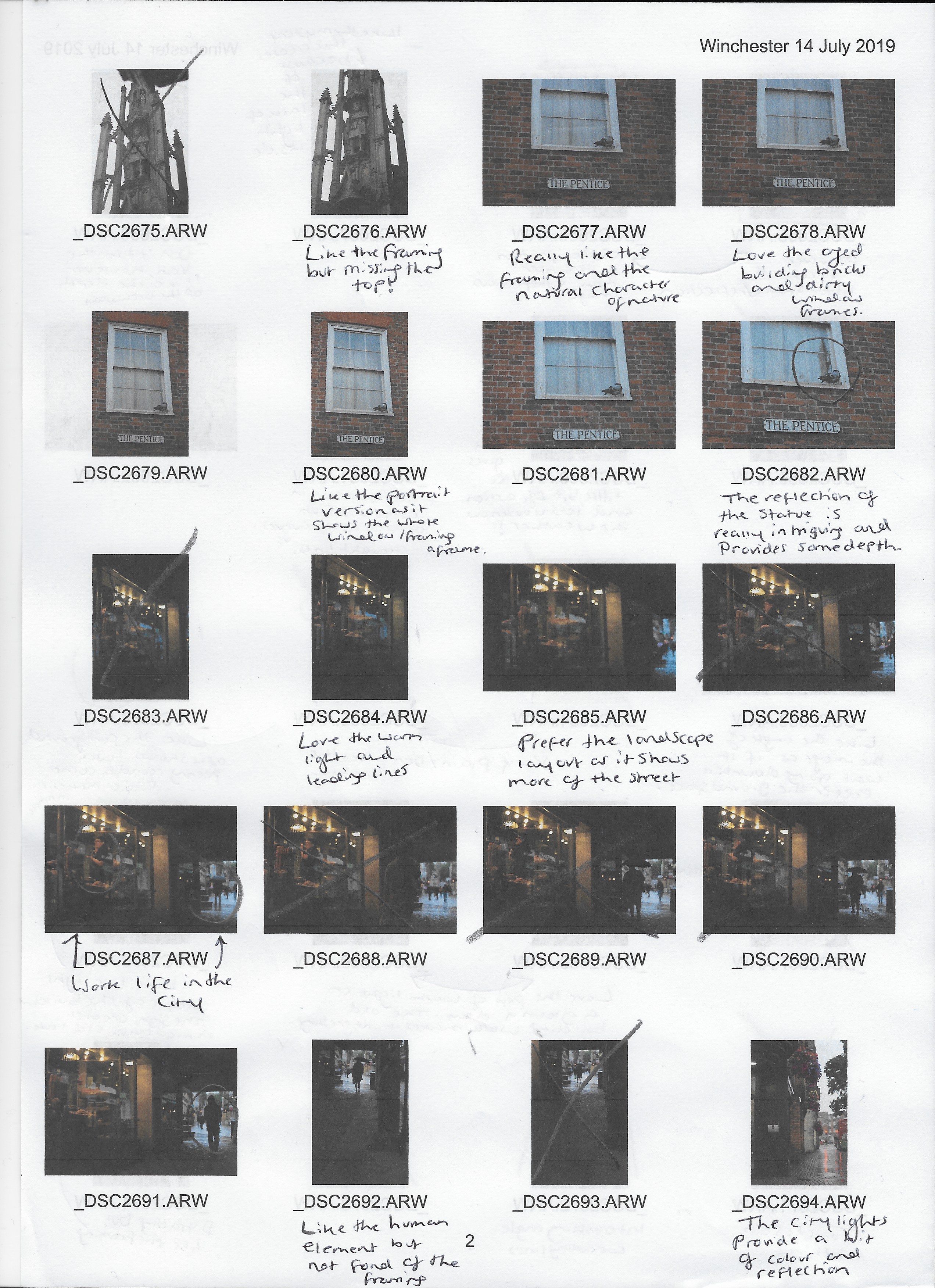
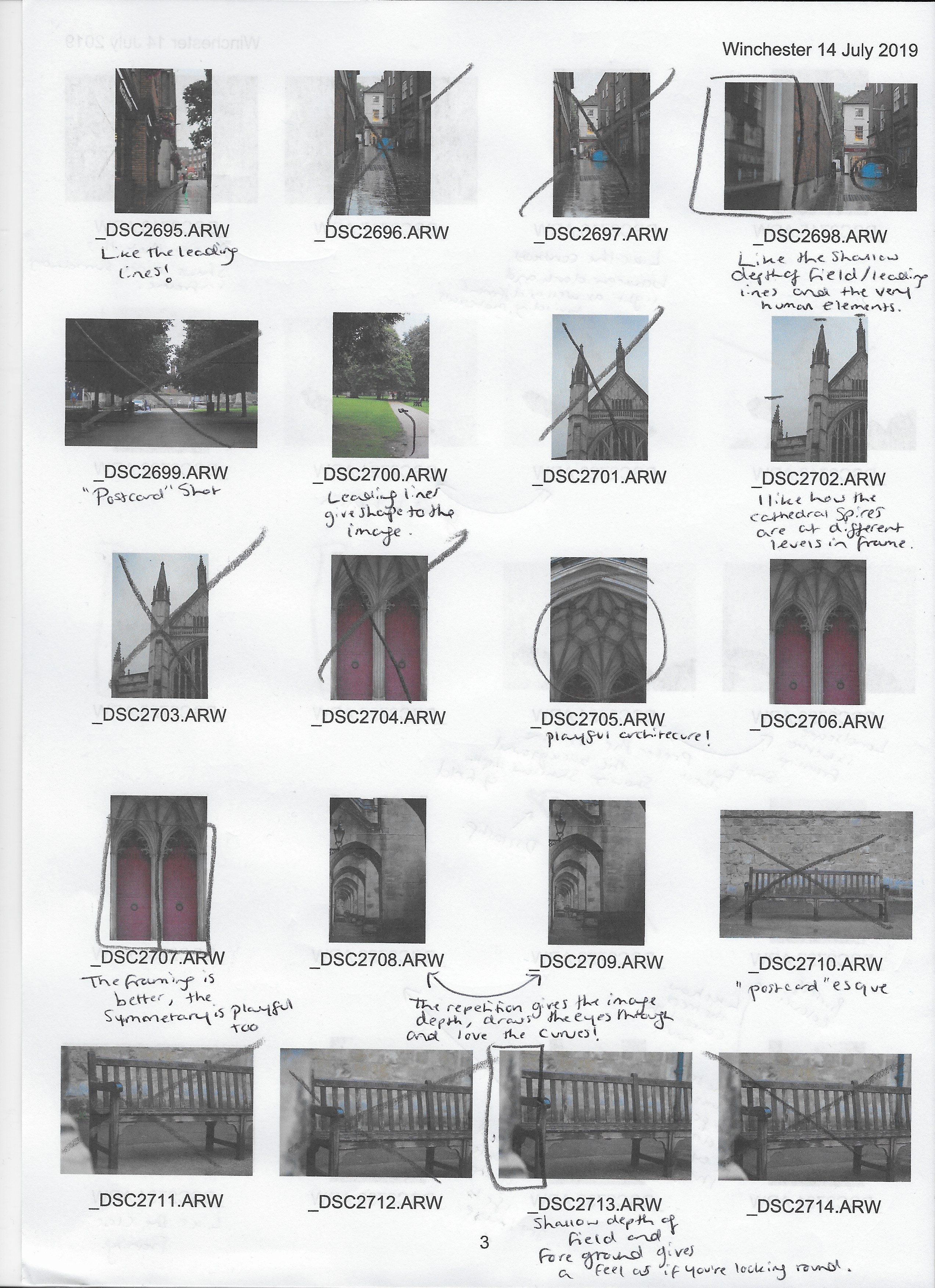
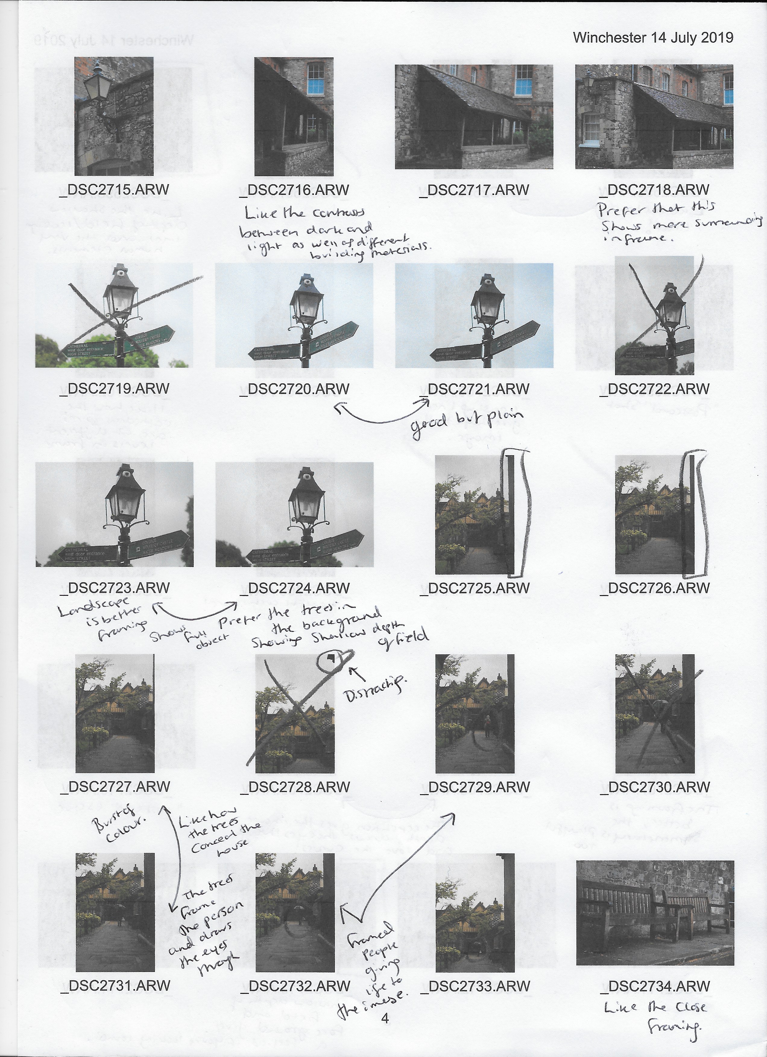
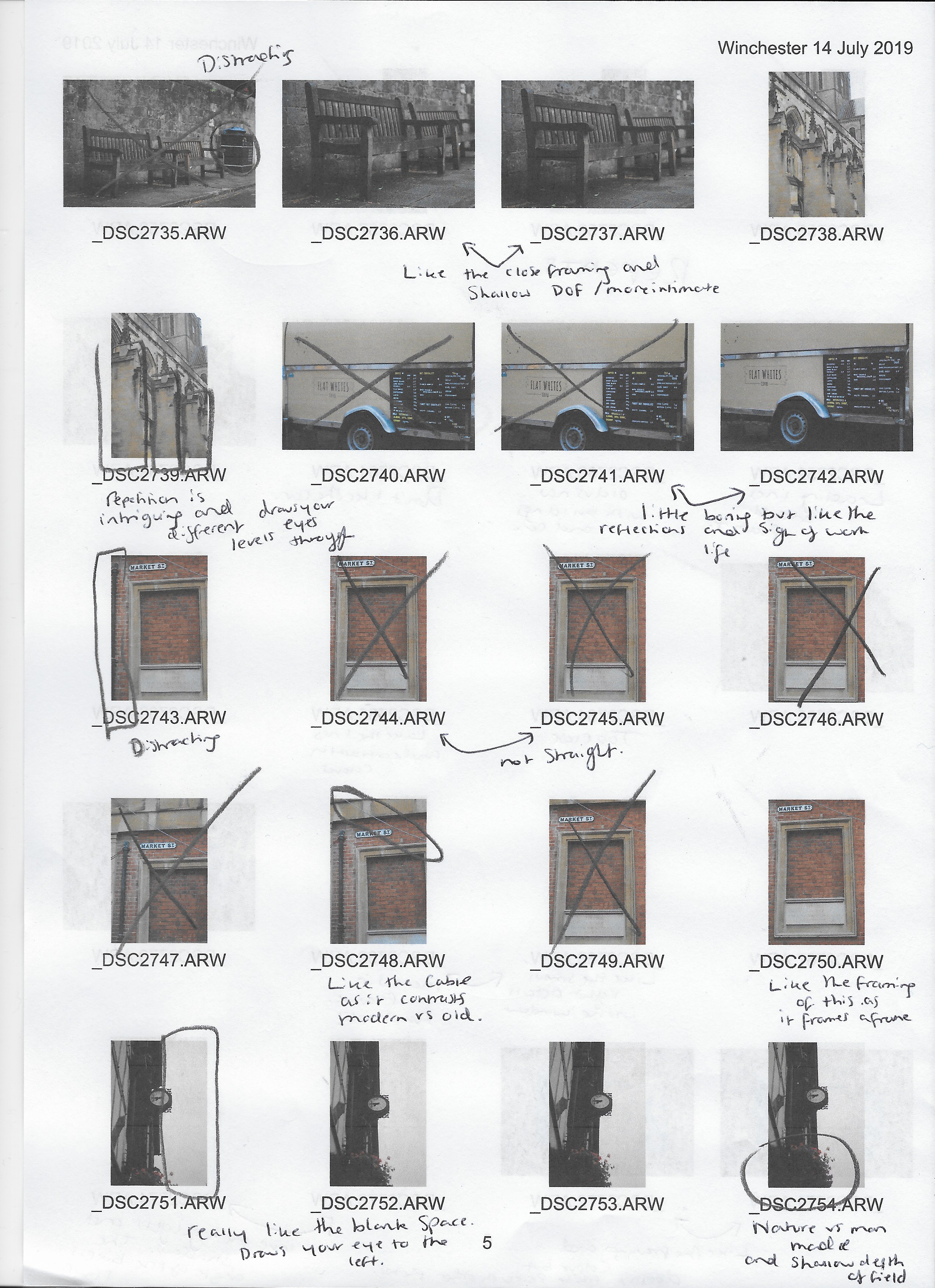
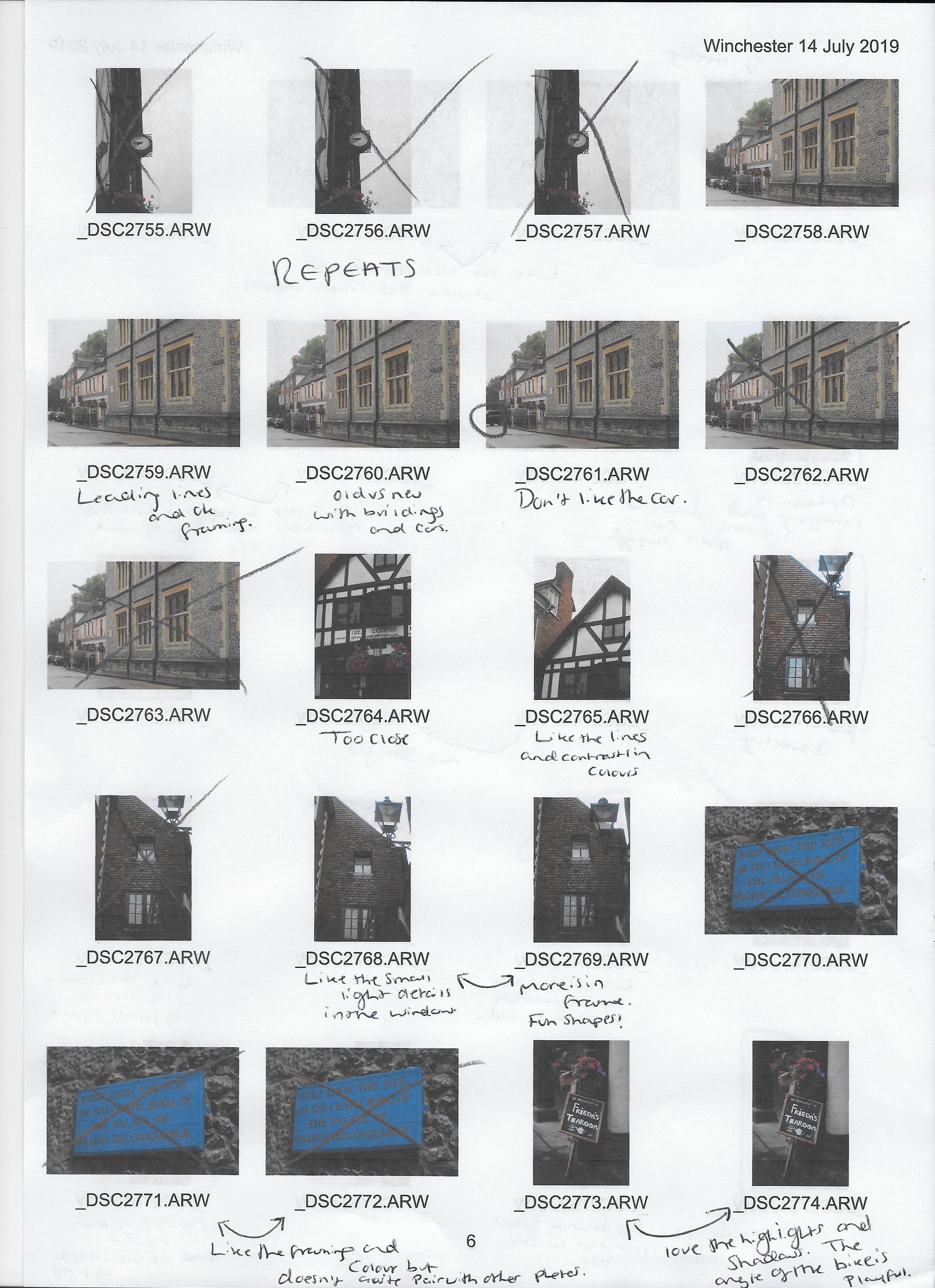
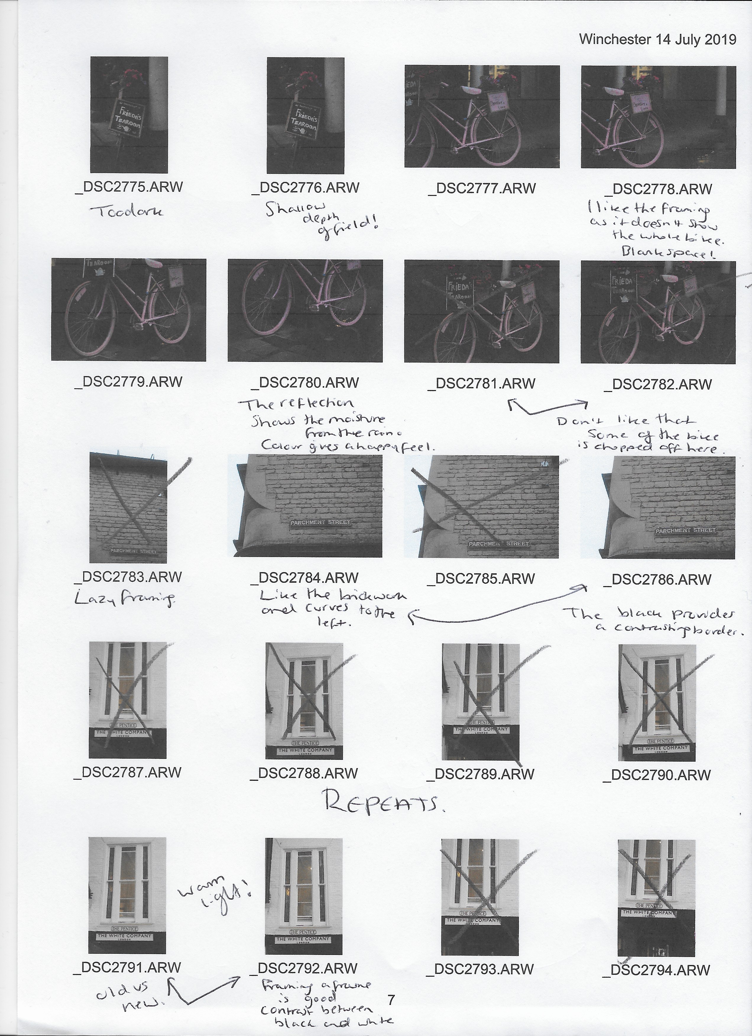
Much like the rest of the exercises, I was challenged when it came to this brief because I rarely use the grid feature on my camera. However, this pushed me out of a comfort zone while shooting and allowed me to think about what was in the particular section.
Capturing these images in a busy city made it rather difficult to ignore the rest of the frame while picking out one area of the grid, mainly due to the fact I have trained myself to be aware of everything that is in the viewfinder to avoid any unwanted objects. Eventually, however, I forced myself to keep my eye on the area I was shooting and ignore the hustle and bustle going on around it which provided me with some really good shots.
In terms of what I wanted to take photographs of, there wasn’t a clear plan, forming a more natural process as I could explore and find things to capture, instead of it being regimented and restrictive. The only plan I had set in place was to start at the top of the city and work my way down.
I used Adobe Bridge to scan through all of the photos and select the best, before creating a contact sheet of 116 images.
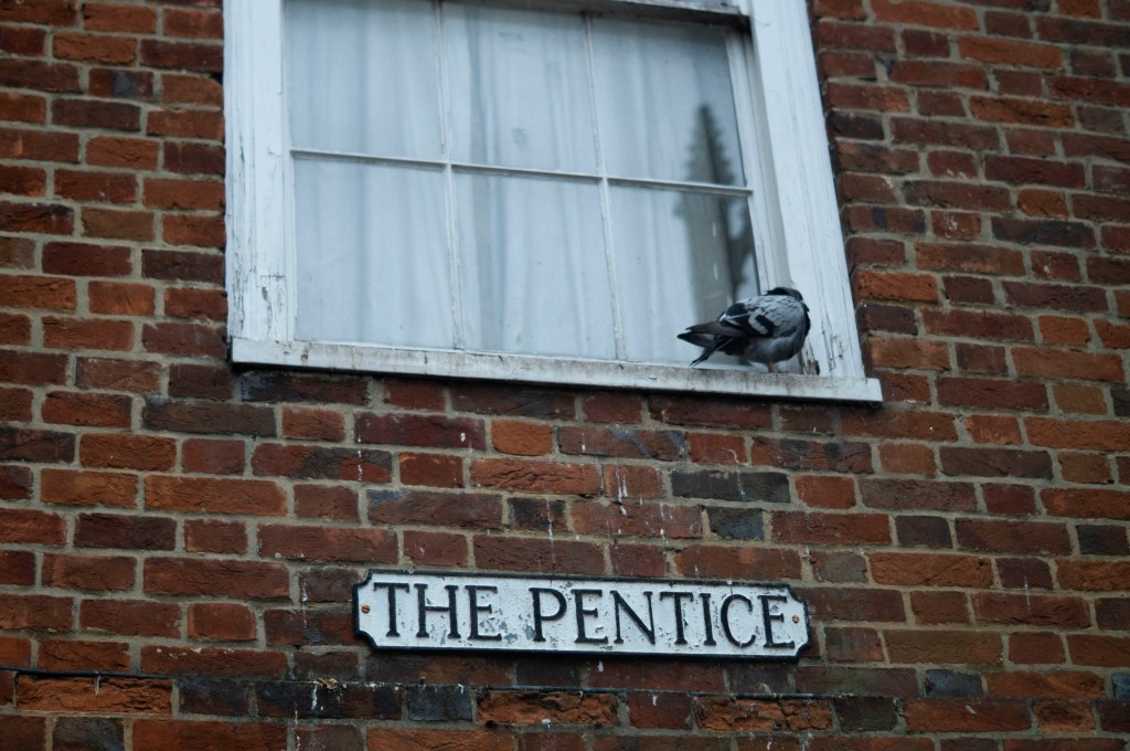
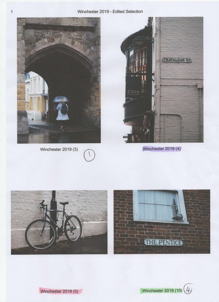
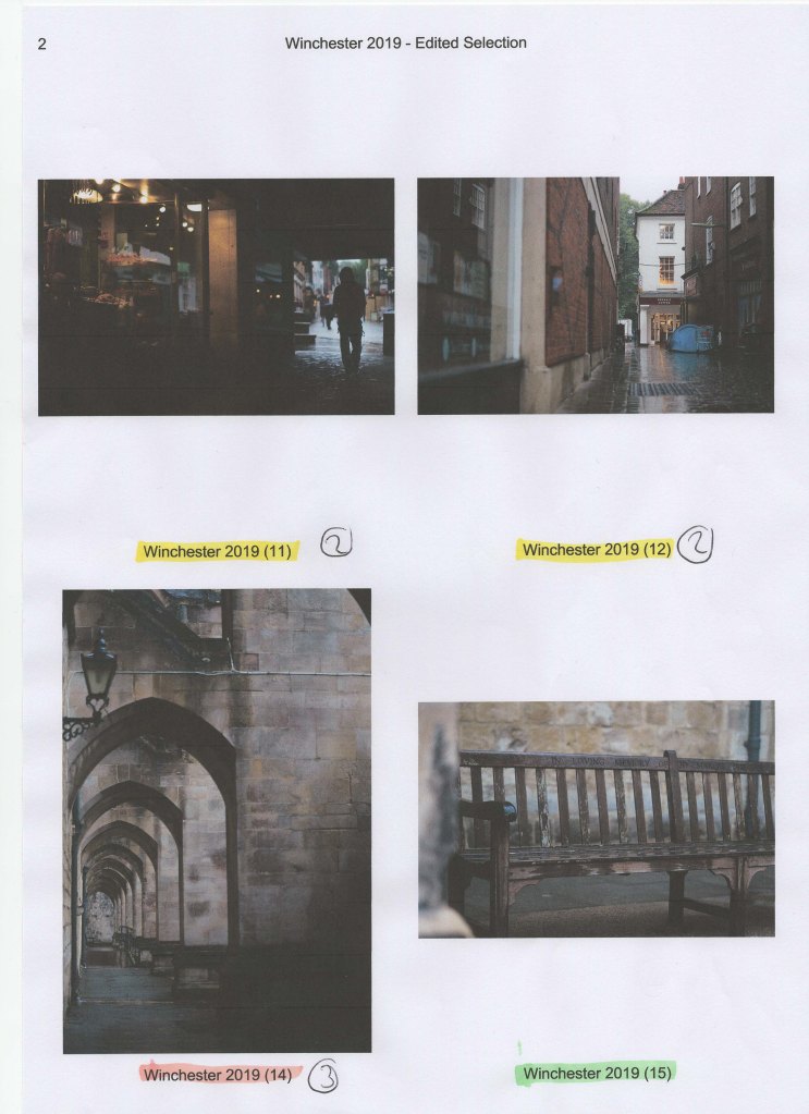
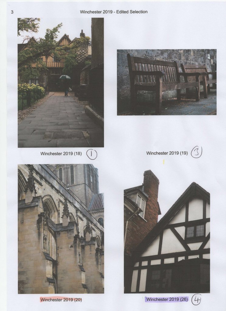
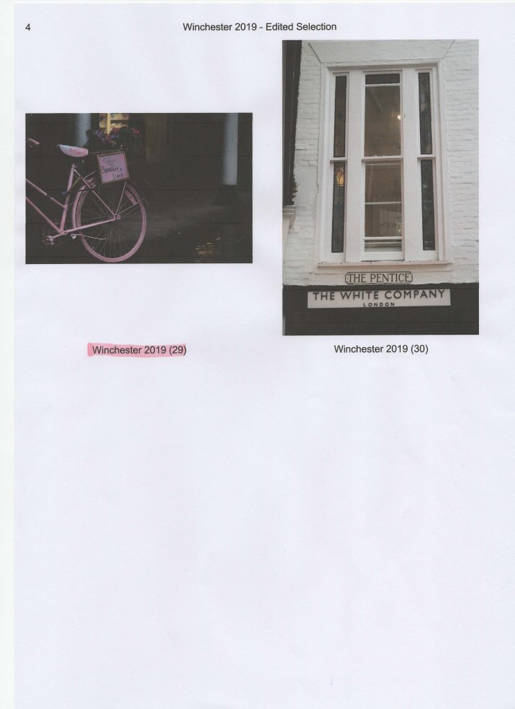
After reviewing the contact sheets once more, I printed a selection of images that featured both city life AND text. This decision was made due to the fact a variety of different signs were placed around the city, therefore it seemed like the most logical subject to create a complementary set from. The selection of images were then cut up and arranged in a grid of 9 to see which layout worked the best. The final arrangement can be seen below.
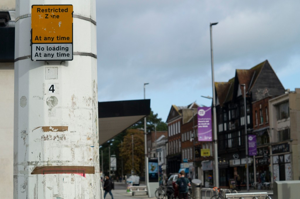
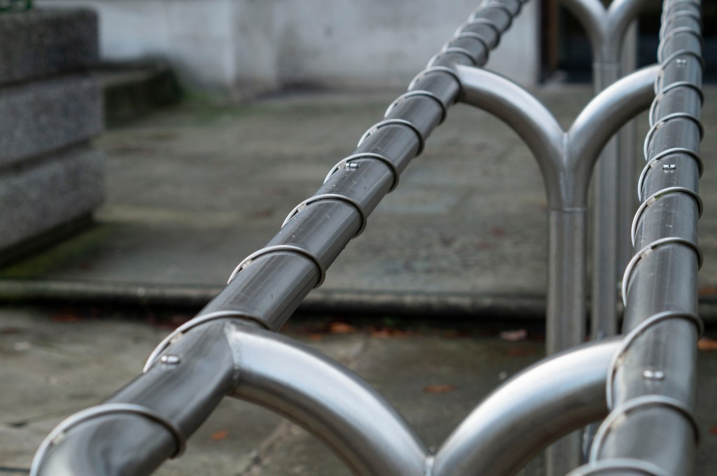
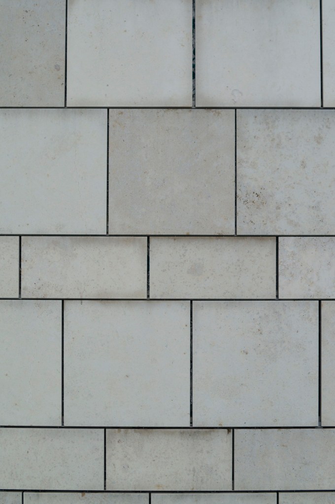
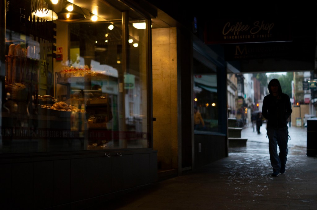
Fig. 1. Frame 2019 85 (2019)
1/2000 sec ; f/5 ; ISO 400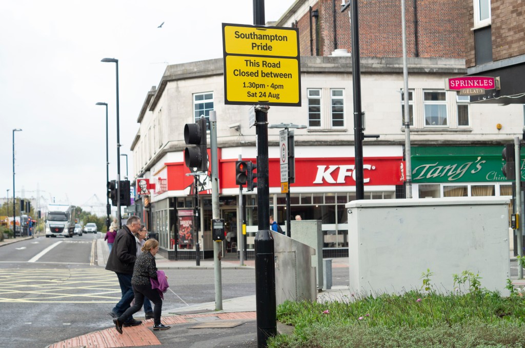
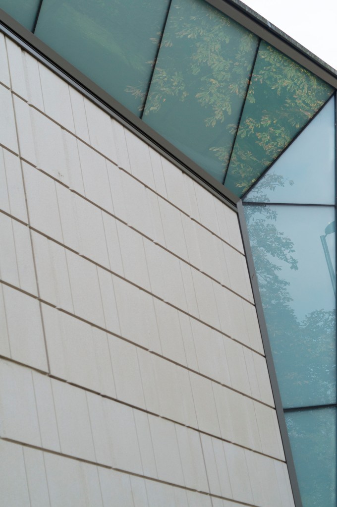
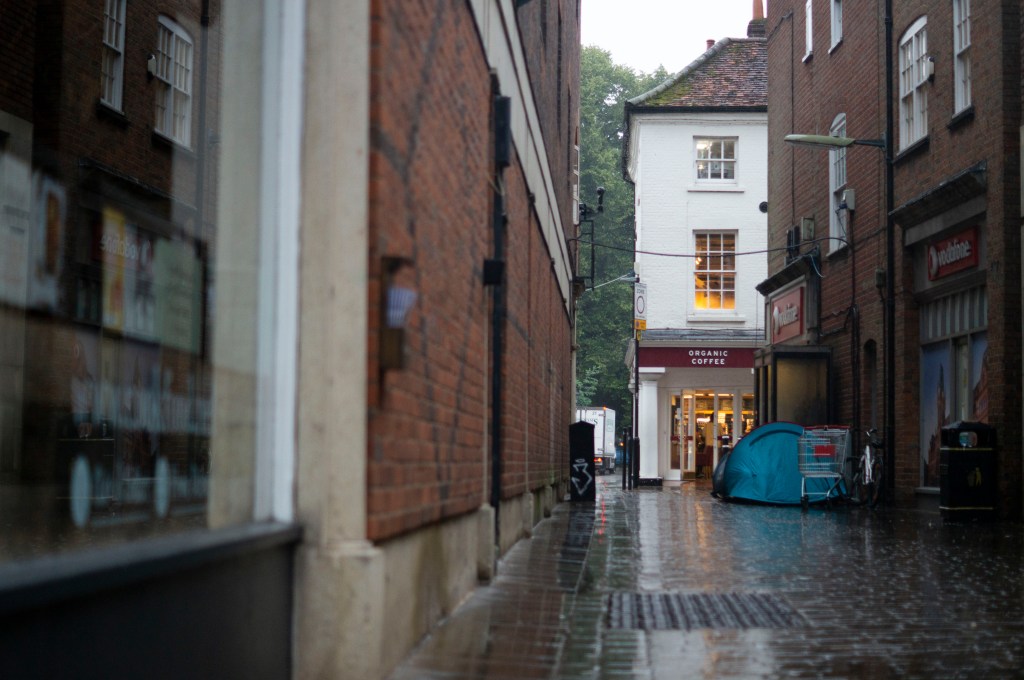
Fig. 2. Frame 2019 149 (2019)
1/500 sec ; f/5 ; ISO 400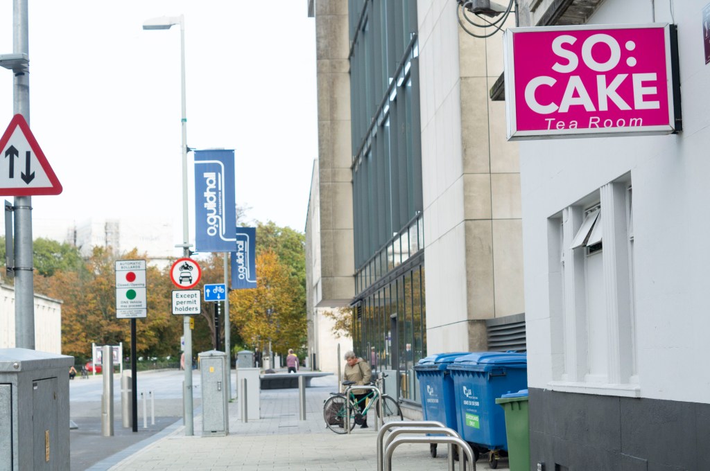
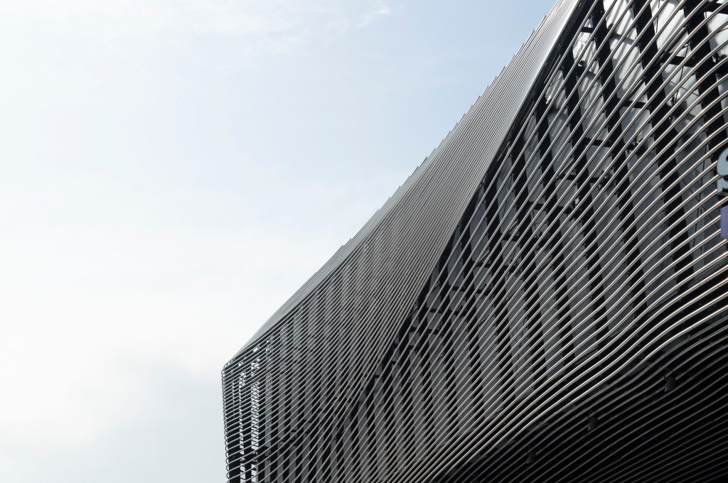
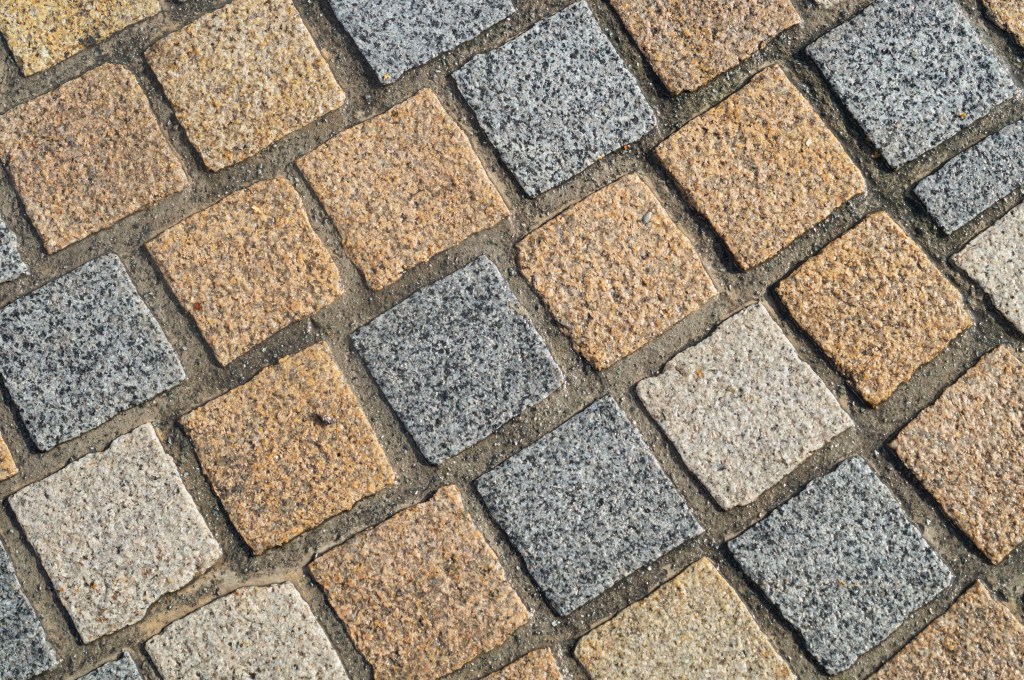
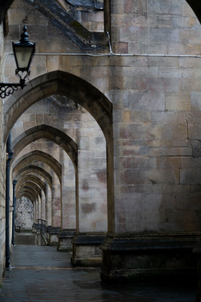
Fig. 3. Frame 2019 49 (2019)
1/500 sec ; f/5 ; ISO 400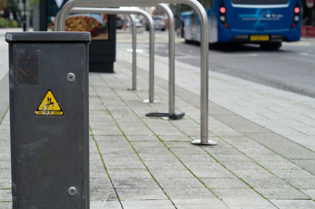
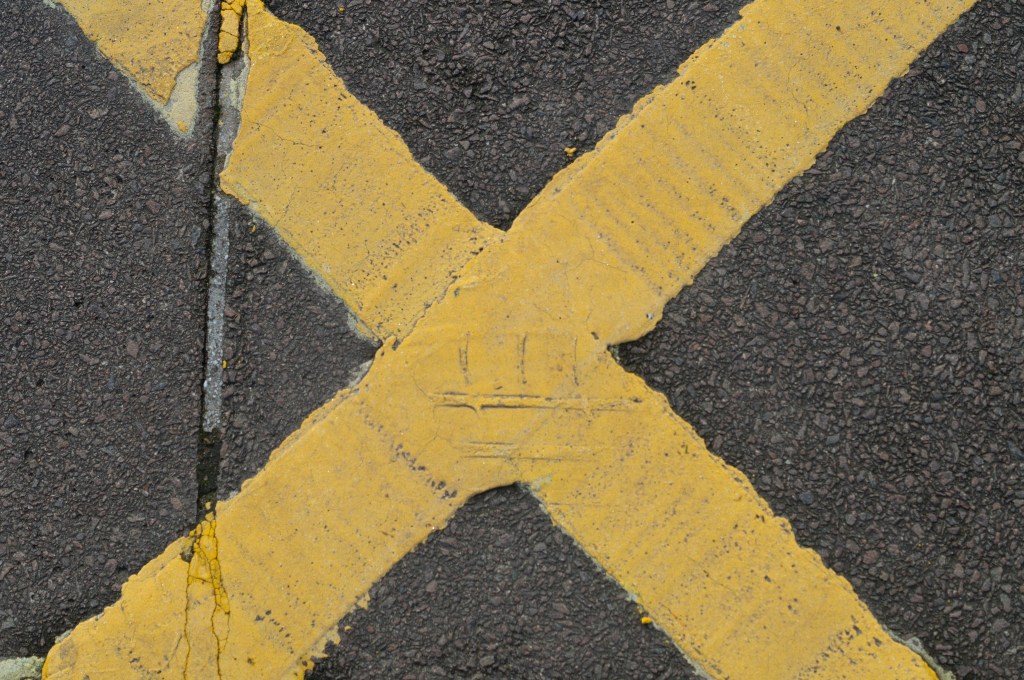
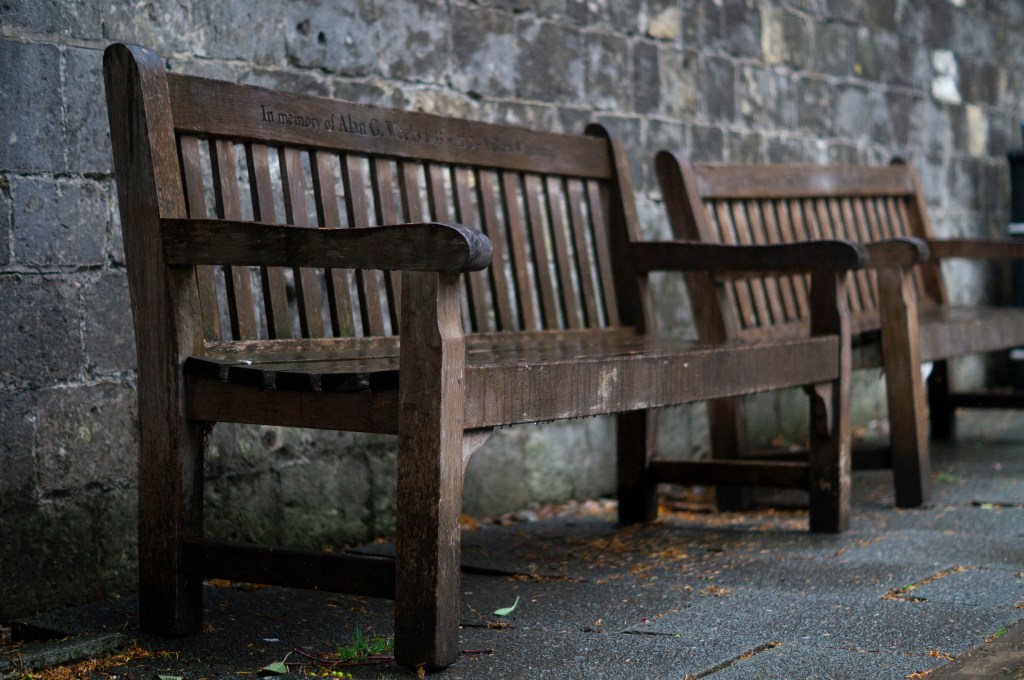
Fig. 4. Frame 2019 115 (2019)
1/500 sec ; f/5 ; ISO 400
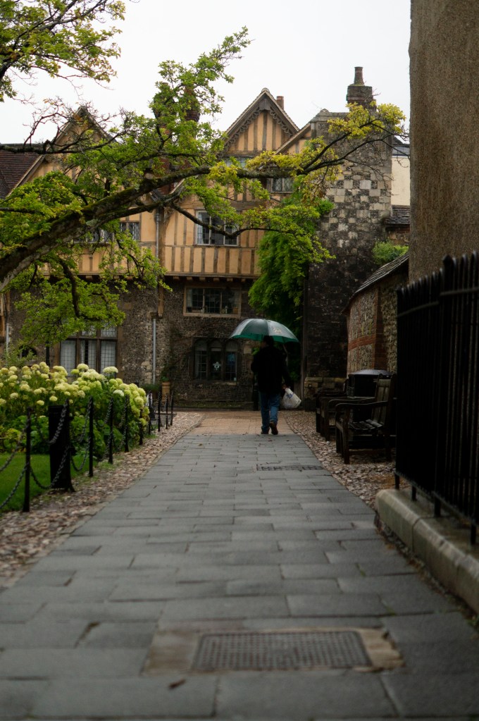
Fig. 5. Frame 2019 39 (2019)
1/1250 sec ; f/5 ; ISO 400
Fig. 6. Frame 2019 289 (2019)
1/400 sec ; f/5 ; ISO 400
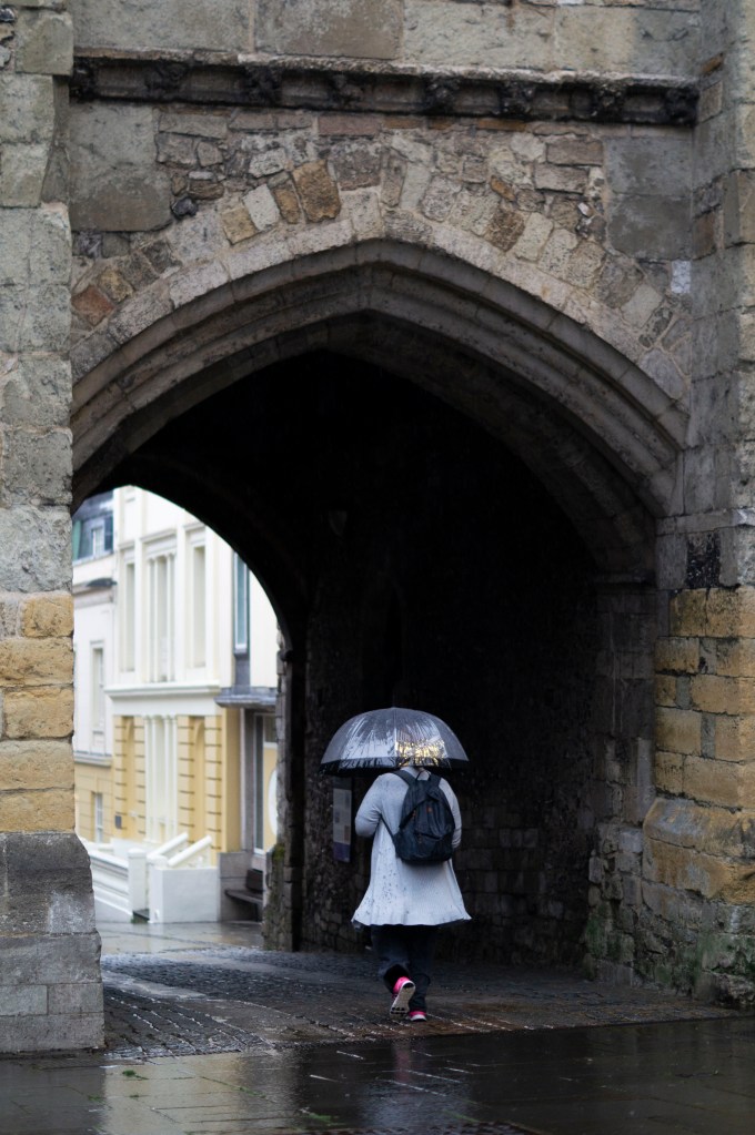
Fig. 7. Frame 2019 227 (2019)
1/640 sec ; f/5 ; ISO 400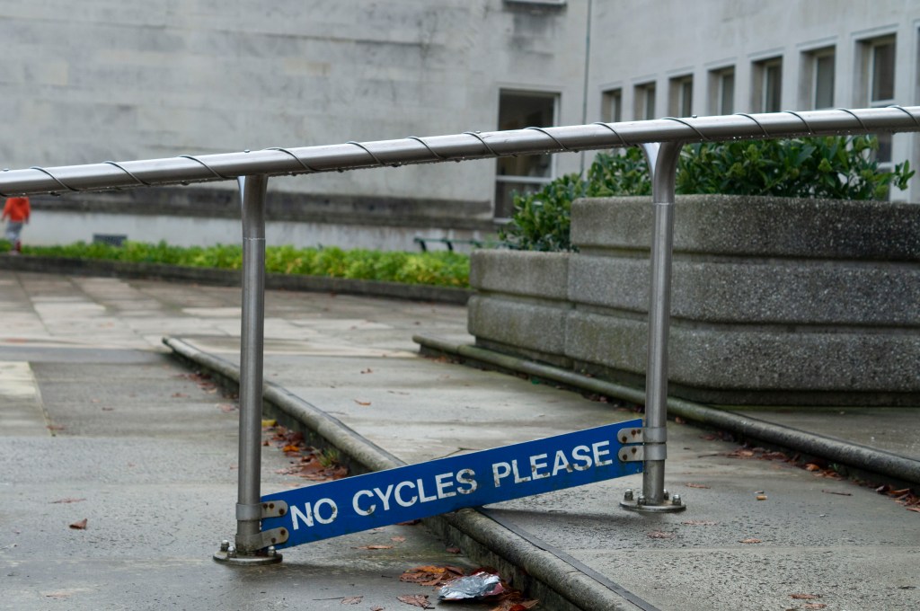
Fig. 8. Frame 2019 28 (2019)
1/640 sec ; f/4.5 ; ISO 400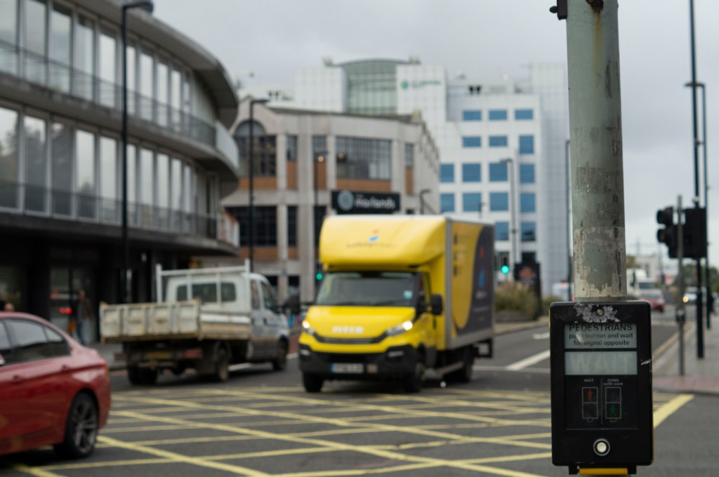
Fig. 9. Frame 2019 165 (2019)
1/800 sec ; f/5 ; ISO 400
Reflection:
As briefly mentioned above, a recurring theme I found throughout my shoot was the use of signs, whether that was to provide a warning, an instruction, a direction or a name. Therefore I wanted to form a set of images that explored all of the different kinds found through the city.
The tones within the imagery are very neutral, with the occasional burst of colour to bring life to the frame which is pleasing to the eye, it’s not too much, nor is it too little that the images become flat.
Each image shows the grime and age of the city, caused by footfall, human littering and natural causes, it doesn’t feel or look fresh which gives character.
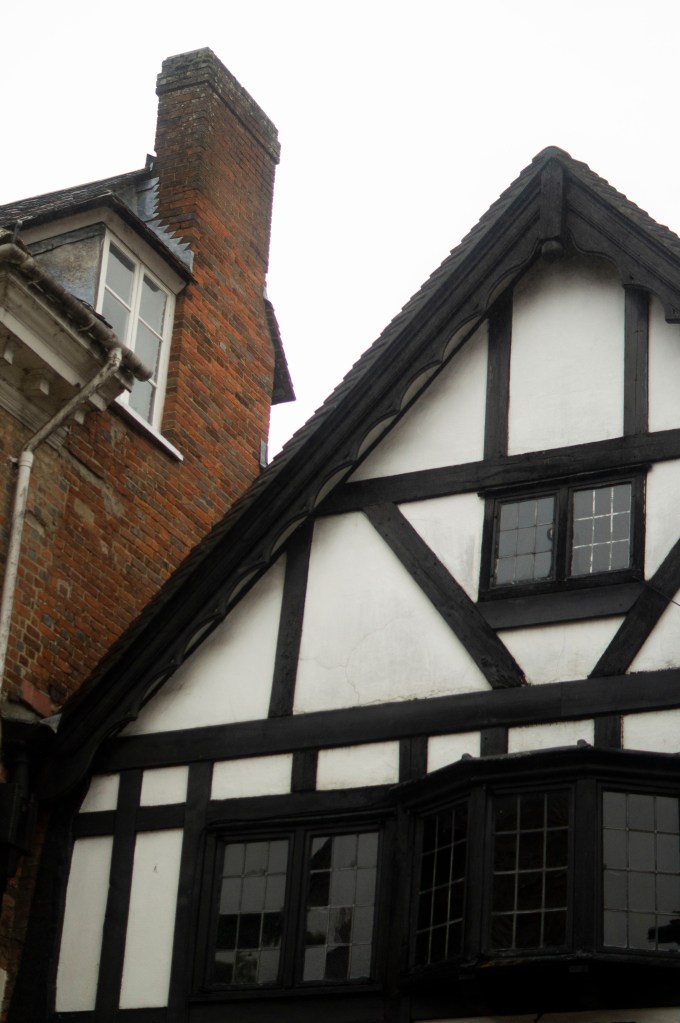
City life is another constant factor, showing transportation of all forms, buildings of all kinds, the work-life of various sorts and the ongoing business of the place.
While the gestalt isn’t the most appealing or prettiest to look at, it is a cohesive set and captures the life and the effects of it which is what photography is about. Capturing what is there and how it changes, in a short second.
References :
Bloomfield, R., 2018. Photography 1: Expressing your Vision. 4th ed. [pdf] Barnsley: OCA, p.29. Available at: https://www.oca-student.com/course/photography-1-expressing-your-vision [Accessed 12 November 2019].
Powell, L., 2019. frame-contact-sheet [pdf] In possession of: Lauren Powell: Eastleigh.
List of images:
Figure. 1. Powell, L. (2019) Frame 2019 85 [image] In possession of: Lauren Powell: Eastleigh.
Figure. 2. Powell, L. (2019) Frame 2019 149 [image] In possession of: Lauren Powell: Eastleigh.
Figure. 3. Powell, L. (2019) Frame 2019 49 [image] In possession of: Lauren Powell: Eastleigh.
Figure. 4. Powell, L. (2019) Frame 2019 115 [image] In possession of: Lauren Powell: Eastleigh.
Figure. 5. Powell, L. (2019) Frame 2019 39 [image] In possession of: Lauren Powell: Eastleigh.
Figure. 6. Powell, L. (2019) Frame 2019 289 [image] In possession of: Lauren Powell: Eastleigh.
Figure. 7. Powell, L. (2019) Frame 2019 227 [image] In possession of: Lauren Powell: Eastleigh.
Figure. 8. Powell, L. (2019) Frame 2019 28 [image] In possession of: Lauren Powell: Eastleigh.
Figure. 9. Powell, L. (2019) Frame 2019 165 [image] In possession of: Lauren Powell: Eastleigh.