– Listed my initial thoughts, reasonings for choosing a specific path
– Before attaching two mind-maps with various ideas/concepts
– Then listing the pros and cons for each technical approach
– With a short reflection on my ideas and how I will come to decide what I want to do for Languages of Light.
Brief
‘Revisit one of the exercises on daylight, artificial light or controlled light from Part Four (Ex4.1, Ex 4.2 or Ex 4.3) and develop it into a formal assignment submission. The submissionrequirement for this assignment is a set of between six and ten high-quality photographicprints‘ (Bloomfield, 2018).
Initial thoughts
As I’ve used natural light a lot for personal work and past assignments, I feel it’s necessary to push myself out of my comfort zone and explore either artificial or controlled light for this particular assignment. Both 4.2 and 4.3 were interesting to do as well as the analysis of the results and what they taught me, so choosing the exercise I would like to revisit may take a little longer than anticipated.
I’ve gathered together multiple ideas for each technical approach and formulated two individual mind-maps, allowing me to figure out the subjects or projects that stand out to me most over the next few days. I plan to sit with these ideas for 2-3 days, see which ones come back to mind most and begin researching the different techniques or approaches, before exploring the chosen project in more detail.
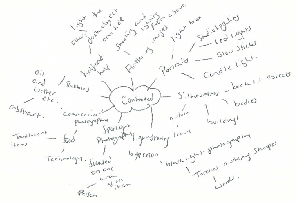
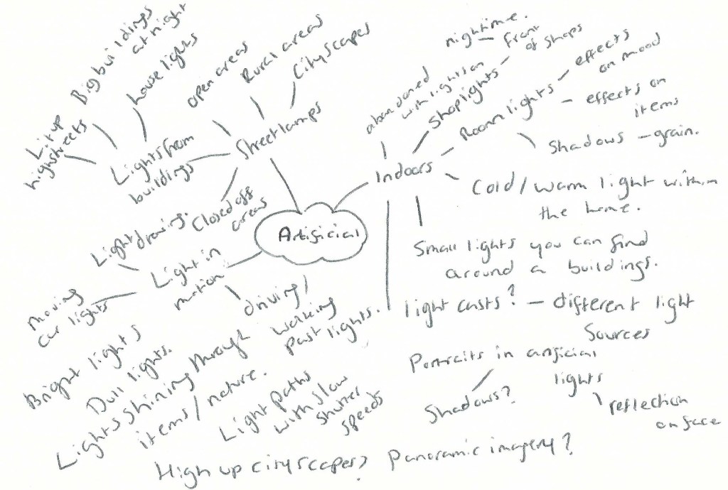
Mindmaps
Fig. 1 Controlled (2021)
Fig. 2 Artificial (2021)
Artificial light
– Shooting with artificial light will remove the option for me to control how the light falls, forcing me to capture it in an interesting way from what is available.
– Working outside would be more realistic currently, given the slow ease of lockdown restrictions.
– If I didn’t want to go outside, there is always the possibility to explore artificial light within the home e.g. lamps, lights from house windows, lights from technology etc.
– Shooting during the night would mean fewer people around so wouldn’t have to worry about social distancing and could capture shop windows/high streets in a way we may not see usually. Ghosttown-esque?
– Could experiment with light paths by capturing images from a moving vehicle or by moving around the light source. Abstract?
– Capturing cityscapes and working at night isn’t something I usually do so would be interesting to explore.
– Portraits would be interesting to take at night, as I’ve never done that before and could result in some really interesting shots depending on location and light source.
– It’s nearing summertime so would have to work much later than expected, which isn’t as ideal.
– May have to travel to photograph cityscapes or highstreets, so would have to plan transport.
– Lighting within the home is possible, but more restrictive and not pushing myself further.
Controlled light
– I have control of the light and how it falls on the subject, which could result in some really interesting shots.
– Would push me far out of my comfort zone, having avoided studio lighting for many years.
– Trying out various light sources would be interesting and provide me with much more knowledge than before.
– Could work within the home which is ideal for social distancing purposes and removing the need to travel.
– Silhouette work would be interesting to explore, as they may have the ability to be much more defined than if I were to shoot using a duller artificial light.
– I could make a set-up within the home or garden, which is easier to do than setting up outside with no electrical sources etc.
– Lightbox photography is something I’ve explored briefly before and could link in with silhouette photography, combining multiple ideas.
– If I wanted to use a model for this project, I would have to consider social distancing still if the set-up was indoors.
– Space would be more restrictive working within the home which may not be ideal, depending on what I decide to shoot.
– May have to invest in more lights for this project, as I have very limited options in my pre-existing kit.
Reflection
There are pros and cons for each exercise, ranging from lack of kit to the planning of travel and considering the time of day. Despite all of this, there are some strong ideas that I’d be more than happy to explore and willing to take the time to gather equipment or plan. Silhouette photography, the use of a lightbox and creating abstract images are currently the strongest contenders for me. If I wanted to use a model for this assignment and work around social distancing, I could either model myself with a tripod set up or ask a family member. Sourcing a variety of lights is also possible with a little bit of research and asking around, but still doable.
Any struggles that may occur during this assignment are making me more excited to explore and shoot for Languages of light, as it will push me to work with what I’ve got, find a way around the difficult stages and grow from it.
Still undecided on whether to use artificial or controlled light, but I have plenty of ideas to think about and research in the meantime. Looking forward to this assignment and what results will come from it.
– Provided the brief for this exercise, – As well as writing a short research point about Ernst Haas and his photograph Geranium, USA 1961. – Inserted a screenshot from google, having searched “Green leaves” as my subject, – Before explaining my shoot plan in brief, along with camera settings. – My contact sheets for this exercise are attached to show a variety of shots, – But only one final image was chosen and analysed in further detail. – A short reflection at the end explains how this exercise has confirmed to me that each image is different and unique, regardless of subject.
Brief
‘Make a Google Images search for ‘landscape’, ‘portrait’, or any ordinary subject such as ‘apple’ or ‘sunset’. Add a screengrab of a representative page to your learning log and note down the similarities you find between the images. Now take a number of your own photographs of the same subject, paying special attention to the ‘Creativity’ criteria at the end of Part One. You might like to make the subject appear ‘incidental’, for instance by using focus or framing. Or you might begin with the observation of Ernst Haas, or the ‘camera vision’ of Bill Brandt. Or if you’re feeling bold you might forget about your camera completely and think about the tricky question of originality in a different way – http://penelopeumbrico.net/index.php/project/suns/ Add a final image to your learning log, together with a selection of preparatory shots. In your notes describe how your photograph or representation differs from your Google Images source images of the same subject‘ (Bloomfield, 2018:96).
Research:
Ernst Haas (1921 – 1986)
Ernst Haas was a well known European photographer, born in Vienna, Austria; mostly celebrated for his involvement in colour photography and his work documenting the Austrian prisoners of war returning home. Haas moved to the United States in his 30’s where he began exploring Kodachrome Colour Film, in turn, making him one of the first to have a colour photo feature in LIFE magazine (Ernst Haas Estate, 2018). A few years later, his work was exhibited in New York’s MoMA and again was one of the first colour photography exhibitions.
The Ernst Haas Estate website has a wide range of Haas’ photographic works from across the years, exploring both his B&W pieces, portraiture, coloured compositions using multiple techniques and subjects such as flora, rubbish, people and architectural elements.
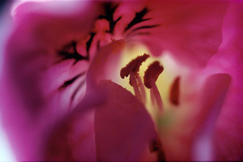
Haas’ New Color Collection: Creation (1959-85) is more neutral in its colour palette, enhancing the earthy colours within the earth’s desert locations and the animals that inhabit them, whereas his Classic Color Collection: Creation (1960-81) is vibrant, full of flora, snow and water. Geranium, USA 1961 (see fig.1) is one of my favourites from the Classic Color Creation collection, as the use of what seems to be a macro lens, captures the minute vein details within the flower petals, the ‘hairs’ of the stamen as it’s surrounded by a warm yellow glow in amongst a sea of pinks.
Shallow depth of field allows the subject that isn’t in the frame to be out of focus and soft, in this case, enhancing the delicate nature of the flower petals and how silky they feel to the touch. Haas captures his subjects in a more detailed and intimate way, rather than shooting them from a distance to get the whole object in the frame. This helps us understand the beauty of nature much more and gives us the ability to explore what some of us may not have taken the time to examine.
Fig. 1. Geranium, USA (1961)
Shoot plan:
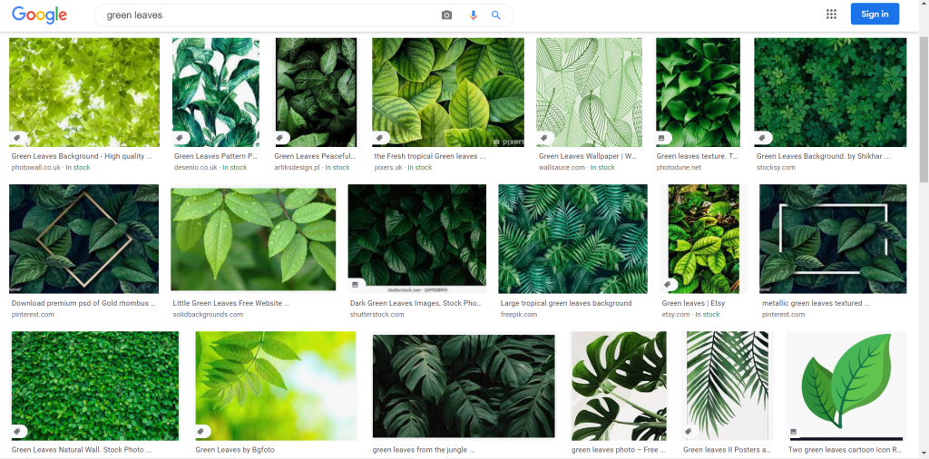
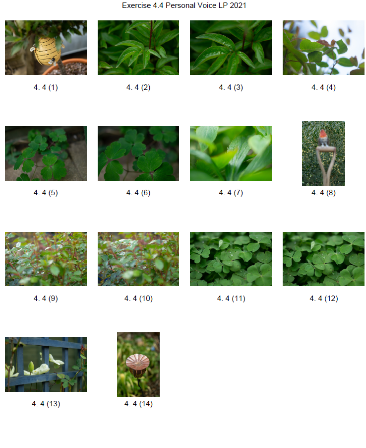
Fig. 2. Green Leaves (2021)
For this exercise, I googled “Green Leaves” (see Fig. 2) to see the variety of images that would come up and how I could explore this subject in my photography. Thankfully there was enough of a range that I could take inspiration and look around my garden to see what I could find in correlation to this search.
My SONY A57 was on manual mode, as was the Sony DT 50mm F1.8 SAM lens, this was so I could have more control over the focus and shutter speed for the exposure. The ISO was at 100, while the aperture was set to f/1.8 to achieve a shallow depth of field when capturing the leaves in a group or in front of other objects. The exercise was quick and easy as it took place in my garden, but despite the ease it beneficial as well as successful.
Contact Sheet:
Fig. 3. Contact sheet (2021)
Final image for analysis:
Fig. 4. 4.4 8 (2021)
By observing and looking further into the subject at hand (see fig. 2), I was able to capture the fine, wrinkled veins of the leaves through the shallow depth of field in the foreground. They look similar to the wrinkles we find on the palm of our hands, which go in all sorts of directions, are different depths and shapes. The natural light bounces off of the leaves from the left, giving texture to the image and helping the viewer understand that this is a smooth and shiny leaf, as opposed to a rough, matte leaf. The focal point being in the midframe pushes the eyes to be drawn into the image, rather than the subject being in the foreground and giving the audience a direct path to reach. It’s more like rummaging through the leaves yourself via a photograph, which is a fun concept to me. Shooting this in landscape was a reference to the majority of the images found via google, however, the differences between this composition and the ones in the screenshot make it my own.
None of the images in the screengrab includes the focal point being midframe or behind a group of other leaves, creating a ‘blockage’ in the foreground. The use of shallow depth of field is used, but the subjects are directly in the foreground, creating a blurred background instead. Most of the green leaf shots seen above are darker and more tropical, whereas the exposure for mine is light, airy and a more typical form of leaf you would find in the garden. Lighting in the google searches is usually either coming from behind the leaves or lit from above minus a few exceptions in the middle row. The final image I have chosen feels like an adventure that you feel involved in, to understand the details, whereas the photographs above provide a clear frame of leaves, in focus, detailed and pretty direct.
Reflection:
While images may be the same in terms of subject matter, orientation or colour, it depends on how it is captured that makes the difference. For example, Ernst Haas’ choice to shoot images of flora up close and personal, allows the viewer to understand the parts that make up a flower, rather than the subject as a whole.
Taking the time to observe, explore and look at what you are capturing, brings a whole new depth into the photograph as you connect with it more, you’ve planned it and taken the time to understand the composition more. Every image is unique, no matter whether it’s framed the same way or not, they are taken at different times, by different people, with a variety of equipment, weather changes, life circumstances and so much more. Sometimes you may not even intend to shoot a particular subject, but it makes its way into the frame anyway which is wonderful.
Each photograph is always different and personal to each individual, no matter how many times it’s documented.
I have received formal feedback from my tutor for my third assignment ‘The Decisive Moment’. Considering this particular assignment took a long time to complete due to personal situations, I am happy with the response I got.
Here is a summary of the comments received via email:
Strengths:
– Strong interpretation of the ‘ongoing’ (in)decisive moment through the representation of time in the still life flower. – Using the domestic setting shows a strategic conceptual documentation of the private and quotidian, rather than the public realm of most decisive work. – Good references about technical approaches. – Explores the technical/conceptual and how it alludes to still life.
Weaknesses:
– Define critical terms right away concisely with a firmer introduction to the assignment. – Show the subject, presentation and give context to the approach, so tell them rather than let them find out themselves. – Link what I’ve found via references but be clear on the subject to start with. – Expand my points further with ‘whys’ with references to show how I’ve done something.
Areas of development:
– Attach annotated contact sheets to show how I got to a certain technical decision etc. – Explain concept initially and expand later one in more detail. – Lead reader into the subject and reference my evidence to back it up. – Reference influences and how I interpreted the assignment.
Reflection:
Once again, I need to work on being more concise but avoid being too vague by referencing and explaining my approaches in more detail. Write about what’s relevant and the influences I used within my own work is important. I need to lead my readers into the subject and further expand with evidence at a later point. Overall, I have the ideas there and the strong images to show that I’ve understood the assignment, however, my written work needs to be clearer and reflect exactly what I discovered. They’ve noted that it’s difficult to do, but worth getting the hang of early on.
‘Create a set of between six and ten finished images on the theme of the decisive moment. You may choose to create imagery that supports the tradition of the ‘decisive moment’ or you may choose to question or invert the concept by presenting a series of ‘indecisive’ moments. Your aim isn’t to tell a story, but in order to work naturally as a series there should be a linking theme, whether it’s a location, event or particular period of time’ (Bloomfield, 2018).
Due to the current pandemic, we students are having to alter any exercises/tasks that require working in a social environment to fit the current guidelines set by the government. Due to this, I will have to work my way around this assignment from a domestic setting which is slightly disappointing as I wanted to push myself out of my comfort zone by shooting street photography. Perhaps I can explore a different technique instead to push myself further?
Before I begin this assignment, I will have to research the decisive moment further, so that I can then also understand what an indecisive moment is. I must admit it’s a little difficult for me to interpret at the minute, but hopefully, with further studying and help from peers will help me formulate a set of images that fit the brief.
Unfortunately, my confidence levels for this assignment are quite low, as I’m unaware as to what I will end up with or where to begin; therefore the best option right now is to search around for definitions, examples and other such materials to help me on my way.
– Drew on the work of Francesca Woodman, a portrait photographer who explored the human body and the idea of revealing and concealing. – Stated my thoughts on her use of black and white photography, what it may represent and how it makes me feel. – Reflected on the statements made by Victoria Miro and found examples of the points made within Woodman’s photography and how they enhanced the imagery. – Briefly covered the effects that motion blur has on her work and the feelings they may create for the viewer, providing an example below to show traces of time. – Drew on the work of Michael Wesley, a still life photographer who captures long exposures to document the invisible force that is time, showing traces of movement, light, life and decay. – Reflect on how he captures what we may feel is impossible, by showing the universe around us by being patience and letting everything happen naturally instead of forcing it. – Explored the work of Hiroshi Sugimoto, who also uses long exposure times to capture the entire length of a movie in a theatre, resulting in ghostly white screens illuminated a once full room. – He too captures the ‘impossible’ by documenting the act of disappearance and showing what the camera saw over that period. – Sugimoto challenges the idea of the moving image by turning what previously moved into a still image once more. – Researched the work of Maarten Vanvolsem, a photographer who captures panoramas of people moving through a scene, documenting slices of time and showing a path of movement. – Vanvolsem challenges the idea of time-based media which is usually film, audio or slides that show signs of movement over time. However he manages to present an audience with a path of movement in a single shot. – Reflect on what I have found throughout this research and the impact of the visual/technical techniques used, as well as how they may encourage me to explore different approaches in the future.
Unlike fast shutter speeds that freeze movement as explored in the previous exercise, slower shutter speeds document activity and capture the path these motions leave behind.
Slow shutter speeds can create exciting results caused by unintentional camera shake, sudden movements or motion blur used intentionally as an art style like many artists explore throughout their work.
During this research, I would like to understand further why people use motion blur and capturing slices of time as an aesthetic choice and the impact this effect can have on the overall image.
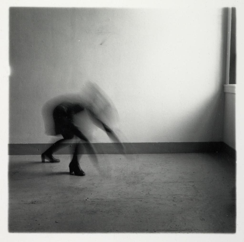
Francesca Woodman (1958-1981)
Francesca Woodman was an American photographer who explored the human body by revealing, concealing and intentionally capturing the movement of herself or another female model, naked or otherwise.
The use of black and white photography not only adds to the ghostly eeriness depicted by the motion blur but may also be reflective of the artist’s mental state following her untimely death by suicide at the age of 22. Whether this was an intentional visual choice or not, it is impossible to ignore the raw emotion that radiates from her imagery.
‘Woodman tested the boundaries of bodily experience in her work and her work often suggests a sense of self-displacement. Often nude except for individual body parts covered with props, sometimes wearing vintage clothing, the artist is typically sited in empty or sparsely furnished, dilapidated rooms, characterised by rough surfaces, shattered mirrors and old furniture’ (Miro, 2014).
The use of empty rooms, with textural features, not only emphasises the importance of the body by creating a focus but also compliments the blurred movement or patterns on the vintage clothing worn, preventing the image from being flat and lifeless.
Victoria Miro states that Woodman’s exploration of presence and absence ‘argues for a kind of work that values disappearance as its very condition’ (Miro, 2014). Woodman deliberately prevents the viewer from seeing hidden areas even though they are, in fact, still there. Isolating parts of the body, through cropping, clothing or props; hints to what is missing, encouraging the viewer to think about the presence of the body and potentially question the choices made.
Distortion of the models features as is seen in Space² (see fig. 1.) not only preserves the identity of the subjects but implies the transition of one movement to another. It may also be a performance of an event that has previously taken place, due to Woodman’s ‘tendency to combine personalised psychodramas with the temporal and spatial displacements of long exposures and blurred movement’ (Badger, 2012).
Woodman’s use of motion blur, while not applied in every image, is intriguing and challenges the idea of what a still image can be by combining movement with still life.
Fig. 1. Space² (1976)
Michael Wesely (1963- )
Michael Wesely is a contemporary photographer based in Berlin, who captures buildings, still life and portraits by using incredibly long exposures that can last for months or even years.
This approach allows the viewer to see movements that are too slow to be seen in real life, documenting what is invisible to the naked eye and the relationship between us and time itself by picturing the past and present. An prominent example of this is Stilleben (5.10-14.10.2011) (Wesley, 2011). The plate of figs that Wesely left for nine days are all perfectly plump until they begin to rot, split and collapse onto the surface as implied by the subtle yet powerful motion blur that captures this natural movement. The recording of decay may reflect on the idea that while time is infinite, time for us as humans is limited and should be cherished while we can experience it.
Instead of documenting movement that is sudden and visible, Wesely attempts to personify time which is something that we cannot physically see or some believe is but a concept. The form itself isn’t the only thing that matters anymore, as the ‘peripheral conditions such as light, movement, and other atmospheric elements’ (Wesely, n.d.) are just as necessary considering they all converge into one final image.
Wesely plays with the idea of movement and the traces of time, by letting the motions occur naturally instead of forcing it, by showing the growth or decay of a subject without influencing the outcome. To capture the universe around us seems impossible, as it exists, yet isn’t a physical object; however, Wesely has proven that you can indeed capture this information with patience.
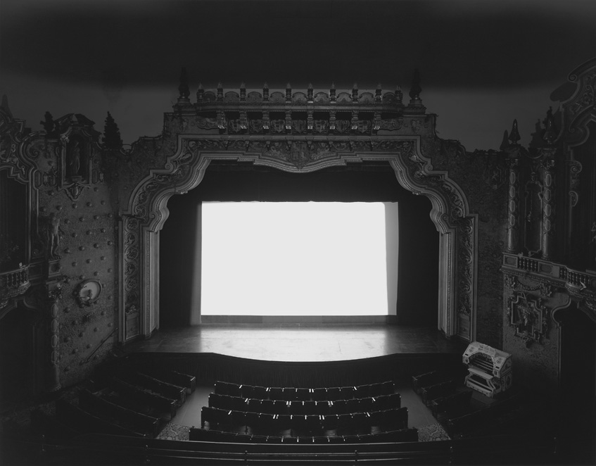
Hiroshi Sugimoto (1948 – )
Hiroshi Sugimoto was born in Japan but has since travelled between Tokyo and New York after becoming a photographer in the ’70s, exploring the relationship between photography and time itself. Sugimoto’s practises consist of photography, architecture and performing arts production which investigates not only our short time on earth but also human knowledge based purely on senses and reality versus what could be (Fraenkel Gallery, 2012).
This approach is very much similar to Wesely, as Sugimoto too uses exceptionally long exposure times to capture traces of time that are invisible to the naked eye. An example of this features throughout his Theaters series (see fig. 2.) that began in 1976 and has spanned across the past four decades, ultimately capturing 130 individual movie theaters that illuminated by a bright white screen (McGrath, 2016).
Sugimoto opens the camera shutter as soon as the movie begins and only closes it once the credits roll, before developing the film to discover the most unusual yet fascinating results. You would imagine that photographing a moving image, would leave behind a distinct path of movement in its wake, however as shown, all that is left is an empty theater and a blank screen to light the room. While there was a full theater of people ‘…they all disappeared…the movie theater is the case to hold this emptiness…’ (Contacts : Hiroshi Sugimoto 2, 2009). So, Sugimoto managed to capture the impossible by encapsulating the disappearance with the empty shell of a building with no sign of life or movement besides the eerie light. The audience were there; they just cannot be seen, much like Woodman’s concept of isolating body parts, you cannot picture something disappearing if it wasn’t there in the first place.
Instead of using slow shutter speeds to capture a single motion to create blur or a double exposure effect, these long exposures have managed to combine multiple moving images into a single still once more. In turn, they are showing what the camera has seen over this period rather than what can physically be seen by the audience in real-time and documenting the invisible forces of time, through the use of light (Sugimoto, n.d.).
‘I wanted to photograph a movie, with all its appearance of life and motion, in order to stop it again… I must use photography as a means to shut away the ghosts resurrected by the excess of photographic afterimages’ (Sugimoto (n.d.) quoted in Musee Magazine, 2016).
Fig. 2. Carpenter Center (1993)
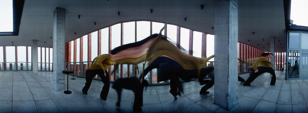
Maarten Vanvolsem (1948 – )
Unlike the previous artists, Maarten Vanvolsem uses a moving camera to capture single slices of time to build up a still image across a short interval, to show traces of movement that challenge the perception of time and space. As a result, rather than shooting a single image and freezing a moment in time, Vanvolsem records multiple movements as the shutter is open by combining multiple seconds into one image.
Vanvolsem is the author of The Art Strip Photography an exploration of over 30 different artists approach to the strip technique and how the idea of time-based media may be possible for photography (Book Depository, n.d.).
Time-based media usually consists of film, audio, slides that can be watched and admired by the viewer over time to see what unfolds, while time isn’t explicitly visual, we as the audience are aware that moments are passing by the second (Tate, 2008). If you apply this logic to photography, we usually see frozen moments that are captured within milliseconds and therefore do not see time unfolding like a film. However, by using slow shutter speeds or in this case, a moving camera, time and movement can be documented in individual slices or exposures across a period. It may be a single image when produced, but time itself features in the frozen image through the multiple viewpoints and motions seen by the camera.
Instead of a strip made of individual frozen images like Muybridge’s work, Vanvolsem keeps his shutter open and pans the camera; as you would in panorama mode, to capture the events that take place during the time the shutter is open. Due to a slight movement in the camera or subject, visual distortion can occur, bending the composition and recording the small intricacies of activity that may not always be obvious in real-time.
35 x 90 cm (Vanvolsem, 2015) shows visual distortion, created by the dipping and rising of the subject in the frame, forming a wave of colour and smudge-like effect as they move across the frame. This result tells a story like a filmstrip would as we can distinguish what actions took place over this time, by looking at the trail that was left behind. 30 x 109 cm (Vanvolsem, 2015), however, suggests that the camera wasn’t always steady vertically due to the ripples in the architecture and ceiling which may imply an ‘up and down’ motion, although this isn’t confirmed.
Some people may not find this technique appealing as the images aren’t crisp and easy to dissect, however, is an incredible way to capture time and space in-camera while leaving a trace of movement in its path.
Reflection
Out of all the artists studied, the most appealing technical approaches for me were Woodman’s and Wesely’s, mainly for the ghostly results they managed to capture in their work. While Woodman may have had more control over the actions that occurred in her work, Wesely did not, instead, let nature take it’s course over a series of months to see what changed.
Motion blur brings life to the composition and provides more context as to what may be happening, what the subject is doing and at what pace or in what direction. Long exposures document change and decay that are not visible in real life, or at least it is less evident to us as humans.
Being able to confront how we see time and space, as well as capturing the impossible that is the act of disappearance by isolating features, blurring or showing what was left behind to imply emptiness, really does challenge what the ‘still’ image can be. A frozen moment shows but a slither of what is happening, leaving a trace behind gives more information for the viewer to explore and question.
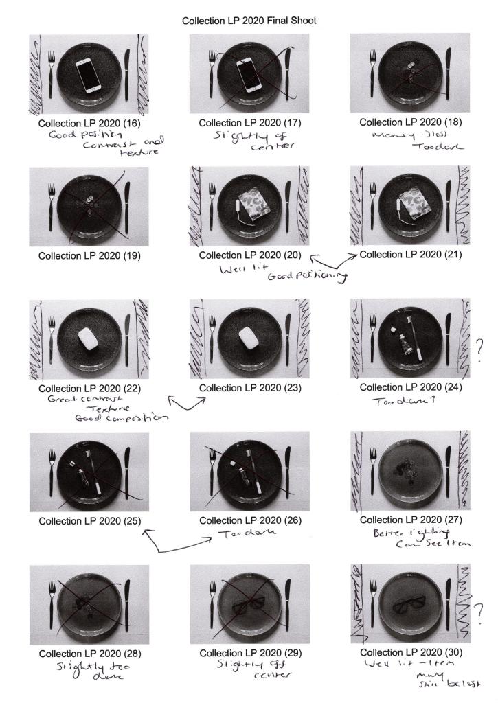
– Provided annotated contact sheets of my final shoot to show the images I preferred or eliminated, along with any changes I’d like to make like cropping. – Explained how I executed this shoot, including camera type and settings, before exploring how the various techniques helped or hindered my imagery. – Drawn on the influence I gathered from Barry Rosenthal and Sam Oster, explaining why. – Stated how my selection process went, what programmes I used, and the minor changes made to improve the quality of the work, – Before explaining the reasoning of my grid work and the groups made what messages they may imply for the viewer. – Briefly reflected on what I felt worked well during the shoot and selection process, as well as my thoughts on the final selection.
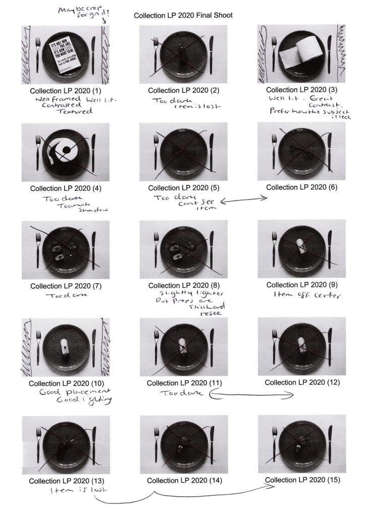
Before selecting my final images the contact sheets were printed off, annotated and analysed to figure out which shots were strongest visually, technically and conceptually when placed together as a group.
Fig. 1. Contact sheet 1 (2020)
Fig. 2. Contact sheet 2 (2020)
Fig. 3. Contact sheet 3 (2020)
Fig. 4. Contact sheet 4 (2020)
While shooting, I made sure to refer to the techniques listed on my shoot plan to make sure I shot my images as intended and the camera settings were suitable for the lighting.
Setting my Sony A57 to manual focus allowed me to make sure everything was as crisp and accurate as possible. At the same time, a narrow aperture of F/14 prevented unwanted blur and provided enough light. I did use an ISO of 400 to boost the light levels slightly, enabling me to use the slowest shutter speed of 1/4 to get a well-lit shot, avoiding bulb mode or a wider aperture.
Placing my camera on a tripod meant the framing was consistent and stable throughout, while everything was in the frame when using a focal length of 35mm. Backlighting my images was a wise decision, as it enhanced the 3D form, however, due to uncontrollable natural light coming from behind, the images were lacking in shadows or became too dark, exampled in Collection LP 2020 (2) and Collection LP 2020 (36) (see Fig. 1. and Fig. 3).
Using the High Contrast B&W setting in camera provided the definition and contrast I wanted to achieve, some subjects, however, were difficult to decipher and can be seen with Collection LP 2020 (2), Collection LP 2020 (5) and Collection LP 2020 (18) (see Fig. 1. and Fig. 2). This camouflaging was due to the plate colour, so experimenting and shooting the items on both plates was vital to give me a chance to capture each subject successfully.
Taking inspiration from Barry Rosenthal and collecting various items allowed me to experiment with different textures such as smooth, soft, wet, rough and hard, which juxtapose one another. However, as a whole, the subjects contextually link together when it comes to theme and functionality, such as electrical, health and hygiene. It also gave a more extensive range of products to choose from when selecting my final images and didn’t restrict in any way that concerned me as I wanted the set to be cohesive yet unique.
Making sure the plate was in the same place throughout and placing the subjects as close to the centre as possible, decreasing the chance of the set flow being distracted by a sudden change in composition. It also created a controlled and cold mood that compliments the crisp black and whites, making the images look profound.
After analysing the contact sheets and selecting the best images, I went into Photoshop to crop and tidy up some blemishes the could be seen on the white background when enlarged on the screen. Cropped photos provided a suitable amount of negative space to frame the subject while emphasising the importance of the items in the shot. Enlarging the canvas and adding a solid 1-inch frame around the image reflect Sam Oster’s use of white boxes in her typologies which appealed to me.
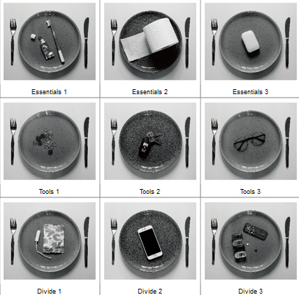
Adobe Bridge enabled me to create a grid and rearrange my edited images to form a cohesive set of images, split into three groups juxtaposing in type and functionality. On the other hand, they complement one another in terms of concept, contrast and composition, forming a solid link between the collection.
Fig. 5. Typology (2020)
Inspiration from Sam Oster and Barry Rosenthal lead me to experiment with a narrow aperture to achieve a sharp focus. B&W photography enhanced the details and shooting overhead instead of straight on. These techniques pushed me beyond my comfort zone and tested my ability to be selective when creating a typology.
Visually this set is powerful due to the variety of tones providing depth to the composition, contrasting highlights and shadows emphasise the subjects 3D form, allowing them to be more prominent. Keeping the product placement consistent creates repetition but stays fresh due to the change in object and colour of the plates. Balance is maintained by using an even amount of background to frame the items and being evenly cropped. Artificial lighting creates harsh shadows that define the details within the plate and products; a cooler colour temperature intensifies the white background preventing the image from being flat with grey tones. Providing a focal point enables the viewer’s eyes to be drawn to the middle of the frame, focusing on the chosen objects that form a narrative when connected, varying between each individual.
The use of black and white restricts the viewer from being distracted by any colours that may confuse their overall understanding of the set, created a conflict between calm and danger, warm and cold, sadness and happiness. Enhancing the forms, textures, details allows the viewer to focus on and explore the purpose of the object rather than how it makes them feel.
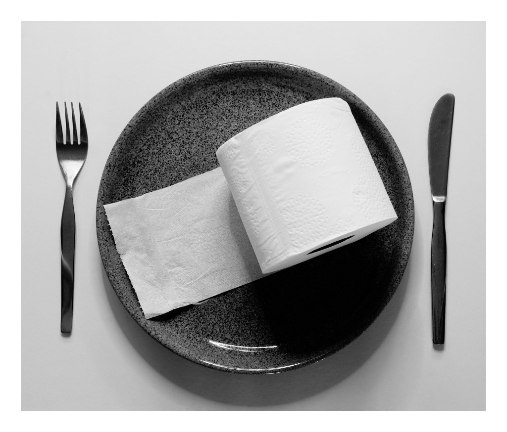
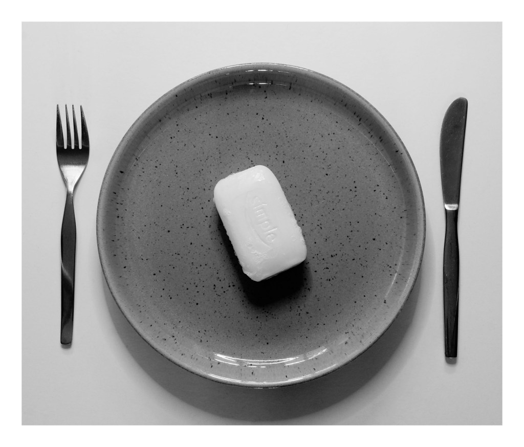
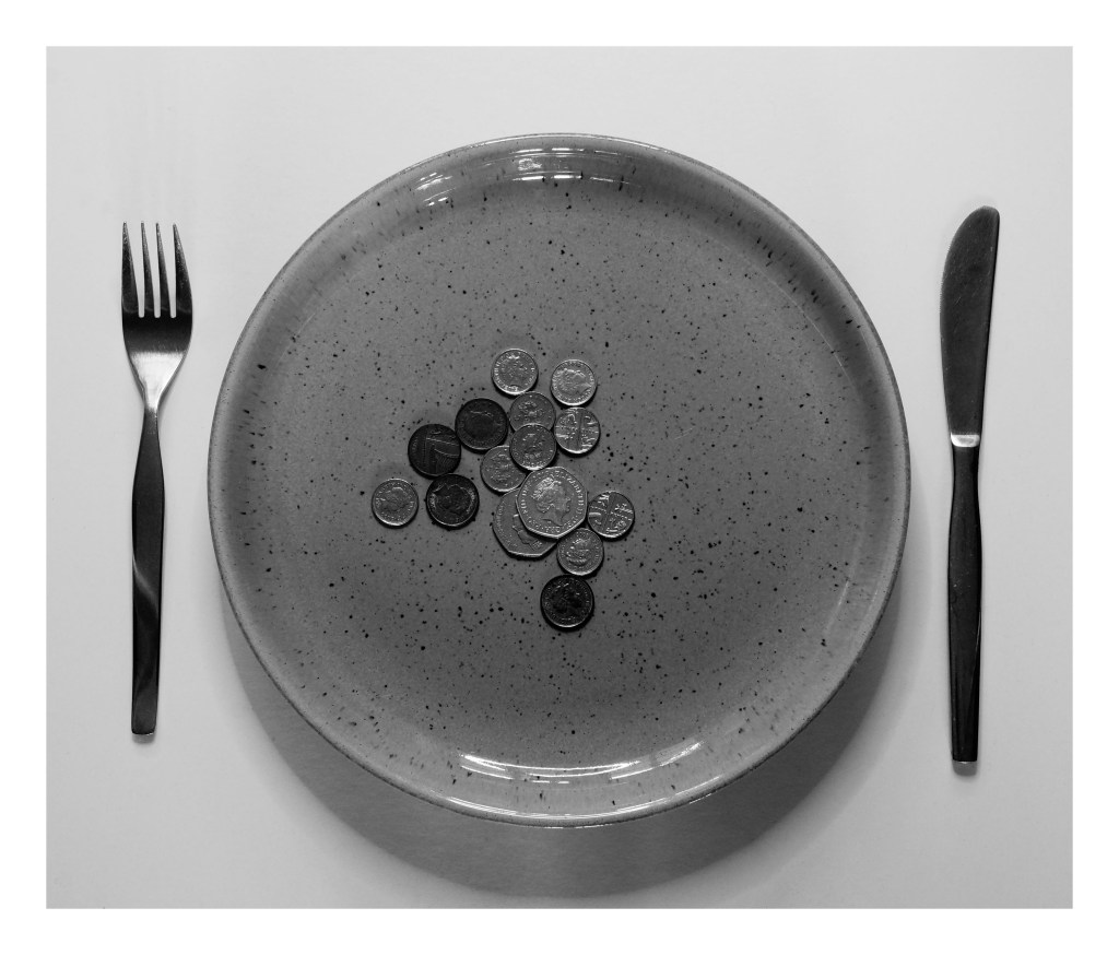
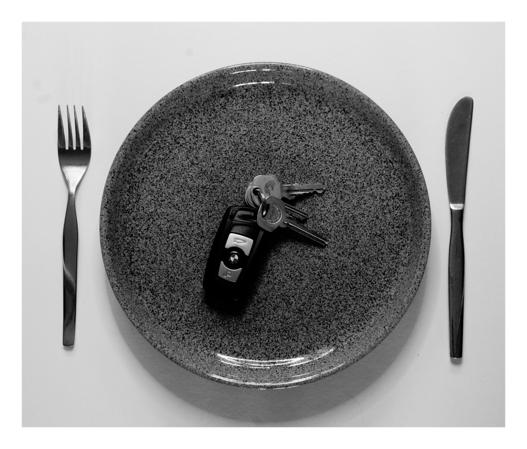
Looking at the groups that have emerged, there is a set of three hygiene products, three tangible metal items and three objects that are all completely different in functionality (see Fig. 5). They are all “things” that people use which is what connects them as a set, however, are they all a necessity? Are there some items that you feel are a luxury? Do you use all of these items, and if so what do they mean to you if anything? Do you see this set as everyday, ordinary items or do they represent a particular message for you?
Fig. 6. Divide 1 (2020)
Fig. 7. Divide 2 (2020)
Fig. 8. Divide 3 (2020)
Fig. 9. Essentials 1 (2020)
Fig. 10. Essentials 2 (2020)
Fig. 11. Essentials 3 (2020)
Fig. 12. Tools 1 (2020)
Fig. 13. Tools 2 (2020)
Fig. 14. Tools 3 (2020)
I feel positive about my final selection and have enjoyed exploring the different collections that we can find around us, even if it isn’t as apparent at first glance. The one issue I did have with this shoot was the influence the natural light had on my imagery, meaning I had less to choose from, however did not ruin the whole selection.
List of images:
Figure. 1. Powell, L. (2020) Contact sheet 1 [scanned document] In possession of: Lauren Powell: Eastleigh.
Figure. 2. Powell, L. (2020) Contact sheet 2 [scanned document] In possession of: Lauren Powell: Eastleigh.
Figure. 3. Powell, L. (2020) Contact sheet 3 [scanned document] In possession of: Lauren Powell: Eastleigh.
Figure. 4. Powell, L. (2020) Contact sheet 4 [scanned document] In possession of: Lauren Powell: Eastleigh.
Figure. 5. Powell, L. (2020) Typology [pdf, screenshot] In possession of: Lauren Powell: Eastleigh.
Figure. 6. Powell, L. (2020) Divide 1 [image] In possession of: Lauren Powell: Eastleigh.
Figure. 7. Powell, L. (2020) Divide 2 [image] In possession of: Lauren Powell: Eastleigh.
Figure. 8. Powell, L. (2020) Divide 3 [image] In possession of: Lauren Powell: Eastleigh.
Figure. 9. Powell, L. (2020) Essentials 1 [image] In possession of: Lauren Powell: Eastleigh.
Figure. 10. Powell, L. (2020) Essentials 2 [image] In possession of: Lauren Powell: Eastleigh.
Figure. 11. Powell, L. (2020) Essentials 3 [image] In possession of: Lauren Powell: Eastleigh.
Figure. 12. Powell, L. (2020) Tools 1 [image] In possession of: Lauren Powell: Eastleigh.
Figure. 13. Powell, L. (2020) Tools 2 [image] In possession of: Lauren Powell: Eastleigh.
Figure. 14. Powell, L. (2020) Tools 3 [image] In possession of: Lauren Powell: Eastleigh.
– Stated Walter Benjamin’s view on what a collection is for future reference to see if I agree with this after researching various artists.
– Drew on the work of Barry Rosenthal, a fine art photographer and sculptor who collects rubbish found on the shore before organising them into groups and bringing them back to life in the studio.
– Briefly analysed Rosenthal’s work to explore what concepts I could find within his imagery and the techniques I felt he used, such as deep depth of field and studio lighting.
– Explored the work of Sam Oster, who uses medium black and white film to shoot typologies (inspired by the Becher’s) of abandoned electrical equipment to emphasise the relationship between humans and their electronic consumption.
– Analysed both her typologies and moving images to gather inspiration from her visual and technical approaches, such as the use of form, texture and various depths of field.
– Studied the work of Jim Golden, a still life photographer who shoots for commercial companies by stripping the products down to their most natural forms.
– Analysed his bold compositions to understand his use of bold colours, organised arrangements and studio lighting to enhance the collections he is shooting.
– Reflected on each artist and how they both compare or differ, visually, technically and conceptually.
– Stated whether I believe these artists reflect the views of Walter Benjamin, as well as
– Summarising my test shoot plan and how I’d like to implement the inspiration gathered by the chosen photographers.
‘Fragments of a vessel which are to be glued together must match one another in the smallest details although they need not be like one another.’ (Walter Benjamin, [1936] 1999, p.79).
Walter Benjamin expresses that although a collection should link in concept and small details, they don’t have to be identical. Therefore making sure there are differences throughout, subtle or keep a collection exciting and engaging.
Using this idea as a guideline, I have decided to research a selection of photographers who have shot a collection of various items to see how they have executed it to see whether their artistic approach differs from the view of Benjamin. Taking influence from these artists will help me decide on how this assignment develops.
Barry Rosenthal
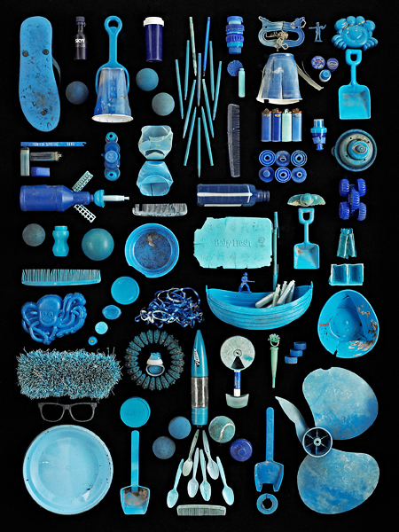
Barry Rosenthal is a fine art photographer and sculptor who has become well known globally for his “Found in Nature” work. The project began in 2007 as a side-project to his Botanical series. It has since developed from a small collection of objects found on the ocean shore into a series of large scale images that capture and display the impact littering has on the planet (Rosenthal, 2012).
After collecting trash from the shore of New York Harbour, Rosenthal separates the items into groups, determined by colour, theme, type, or otherwise, bringing objects that have been beaten out of shape and have lost their purpose back to life in his studio. Using a combination of photography and sculpting, he can form a narrative that confronts the viewer with ‘the way humanity is managing its relationship with nature and the oceans in particular’ (Rosenthal, 2012).
Fig. 1. Blue Ocean (2013)
Fig. 2. Clear Glass Jars and Bottles (2012)
Rosenthal appears to use a deep depth of field as the objects are crisp, and there is no focal point to direct the viewer around the frame. The use of a plain background helps the textures, shapes, colours stand out on their own. The reflections and shadows on the items suggest side lighting by artificial lighting such as studio lights. A birds-eye view flattens the object’s form allowing the viewer to focus on the narrative told via the arrangement, something that may not have been achieved if shot at an angle. The shapes and sizes of each item complement one another without the collection becoming cluttered and unorganised. Subtle changes are made throughout his series, keeping the images fresh, unique yet consistent in concept.
Sam Oster
Sam Oster is an Australian based photo-media artist who has experience in stills photography, moving images, lecturing, film and documentaries.
Oster has exhibited in both solo and group shows across the years including Art Images Gallery, Adelaide (2014); Shimmer Photographic Biennale, Southern Australia (2012) and Duckspool Photographic Centre, England (2001).
‘Short Circuit‘ was created in 2009 to investigate the consumption of electrical items and the ever-growing issue of consumerism and competition between companies, which can create a conflict between what is ‘trash and treasure’ (Oster, 2019).
Bernd and Hilla Becher’s typologies of industrial buildings and structures heavily inspired her; however, Oster used portable electrical items as her subject instead of permanent structures.
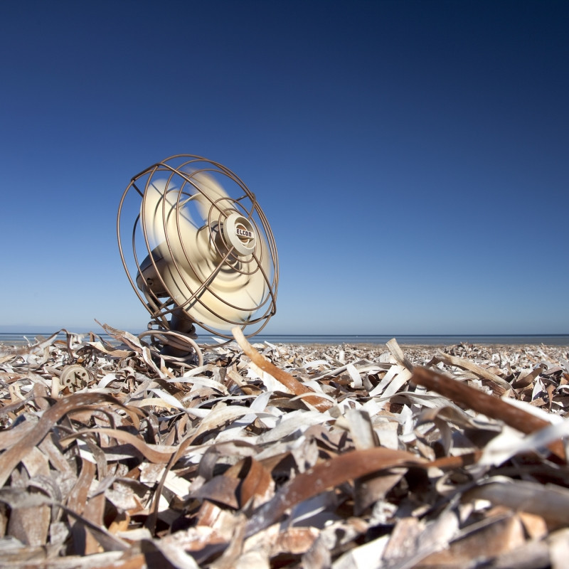
Oster captured electrical items found in rubbish dumps, neatly arranged in individual cabinets to examine the form and function of the objects in the grid. However, the moving image time-lapses represent the idea of electrical dependency and its impact on the environment, for example, a fan placed in a sea of metal in front of an ocean’s horizon (Oster, 2019).
The work shot on a medium format black and white film are hand processed and printed. These pieces have the same grainy post-industrial effect the Becher’s achieved.
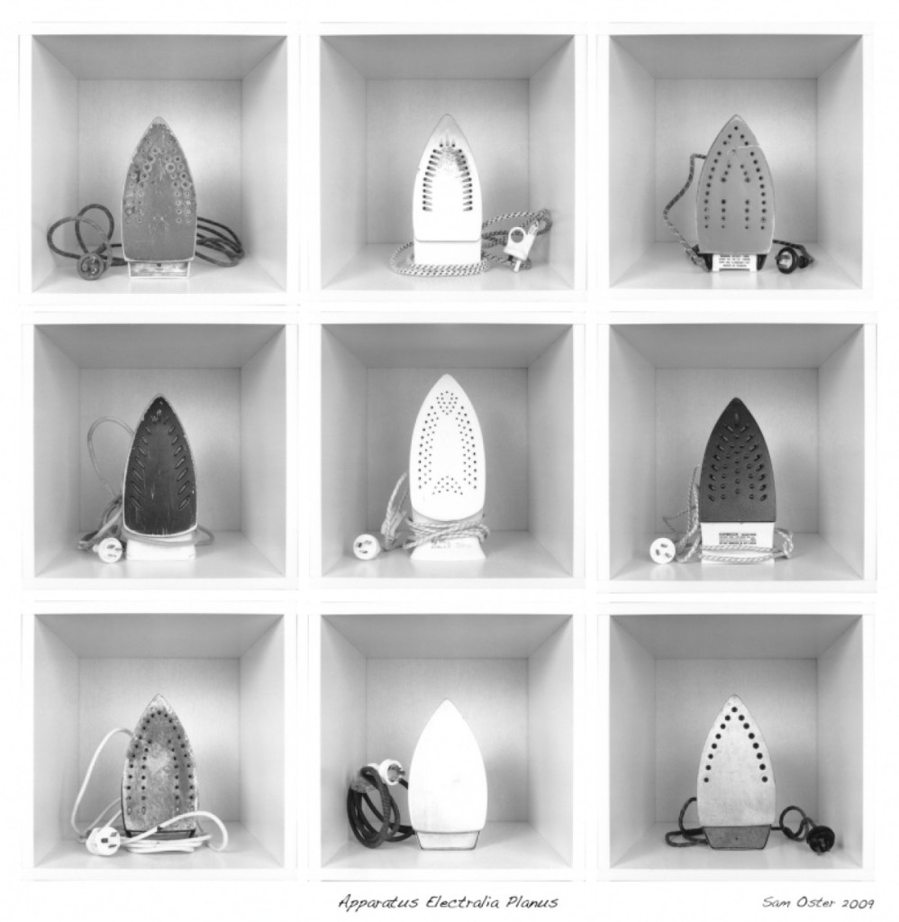
Fig. 3. Apparatus Electralia Planus (2009)
A collection of discarded irons (see Fig. 3.) are framed centrally in a square cabinet, forming a grid of 9. This composition cleverly splits the image into sections without having to take individual photographs. There is an even contrast between light and dark, shown through the metal, scratches, age marks, shape of the subject and the plugs. The lighter irons are aligned down the middle of the collection, framed by different tones of grey and black. While they are the same in function, their forms, the impact of time and usage make them unique, providing the viewer with change. A deep depth of field may have been used for this image, as the items, geometric lines, and the extent of the cabinets are clear.
Fig. 4. Cooling Down (2009)
Fig. 5. Boiling Over (2009)
Unlike the typologies, these moving-image time-lapses feature one item each, however, once paired they form a collection of discarded electrical items in various landscapes. A shallow depth of field may have been used in Cooling Down (see Fig. 4.) due to the subtle blur in the foreground directing the viewer’s eyes to the fan. Deep depth of field seems to have been used to shoot Boiling Over (see Fig. 5.); however, the kettle placed slightly off centre on a rock in the muddy water creates a focal point and direction. These small details call back to the idea of electrical dependency impacting the earth, global warming and the loss of lush green growth, clear waters and land.
Jim Golden
Jim Golden is a still-life and product photographer based in Portland and shoots subjects in their purest forms to avoid applying artificial beauty. Golden is artistic and stylistic in his photography, capturing inanimate objects in a bold or quirky way while keeping the subject accurate to what it is.
He learnt photography by joining the fast-paced world of New York advertising, specialising in high-end retouching and visual effects (Jim Golden Studio, n.d.).
Golden’s enthusiasm and ‘sense of humour’ (Jim Golden Studio, n.d.) reflects throughout via bright colours, exciting subjects, and thorough planning.
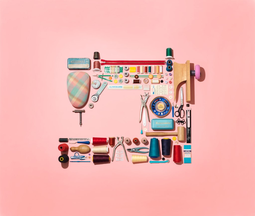
Fig. 6. collection of sewing stuff in shape of a sewing machine (2019)
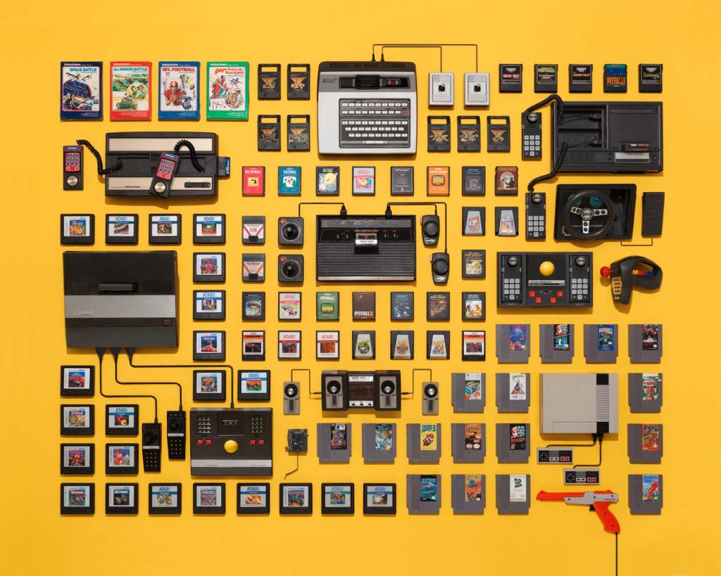
Fig. 7. vintage video game consoles and cartridges on a yellow background (n.d.)
Golden may use deep depth of field in his work due to the sharp, crisp and geometric forms created by the arrangement of the items. There are many leading lines throughout the imagery, the spaces between the subjects outline the shapes and sizes of each item, allowing the viewer’s eyes to follow around the composition with no end to the line. Like Rosenthal, Golden shoots his subjects from above from a height or using a wide-angle lens, using studio lighting to light the items. A soft halo in the middle of collection of sewing stuff (see Fig. 6.) and the few harsh shadows in both images caused by taller items may imply lighting from above or behind. Creating shapes that relate to the collected items, using the products and making the image pop with intense colour may represent happiness, playfulness, love or other positive emotions.
Overall thoughts:
All of the artists above vary from one another visually. Oster uses a mixture of B&W film and coloured imagery, using the background to frame the items. Rosenthal uses monochrome backgrounds and uses the collection to add colour and depth. In contrast, Golden uses bold colours, leading lines and negative space to enhance the objects.
However, they are alike technically as their images are crisp and in focus, suggesting a deep depth of field. Sharp shadows and bright highlights imply artificial lighting, and they all share a meticulous approach to the composition and framing of their subjects.
Contextually Rosenthal and Oster focus on political issues, such as the impact of human nature and consumerism on the planet. The way they execute this is by collecting disposed electrical products, plastic from the ocean and dumps. Oster’s choice to shoot with B&W film creates a raw emotion by enhancing the aged and shiny, textural details on the metal irons, while the rusty browns and muddy waters evoke thoughts of decay and neglect. Her choice of discarded electrical items reflects the waste caused by a lack of appropriate recycling resources. Rosenthal’s use of a black background creates a contrast between the colourful plastics and their battered forms, helping them stand out; this shows how time has affected the product’s shape but is mostly still intact and beautiful. The way items form shapes such as a man on a boat, link back to humanity’s relationship with the ocean. These elements, when combined, form a narrative about the negative correlation between land and ocean pollution, and human activity.
On the other hand, Golden shoots a selection of brand new goods and electronics, documenting products that show human progress, and a positive, appealing side to consumerism. The use of vibrant colours and shapes brings playfulness, contrast the vintage products, implying how style and inventions have evolved. Arranging individual components when put together become a working product, for example, the gaming cartridges wouldn’t be playable without the console, which wouldn’t be functional without the wiring, celebrates human creativity and growth.
Each artist has formed a cohesive series by keeping visual changes to a minimum or at least make sure they are complimentary to avoid jarring the viewer and being consistent with the overall concept, and in turn support Walter Benjamin’s view on collections very well.
After researching these practitioners and the concepts behind their work I have decided to explorewhat ‘necessity’ means. I will develop on this by collecting various items based on the responses gathered in my online survey and personal list group them by theme, form or function if possible, before looking for juxtapositions or similarities within the collection.
Keeping the framing and position of the subject consistent, as Oster does in Apparatus Electralia Planus, is something I will apply when composing my shoot to avoid breaking the fluidity. The choice of black and white or colour can impact the overall mood of the images; therefore I will experiment with the use of colour to decide how I want to evoke emotion or enhance details in the shot. Shadows and highlights can affect the form of a subject as well as the depth so I will consider using artificial light during my test shoot to decide whether I’d like to achieve a soft or sharp visual style. Shooting from a birds-eye view isn’t something I do very often and is something I would like to try out for this assignment, taking influence from Rosenthal and Golden as a guide for creating successful compositions. Deep depth of field assures that everything in the frame is crisp and in focus, so even though I would like the items to stand out, the rest of the composition will be just as essential to provide context; therefore, I will use a narrow aperture.
The final selection of images can make or break the set and how they knit together, so I will be meticulous when it comes to formulating the collection as a whole. During my test shoots, I would like to take influence from Oster and experiment with grid work and typologies; this may determine how I present my final selection.
Summary of the shoot plan :
– Experiment with B&W and colour.
– Vary the lighting used to see what works best.
– Test different angles, focal lengths and apertures.
– Consider the framing and positioning of the selected items.
– Play around with cropping and grid work.
– Be thorough when choosing final camera settings.
– Consider the relationship between each image when it comes to the final selection.
References:
Benjamin, W. ([1936]1999) Illuminations. London: Pimlico
– Briefly explained my reasoning for gathering anonymous responses for this assignment and – Provided the results of the online survey via screenshots. – Listed my research, taken over the space of a few days to see how they correlated with the online survey results. – Reviewed the collection of results as a whole, explored what I was surprised and glad to see from the responses – Before suggesting a few areas I may look further into throughout this assignment like privilege, luxury and necessity e.t.c.
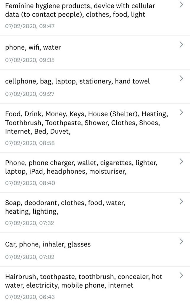
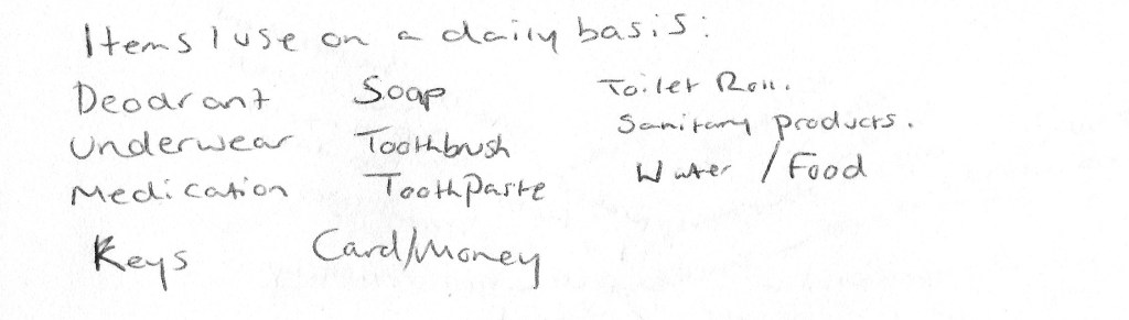
Instead of solely relying on my own opinions and views about the necessities in life, I wanted to see what others felt were necessary items in their daily life to hopefully build selection to experiment with when it comes to shooting my imagery. Therefore, as part of my research for this assignment, I decided to gather some non-biased responses from anonymous persons using an online survey by asking ‘What everyday items do you consider are a necessity? (Something you need)’ (Powell, 2020).
Here are the responses:
Fig. 1. Survey Monkey 1 (2020).
Fig. 2. Survey Monkey 2 (2020).
I also took part in the research, noting down items I used daily and what I considered a necessary item (see Fig. 3) before comparing it with the survey responses. The note-taking was quite interesting for me to do, as it made me more aware of what I use and how often, something we don’t necessarily tend to do when items become a part of daily life.
Here is my response to the question:
Fig. 3. Necessity List (2020)
Review of the responses:
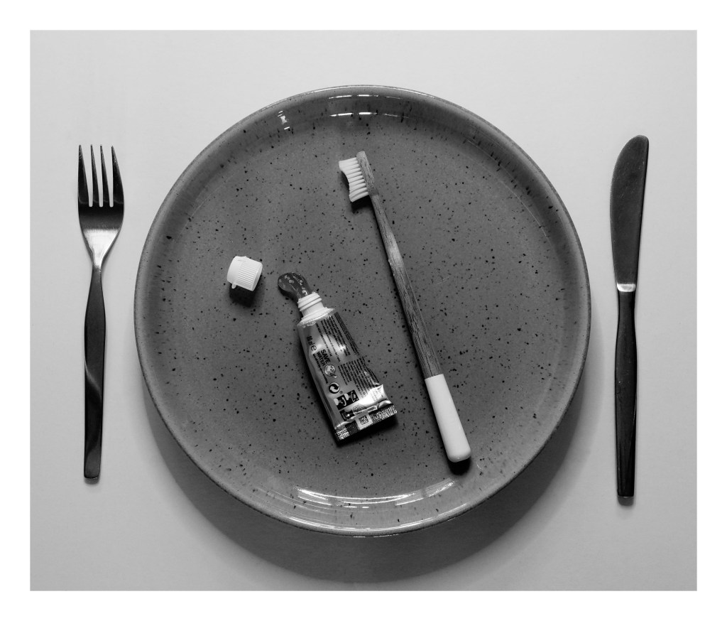
After comparing the two sets of responses (see Fig. 1. and Fig. 2), it is clear that there is a common theme of items to work with, such as clothing, money, keys, hygiene products, medication as well as a few extras that I hadn’t thought about.
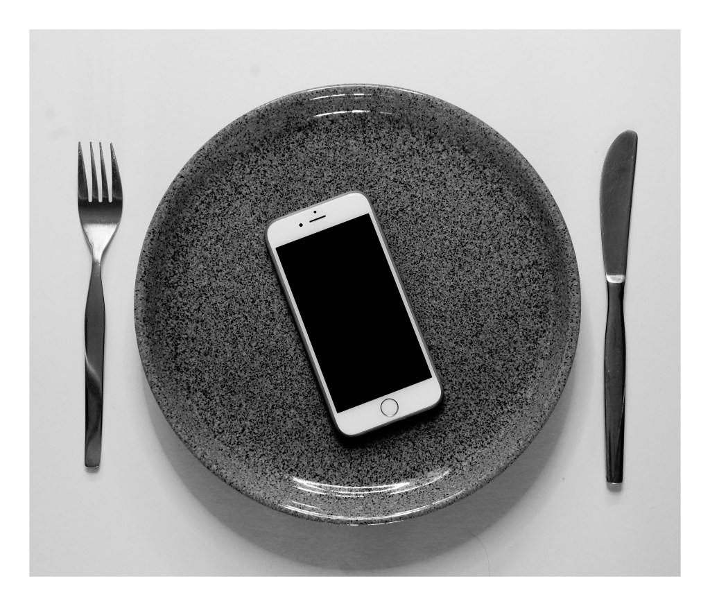
Initially, I didn’t expect to see so many people list phones, laptops and other electrical items as a necessity, however, it does make sense when you consider the modern way of communication, technology in careers and education. Without technology, many people would struggle to contact loved ones, reach emergency services or access their money due to banks going digital. Even hospitals use technology to save people’s lives, so while we may feel phones and such are a luxury, they are becoming a necessity more and more.
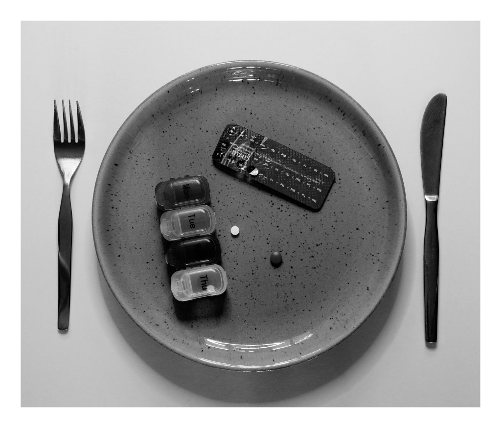
Those with good health may not have to be concerned about glasses or medications, however, some people wouldn’t be able to navigate safely or survive comfortably without such items that show privilege by not having to rely on prescriptions.
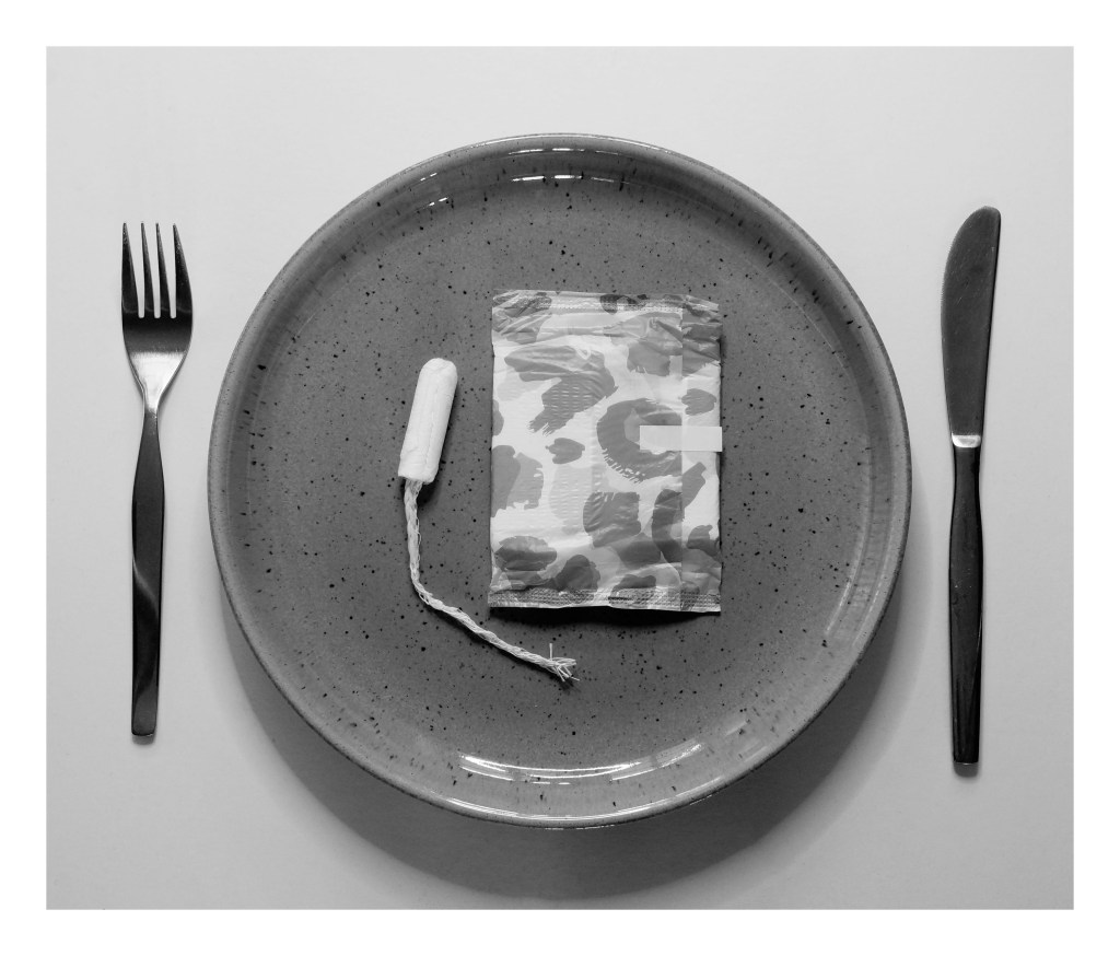
One item that reflected my research in the survey responses is sanitary products for those who have periods (see. Fig. 2). There has been controversy surrounding the tampon tax and free sanitary products in bathrooms, schools and shops for those who cannot afford it. Periods are a part of nature and cannot be prevented without the pill or other forms of contraception, therefore sanitary products should be widely accessible for people so they can go about their daily life comfortably and cleanly. It shouldn’t be a case of who has money or not, as it isn’t a matter of choice that highlights areas of inequality in society.
Other items that were interesting to see were cigarettes, a lighter and concealer (see. Fig. 2.). A lot of people would probably consider these items as unnecessary, however, without being in that person’s shoes you have no idea why these products are essential whether you agree with it or not. This may be due to situations such as addiction, insecurities, social pressures or self-satisfaction.
Final thoughts:
This research has given me a wide range of paths to experiment with and explore, such as politics, privilege and equality. Depending on my artist research I may decide to group up items that share the same concept, visuals and technical approaches but conflict with one another when placed together as a collection e.g Luxury vs Necessary, or Electrical vs Manual. The overriding theme that has been discovered through this research is that necessities are subjective and highlights individuality and diversity. This will allow me to form a cohesive concept for the images I wish to shoot, which I am yet to decide on.
‘Fragments of a vessel which are to be glued together must match one another in the smallest details although they need not be like one another’ (Walter Benjamin, [1936] 1999, p.79).
‘The Walter Benjamin quote above expresses the idea that a collection should reflect a single coherent idea, but you’ll also need technical rigour to match the photographs to each other ‘in the smallest details’. Start by choosing your focal length, aperture and viewpoint combination in advance. Visually, similarities correspond so they’re easy to look at, but be careful of duplicates because repetition is boring. Differences are interesting because they contrast, but randomly changing your framing or allowing a confusion of detail into your backgrounds will distract from the viewing.
Brief:
‘Create a series of between six and ten photographs on one of the following subjects: • Things • Views • Heads’ (Bloomfield, 2018).
Initial thoughts:
– Excited to be challenged by creating a collection of images that are consistent in terms of concept but unique in appearance, albeit small. – Enjoy the idea of being able to branch out from a single word, allowing the assignment to be broad and open right from the beginning. – Slightly wary about creating ‘duplicates’ and creating a jarring set, so I will have to plan thoroughly to avoid this. – Concerned about going off-piste from the brief due to the variety of ideas, so will regularly refer to it throughout each stage to make sure everything is on track.
Initial plan for the brief:
– Create a list of ideas that link with each word. – Choose one subject and start exploring the ideas within in more detail. – Research practitioners for further ideas to help with the concept choice. – Use a tripod to keep the framing as accurate as possible. – Experiment with a deep depth of field, instead of shallow depth of field which I am comfortable with. – Experiment with focal lengths to see what works best. – Make sure the set is coherent, yet individual. – Explore what makes me uncomfortable e.g different camera settings, framing and lighting.
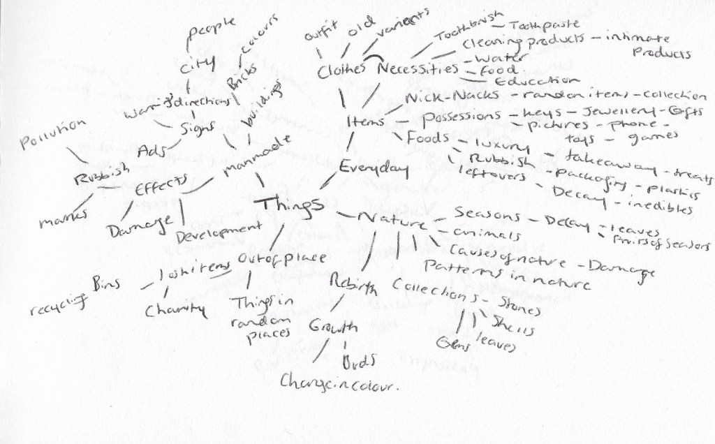
Fig. 1. Things (2020)
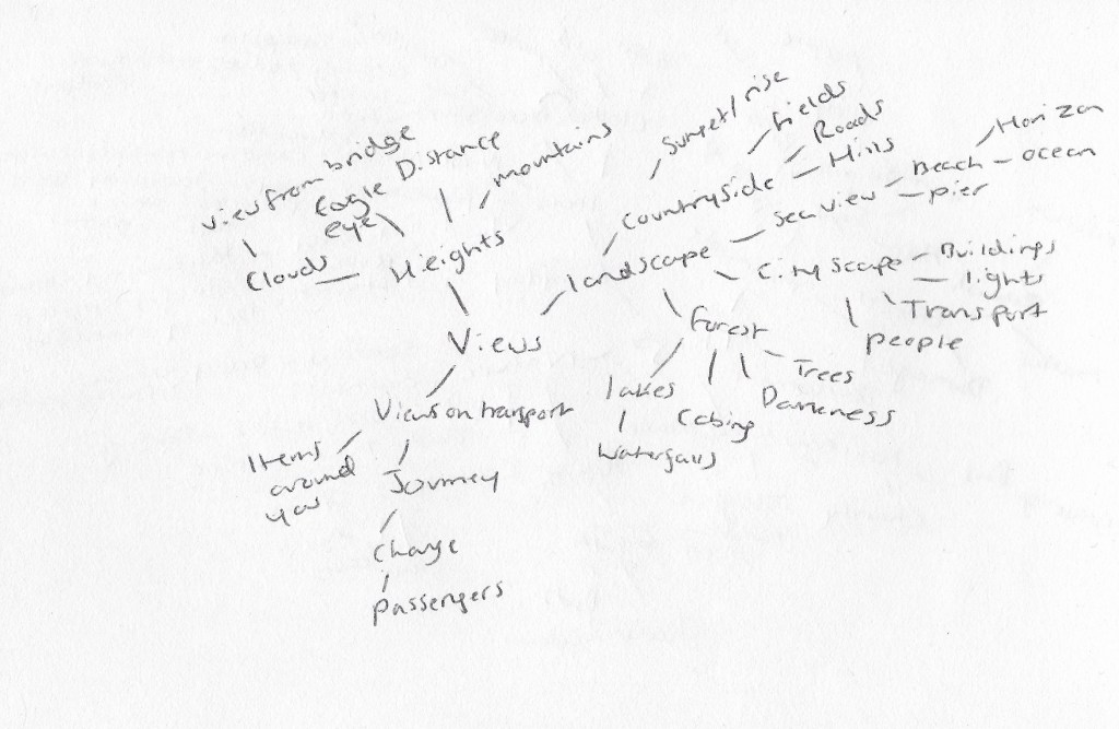
Fig. 2. Views (2020)
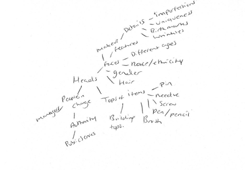
Fig. 3. Heads (2020)
Reflection on mind-maps:
– Wide variety of concepts for me to explore and experiment with. – Plenty of ideas linked with ‘Things’ which will allow me to fall back on another idea if my initial plan doesn’t work. – Also, like the idea of exploring facial features in the ‘Heads’ (see Fig. 3.) subject, but don’t have many back up ideas if that doesn’t work, hence my appeal to focus on ‘Things’ (see Fig. 1.). – Plenty of ideas to push me out of my comfort zone and potentially collaborate with others to shoot or gather opinions. E.g. asking someone for their most important possessions, asking to shoot with someone I don’t know well, or figuring out what everyday items people would count as a “necessity”. – Don’t enjoy the ‘Views’ subject as much due to the lack of different ideas and potential struggles with keeping the images cohesive.
After formulating a selection of ideas and concepts for the three subjects, sitting with them and going about daily life to see which ideas remain in my head, has been really helpful with deciding with routes I want to go down first. Currently, the necessities of life mentioned in the ‘Things’ mind-map (see Fig. 1.) is standing out for me, therefore will begin to note down the items I use on a daily basis across the space of a few days, as well as gathering anonymous responses via an online survey about “necessary” everyday items. I will also begin artist research to understand what a ‘collection’ can mean when it comes to photography.
– This research point was difficult to complete due to intellectual text overpowering Campany’s review of the work.
– Campany helped me understand how Ruff works and the importance of archives but didn’t get a feel for how they viewed the work as a whole.
– Colberg’s review was much easier to process and got straight to the point.
– Explained what they did and didn’t like, without dismissing other’s opinions on how the work was presented.
– I agree with Colberg’s view that an image can be beautiful on its own, without having a complex concept behind it.
Brief:
‘Read the reviews by Campany and Colberg and, if you haven’t already done so, use them to begin the Research section of your learning log. Try to pick out the key points made by each writer. Write about 300 words.
If you wish, you could add a screengrab of an image from Ruff’s jpeg series, and one or two of your own compressed jpegs (taken on auto mode of course). You can achieve the effect quite easily by re-sizing a photograph to say, 180 x 270 pixels, and saving at ‘zero quality’ compression. If you use Photoshop’s ‘save for web’ you can see the effect immediately without having to save, close and reopen the file.‘ (Bloomfield, 2018)
Review 1 – David Campany – Thomas Ruff: Aesthetic of the Pixel, IANN MAGAZINE NO. 2, 2008
Campany describes Ruff’s work as being ‘cold and dispassionate’, yet surprisingly beautiful at times. They also state that Ruff’s art can ‘solicit individual and global responses’ that cannot be completely agreed upon (Campany, 2008) .
All photographic images come from archives, which has shaped Photography and how it developed over time. Photographic prints, family albums, computerised image files and gallery work are all forms of archives, all unique in their way but still forms of photography. We cannot tell which archives Ruff’s JPEGs have come from, simply by looking at them. However Ruff does mention that the images come from the internet, as he searched for images, going from link to link and finding imagery through a route (Campany, 2008).
Campany believes that Ruff has made a great impact on introducing the ‘art of the pixel’, into photographic art, allowing us to view the pixel at a base level, both aesthetically and psychologically (Campany, 2008) .
While analogue photography was created using film and the prints being made up of grains, in the modern-day these grains are now replaced by pixels. They suggest that Ruff’s JPEGs are not organised or planned like pixels which are evidence that our view of the pixel is changing and may not be as regimented as we first thought (Campany, 2008) .
Review 2 – Joerg Colberg – Review: jpegs by Thomas Ruff
Colberg believes that Thomas Ruff may be one of the most ‘creative and inventive photographers of all time’, however, they also acknowledge the fact that many people may debate whether his work can be classed as photography at all (Colberg, 2009).
Despite how you view the work and what you believe the art form is, Colberg, realises the importance of what the work does, more so than what the work is. Colberg states that the images work well in book form, in comparison to the large physical prints at the Zwirner gallery, where they felt it was a ‘tad too pretentious’. While they understand the importance of physical interaction from the viewer, in their opinion the detail in the images weren’t large enough to justify the size of the prints in the gallery (Colberg, 2009) .
Despite all of the positive feedback, Colberg feels slightly uneasy about Ruff’s work as the images are great, but they feel as if the concepts rely too much on the techniques involved (Colberg, 2009) .


