
Summary:
For this research point I;
– Watched the documentary suggested in the brief and made notes on what I discovered during 70 minutes of watch time, expanding on the statement made and interpret them in my own words to further understand the decisive moment.
– Reflected on Sluban’s visit to a prison, where he ran a photography workshop and how he approached as well as taught the inmates, emphasising that the composition is extremely important and is more than just pressing a button to provide meaning.
– Explored Bonnefoy’s comments about Simiane-la-Rotonde and how being aware of your surroundings allows you to see a lot more, provides evidence of Cartier-Bresson’s ability to capture a balanced composition through intuition and the importance observing.
– Expanded on Cartier-Bresson’s view on what makes a decisive moment, by finding an example of sensitivity, intuition and sense of geometry in his work Alberto Giacometti rue d’Alésia. A photograph that documents the gaze of his friend Alberto Giocometti and the connection between the two, showing the empathy Cartier-Bresson has for his subjects.
– Briefly covered Arikha’s thoughts about painting and how we are so influenced by recognition, therefore we need to capture what we see, not what we think we see.
– Documented Cartier-Bresson’s approach to capturing decisive moments, by making sure people don’t know he is observing, to avoid an unnatural response from the subject. Once again showing a huge amount of empathy, to somewhat become invisible and connect with the mood of the room.
– Explored the critiques of Liz Wells, who believes that documentary can remove context from an image by dislocating moments in time, in turn creating a less powerful image by not showing what has happened/is happening. However, I challenged this by disagreeing and providing the reasons as to why, before
– Challenging Colin Pantell’s views on Paul Graham’s The Present, where he believes there are many indecisive, decisive moments that we don’t know what to look for, however I feel isn’t true as there is a consistent theme throughout and many focal points throughout.
– Briefly scanned John Suler’s article about the decisive moment, to increase my knowledge of it before continuing with this assignment. Understanding that it is important to look, be more decisive about what you’re shooting, don’t overly influence the shots, if at all and provide balance, questions and tension.
– Reflect on how I feel about the decisive moment as a visual strategy and the power it has to create a strong image, while expressing concerns about the difficulty of being able to capture such moments.
Brief
‘Watch the Henri Cartier-Bresson documentary ‘L’amour de court’ (‘Just plain love’, 2001) available
on Vimeo.
Write up your research on the decisive moment in your learning log taking care to give a proper
account of the three differing views offered above, and any further research you’ve undertaken
independently. What do you feel personally about the decisive moment as a visual strategy, or
just as a way to take pictures? Conclude your post with your own perspective on the debate at
this point in time‘ (Bloomfield, 2018).
Henri Cartier-Bresson’s view on a successful photograph is made evident by emphasising the importance of looking. He feels as if not many people do when stating that ‘75% of the people just press the button’ (L’amour Tout Court, 2001) and don’t necessarily think about the gaze that encourages questions. To think about what you’re capturing, making sure the image is balanced when composed, is more effective than just raising the camera and shooting without much thought. The intentional space gives context to the gaze of the subject, enabling the viewer to think about what may be happening.
This idea is further supported by Klavdij Sluban on his visit to the inmates at Fleury-Merogis Prison for a photography workshop in 1995, educating them on how to take photographs and their approach to the task in a calm, welcoming manner. Sluban communicates to the group that the fascinating element of photography is the composition, as it is a language that you have to learn (L’amour Tout Court, 2001).
Approaching the inmates politely and humanely, enables them to listen and be excited about the workshop, therefore encouraging them to take the photography seriously and give that sense of ‘meaning… an instant of your life’ (L’amour Tout Court, 2001).
Thinking about what you’re about to capture provides that extra level of care and understanding, that to some may just simply be a photograph and nothing more. However, to the more avid viewer, we may be able to discover the relation between the subject and artist by further exploring the deeper layers of the composition, to appreciate how the balance enhances the overall mood of the arrangement. Simiane-la-Rotonde taken in 1969 is an example of this.
Yves Bonnefoy states the square was usually empty and could not recall any children playing or Cartier-Bresson being around to take the image on this day, they simply walked straight past the square as usual (L’amour Tout Court, 2001). We can see that the children in the foreground are relaxed, enjoying the company of one another as if nothing has changed and Cartier-Bresson isn’t observing. A young girl in the background is pointing towards a dog, albeit a stray or a member of the communities, that may suggest sheer excitement of discovering this furry friend. The negative space emphasises the space between each group of people, supporting Bonnefoy’s statement that the square is usually empty. On the other hand, enhances Cartier-Bresson’s intuitive use of the golden section as each person is placed between or near the intersecting lines of the camera grid, keeping the composition balanced.
Bonnefoy understands that the reason he didn’t see this happening on the day he passed by was that Cartier-Bresson is always on the lookout and ready to react to a situation. In contrast, others are usually ‘distracted and unobservant’, Cartier-Bresson doesn’t have to stop for the geometry to play a decisive role in framing the scene (L’amour Tout Court, 2001).
Furthermore, Cartier-Bresson addresses that all it takes to capture a decisive moment is having ‘sensitivity, intuition … a sense of geometry’ (L’amour Tout Court, 2001). He has an incredible amount of empathy and can relate to the subject in the frame, making them feel comfortable.
By photographing Alberto Giacometti in Alberto Giacometti rue d’Alésia crossing the road in the pouring rain, covering his head with a coat for protection, gazing at the photographer across the street with somewhat of a melancholic emotion looking for support, reflects this idea of compassion. The simple connection of eyes forms a relationship between the subjects, good or bad, determined by the expression given. Capturing the distance between them, documenting the walk towards him almost radiates the action of waiting for Giacometti to reach him and feel the warmth of reuniting with a friend on this rainy day.
The painter Avigdor Arikha suggests that ‘our gaze is always conditioned by recognition’ (L’amour Tout Court, 2001); therefore we only see what we recognise and don’t necessarily observe anything further than that. This statement reminds me of an approach my fine art teacher taught our class, that was to draw what you see, not what you think you see. We must observe the form and stray from being influenced by what we assume something should look like, or like Arikha mentions ‘to look openly is to look with the senses’ (L’amour Tout Court, 2001).
Henri Cartier-Bresson doesn’t want the subjects he is photographing to know that he is doing so, since the awareness of observation, can influence someone’s posture, emotion, put on a mask that rids of spontaneity. Bonnefoy feels as if Cartier-Bresson was able to go unnoticed during the funeral of a Kabuki actor because of his ability to recognise and relate to the room, in turn becoming invisible through the act of sympathy (L’amour Tout Court, 2001).
In her book Photography: A Critical Introduction, Liz Wells suggests how this approach to documentary photography can fragment a moment in time and remove the context of an image that could, therefore, explain the photograph in a more significant way. By recording ‘dislocated moments’ (Wells, 2009:93) meant that documenting swayed from capturing major subjects and focused more on implying that something bigger had occurred.
While I almost agree with the idea that this approach can come across as a ‘stylistic cliche’ (Bloomfield, 2018:71), as many photographers have adopted Cartier-Bresson’s way of shooting, therefore removing the uniqueness of the technique, it still raises questions for the viewer. Documentary photography records factual events or environments in daily life or history, consequently may be more potent if you provide context to present an accurate reflection of what is occurring. On the other hand, by fragmenting a situation much like Cartier-Bresson does while maintaining balance, encourages the viewer to understand further what they can see and the impact of an event without being shown what caused it. This approach, in my opinion, can be more impactful than being handed the context of a photograph, as it provokes a more profound sense of comprehension and forces the audience to think about what is in front of them.
A further criticism for the decisive moment comes from Colin Pantall as he reviews Paul Graham’s photographic book The Present, a series of images that are taken in pairs, showing different events taking place in the same location moments apart from one another. Pantall states how Graham wants us to see the opposite of the decisive moment and the prospect of urban life, however, he feels that instead, we get ‘moments so decisively indecisive’ (Pantall, 2012) that we don’t know what to look out for, as a result missing the mark of contemporary life.
After viewing a few examples from Graham’s book, I can’t say I agree with Pantall, purely based on the fact Graham has decided and stuck to the idea of capturing moments through an urban landscape, to see the changes in a particular area. The sequencing of this book also presents the concept of a decisive moment, by grouping the images to allow the viewer to see the small differences over time by looking at both photographs spread out beside one another. Paul Graham has shown consistency in this series and a sense of care by looking out for these shifts in the present, creating a connection between each image, that in itself is decisive. The hustle and bustle of everyday life appear throughout, showing the diversity between each subject, the backgrounds, the journeys people are making and what each person may be doing. It poses a question for the audience, a clear understanding of what Graham is trying to achieve by recording the natural state of people navigating the city. I feel as if this wouldn’t be possible if this were an indecisive moment with conflicting ideas that don’t connect, confusing the viewer due to the inconsistency.
To understand the decisive moment further, I briefly scanned through John Suler’s article The Psychology of the “Decisive Moment”. In this text, he covers critical features of how to capture a “perfect” decisive moment; harmony, meaning, anticipation, uncertainty, unique fleeting moments, one chance shots, candid, objective fact versus subjective interpretation (Suler, 2017).
As a result, Suler shows the importance of looking or thinking about what you are capturing as a photographer. The decisive moment seems to be more complicated than I first expected, as you have to connect with the subjects you are photographing and be aware of the relationship of the whole composition. Stop and be mindful of what is around you and don’t just shoot for the sake of shooting. Be more firm about what it is you’re trying to achieve, whether that is attempting to encourage questions, document balance or tension.
While it sounds complicated, the results that have come from being more open to what you’re are capturing, instead of wanting a particular image makes for a much more substantial photograph.
I feel as if the decisive moment is a powerful visual strategy, as it steps away from a snapshot, it’s much deeper than that and for me is what photography should be about, recording moments with meaning and emotion. We are quick to pick up the camera and shoot multiple images, scanning through a selection to find the best one, however, if a little more effort goes into the composition, instead of hoping for a powerful image it may just come naturally.
References
Bloomfield, R., 2018. Photography 1: Expressing your Vision. 4th ed. [pdf] Barnsley: OCA, p. 72. Available at: https://www.oca-student.com/course/photography-1-expressing-your-vision [Accessed 30 March 2020].
Fondation Henri Cartier-Bresson. (2015) ‘Henri Cartier-Bresson et Alberto Giacometti’ [image] Available at: https://www.henricartierbresson.org/en/expositions/henri-cartier-bresson-alberto-giacometti/ (Accessed 25 March 2020).
H. Cartier-Bresson: l’amour tout court (2001) Directed by O’Byrne, R. [online video] Available at: https://vimeo.com/106009378 |(Accessed 25 March 2020).
Pantall, C. (2012) ‘photo-eye | BLOG: photo-eye Book Reviews: The Present‘ [online] Available at: https://blog.photoeye.com/2012/05/photo-eye-book-reviews-present.html (Accessed 25 March 2020).
Peter Fetterman Gallery. (2019) ‘Henri Cartier-Bresson, Simiane-la-Rotonde, France, 1969/Printed later’ [image] Available at: https://www.peterfetterman.com/artists/75-henri-cartier-bresson/works/24483-henri-cartier-bresson-simiane-la-rotonde-france-1969-printed-later/ (Accessed 25 March 2020).
Suler, J. (2017) ‘Photographic Psychology: The Decisive Moment’ [online] Available at: http://truecenterpublishing.com/photopsy/decisive_moment.htm (Accessed 25 March 2020).
Wells, L. (ed.) (2015) Photography: A Critical Introduction (5th edition). Abingdon: Routledge.
Reflection on coursework
Exercise 3.2 – Trace
Part 3, Reflection on courseworkSummary:
For this exercise I;
– Provided the brief and shared my initial thoughts about it while considering the UK’s current lockdown and how it affected my original plans for this task.
– Briefly explained my new plans for this exercise, taking influence from my portrait work and the artist research gathered in ‘A durational space’.
– Documented the camera used and the settings, along with any changes made to these further on in the shoot.
– Inserted annotated contact sheets to show the strengths and weaknesses of each image, as well as the techniques used before analysing a few images to explain how they were shot/edited, what I discovered and what I felt worked or didn’t work.
– Reflected on the exercise as a whole, what I learnt and how my feelings have changed about it.
Brief
‘Start by doing your own research into some of the artists discussed above. Then, using slow shutter speeds, the multiple exposure function, or another technique inspired by the examples above, try to record the trace of movement within the frame. You can be as experimental as you like. Add a selection of shots together with relevant shooting data and a description of process (how you captured the shots) to your learning log‘ (Bloomfield, 2018).
Initial thoughts
Planning this exercise was challenging as social distancing and reducing travel restricted me to unpopulated areas. As a result, I decided to become the subject for this task, making the most of what was available while using previous knowledge of self-portraits.
After gathering research on various artists, the techniques I chose to explore for this shoot consisted of capturing long exposures with BULB mode, combining a moving subject with slow shutter speeds, moving the camera and creating double exposures using Photoshop. These ideas have allowed me to experiment with various methods, achieving different effects and tracing time in multiple ways. I was also able to reflect on approaches mentioned in the practitioner research.
Before shooting, I set my SONY A57 to shutter priority mode, attached a SONY 18-55 3.5-5.6 SAM lens to allow for focal length adjustment if necessary and used a high-contrast black and white filter to re-create the ghost-like effects captured in Francesca Woodman’s work. In addition to that, I lowered the ISO to 100 to reduce the camera’s sensitivity to light as the shutter would be open for longer. The ISO was increased slightly for some images to allow for more light, but no higher than 300 to avoid any blowouts.
Contact sheets:
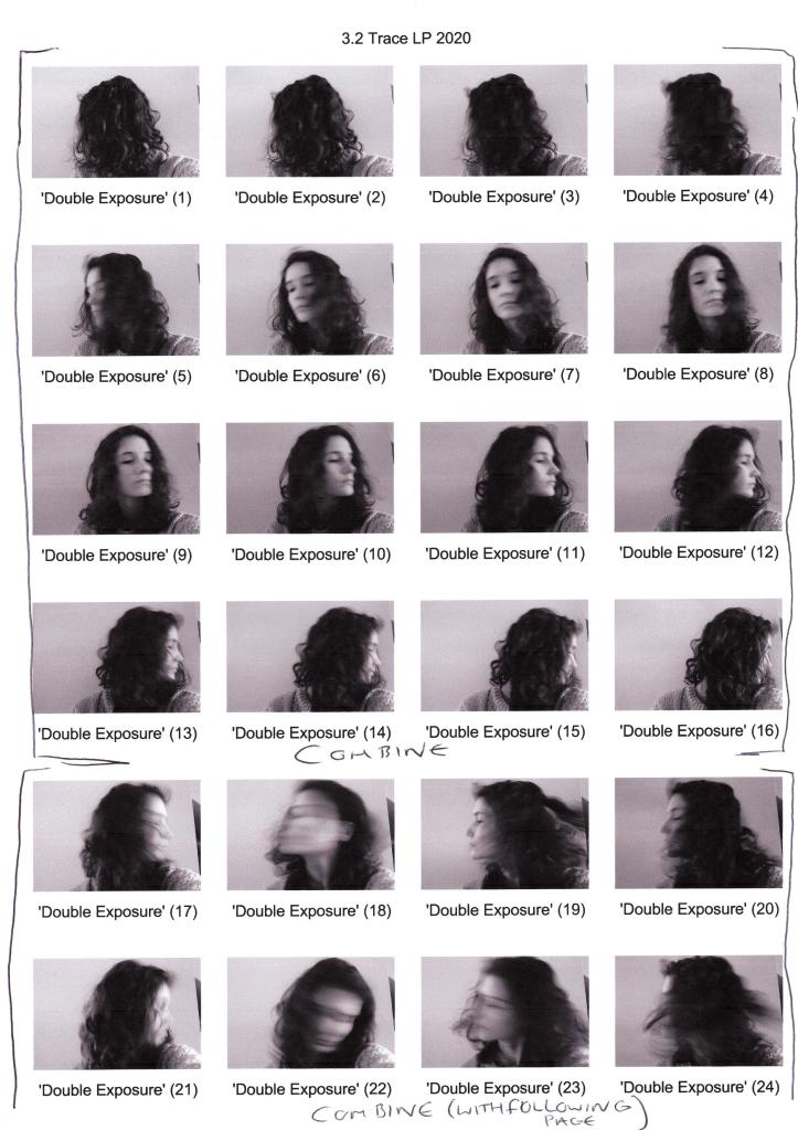
Fig. 1. Contact sheet 1 (2020) 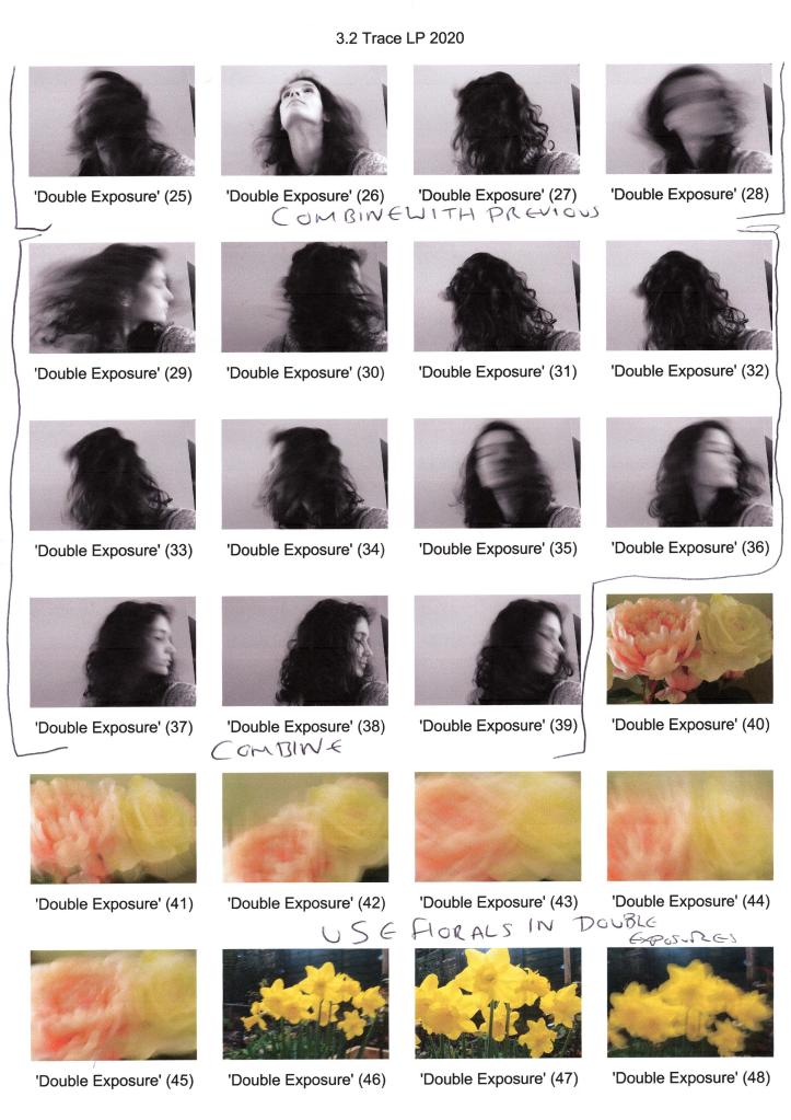
Fig. 2. Contact sheet 2 (2020) 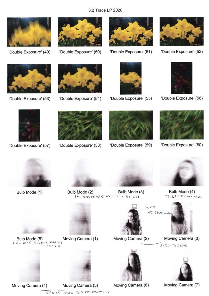
Fig. 3. Contact sheet 3 (2020) 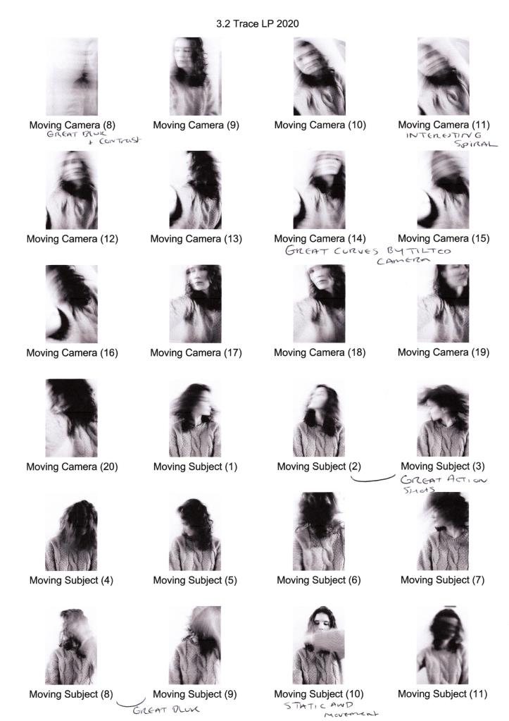
Fig. 4. Contact sheet 4 (2020) 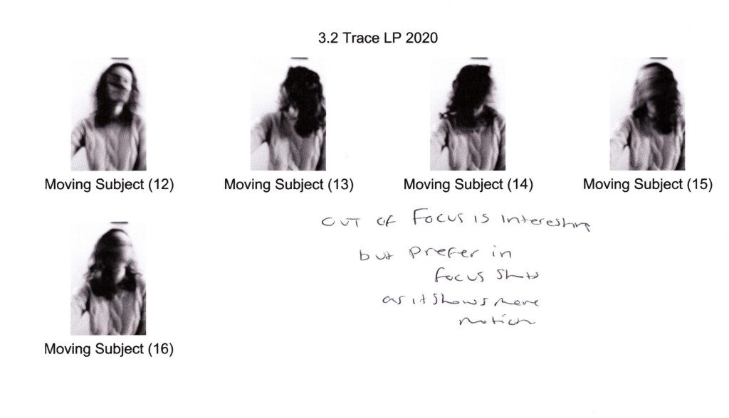
Fig. 5. Contact sheet 5 (2020)
Images:
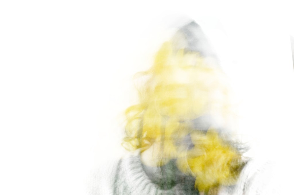
Fig. 6. Trace 1 (2020)
1/10 sec; f/9; ISO 400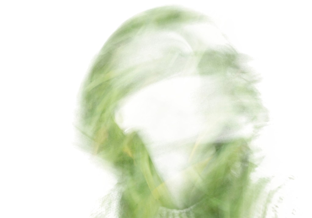
Fig. 7. Trace 2 (2020)
1/10 sec; f/9 ; ISO 400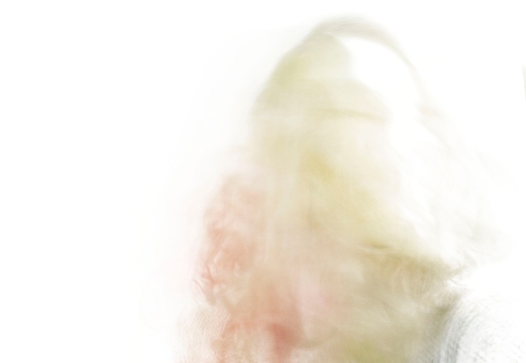
Fig. 8. Trace 3 (2020)
1/10 sec; f/9 ; ISO 400
As the SONY A57 doesn’t have a multiple exposure setting, I used continuous shoot mode to capture numerous shots by holding the shutter release button. As a result of moving with a slow shutter speed of 1/10 second, motion blur occurred, showing a trace of time similar to Michael Wesely’s work. Each piece (see Fig. 6., Fig. 7., and Fig. 8.) consists of up to 10-16 individual photographs layered on top of one another and altered to either the screen or hard light blend modes, consequently achieving the ghostly figures I desired. Using the coloured floral images brings life to the composition by inserting a pop of colour throughout the monochrome shadows. On closer inspection, the direction of movement can be seen via the curves and lines within the arrangements, informing the viewer about the motions that may have taken place across a short space of time. The contrasts enhance the texture of the hair and floral elements while also forming a white silhouette, capturing the act of disappearance.
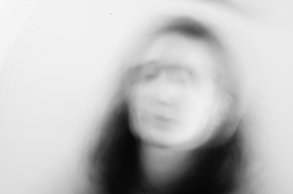
Fig. 9. BULB MODE (2020)
Exposed for 4 sec; f/21 ; ISO 100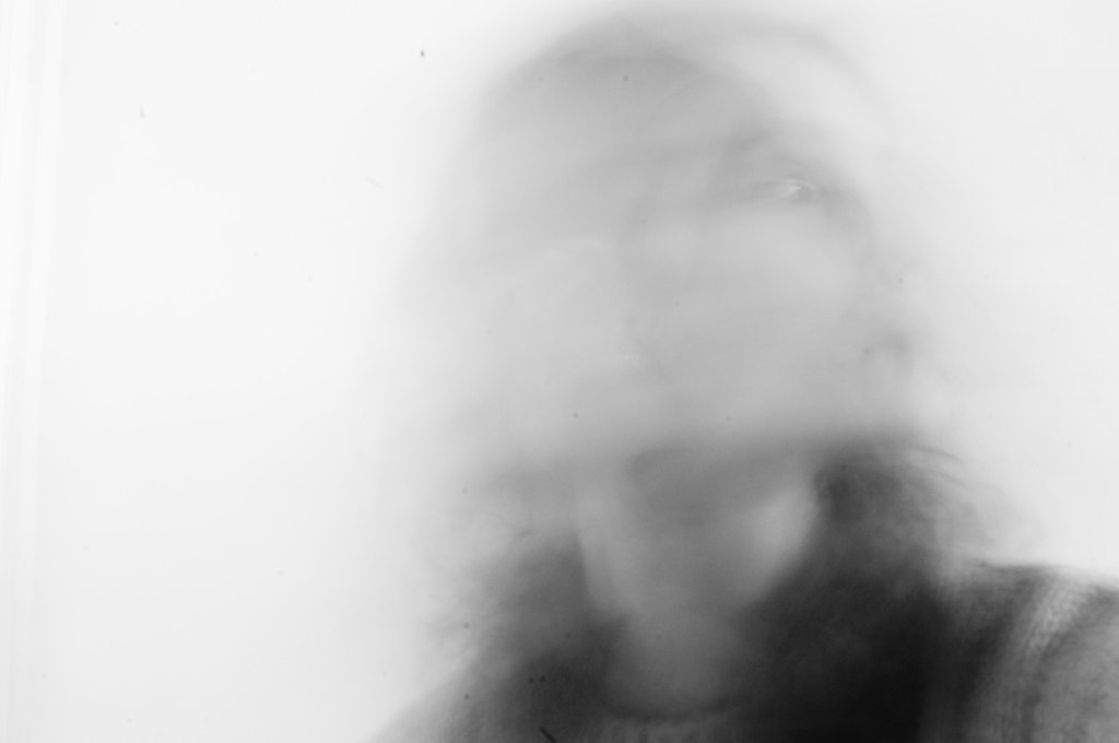
Fig. 10. BULB MODE 2 (2020)
Exposed for 6 sec; f/21 ; ISO 100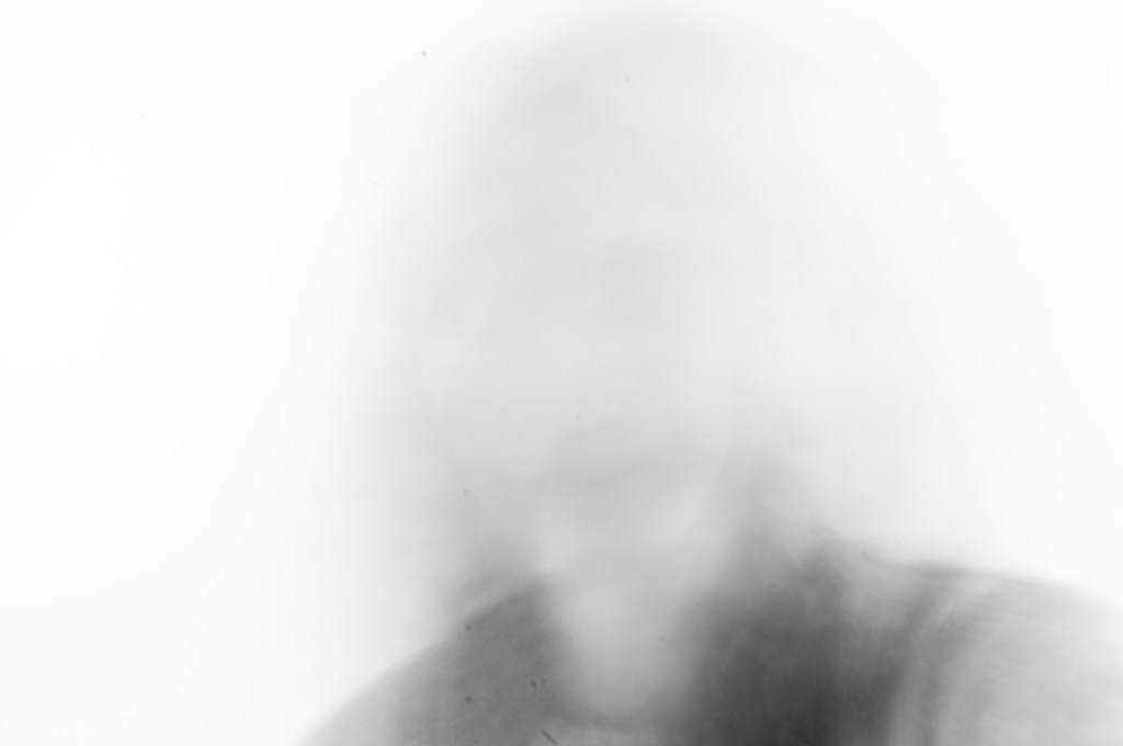
Fig. 11. BULB MODE 3 (2020)
Exposed for 11 sec; f/21 ; ISO 100
For the BULB mode experiment, I held down the shutter release whilst rapidly moving for a variety of seconds to see the outcome of each timespan. The shortest exposure time of 4 seconds (see Fig. 9.) allowed me to capture motion blur and an outline of facial features that show the circular movement of the head through the swirling curves documented. Looking at the contrasts, the viewer can see that the hair is dark, the lighter areas of skin are bright and highlighted, showing a clear distinction between black and white. As can be seen with an exposure of 6 seconds (see Fig. 10), the shadows are a blend of lighter greys rather than a deeper black due to the combination of transparency caused by a moving subject and a bright white wall that enhanced highlighted areas. The smudged path left behind from the model implies the simple act of looking side to side via the blurred lines. Using an exposure time of 11 seconds (see Fig. 11) meant that more light entered the camera, brightening the composition as a whole. The lack of features again reflects the idea of documenting disappearance as it is evident that something is there yet invisible. While the motion blur indicates movement, the traces aren’t as strong as the previous two examples.
1/5 sec; f/7.1 ; ISO 100
Fig. 12. Moving Camera (2020)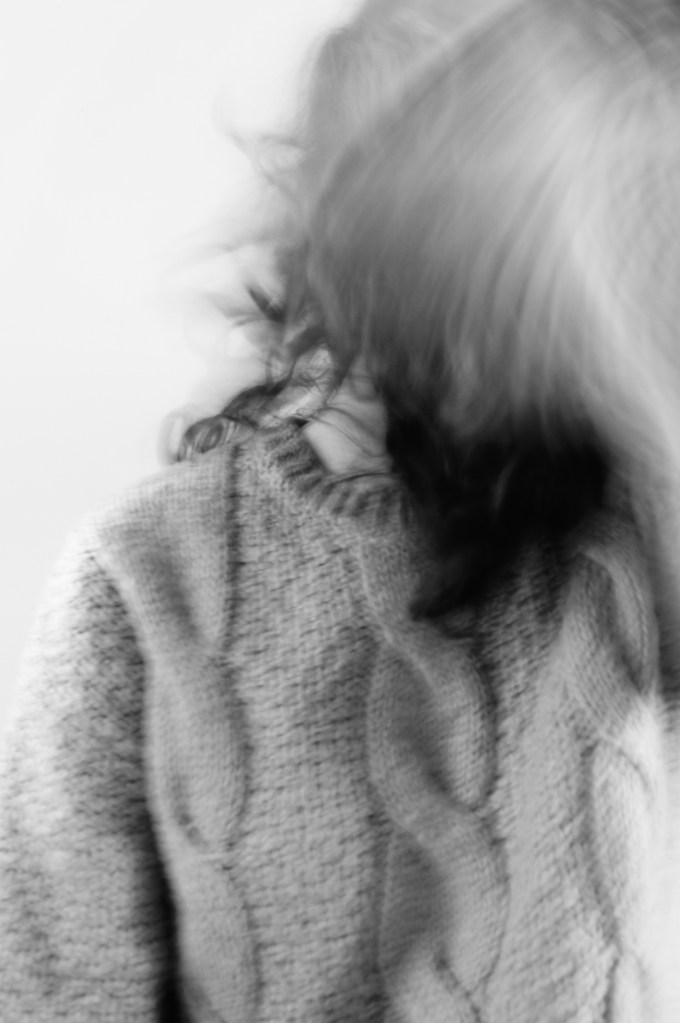
1/5 sec; f/7.1 ; ISO 100
Fig. 13. Moving Subject (2020)
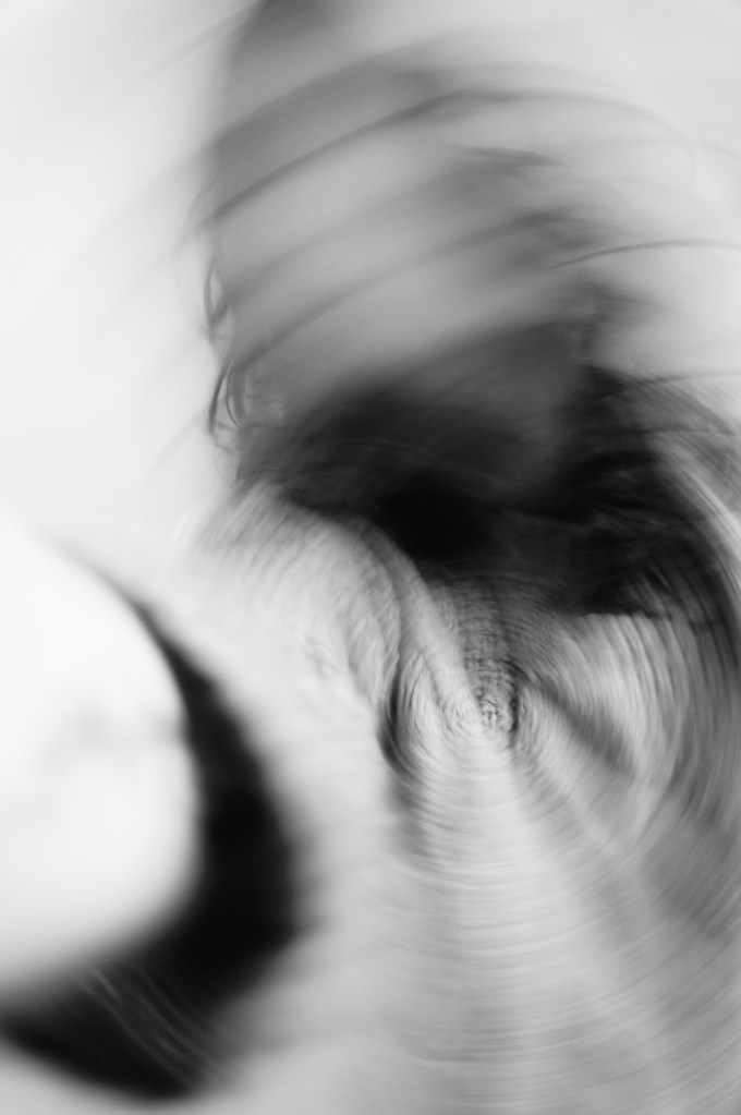
The final images show the results of moving both the camera and subject, but using the same settings keep some form of consistency. Tilting the camera causes an intriguing spiral to appear (see Fig. 12), drawing the eyes in and out of the image. Once again, the subject’s face is blurred as if it spinning, preserving the identity and brings mystery to the composition. A combination of contrasts brings depth to the image, as does the hand in the foreground, showing the distance between the face and arm. There are three traces of time documented in this image, movement of the camera, the journey the hand took to reach the camera and the motion of a head shaking.
Moving subject (see Fig. 13) isn’t as busy as the previous example; however, it still suggests movement regardless of the amount documented. Due to the severe blurring in front of the face, implies a swift gesture took place as multiple curved lines are overlapping one another, as opposed to a single spiral. For this particular image, I wanted to combine both static and motion to create a juxtaposition between the two, challenging the idea of a still image; however, I wasn’t successful this time round as the clothing is still slightly obscured. The fabric of the jumper brings texture to the surface of the image, therefore, not completely smooth and smudged.
Reflection
Overall, I am pleased with the outcome of this particular exercise, as a broader range of experiments took place than the previous task, which in turn allowed for a variety of results. Consequently, slow shutter speeds and long exposures helped me gather a selection of intriguing abstract images and push my abilities in a somewhat restricted situation, therefore meeting the expectations of this particular section.
As well as stepping out of my comfort zone, I made sure to reflect on the techniques and visual elements discovered in my artist research regularly to show what I learnt, instead of going on a tangent and doing my own thing without considering different techniques.
References
Bloomfield, R., 2018. Photography 1: Expressing your Vision. 4th ed. [pdf] Barnsley: OCA, p. 68. Available at: https://www.oca-student.com/course/photography-1-expressing-your-vision [Accessed 3 February 2020].
List of images:
Figure. 1. Powell, L. (2020) Contact sheet 1 [scanned document] In possession of: Lauren Powell: Eastleigh.
Figure. 2. Powell, L. (2020) Contact sheet 2 [scanned document] In possession of: Lauren Powell: Eastleigh.
Figure. 3. Powell, L. (2020) Contact sheet 3 [scanned document] In possession of: Lauren Powell: Eastleigh.
Figure. 4. Powell, L. (2020) Contact sheet 4 [scanned document] In possession of: Lauren Powell: Eastleigh.
Figure. 5. Powell, L. (2020) Contact sheet 5 [scanned document] In possession of: Lauren Powell: Eastleigh.
Figure. 6. Powell, L. (2020) Trace 1 [image] In possession of: Lauren Powell: Eastleigh.
Figure. 7. Powell, L. (2020) Trace 2 [image] In possession of: Lauren Powell: Eastleigh.
Figure. 8. Powell, L. (2020) Trace 3 [image] In possession of: Lauren Powell: Eastleigh.
Figure. 9. Powell, L. (2020) BULB MODE [image] In possession of: Lauren Powell: Eastleigh.
Figure. 10. Powell, L. (2020) BULB MODE 2 [image] In possession of: Lauren Powell: Eastleigh.
Figure. 11. Powell, L. (2020) BULB MODE 3 [image] In possession of: Lauren Powell: Eastleigh.
Figure. 12. Powell, L. (2020) Moving Camera [image] In possession of: Lauren Powell: Eastleigh.
Figure. 13. Powell, L. (2020) Moving subject [image] In possession of: Lauren Powell: Eastleigh.
Exercise 3.1 – Freeze
Part 3, Reflection on courseworkSummary:
For this exercise I;
– Documented the brief and my initial thoughts about it, stating my nerves towards it alongside my plans for the task.
– Stated the camera settings used, fitting what was requested in the brief as well as personal choices to reflect the light levels in my home.
– Provided annotated contact sheets of the images shot during this exercise, before selecting a few examples with technical details, to show what was captured, the strengths and weaknesses of each and the images I felt were the strongest.
– Reflected on my initial thoughts and how these have changed having done the exercise, as well as what I have learnt from this task and how the techniques may influence me in the future.
Brief:
‘Start by doing some of your own research into the photographers discussed above. Then,
using fast shutter speeds, try to isolate a frozen moment of time in a moving subject.
Depending on the available light you may have to select a high ISO to avoid visible blur
in the photograph. Add a selection of shots, together with relevant shooting data and a
description of process (how you captured the images), to your learning log‘ (Bloomfield 2018).
Initial thoughts
After researching the suggested photographers, I was slightly apprehensive as to how to experiment with shutter speed due to the lack of an electronic flash that can help with freezing a moment and supply extra light if needed.
However, despite the lack of equipment, I took into consideration the encouragement to step out of the comfort zone and go ahead with the idea that may not have been the easiest to execute.
‘The key to a successful third assignment is simple – the depth of your experimentation in the practical exercises …’ (Bloomfield, 2018:57).
One idea that came to mind was to try and capture a subject flicking their hair with a variety of shutter speeds, to see if any motion blur would occur or whether the movements would be frozen completely. After much thought, this approach seemed too easy to use as I have done this previously for personal work, hence my decision to freeze the process of making a cup of coffee with the challenge of restricted light.
As instructed in the course handbook, I set my SONY A57 to shutter priority mode, continuous shooting and set the ISO to 6400 to allow for a faster shutter speed to be used, without causing too much grain in the images. Despite these settings, the exposure was still slightly too dark; therefore, I made small adjustments in post-production so the imagery was much clearer to study.
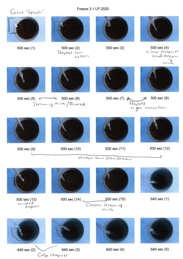
Fig. 1. Contact sheet 1 (2020) 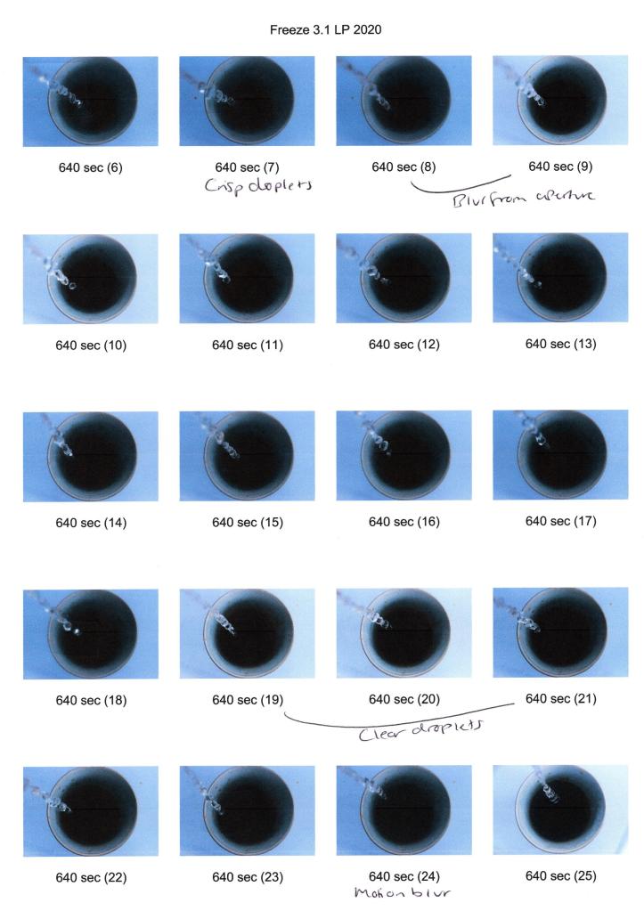
Fig. 2. Contact sheet 2 (2020) 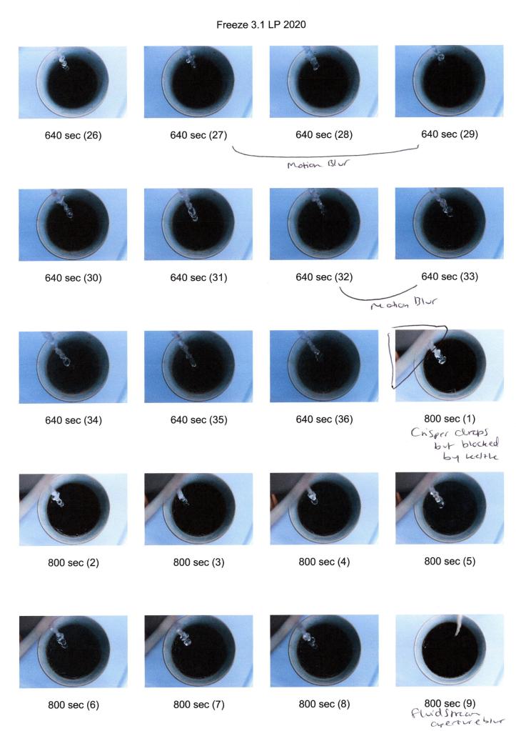
Fig. 3. Contact sheet 3 (2020) 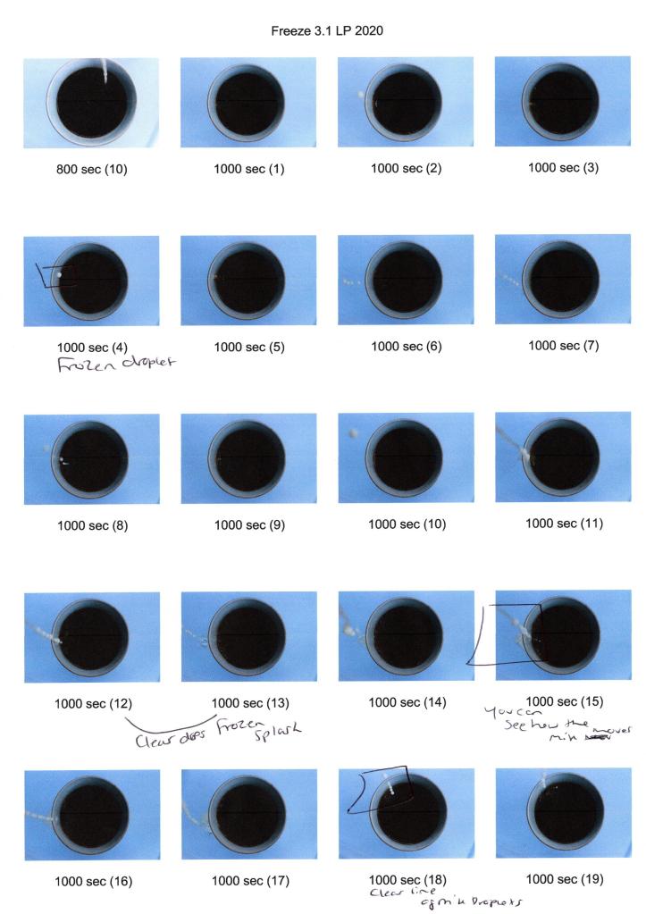
Fig. 4. Contact sheet 4 (2020) 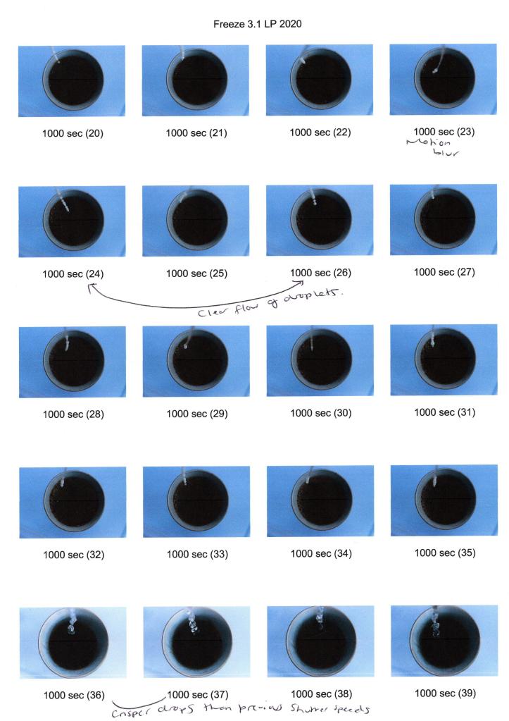
Fig. 5. Contact sheet 5 (2020) 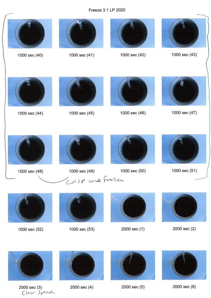
Fig. 6. Contact sheet 6 (2020) 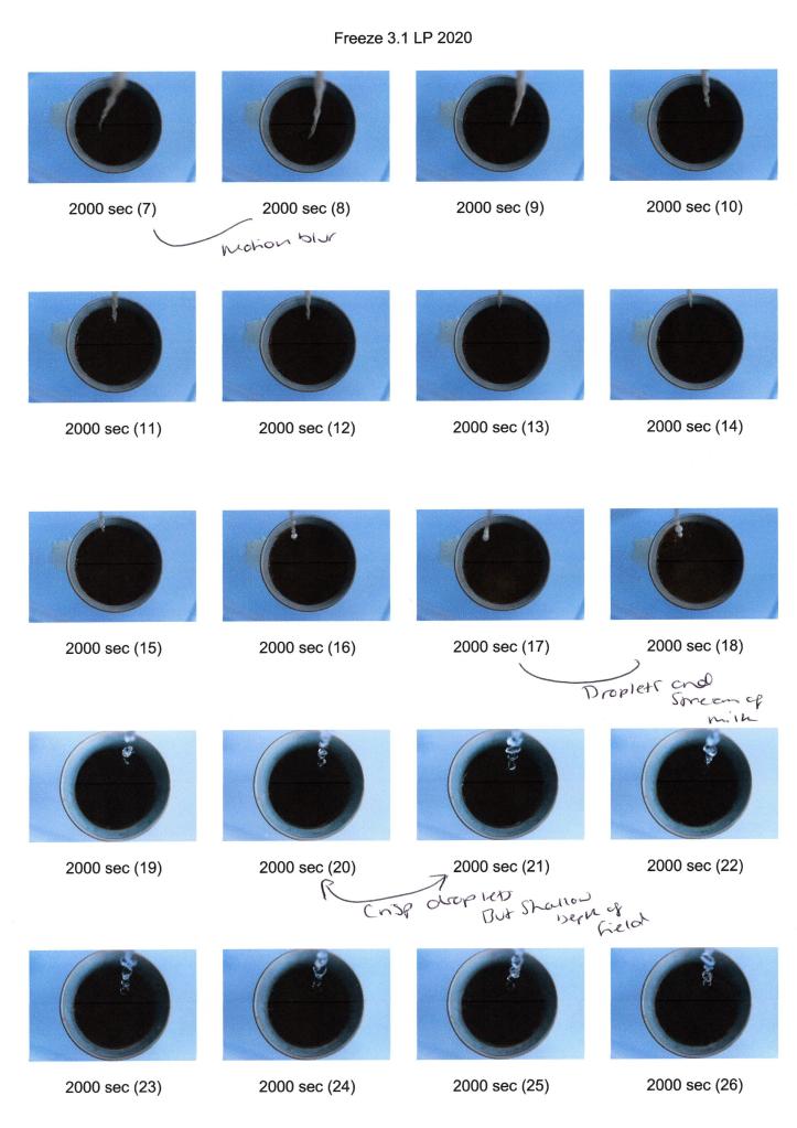
Fig. 7. Contact sheet 7 (2020) 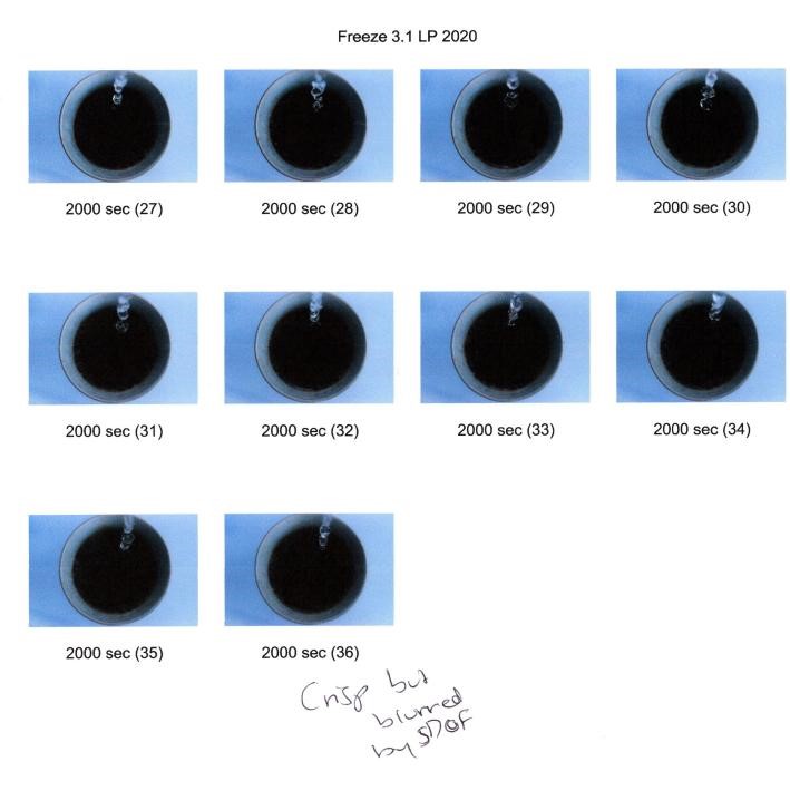
Fig. 8. Contact sheet 8 (2020)
For this exercise, I placed my camera onto a tripod and positioned it firmly on the table, making sure the lens was facing directly above the cup. To avoid any distraction from the tripod legs and jugs used to pour the liquids, I adjusted the SONY 18-55 3.5-5.6 SAM lens the longest focal length of 55mm and in turn, tightly framed the coffee cup.
Using a ring light to provide extra light, didn’t make any difference at all due to the natural light already in the room; consequently I decided to go ahead with the daylight already available and kept the exposure in mind when altering the shutter speeds. As seen above, the selected speeds to experiment with were 1/500, 1/640, 1/800, 1/1000 and 1/2000, allowing me to capture a range of shots to compare and understand frozen moments in time.
Unfortunately, the fastest shutter speed I could use was 1/2000, before the exposure started to get darker due to the camera’s light sensitivity limit. While I would’ve liked to have used an even higher setting, the chosen speeds still provided me with a distinct, frozen set of shots to complete this exercise.
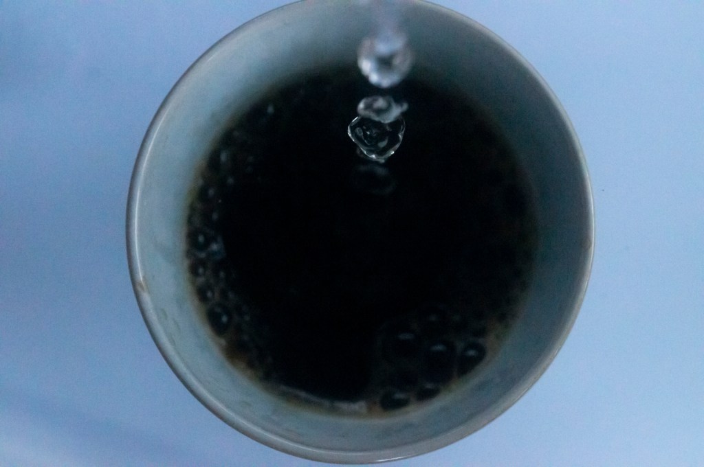
1/500 sec; f/16; ISO 6400
A shutter speed of 1/500 captures the small splash of liquid, showing the forceful impact the milk had on the coffee after being poured from a height of 15 centimetres (see Fig. 9). If the milk were poured gently from a reasonable height, there would be fewer droplets, little to no splashes and as a result, wouldn’t create such an intense surface tension. While the majority of the shot is crisp, there is some motion blur just below the droplets and surrounding the crown of liquid, therefore does not freeze the action in its entirety and proves that a faster shutter speed is more appropriate for this experiment.

1/640 sec; f/13; ISO 6400
The water droplets in this image (see Fig. 10) are seen to be connected with thinner links of liquid in between each sphere, showing how a stream of water isn’t always as smooth as the naked eye would see. Each droplet is a different shape and warps from the gravity and height of the kettle compared to the cup. Once again, the shot isn’t entirely crisp due to some motion blur surrounding the water, however, is slightly better than the previous image and as a result, shows how small changes in shutter speed can affect the result of a shot significantly.
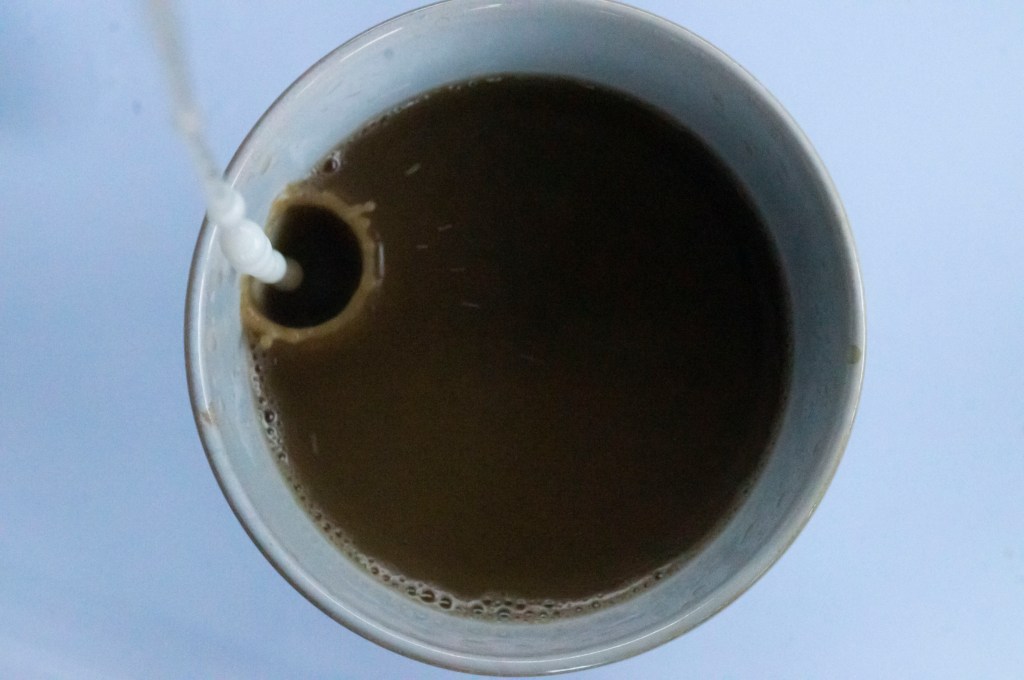
1/800 sec; f/9; ISO 6400
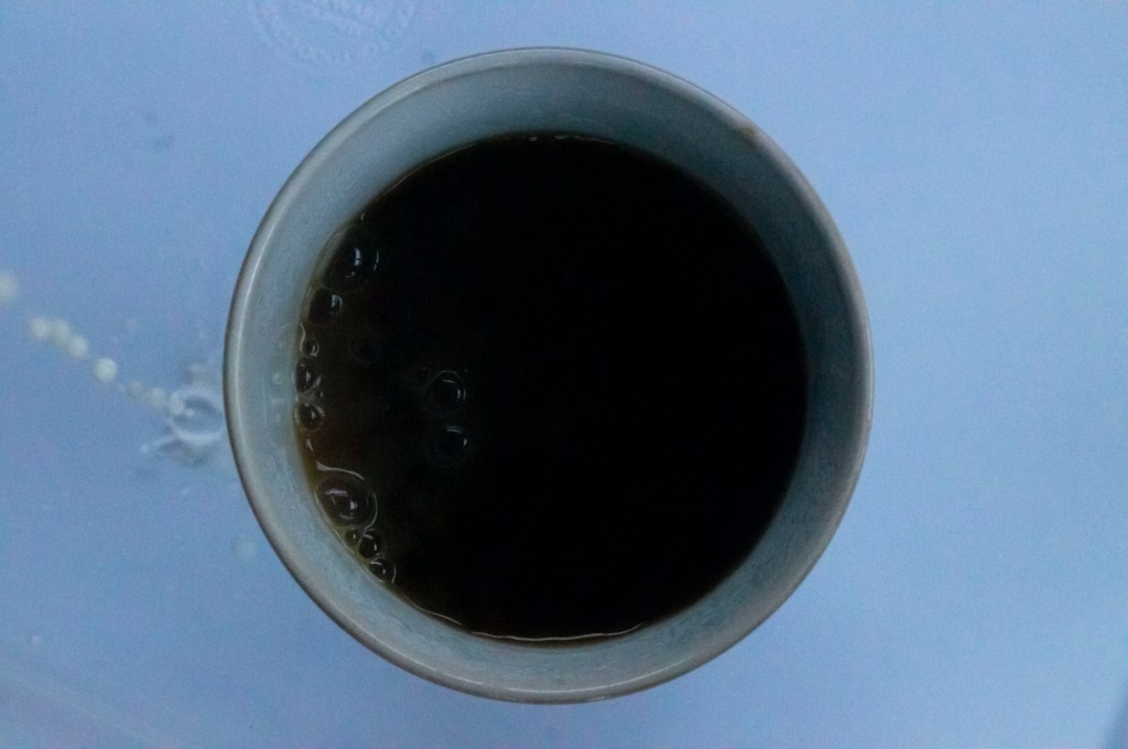
Using a shutter speed of 1/800 enabled me to capture a much smoother stream of milk (see Fig. 11), as opposed to heavy droplets of liquid as seen in previous images which were interesting to see, as this is a more accurate visual of what we would see in the flesh. Due to the shallow depth of field, however, the flow isn’t as sharp and shows the downside of using a faster shutter speed at this particular angle as the aperture becomes wider to allow more light in, yet reduces the area of focus and distorts the shot. Despite this, we can focus on the small ripples created in the coffee not seen in previous shots as the imagery wasn’t as clear as this, allowing the viewer to discover a whole new layer of movement.
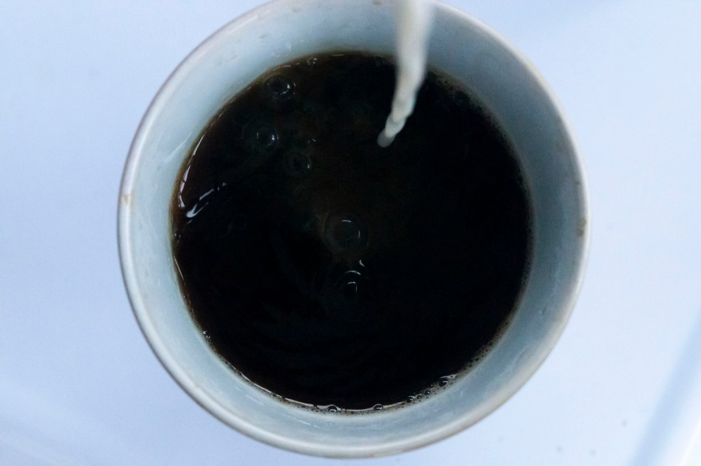
1/1000 sec; f/10; ISO 6400
Comparing this image (see Fig. 12) to the first example shows how vital shutter speed can be when it comes to freezing movement as the droplets are precise, crisp and utterly void of motion blur. However, once again, the shallow depth of field prevents an entirely in-focus shot. Due to a wider aperture, the exposure is brighter than previous shots and has reduced the grain created by the ISO. While the earlier settings did capture movement that would be difficult to see clearly with the naked eye, it is clear to see that shutter speeds above 1000 are the most successful if you want to completely freeze the most minute of moments in it’s sharpest form.
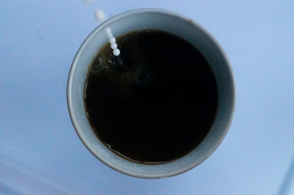
1/2000 sec; f/7.1; ISO 6400
Even though the shallow depth of field has once again prevented the image from being fully in focus, it enhances the details we can see and directs our eyes towards the clear droplets mid-frame (see Fig. 13). Instead of a frozen sphere, the camera has managed to capture the water breaking and flattening due to gravity which we wouldn’t usually see without slow-motion technology or fast shutter speeds. After reviewing the whole shoot, this is the most prominent and unique as the physics of the water has been visibly documented, which is fascinating.
1/1000 sec; f/11; ISO 6400
This example (see Fig. 14) is more of an ‘outtake’ than anything else, however was an image I wanted to include to reflect back on the idea of fragmenting time. Due to the height of the milk jug, it was extremely difficult to keep the liquid pouring in one fluid stream especially as it began to run out, causing the milk to break in flow and splash down the side of the cup. This event isn’t something that the viewer would’ve seen if not included in this set, therefore is a slice of time that could remove context from the shooting process.
Reflection
Despite my apprehension at the start of this exercise, these images have helped me to understand both the importance and impact of shutter speeds, how time can be frozen, and we can discover the most minute details because of it.
There is only so much you can see with the naked eye that if you blink, you can miss the most spectacular moments created in milliseconds, yet we can freeze and keep these moments forever with just a click of a button. Capturing these moving subjects help challenge the viewer’s perception of movement and all of the elements that make up one constant motion, as well as being able to admire the beauty of a frozen moment and its intricacies.
It is fascinating to see the individual phases of event and the small details we can discover within, that we may not have noticed before.
References:
Bloomfield, R., 2018. Photography 1: Expressing your Vision. 4th ed. [pdf] Barnsley: OCA, p. 61. Available at: https://www.oca-student.com/course/photography-1-expressing-your-vision [Accessed 16 March 2020].
List of images:
Figure. 1. Powell, L. (2020) Contact sheet 1 [scanned document] In possession of: Lauren Powell: Eastleigh.
Figure. 2. Powell, L. (2020) Contact sheet 2 [scanned document] In possession of: Lauren Powell: Eastleigh.
Figure. 3. Powell, L. (2020) Contact sheet 3 [scanned document] In possession of: Lauren Powell: Eastleigh.
Figure. 4. Powell, L. (2020) Contact sheet 4 [scanned document] In possession of: Lauren Powell: Eastleigh.
Figure. 5. Powell, L. (2020) Contact sheet 5 [scanned document] In possession of: Lauren Powell: Eastleigh.
Figure. 6. Powell, L. (2020) Contact sheet 6 [scanned document] In possession of: Lauren Powell: Eastleigh.
Figure. 7. Powell, L. (2020) Contact sheet 7 [scanned document] In possession of: Lauren Powell: Eastleigh.
Figure. 8. Powell, L. (2020) Contact sheet 8 [scanned document] In possession of: Lauren Powell: Eastleigh.
Figure. 9. Powell, L. (2020) Freeze 1 [image] In possession of: Lauren Powell: Eastleigh.
Figure. 10. Powell, L. (2020) Freeze 2 [image] In possession of: Lauren Powell: Eastleigh.
Figure. 11. Powell, L. (2020) Freeze 3 [image] In possession of: Lauren Powell: Eastleigh.
Figure. 12. Powell, L. (2020) Freeze 4 [image] In possession of: Lauren Powell: Eastleigh.
Figure. 13. Powell, L. (2020) Freeze 5 [image] In possession of: Lauren Powell: Eastleigh.
Figure. 14. Powell, L. (2020) Freeze 6 [image] In possession of: Lauren Powell: Eastleigh.
Exercise 2.4 Woodpecker
Notes, Part 2, Reflection on courseworkSummary:
For the final exercise in this project I;
– Noted the restrictions caused due to the space available to me in my chosen location and how the camera settings were changed to deal with this minor issue.
– Documented the variety of camera settings used and how I took the images, for example, resting the camera on my knees to reduce camera shake and maintain the framing,
– Analysed the visual differences between each shot, how the different focal ranges helped enhance certain details that couldn’t be seen in the other.
– As well as exploring the lack of focus caused by using a small aperture and focusing on a midpoint, making the composition quite messy.
– Acknowledged the importance of a focal point and aperture, depending on the kind of image you’re trying to achieve.
Brief :
‘Find a subject in front of a background with depth. Take a very close viewpoint and zoom in;
you’ll need to be aware of the minimum focusing distance of your lens. Focus on the subject
and take a single shot. Then, without changing the focal length or framing, set your focus to
infinity and take a second shot.
As you review the two shots, how does the point of focus structure the composition? With
a shallow depth of field the point of focus naturally draws the eye, which goes first of all to
the part of the image that’s sharp.
Again without moving the camera, select a very small aperture (perhaps one stop above
the minimum to avoid diffraction) and find a point of focus that will give you acceptable
sharpness throughout the entire field, from foreground to infinity. Take a third shot and add
it to the first two to make a set.’ (Bloomfield, 2018)
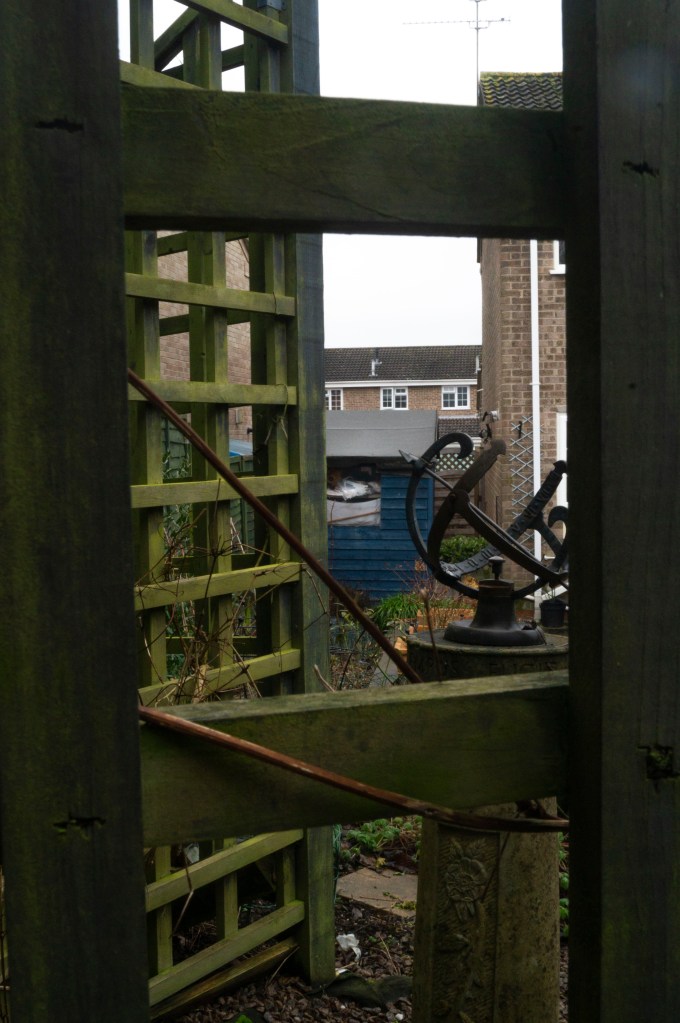
Due to the lack of space between the subject and I, the longest the focal length could be with the SONY 18-55 3.5-5.6 SAM lens was 26mm keeping in mind the minimum focal distance and being able to frame the fence appropriately. The aperture on my Sony A57 was set to it’s widest at f/5.6 to provide a clear difference between the foreground and background. To assure the framing was consistent, the camera was balanced on my knees as there was no space for a chunky tripod.
1/250 sec; f/5.6; ISO 400; 26mm
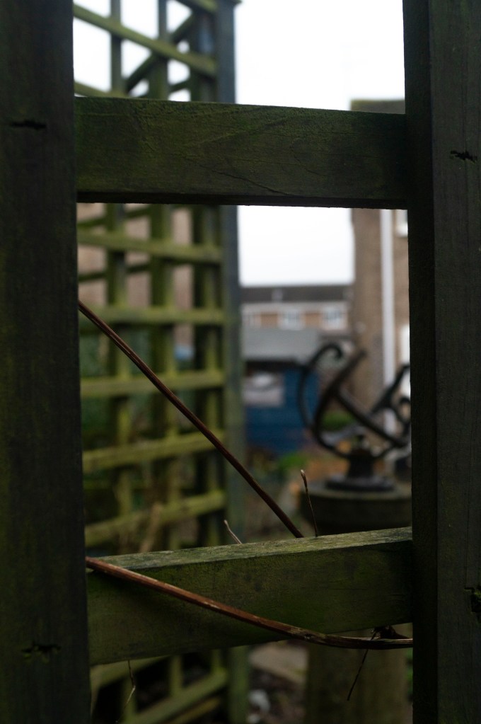
Fig. 1. Focus on subject (2020)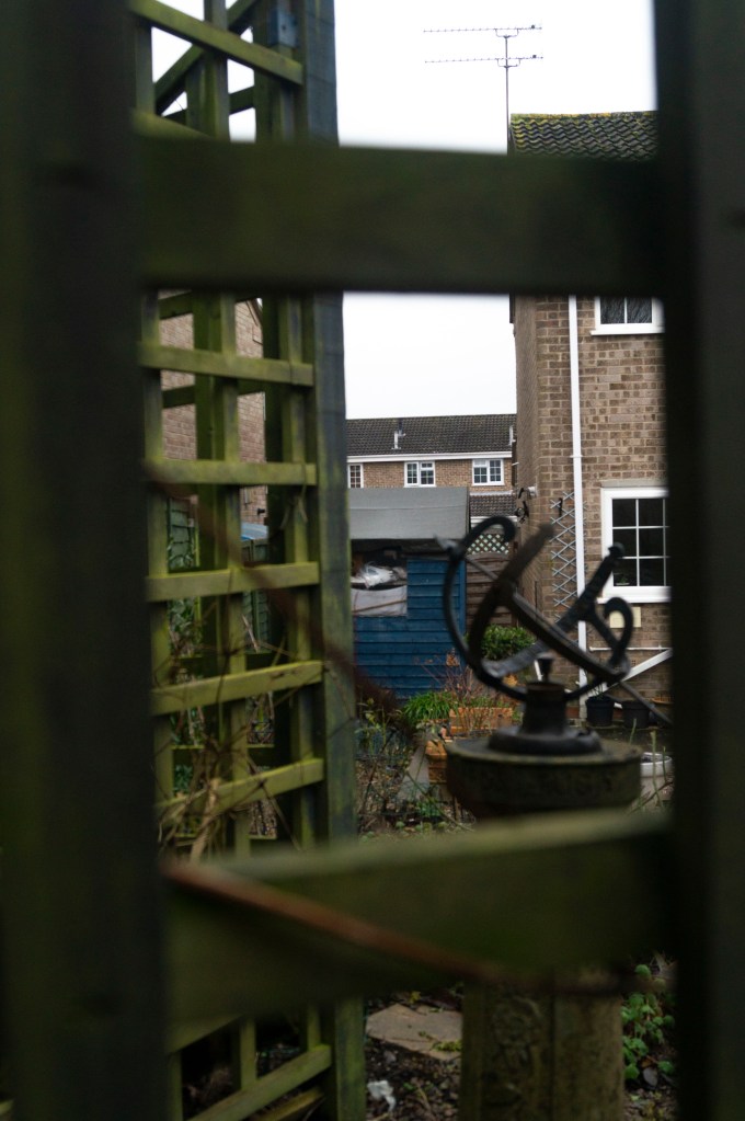
1/250 sec; f/5.6; ISO 400; 26mm
Fig. 2. Infinity (2020)
Focusing on the subject means that the eyes are drawn towards the outer edges of the frame as the trellis fence fills the space (see Fig. 1). We are also able to see the grain of the wood, the moss and twigs that cover and intertwine the fence, which cannot be seen when the focus is set to infinity. The fence also frames the blurred background and creates a balanced composition by cutting the scene into individual sections. Infinity mode draws the eyes into the image and through the frame, rather than around it. This provides more depth due to the layering of objects and buildings behind one another. More detail can be seen in Infinity (see Fig. 2), making it interesting for the eye as the individual sections provide more context, texture and colour than the first image. Despite the busy background, the composition remains balanced due to the blurred foreground dividing the frame.
1/10 sec; f/25; ISO 400; 26mm
Fig. 3. Midpoint focus (2019)
For the final image (see Fig. 3), I set the aperture to f/25 and made sure that as much of the image was in focus as possible. This took a couple of attempts as the camera was set to manual focus, meaning it is very easy to be slightly out of focus when adjusting it by hand.
Comparing this image to the previous two, I can see quite clearly how important aperture, viewpoint and focal length can be when composing a shot. This is an extremely busy image, too much is going on for the eyes to take in and feels messy as a whole. The balance between foreground and background achieved in the first set is much more comfortable for the eye than this shot as everything just blends, so the depth is lost.
References:
Bloomfield, R., 2018. Photography 1: Expressing your Vision. 4th ed. [pdf] Barnsley: OCA, p. 46. Available at: https://www.oca-student.com/course/photography-1-expressing-your-vision [Accessed 6 February 2020].
List of images:
Figure. 1. Powell, L. (2020) Focus on subject [image] In possession of: Lauren Powell: Eastleigh.
Figure. 2. Powell, L. (2020) Infinity [image] In possession of: Lauren Powell: Eastleigh.
Figure. 3. Powell, L. (2020) Midpoint focus [image] In possession of Lauren Powell: Eastleigh.
Exercise 2.3 Focus
Part 2, Reflection on courseworkSummary:
For exercise 2.3 I;
– Mentioned the choice of location and my reasoning for changing positions, in terms of safety while making sure I still covered what was asked in the brief.
– Stated the camera settings and my approach to the task by adjusting my focal lengths, in addition to my own personal distance from the model.
– Analysed the images briefly to understand the visual elements created by the various settings before
– Reflecting on the task as a whole, the difficulties faced while executing it and the importance of going out of you comfort zone.
Brief:
‘Find a location with good light for a portrait shot. Place your subject some distance in front
of a simple background and select a wide aperture together with a moderately long focal
length such as 100mm on a 35mm full-frame camera (about 65mm on a cropped-frame
camera). Take a viewpoint about one and a half metres from your subject, allowing you to
compose a headshot comfortably within the frame. Focus on the eyes and take the shot.‘ (Bloomfield, 2018)
Taking into consideration I had to focus on the subject’s eyes, I adjusted her position so the direct sunlight was shining on the side of her face to avoid eye strain, yet providing enough light for the portrait. My SONY A57 was already set at a wide aperture of f/5.6 from the previous exercise, the SONY 18-55 3.5-5.6 SAM lens only reaches 55mm so, unfortunately, it was the longest the focal length could be. Therefore I stood about a metre away instead of one and a half to make sure she was framed appropriately.
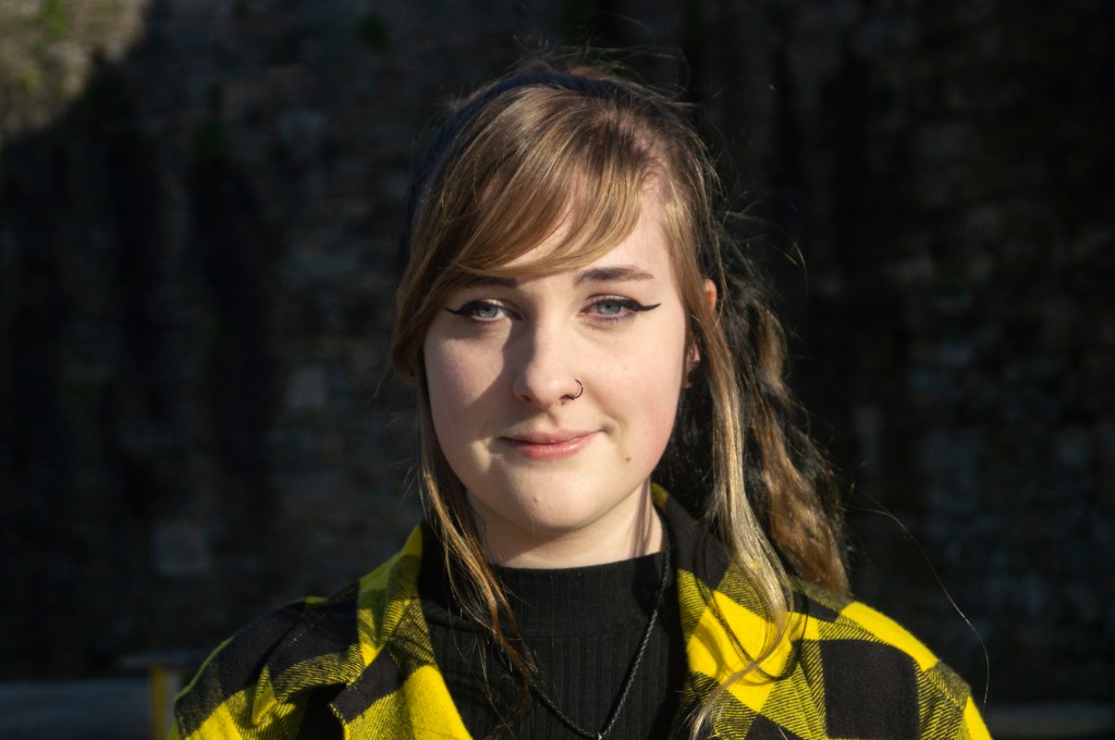
Fig. 1. Focus (2020)
1/4000 sec; f/5.6; ISO 400; 55mm
The model was positioned roughly 3 metres away from an old brick wall at the bottom of our local town, which towers over a pathway and forms a heavy shadow. As well as the background being soft and blurred due to the wide aperture and distance between the subject, the intensity of the sunlight and the dark shadows help the subject stand out even more, making sure she is the main focal point.
It’s interesting how the soft focus creates an illusion of the background being a studio backdrop right behind the model, however, in reality, it is quite a distance away. While you can see subtle shapes and colours, it’s difficult to decipher what is behind the subject which creates a little bit of surface tension between the two.
Reflection:
I use a wide aperture regularly for personal work, so I knew what kind of effect this exercise was meant to achieve. However, direct sunlight isn’t something I have challenged myself with before due to how intense the highlights and shadows can be. These exercises are all about testing your abilities and pushing your comfort zone, which is why I decided to shoot at midday and stop avoiding the fear of intense light.
While it took a little while to figure out which position was best for the model and me, in the end, it worked out better than I expected. In conclusion, exploring different locations, lighting and subjects is something I need to do more.
References:
Bloomfield, R., 2018. Photography 1: Expressing your Vision. 4th ed. [pdf] Barnsley: OCA, p. 45. Available at: https://www.oca-student.com/course/photography-1-expressing-your-vision [Accessed 5 February 2020].
List of images:
Figure. 1. Powell, L. (2020) Focus [image] In possession of: Lauren Powell: Eastleigh.
Exercise 2.2 Viewpoint
Part 2, Reflection on courseworkSummary:
In this exercise I;
– Documented the camera and lens type, along with the settings used.
– Explained the process taken to take these images, the use of direct sunlight and the difficulties faced.
– Briefly analysed the various shots to compare the differences in background, depth of field and distortion.
– Reflected on the difficulty of remembering the difference between long and short focal length, how I handled this and noted the contrasts between the two compositions.
Brief
‘Select your longest focal length and compose a portrait shot fairly tightly within the frame in front of a background with depth. Take one photograph. Then walk towards your subject while zooming out to your shortest focal length. Take care to frame the subject in precisely the same way in the viewfinder and take a second shot. Compare the two images and make notes in your learning log.‘ (Bloomfield, 2018)
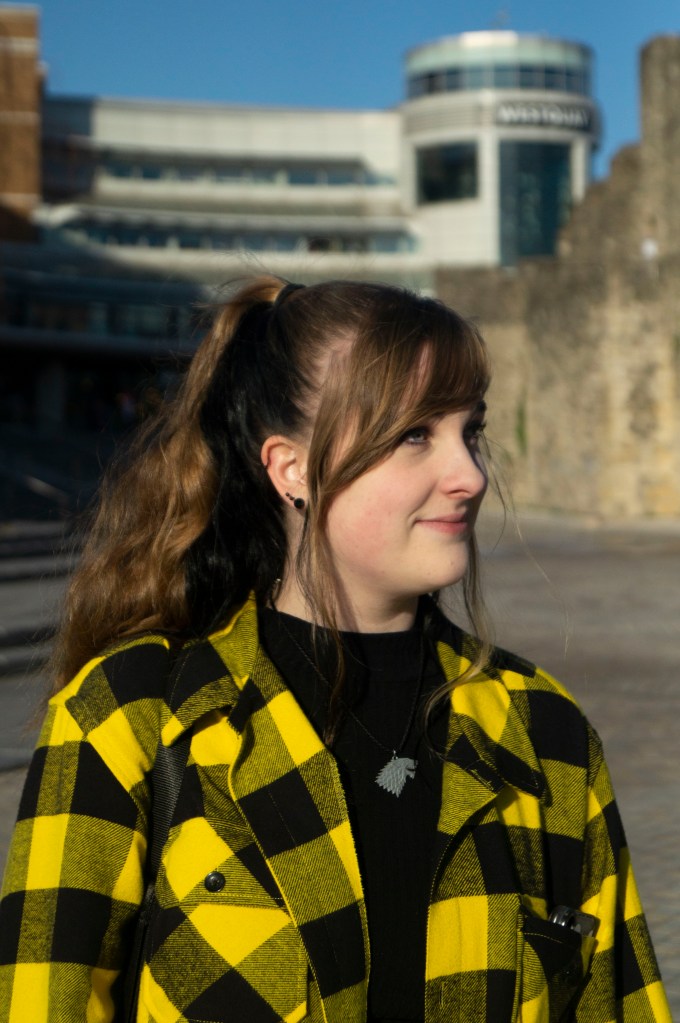
Fig. 1. Viewpoint 1 (2020)
1/4000 sec; f/5.6; ISO 400; 55mm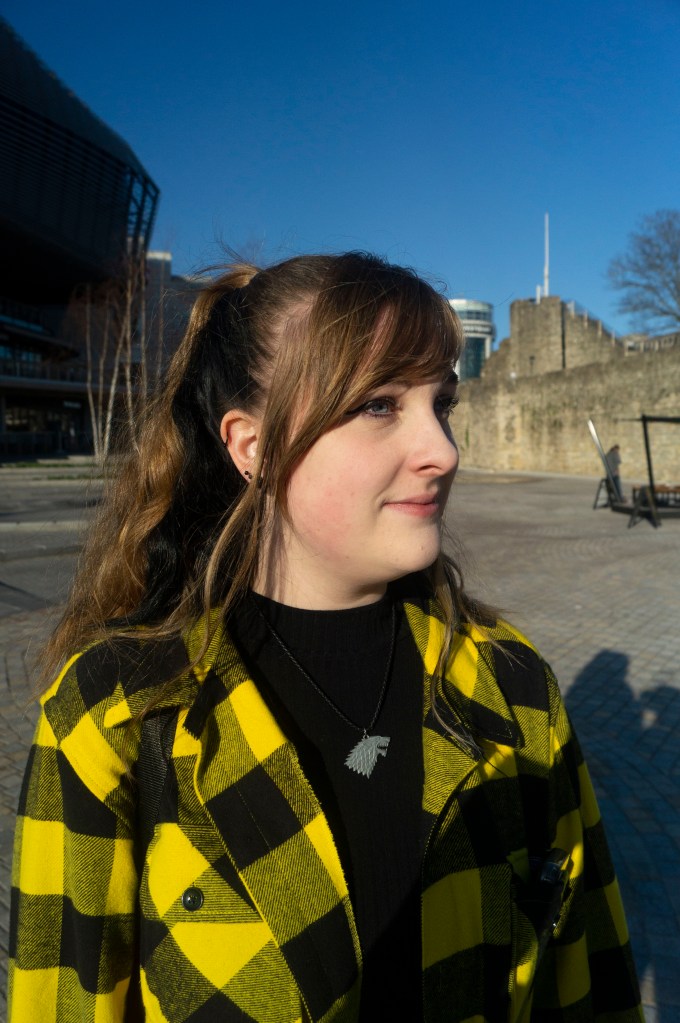
Fig. 2. Viewpoint 2 (2020)
1/4000 sec; f/5.6; ISO 400; 18mm
Just like the previous exercise, I used a SONY A57 with the SONY 18-55mm 3.5-5.6 SAM lens, set the aperture to a wide aperture of f/5.6 to provide a subtle blur behind the model and kept the camera on manual focus to avoid relying on autofocus for a crisp image.
These images were taken in direct sunlight, as all other areas of the town were too dark to capture a crisp portrait, which is why my model is looking sideways rather than forwards. While I preferred the eyes facing the lens, we had to consider eye safety first.
For Viewpoint 1 (see Fig. 1), I zoomed the lens all the way in at 55mm, standing roughly a metre or so away from the model and making sure her upper torso fit tightly within the frame. The background is close yet soft and out of focus, assuring that the person in the frame is the primary focus with minimal distractions from the surroundings. The wall subtly frames the model and doesn’t “cut” through her head. You can see that the image is at eye level, not from above or below, meaning the models face isn’t warped in any way.
For Viewpoint 2 (see Fig. 2), I zoomed out to 18mm and had to stand extremely close to the model to frame the image as accurately as I could to match the previous shot. Despite the wide aperture, the background is much clearer and more in focus than its partner. The buildings are much further away, showing even more of the wall to the right and featuring a whole new building to the left. Unlike the first image, this shot looks as if it has been shot from a lower angle and has distorted the models face in a way a fisheye lens would.
Reflection:
It was difficult for me to actively remember the difference between long and short focal length while taking these images. Usually, I refer to it as zooming in or out. Therefore, I noted that longest = the large number, shortest = the smaller number. These exercises are helping me to push my technical knowledge even further, which is helpful when it comes to comparing the imagery.
The differences between the two images are immense, which I wasn’t expecting even after looking at the example images provided with the brief. It was intriguing to see how small changes can impact the subject and its surroundings in a way that results in two opposing shots.
Hopefully, this experience will challenge me to be more aware of my camera settings and the viewpoint I take an image from, experimenting a little if initially they don’t work out or look ‘right’.
References:
Bloomfield, R., 2018. Photography 1: Expressing your Vision. 4th ed. [pdf] Barnsley: OCA, p. 44. Available at: https://www.oca-student.com/course/photography-1-expressing-your-vision [Accessed 22 February 2020].
List of images:
Figure. 1. Powell, L. (2020) Viewpoint 1 [image] In possession of: Lauren Powell: Eastleigh.
Figure. 2. Powell, L. (2020) Viewpoint 2 [image] In possession of: Lauren Powell: Eastleigh.
Project 1 – Distorting Lens – Exercise 2.1 Zoom
Part 2, Reflection on courseworkSummary:
For this exercise I have;
– Stated the settings used on my camera, the camera and lens type, as well as
– Explaining where the images were shot and how they were taken, including the variety of focal length settings.
– Briefly covered the difficulties faced while shooting in a busy environment and the knowledge I have gained by completing this task, such as the impact zoom has on the depth of an image.
– Analysed the imagery taken, documenting what I found within each shot visually alongside the technical strengths.
– Inserted a slideshow to show the idea of moving through a scene without actually moving.
– Cropped an image to show how zoom can affect the context of an images, before exploring
– The history of pixel art in gaming and the comparison between peoples preference for clearer graphics in games and sharp HD images in digital photography, versus nostalgia and aesthetics.
– Made notes on the power of a pixel within an image and they importance of the detail within an image before
– Reflecting on the exercise as a whole and what I found both difficult, or interesting.
Brief:
‘Find a scene that has depth. From a fixed position, take a sequence of five or six shots at different focal lengths without changing your viewpoint. (You might like to use the specific focal lengths indicated on the lens barrel.) As you page through the shots on the preview screen it almost feels as though you’re moving through the scene. So the ability to change focal lengths has an obvious use: rather than physically move towards or away from your subject, the lens can do it for you. But zooming is also a move towards abstraction, which, as the word itself tells us, is the process of ‘drawing things away’ from their context.‘ (Bloomfield, 2018)
Before starting this exercise, I made sure that my Sony A57 was set to aperture priority mode as requested at the start of Imaginative Spaces, as well as switching the SONY 18-55 3.5-5.6 SAM lens and camera body to manual focus, to avoid relying on autofocus to sharpen the image correctly.
I decided to take these images while out and about in my local town, therefore I didn’t have a tripod with me purely out of convenience. However, to make sure the position was fixed I crouched to keep my feet firmly in one place and used my knees to keep the camera balanced. Due to how busy the environment was, a few attempts had to be made, as members of the public were walking in and out of the frame, blocking the main focal point at the end of the walkway and disturbing the abstraction.
There are 5 focal lengths labelled on the lens ring (55mm, 35mm, 28mm, 24mm, 18mm) however I used these as a rough guide to show a gradual difference in the zoom settings. The focal lengths used were 55mm, 45mm, 35mm, 30mm, 26mm and 18mm, which created a fairly even spread as can be seen below.
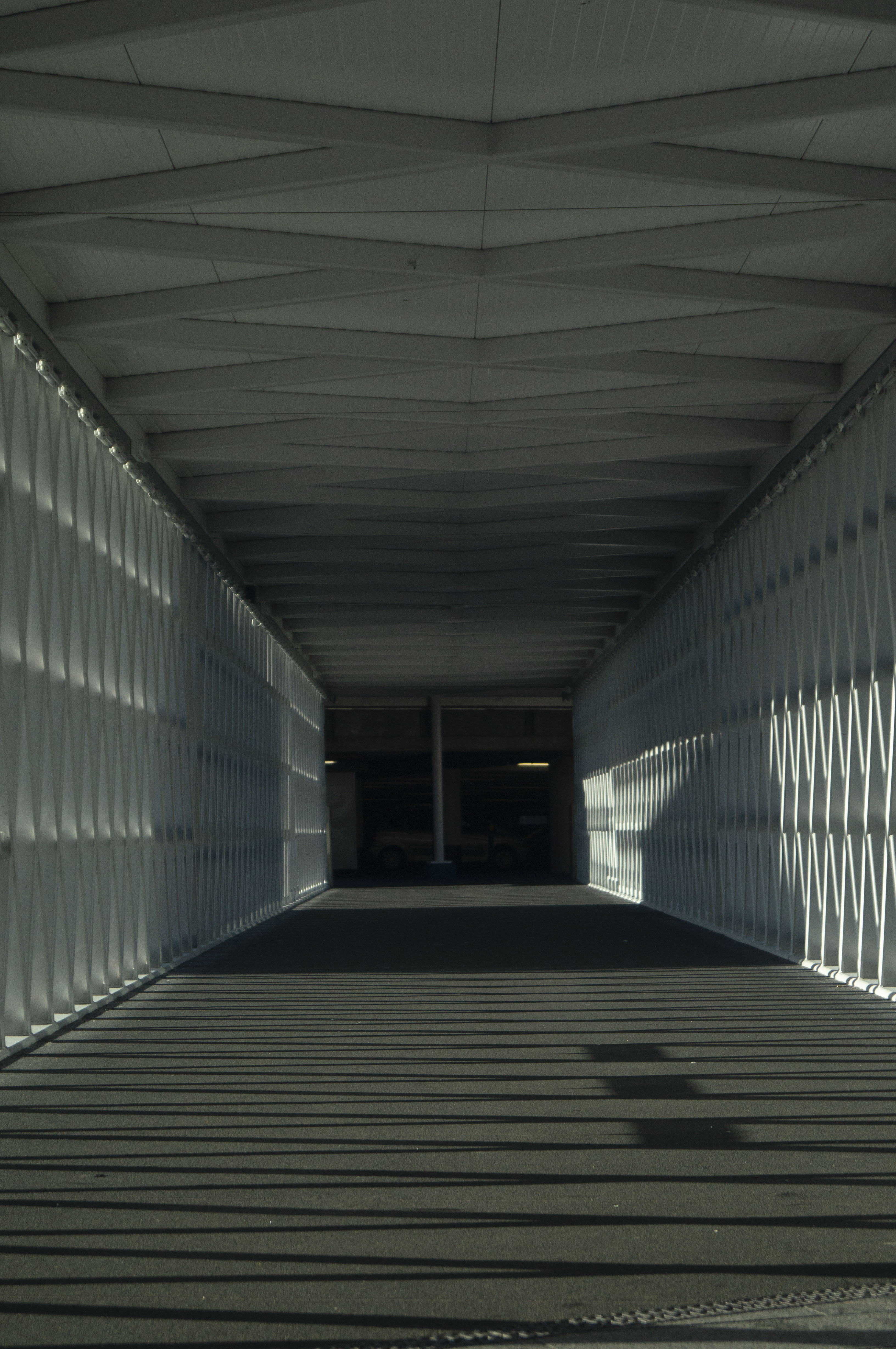
Fig. 1. Lens 1 (2020)
1/1600 sec; f/5.6; ISO 400; 55mm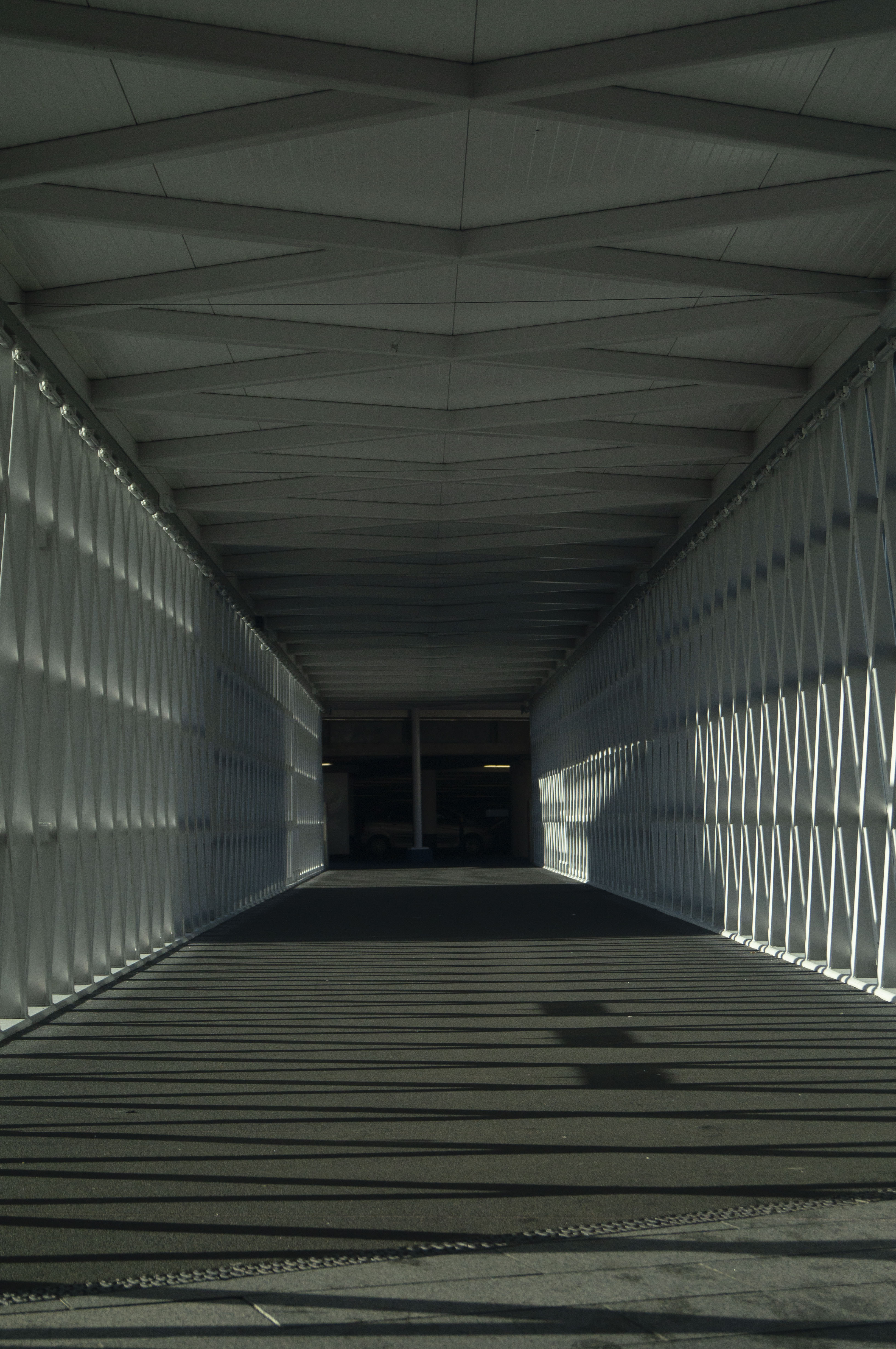
Fig. 2. Lens 2 (2020)
1/2000 sec; f/5.6; ISO 400; 45mm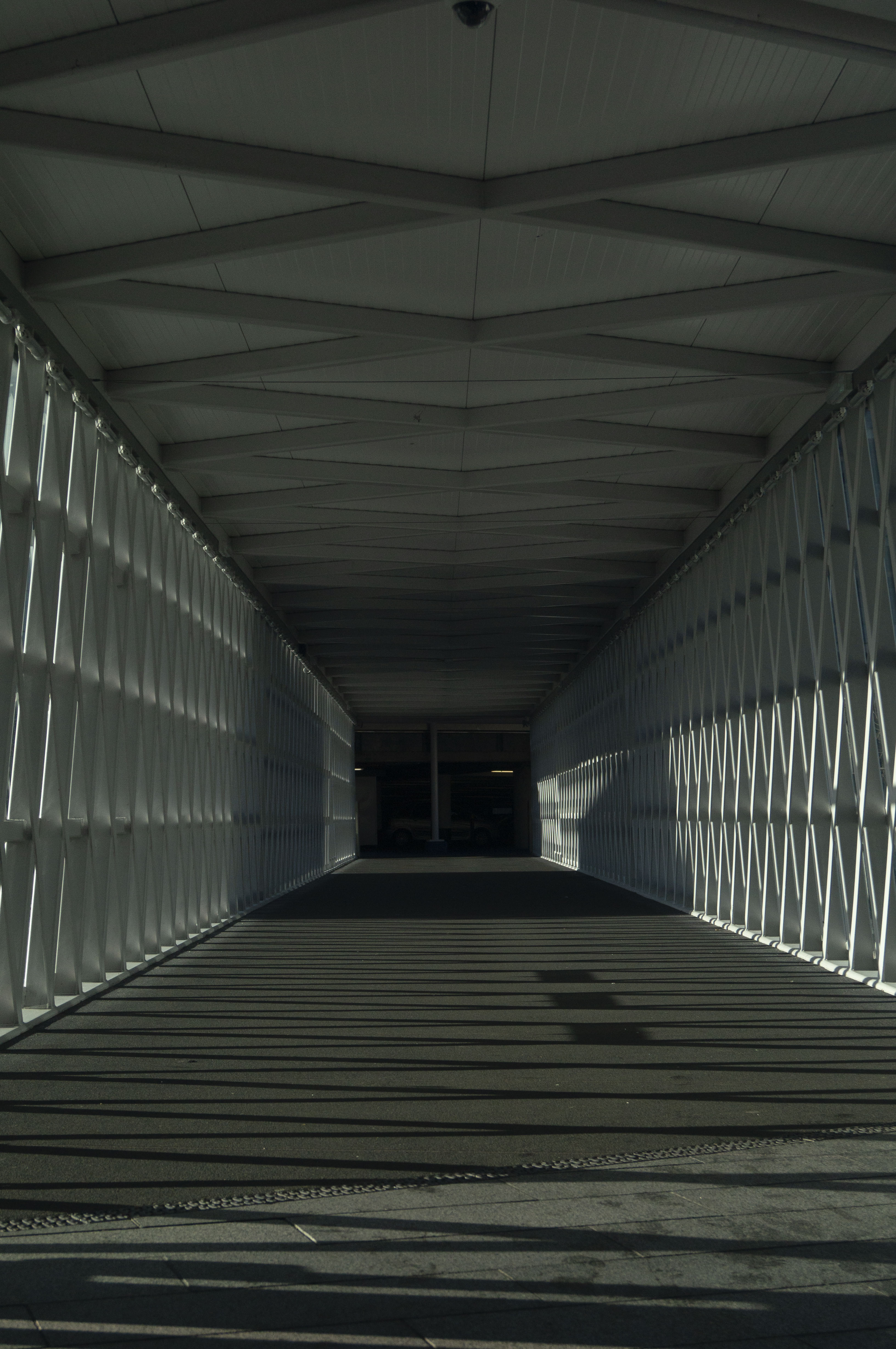
Fig. 3. Lens 3 (2020)
1/2000 sec; f/5.6; ISO 400; 35mm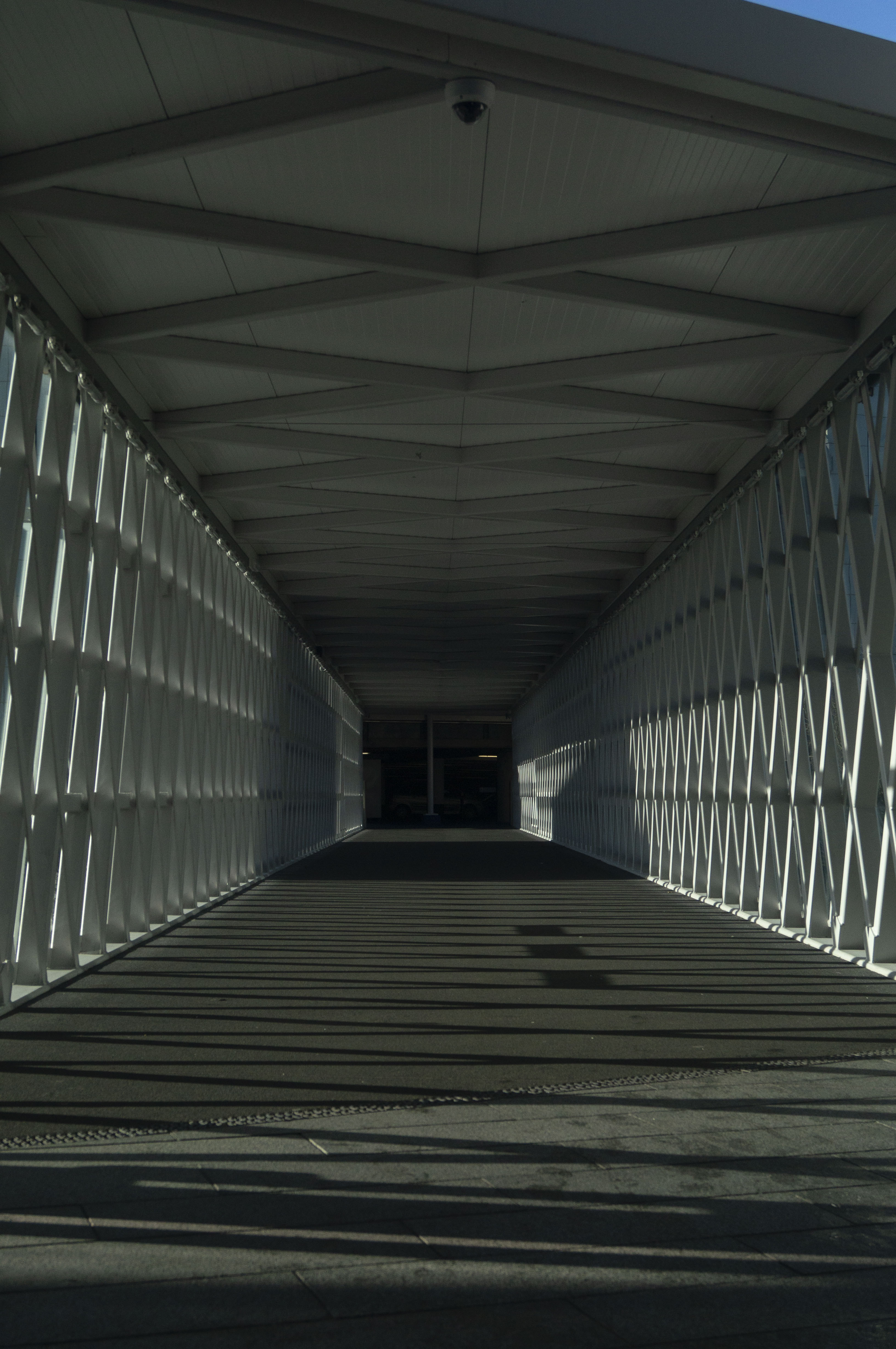
Fig. 4. Lens 4 (2020)
1/2500 sec; f/5.6; ISO 400; 30mm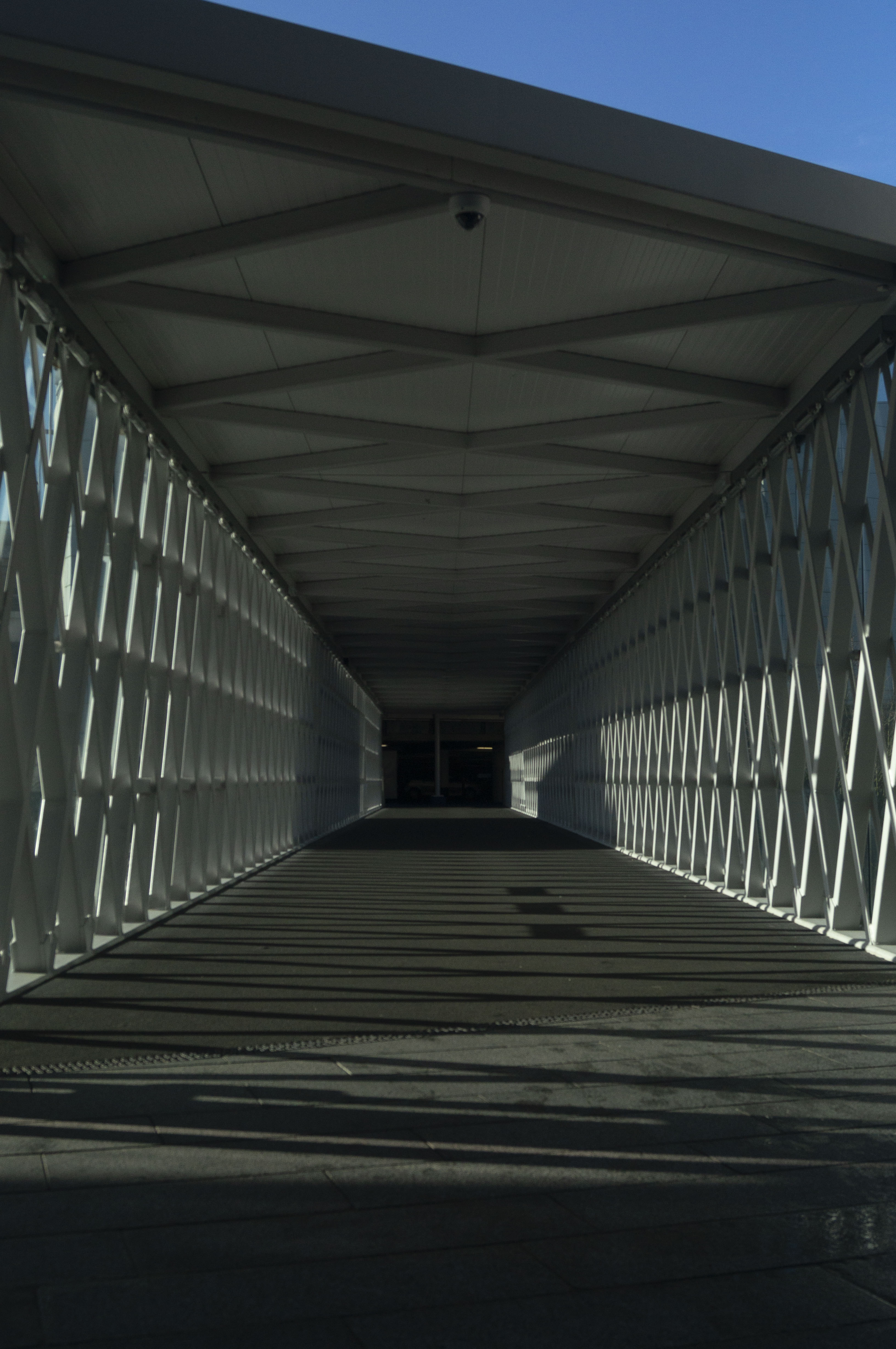
Fig. 5. Lens 5 (2020)
1/2500 sec; f/5.6; ISO 400; 26mm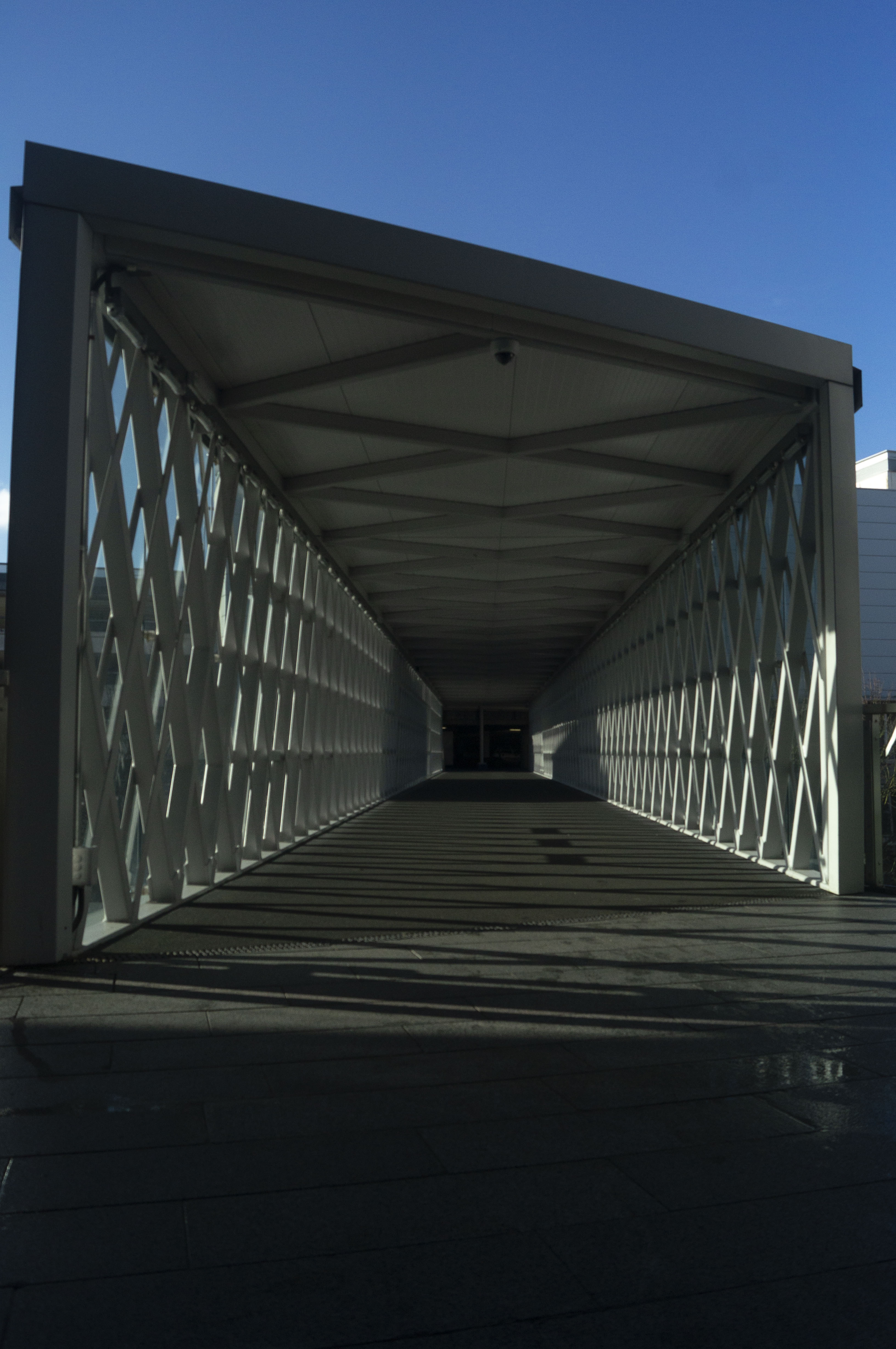
Fig. 6. Lens 6 (2020)
1/3200 sec; f/5.6; ISO 400; 18mm
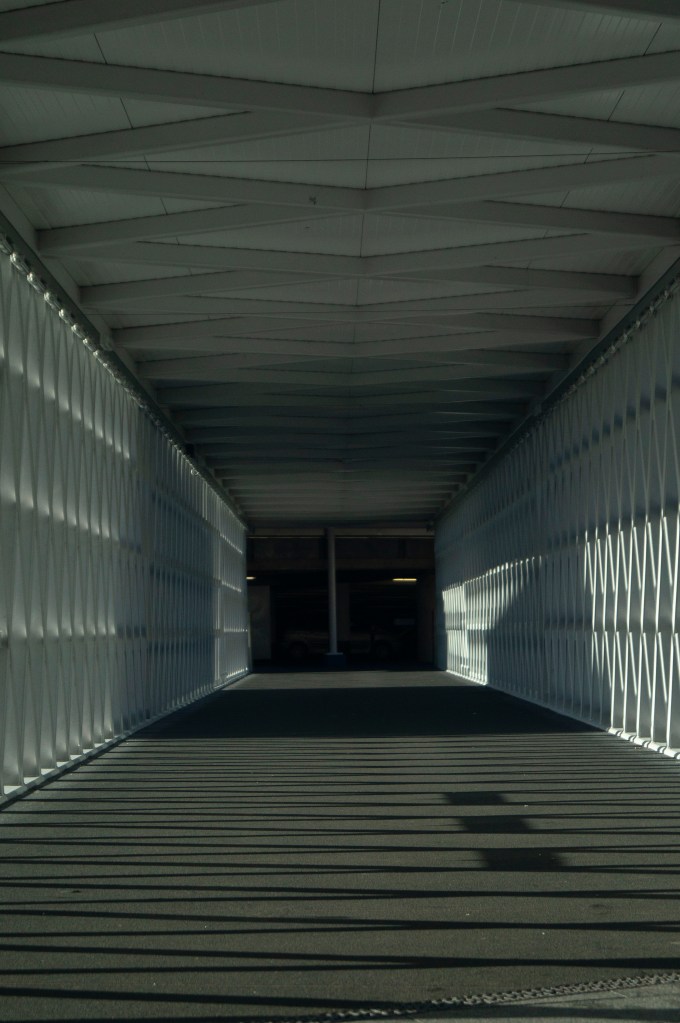
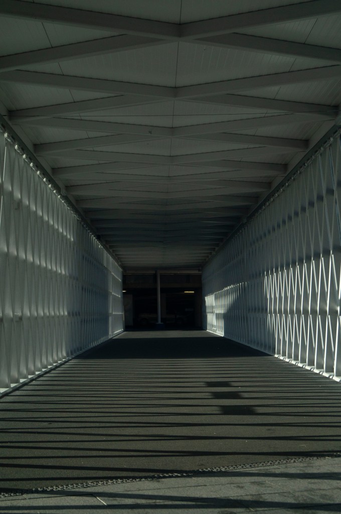
For a few years I have been using prime lenses and have learned the importance of being able to move your body to get the image you want, therefore switching back to a zoom lens and being able to ‘move’ through a scene via the lens has reminded me of the difference perspectives you can achieve if you vary the lenses and settings.
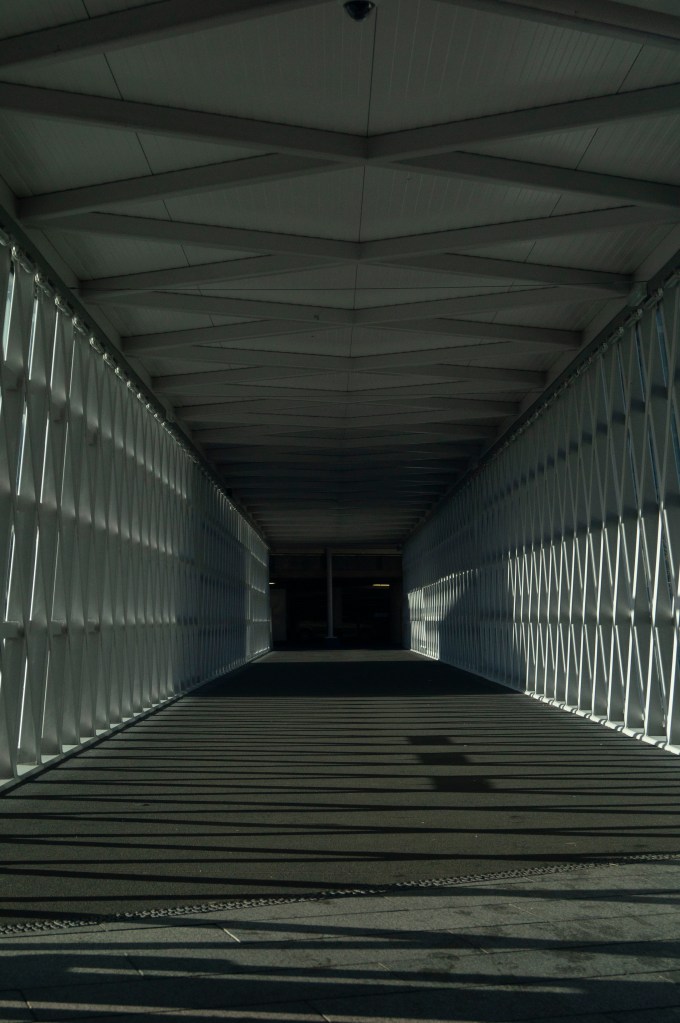
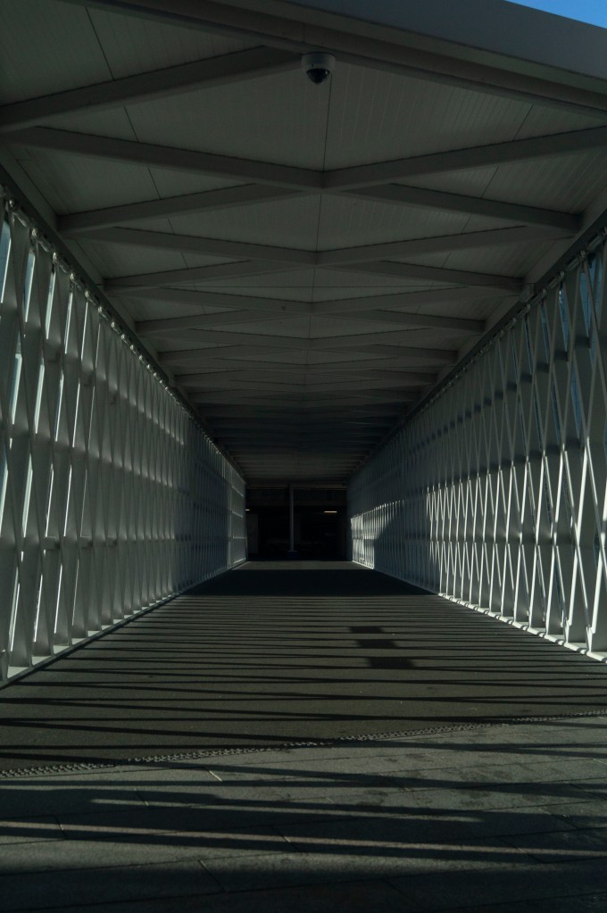
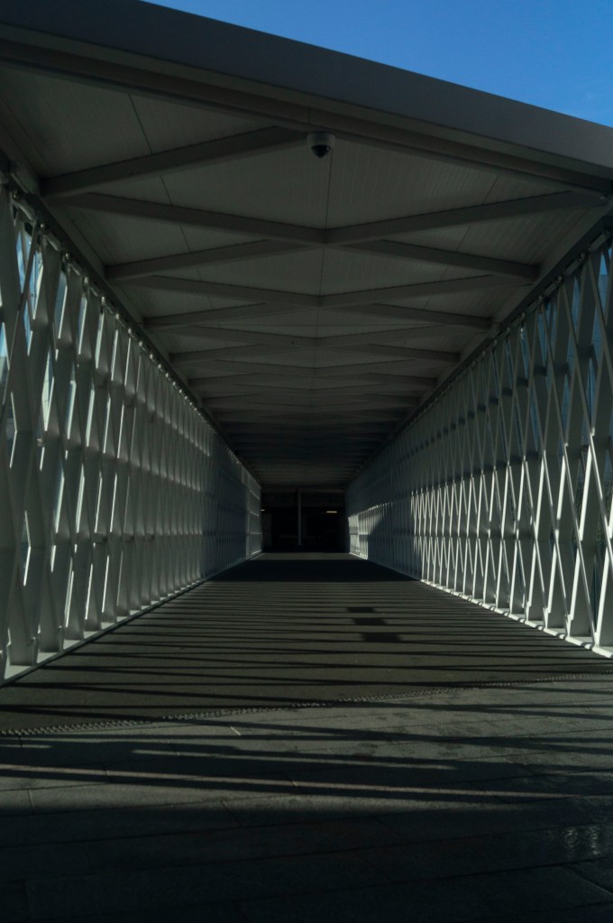
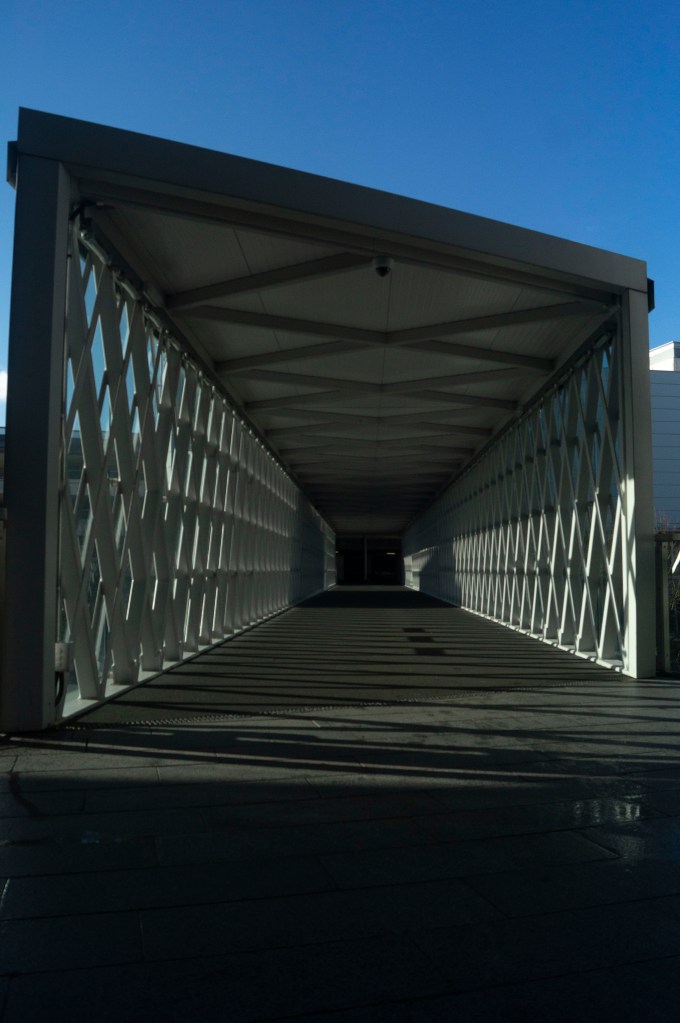
The longer the focal length is, the more cropped and out of context the subject (see Fig. 1.) becomes having eliminated the true length of the walkway. However, you can find much more detail within the scene such as the walls and poles in the car park that you can’t see as clearly with the shorter focal length. As you pan through each image, the shorter the focal length gets the more it creates the sense of backing out of the small box of darkness at the end of the tunnel, into a bright and open space showing the true extent of the path. The shot taken at 26mm (see Fig. 5) is the most accurate portrayal of what I could see in person, a combination of shadows and highlights from the midday sun, a clearer view of the latticed walls, the true length of the path and a small slither of blue sky, therefore looking at how much detail is captured in the 18mm shot shows how powerful zoom can be. The last image (see Fig. 6) is an expanded shot, almost like a vertical panorama showing more of the sky, bringing more colour and light into the frame than could be seen in person, bringing the viewer about 2 metres further back from the position of the camera, providing more height to the image and showing the full framework of the walkway.
Considering my camera lens couldn’t zoom in any further than 55mm, I created the last image in Photoshop by repeatedly zooming in and cropping the image shot at 18mm, taking screenshots of the process. This created a very abstract final product, focusing more on the details of the images up close than as a whole.
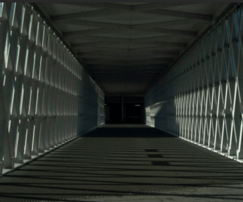
Fig. 7. Cropped (2020) 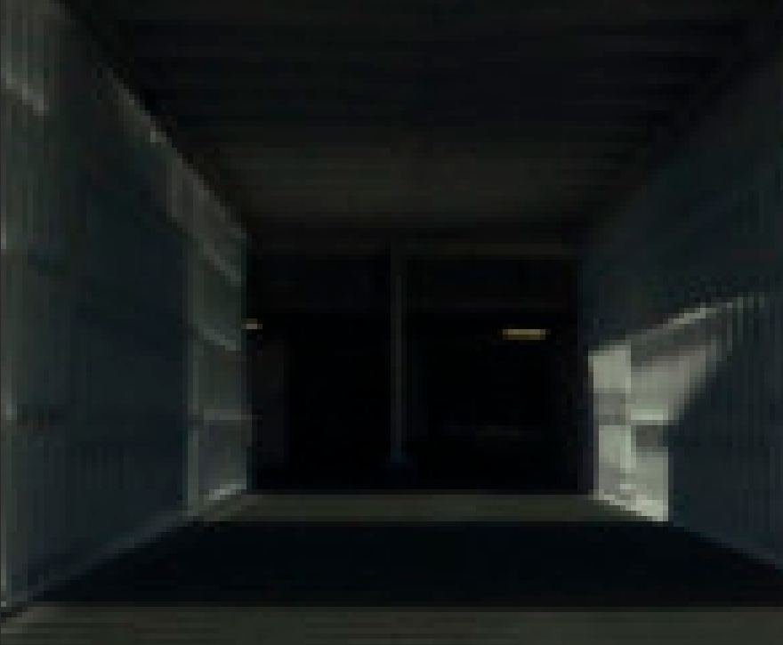
Fig. 8. Cropped and zoomed (2020) 
Fig. 9. Cropped, zoomed and cropped again (2020)
This process reminded me of pixel art and how the early era of game producers, used this style despite the lack of technology and experience, to create simple yet fun games by using simple shapes to represent certain objects or characters, relying on the ‘imagination of players to fill in the blanks’ (Griffiths, 2017).
Over the years the style evolved due to the advance in technology, while they were still restricted, 8-bit games such as Super Mario Bros. 3 (see Fig. 10) explored the idea of turning pixel blocks into more recognisable characters, as well as including backgrounds and inserting cut scenes, ultimately fleshing out the game and making it more interactive and immersive as a whole (Griffiths, 2017).

In modern times, however, pixel art is mostly used for the retro aesthetic and challenging imagination more so than a technical choice, mainly because games with higher graphics and 3D elements seem to be more appealing to most players due to the realism.
This is very similar to the development of digital cameras and lenses, to help capture more high definition imagery via digital pixels, in comparison to pinhole and film cameras which are instead made up of noisy grains. Much like old games, “vintage” cameras are used by a lot of people these days for nostalgic and visual purposes rather than the technical elements.
More and more people are becoming interested in the latest technology and capturing more detailed and crisp photographs, almost as if you were looking at it in person, however at the end of the day no matter how high the resolution may be, the closer you zoom into the details you will see that every image is made up of individual pixels or grains. The final image I have created may not be the most appealing to the eye, but the distorted out of context blocks all add up to create the full photograph in a frame. Not every image has to be clear or aesthetically pleasing, as long as you have the imagination to see the deeper details within a simpler, abstracted piece.
Reflection
Despite the fact this exercise took a few attempts to get right, I’m pleased that it allowed me to re-explore the power of zoom lenses, what details can be captured in the frame, what changes and how the perspective can be altered just by changing the focal length. The position of the camera within a scene, the settings you choose and the lens you pick, can affect the outcome of an image which is something I had forgotten due to the restrictions of fixed focal lengths.
It also helped me look at my images in closer detail, by experimenting with extreme zoom and cropping to discover the tiny details that build the whole image.
References :
Bloomfield, R., 2018. Photography 1: Expressing your Vision. 4th ed. [pdf] Barnsley: OCA, p. 40. Available at: https://www.oca-student.com/course/photography-1-expressing-your-vision [Accessed 3 February 2020].
Griffiths, D. (2017) ‘The History Of Pixel Art – The Factory Times’. [online] Available at : http://www.thefactorytimes.com/factory-times/2018/9/27/the-history-of-pixel-art (Accessed 29 January 2020)
List of Images :
Figure. 1. Powell, L. (2020) Lens 1 [image] In possession of: Lauren Powell: Eastleigh.
Figure. 2. Powell, L. (2020) Lens 2 [image] In possession of: Lauren Powell: Eastleigh.
Figure. 3. Powell, L. (2020) Lens 3 [image] In possession of: Lauren Powell: Eastleigh.
Figure. 4. Powell, L. (2020) Lens 4 [image] In possession of: Lauren Powell: Eastleigh.
Figure. 5. Powell, L. (2020) Lens 5 [image] In possession of: Lauren Powell: Eastleigh.
Figure. 6. Powell, L. (2020) Lens 6 [image] In possession of: Lauren Powell: Eastleigh.
Figure. 7. Powell, L. (2020) Cropped [image] In possession of: Lauren Powell: Eastleigh.
Figure. 8. Powell, L. (2020) Cropped and zoomed [image] In possession of: Lauren Powell: Eastleigh.
Figure. 9. Powell, L. (2020) Cropped, zoomed and cropped again [image] In possession of: Lauren Powell: Eastleigh.
Figure 10. Nintendo. (n.d) ‘Super Mario Bros. 3 (1988): Level 5-3‘. (2013) [Gameological, screenshot] Available at: http://gameological.com/2013/05/super-mario-bros-3-1988-level-5-3/index.html (Accessed 29 January 2020)
Exercise 1.4 Frame
Notes, Part 1, Reflection on coursework, Thoughts & IdeasSummary:
For the final exercise in this project I have;
– Documented my initial thoughts about the exercise.
– Stated how I was out of my comfort zone and the difficulties faced while using the grid, alongside the knowledge gained from it.
– Explored my process for shoot and my lack of a fixed plan to encourage a natural exploration, as well as the steps I took to select my final images.
– For example, I cut out the images and arranged them in a grid to find the best combination.
– Provided a PDF version of the contact sheet for this task, along with the final images for the Gestalt and the technical settings for each.
– Reflected on my recurring theme of city life and the use of different signs, in addition to the visual elements documented throughout, such as colour, texture and signs of life.
Brief:
‘Take a good number of shots, composing each shot within a single section of the viewfinder grid. Don’t bother about the rest of the frame! Use any combination of grid section, subject and viewpoint you choose.
When you review the shots evaluate the whole frame not just the part you’ve composed. Looking at a frame calmly and without hurry may eventually reveal a visual coalescence, a ‘gestalt’.
Gestalt: an organised whole perceived as more than a sum of its parts. (Google Search using the define: operator)
Select six or eight images that you feel work both individually and as a set and present them as a single composite image. Add to your learning log together with technical information such as camera settings and two or three lines containing your thoughts and observations.‘ (Bloomfield, 2018)
Much like the rest of the exercises, I was challenged when it came to this brief because I rarely use the grid feature on my camera. However, this pushed me out of a comfort zone while shooting and allowed me to think about what was in the particular section.
Capturing these images in a busy city made it rather difficult to ignore the rest of the frame while picking out one area of the grid, mainly due to the fact I have trained myself to be aware of everything that is in the viewfinder to avoid any unwanted objects. Eventually, however, I forced myself to keep my eye on the area I was shooting and ignore the hustle and bustle going on around it which provided me with some really good shots.
In terms of what I wanted to take photographs of, there wasn’t a clear plan, forming a more natural process as I could explore and find things to capture, instead of it being regimented and restrictive. The only plan I had set in place was to start at the top of the city and work my way down.
I used Adobe Bridge to scan through all of the photos and select the best, before creating a contact sheet of 116 images.
After reviewing the contact sheets once more, I printed a selection of images that featured both city life AND text. This decision was made due to the fact a variety of different signs were placed around the city, therefore it seemed like the most logical subject to create a complementary set from. The selection of images were then cut up and arranged in a grid of 9 to see which layout worked the best. The final arrangement can be seen below.
Fig. 1. Frame 2019 85 (2019)
1/2000 sec ; f/5 ; ISO 400
Fig. 2. Frame 2019 149 (2019)
1/500 sec ; f/5 ; ISO 400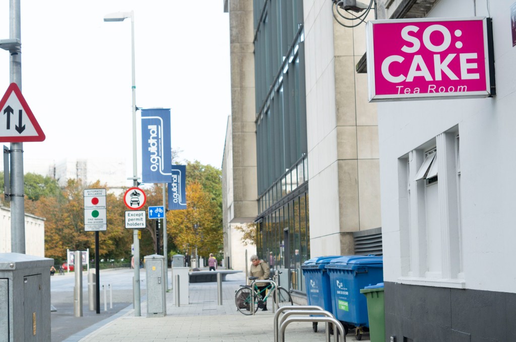
Fig. 3. Frame 2019 49 (2019)
1/500 sec ; f/5 ; ISO 400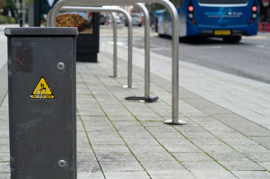
Fig. 4. Frame 2019 115 (2019)
1/500 sec ; f/5 ; ISO 400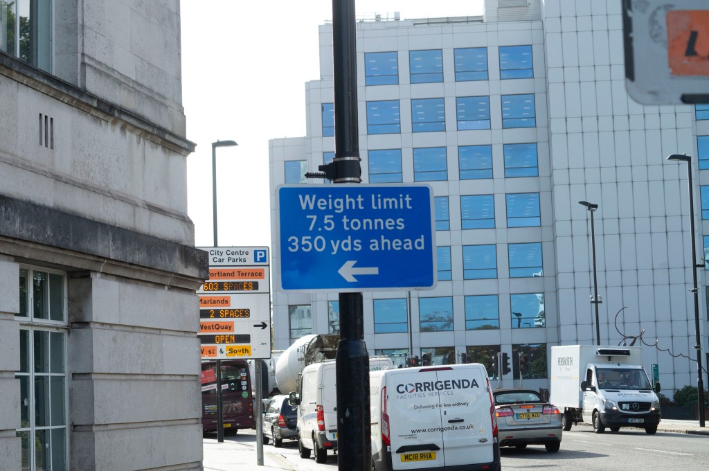
Fig. 5. Frame 2019 39 (2019)
1/1250 sec ; f/5 ; ISO 400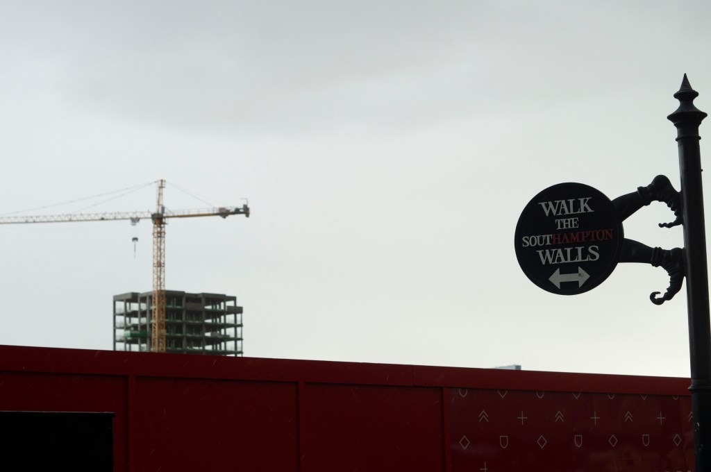
Fig. 6. Frame 2019 289 (2019)
1/400 sec ; f/5 ; ISO 400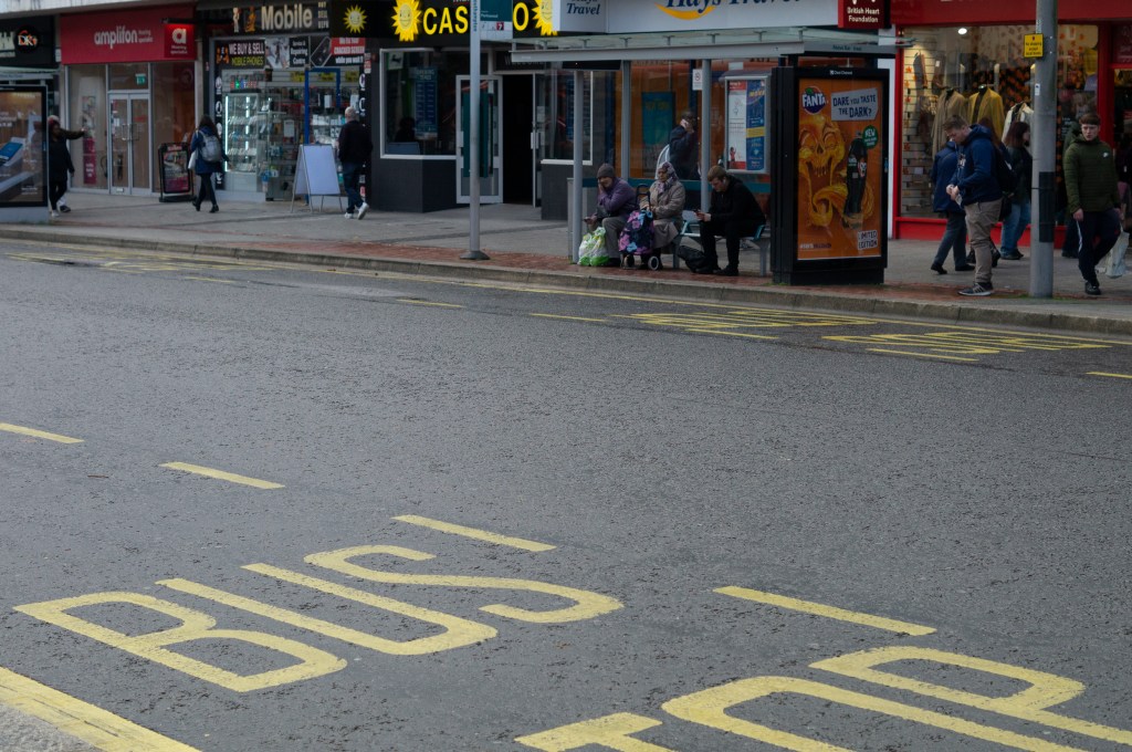
Fig. 7. Frame 2019 227 (2019)
1/640 sec ; f/5 ; ISO 400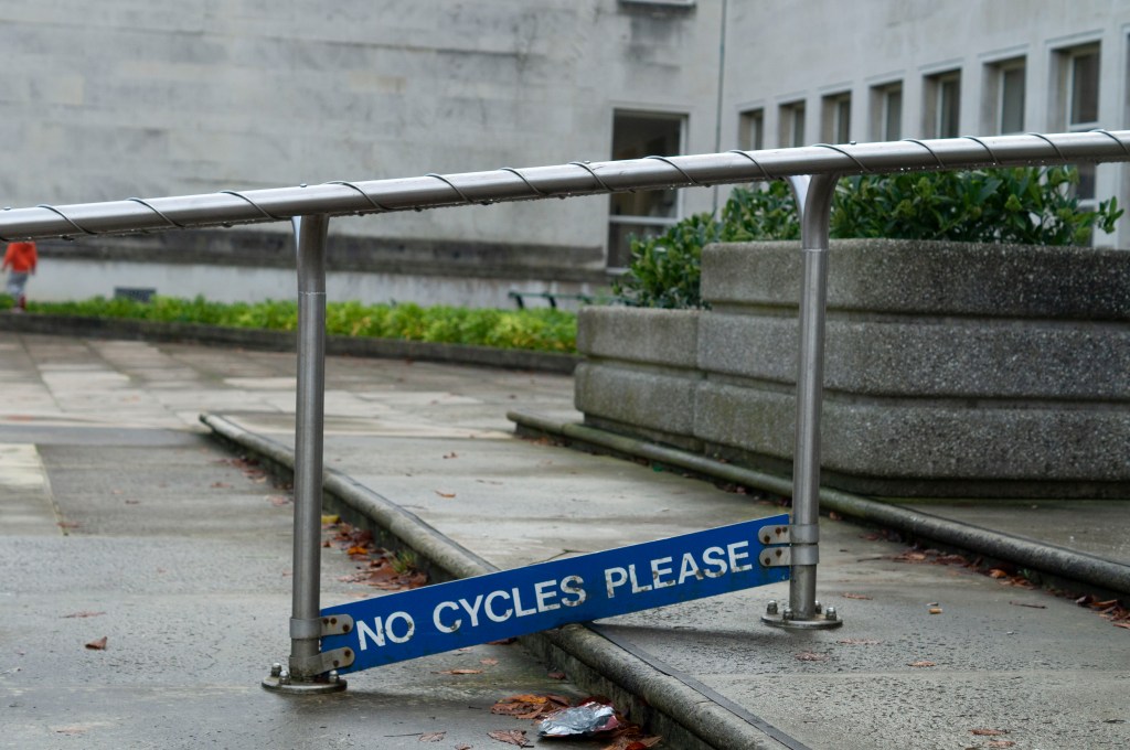
Fig. 8. Frame 2019 28 (2019)
1/640 sec ; f/4.5 ; ISO 400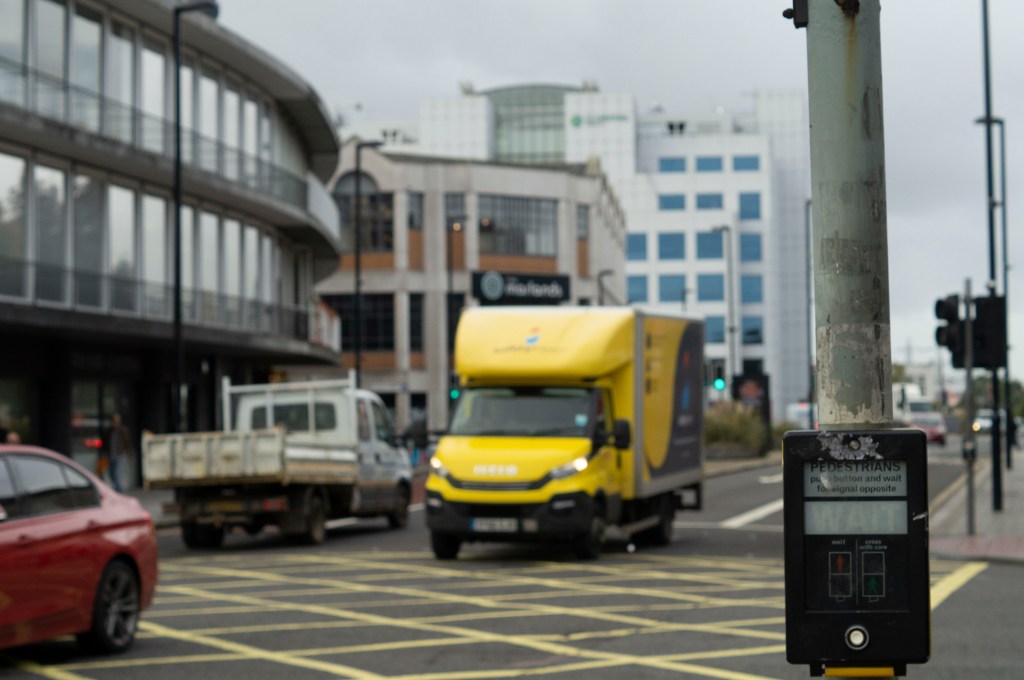
Fig. 9. Frame 2019 165 (2019)
1/800 sec ; f/5 ; ISO 400
Reflection:
As briefly mentioned above, a recurring theme I found throughout my shoot was the use of signs, whether that was to provide a warning, an instruction, a direction or a name. Therefore I wanted to form a set of images that explored all of the different kinds found through the city.
The tones within the imagery are very neutral, with the occasional burst of colour to bring life to the frame which is pleasing to the eye, it’s not too much, nor is it too little that the images become flat.
Each image shows the grime and age of the city, caused by footfall, human littering and natural causes, it doesn’t feel or look fresh which gives character.
City life is another constant factor, showing transportation of all forms, buildings of all kinds, the work-life of various sorts and the ongoing business of the place.
While the gestalt isn’t the most appealing or prettiest to look at, it is a cohesive set and captures the life and the effects of it which is what photography is about. Capturing what is there and how it changes, in a short second.
References :
Bloomfield, R., 2018. Photography 1: Expressing your Vision. 4th ed. [pdf] Barnsley: OCA, p.29. Available at: https://www.oca-student.com/course/photography-1-expressing-your-vision [Accessed 12 November 2019].
Powell, L., 2019. frame-contact-sheet [pdf] In possession of: Lauren Powell: Eastleigh.
List of images:
Figure. 1. Powell, L. (2019) Frame 2019 85 [image] In possession of: Lauren Powell: Eastleigh.
Figure. 2. Powell, L. (2019) Frame 2019 149 [image] In possession of: Lauren Powell: Eastleigh.
Figure. 3. Powell, L. (2019) Frame 2019 49 [image] In possession of: Lauren Powell: Eastleigh.
Figure. 4. Powell, L. (2019) Frame 2019 115 [image] In possession of: Lauren Powell: Eastleigh.
Figure. 5. Powell, L. (2019) Frame 2019 39 [image] In possession of: Lauren Powell: Eastleigh.
Figure. 6. Powell, L. (2019) Frame 2019 289 [image] In possession of: Lauren Powell: Eastleigh.
Figure. 7. Powell, L. (2019) Frame 2019 227 [image] In possession of: Lauren Powell: Eastleigh.
Figure. 8. Powell, L. (2019) Frame 2019 28 [image] In possession of: Lauren Powell: Eastleigh.
Figure. 9. Powell, L. (2019) Frame 2019 165 [image] In possession of: Lauren Powell: Eastleigh.
Exercise 1.3 Line
Notes, Part 1, Reflection on coursework, Thoughts & IdeasSummary:
In this post I;
– Provided a selection of images that explore the use of lines to create depth and the flattening of space, along with technical settings.
– Analysed the images, noting down their visual strengths, the impact of the lines and angles explored as well as textures and colours.
– Stated my initial concerns, what I have learnt from it and the importance of lines in a composition.
Brief:
‘Take a number of shots using lines to create a sense of depth. Shooting with a wide-angle lens (zooming out) strengthens a diagonal line by giving it more length within the frame. The effect is dramatically accentuated if you choose a viewpoint close to the line.‘ (Bloomfield, 2018)

Fig. 1. Line 1 (2019)
1/640 sec; f/4.5; ISO 400
Fig. 2. Line 2 (2019)
1/500 sec; f/4.5; ISO 400
Fig. 3. Line 3 (2019)
1/1600 sec; f/8; ISO 400
After reading the brief, I headed to my local city to explore the different architecture available and the modern public facilities dotted around the area.
As I don’t have a wide-angle lens, I used my 50mm lens while being aware of my position to get better angles and hopefully create the same effect.
The first image (see Fig. 1) is full of various lines, keeping the eyes busy. The length of the handrail leads the eyes from the bottom left corner to the top right, while the wire and the curved structural pieces throughout the middle of the rail provides a circular motion for the viewer while they travel through the frame. Despite the shallow depth of field, you can still clearly see the straight line of the step and the wall to the left; this stops the eyes from heading straight out of the picture.
The depth in the second image (see Fig. 2) stands out the most, mainly due to the unique structure of the building. The camera was as close to the wall as possible to show the sharp angles of the architecture; it goes inwards, drawing your eyes directly into the photograph then leading you back out when the glass windows come outwards. Not only do the faint and deep lines cause your eyes to flick up and down throughout, but the reflections in the glass gives that little bit more texture, as well as tonal variants due to the sunlight, feeding the eyes with more detail to explore bringing you back into the image. Depending on how you look at it and how your eyes adjust, it could create an optical illusion, causing the building to come out of the frame rather than go inwards. It’s all about perspective.
Modern architecture is something to behold, so the third image (see Fig. 3) is an incredible example of this. The curves in this building are beautiful, creating a wave effect for the eyes, very similar to the figure of a whale and its skin details. This composition provides circular motions for the eyes instead of a straight line that draws you from one side of the frame to the next. Not only are there horizontal lines, but much darker vertical lines behind the curved structure too.
Brief continued
‘Now take a number of shots using lines to flatten the pictorial space. To avoid the effects of perspective, the sensor/film plane should be parallel to the subject and you may like to try a high viewpoint (i.e. looking down). Modern architecture offers strong lines and dynamic diagonals, and zooming in can help to create simpler, more abstract compositions.’ (Bloomfield, 2018:25).
Fig. 4. Line 4 (2019)
1/1600 sec; f/5; ISO 400
Fig. 5. Line 5 (2019)
1/1000 sec; f/5; ISO 400
Fig. 6. Line 6 (2019)
1/640 sec; f/8; ISO 400
Finding a high viewpoint and looking down with a fear of heights didn’t seem appealing, so I had to get creative and find something on the ground level.
The bright yellow focal point of the first image (see Fig. 4) not only cuts the image into four sections for the audience to explore, but the eyes also travel across multiple diagonals. While there is no physical depth like the previous images, the contrast between the tarmac and yellow paint lifts the cross out of the frame. The lines are sharp and straight, very geometric and make the picture slightly more dynamic than the perspective lines.
Not only do your eyes go up and down and side to side from exploring the tiles in image Line 5 (see Fig. 5), but the different sizes also expand and shrink the image as the eyes travel through the frame. The dark lines are very sharp and draw the eyes into the frame as it sinks in from the bright white wall, much like a minimalist painting. I like how I shot this wall very closed in and cropped, preventing the composition from being overwhelmed with too many shapes.
I enjoy shooting images at odd angles and going against the idea of a straight horizon, which I applied in Line 6 (see Fig. 6). Not only do the eyes get to jump around the frame to explore the various coloured brickwork, but they are also guided through the image diagonally and around each brick in a diamond-shaped motion. Once again, the highlights and shadows provide a little bit of depth, but not too much.
Review
Despite being a little nervous about this exercise, I am pleased with the results. It made me aware of what is around me, whether it is natural or built by hand. We very often look forwards, rarely looking up at what’s above us or below us besides our feet or our phone. Not only did this help me understand how lines work in photography, how they can shape a composition, give more depth and the effect these features can have on the viewer, it also helped me find the beauty of shapes and structure in person, not just a snapshot.
References :
Bloomfield, R., 2018. Photography 1: Expressing your Vision. 4th ed. [pdf] Barnsley: OCA, p. 24. Available at: https://www.oca-student.com/course/photography-1-expressing-your-vision [Accessed 12 November 2019].
List of images:
Figure. 1. Powell, L. (2019) Line 1 [image] In possession of: Lauren Powell: Eastleigh.
Figure. 2. Powell, L. (2019) Line 2 [image] In possession of: Lauren Powell: Eastleigh.
Figure. 3. Powell, L. (2019) Line 3 [image] In possession of: Lauren Powell: Eastleigh.
Figure. 4. Powell, L. (2019) Line 4 [image] In possession of: Lauren Powell: Eastleigh.
Figure. 5. Powell, L. (2019) Line 5 [image] In possession of: Lauren Powell: Eastleigh.
Figure. 6. Powell, L. (2019) Line 6 [image] In possession of: Lauren Powell: Eastleigh.
Project 2 – Visual Skills – Exercise 1.2 Point
Notes, Part 1, Reflection on coursework, Thoughts & IdeasSummary:
For my second exercise I have;
– Provided the brief for this task and my initial worries about how to I was going to shoot as well as
– My decision to explore flat lays and the visual preferences for this exercise.
– Stated the choice of subject and why they helped with the overall balance of the shot.
– Inserted the images taken for this exercise, explaining the different choices made and a short analysis of how I feel they fit the brief along with
– Selecting the strongest example.
– Explored the shots taken without the rules applied and why they aren’t the strongest
– While noting the few strengths they provide and choosing the best image of the two.
Brief:
‘Take three or four photographs in which a single point is placed in different parts of the frame. When composing the shots use these three rules: the place of the point shouldn’t be too obvious (such as right in the middle), the composition should hold a tension and be balanced (the golden section or rule of thirds) and the point should be easy to see. Evaluate the shots according to these rules and select which one you think works best.
Then take a few more shots without any rules, just being aware of the relationship of the point to the frame. Without the rules, how can you evaluate the shots? That will be a key question throughout the whole degree programme.
Add the photographs to your learning log together with brief observations.‘ (Bloomfield, 2018)
I must admit, when I first saw this exercise I was slightly nervous and didn’t have a clue as to how I was going to execute it, mainly due to the fact I don’t use the grid when I shoot imagery, nor do I actively think about the rule of thirds.
However, I decided to go with a flat lay shoot, as I like the way they look visually and allowed me to have more control over the negative space.
My subjects of choice we’re a pegboard, a succulent and the point being a pair of rings. I feel as if the balance was created by the different sized objects I decided to use, to avoid crowding the frame with “stuff” making the point difficult to find.
Camera settings:
1/80 sec; f/1.8; ISO 400.

Fig. 1. Flatlay 1 (2019)
For the first composition (see Fig. 1), I decided to place the point in the bottom corner of the pegboard to draw your eyes throughout the image in a straight diagonal line, whether you start from the middle and then up, then down OR from the top to bottom and vice versa.
It doesn’t take away from the text, nor is the point out of sight and ignored. Instead, it’s subtle and very natural to my eyes.

Fig. 2. Flatlay 2 (2019)
For the above piece (see Fig. 2), I chose to move the point further into the negative space and closer to the two other objects to create a cosier feel. The placement of the items creates a right-angled triangle when you flick your eyes from each object, which forms an invisible geometric shape to complement the visible geometric shapes within the frame. I found this quite clever in terms of composition, especially as the rings are placed on the 90-degree point which is the most significant part of the triangle. Therefore the point continues to be the most important element of the image without it being obvious.

Fig. 3. Flatlay 3 (2019)
For my last image (see Fig. 3) following the rules, I moved the rings on to the plant to make it a little harder for the audience to see, without it being lost. The point highlights the middle of the succulent and compliments the natural curves of the plant, however, the contrast between green and gold helps the ring stand out, despite it being small.
I feel as if the tension in this particular image is caused by the fact you have to look a little deeper than you did with the other two, which makes it a fun composition to explore and is the strongest of the three in my opinion.

Fig. 4. Flatlay 4 (2019) 
Fig. 5. Flatlay 5 (2019)
I then removed the rules and just shot a couple of images (see Fig. 4. and Fig. 5), without really putting much thought into the composition at all, taking it to the opposite extreme.
While these images aren’t awful, as the colours compliment each other, as do the shapes and sizes, the fact there wasn’t much thought put into the framing or placement of the point, it feels slightly sloppy and unbalanced. The best one out of the two for me is the first image as the angle of the frame cuts up the image slightly, forming more geometric shapes.
Whether you consciously apply the rule of thirds, balance or tension or not, I think it’s important to pay attention to what you’re shooting and where things are in the frame to create a stronger image overall.
References:
Bloomfield, R., 2018. Photography 1: Expressing your Vision. 4th ed. [pdf] Barnsley: OCA, p. 23. Available at: https://www.oca-student.com/course/photography-1-expressing-your-vision [Accessed 9 November 2019].
List of images:
Figure. 1. Powell, L Flatlay 1 [image] In possession of: Lauren Powell: Eastleigh.
Figure. 2. Powell, L Flatlay 2 [image] In possession of: Lauren Powell: Eastleigh.
Figure. 3. Powell, L Flatlay 3 [image] In possession of: Lauren Powell: Eastleigh.
Figure. 4. Powell, L Flatlay 4 [image] In possession of: Lauren Powell: Eastleigh.
Figure. 5. Powell, L Flatlay 5 [image] In possession of: Lauren Powell: Eastleigh.
