
Summary:
For this exercise I;
– Provided the brief and shared my initial thoughts about it while considering the UK’s current lockdown and how it affected my original plans for this task.
– Briefly explained my new plans for this exercise, taking influence from my portrait work and the artist research gathered in ‘A durational space’.
– Documented the camera used and the settings, along with any changes made to these further on in the shoot.
– Inserted annotated contact sheets to show the strengths and weaknesses of each image, as well as the techniques used before analysing a few images to explain how they were shot/edited, what I discovered and what I felt worked or didn’t work.
– Reflected on the exercise as a whole, what I learnt and how my feelings have changed about it.
Brief
‘Start by doing your own research into some of the artists discussed above. Then, using slow shutter speeds, the multiple exposure function, or another technique inspired by the examples above, try to record the trace of movement within the frame. You can be as experimental as you like. Add a selection of shots together with relevant shooting data and a description of process (how you captured the shots) to your learning log‘ (Bloomfield, 2018).
Initial thoughts
Planning this exercise was challenging as social distancing and reducing travel restricted me to unpopulated areas. As a result, I decided to become the subject for this task, making the most of what was available while using previous knowledge of self-portraits.
After gathering research on various artists, the techniques I chose to explore for this shoot consisted of capturing long exposures with BULB mode, combining a moving subject with slow shutter speeds, moving the camera and creating double exposures using Photoshop. These ideas have allowed me to experiment with various methods, achieving different effects and tracing time in multiple ways. I was also able to reflect on approaches mentioned in the practitioner research.
Before shooting, I set my SONY A57 to shutter priority mode, attached a SONY 18-55 3.5-5.6 SAM lens to allow for focal length adjustment if necessary and used a high-contrast black and white filter to re-create the ghost-like effects captured in Francesca Woodman’s work. In addition to that, I lowered the ISO to 100 to reduce the camera’s sensitivity to light as the shutter would be open for longer. The ISO was increased slightly for some images to allow for more light, but no higher than 300 to avoid any blowouts.
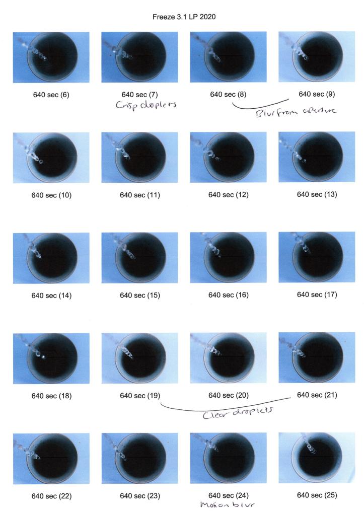
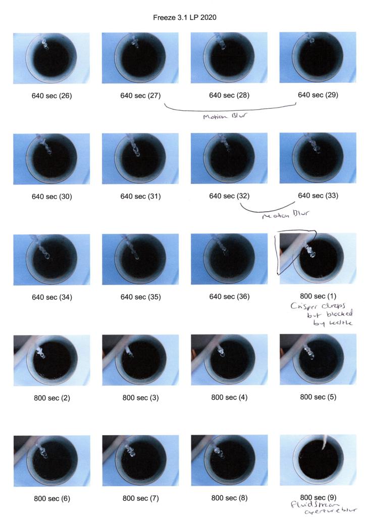
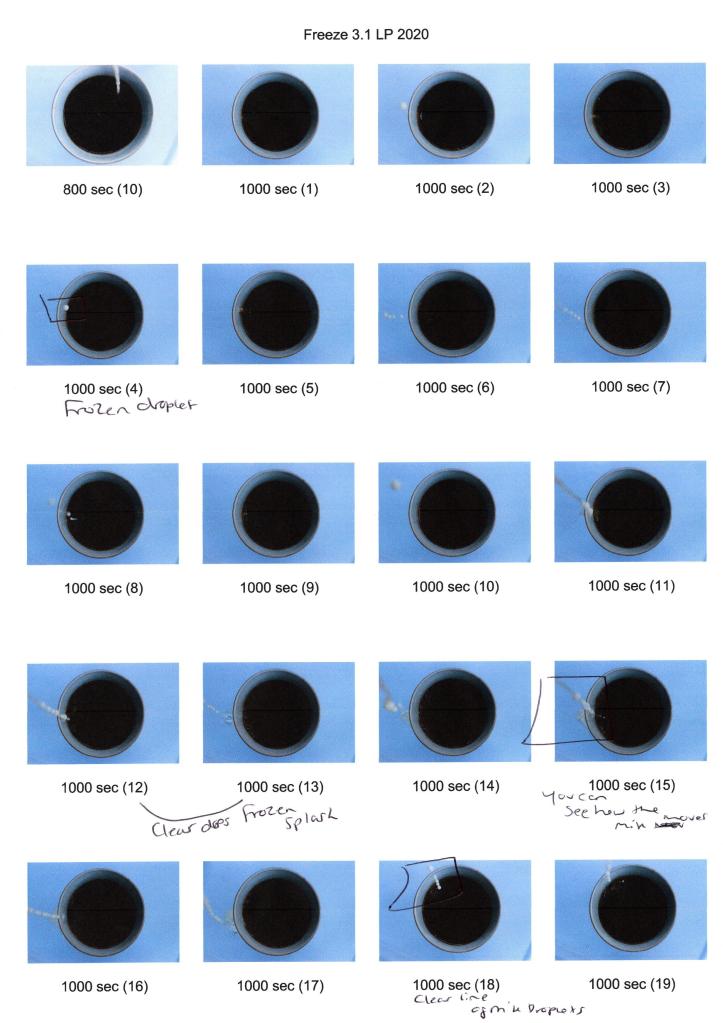
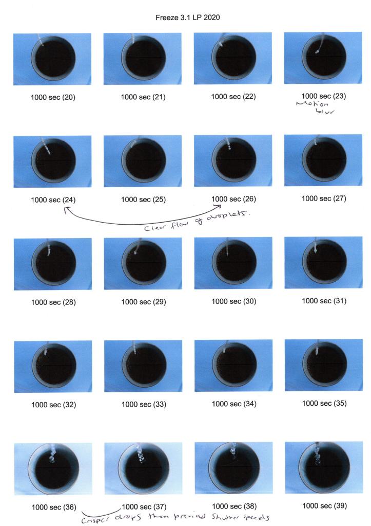
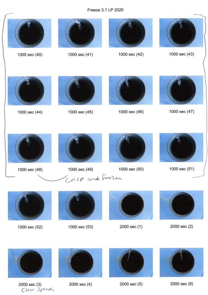
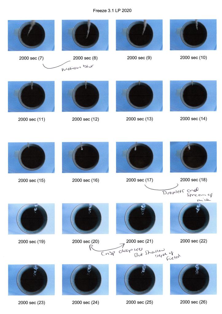
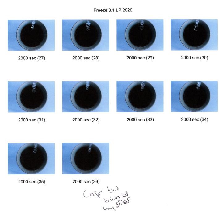
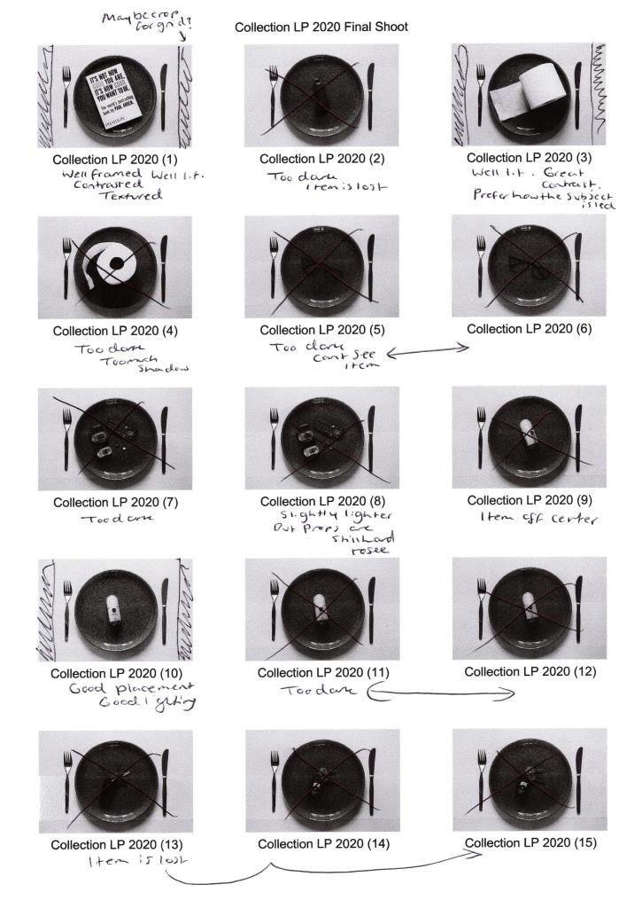
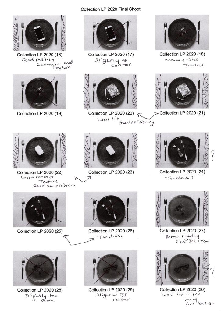
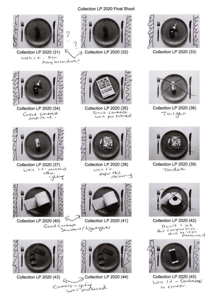
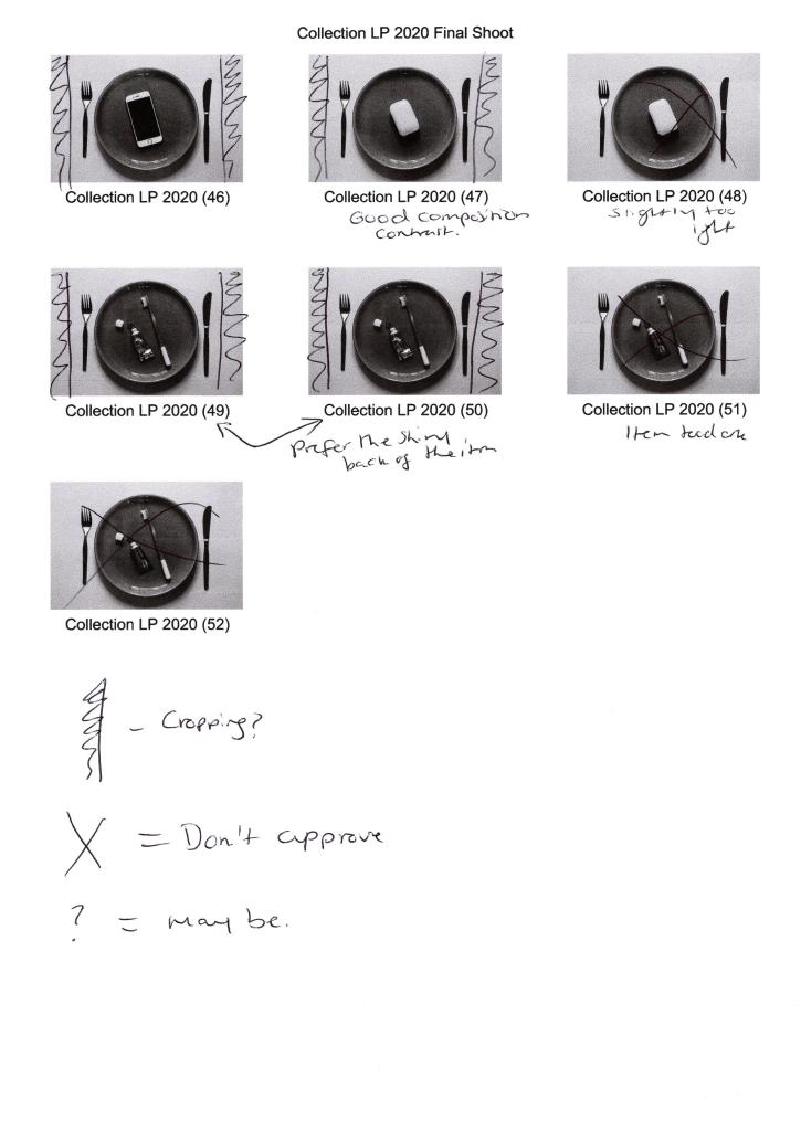
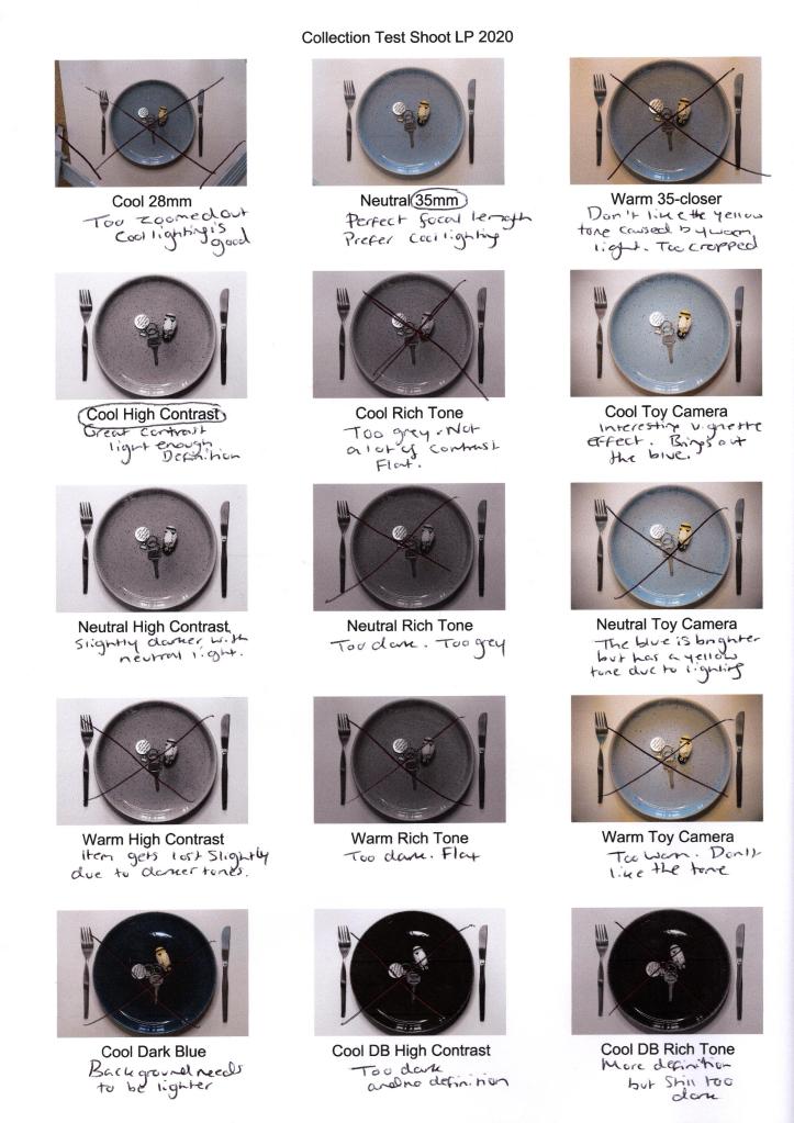
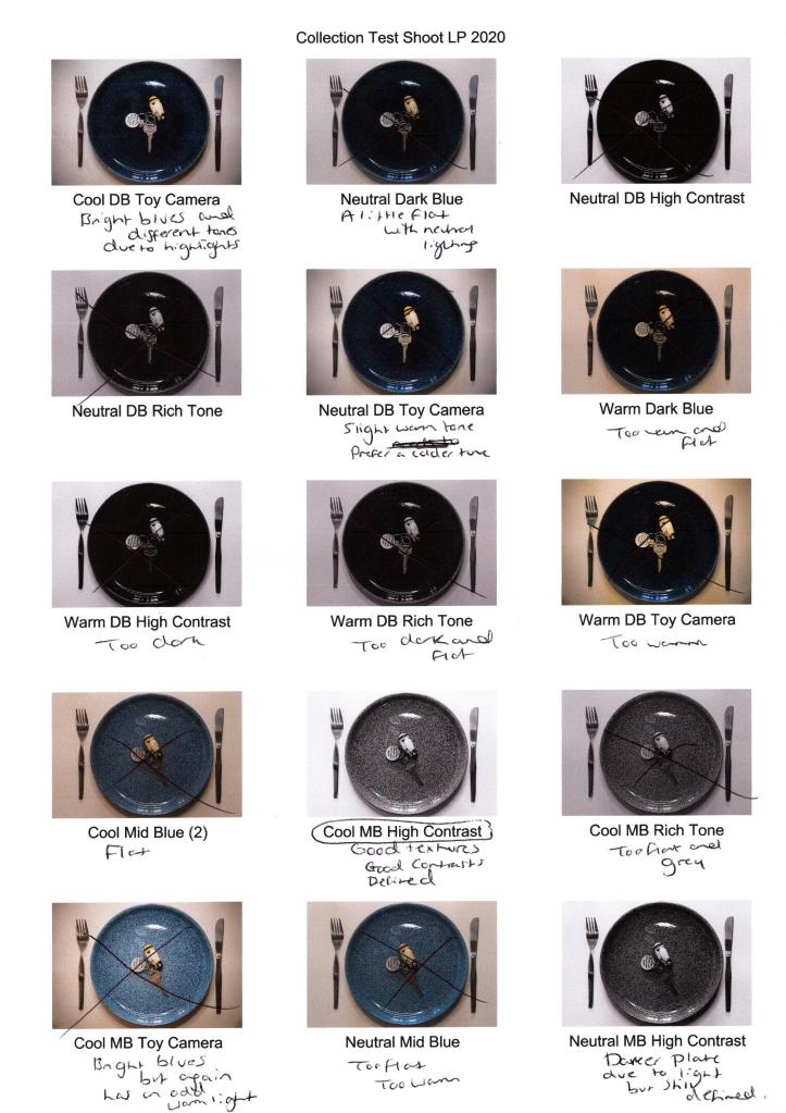
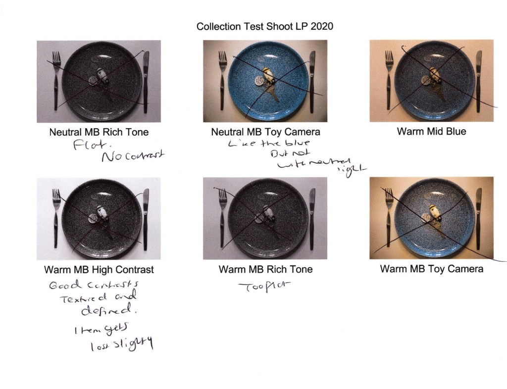
Contact sheets:
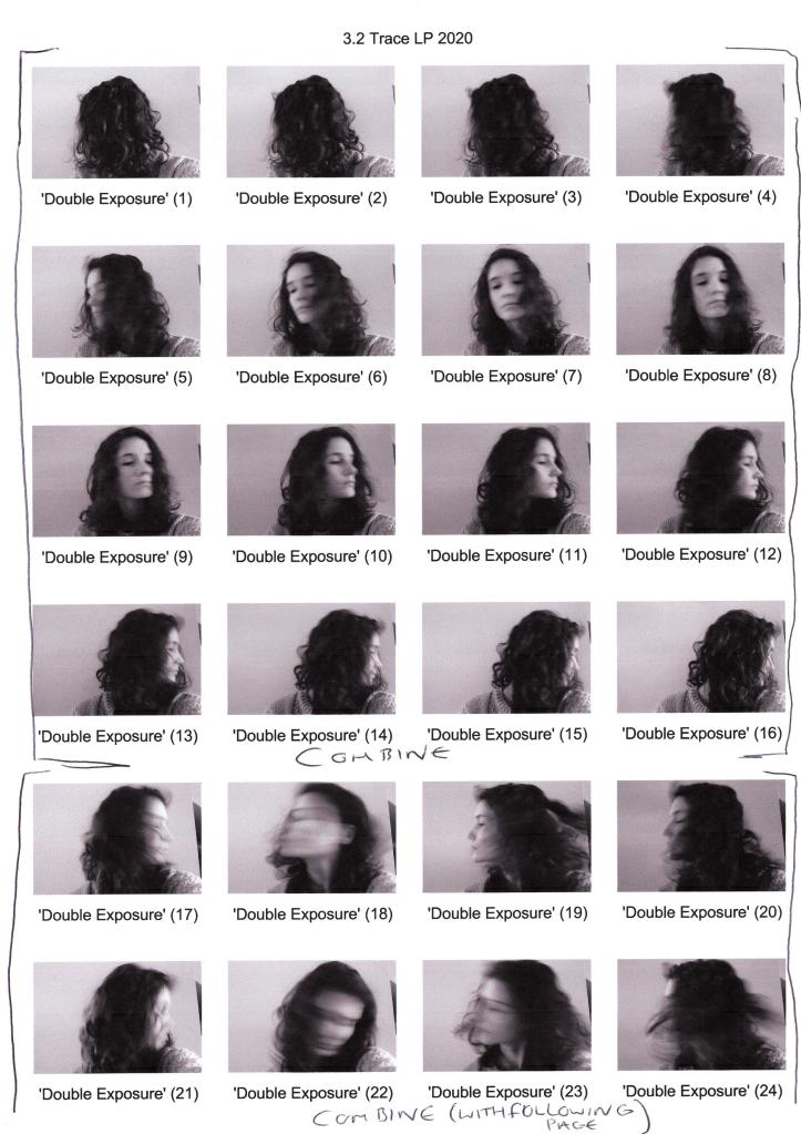
Fig. 1. Contact sheet 1 (2020) 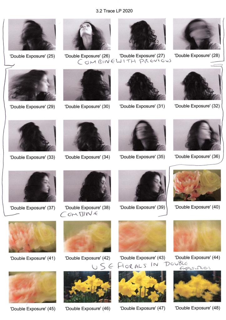
Fig. 2. Contact sheet 2 (2020) 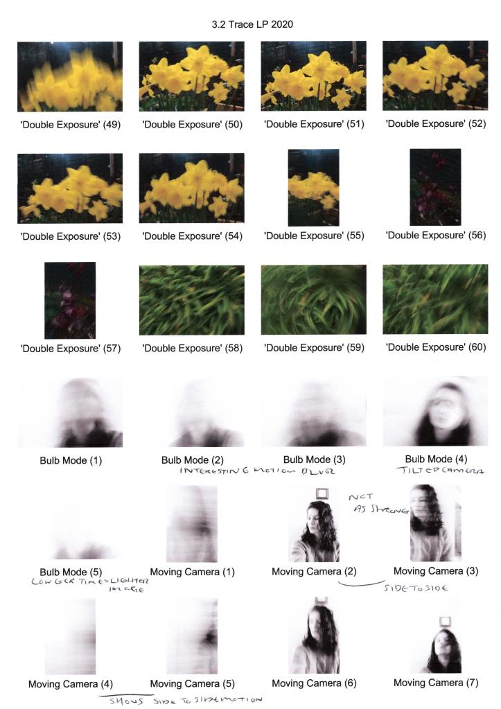
Fig. 3. Contact sheet 3 (2020) 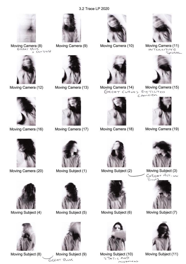
Fig. 4. Contact sheet 4 (2020) 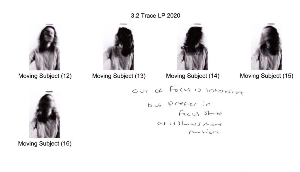
Fig. 5. Contact sheet 5 (2020)
Images:
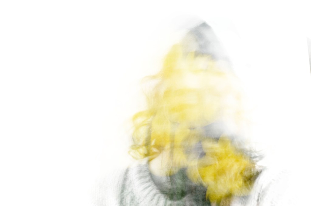
Fig. 6. Trace 1 (2020)
1/10 sec; f/9; ISO 400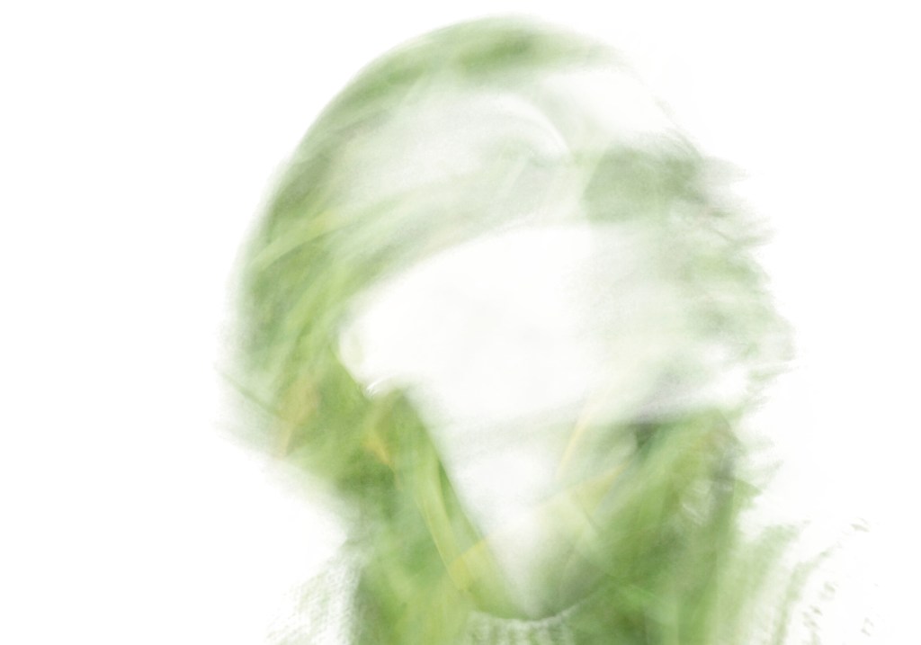
Fig. 7. Trace 2 (2020)
1/10 sec; f/9 ; ISO 400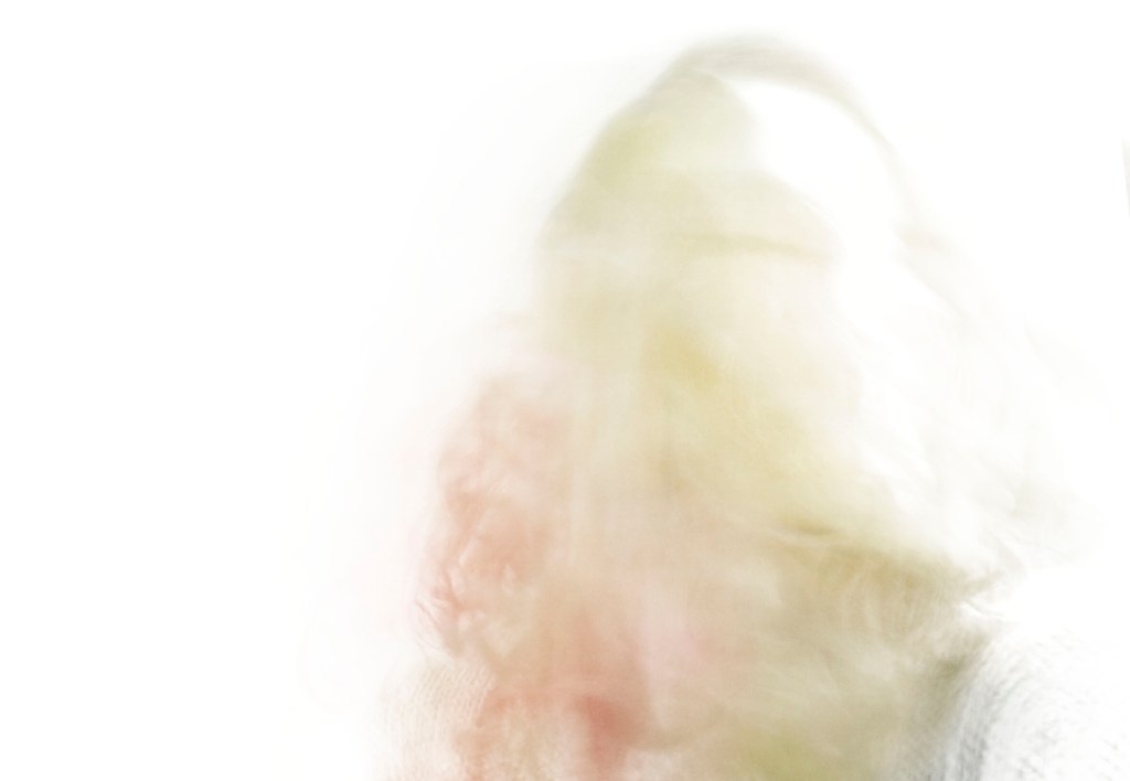
Fig. 8. Trace 3 (2020)
1/10 sec; f/9 ; ISO 400
As the SONY A57 doesn’t have a multiple exposure setting, I used continuous shoot mode to capture numerous shots by holding the shutter release button. As a result of moving with a slow shutter speed of 1/10 second, motion blur occurred, showing a trace of time similar to Michael Wesely’s work. Each piece (see Fig. 6., Fig. 7., and Fig. 8.) consists of up to 10-16 individual photographs layered on top of one another and altered to either the screen or hard light blend modes, consequently achieving the ghostly figures I desired. Using the coloured floral images brings life to the composition by inserting a pop of colour throughout the monochrome shadows. On closer inspection, the direction of movement can be seen via the curves and lines within the arrangements, informing the viewer about the motions that may have taken place across a short space of time. The contrasts enhance the texture of the hair and floral elements while also forming a white silhouette, capturing the act of disappearance.
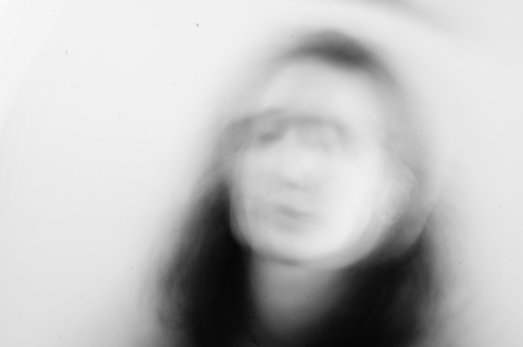
Fig. 9. BULB MODE (2020)
Exposed for 4 sec; f/21 ; ISO 100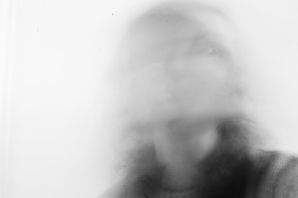
Fig. 10. BULB MODE 2 (2020)
Exposed for 6 sec; f/21 ; ISO 100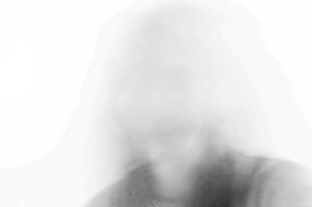
Fig. 11. BULB MODE 3 (2020)
Exposed for 11 sec; f/21 ; ISO 100
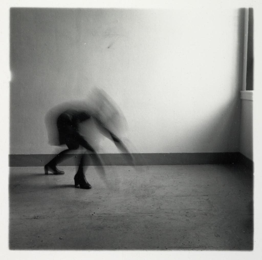
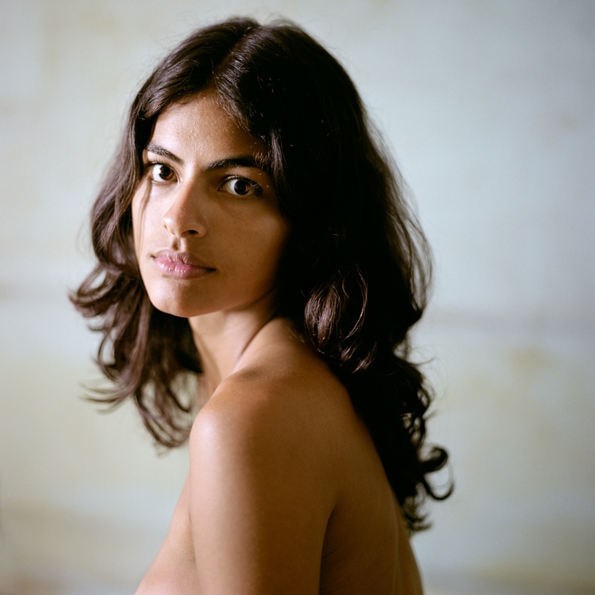
For the BULB mode experiment, I held down the shutter release whilst rapidly moving for a variety of seconds to see the outcome of each timespan. The shortest exposure time of 4 seconds (see Fig. 9.) allowed me to capture motion blur and an outline of facial features that show the circular movement of the head through the swirling curves documented. Looking at the contrasts, the viewer can see that the hair is dark, the lighter areas of skin are bright and highlighted, showing a clear distinction between black and white. As can be seen with an exposure of 6 seconds (see Fig. 10), the shadows are a blend of lighter greys rather than a deeper black due to the combination of transparency caused by a moving subject and a bright white wall that enhanced highlighted areas. The smudged path left behind from the model implies the simple act of looking side to side via the blurred lines. Using an exposure time of 11 seconds (see Fig. 11) meant that more light entered the camera, brightening the composition as a whole. The lack of features again reflects the idea of documenting disappearance as it is evident that something is there yet invisible. While the motion blur indicates movement, the traces aren’t as strong as the previous two examples.
1/5 sec; f/7.1 ; ISO 100
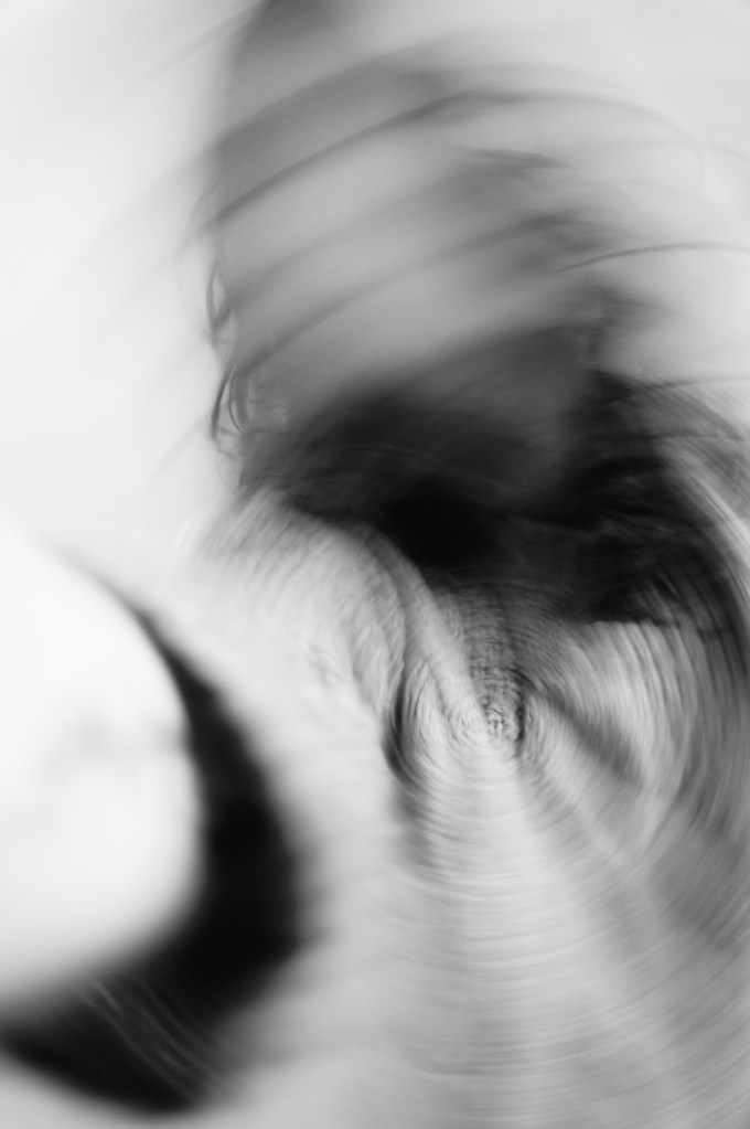
Fig. 12. Moving Camera (2020)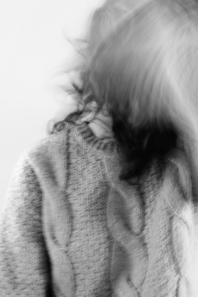
1/5 sec; f/7.1 ; ISO 100
Fig. 13. Moving Subject (2020)
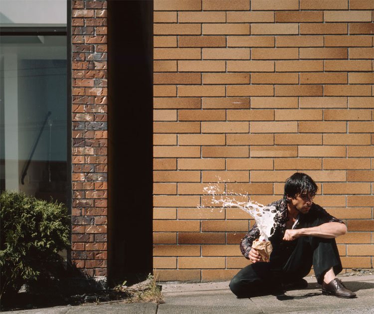
The final images show the results of moving both the camera and subject, but using the same settings keep some form of consistency. Tilting the camera causes an intriguing spiral to appear (see Fig. 12), drawing the eyes in and out of the image. Once again, the subject’s face is blurred as if it spinning, preserving the identity and brings mystery to the composition. A combination of contrasts brings depth to the image, as does the hand in the foreground, showing the distance between the face and arm. There are three traces of time documented in this image, movement of the camera, the journey the hand took to reach the camera and the motion of a head shaking.
Moving subject (see Fig. 13) isn’t as busy as the previous example; however, it still suggests movement regardless of the amount documented. Due to the severe blurring in front of the face, implies a swift gesture took place as multiple curved lines are overlapping one another, as opposed to a single spiral. For this particular image, I wanted to combine both static and motion to create a juxtaposition between the two, challenging the idea of a still image; however, I wasn’t successful this time round as the clothing is still slightly obscured. The fabric of the jumper brings texture to the surface of the image, therefore, not completely smooth and smudged.
Reflection
Overall, I am pleased with the outcome of this particular exercise, as a broader range of experiments took place than the previous task, which in turn allowed for a variety of results. Consequently, slow shutter speeds and long exposures helped me gather a selection of intriguing abstract images and push my abilities in a somewhat restricted situation, therefore meeting the expectations of this particular section.
As well as stepping out of my comfort zone, I made sure to reflect on the techniques and visual elements discovered in my artist research regularly to show what I learnt, instead of going on a tangent and doing my own thing without considering different techniques.
References
Bloomfield, R., 2018. Photography 1: Expressing your Vision. 4th ed. [pdf] Barnsley: OCA, p. 68. Available at: https://www.oca-student.com/course/photography-1-expressing-your-vision [Accessed 3 February 2020].
List of images:
Figure. 1. Powell, L. (2020) Contact sheet 1 [scanned document] In possession of: Lauren Powell: Eastleigh.
Figure. 2. Powell, L. (2020) Contact sheet 2 [scanned document] In possession of: Lauren Powell: Eastleigh.
Figure. 3. Powell, L. (2020) Contact sheet 3 [scanned document] In possession of: Lauren Powell: Eastleigh.
Figure. 4. Powell, L. (2020) Contact sheet 4 [scanned document] In possession of: Lauren Powell: Eastleigh.
Figure. 5. Powell, L. (2020) Contact sheet 5 [scanned document] In possession of: Lauren Powell: Eastleigh.
Figure. 6. Powell, L. (2020) Trace 1 [image] In possession of: Lauren Powell: Eastleigh.
Figure. 7. Powell, L. (2020) Trace 2 [image] In possession of: Lauren Powell: Eastleigh.
Figure. 8. Powell, L. (2020) Trace 3 [image] In possession of: Lauren Powell: Eastleigh.
Figure. 9. Powell, L. (2020) BULB MODE [image] In possession of: Lauren Powell: Eastleigh.
Figure. 10. Powell, L. (2020) BULB MODE 2 [image] In possession of: Lauren Powell: Eastleigh.
Figure. 11. Powell, L. (2020) BULB MODE 3 [image] In possession of: Lauren Powell: Eastleigh.
Figure. 12. Powell, L. (2020) Moving Camera [image] In possession of: Lauren Powell: Eastleigh.
Figure. 13. Powell, L. (2020) Moving subject [image] In possession of: Lauren Powell: Eastleigh.
