Research for ‘Photography is simple’ + Mindmap

Assignment 5, Online Research, Practitioner Research, Thoughts & Ideas

Summary:

In this post I

– Inserted my mind-map exploring the ideas Opposites and Minimalism with a paragraph reflecting on the results

– Discussed the concepts I want to explore and research in further detail in this post

– Wrote a paragraph on the Minimalism art movement and what it consists of

– Provided a short paragraph about the photographer Paloma Parrot, along with an image which I briefly analysed

– Studied the history of the polaroid camera, the interest behind it and the benefits

– Researched Ziqian Liu and analysed one of her images in detail before reflecting on the post as a whole

– Decided to explore the combination of a minimal composition with a complex subject, to explore the ‘simple’ statement while arguing my belief that photography is anything but simple.

Fig. 1. Photography is simple (2021)

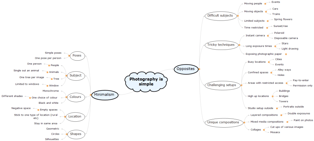
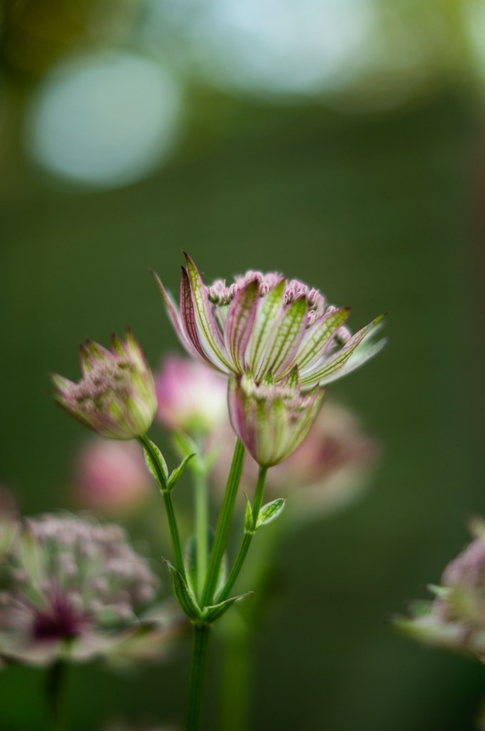
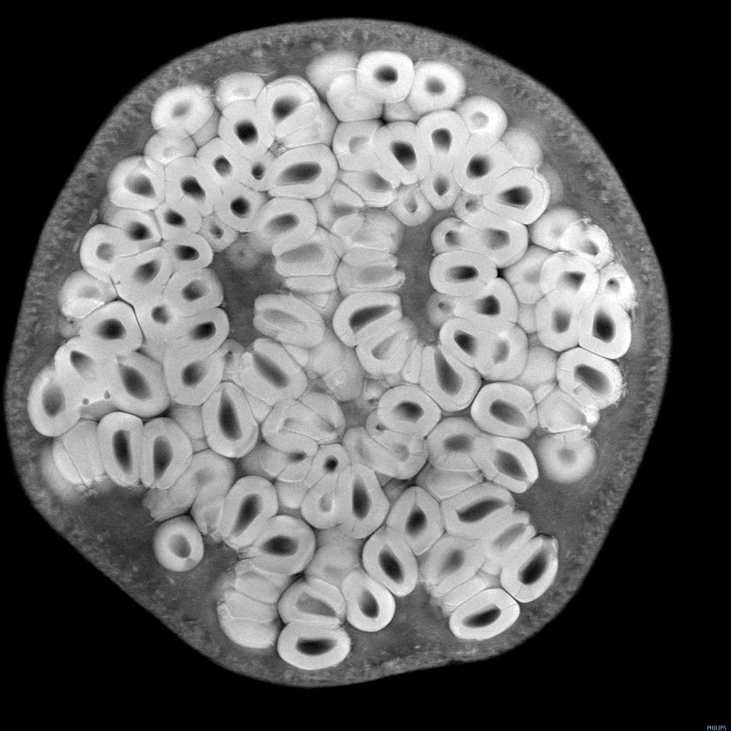
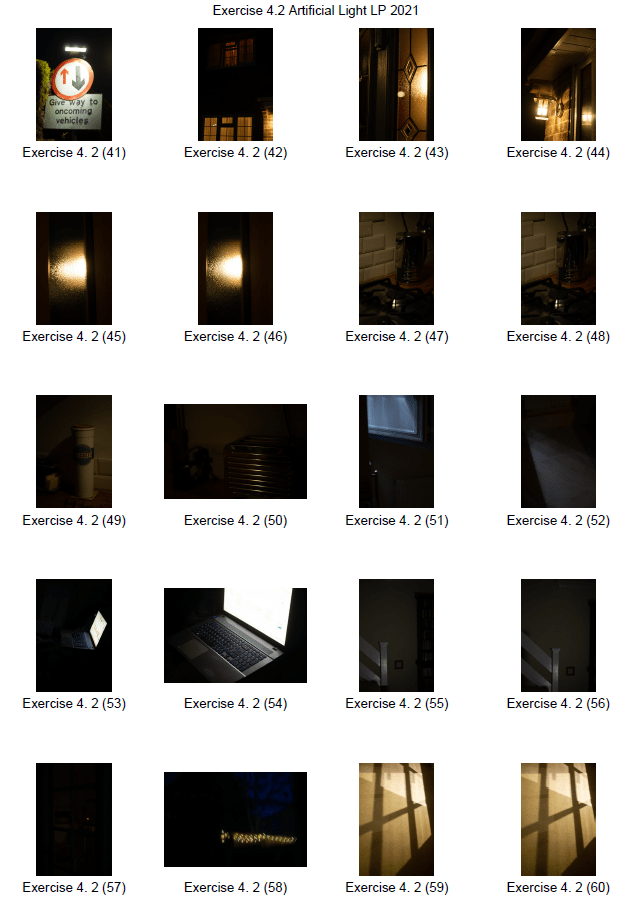
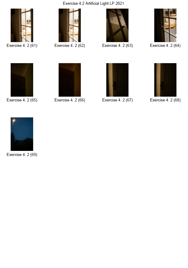
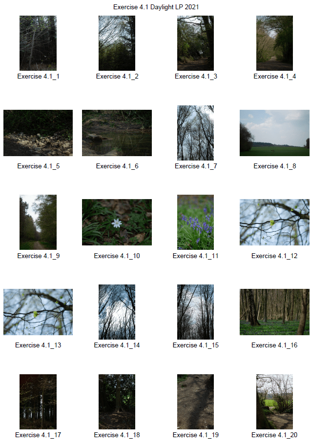
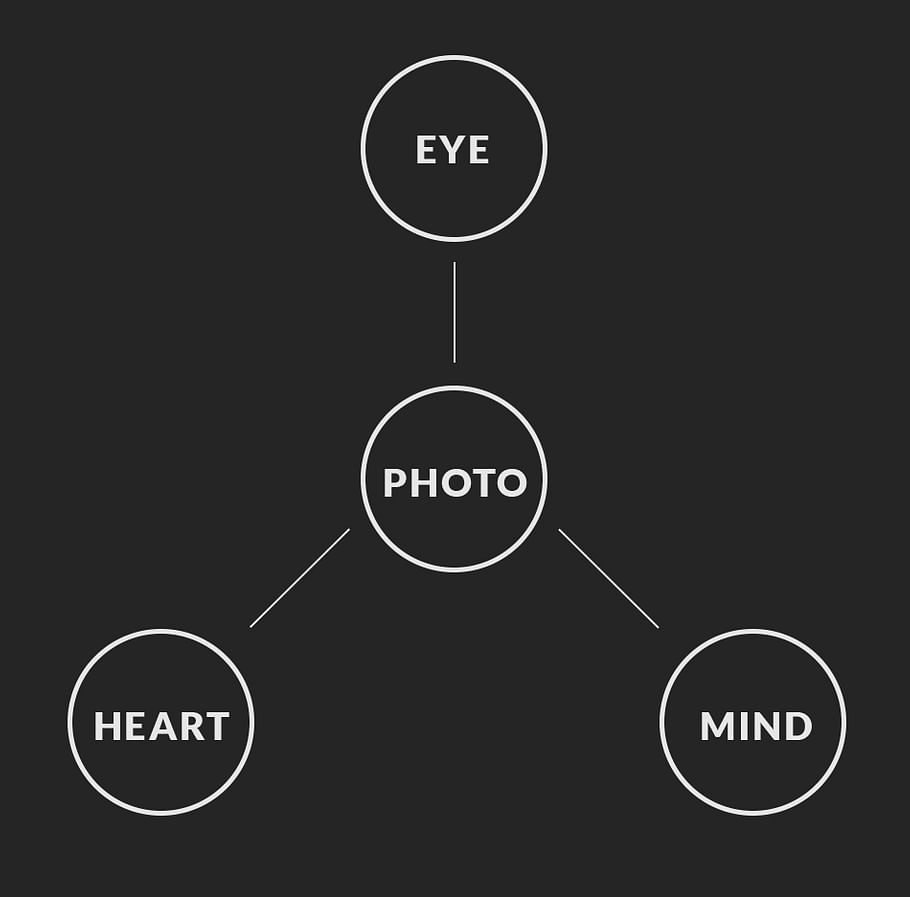
My mind-map (see Fig. 1) explores various branches of ideas underneath the Opposites and Minimalism concepts briefly discussed in my initial thoughts post (2021). Experimenting with difficult subjects would bring a challenge to the project as I would have to get the shutter speeds correct, plan accordingly to fit within specific time scales and events. Bearing that in mind, it wouldn’t be the most ideal choice due to restrictions with travel and gatherings. I like the idea of using an instant camera whether that be a polaroid camera or disposable, as that restricts me to a set amount of shots, not an easy task. Mixed media or collages would be interesting to combine with the use of physical photographic prints.

Simple poses would be perfect to use in unison with a single person for my subject choice, this takes the pressure off of the individual to get into positions they’re not comfortable with. A ‘candid’ aesthetic could be achieved if I explored this route. Negative space and restrictions in colour would provide a clear focal point for the viewer and could influence the particular mood the composition is trying to portray as a whole.

Limiting the type of subject of interest could become quite challenging depending on what is chosen, for example, capturing various styles of windows in a built-up area may not be as easy as it sounds due to a set blueprint for the buildings.

Further research on a few of these concepts needs to take place so that I can decide on a final idea for this assignment.

I will look at minimalism in more detail, explore the history of polaroid photography, portraits and artists who subtly portray complex ideas.

Minimalism:

‘Minimalism is an extreme form of abstract art developed in the USA in the 1960s and typified by artworks composed of simple geometric shapes based on the square and the rectangle’ (Tate, 2017).

Minimalist art pushes the boundaries of abstract art and what it is, by removing the elements that could encourage the viewer to see a piece of art in a particular way. A ‘typical’ form of abstract art could contain a variety of colours that mix to depict a certain mood, action or a sequence of shapes and lines that form a bigger subject. This approach goes back to basics by using simple shapes, a minimal selection of colours if any, pushing the viewer to “just see what you see” (Frank Stella 1966, cited in ARTnews, 2015:2) without much information at all.

The movement began in the late ’50s before continuing to grow in the ’60s and ’70s with the likes of Donald Judd and Robert Morris. It is compared with the conceptual art movement due to the similarities between the ‘unusual and its ability to challenge the stereotypes of what art is, usually only appreciated by a specific audience (Tate, 2017).

Simplicity can be beautiful, as it strips back any unnecessary details that may otherwise clutter or influence the final result of the art.

Paloma Parrot

Paloma Parrot is a minimalist photographer based in Ruhr, Germany. She has over 20 years of photographic experience, encourages that people take a camera wherever they go and sticks to a colour palette of grey/white with a burst of colour to draw attention. Her toolkit consists of a tripod, remote trigger to help capture self-portraits without the additional help of others or a timer (Parrot, n.d.).

Parrot is minimal in every sense of the word from the tonal choice, subject, titles and such, an inspiring way to work, to say the least. As photographers, we can get carried away with an abundance of different lens, lights and cameras, that it’s not always ideal when shooting on the go. Keeping everything manageable and light must make the photographic experience more enjoyable and smooth.

Fig. 1. Upside down (2018)

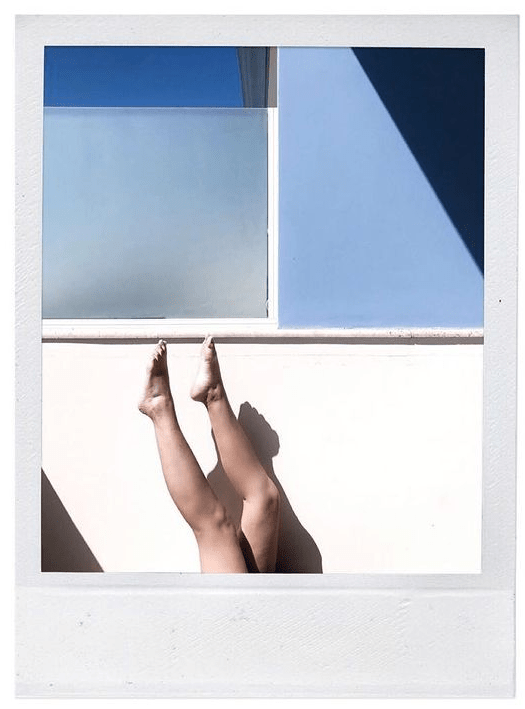
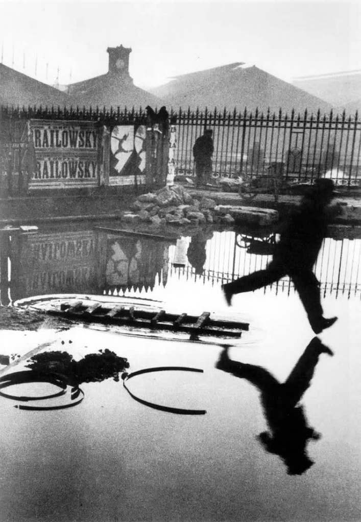
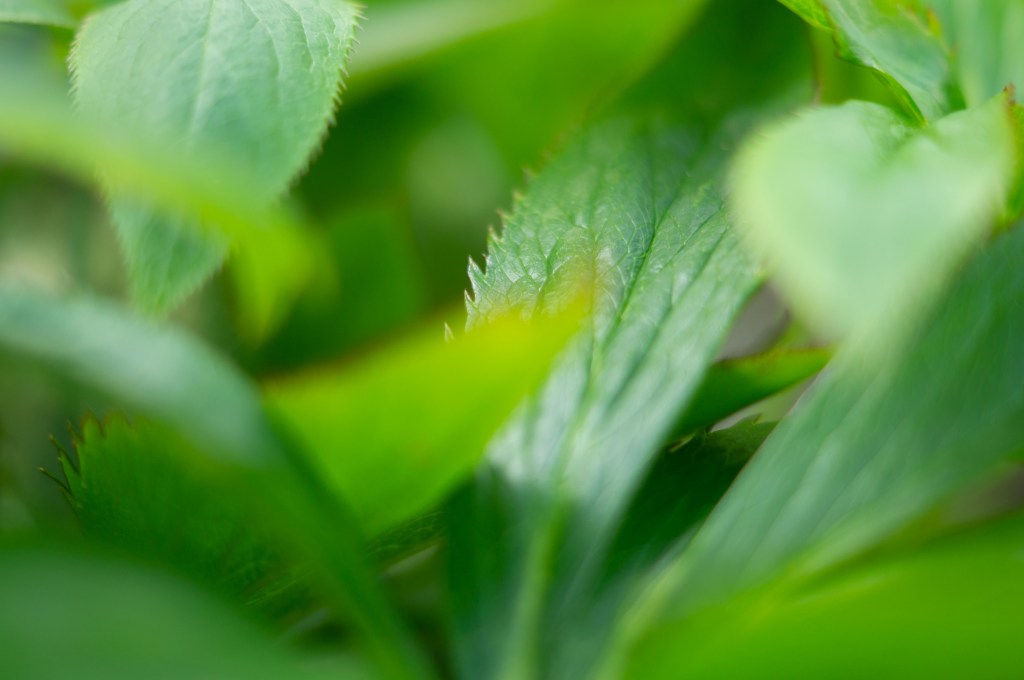
One of my favourite images from her Instagram page is Upside down (see. Fig. 1) as it features little colour, besides a few different shades of blue and the standard white, greys with the occasional dark shadow to add depth to the composition. While it may look like an effortless image the framing will have taken time to perfect, it seems to have been taken on a polaroid implying a limited amount of attempts and the subject in question had to pose in the most abstract way for the image. Nothing about this is that simple besides the shapes and colour palette. Geometric shapes bring complexity to the photograph, cutting the frame into sections and encouraging the eyes to explore the piece in its entirety. Using the legs as the focal point is an interesting choice, as the audience is left wondering who the person is, why they’re in that position in the first place and what else is outside of the frame. Conceptually the portrait may be referencing the action of falling down a rabbit hole like Alice in Wonderland, adding a layer of humour to the piece and fleshing out what could be seen as quite a ‘boring’ picture. The context for this art isn’t given so despite the arrangement being minimal there are many messages and possible references this shot could explore, in turn, forming a juxtaposition within itself.

‘Instant Photography – Polaroid photography

The polaroid was created by Dr Edwin Land, a scientist and CEO of the Polaroid company following a conversation with his young daughter who asked why she couldn’t see the picture following its capture. When Land started the company in the 1930s Kodak bought his first product — the polarizing filter. And for most of the ’50s and ’60s, it manufactured negatives that Polaroid used in its film packs (Legacy User, 2012).

Polaroid cameras do everything that a dark room would have to do, the film is exposed to create a negative image before it is developed within the camera to create a positive print that becomes permanent once it develops in its entirety. The company hired a selection of famous artists to use the cameras and film, as a way to advertise the product and draw attention to it through the eyes of the most prominent creators at the time (Legacy User, 2012).

Watching an image come to life right in front of you is exciting to experience, as you feel as if you are part of the entire process from pressing the shutter to development, without the additional chemicals and time-consuming process. Over recent years, the camera has become increasingly popular with a younger modern audience. Instax has created models that are less expensive and more accessible to those who are on a budget but still want to experience the magic of polaroid photography.

Due to the limited number of film sheets in a pack, the lack of self-timers and the ability to delete the image once it’s been taken makes the photographs taken more unique and challenging to prepare for. Each picture counts, so thinking about your composition is important if you’re unable to have a backlog of films to hand.

Unlike disposable cameras, prints are available instantly beside the developing time, this allows the creator to enjoy the photographs without having to pay or wait for the film to be developed in a lab.

Ziqian Liu

Ziqian Liu, a Shanghai-based photographer, specialises in self-portraiture. Similar to Paloma Parrot her approach is minimal and subtle with the colour palettes chosen for the subject. A lot of her pieces explore the relationship between flowers, fruit and us as humans much like Carol Sharp, a macro photographer who connects with plants as a way to capture their beauty.

‘In her work, the image in the mirror represents the idealized world she wishes to live in,’ (ARTPIL, 2019). Taking a picture of a reflection shows it from a different perspective and angle to what would initially be seen if it were taken with the subject directly in front of the camera. For example, the reflection of a palm shows the opposing side of the back of a hand.

Documenting the body in such a simplistic manner brings intimacy and privacy to the composition, targeting a singular area to be the focal point puts it at the forefront of the photograph. As a result, the audience can appreciate and connect with the body in the frame a lot more than a full-body image. We are given less opportunity to look for what we want, instead of being lead to analyse what is provided and understand it.

Fig. 2. Skin (n.d.)

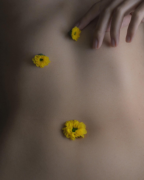
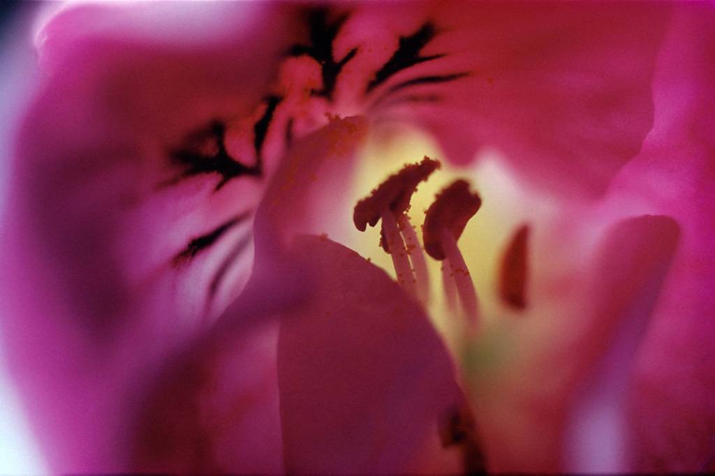
The example I have picked from Liu’s Skin album (see. Fig. 2) is delicate. From the soft diffused light to the smooth texture of the skin in the frame. A pop of colour brings life to composition, possibly referencing the beauty of life’s process within nature and for us as human beings, we all have a life and death cycle that is fragile as one another. A gentle placement of the hand at the top, adds intimacy to the piece by touching and connecting with the human body. The pose isn’t tense or obnoxious, everything about it is calm and warm. Cropped framing brings you closer to the subject, enhancing the textures and shapes that the body has, something we all have so is a source of relatability. The tones are fairly neutral, but compliment the photograph as harsher colours, highlights and shadows would’ve created a jarring, intense image rather than a welcoming one. There is a subtle leading line throughout due to the placement of the flowers. Starting from the top and curving slightly round towards the bigger flower head on the belly button or back. The context for this composition is quite blurred as it’s unclear as to which part of the body this is, which I touched on in the previous sentence.

Art such as this feels personal, creating a story for the audience whether they know the context or concept beforehand. The human body is an incredibly relatable subject, the ‘flaws’ and marks that each of us have that show a journey or make us unique. It’s simple from an aesthetic standpoint, however, if you look deeper there is much more to be explored.

Intimacy in film and TV

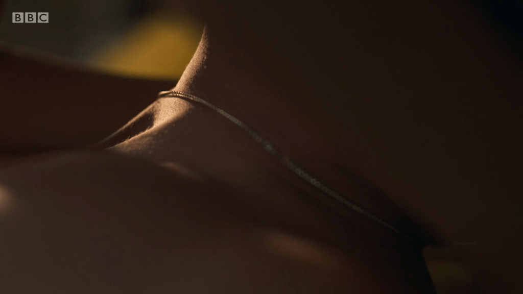
Normal People has been considered one of the best television productions in the modern age, due to its handling of young love, the hardships and beauty of it all. It includes many intimate scenes which is unusual for BBC productions, however, they were directed beautifully, respectfully and it comes across through the camera extraordinarily. The shallow depth of field softens the environment around the characters, enhancing the delicate nature of the skin on show, lighting is warm and inviting, rather than cold and uncomfortable. Close framing respects the actor’s privacy as well as focusing on the parts of the body that make us human or add personality (see Fig. 3). This approach brings the viewers into a place that may be familiar, challenging or easing their feelings surrounding intimacy and image. Many sexual scenes are over the top, extreme and unrealistic to most viewers, so to have a variety of scenes that perfectly portray the reality of opening up and showing yourself to another or a mirror is powerful. It’s human.

Fig. 3. Normal People (2020)


Reflection:

The open nature of this brief allows for a flexible brief without too many restrictions, it is up to us as the students to decide what we think the project should be about and how we’re going to portray that idea.

Taking the word ‘simple’ and exploring the minimalist art movement has been one way for me to inject the concept of photography being as such. However, gathering examples from minimalist photographers further supports my belief that despite a ‘basic’ composition, subject or theme, the background and makeup of the pieces are less than straightforward. Photography is full of thoughts, planning and meanings that flesh out the art, allowing the audience to connect with it more deeply.

Combining a minimalist art style, with the use of an instant camera and a complex subject such as the human body, a system full of organs, cells, DNA creates a juxtaposition between the aesthetic and concept. I would be able to fulfil the statement ‘Photography is simple’ while proving my point at the same time, creating a ‘for and against the type of project.

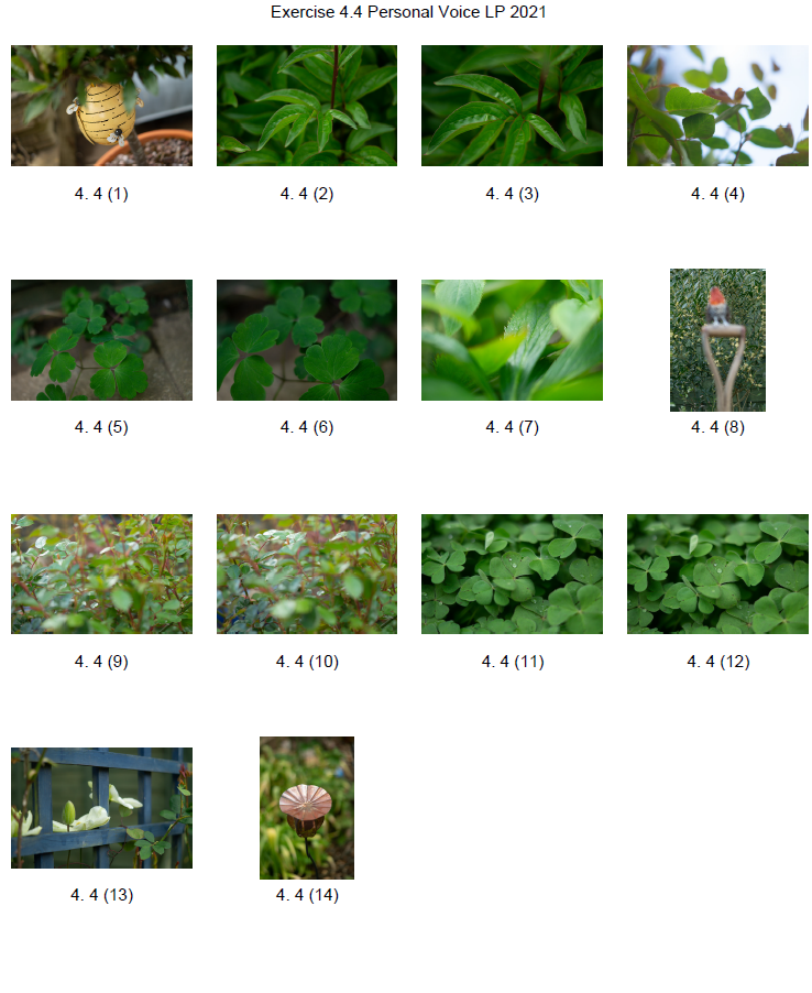
Going forward I intend to take a few test shots with my Instax instant camera to see how achievable this project will be.


References:

ARTPIL. (2019) Ziqian Liu [online] Available at: https://artpil.com/ziqian-liu/ [Accessed 14 June 2021].

Legacy User. (2012) History of Polaroid and Edwin Land [online] Available at: https://www.boston.com/uncategorized/noprimarytagmatch/2012/10/03/history-of-polaroid-and-edwin-land/ [Accessed 14 June 2021].

Parrot, P. (n.d.) 5 Minutes With a Photographer : Paloma Parrot [online] Available at: https://www.artifactuprising.com/photographer-interview-paloma-parrot [Accessed 13 June].

Powell, L. (2021) Initial thoughts on ‘Photography is simple’ [online] Available at: https://laurenpowelloca.photo.blog/2021/06/14/initial-thoughts-on-photography-is-simple/ [Accessed 14 June 2021].

Tate. (2017) Minimalism – Art Term [online] Available at: https://www.tate.org.uk/art/art-terms/m/minimalism [Accessed 14 June 2021].

Stella, F. (1966) ‘Questions to Stella and Judd’ In: What You See Is What You See p. 2. Available at: https://www.artnews.com/art-news/retrospective/what-you-see-is-what-you-see-donald-judd-and-frank-stella-on-the-end-of-painting-in-1966-4497/ [Accessed 13 June 2021].

List of images:

Figure. 1. Parrot, P. (2018) Upside Down [Instagram, screenshot] Available at: https://www.instagram.com/palomaparrot/
[Accessed 13 June 2021].

Figure. 2. Liu, Ziqian (n.d.) Skin [image] Available at: https://www.ziqianqian.net/skin [Accessed 14 June 2021].

Figure. 3. Abrahamson, L. (2020) Normal People: Episode 5 [BBC iPlayer, screenshot] Available at: https://www.bbc.co.uk/iplayer/episode/p089j889/normal-people-series-1-episode-5?seriesId=p089g8vv (Accessed 24th August 2021).

Exercise 5.3 – Looking at photography

Notes, Online Research, Part 5, Practitioner Research, Reflection on coursework, Thoughts & Ideas

Summary:

In this post I
– Included the exercise brief to re-visit Henri Cartier-Bresson’s photograph Behind the Gare Saint-Lazare (1982)
– Before inserting the image and explaining the point within the image I felt was the most signification and why.
– Referenced one of my own images to give context to the use of a focal point and the rule of thirds.
– Included a short reflection on the importance of understanding the pivotal points within a piece of art.

Brief:

If photography is an event then looking at photography should also be an event.
Look again at Henri Cartier-Bresson’s photograph Behind the Gare Saint-Lazare in Part Three.
(If you can get to the Victoria & Albert Museum in London you can see an original print
on permanent display in the Photography Gallery.) Is there a single element in the image
that you could say is the pivotal ‘point’ to which the eye returns again and again? What
information does this ‘point’ contain? Remember that a point is not a shape. It may be a
place, or even a ‘discontinuity’ – a gap. The most important thing though is not to try to
guess the ‘right answer’ but to make a creative response, to articulate your ‘personal voice’.

Include a short response to Behind the Gare Saint-Lazare in your learning log. You can be as
imaginative as you like. In order to contextualise your discussion, you might want to include
one or two of your own shots, and you may wish to refer to Rinko Kawauchi’s photograph
mentioned above or the Theatres series by Hiroshi Sugimoto discussed in Part Three. Write
about 300 words.
‘ (Bloomfield, 2018).

Behind the Gare Saint-Lazare re-visit:

Fig. 1. Behind the Gare Saint-Lazare (1982)

Behind the Gare Saint-Lazare is extraordinary as Cartier-Bresson shot it through a small gap in the wall, unaware of the activity going on behind it. The pivotal point for this shot is the movement. Despite the composition being full of details, textures and shapes becoming a playground for the viewer to explore, the eyes are always drawn back to the blur within the shot. It stands out from the rest, a frozen backdrop in black and white while the mysterious shape to the right flies through the frame.

You are made aware of the direction of movement and the travel speed without being there in the moment. It’s an image that tells its own story, a moment of urgency on a wet day as they jumped over or through the puddles below. You want to know where they are going, why they are running and if something exciting or disastrous happened outside the frame.

The tonal balance within this picture is mixed, with the majority of them being light greys and white. Meanwhile, the silhouette and items nearby are heavily contrasted, making it difficult to ignore.

There is life within the frame, a definitive moment that took place and was unique in photographic execution. Not many images can document a piece of history intriguing enough for the audience to stay and observe it for a length of time over and over. While there may not be a clear leading line, there is an obvious focal point pushing the eyes to look and appreciate it whether they want to or not. It’s so powerful.

An example of drawing the eyes towards a particular point without a leading line features in one of my product images (see Fig. 1) through the use of the rule of thirds.

Fig. 2. Sloth (2021)

Reflection

Re-visiting an image can help you appreciate the piece of work, especially if you have more knowledge to hand. Understanding what ‘makes’ an image and shapes it, encouraging the viewer to look deeper and sit with the art for longer solidifies the importance of composition, balance and intent.

References:

Bloomfield, R., 2018. Photography 1: Expressing your Vision. 4th ed. [pdf] Barnsley: OCA, p. 109. Available at: https://www.oca-student.com/course/photography-1-expressing-your-vision [Accessed 13 June 2021].

List of images:

Figure. 1. Cartier-Bresson, H. (1932) Behind the Gare Saint-Lazare [image] Available at: https://en.wikipedia.org/wiki/Behind_the_Gare_Saint-Lazare#/media/File:Henri_Cartier-Bresson_-_Behind_the_Gare_Saint-Lazare,_1932.jpg [Accessed 13 June 2021].

Figure. 2. Powell, L. (2021) Sloth [image] In possession of: Lauren Powell: Eastleigh.

Exercise 5.2 Homage – Research point

Notes, Online Research, Part 5, Practitioner Research, Reflection on coursework

Summary:

In this post I;

– Included the research point brief and my response to it by referencing the text throughout.

– Inserted the exercise brief for ‘Homage’.

– Wrote a short paragraph about Carol Sharp and how she connects with her subjects while photographing

– Before comparing one of her images with my own as a homage

– Alongside a brief analysis of my response and the context

– Inserted a couple of extra images to show how I paid homage to Sharp’s work

– Included a past image from my archive, with a short analysis of the message and context behind it

– Before reflecting on what this exercise taught me

Research

For a short introduction to how context operates in relation to photographs, read Terry Barrett’s essay ‘Photographs and Context’: terrybarrettosu.com/wp-content/uploads/2017/08/B_PhotAndCont_97.pdf [accessed 25/01/18]. Barrett suggests that we interpret pictures according to three different types of information: information in the picture, information surrounding the picture and information about the way the picture was made. He calls these the internal context, the external context and the original context‘ (Bloomfield, 2018).

Images can be incredibly flexible in terms of context, based on the environment, the subjects within the frame, the colours or lack thereof. However, the context of a photograph can alter depending on whom it reaches. For example, in Terry Barrett’s Photographs and Contexts (Barrett, 1985) a photograph of a pair sat outside a bar taken by Robert Doisneau was given different contexts; to Gisele Freund’s knowledge, up to five times by various magazines, brochures and galleries. A few examples of this consist of accusations of sex work, alcohol abuse and seduction (Barrett, 1985).

The initial context behind Doisneau’s shot was simply a moment of charm as he enjoyed cafe’s and seeing the couple together was enjoyable.

‘Texts that surround the photograph eliminate any residual ambiguity’ (Barrett, 1985). If we were to put a picture of a beef burger on the front of a vegan magazine, it would probably cause some shock before going on to talk about the environmental effects and immoral behaviour of the industry, however, on the front of a restaurant menu, people would be enticed and seduced by how good it looked.

Images are used for other things, different to their initial intent. Pictures of lungs on a cigarette packet are used to encourage smokers to stop smoking before too much damage occurs but are initially used for scientific and medical research.

The placement of an image is another factor to consider for context. The display of a picture of people in poverty may glorify the situation for the benefit of art and a famous gallery rather than portraying the horrific effect on lives in a place you would expect to see such circumstances.

No matter where you are in the world or what language you speak, photography can be a source of communication for some people (Sander, 1978 referenced in Barrett, 1985:114), whether an artist is documenting their mental state or an audience expressing feeling by sending a photographic meme. Despite the global interaction with these photographs, they may not provide the same message to one person in the way it did to another. Context is still subjective depending on the viewer.

Internal context includes the image, title, date and maker. External context would be the presentational environment, so where it’s displayed. The original context is the ‘causal environment’, in other terms, the physical and psychological elements available to the photographer at the time of capture (Barrett, 1985).

To understand the context as an audience, we need to look deeper and consider everything, including what the photographer may have been doing or thinking at the time. These things combined will help us appreciate the make-up of the image a lot more.

Brief:

Select an image by any photographer of your choice and take a photograph in response to it. You can respond in any way you like to the whole image or to just a part of it, but you must make explicit in your notes what it is that you’re responding to. Is it a stylistic device such as John Davies’ high viewpoint, or Chris Steele Perkins’ juxtapositions? Is it an idea, such as the decisive moment? Is it an approach, such as intention – creating a fully authored image rather than discovering the world through the viewfinder? Add the original photograph together with your response to your learning log. Which of the three types of information discussed by Barrett provides the context in this case? Take your time over writing your response because you’ll submit the relevant part of your learning log as part of Assignment Five.‘ (Bloomfield, 2018).

Carol Sharp

“Carol Sharp is an award winning photographer and fine artist, renowned for her lyrical composition, attention to detail and her delicate touch with light.” (Carol Sharp, n.d.)

Sharp is UK based photographer who has over 20+ years of professional photographic experience, has featured in Chelsea Flower Show posters in the past. Her exploration of the world and its plants is a way to encourage society to reconnect with nature and empathise with it.

“I use different types of perception to not only see their form, but to understand the meaning of the form and to reveal its ‘gesture’. which means having a communion with my subjects and a desire to feel their very life force.” (Sharp, n.d.). Unlike the majority who may pass by a flower or tree without much notice, Sharp truly connects with her subjects to understand them and appreciate them. I think this shines through in her work as the framing is cropped and intimate as shallow depth of field emphasises the soft petals and delicacy of the foliage and flowers in the composition. Vibrant colours bring life to the images, subtly getting the viewer to realise that this life source is living, thriving and a powerful part of our world. Flowers, trees, moss and other forms of plants keep this world functioning, helping us live and grow. It’s important to be grateful for what is around us, something Sharp does very well.

Due to how Sharp talks about her work and the passion for her subjects, I would say that the original context is the most prominent context type in these images. Bearing in mind the importance to the maker, it heavily influences how the viewer sees the subject, making it feel more personal and ripe with life. The images are not just another simple set of shots of a bunch of flora and fauna as time and energy have been taken by the creator to capture the beauty.

The selection of images I paid homage to for this exercise came from the Plant Portraits (n.d.) album.

My SONY A57 camera was on manual mode, the aperture was at F/1.8, the shutter speed was 1/250 and ISO was set to 100. The shooting process was simple as I took a walk around my garden during dusk, capturing a few of the flowers available to me. The response to this exercise was to keeping original context at the forefront of my mind by analysing the subjects and connecting with them before pressing the shutter. A creamy shallow depth of field and cropped framing were two of the most important visual and technical elements to include during this shoot.

Homage 3 (see Fig. 2) referenced the feature of a poppy seed head in Sharp’s image (see Fig. 1.) by capturing the metal sculpture in my garden, a permanent piece of art, unlike an actual poppy. Using an aperture of F/1.8 enabled me to get the creamy bokeh effect that flows throughout Sharp’s work so beautifully; focal points draw the eyes of the audience to the subject, all of its details, the textures and colours. Cropping the frame brings the object closer to the camera lens, allowing the viewer to observe it more intimately and connect with what is going on within the composition. Contextually, this metal poppy head was a gift to my dad from my mum for his birthday, so holds a deeper meaning for me, much like Sharp attaches to her subjects to appreciate it more. The colours within Plant portraits are vibrant, warm and full of life, while tones within my homage are earthy, so despite it being artificial, the subtle connection to nature and its rich soil is a clever addition to my piece. From a conceptual point of view, the relationship between the two shots juxtaposes despite a few similarities. Sharp embraces the life and death of plants, reconnecting to their importance for our survival as living beings. On the other hand, I have captured a replica of a pollinating plant that will never pollinate, an unintentional parody of how humans keep making things that do not benefit the world environmentally.

Original context brings more personality to photographs as you understand why it was taken, how it made the creator feel, what was going on at the time and the image that was achieved as a result. It pushes the audience to explore it to understand it as a whole composition rather than a simple picture. The work I shot may be unoriginal visually, but the extra level of information lifts it and makes it a rich piece of art.

The internal and external context is just as important but feels less characteristic for some artworks in my opinion as it allows the viewer to come up with their own story as to what the photograph contains and what it may be portraying. Some photographs need that extra bit of information to steer the observer in the right direction.

Here are a few other images I took for this exercise:


Homage example from past archive:

While this isn’t a homage inspired by a photographer, it was an image I created as a tribute to the Draw this in your style (2019) drawing by Ellie Goldwine on Instagram. My response to this piece was approached with intent, having complete control over the props used, outfits and makeup worn, as well as the background, pose and editing. It became a reversed image of the original piece (see Fig. 5), the dress chosen for my composition (see Fig. 6) was the opposite colour creating a juxtaposition between the two. Rather than red roses, light pink roses were used and the circular framing around the drawing in my piece represented the full moon. Everything about the photograph I created was intentional, as the brief was to create something in your style from the reference given.

The context for this piece was internal, as it was inspired by the Draw in your style title and image. Without this information, I may not have been encouraged to replicate it at all.

Reflection

This research point and exercise helped me understand the importance of context, the different types and how the portrayal of images original intent can be influenced. An images original message can be changed through the way it is displayed, the environment in which it’s found, the title and other such information. The original context is a type that features heavily in my work when given the chance, as personality and background mean a lot to me when it comes to creating a piece of work.

References:

Barrett, T., 1985. Photographs and Contexts. [pdf] pp. 110-116. Available at: http://terrybarrettosu.com/wp-content/uploads/2017/08/B_PhotAndCont_97.pdf [Accessed 13 June 2021].

Bloomfield, R., 2018. Photography 1: Expressing your Vision. 4th ed. [pdf] Barnsley: OCA, p. 106. Available at: https://www.oca-student.com/course/photography-1-expressing-your-vision [Accessed 13 June 2021].

Elliegoldwine. (2019) Draw this in your own style [online] Available at: https://www.instagram.com/elliegoldwine/ [Accessed 13 June 2021).

Sanders, A. (1978) ‘Photography as a Universal Language’ In: Photographs and Contexts. [pdf] p. 114. Available at: http://terrybarrettosu.com/wp-content/uploads/2017/08/B_PhotAndCont_97.pdf [Accessed 13 June 2021].

Sharp, C. (n.d.). Biography – Carol Sharp [online] Available at: https://www.carolsharp.co.uk/biography [Accessed 13 June 2021].

Sharp, C. (n.d.). Plant portraits – Carol Sharp [image] Available at: https://www.carolsharp.co.uk/biography [Accessed 13 June 2021].

List of images:

Figure. 1. Sharp, C. (n.d.) Plant portraits [Carol Sharp, screenshot] Available at: https://www.carolsharp.co.uk/plant-portraits [Accessed 13 June 2021).

Figure. 2. Powell, L. (2021) Homage 3 [image] In possession of: Lauren Powell: Eastleigh.

Figure. 3. Powell, L. (2021) Homage 1 [image] In possession of: Lauren Powell: Eastleigh.

Figure. 4. Powell, L. (2021) Homage 5 [image] In possession of: Lauren Powell: Eastleigh.

Figure. 5. Elliegoldwine. (2019) Draw this in your own style [Instagram, screenshot] Available at: https://www.instagram.com/elliegoldwine/ [Accessed 13 June 2021].

Figure. 6. Powell, L. (2019) Rose [image] In possession of: Lauren Powell: Eastleigh.


Further research and shoot plan

Assignment 4, Online Research, Reflection on assignments, Thoughts & Ideas

Summary

In this post I

– Discussed lightbox and food photography, following a short YouTube tutorial from Doug McKinlay

– Explored the details of his shoot set-up, camera settings and lighting choices

– Suggested the differences I would make if I were shooting this project and the type of subjects that can be used

– Before briefly analysing a screenshot of his work from the lightbox shoot.

– Researched the concept of MRI’s scans and the use of fruit and vegetable cross-sections

– Discussed the idea behind Andy Ellison’s scans and why he did them

– Explained the similarities between MRI’s and negative film, what they pick up and the differences we can find

– With a brief analysis of Ellison’s work and the contrasts between the two.

– Explored the technical approach for symmetrical and asymmetrical images, the balance and elements that make them what they are.

– While referencing a past project I did in 2013 and analysing an image from it to explain my understanding of the technique.

– Provided bullet points for my shoot plan for this assignment and a reflection on this post as a whole

– What it taught me and what I’d like to implement in my work.

Lightbox and food photography

Following my techniques research where I looked at macro, abstract photography and lumen prints, I decided to focus on lightbox photography and using a macro lens to explore my chosen subject in a more intimate, up close and personal way.

Doug McKinlay, a UK based photographer released a short YouTube tutorial in March of 2017, exploring lightbox art and ways to achieve some impressive shots from the comfort of your home. McKinlay’s set-up consisted of a large lightbox, placed on a few stools to avoid the camera being too close to the subjects, in turn causing the macro lens to struggle with focus. He gathered a variety of fruit and veg, sliced them into thin pieces and arranged them in a way that he felt was great for a strong composition. Using transparent or translucent items are ideal for this project, as light can pass through and highlight the details, rather than blocking light and becoming solid shapes.

McKinlay decided to set the aperture on his camera to F/8 allowing the depth of field to be even across the frame, however, suggested if the shutter speed isn’t high enough to shoot handheld then boost the ISO slightly without causing too much grain. I would use a tripod to steady the camera if the aperture was slightly wider and the shutter speed too slow to avoid handheld motion blur. Another tip that was suggested was overexposing by 1 or 2 stops, to avoid the camera light meter from turning the bright white light into a duller grey (McKinlay, 2017).

Depending on what you decide to photograph, their makeup and the thickness will influence the end product in a variety of ways, as can be seen in the screenshot I took from McKinlay’s tutorial (see Fig.1). The denser areas are darker and lack texture, whereas the thinner, more translucent elements of the fruit are lighter and full of texture, detail and colour. Being able to capture the tiny details and structure of the subject is fascinating, as it allows you to appreciate what it is made up of, how it holds itself together and what it might feel like if you weren’t already aware. In terms of composition, this isn’t my favourite as the layout isn’t the most exciting, however, the cold citrus colours and asymmetric segments, seeds and shapes make up for quite a simple subject placement. Overexposing the shot helped the background be crisp and white, preventing the background from looking dull and affecting the fruit slices as a result.

If I were doing this project, I would get closer to the subject, focus on the smaller details within the frame rather than the slices as a whole. Exploring the areas we don’t normally look at in much detail, removing context from the composition by cropping out some familiar elements with the lens, may encourage the viewer to appreciate what they are viewing for a little while longer.

Fig 1. Light Box Art (2017)

MRI’s on fruit and veg research

Andy Ellison is an MRI technician at Boston University Medical School, who has produced multiple scans of the cross-sections of fruit and vegetables, following an MRI machine settings test with an orange slice (Insider, 2013). While fruit and vegetables aren’t at risk of tumours or bleed as a brain maybe, they’re still complex, held together by their fibres and flesh much like the human body. Lemons, for example, are made up of segments and have little fleshy pockets of juice within, while human skin is made up of cells that are all connected to create many thin layers to protect us.

Ellison’s scans are beautiful, ghostly and look like they could be part of the human body which wonderful to see how incredible nature is and the patterns that can be found within something that has grown from a tiny seed.

Much like photographic negatives, MRI’s I’ve briefly googled, tend to show the thicker areas that are blocking out most of the light or rays via a white or light grey image, while the more exposed areas show up as dark grey or black. Some scans may vary and present the denser areas in black or grey, while the emptier or thinner areas are represented with light grey or white, similar to a developed film print.

As seen in the scan of the pomegranate (see Fig. 2) the fleshier, cell-like seeds are bright white, while the thicker skin is grey. The shape of the fruit is asymmetric, defined, full of texture and detailed around the outer edges especially. Heavy shadows within the translucent seeds imply that there is a small yet thicker seed or pip inside. Removing colour allows the viewer to come up with their conclusion as to what is in front of them.

The MRI of the melon is the complete opposite (See Fig. 3) as the tougher, opaque part of the fruit is a lighter white whereas the transparent seeds in the middle remain dark black to imply overexposure. There are tiny veins that can be seen if you look at this photograph closely, something that makes the composition more exciting as the details are subtle, allowing the eyes to look further. The middle section of the melon seems to reflect itself too which may be an interesting concept to look into.


Symmetry and reflection examples

As previously mentioned above symmetry and asymmetry is an interesting concept to consider within photography as it creates a sense of balance and intrigue to the composition. It would be possible to explore either one or both of these techniques when photographing fruits, flowers and any other object that naturally features a constant similarity pattern throughout.

Symmetrical photography is pretty straightforward and explains itself. The image is equally balanced all around, each section complimenting the other without having to be identical in detail all the time. For example, one half has a different shaped window frame to the one on the right-hand side of the image, but it’s still balanced and appealing.

Asymmetrical photography is a lot more clever and isn’t noticed straight away, which makes it more effective in my opinion. Helen Kantilaftis wrote for the New York Film Academy about photographic balance. They explained that despite an image having differences in shape and size, it is still balanced via the highlights, shadows and interesting use of filling space, making it an asymmetrically balanced image (Kantilaftis, 2014).

I’ve explored symmetrical photography in post-production (see Fig. 4), for a project that featured light paths from moving cars at night. After enhancing the highlights and shadows within the original image, boosting the contrast of the blacks and coloured lights, I copied it 3 more times and changed the orientation to create a 4 way mirrored image. This drew more attention to the shapes, curves of the light and the various colours, turning it into a bigger photographic light drawing. Negative space framed the busier details, preventing the composition from being too energetic and balancing it back out. Contrast is the ratio between the highlights and shadows, an element that is also levelled out within this photograph to avoid the lights being over or underexposed. If the original image hadn’t been mirrored, it would most like be asymmetric or diagonal in symmetry due to the negative space in the other half of the image.

Fig. 4. Symmetry I (2015)

Shoot plan:

– Take images of the cross-section of fruits and vegetables, backlit by a light pad or lightbox to emphasise the shape, details and light passing through the translucent areas.

– Focus on the details and lesser photographed elements of the subject with a macro lens set to manual.

– Maybe use a tripod to stabilise the camera, but make a judgement while shooting.

– Place white paper underneath the objects to enhance the background and prevent the camera from focusing on the reflection of the glass from the lightbox/pad.

– Set up the shoot in the conservatory on the floor to allow for different focal distances to be achieved, without having to stand on steps if it were shot on a higher surface.

– Edit the images in photoshop to black and white, before inverting the image or adding a gradient to mimic an MRI or X-Ray.

– Once the original image has been edited, copy and paste the photograph to create a quadruple mirrored image, to see what exciting results I can get.

Reflection

All of the research above has solidified what images I want to shoot, the subject I want to use and how I am going to use controlled light to create some strong compositions at the end of this assignment. The set-up may be fairly easy and cheap in terms of equipment, but planning and composing the image to draw the eyes in will take a lot of thinking, experimenting and technical knowledge to succeed. Pushing myself further by using a macro lens alongside a ‘studio’ light is going to help me grow both creatively and technically moving forward. In terms of presentation for this assignment, we are required to provide high-quality digital prints, so making sure I pick the correct images and layout will be something I’ll have to look into in more depth once the shoot is done.


References

Insider (2013). Andy Ellison X-Ray Scans of Food. [online] Available at: https://www.businessinsider.com/andy-ellison-x-ray-scans-of-food-2013-3?r=US&IR=T (Accessed 28 May 2021).

Kantilaftis, H (2014). Five Kinds of Photography Balance You Need To Understand. [online] Available at: https://www.nyfa.edu/student-resources/five-kinds-photography-balance-you-need-to-understand/ (Accessed 28 May 2021).

McKinlay, D (2017) Light Box Art: Stay Focused with Doug McKinlay [online video] Available at: https://www.youtube.com/watch?v=kWiL5N-b4YM (Accessed 28 May 2021).

List of images

Figure. 1. McKinlay, D. (2017) Light Box Art: Stay Focused with Doug McKinlay [YouTube, screenshot] Available at: https://www.youtube.com/watch?v=kWiL5N-b4YM (Accessed 28th May 2021).

Figure. 2. Ellison, A. (n.d.) Pomegranate [image] Available at: http://insideinsides.blogspot.com/p/high-resolution-still-images.html (Accessed 28th May 2021).

Figure. 3. Ellison, A. (n.d.) Melon [image] Available at: http://insideinsides.blogspot.com/p/high-resolution-still-images.html (Accessed 28th May 2021).

Figure. 4. Powell, L. 2015. Symmetry I [image] In possession of: Lauren Powell: Eastleigh.

Technical research and ideas

Assignment 4, Books & Magazines, Online Research, Reflection on assignments, Thoughts & Ideas

Summary

In this post I have

– Briefly discussed my mind-map post

– Explained how my preferred concepts led me to research via YouTube and books

– Before explaining three techniques, how they’re done and the results you can get

– Including screenshots and scans of the examples from the research

– Finishing the post with a short reflection about these techniques and what I plan to do as a project.

In my last post, I briefly discussed my mind-maps for both artificial light and controlled light, the multiple techniques, concepts and possible subjects that could be explored, along with their pros and cons. The ideas ranged from cityscapes to light casts, streetlamps and their shadows, light drawings, spotlight photography, commercial and lightbox photography.

As mentioned in my initial thoughts I sat with the ideas I was interested in most, which were silhouette and lightbox photography. While these ideas were in the foreground of my mind, I searched YouTube for further ideas and tutorials for lightbox, abstract and macro photography, as well as referring to an experimental photography book. This helped me figure out the direction I want to take for this assignment while pushing me to explore techniques I’d not done before or in a long time.

Oil and water

One of the first concepts I thought of when exploring the idea of using a lightbox, was oil and water macro photography, a simple set-up with incredibly unique results. Lighting the subject from behind (or below if it’s flat on a surface) and lifting the subject high above the light source intensifies the shallow depth of field, diffusing the colours below and making sure the main focal point is the bubbles in the frame. You can adjust the colours used underneath, the direction they’re pointing and the shape of the oil bubbles by stirring it and manipulating the mixture (Adaptalux, 2019). Ben from Adaptalux inserted videography of his results at the end of the YouTube tutorial, which I was able to take a screenshot of (See Fig. 1) for future reference.

Having more control over the process, can result in some incredible shots and allow you to get the exact outcome you’re looking for, however, it is possible to let gravity and chemistry take control of the subject while you focus on the light. This technique is full of flexibility, depending on what you prefer to do, but not so much so that you don’t have to plan or take control of what is going on. While this would be perfect to use for a controlled light project, it is also a concept I’ve explored myself in the past, so isn’t ideal for pushing myself further. The set-up and technical information regarding light placement, filters and stability for the camera/subject from this specific tutorial have still been beneficial for me to consider for this assignment, so worth the watch and research time.

Fig. 1. Oil and Bubble (2019)

Abstract paper photography

Another tutorial I saw from Adaptalux on YouTube, was an abstract photography project with nothing but lighting and paper. Much like the previous project with the oil and water the lighting is coming from underneath the subject (backlit when it’s flat on a surface) via the use of a lighting arm and some diffusion filters for additional colour. Before shooting, the camera is set up on a tripod and the focus is set beforehand so all that has to be changed is the paper folds, positioning or lighting direction/colour. The height of your camera and the focal range of your lens can result in an extremely close frame or a wider shot depending on your preference, making this another flexible technique to try out (Adaptalux, 2020). You can either fold the paper, roll it up, use one sheet or multiple sheets and manipulate their shape to get a variety of styles to shoot. Despite being lit from below, due to the curves in the paper, soft shadows are captured as opposed to a silhouette or flat image of the item in the frame.

Shooting the cross-section of paper is much more interesting than I first imagined it would be, as it cuts the camera frame into multiple sections and is ambiguous in terms of the subject (see Fig. 2). Abstract art is meant to be ambiguous and cause questions to be asked, in turn making it a much more complex idea to explore and play around with.

I’ll definitely consider exploring this particular technique, even if it’s not chosen for this assignment.

Fig. 2. Abstract photography with paper (2020)

Lumen prints

Despite not having the products needed for this particular experiment, looking through Thames & Hudson’s book Experimental Photography (Bendandi et al., 2015) gave me something to think about in terms of photographic presentation and technical choices made in photography. The contact printing frame used for this experiment (see Fig. 3) looked similar to a light pad, a thin LED glass pad used for tracing for art and other such things, while the lumen print Francisco Gomez managed to produce (see Fig. 4), reminded me of a photographic film after they’ve been developed. Placing the leaves on a piece of photographic paper, blocked those specific areas from the light, much like objects do when shooting with film. The denser subject is shown via a ghostly silhouette; with a few shadows to define the details where light has seeped through, while the open areas are much darker to show how much light the paper was subjected to during the experiment. By ‘inverting’ the print with Photoshops gradient map, the image looks like a typical sepia print, which has got me thinking about the possibility of creating digital ‘negatives’ for this assignment and how light can affect the results of an image.

Reflection

The techniques explored in this post have helped me understand a variety of techniques that can be used for this particular assignment, including macro photography, inverting photographs and experimenting with light, colour and its subjects. Abstract photography is unique and results in a never-ending list of outcomes, especially if the subject is constantly moving, such as oil bubbles in the water. Despite having total control of the light it doesn’t mean that you are in control of everything which I like. Lumen prints could be similar if you measure the exact amount of time the paper is exposed for, but the subjects used to make the composition are most likely to be different, even by a millimetre.

This has me thinking about film photography and how you have a restricted amount of time to get the desired image. Over or underexposure could make or break an image, influencing the mood or details of the subject. One second out, or one wrong move and you could’ve missed the ‘perfect’ composition. Light levels are shown on a negative via the translucent and opaque areas; the lighter areas are caused by denser objects that have been less exposed to light, in comparison to the darker areas such as a clear sky or another strong light source.

For my Languages of light assignment, I may explore the use of a light pad or lightbox to illuminate subjects from the bottom, how lens filters or gels could affect the overall image and how to create digital ‘negatives. Further research is needed to make this decision.


References

Adaptalux, 2019. Oil & Water Bubble Photography & Videography Tips | Macro Photography Tutorial. Available at: https://www.youtube.com/watch?v=mixLIIQ5N00&t=678s [Accessed 18 May 2021].

Adaptalux, 2020. How to shoot beautiful abstract photography using paper!. Available at: https://www.youtube.com/watch?v=2oM41u3JyCc&t=335s [Accessed 18 May 2021].

Bendandi, L., Minniti, S., Gómez, F., Lungarella, G. and Antonini, M., 2015. Experimental photography. 1st ed. London: Thames & Hudson, pp.34-35.

List of images

Figure. 1 Adaptalux. (2019) Oil and Bubble videograph by Adaptalux [YouTube, screenshot] Available at: https://www.youtube.com/watch?v=mixLIIQ5N00&t=678s [Accessed 18 May 2021].

Figure. 2 Adaptalux. (2020) Abstract photography with paper by Adaptalux [YouTube, screenshot] Available at: https://www.youtube.com/watch?v=2oM41u3JyCc&t=335s [Accessed 18 May 2021].

Figure. 3 Gómez, F. (2013) Lumen Prints [Scanned page] In: Bendandi, L., Minniti, S., Gómez, F., Lungarella, G. and Antonini, M. (2015) Experimental photography. 1st ed. London: Thames & Hudson, p.34.

Figure. 4 Gómez, F. (2013) Lumen Print [image] In: Bendandi, L., Minniti, S., Gómez, F., Lungarella, G. and Antonini, M. (2015) Experimental photography. 1st ed. London: Thames & Hudson, p.35.

Exercise 4.4 – Personal Voice

Online Research, Part 4, Practitioner Research, Reflection on coursework, Thoughts & Ideas

In this post I have:

– Provided the brief for this exercise,
– As well as writing a short research point about Ernst Haas and his photograph Geranium, USA 1961.
– Inserted a screenshot from google, having searched “Green leaves” as my subject,
– Before explaining my shoot plan in brief, along with camera settings.
– My contact sheets for this exercise are attached to show a variety of shots,
– But only one final image was chosen and analysed in further detail.
– A short reflection at the end explains how this exercise has confirmed to me that each image is different and unique, regardless of subject.

Brief

Make a Google Images search for ‘landscape’, ‘portrait’, or any ordinary subject such as ‘apple’
or ‘sunset’. Add a screengrab of a representative page to your learning log and note down
the similarities you find between the images.
Now take a number of your own photographs of the same subject, paying special attention
to the ‘Creativity’ criteria at the end of Part One. You might like to make the subject appear
‘incidental’, for instance by using focus or framing. Or you might begin with the observation
of Ernst Haas, or the ‘camera vision’ of Bill Brandt. Or if you’re feeling bold you might forget
about your camera completely and think about the tricky question of originality in a
different way – http://penelopeumbrico.net/index.php/project/suns/
Add a final image to your learning log, together with a selection of preparatory shots. In
your notes describe how your photograph or representation differs from your Google
Images source images of the same subject
‘ (Bloomfield, 2018:96).

Research:

Ernst Haas (1921 – 1986)

Ernst Haas was a well known European photographer, born in Vienna, Austria; mostly celebrated for his involvement in colour photography and his work documenting the Austrian prisoners of war returning home. Haas moved to the United States in his 30’s where he began exploring Kodachrome Colour Film, in turn, making him one of the first to have a colour photo feature in LIFE magazine (Ernst Haas Estate, 2018). A few years later, his work was exhibited in New York’s MoMA and again was one of the first colour photography exhibitions.

The Ernst Haas Estate website has a wide range of Haas’ photographic works from across the years, exploring both his B&W pieces, portraiture, coloured compositions using multiple techniques and subjects such as flora, rubbish, people and architectural elements. 

Haas’ New Color Collection: Creation (1959-85) is more neutral in its colour palette, enhancing the earthy colours within the earth’s desert locations and the animals that inhabit them, whereas his Classic Color Collection: Creation (1960-81) is vibrant, full of flora, snow and water. Geranium, USA 1961 (see fig.1) is one of my favourites from the Classic Color Creation collection, as the use of what seems to be a macro lens, captures the minute vein details within the flower petals, the ‘hairs’ of the stamen as it’s surrounded by a warm yellow glow in amongst a sea of pinks.

Shallow depth of field allows the subject that isn’t in the frame to be out of focus and soft, in this case, enhancing the delicate nature of the flower petals and how silky they feel to the touch. Haas captures his subjects in a more detailed and intimate way, rather than shooting them from a distance to get the whole object in the frame. This helps us understand the beauty of nature much more and gives us the ability to explore what some of us may not have taken the time to examine.

Fig. 1. Geranium, USA (1961)

Shoot plan:

Fig. 2. Green Leaves (2021)

For this exercise, I googled “Green Leaves” (see Fig. 2) to see the variety of images that would come up and how I could explore this subject in my photography. Thankfully there was enough of a range that I could take inspiration and look around my garden to see what I could find in correlation to this search.

My SONY A57 was on manual mode, as was the Sony DT 50mm F1.8 SAM lens, this was so I could have more control over the focus and shutter speed for the exposure. The ISO was at 100, while the aperture was set to f/1.8 to achieve a shallow depth of field when capturing the leaves in a group or in front of other objects. The exercise was quick and easy as it took place in my garden, but despite the ease it beneficial as well as successful.


Contact Sheet:

Fig. 3. Contact sheet (2021)

Final image for analysis:

Fig. 4. 4.4 8 (2021)

By observing and looking further into the subject at hand (see fig. 2), I was able to capture the fine, wrinkled veins of the leaves through the shallow depth of field in the foreground. They look similar to the wrinkles we find on the palm of our hands, which go in all sorts of directions, are different depths and shapes. The natural light bounces off of the leaves from the left, giving texture to the image and helping the viewer understand that this is a smooth and shiny leaf, as opposed to a rough, matte leaf. The focal point being in the midframe pushes the eyes to be drawn into the image, rather than the subject being in the foreground and giving the audience a direct path to reach. It’s more like rummaging through the leaves yourself via a photograph, which is a fun concept to me. Shooting this in landscape was a reference to the majority of the images found via google, however, the differences between this composition and the ones in the screenshot make it my own. 

None of the images in the screengrab includes the focal point being midframe or behind a group of other leaves, creating a ‘blockage’ in the foreground. The use of shallow depth of field is used, but the subjects are directly in the foreground, creating a blurred background instead. Most of the green leaf shots seen above are darker and more tropical, whereas the exposure for mine is light, airy and a more typical form of leaf you would find in the garden. Lighting in the google searches is usually either coming from behind the leaves or lit from above minus a few exceptions in the middle row. The final image I have chosen feels like an adventure that you feel involved in, to understand the details, whereas the photographs above provide a clear frame of leaves, in focus, detailed and pretty direct.

Reflection:

While images may be the same in terms of subject matter, orientation or colour, it depends on how it is captured that makes the difference. For example, Ernst Haas’ choice to shoot images of flora up close and personal, allows the viewer to understand the parts that make up a flower, rather than the subject as a whole. 

Taking the time to observe, explore and look at what you are capturing, brings a whole new depth into the photograph as you connect with it more, you’ve planned it and taken the time to understand the composition more. Every image is unique, no matter whether it’s framed the same way or not, they are taken at different times, by different people, with a variety of equipment, weather changes, life circumstances and so much more. Sometimes you may not even intend to shoot a particular subject, but it makes its way into the frame anyway which is wonderful.

Each photograph is always different and personal to each individual, no matter how many times it’s documented.


References:

Bloomfield, R., 2018. Photography 1: Expressing your Vision. 4th ed. [pdf] Barnsley: OCA, p. 96. Available at: https://www.oca-student.com/course/photography-1-expressing-your-vision [Accessed 10 May 2021].

Ernst Haas Estate. (2018) Biography | Ernst Haas [online] Available at: http://ernst-haas.com/biography/ (Accessed 10 May 2021).

List of images:

Figure. 1. Haas, E. (1961) Geranium, USA 1961 [image] Available at: http://ernst-haas.com/classic-color-creation/ (Accessed 10 May 2021).

Figure. 2. Powell, L. (2021) Green leaves [Google, screenshot] In possession of: Lauren Powell: Eastleigh.

Figure. 3. Powell, L. (2021) Contact sheet [pdf, screenshot] In possession of: Lauren Powell: Eastleigh.

Figure. 4. Powell, L. (2021) 4.4 8 [image] In possession of: Lauren Powell: Eastleigh.

Exercise 4.2 – Artificial Light

Notes, Online Research, Part 4, Reflection on coursework

Summary

In this post I;

– Included the brief for this exercise.

– Researched Sato Shintaro and Rut Blees Luxemberg’s work before analysing one image of theirs very briefly.

– Provided a small description about my camera and shoot preparation

– Before including the contact sheets for this particular exercise.

– I then chose 5 images from the shoot and analyses each one in terms of technique and the quality of light within them

– And finished the post with a short reflection of the exercise as a whole.

Capture ‘the beauty of artificial light’ in a short sequence of shots (‘beauty’ is, of course, a subjective term). The correct white balance setting will be important; this can get tricky but interesting – if there are mixed light sources of different colour temperatures in the same shot. You can shoot indoors or outside and the light can be ambient or handheld flash‘ (Bloomfield, 2018).

Sato Shintaro – (1969- )

Sato Shintaro is a Japanese freelance photographer who graduated from Tokyo College of Photography (1992) and Waseda University, School of Letters, Arts and Sciences (1995). Shintaro is well known for his brightly lit Tokyo cityscapes, Night Lights (1997-9), one of many photo series (Shintaro, 2020).

Shooting during dusk allows any surroundings lit by artificial light to stand out in ways daylight cannot. The tones are much crisper, while shadows are significantly darker and highlights are glaring. While this is possible with direct sunlight, the colours are usually more washed out and have a greater risk of overexposure, causing the images to blow out. The main difference between day and night photography is that daytime images are usually warmer in temperature and contrast.

Shintaro’s work is well balanced so that the viewer has much to look at in detail. Light bounces off all of the subjects around without becoming a black block due to underexposure. The colours are vibrant, busy and fill the frame, which encapsulates the hustle and bustle of city life without including people in the shots. Asian culture is beautiful and striking; seeing such elements and the traditional decorations throughout these images is delightful.

Fig. 1. Nakano, Tokyo (Shintaro, 1997-9)

Nakano (1997-9) is possibly one of my favourite images from Shintaro, as the composition is warm and cosy as the bright yellows and reds help the white lights be less harsh on the eyes. The alleyway feels close, compact and welcoming, much like the restaurant on the left. The photograph is balanced, full of geometry from the rectangular signs and buildings, a mixture of vibrant colours and cool nighttime tones on the pavement below. Some of the bulbs higher up have created lens flares but emit softer rays than crisp glaring ones. In my opinion, this shot represents the many Asian people who welcome others into their culture and communities through their friendly, enthusiastic personalities and traditions. 

Rut Blees Luxemberg (1967 – )

Rut Blees Luxemberg is a German-born photographer based in the UK, well known for her urban photography work (Artimage, 2017). Much like Shintaro, Blees Luxemberg shoots at night when capturing urban landscapes as, ‘The night is a space of freedom, where certain demands of the day are temporarily suspended’ (Blees Luxemberg, 2018). 

The reduction of movement captures different energies in comparison to busy high streets or buildings lit by daylight. Instead, evidence of life features throughout illuminated buildings, lit streets and items/natural elements left behind ‘But photographs are not just a record of a moment passed, they can also be an imagination or visual premonition of possible futures’ (Blees Luxemberg, 2018).

Her aesthetic is consistent throughout the images, ranging from greens to greys to cool hues, warm yellows and oranges. The combination of colours emits an eerie and grungy mood through her works which seems quite fitting for the series titled Liebeslied, My Suicides.

Fig. 2. Nach Innen / In Deeper (Blees Luxemberg, 1999)

In Deeper (1999) was shot from what looks like multiple sets of stairs but could also be a few small steps towards a small platform. We are unaware of the location due to the lack of context within the black shadows of this photograph. Reflections in the frame imply that it has rained or flooded due to the water in the background. The texture is prominent throughout this work, from the stone steps, ageing walls or brickwork from the building on the left, the water and ripples we can see in the yellow light shining in from the right of the frame. Leading lines, a slightly shallow depth of field in the foreground, draw the eyes downstairs towards the lights and water in the background. ‘In Deeper‘ may suggest that this is a picture of a river, sea or flood, purely because of how deep the water looks and how far the reflection of light continues.

Compared to Shintaro, Blees Luxemberg’s work is much warmer in white balance than the white bulbs and LED’s featured in Shintaro’s Night Lights (1997-9). The photographs featured in My Suicides (1997-2000) are much darker and higher in contrast. With these different aesthetics in mind, this helped make my shoot for this exercise even more exciting, as I was able to explore a range of photographic techniques in one swoop.

Camera preparation

As it is now springtime, I had to wait until around half past eight at night to head out and take photographs for this particular exercise. My Sony A57 was already preset to manual mode, but I had to reset the white balance to auto to prevent any unwanted colour casts in the images taken during blue hour. An ISO of 200 enhanced the brightness without causing too much grain in the darkest areas. A large aperture of F1.8, allows for more light to enter the camera, ideal for night photography as it reduces the need for too slow a shutter speed if the camera isn’t on a tripod.

The shoot plan was simple as I took a short walk around my local area, observed the light from artificial light sources and how it shone on its surroundings and effects had on any subjects in the frame.


Images for analysis

1 – Despite taking the image during the blue hour, the period after sunset or just before sunrise, there is very minimal light to illuminate the buildings in the foreground. Secluded areas struggle to be lit during the evening regardless of artificial light due to the obstacles blocking most light sources. If I were to take the image during the day with a more powerful light level, we would see the buildings in their entirety. The sky brings a burst of colour to the composition, emphasising the shape of the buildings in the alleyway. Houses have helped frame the image nicely and document the lack of space that is in the shot. Focal pointwise, the bright white bulb from the streetlamp and the top of the tree leaves towards the background stand out before the eyes are drawn towards the soft spotlight below, lighting the pathway. The mood is mysterious and allows the brain to wonder was is around the corner or where this is. 

2 – This building is in an open space, so the remaining light just after sunset was able to light the brickwork of the flats in the frame, as well as the fencing surrounding it. Added details such as these provide a context of location, type of building, how long it’s been there for; e.g. a partly broken fence implies it’s been up for a long time and endured some wear and tear. Reflections add both texture and depth to the composition, rather than it being a flat 2D image. A warm light source from the window just below the mid-frame brings a sense of home to the photograph and welcomes the viewer into a comforting space. The camera’s position compared to the fence and light source caused a lens flare to occur. As a result, it looks as if there were a torch pointing directly towards us. The tonal range is cold and suits the crisp spring evening while documenting blue hour well. 

3 – With the blue hour long gone, the warmer streetlights can fully light the main road for the cars and pedestrians walking past, as seen in the far background. The white balance was changed to daylight for these shots to enhance the temperature of the bulbs and reflect Blees Luxemberg’s yellow/orange hues. Streetlights may be higher from the ground than most light sources, but they’re powerful enough to light the paths below like daylight would, just a lot softer in appearance. Headlights from cars are blinding for a good reason. Not only do they assist drivers to see where they’re going and if there are any obstacles ahead, but for the safety of other drivers so they’re aware of cars surrounding them. The contrast between the white light patch midframe and the yellow light brings balance to the frame, preventing it from looking like a sepia image, which I dislike as a photographic technique. The images leading lines draw the viewers eyes from the softly lit tree on the left, up and around the curves of the road swallowed by the black night sky. 

4 – For image number 4 the light source comes from the cooker hood that is purposely brighter where the oven hobs are but much softer to the sides. Reflections from the kettle and oven top provide texture and context to the materials and shape of these objects. For example, the curves of the tiles reflect in the round kettle body. A small patch of the wooden worktop has warmed the frame up and made it feel more homely like a cottage kitchen would. Light coming from the left has created a soft shadow on the right-hand side of the frame, gently illuminating the utensils on the wall, making the kettle the main focus of the composition. 

5 – This area has been fully lit by the light from the ceiling, allowing us to see the worktops, cupboards, windows and other items on the side. The door has light shining through, so we can see the cold metal handle and carved details in the window frames, which is a subtle detail to see. More context allows the viewer to understand a bit more about the subjects, where it is and the lifestyle of the people living there, much like Sato Shintaro’s works. Due to the light source coming from the right and straight out the door, means that the walls to the left are just out of range, full of shadows, bringing depth to the image. The composition is full of shapes, geometric or otherwise, as well as being warm and welcoming.

Reflection

Artificial and natural light can range from intense to soft depending on the light source, its position and the location, however, the majority of the images taken during this exercise have been dimly lit, creating softer and mysterious compositions compared to a brightly lit photograph taken in daylight where we have further context. No source of light is more superior to the other, as each is important. Without artificial light, we wouldn’t have the privilege of travelling at night or navigate around our homes in the dark. I prefer to work with natural light as I enjoy the softly lit compositions rather than harsh highlights and shadows from studio lights. This exercise, however, has made me appreciate artificial light much more and the kinds of images you can capture. Sato Shintaro’s work is a prime example of breathtakingly beautiful night photographs, full of life and detail.

References:

Blees Luxemberg, R. (2018) London: A visual love song [online] Available at: https://www.1854.photography/2018/02/rut-blees-luxemburg-modern-project-liebeslied/ (Accessed 26 April 2021).

Bloomfield, R., 2018. Photography 1: Expressing your Vision. 4th ed. [pdf] Barnsley: OCA, p. 87. Available at: https://www.oca-student.com/course/photography-1-expressing-your-vision [Accessed 27 April 2021].

Shintaro, Sato. (2020) Profile [online] Available at: https://sato-shintaro.com/profile/ (Accessed 26 April 2021).

List of images:

Figure. 1. Shintaro, S. (1997-9) Nakano, Tokyo [image] Available at: https://sato-shintaro.com/work/night-lights/ (Accessed 26 April, 2021).

Figure. 2. Blees Luxemberg, R. (1999) Nach Innen / In Deeper [image] Available at: https://rutbleesluxemburg.com/liebeslied-2 (Accessed 26 April 2021).

Figure. 3. Powell, L. (2021) Contact sheet 1 [pdf, screenshot] In possession of: Lauren Powell: Eastleigh.

Figure. 4. Powell, L. (2021) Contact sheet 2 [pdf, screenshot] In possession of: Lauren Powell: Eastleigh.

Figure. 5. Powell, L. (2021) Contact sheet 3 [pdf, screenshot] In possession of: Lauren Powell: Eastleigh.

Figure. 6. Powell, L. (2021) Contact sheet 4 [pdf, screenshot] In possession of: Lauren Powell: Eastleigh.

Figure. 7. Powell, L. (2021) 1 [pdf, screenshot] In possession of: Lauren Powell: Eastleigh.

Figure. 8. Powell, L. (2021) 2 [pdf, screenshot] In possession of: Lauren Powell: Eastleigh.

Figure. 9. Powell, L. (2021) 3 [pdf, screenshot] In possession of: Lauren Powell: Eastleigh.

Figure. 10. Powell, L. (2021) 4 [pdf, screenshot] In possession of: Lauren Powell: Eastleigh.

Figure. 11. Powell, L. (2021) 5 [pdf, screenshot] In possession of: Lauren Powell: Eastleigh.

Exercise 4.1 – Daylight

Online Research, Part 4, Practitioner Research, Reflection on coursework

Summary:

In this post I have

– Mentioned the brief for this exercise.
– Briefly explained my process for choosing Eugene Atget as my starting point for these images.
– Gave a short description about Atget’s work and what he was well known for, plus his approaches.
– Briefly covered where I was taking my images and why.
– Listed my camera settings and the reasoning behind these choices.
– Included contact sheets of all the images shot for this exercise and picked out 5 to analyse.
– Gave a short analysis for each chosen image, exploring the light and how it effected the compositions.
– Reflected on this exercise as a whole and what it taught me.

Taking the photography of Mann, Atget or Schmidt or a photographer of your own
choosing as your starting point, shoot a number of photographs exploring the quality of
natural light. The exercise should be done in manual mode and the important thing is to
observe the light, not just photograph it. In your learning log, and using the descriptions
above as your starting point, try to describe the quality of the light in your photographs in
own words
‘ (Bloomfield, 2018).

To avoid overthinking the practitioner in which I would gain inspiration, I searched each one via Google and scanned through a few images to see which one stood out most to me. By doing this, I was drawn towards Eugène Atget, as his work contains a variety of approaches as mentioned in the EYV coursebook; ‘He usually made such images – see, for example, Environs, Amiens – in the middle of the day, when shadows were minimal. Atget’s late photographs, however, are frequently marked by subjective light and deep shadows’ ([Artist description], n.d).

Atget was a French photographer who is well known for his imagery of the architecture and streets within Paris. Keeping the idea of outdoor photography in mind, I took the opportunity to complete the exercise while out on a walk around the woods. Quite a few of his works included nature, trees especially (see Fig. 1) so my images were still taking influence even without architecture or street imagery.

Fig. 1. Saint-Cloud, Tree Roots, Saint Cloud Park (Atget, 1906)

While most of his works featured diffused light, in turn capturing a clear and detailed composition, there were also the occasional shots that included heavy shadows or highlights to provide depth and show silhouettes of the surroundings or subjects. The dynamic approach is what I took on board while exploring my surroundings, allowing me to capture a range of images that fell into both of these categories.

Contact Sheets:

Before shooting images, I set the white balance to auto mode to avoid any artificial temperature changes within the camera. The aperture was set to F1.8 for no other reason than personal preference and set the camera mode back to manual following a mini light meter exercise. My 75mm lens was also set to manual mode, allowing me to take time to observe the light and actively be aware of the depth of field for each area I shot.

Images for analysis:

1 – The light shining through the trees from the east caused shadows to fall on the sunrays below. The sky is bright but not so much that it has blown out the composition. The leaves on the left show warmth from the sun, juxtaposing the cool and shadier shadows. Shooting this image as a portrait has allowed the tall trees to frame the top, providing context to what is blocking the light and how closed in this location is.

2 – The small patches of light that shone through the gaps within the leaves of bushes and trees create a focal point for this photograph by enhancing the darker areas within the frame. The size and textures of the rocks are enhanced by the contrast of highlights and shadows, preventing them from looking flat and smooth. Light can be used as a spotlight for the subject, leading the viewer towards the significant elements within the composition.

3 – Unlike the previous photographs, this one is more diffused and lacks much depth. Despite the lack of shadows and highlights, there are still reflections and shapes within the water that provides movement and texture to the composition. In my opinion, it feels less exciting as the colours are neutral. Nonetheless, exploring the importance of natural light and its effect on a subject is what this exercise is all about, whether we like the result or not.

4 – The light came from behind the camera, as opposed to the sides or directly in front of the lens. As a result, instead of capturing the silhouette of the leaves and branches, we can see the light green and veins of the leaves. Other images in this collection lack a deep depth of field because of the enclosed areas, so to capture such a soft, diffused image that is also full of depth shows how light and location can affect the mood or overall result of a piece of work.

5 -Shooting directly at the sun has caused the camera to capture the skeleton silhouettes of the group of trees in the frame. There is no light from behind to shine on the branches to illuminate the textures of the wood, so they become spindly lines that are cutting through the sunrays. Due to a clear sky, we can see small patches of blue that bring a pop of colour to an eerie photograph. The sun glare in this shot creates a juxtaposition between images 2 and 4, where the light is bright but not enough to cause the lens to be overwhelmed.

Reflection:

This exercise helped me understand the power of light and the significance that it has within photography. Without it, capturing images would be impossible, but playing around with light and observing how it falls can be the difference between a good and bad image. I have learnt that I prefer using more dynamic and contrasting light rather than diffused when it comes to outdoor photography due to the enhanced shapes, textures and colours within the composition. My favourites from this image set are 2 and 5 (see Fig. 5., and Fig. 8), for that very reason. Diffused natural light feels better suited for indoor photography from a personal standpoint. Ultimately, however, it depends on the picture and what effect you want to create, as seen in image 4 (see Fig. 7).

References:

[Artist description]. (n.d) Photography 1 Expressing Your Vision Barnsley : OCA.

Bloomfield, R., 2018. Photography 1: Expressing your Vision. 4th ed. [pdf] Barnsley: OCA, p.84. Available at: https://www.oca-student.com/course/photography-1-expressing-your-vision [Accessed 22 April 2021].

List of images:

Figure. 1. Atget, E. (1906) Saint-Cloud, Tree Roots, Saint Cloud Park [Photograph] Available at: https://www.getty.edu/art/collection/objects/63460/eugene-atget-saint-cloud-tree-roots-saint-cloud-park-french-negative-1906-print-1920s/ (Accessed 22nd April 2021).

Figure. 2. Powell, L. (2021) Contact sheet 1 [pdf, screenshot] In possession of: Lauren Powell: Eastleigh.

Figure. 3. Powell, L. (2021) Contact sheet 2 [pdf, screenshot] In possession of: Lauren Powell: Eastleigh.

Figure. 4. Powell, L. (2021) 1 [image] In possession of: Lauren Powell: Eastleigh.

Figure. 5. Powell, L. (2021) 2 [image] In possession of: Lauren Powell: Eastleigh.

Figure. 6. Powell, L. (2021) 3 [image] In possession of: Lauren Powell: Eastleigh.

Figure. 7. Powell, L. (2021) 4 [image] In possession of: Lauren Powell: Eastleigh.

Figure. 8. Powell, L. (2021) 5 [image] In possession of: Lauren Powell: Eastleigh.


Further research on the Decisive Moment + practitioner research

Assignment 3, Notes, Online Research, Practitioner Research

Summary:

For this post I have;

– Researched the ‘Inspired’ moment, written by Olivier Duong, to further understand the Decisive Moment in a slightly simpler form.

– Written three detailed paragraphs about Henry Cartier-Bresson, Garry Winogrand, Bruce Davidson and KayLynn Deveney, exploring their career history, what they capture and why.

– As well as writing a short analysis for one or two images from each practitioner, stating what I enjoyed about their work and what I took from it.

– Before reflecting on the post as a whole.

The ‘Inspired’ Moment

The Decisive Moment for me is one of those topics that I believe is clear to understand at first until I find myself questioning it once more, therefore I have found a definition that strips the technique down to the bare basics.

Olivier Duong also struggled to piece together the elements that make up a Decisive Moment, so took it upon themselves to break it down into their own words, or as they call it ‘The Inspired Moment’ (Duong, 2013). A diagram of the Inspired Moment (see Fig. 1.) shows the alignment of the photographer’s eye, the photograph, the heart and the mind, a combination of compositions, emotions and thoughts that pull together to create that ‘perfect’ moment (Duong, 2013).

Fig. 1. Decisive Moment (2013)

Duong continues to describe the Decisive moment in terms of time; Chronos and Kairos time. Chronos being ‘linear time’ and a much more definitive view on time, whereas Kairos is opportune and varies, as is the Decisive Moment. A Decisive Moment can happen at any time, hence you have to grab it when it arises or you will miss it, ‘you could not catch him by the hair because he is bald from the back’ (Duong, 2013). You must always be responsive and ready for any given moment, see it and shoot, have your camera settings ready to avoid missing the shot.

In summary, you must see the image in your mind’s eye, be ready both physically, mentally and technically and shoot before you miss. 

Henri Cartier-Bresson (1908-2004)

Henri Cartier-Bresson was a photographer, painter, filmmaker and prisoner of war, well known for being a master of street photography and the Decisive Moment. Cartier-Bresson had a strong interest in surrealism, an art movement that inspired the direction of his photographic work. Peter Galassi explains in his book Henri Cartier-Bresson, The Early Work, that the surrealists ‘…approached the street: with a voracious appetite for the usual and unusual…’ (Galessi, 1987:33), meaning they saw more than an ordinary photograph and understood the deeper meanings and unplanned situations.

In 1952, upon his return to Europe after a three-year stream of travelling, Cartier-Bresson published Images à la Sauvette or as we know it, The Decisive Moment. This book provides the viewer with a collection of images that were taken in an instant, with intuition and ‘in visual terms, questions and decides simultaneously’ (Cartier-Bresson, n.d.). 

‘Cartier-Bresson did not “point and shoot” to achieve this effect. He often framed a picture in the viewfinder of his Leica, and then waited for the perfect event to occur, normally a person passing through the scene’ (Huxley Parlour, 2017). 

Huxley Parlour provides a perfect example of this approach, shown in Behind the Gare Saint-Lazare (1932), a frozen yet slightly blurred silhouette of a figure leaping over what seems to be a rain-sodden ground, a result of ‘luck’ as Cartier-Bresson calls it in the documentary L’amour Tout Court. It was almost a matter of fate due to the fact he slotted his camera in between the planks, just barely managing to fit the lens through, meaning he could not see the composition (L’amour Tout Court, 2001). The image is beautifully balanced and perfectly timed, the feet of the person just inches from the ground before splashing into the water below. We know what is going to happen without the documentation of the result, this is achieved by intuition. Ripples surrounding what looks like a wooden ladder implies that it may have fallen or at least been disturbed recently. The dark pile of rubble next to the hoops on the floor, brings further texture to the image, contrasting the wet, shiny water. Cartier-Bresson placed a lot of emphasis on the ‘geometry’ of an image, an element that will enable the composition to be proportionate (L’amour Tout Court, 2001). Despite his lack of sight for this piece, the balance was still maintained as the silhouette is framed within the far right of the frame and as a result achieves the rule of thirds. A small figure in the background of the shot may pose a few questions for the viewer. Are they in front or behind the railings? Is that a police officer or a civilian looking at them? Or are they even looking? The motion blur implies a fast movement, however, we are unaware as to why they are leaping, or whether they are running from or to something. The tensions throughout this artwork create intrigue and have helped me understand the true power of a decisive moment, intuition and awareness. 

Garry Winogrand (1928-1984)

Garry Winogrand was a New York based photographer who captured the hustle and bustle of busy streets, airports, people at rodeos and animals in the zoo (Fraenkel Gallery, 2012).

A number of his works have been exhibited in museums and galleries across the world, as well as being published to accompany the exhibitions. Winogrand’s work is considered highly influential in the street photography genre, having provided slices ‘… of 20th-century American culture, replete with all the nightlife, excitement, heartbreak, trauma, and banality…’ (artnet, 2011) that makes up the foundations of life. 

Documenting monumental events that have taken place due to the social issues in the U.S., enabled Winogrand to excel and become one of very few artists that stand out in the world of street photography.

Winogrand worked as a freelance photojournalist, as well as exploring the world of advertising in the 50s and 60s, before teaching the subject in the ’70s. Following his death it was discovered that a huge majority of his older works had been left undeveloped, no proofed exposures or only got as far as being made into contact sheets (MoMA, 2009).

One image that stands out for me is New York1969, (see Fig. 2.) part of the Women are Beautiful series, a collection of images taken in various locations of women in their natural state, observing, partying or otherwise occupied in some way. In the foreground we are presented with a woman in her early 20’s perhaps, her thick hair is down, resting naturally against her shoulders, seemingly unaware of the photographer taking her picture just a distance away. The shot has been taken just before the pretzel in her hand reaches her mouth, freezing time and showing the process of a decisive moment, showing the neutral emotion of eating while on the move in a busy environment with no time to savour the event. In the background we see multiple darker figures of people passing by, the natural light not quite reaching them like the woman closest to the camera. They’re noticeable of course, adding movement and providing context for the location, as well as their acknowledgement of the camera, potentially questioning what is happening. That being said, they don’t stand out because they are not the subject in question, the woman in front is, she is the focal point of this composition. A variety of tones run through the photograph, adding depth to the shot, enhancing the brickwork in the architecture and the natural marking of the lighter buildings, dirtied by pollution, animals or other such elements. The horizontal and vertical structures, create leading lines for the viewer to explore the street behind the bustling pavements and roads, drawing the eyes further into the background towards the left before leading out of the image. Balance is maintained by the use of the rule of thirds, as the woman in question is placed perfectly within the lines of the left intersections of a camera grid, complimented by the shallow depth of field that further encourages the eyes to focus. As previously mentioned, the Women are Beautiful series documents women in various situations, dressed to the nines or in her casual wear. Conceptually this may be exploring the pressure that women have been put under for centuries. Using the decisive moment to photograph women without any makeup on, their hair flowing naturally, eating what may be considered ‘junk food’, showing the true nature of women in the comfort and without the mask of societal norms influencing the moment. A compelling statement and a chance to empower women, quirks and all. 


Fig. 2. New York (1969)

Bruce Davidson (1933 – )

Bruce Davidson is an American photographer based in New York, a member and contributor to Henri Cartier-Bresson’s Magnum Photos. Davidson began taking photos from the age of 10, the catalyst for studying and furthering his knowledge on the subject at Rochester Institute of Technology and Yale University (Magnum Photos, 2008). 

After returning from the army in 1957, Davidson began doing freelance work for LIFE magazine before creating a variety of influential works such as The Dwarf, Brooklyn Gang and Freedom Rides (Magnum Photos, 2008).

Davidson has exhibited in many museums and galleries over the years, one of them being the Museum of Modern Art, New York, where East 100th Street was displayed following its publication at Harvard University and St. Ann’s press in 1970. Most of the work produced by Davidson documents events or situations within society, capturing the different walks of life through the lens of a camera, much like his friend Henri Cartier-Bresson did years before him. Many pieces of work from the past 50 years have been published in monographs and reside in both public and private fine art collections worldwide (Magnum Photos, 2008). 

“If I am looking for a story at all, it is in my relationship to the subject — the story that tells me, rather than that I tell” (Bruce Davidson, n.d.).

One example that explores the above statement, is Woman on tube holding flowers, London, 1960 (Davidson, 1960) a photograph that seems to show no sense of the relationship between Davidson and the people on the train. Of course, the connection between the members of the public is unknown, however, the fact we know that the photographer is outside of the train, most likely positioned on the station’s platform while the woman looks onward down the cabin, implies that she is unaware anyone is watching her. The woman has a fairly neutral face however, a slight hint of anger or confusion shines through with her subtle furrowed brow and puckering of the lips. We are unaware of what this person is thinking, what is in front of her as the scene is tightly framed, creating a mystery for the viewer. Is she in deep thought? Has someone said something to make her angry? Is she even angry or is this how her expression naturally falls? Her posture seems relaxed, hands overlapping each other gently while holding the bunch of flowers, so perhaps she is just in deep thought. Who are the flowers for? Again we don’t know and have to piece our own story together with our imagination due to this lack of information. The cabin is brightly lit and contrasts with the dark body of the train creating balance in the composition, as well as drawing our attention to others on the tube. The man to the left is leaning forward with a confused or shocked face, as if he’s missed his stop, while the man to the right grabs his head in his hands, maybe from stress or despair? Meanwhile, the woman next to him seems blissfully unaware as to what is going on, as her head bows down over a book or a newspaper? 

There are a lot of stories that can be told throughout this image, not necessarily accurate to the facts of what happened when this was shot, but a story none-the-less. All of the elements within this photograph, create intrigue, keep the viewer interested, forms tension and captures the natural state of people within seconds, a recipe for a successful decisive moment. 

As Davidson stated in the quote above, he has let the story tell itself, rather than placing it into our hands. 

KayLynn Deveney (1967- )

KayLynn Deveney, born in Albuquerque, New Mexico is a photographer and lecturer now based in Belfast, Northern Ireland. 

Deveney studied and earned a bachelor’s degree for journalism while living in Albuquerque, before becoming a staff photographer for the Albuquerque Tribune for 9 years, covering a wide range of topics across that period (KayLynn Deveney Photography, 2015). 

In 1999, Deveney and her boyfriend travelled to the UK where she furthered her education by going to graduate school and going on the earn a masters degree in documentary photography at the University of Wales, Newport in the early 2000s. In 2009, she completed her Ph. D. in Photography, exploring how ‘contemporary and historical photographic diaries and self-books address myths of domesticity’ (KayLynn Deveney Photography, 2015). 

Since her many years of education, Deveney’s work has been exhibited across the world, as well as being held in permanent exhibitions at The Museum of Contemporary Photography in Chicago, Illinois, Light Work in Syracuse, New York and the Portland Art Museum in Oregon (KayLynn Deveney Photography, 2015). 

Deveney’s first photography book was released in 2007, capturing the life of an elderly man called Albert Hastings within his home and local area in Wales. Following their first meeting in 2001, she began to learn about Bert’s history, his memories of WWII and his many interests, albeit simple. This encouraged Deveney to document the mundane aspects of daily life, the familiar items or routines that make life what it is and what makes a home, a home.

When the images were presented to Bert, Deveney began to realise that they had differing opinions regarding their perspectives. Art is subjective after all. The captions that are written throughout the series, come from Bert Hastings himself, some of which match the photographer’s intentions for the image, while others contribute a more ‘critical second perspective’ (Deveney, 2015).

While this series is only a small window into someone’s life, it is still incredibly powerful. Documenting someone’s life, no matter how brief, provides a little bit of context as to how they live, how they act, how they respond to the banalest of things. It shows intimacy and peels back the privacy barrier we all have; whether it’s intentional or not, which allows us or at least try to understand the life of others. 

Fig. 3. Far Sun (n.d.)

One image that stood out for me was Far Sun, n.d. (see Fig. 3.) as it feels so out of place, humorous and not something you see every day, something I believe the concept of the decisive moment encourages. Regarding the balance of the composition, Bert’s body is positioned perfectly within the bottom left box and his head directly on the 1st vertical line of the grid. Not only does this draw the eyes to the left from the start, but it also follows Cartier-Bresson’s ‘rule’ of maintaining balance and being aware of the geometry within the frame. The first point of interest for myself is Bert; which makes complete sense as the series is about him, however, in comparison to the dark tarmac and brick wall in the background, he stands out like a sore thumb with a bright blue and pink towel to support him. You can’t miss him. Moving on to the second point of interest, the black car; that is positioned in between the middle right and bottom right of the grid, provides a little bit of context as to where this may be taking place. Is this in a car park? Why is he in a car park? Also, why is he sunbathing on the tarmac when it looks like it is about to rain? Juxtaposition; as previously mentioned in my post The Decisive and (In)decisive moment, 2020, is another strong element to consider when documenting decisive moments. It creates a conversation and a list of questions for the viewer, making them think about what is in front of them for a little bit longer. The moment seems so unique and whacky, that it feels staged, but I don’t think it was due to the fun personality that comes through in the candid shots of Albert. As an outsider looking in, with very little knowledge of this person, it feels like a very Bert thing to do, especially if he didn’t have a garden or local beach to visit. 

The captions make the images a touch more personal, something I feel brings the collection together and may help the audience understand the photographs more, or at least learn about Bert’s thought process.

Reflection: 

– The Decisive moment doesn’t necessarily mean dropping everything, to capture the perfect moment.

– As long as you are aware of your surroundings and what is happening around you, that is what matters.

– You can set up your camera to get the composition you want, to provide balance and understanding of what is in front of you, then wait for the moment to come to you at the right time. 

– Be intuitive and be ready for the ‘perfect’ moment to come, before you miss it.

– The subject may be aware of your presence, but as long as you make them feel comfortable or blend into the background, you can document some incredibly candid and personal moments that may have otherwise been missed.

– Don’t just focus on one subject, be observant about EVERYTHING.

– Street photography allows for some very unique moments, however, they aren’t restricted to this form of photography or location type.

References:

Artnet. (2011) Garry Winogrand | artnet [online] Available at : http://www.artnet.com/artists/garry-winogrand/ (Accessed 23rd November 2020).

Cartier-Bresson, H. (n.d) Henri Cartier-Bresson – Fondation [online] Available at : https://www.henricartierbresson.org/en/hcb/ (Accessed 23rd November 2020).

Davidson, B. (n.d.) Bruce Davidson . Photographer Profile . Magnum Photos [online] Available at: https://www.magnumphotos.com/photographer/bruce-davidson/ (Accessed 23rd November 2020).

Davidson, B. (1960) Woman on Tube Holding Flowers, London, England, 1960 [image] Available at: https://huxleyparlour.com/works/woman-on-tube-holding-flowers-london-england-1960/ (Accessed 23rd November 2020).

Deveney, K. (2015) The Day to Day Life of Albert Hastings [online] Available at: https://kaylynndeveney.com/the-day-to-day-life-of-albert-hastings (Accessed 23rd November 2020).

Duong, O. (2013) How to understand the Decisive Moment | INSPIRED EYE [online] Available at: https://www.theinspiredeye.net/street-photography-tips/decisive-moment/ (Accessed 23rd November 2020).

Galassi, P. (1987) Henry Cartier-Bresson: The Early Work [pdf] (Accessed 23rd November 2020).

H. Cartier-Bresson: l’amour tout court (2001) Directed by O’Byrne, R. [online video] Available at: https://vimeo.com/106009378 |(Accessed 25 March 2020).

Huxley Parlour. (2017) Henry Cartier-Bresson [online] Available at: https://huxleyparlour.com/artists/henri-cartier-bresson/ (Accessed 23rd November 2020).

Fraenkel Gallery. (2012) Garry Winogrand | Fraenkel Gallery [online] Available at: https://fraenkelgallery.com/artists/garry-winogrand (Accessed 23rd November 2020).

KayLynn Deveney Photography. (2015) Bio – KayLynn Deveney Photographer [online] Available at: https://kaylynndeveney.com/bio (Accessed 23rd November 2020).

Magnum Photos. (2008) Bruce Davidson . Photographer Profile. Magnum Photos [online] Available at: https://www.magnumphotos.com/photographer/bruce-davidson/ (Accessed 23rd November 2020).

MoMA. (2009) Garry Winogrand | MoMA [online] Available at: https://www.moma.org/artists/6399 (Accessed 23rd November 2020).

Cartier-Bresson, H. (2015) Henri Cartier-Bresson. Behind the Gare St. Lazare. 1932 [image] Available at: https://www.moma.org/collection/works/98333 (Accessed 23rd November 2020).

Winogrand, G. (2013) Women are Beautiful | Fraenkel Gallery [image] Available at: https://fraenkelgallery.com/portfolios/women-are-beautiful (Accessed 23rd November 2020).

List of Images:

Figure 1. Duong. O. (2013) Decisive Moment [image] Available at: https://www.theinspiredeye.net/street-photography-tips/decisive-moment/ (Accessed 23rd November 2020).

Figure 2. Winogrand, G. (1969) New York [image] Available at: https://fraenkelgallery.com/portfolios/women-are-beautiful (Accessed 23rd November 2020).

Figure 3. Deveney, K. (n.d.) Far Sun [image] Available at: https://kaylynndeveney.com/bert-grid (Accessed 23rd November 2020).


The Decisive and (In)decisive moment

Assignment 3, Online Research

Summary:

For this post I have;

– Made bullet points on what I found in the slideshow provided by Robert Bloomfield, regarding the Decisive and (in)decisive moment.
– Reflected on what I have found from this slideshow, quick scans of the artists suggested and imagery included.
– Stated the differences and similarities between the decisive and (in)decisive moment, interpreting what I read in the slideshow.
– Briefly mentioned how I am still undecided on the path I will take for this assignment, therefore more research needs to take place.

Before beginning my mind-map for this assignment, I am first going to have to properly understand what decisive and indecisive moments are to make sure I am creating images with a more definite knowledge of what I need to achieve.

Robert Bloomfield ran a meetup earlier on this month which I didn’t attend myself; however, a PDF of the slideshow became available in the PHEYV email thread. I will make short bullet points reflecting on what I have found from both this slide to summarise the meaning of both techniques for easy access when future referencing.

Decisive Moment :

– DM is usually street photography, so will need to be altered for the UK lockdown.

– DM is when you take the current event and the forms into consideration at the same time, forming a balance between the two. Don’t just focus on the form; think about the surroundings and vice versa.

– Be aware of what is happening around you and anticipate what may happen to capture the unique moment before it changes.

– Basic elements of DM, Gesture, Juxtaposition and Moment. 

– ‘Well sometimes the pictures disappeared and there is nothing you can do’ (Cartier-Bresson, 1973). In other words, the moment is there in a second and once it’s gone, that’s it. 

– ‘The difference between a good picture and a mediocre picture is a question of millimeters, a small, small difference, but its essential’ (Cartier-Bresson, 1973). Find the balance, be aware of how each detail fits with one another. Recognise what is in front of you.

– Shoot pictures of people who aren’t aware you are there, capturing them in their natural state rather than posed to evoke questions and feeling. Study them and try to understand who they are, rather than just taking a snapshot without studying or thinking. 

– Establish contact when taking portraits, to pose some questions to create a slight connection and reaction.

– Don’t overshoot, the picture you may have wanted may have already gone when you just snap away, be more selective with your shooting (Cartier-Bresson, 1973).

– You need to forget about yourself for a while; otherwise, if you get involved too much, you may start to try and push a point which isn’t necessary. 

– The juxtaposition in photography evokes questions and emotion due to the contrasts between the different events or subjects. To capture these elements can add to the image and supply some sort of statement.

– Be intuitive and know when to click the camera, ‘that is the moment the photographer is creative’ (Cartier-Bresson, 1957).

– Observe and find something interesting in an ordinary space (Erwitt, 1999).

Indecisive moment:

– To remove expression or visual triggers such as gesture can confuse the viewer’s expectations to understand someone’s character (Cotton, 2018:106). 

– Instead of juxtaposing the imagery, Paul Graham captured a connection between the two or threes compositions to create tension or surprise, rather than contrasting the subjects. The center of the photographs shows movement in turn, encouraging the viewer to focus on the event that is soon to be gone, implied by the images (Bloomfield, n.d). 

– Guido Guidi captures the ordinary and overlooked, things people usually rush past and don’t naturally observe. He often presents images in a sequence, showing slight changes in time for the viewer to pick up on (Higgins, 2018).

– ‘Chance is important’ (Guidi, 2018).

– ‘All moments are decisive – and none’ – (Guidi, 2018). He doesn’t necessarily agree with Cartier-Bresson’s idea that a single moment can encapsulate the impact of an action or scene. Instead, he captures a moment which is one of many. 

– There is something more outside of the image, and there is always more to discover. 

– Photographs are monuments that show the passing of time, single moments that hold importance. 

– Memory and the photograph are inseparable; they capture a memory than can be seen whenever needed. 

– Every moment is significant in their way. 

Reflection

After looking through the slideshow and reading a few articles suggested within, I now understand much clearer the difference between a decisive and an indecisive moment. A decisive moment is to be vigilant and capture a few unique moments that we feel cannot reoccur. Observe and snap someone in their natural state, without them knowing you’re there to avoid an influenced reaction. Find balance within the composition and be aware of how each element fits with one another. Juxtapositions formulate a contrast, consequently evoking questions to be made and enhance the impact of the event taking place, for example, a wealthy person walking past a homeless person. Try not to overshoot to prevent missing that ‘moment’ and remove yourself from the scene to stop your ideas from taking over your thinking.

An indecisive moment is more flexible, as each moment is significant and doesn’t have to be a spectacularly unique event. Instead of juxtaposing, you can connect the imagery by showing the differences that have taken place within a period, slices of time that show a procession of actions. The photographer has more control of the composition, maybe directing the models to look a certain way or move the subject to a particular place, rather than relying on fate to hand it to you. You have more chances with the indecisive moment than you would with the decisive, which can seem like the more appealing route depending on how you view it. Although, to observe the ordinary and find something interesting in it, takes time and a sense of awareness that isn’t as easy as first thought. 

One thing that the two have in common, however, is being open to what you are photographing and taking time to observe or capture a shot. Albeit planned or otherwise. 

I am yet to decide whether to focus on the decisive or the indecisive moment as of yet, but considering the UK is restricted as to what they can do and where they can go, the likelihood of me being able to capture a decisive moment indoors may not be possible. Further research needs to take place for this decision to be made.

References

Bloomfield, R. (2020). INDECISIVE MOMENT EYV MEETUP REDUCED [pdf] (Accessed 31 March 2020).

Cartier-Bresson, H. (1973) Words by Henry Cartier-Bresson (1973) – AMERICAN SUBURB X [online] Available at: https://americansuburbx.com/2009/07/theory-words-by-henri-cartier-bresson.html (Accessed 31 March 2020).

Cotton, C. (2018) The Photograph As Contemporary Art, 3rd ed. London: Thames and Hudson.

Erwitt, E. (1999). Life According to Elliot Erwitt [online] Available at: https://www.magnumphotos.com/arts-culture/society-arts-culture/elliott-erwitt-life/ (Accessed 31 March 2020).

Guidi, G. (2018) Guido Guidi: ‘Many times I’m not looking when I press the shutter’ [online] Available at: https://www.theguardian.com/artanddesign/2018/nov/05/guido-guidi-interview-photographs-suburban-italy (Accessed 31 March 2020).

Higgins, C. (2018) Guido Guidi: ‘Many times I’m not looking when I press the shutter’ [online] Available at: https://www.theguardian.com/artanddesign/2018/nov/05/guido-guidi-interview-photographs-suburban-italy (Accessed 31 March 2020).