Summary:
For my second exercise I have;
– Provided the brief for this task and my initial worries about how to I was going to shoot as well as
– My decision to explore flat lays and the visual preferences for this exercise.
– Stated the choice of subject and why they helped with the overall balance of the shot.
– Inserted the images taken for this exercise, explaining the different choices made and a short analysis of how I feel they fit the brief along with
– Selecting the strongest example.
– Explored the shots taken without the rules applied and why they aren’t the strongest
– While noting the few strengths they provide and choosing the best image of the two.
Brief:
‘Take three or four photographs in which a single point is placed in different parts of the frame. When composing the shots use these three rules: the place of the point shouldn’t be too obvious (such as right in the middle), the composition should hold a tension and be balanced (the golden section or rule of thirds) and the point should be easy to see. Evaluate the shots according to these rules and select which one you think works best.
Then take a few more shots without any rules, just being aware of the relationship of the point to the frame. Without the rules, how can you evaluate the shots? That will be a key question throughout the whole degree programme.
Add the photographs to your learning log together with brief observations.‘ (Bloomfield, 2018)
I must admit, when I first saw this exercise I was slightly nervous and didn’t have a clue as to how I was going to execute it, mainly due to the fact I don’t use the grid when I shoot imagery, nor do I actively think about the rule of thirds.
However, I decided to go with a flat lay shoot, as I like the way they look visually and allowed me to have more control over the negative space.
My subjects of choice we’re a pegboard, a succulent and the point being a pair of rings. I feel as if the balance was created by the different sized objects I decided to use, to avoid crowding the frame with “stuff” making the point difficult to find.
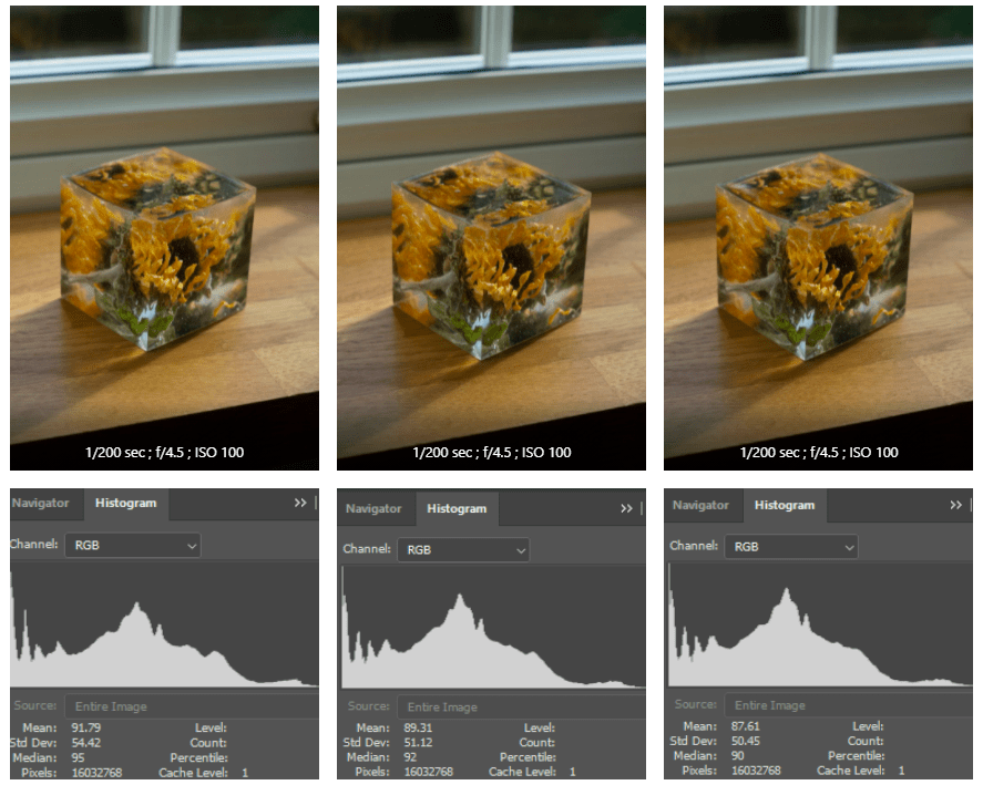
Camera settings:
1/80 sec; f/1.8; ISO 400.
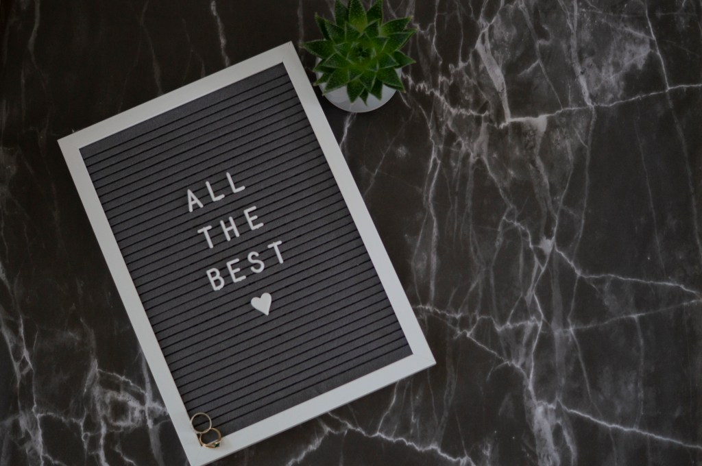
Fig. 1. Flatlay 1 (2019)
For the first composition (see Fig. 1), I decided to place the point in the bottom corner of the pegboard to draw your eyes throughout the image in a straight diagonal line, whether you start from the middle and then up, then down OR from the top to bottom and vice versa.
It doesn’t take away from the text, nor is the point out of sight and ignored. Instead, it’s subtle and very natural to my eyes.
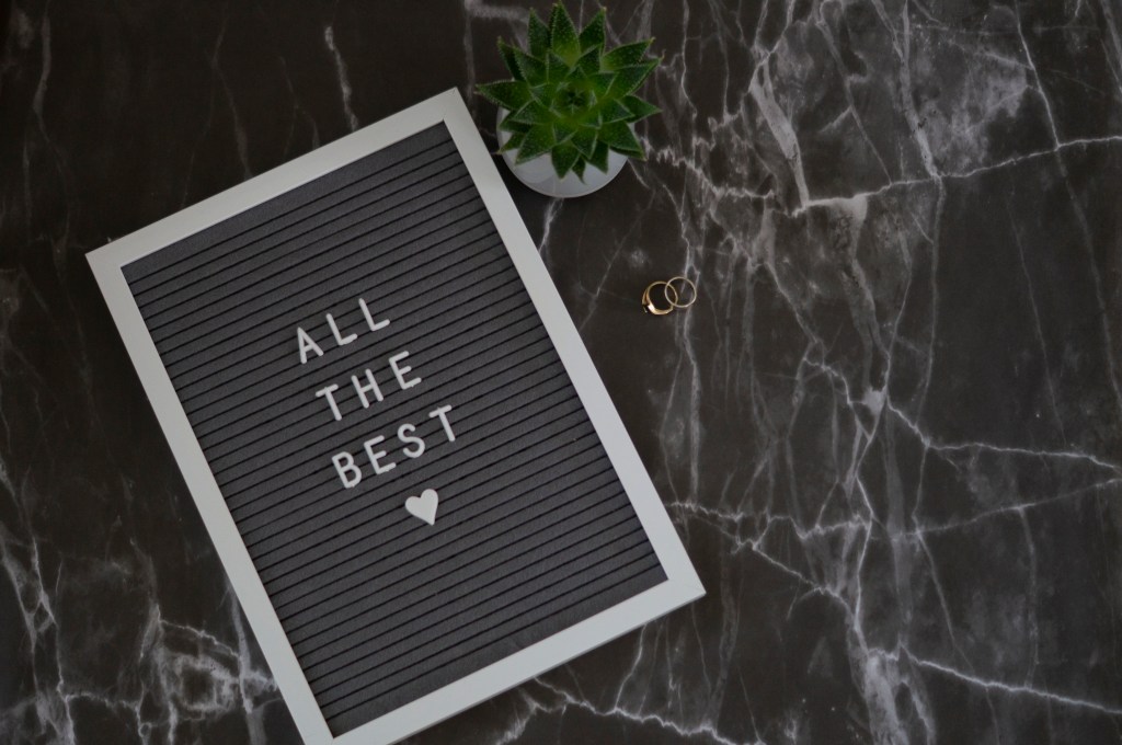
Fig. 2. Flatlay 2 (2019)
For the above piece (see Fig. 2), I chose to move the point further into the negative space and closer to the two other objects to create a cosier feel. The placement of the items creates a right-angled triangle when you flick your eyes from each object, which forms an invisible geometric shape to complement the visible geometric shapes within the frame. I found this quite clever in terms of composition, especially as the rings are placed on the 90-degree point which is the most significant part of the triangle. Therefore the point continues to be the most important element of the image without it being obvious.
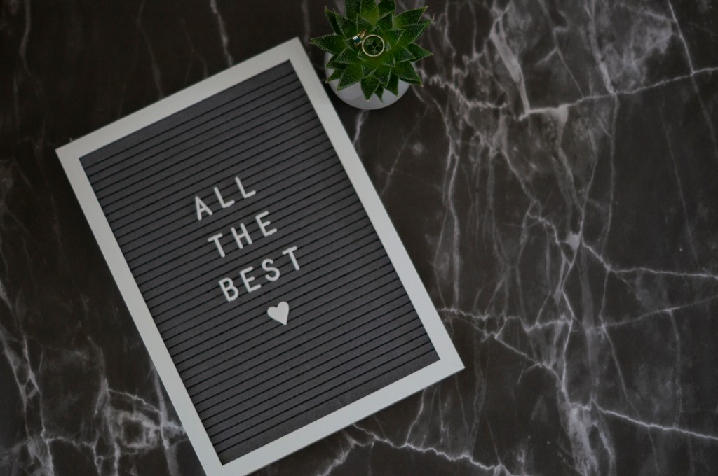
Fig. 3. Flatlay 3 (2019)
For my last image (see Fig. 3) following the rules, I moved the rings on to the plant to make it a little harder for the audience to see, without it being lost. The point highlights the middle of the succulent and compliments the natural curves of the plant, however, the contrast between green and gold helps the ring stand out, despite it being small.
I feel as if the tension in this particular image is caused by the fact you have to look a little deeper than you did with the other two, which makes it a fun composition to explore and is the strongest of the three in my opinion.

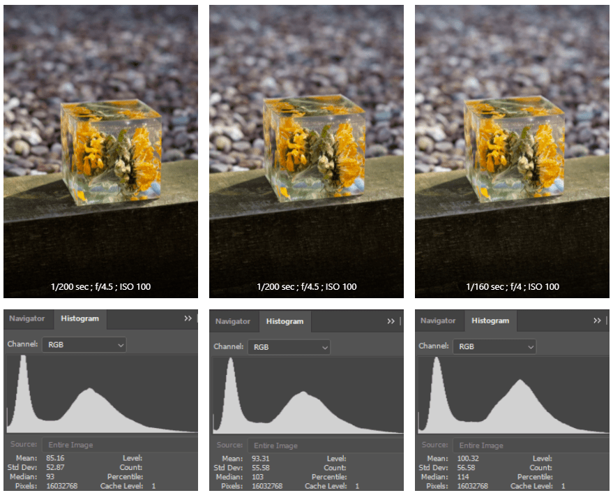
Fig. 4. Flatlay 4 (2019) 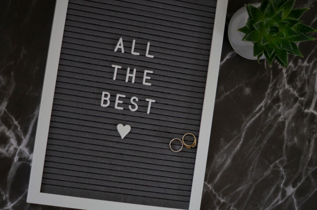
Fig. 5. Flatlay 5 (2019)
I then removed the rules and just shot a couple of images (see Fig. 4. and Fig. 5), without really putting much thought into the composition at all, taking it to the opposite extreme.
While these images aren’t awful, as the colours compliment each other, as do the shapes and sizes, the fact there wasn’t much thought put into the framing or placement of the point, it feels slightly sloppy and unbalanced. The best one out of the two for me is the first image as the angle of the frame cuts up the image slightly, forming more geometric shapes.
Whether you consciously apply the rule of thirds, balance or tension or not, I think it’s important to pay attention to what you’re shooting and where things are in the frame to create a stronger image overall.
References:
Bloomfield, R., 2018. Photography 1: Expressing your Vision. 4th ed. [pdf] Barnsley: OCA, p. 23. Available at: https://www.oca-student.com/course/photography-1-expressing-your-vision [Accessed 9 November 2019].
List of images:
Figure. 1. Powell, L Flatlay 1 [image] In possession of: Lauren Powell: Eastleigh.
Figure. 2. Powell, L Flatlay 2 [image] In possession of: Lauren Powell: Eastleigh.
Figure. 3. Powell, L Flatlay 3 [image] In possession of: Lauren Powell: Eastleigh.
Figure. 4. Powell, L Flatlay 4 [image] In possession of: Lauren Powell: Eastleigh.
Figure. 5. Powell, L Flatlay 5 [image] In possession of: Lauren Powell: Eastleigh.