In this post I – Included the exercise brief to re-visit Henri Cartier-Bresson’s photograph Behind the Gare Saint-Lazare (1982) – Before inserting the image and explaining the point within the image I felt was the most signification and why. – Referenced one of my own images to give context to the use of a focal point and the rule of thirds. – Included a short reflection on the importance of understanding the pivotal points within a piece of art.
Brief:
‘If photography is an event then looking at photography should also be an event. Look again at Henri Cartier-Bresson’s photograph Behind the Gare Saint-Lazare in Part Three. (If you can get to the Victoria & Albert Museum in London you can see an original print on permanent display in the Photography Gallery.) Is there a single element in the image that you could say is the pivotal ‘point’ to which the eye returns again and again? What information does this ‘point’ contain? Remember that a point is not a shape. It may be a place, or even a ‘discontinuity’ – a gap. The most important thing though is not to try to guess the ‘right answer’ but to make a creative response, to articulate your ‘personal voice’.
Include a short response to Behind the Gare Saint-Lazare in your learning log. You can be as imaginative as you like. In order to contextualise your discussion, you might want to include one or two of your own shots, and you may wish to refer to Rinko Kawauchi’s photograph mentioned above or the Theatres series by Hiroshi Sugimoto discussed in Part Three. Write about 300 words.‘ (Bloomfield, 2018).
Behind the Gare Saint-Lazare re-visit:
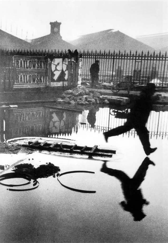
Fig. 1. Behind the Gare Saint-Lazare (1982)
Behind the Gare Saint-Lazare is extraordinary as Cartier-Bresson shot it through a small gap in the wall, unaware of the activity going on behind it. The pivotal point for this shot is the movement. Despite the composition being full of details, textures and shapes becoming a playground for the viewer to explore, the eyes are always drawn back to the blur within the shot. It stands out from the rest, a frozen backdrop in black and white while the mysterious shape to the right flies through the frame.
You are made aware of the direction of movement and the travel speed without being there in the moment. It’s an image that tells its own story, a moment of urgency on a wet day as they jumped over or through the puddles below. You want to know where they are going, why they are running and if something exciting or disastrous happened outside the frame.
The tonal balance within this picture is mixed, with the majority of them being light greys and white. Meanwhile, the silhouette and items nearby are heavily contrasted, making it difficult to ignore.
There is life within the frame, a definitive moment that took place and was unique in photographic execution. Not many images can document a piece of history intriguing enough for the audience to stay and observe it for a length of time over and over. While there may not be a clear leading line, there is an obvious focal point pushing the eyes to look and appreciate it whether they want to or not. It’s so powerful.
An example of drawing the eyes towards a particular point without a leading line features in one of my product images (see Fig. 1) through the use of the rule of thirds.
Fig. 2. Sloth (2021)
Reflection
Re-visiting an image can help you appreciate the piece of work, especially if you have more knowledge to hand. Understanding what ‘makes’ an image and shapes it, encouraging the viewer to look deeper and sit with the art for longer solidifies the importance of composition, balance and intent.
– Included the research point brief and my response to it by referencing the text throughout.
– Inserted the exercise brief for ‘Homage’.
– Wrote a short paragraph about Carol Sharp and how she connects with her subjects while photographing
– Before comparing one of her images with my own as a homage
– Alongside a brief analysis of my response and the context
– Inserted a couple of extra images to show how I paid homage to Sharp’s work
– Included a past image from my archive, with a short analysis of the message and context behind it
– Before reflecting on what this exercise taught me
Research
‘For a short introduction to how context operates in relation to photographs, read Terry Barrett’sessay ‘Photographs and Context’:terrybarrettosu.com/wp-content/uploads/2017/08/B_PhotAndCont_97.pdf[accessed 25/01/18].Barrett suggests that we interpret pictures according to three different types of information:information in the picture, information surrounding the picture and information about the waythe picture was made. He calls these the internal context, the external context and the originalcontext‘ (Bloomfield, 2018).
Images can be incredibly flexible in terms of context, based on the environment, the subjects within the frame, the colours or lack thereof. However, the context of a photograph can alter depending on whom it reaches. For example, in Terry Barrett’s Photographs and Contexts (Barrett, 1985) a photograph of a pair sat outside a bar taken by Robert Doisneau was given different contexts; to Gisele Freund’s knowledge, up to five times by various magazines, brochures and galleries. A few examples of this consist of accusations of sex work, alcohol abuse and seduction (Barrett, 1985).
The initial context behind Doisneau’s shot was simply a moment of charm as he enjoyed cafe’s and seeing the couple together was enjoyable.
‘Texts that surround the photograph eliminate any residual ambiguity’ (Barrett, 1985). If we were to put a picture of a beef burger on the front of a vegan magazine, it would probably cause some shock before going on to talk about the environmental effects and immoral behaviour of the industry, however, on the front of a restaurant menu, people would be enticed and seduced by how good it looked.
Images are used for other things, different to their initial intent. Pictures of lungs on a cigarette packet are used to encourage smokers to stop smoking before too much damage occurs but are initially used for scientific and medical research.
The placement of an image is another factor to consider for context. The display of a picture of people in poverty may glorify the situation for the benefit of art and a famous gallery rather than portraying the horrific effect on lives in a place you would expect to see such circumstances.
No matter where you are in the world or what language you speak, photography can be a source of communication for some people (Sander, 1978 referenced in Barrett, 1985:114), whether an artist is documenting their mental state or an audience expressing feeling by sending a photographic meme. Despite the global interaction with these photographs, they may not provide the same message to one person in the way it did to another. Context is still subjective depending on the viewer.
Internal context includes the image, title, date and maker. External context would be the presentational environment, so where it’s displayed. The original context is the ‘causal environment’, in other terms, the physical and psychological elements available to the photographer at the time of capture (Barrett, 1985).
To understand the context as an audience, we need to look deeper and consider everything, including what the photographer may have been doing or thinking at the time. These things combined will help us appreciate the make-up of the image a lot more.
Brief:
‘Select an image by any photographer of your choice and take a photograph in responseto it. You can respond in any way you like to the whole image or to just a part of it, but youmust make explicit in your notes what it is that you’re responding to. Is it a stylistic devicesuch as John Davies’ high viewpoint, or Chris Steele Perkins’ juxtapositions? Is it an idea,such as the decisive moment? Is it an approach, such as intention – creating a fully authoredimage rather than discovering the world through the viewfinder?Add the original photograph together with your response to your learning log. Which of thethree types of information discussed by Barrett provides the context in this case? Take yourtime over writing your response because you’ll submit the relevant part of your learning logas part of Assignment Five.‘ (Bloomfield, 2018).
Carol Sharp
“Carol Sharp is an award winning photographer and fine artist, renowned for her lyrical composition, attention to detail and her delicate touch with light.” (Carol Sharp, n.d.)
Sharp is UK based photographer who has over 20+ years of professional photographic experience, has featured in Chelsea Flower Show posters in the past. Her exploration of the world and its plants is a way to encourage society to reconnect with nature and empathise with it.
“I use different types of perception to not only see their form, but to understand the meaning of the form and to reveal its ‘gesture’. which means having a communion with my subjects and a desire to feel their very life force.” (Sharp, n.d.). Unlike the majority who may pass by a flower or tree without much notice, Sharp truly connects with her subjects to understand them and appreciate them. I think this shines through in her work as the framing is cropped and intimate as shallow depth of field emphasises the soft petals and delicacy of the foliage and flowers in the composition. Vibrant colours bring life to the images, subtly getting the viewer to realise that this life source is living, thriving and a powerful part of our world. Flowers, trees, moss and other forms of plants keep this world functioning, helping us live and grow. It’s important to be grateful for what is around us, something Sharp does very well.
Due to how Sharp talks about her work and the passion for her subjects, I would say that the original context is the most prominent context type in these images. Bearing in mind the importance to the maker, it heavily influences how the viewer sees the subject, making it feel more personal and ripe with life. The images are not just another simple set of shots of a bunch of flora and fauna as time and energy have been taken by the creator to capture the beauty.
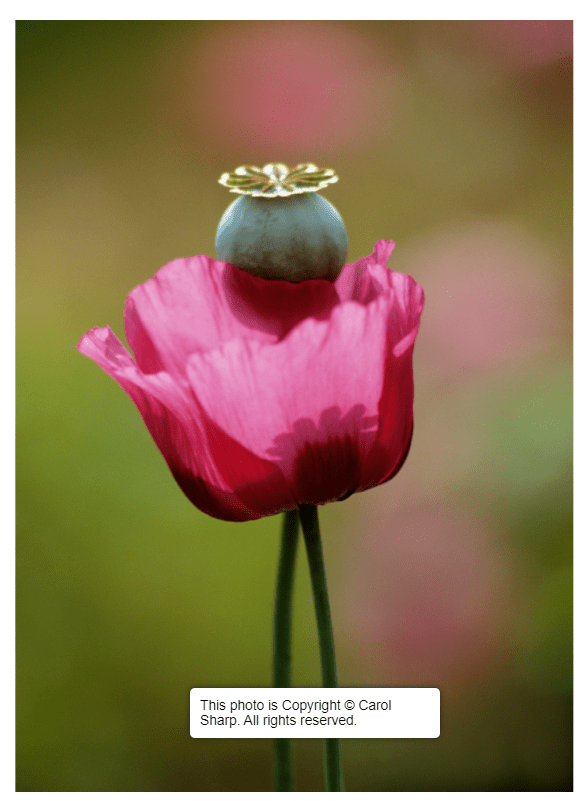
The selection of images I paid homage to for this exercise came from the Plant Portraits (n.d.) album.
My SONY A57 camera was on manual mode, the aperture was at F/1.8, the shutter speed was 1/250 and ISO was set to 100. The shooting process was simple as I took a walk around my garden during dusk, capturing a few of the flowers available to me. The response to this exercise was to keeping original context at the forefront of my mind by analysing the subjects and connecting with them before pressing the shutter. A creamy shallow depth of field and cropped framing were two of the most important visual and technical elements to include during this shoot.
Fig. 1. Plant portraits (n.d.)
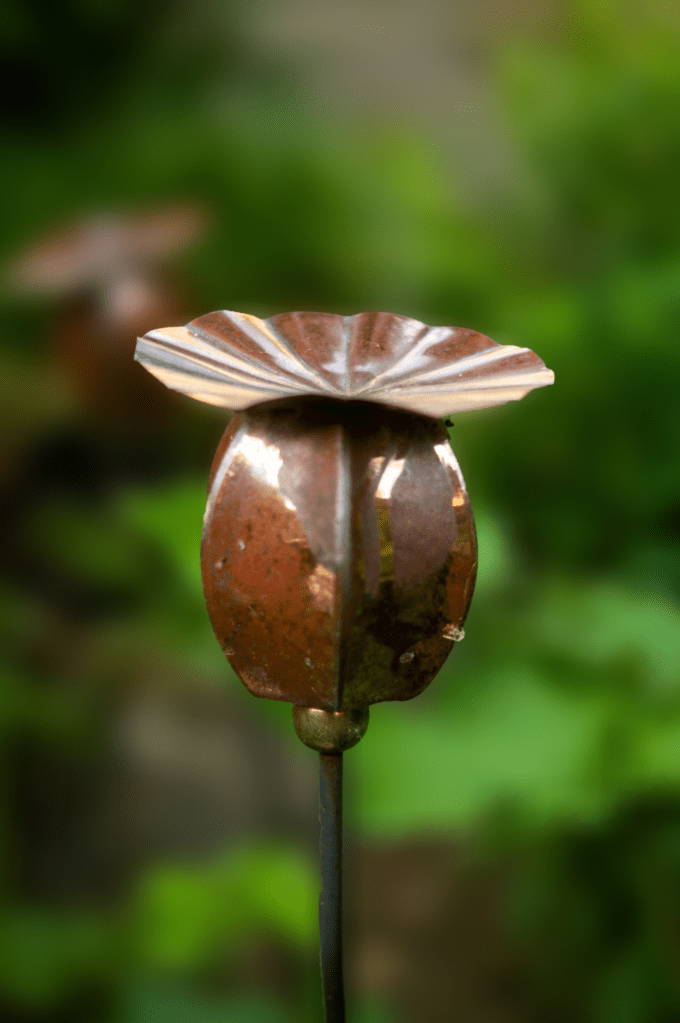
Fig. 2. Homage 3 (2021)
Homage 3 (see Fig. 2) referenced the feature of a poppy seed head in Sharp’s image (see Fig. 1.) by capturing the metal sculpture in my garden, a permanent piece of art, unlike an actual poppy. Using an aperture of F/1.8 enabled me to get the creamy bokeh effect that flows throughout Sharp’s work so beautifully; focal points draw the eyes of the audience to the subject, all of its details, the textures and colours. Cropping the frame brings the object closer to the camera lens, allowing the viewer to observe it more intimately and connect with what is going on within the composition. Contextually, this metal poppy head was a gift to my dad from my mum for his birthday, so holds a deeper meaning for me, much like Sharp attaches to her subjects to appreciate it more. The colours within Plant portraits are vibrant, warm and full of life, while tones within my homage are earthy, so despite it being artificial, the subtle connection to nature and its rich soil is a clever addition to my piece. From a conceptual point of view, the relationship between the two shots juxtaposes despite a few similarities. Sharp embraces the life and death of plants, reconnecting to their importance for our survival as living beings. On the other hand, I have captured a replica of a pollinating plant that will never pollinate, an unintentional parody of how humans keep making things that do not benefit the world environmentally.
Original context brings more personality to photographs as you understand why it was taken, how it made the creator feel, what was going on at the time and the image that was achieved as a result. It pushes the audience to explore it to understand it as a whole composition rather than a simple picture. The work I shot may be unoriginal visually, but the extra level of information lifts it and makes it a rich piece of art.
The internal and external context is just as important but feels less characteristic for some artworks in my opinion as it allows the viewer to come up with their own story as to what the photograph contains and what it may be portraying. Some photographs need that extra bit of information to steer the observer in the right direction.
Here are a few other images I took for this exercise:
Fig. 3. Homage 1 (2021)
Fig. 4. Homage 5 (2021)
Homage example from past archive:
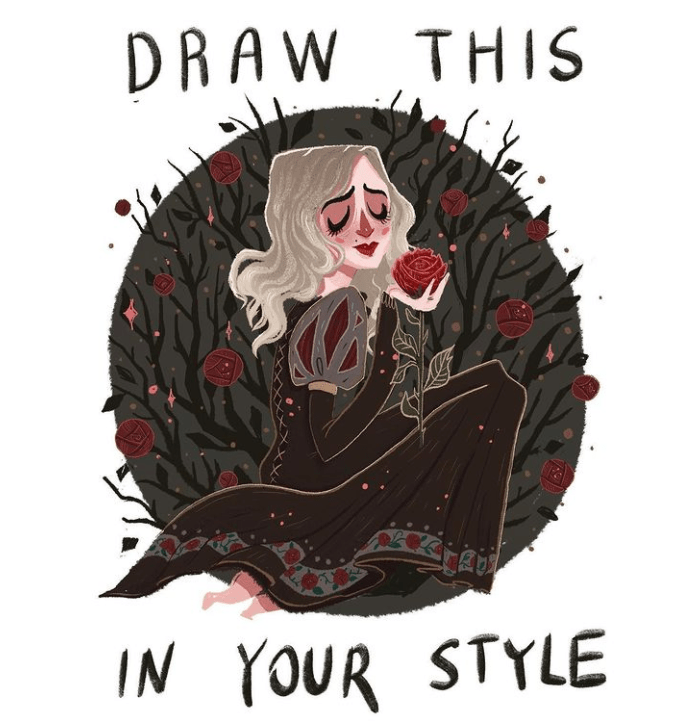
Fig. 5. Draw this in your style (2019)
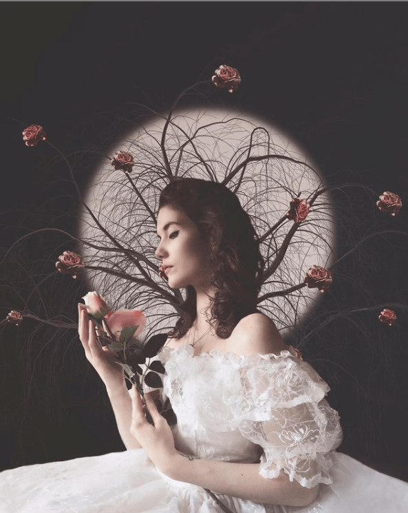
Fig. 6. Rose (2019)
While this isn’t a homage inspired by a photographer, it was an image I created as a tribute to the Draw this in your style (2019) drawing by Ellie Goldwine on Instagram. My response to this piece was approached with intent, having complete control over the props used, outfits and makeup worn, as well as the background, pose and editing. It became a reversed image of the original piece (see Fig. 5), the dress chosen for my composition (see Fig. 6) was the opposite colour creating a juxtaposition between the two. Rather than red roses, light pink roses were used and the circular framing around the drawing in my piece represented the full moon. Everything about the photograph I created was intentional, as the brief was to create something in your style from the reference given.
The context for this piece was internal, as it was inspired by the Draw in your style title and image. Without this information, I may not have been encouraged to replicate it at all.
Reflection
This research point and exercise helped me understand the importance of context, the different types and how the portrayal of images original intent can be influenced. An images original message can be changed through the way it is displayed, the environment in which it’s found, the title and other such information. The original context is a type that features heavily in my work when given the chance, as personality and background mean a lot to me when it comes to creating a piece of work.
Figure. 2. Powell, L. (2021) Homage 3 [image] In possession of: Lauren Powell: Eastleigh.
Figure. 3. Powell, L. (2021) Homage 1 [image] In possession of: Lauren Powell: Eastleigh.
Figure. 4. Powell, L. (2021) Homage 5 [image] In possession of: Lauren Powell: Eastleigh.
Figure. 5. Elliegoldwine. (2019) Draw this in your own style [Instagram, screenshot] Available at: https://www.instagram.com/elliegoldwine/ [Accessed 13 June 2021].
Figure. 6. Powell, L. (2019) Rose [image] In possession of: Lauren Powell: Eastleigh.
– Shared my camera settings and technical information
– Before providing the contact sheets for my shoot
– Inserted 6 of my favourite shots from the set and explained why through analysis
– Chose my ‘select’, analysed the image
– Before discussing why I chose it as the strongest image, the unintentional and conceptual elements discovered
Brief:
Use your camera as a measuring device. This doesn’t refer to the distance scale on the focusring. Rather, find a subject that you have an empathy with and take a sequence of shots to‘explore the distance between you’. Add the sequence to your learning log, indicating whichis your ‘select’ – your best shot.When you review the set to decide upon a ‘select’, don’t evaluate the shots just according tothe idea you had when you took the photographs; instead evaluate it by what you discoverwithin the frame (you’ve already done this in Exercise 1.4). In other words, be open to theunexpected. In conversation with the author, the photographer Alexia Clorinda expressedthis idea in the following way. Look critically at the work you did by including what you didn’t mean to do. Include the mistake,or your unconscious, or whatever you want to call it, and analyse it not from the point of view ofyour intention, but because it is there. (Bloomfield, 2018)
Initial plans
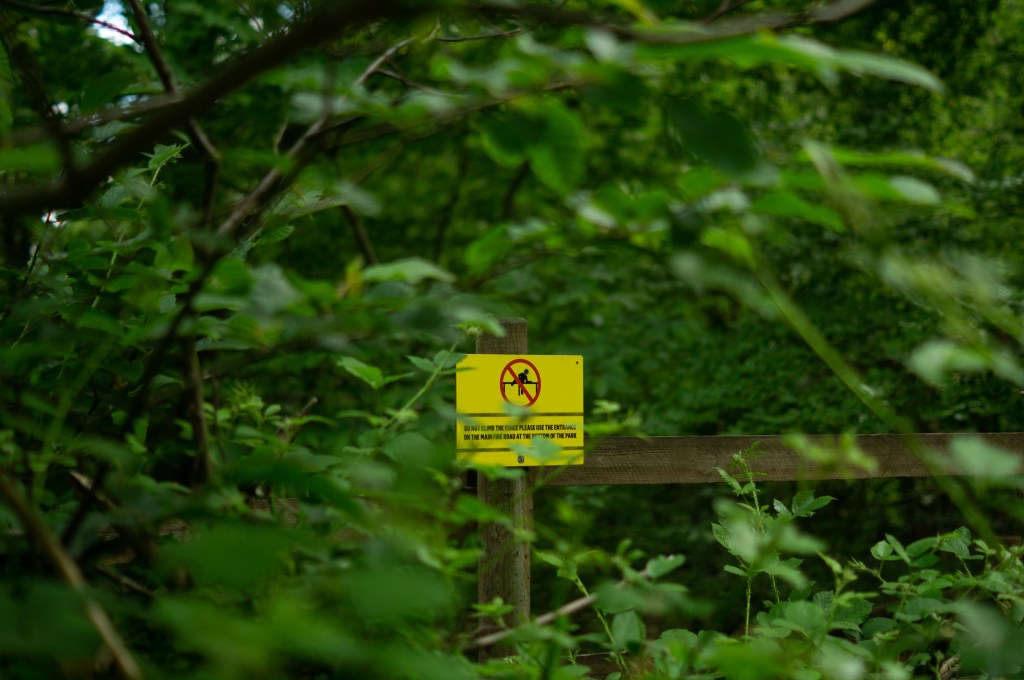
I didn’t want to give too much thought about what to take images of to give myself a challenge; instead, I read the brief and decided to pick the first subject that came to mind in terms of empathy. As a result, the deforestation and increase of littering within my local woodland popped up first.
Growing up next to woodland is something to be grateful for as nature is right on your doorstep and isn’t something everyone has the privilege of having. Unfortunately, I’ve watched this beautiful area be the victim of mass deforestation and urbanisation to allow room for more homes. Building on land to cover the rise in population isn’t so much the problem, but the littering, lack of care taken after trees and foliage removable are.
It’s not satisfying to go on a nature walk, to find metal barriers up that are yet to move, piles of logs and leftover branches scattered around the place with signs and ripped tape on the floor. Seeing all the changes happen and watching it decline since childhood makes me feel empathetic toward the animals that live within those woods, the insects, trees and the pedestrians who want to observe this place.
I used my SONY A57, set my aperture to F/2.8, the focus and camera settings to manual before heading out on a walk around the woods. Not knowing what I was going to find made this exercise more challenging as I wasn’t sure whether there would be enough around to gather a substantial amount of images to choose from, although, wasn’t the case as seen below in my contact sheets.
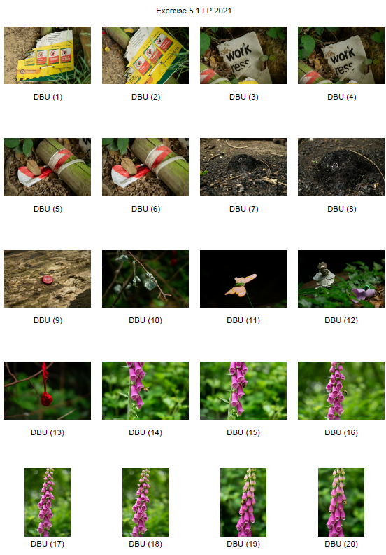
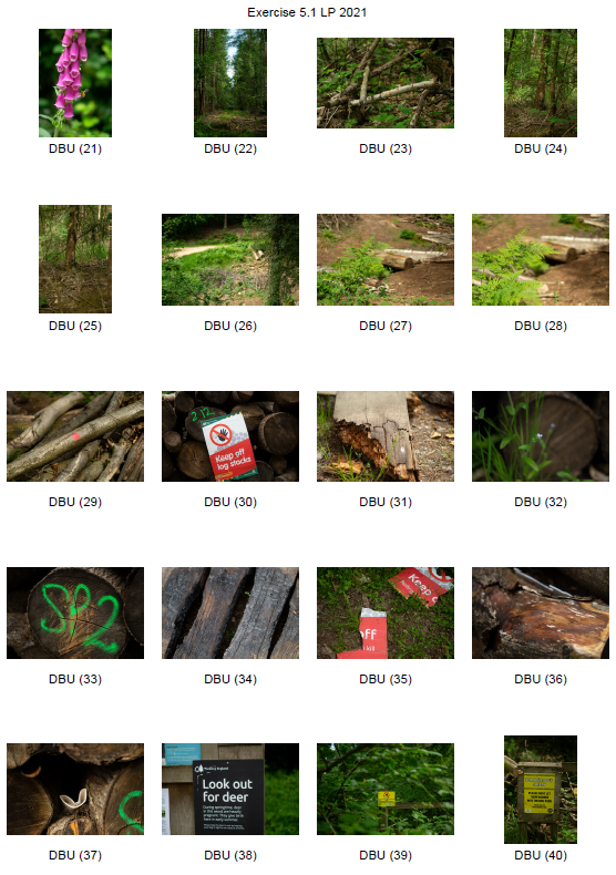
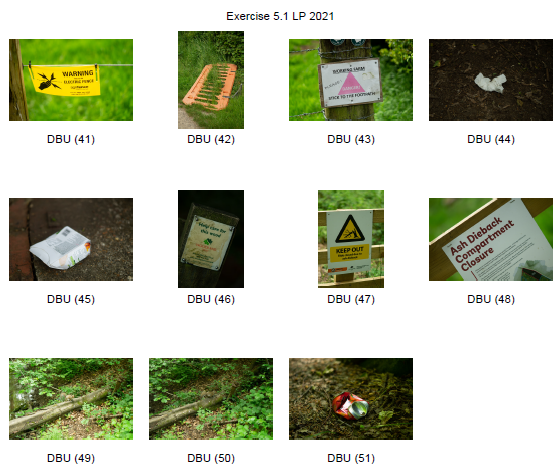
Contact sheets
Fig. 1. Contact sheet 1 (2021)
Fig. 2. Contact sheet 2 (2021)
Fig. 3. Contact sheet 3 (2021)
A selection of favourite images:
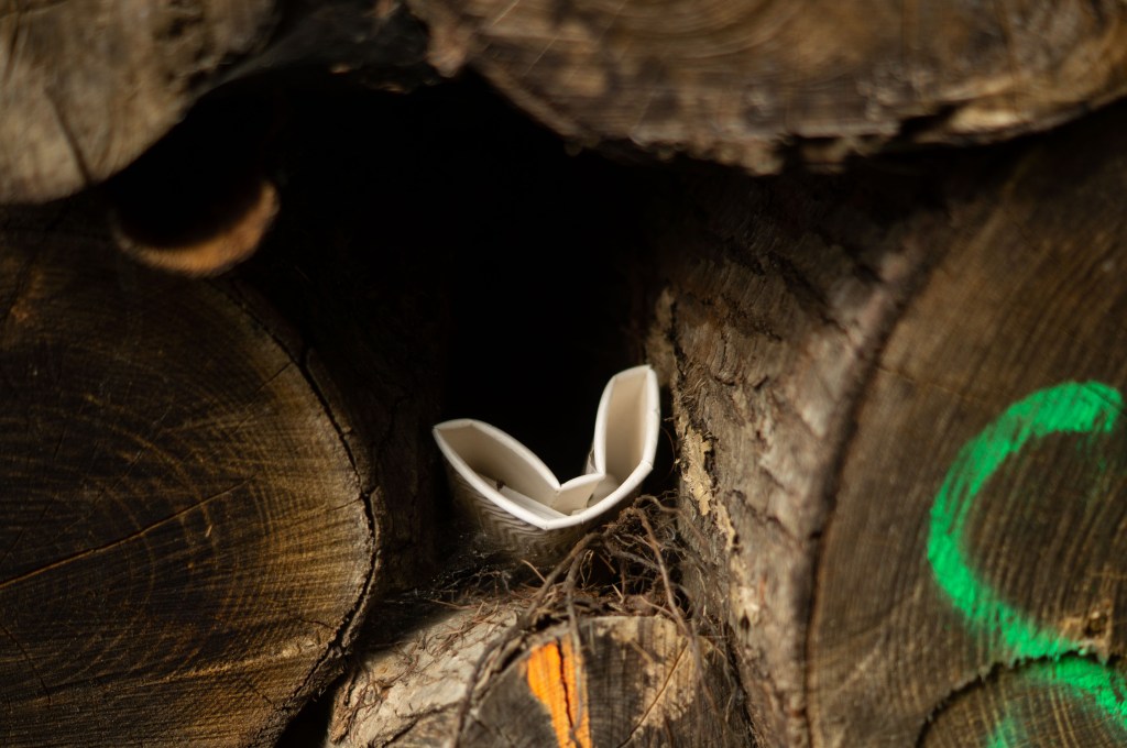
Fig. 4. DBU 4 (2021)
Fig. 5. DBU 12 (2021)
Fig. 6. DBU34 (2021)
Fig. 7. DBU 37 (2021)
Fig. 8. DBU 39 (2021)
Fig. 9. DBU 49 (2021)
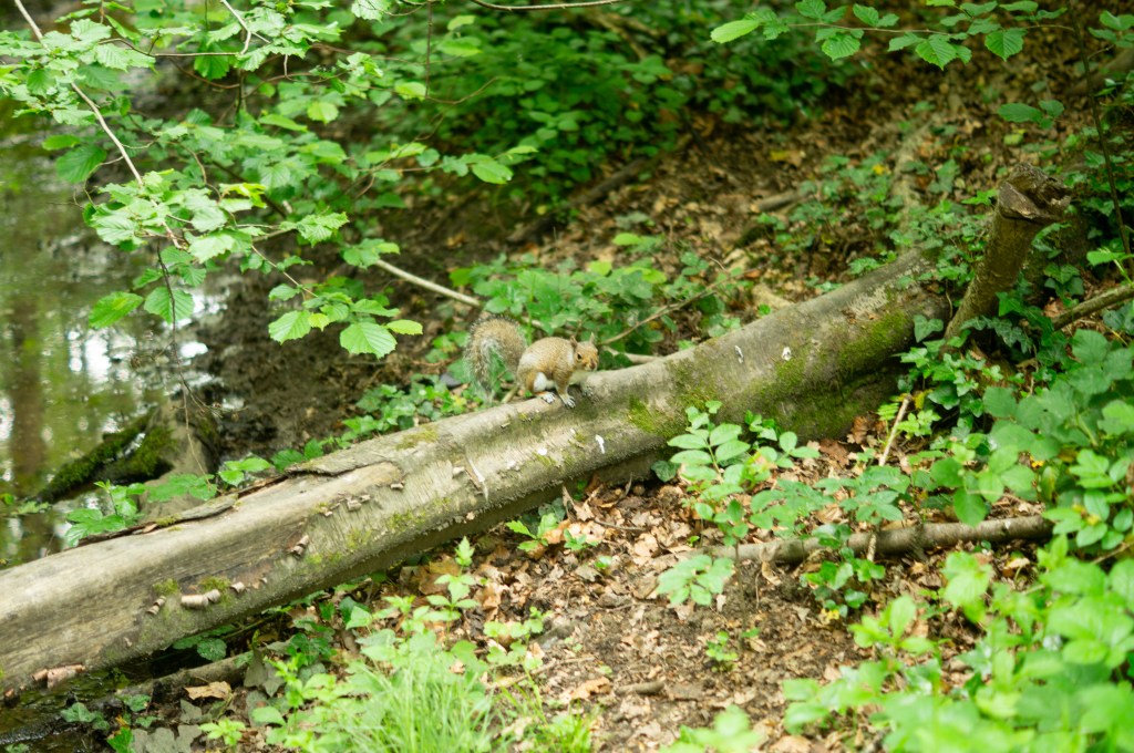
The selection of the six images above is visually strong, well framed and clearly show where the focal points are. Earthy tones perfectly reflect the life and death of nature, rich soil and crisp green foliage. Tonal differences throughout the compositions provide a steady balance between the dark shadowy areas, well lit vibrant sections and shapes that supply a contrast between the organic and more structural man-made subjects featured. Using natural overcast light allowed me to capture diffused shadows and highlights that made the shallow depth of field creamer and smooth, complimenting the fragility of the nature I was documenting. Contextually and conceptually, they present the various elements found within our woodland, from rubbish, to work signs, animals navigating through their home despite it. It may encourage the viewer to think about our effect on the area we live in, how people treat it and the results of these actions. The juxtaposition between nature and man-made objects or situations is jarring as it doesn’t belong and evokes a powerful reaction.
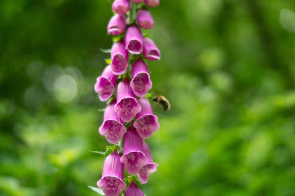
My final ‘select’:
Fig. 10. DBU 16 (2021)
While that collection of photographs were powerful contenders for my ‘select’ and final image, the shot that spoke the most to me was DBU 16 (see Fig. 10). This picture surprised me the most, as it doesn’t necessarily present the idea of deforestation and the massive effect on nature at first glance. Unlike the other compositions, there aren’t any man-made subjects within the frame indicating building work, littering or burnt wood and foliage. Tonally it is balanced, as the shadows and highlights are soft rather than heavily contrasted, while the colours are vibrant and pleasant to look at. Everything about this shot is organic, fresh and full of life, soft due to the natural light and shallow depth of field; a complete juxtaposition to the darker, grittier photographs of old cups, spray-painted trees and plastic items. However, conceptually it still connects with my initial idea of capturing the woodland and its effects on nature and humans etcetera.
When I saw the foxglove growing in between the grass down a thin, closed off path, I was inclined to capture it even though I felt it didn’t ‘fit’ the aesthetic or context behind this exercise. This flower was in the most secluded area, away from the set path, in the middle of trees and tufts of long grass. Despite the destruction and interactions that have taken place in the area, this piece of nature has thrived. Its petals were vibrant, silky and undamaged, while leaves from the trees behind were crisp, fresh and thriving. Initially, I just thought I was taking a pretty picture, quite a simple shot which some may call a ‘postcard shot’, but when I looked at it closely there was a bee in the background. Nature continues to live on no matter what we’re doing, doing its job, much like the bumblebee in this shot. It wasn’t intentional to have a bee in the frame as the focal point was on the foxglove but it’s added an extra layer to the composition as a whole. Without bees and other insects, we wouldn’t have flowers, trees and a healthy abundance of nature to help us survive. The fact that its wings blurred despite the fast shutter speed and its convenient placement within the shallow depth of field in the background feels like a clever reference to the decrease in bees and the danger they face due to the lack of plants that allow them to pollinate. If the bee was further back we would barely see it; it would disappear in the blur.
The distance between humans and nature isn’t far at all, we need it more than we think.
Reflection:
This exercise was interesting as it lightly linked back to assignment 1, where I revisited important places from childhood to see how they had changed. My final image wasn’t one I was expecting to choose, purely because of the initial plan to explore the destruction and man-made influences within the local woodland. Giving myself a challenge by picking the first idea that came to mind made me focus more on the location which is what photography is all about. It was a risk, but it worked.
The distance between us has taught me that photographs may look simple, plain and just become another pretty picture, but if you take a deeper look you may find something you weren’t anticipating. When selecting images, it’s important to choose those that are compelling even if it’s not one of your favourites to start with. In future, I will be more flexible when it comes to picking a final set and presentation.