Summary:
In this post I;
– Provided a selection of images that explore the use of lines to create depth and the flattening of space, along with technical settings.
– Analysed the images, noting down their visual strengths, the impact of the lines and angles explored as well as textures and colours.
– Stated my initial concerns, what I have learnt from it and the importance of lines in a composition.
Brief:
‘Take a number of shots using lines to create a sense of depth. Shooting with a wide-angle lens (zooming out) strengthens a diagonal line by giving it more length within the frame. The effect is dramatically accentuated if you choose a viewpoint close to the line.‘ (Bloomfield, 2018)
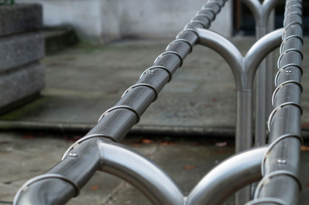
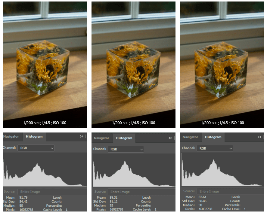
Fig. 1. Line 1 (2019)
1/640 sec; f/4.5; ISO 400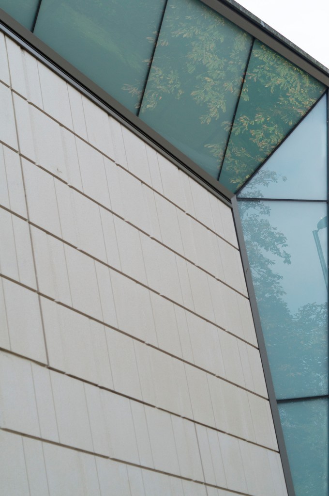
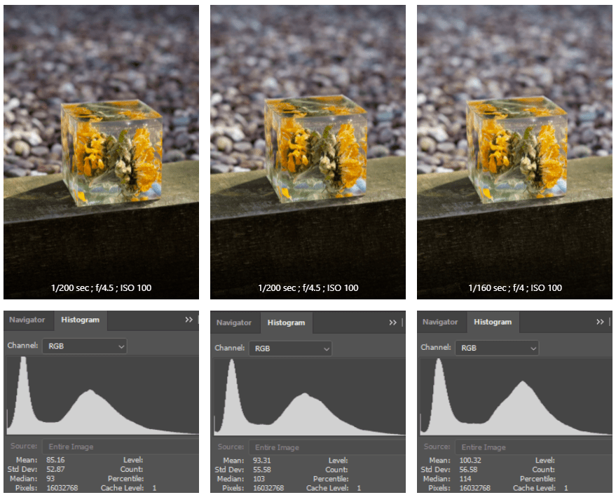
Fig. 2. Line 2 (2019)
1/500 sec; f/4.5; ISO 400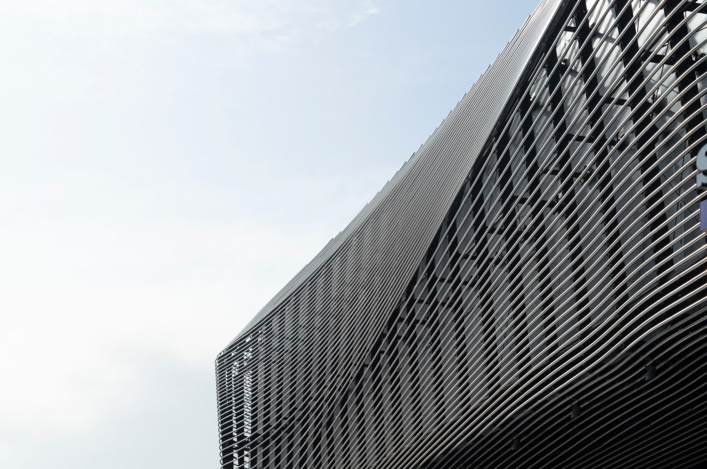
Fig. 3. Line 3 (2019)
1/1600 sec; f/8; ISO 400
After reading the brief, I headed to my local city to explore the different architecture available and the modern public facilities dotted around the area.
As I don’t have a wide-angle lens, I used my 50mm lens while being aware of my position to get better angles and hopefully create the same effect.
The first image (see Fig. 1) is full of various lines, keeping the eyes busy. The length of the handrail leads the eyes from the bottom left corner to the top right, while the wire and the curved structural pieces throughout the middle of the rail provides a circular motion for the viewer while they travel through the frame. Despite the shallow depth of field, you can still clearly see the straight line of the step and the wall to the left; this stops the eyes from heading straight out of the picture.
The depth in the second image (see Fig. 2) stands out the most, mainly due to the unique structure of the building. The camera was as close to the wall as possible to show the sharp angles of the architecture; it goes inwards, drawing your eyes directly into the photograph then leading you back out when the glass windows come outwards. Not only do the faint and deep lines cause your eyes to flick up and down throughout, but the reflections in the glass gives that little bit more texture, as well as tonal variants due to the sunlight, feeding the eyes with more detail to explore bringing you back into the image. Depending on how you look at it and how your eyes adjust, it could create an optical illusion, causing the building to come out of the frame rather than go inwards. It’s all about perspective.
Modern architecture is something to behold, so the third image (see Fig. 3) is an incredible example of this. The curves in this building are beautiful, creating a wave effect for the eyes, very similar to the figure of a whale and its skin details. This composition provides circular motions for the eyes instead of a straight line that draws you from one side of the frame to the next. Not only are there horizontal lines, but much darker vertical lines behind the curved structure too.
Brief continued
‘Now take a number of shots using lines to flatten the pictorial space. To avoid the effects of perspective, the sensor/film plane should be parallel to the subject and you may like to try a high viewpoint (i.e. looking down). Modern architecture offers strong lines and dynamic diagonals, and zooming in can help to create simpler, more abstract compositions.’ (Bloomfield, 2018:25).
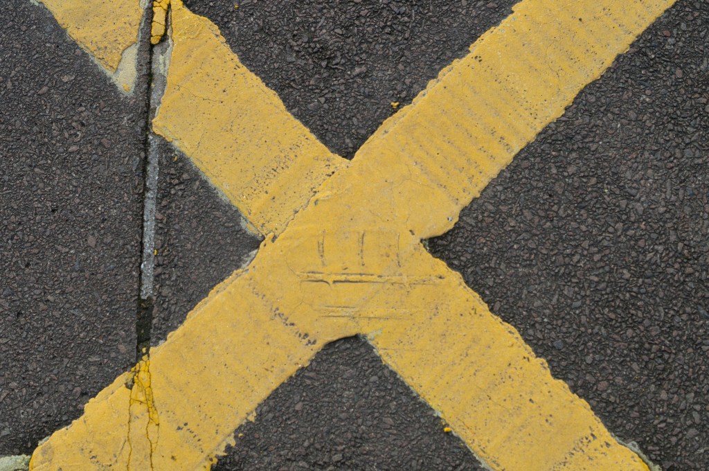
Fig. 4. Line 4 (2019)
1/1600 sec; f/5; ISO 400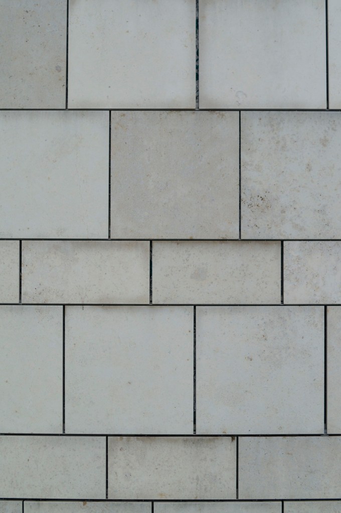
Fig. 5. Line 5 (2019)
1/1000 sec; f/5; ISO 400
Fig. 6. Line 6 (2019)
1/640 sec; f/8; ISO 400
Finding a high viewpoint and looking down with a fear of heights didn’t seem appealing, so I had to get creative and find something on the ground level.
The bright yellow focal point of the first image (see Fig. 4) not only cuts the image into four sections for the audience to explore, but the eyes also travel across multiple diagonals. While there is no physical depth like the previous images, the contrast between the tarmac and yellow paint lifts the cross out of the frame. The lines are sharp and straight, very geometric and make the picture slightly more dynamic than the perspective lines.
Not only do your eyes go up and down and side to side from exploring the tiles in image Line 5 (see Fig. 5), but the different sizes also expand and shrink the image as the eyes travel through the frame. The dark lines are very sharp and draw the eyes into the frame as it sinks in from the bright white wall, much like a minimalist painting. I like how I shot this wall very closed in and cropped, preventing the composition from being overwhelmed with too many shapes.
I enjoy shooting images at odd angles and going against the idea of a straight horizon, which I applied in Line 6 (see Fig. 6). Not only do the eyes get to jump around the frame to explore the various coloured brickwork, but they are also guided through the image diagonally and around each brick in a diamond-shaped motion. Once again, the highlights and shadows provide a little bit of depth, but not too much.
Review
Despite being a little nervous about this exercise, I am pleased with the results. It made me aware of what is around me, whether it is natural or built by hand. We very often look forwards, rarely looking up at what’s above us or below us besides our feet or our phone. Not only did this help me understand how lines work in photography, how they can shape a composition, give more depth and the effect these features can have on the viewer, it also helped me find the beauty of shapes and structure in person, not just a snapshot.
References :
Bloomfield, R., 2018. Photography 1: Expressing your Vision. 4th ed. [pdf] Barnsley: OCA, p. 24. Available at: https://www.oca-student.com/course/photography-1-expressing-your-vision [Accessed 12 November 2019].
List of images:
Figure. 1. Powell, L. (2019) Line 1 [image] In possession of: Lauren Powell: Eastleigh.
Figure. 2. Powell, L. (2019) Line 2 [image] In possession of: Lauren Powell: Eastleigh.
Figure. 3. Powell, L. (2019) Line 3 [image] In possession of: Lauren Powell: Eastleigh.
Figure. 4. Powell, L. (2019) Line 4 [image] In possession of: Lauren Powell: Eastleigh.
Figure. 5. Powell, L. (2019) Line 5 [image] In possession of: Lauren Powell: Eastleigh.
Figure. 6. Powell, L. (2019) Line 6 [image] In possession of: Lauren Powell: Eastleigh.