Project 2 – A Durational Space – Research

Online Research, Part 3, Thoughts & Ideas

Summary:

For this research point I;

– Drew on the work of Francesca Woodman, a portrait photographer who explored the human body and the idea of revealing and concealing.
– Stated my thoughts on her use of black and white photography, what it may represent and how it makes me feel.
– Reflected on the statements made by Victoria Miro and found examples of the points made within Woodman’s photography and how they enhanced the imagery.
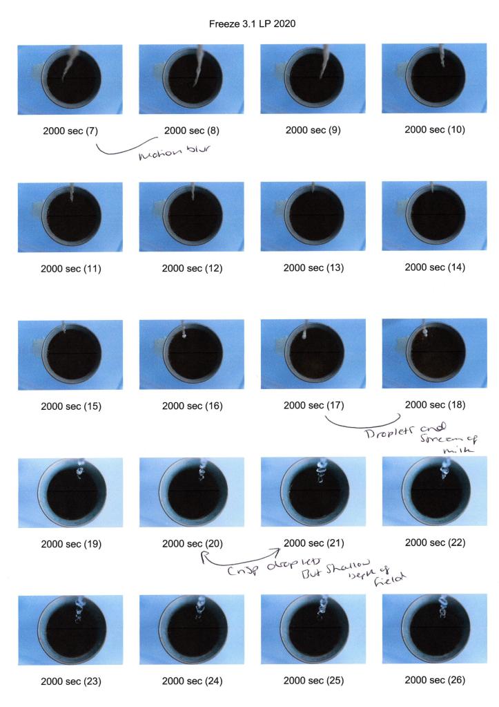
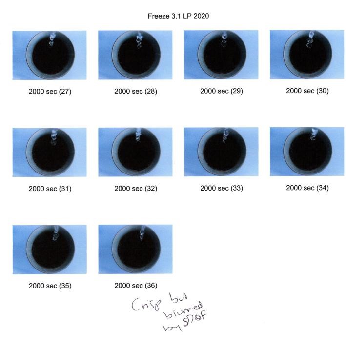
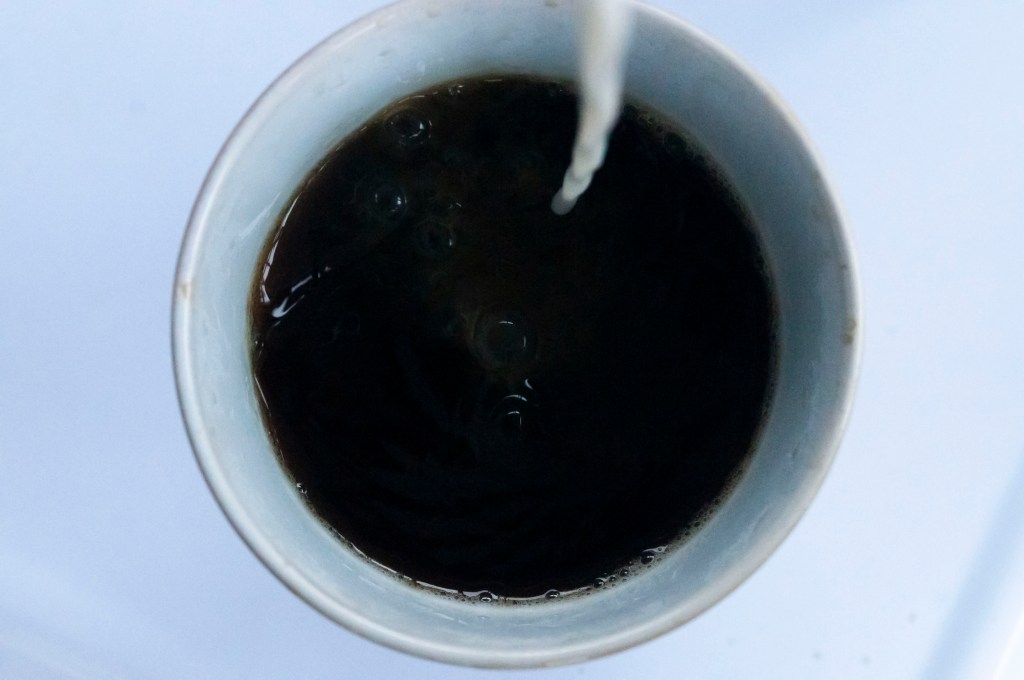
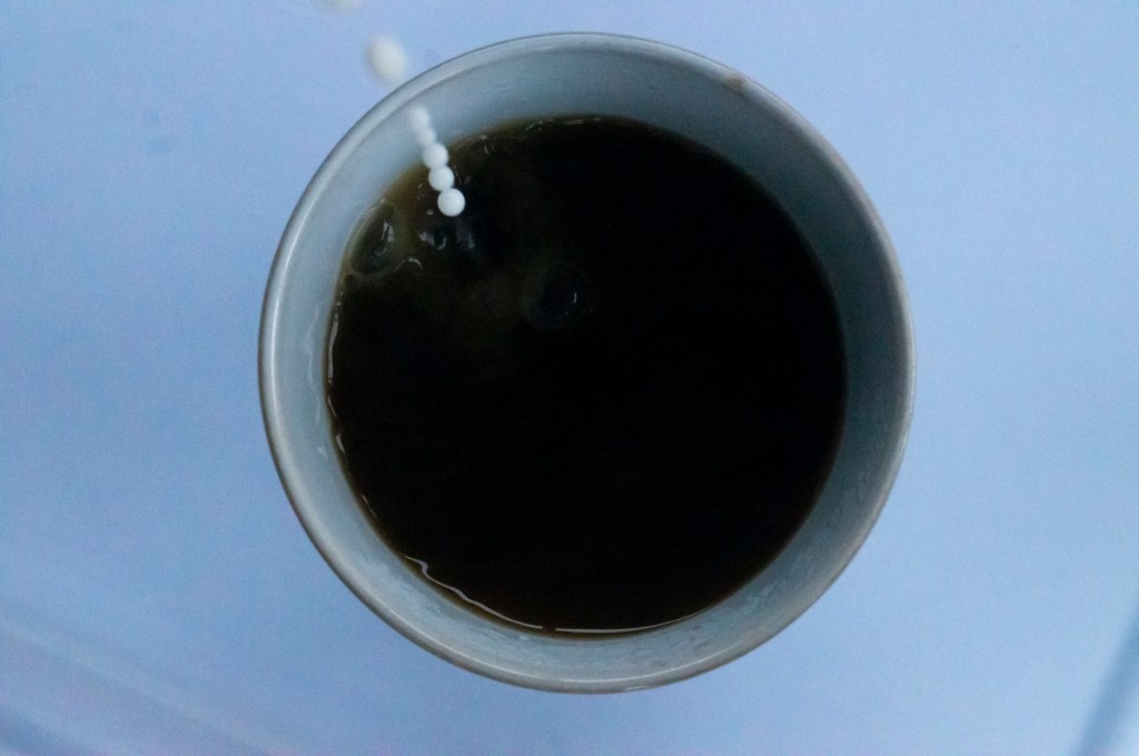
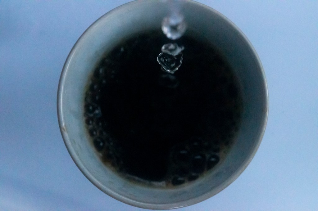
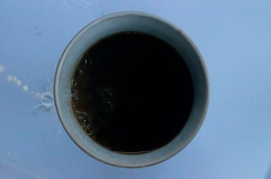
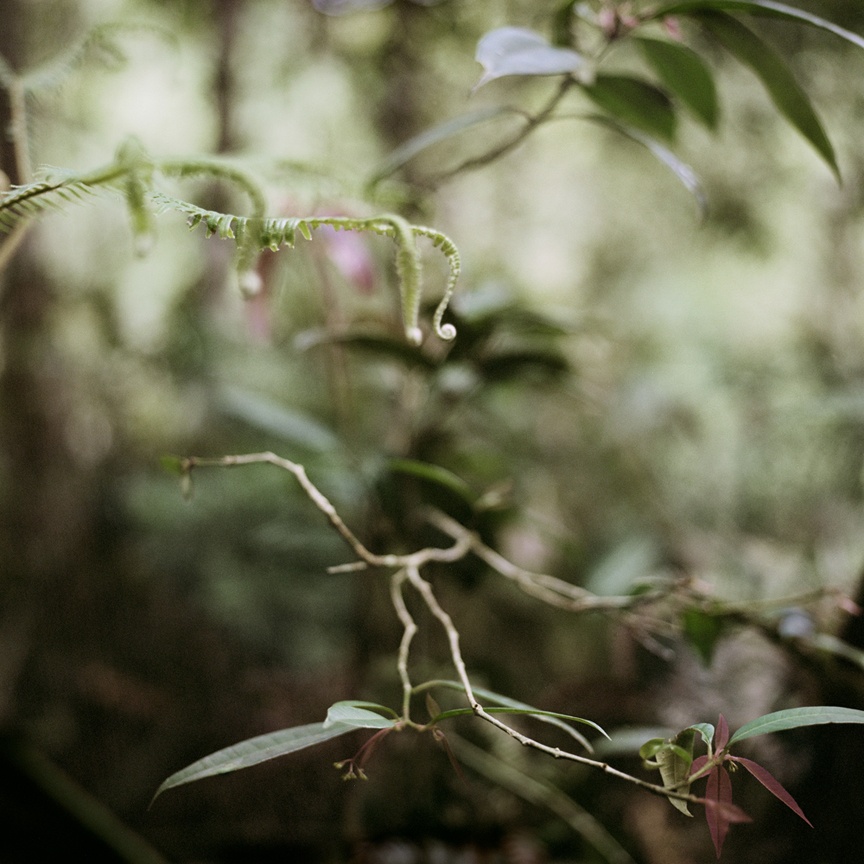
– Briefly covered the effects that motion blur has on her work and the feelings they may create for the viewer, providing an example below to show traces of time.
– Drew on the work of Michael Wesley, a still life photographer who captures long exposures to document the invisible force that is time, showing traces of movement, light, life and decay.
– Reflect on how he captures what we may feel is impossible, by showing the universe around us by being patience and letting everything happen naturally instead of forcing it.
– Explored the work of Hiroshi Sugimoto, who also uses long exposure times to capture the entire length of a movie in a theatre, resulting in ghostly white screens illuminated a once full room.
– He too captures the ‘impossible’ by documenting the act of disappearance and showing what the camera saw over that period.
– Sugimoto challenges the idea of the moving image by turning what previously moved into a still image once more.
– Researched the work of Maarten Vanvolsem, a photographer who captures panoramas of people moving through a scene, documenting slices of time and showing a path of movement.
– Vanvolsem challenges the idea of time-based media which is usually film, audio or slides that show signs of movement over time. However he manages to present an audience with a path of movement in a single shot.
– Reflect on what I have found throughout this research and the impact of the visual/technical techniques used, as well as how they may encourage me to explore different approaches in the future.

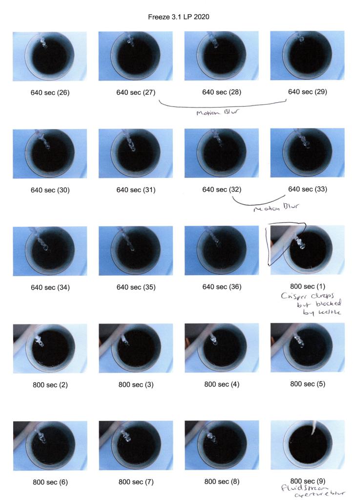
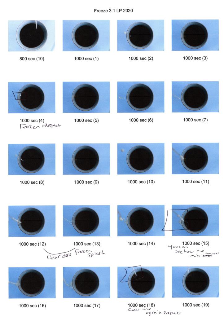
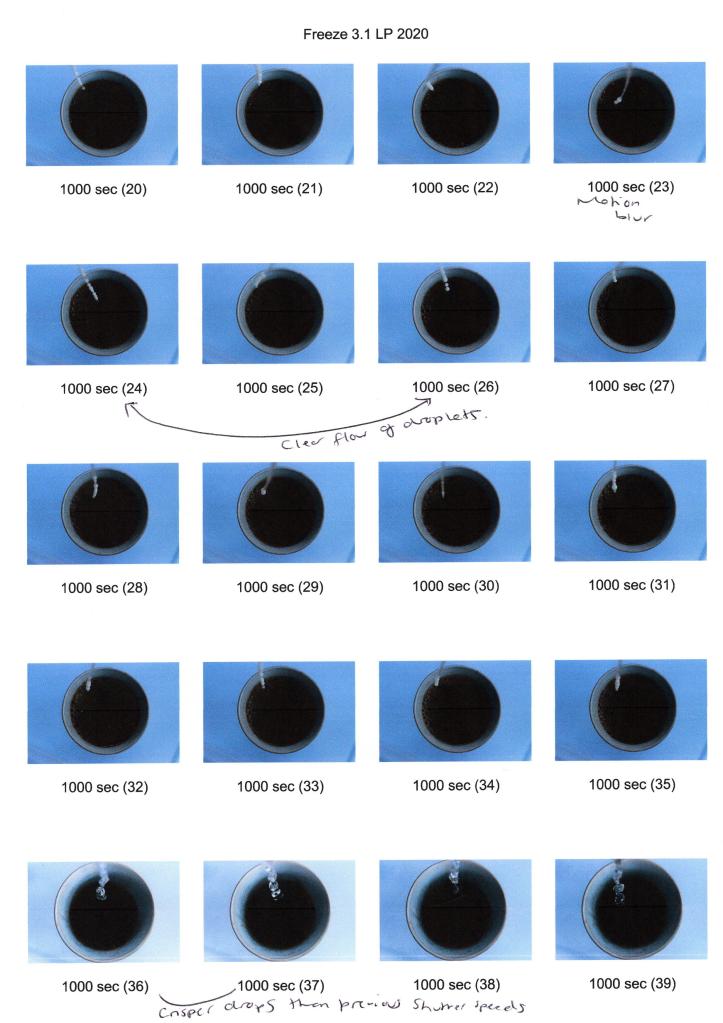
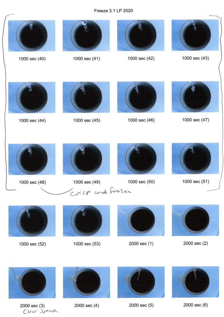
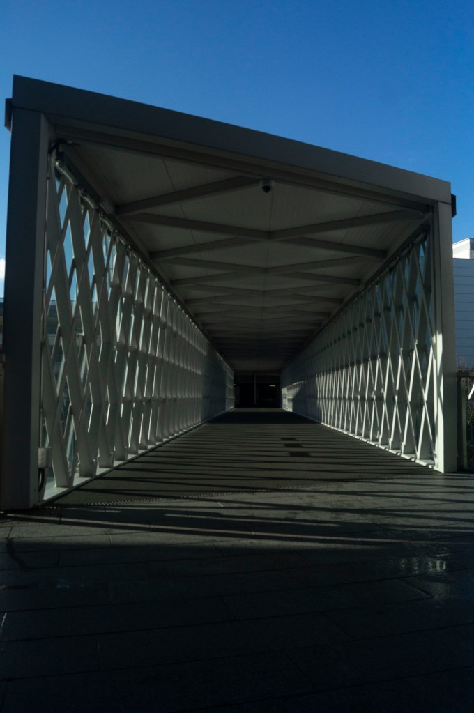
Unlike fast shutter speeds that freeze movement as explored in the previous exercise, slower shutter speeds document activity and capture the path these motions leave behind.

Slow shutter speeds can create exciting results caused by unintentional camera shake, sudden movements or motion blur used intentionally as an art style like many artists explore throughout their work.

During this research, I would like to understand further why people use motion blur and capturing slices of time as an aesthetic choice and the impact this effect can have on the overall image.

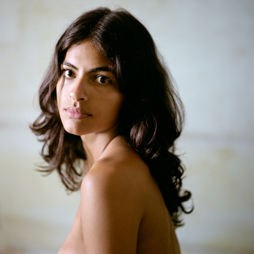
Francesca Woodman (1958-1981)

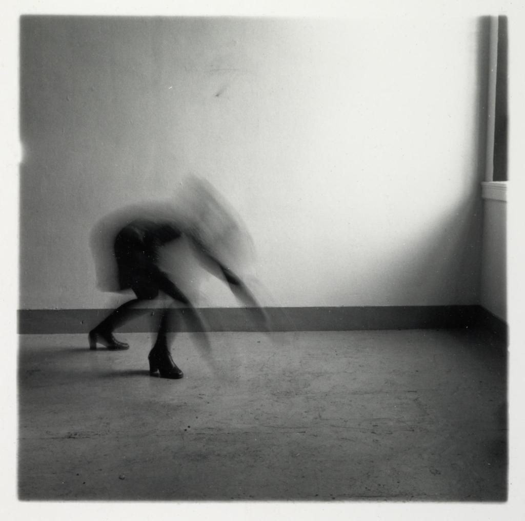
Francesca Woodman was an American photographer who explored the human body by revealing, concealing and intentionally capturing the movement of herself or another female model, naked or otherwise.

The use of black and white photography not only adds to the ghostly eeriness depicted by the motion blur but may also be reflective of the artist’s mental state following her untimely death by suicide at the age of 22. Whether this was an intentional visual choice or not, it is impossible to ignore the raw emotion that radiates from her imagery.

‘Woodman tested the boundaries of bodily experience in her work and her work often suggests a sense of self-displacement. Often nude except for individual body parts covered with props, sometimes wearing vintage clothing, the artist is typically sited in empty or sparsely furnished, dilapidated rooms, characterised by rough surfaces, shattered mirrors and old furniture’ (Miro, 2014).

The use of empty rooms, with textural features, not only emphasises the importance of the body by creating a focus but also compliments the blurred movement or patterns on the vintage clothing worn, preventing the image from being flat and lifeless.

Victoria Miro states that Woodman’s exploration of presence and absence ‘argues for a kind of work that values disappearance as its very condition’ (Miro, 2014). Woodman deliberately prevents the viewer from seeing hidden areas even though they are, in fact, still there. Isolating parts of the body, through cropping, clothing or props; hints to what is missing, encouraging the viewer to think about the presence of the body and potentially question the choices made.

Distortion of the models features as is seen in Space² (see fig. 1.) not only preserves the identity of the subjects but implies the transition of one movement to another. It may also be a performance of an event that has previously taken place, due to Woodman’s ‘tendency to combine personalised psychodramas with the temporal and spatial displacements of long exposures and blurred movement’ (Badger, 2012).

Woodman’s use of motion blur, while not applied in every image, is intriguing and challenges the idea of what a still image can be by combining movement with still life.

Fig. 1. Space² (1976)

Michael Wesely (1963- )

Michael Wesely is a contemporary photographer based in Berlin, who captures buildings, still life and portraits by using incredibly long exposures that can last for months or even years.

This approach allows the viewer to see movements that are too slow to be seen in real life, documenting what is invisible to the naked eye and the relationship between us and time itself by picturing the past and present. An prominent example of this is Stilleben (5.10-14.10.2011) (Wesley, 2011). The plate of figs that Wesely left for nine days are all perfectly plump until they begin to rot, split and collapse onto the surface as implied by the subtle yet powerful motion blur that captures this natural movement. The recording of decay may reflect on the idea that while time is infinite, time for us as humans is limited and should be cherished while we can experience it.

Instead of documenting movement that is sudden and visible, Wesely attempts to personify time which is something that we cannot physically see or some believe is but a concept. The form itself isn’t the only thing that matters anymore, as the ‘peripheral conditions such as light, movement, and other atmospheric elements’ (Wesely, n.d.) are just as necessary considering they all converge into one final image.

Wesely plays with the idea of movement and the traces of time, by letting the motions occur naturally instead of forcing it, by showing the growth or decay of a subject without influencing the outcome. To capture the universe around us seems impossible, as it exists, yet isn’t a physical object; however, Wesely has proven that you can indeed capture this information with patience.

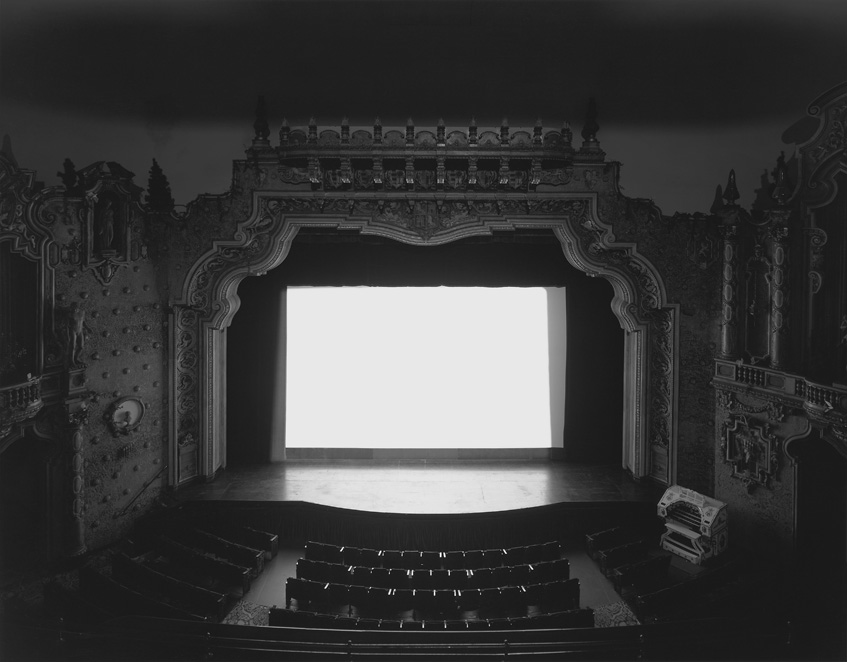
Hiroshi Sugimoto (1948 – )

Hiroshi Sugimoto was born in Japan but has since travelled between Tokyo and New York after becoming a photographer in the ’70s, exploring the relationship between photography and time itself. Sugimoto’s practises consist of photography, architecture and performing arts production which investigates not only our short time on earth but also human knowledge based purely on senses and reality versus what could be (Fraenkel Gallery, 2012).

This approach is very much similar to Wesely, as Sugimoto too uses exceptionally long exposure times to capture traces of time that are invisible to the naked eye. An example of this features throughout his Theaters series (see fig. 2.) that began in 1976 and has spanned across the past four decades, ultimately capturing 130 individual movie theaters that illuminated by a bright white screen (McGrath, 2016).

Sugimoto opens the camera shutter as soon as the movie begins and only closes it once the credits roll, before developing the film to discover the most unusual yet fascinating results. You would imagine that photographing a moving image, would leave behind a distinct path of movement in its wake, however as shown, all that is left is an empty theater and a blank screen to light the room. While there was a full theater of people ‘…they all disappeared…the movie theater is the case to hold this emptiness…’ (Contacts : Hiroshi Sugimoto 2, 2009). So, Sugimoto managed to capture the impossible by encapsulating the disappearance with the empty shell of a building with no sign of life or movement besides the eerie light. The audience were there; they just cannot be seen, much like Woodman’s concept of isolating body parts, you cannot picture something disappearing if it wasn’t there in the first place.

Instead of using slow shutter speeds to capture a single motion to create blur or a double exposure effect, these long exposures have managed to combine multiple moving images into a single still once more. In turn, they are showing what the camera has seen over this period rather than what can physically be seen by the audience in real-time and documenting the invisible forces of time, through the use of light (Sugimoto, n.d.).

‘I wanted to photograph a movie, with all its appearance of life and motion, in order to stop it again… I must use photography as a means to shut away the ghosts resurrected by the excess of photographic afterimages’ (Sugimoto (n.d.) quoted in Musee Magazine, 2016).

Fig. 2. Carpenter Center (1993)

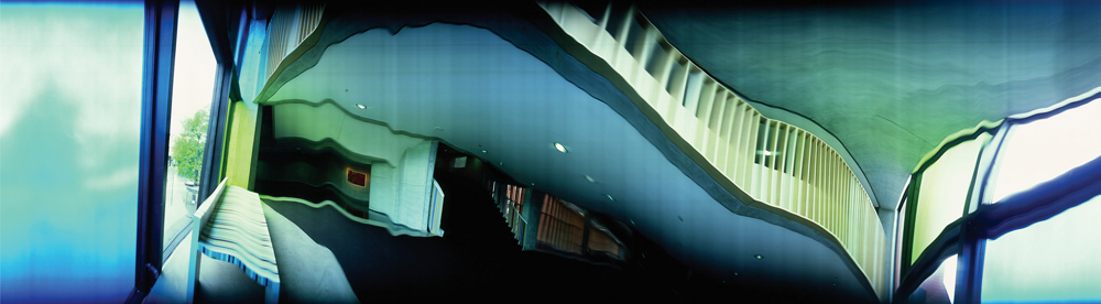
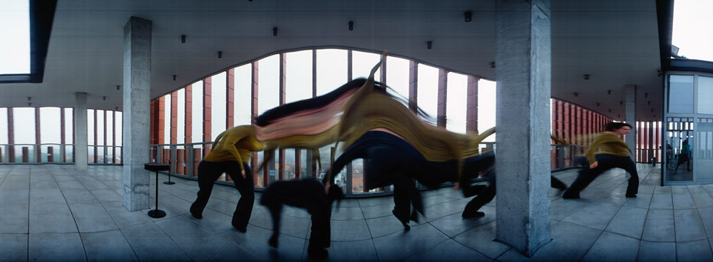
Maarten Vanvolsem (1948 – )

Unlike the previous artists, Maarten Vanvolsem uses a moving camera to capture single slices of time to build up a still image across a short interval, to show traces of movement that challenge the perception of time and space. As a result, rather than shooting a single image and freezing a moment in time, Vanvolsem records multiple movements as the shutter is open by combining multiple seconds into one image.

Vanvolsem is the author of The Art Strip Photography an exploration of over 30 different artists approach to the strip technique and how the idea of time-based media may be possible for photography (Book Depository, n.d.).

Time-based media usually consists of film, audio, slides that can be watched and admired by the viewer over time to see what unfolds, while time isn’t explicitly visual, we as the audience are aware that moments are passing by the second (Tate, 2008). If you apply this logic to photography, we usually see frozen moments that are captured within milliseconds and therefore do not see time unfolding like a film. However, by using slow shutter speeds or in this case, a moving camera, time and movement can be documented in individual slices or exposures across a period. It may be a single image when produced, but time itself features in the frozen image through the multiple viewpoints and motions seen by the camera.

Instead of a strip made of individual frozen images like Muybridge’s work, Vanvolsem keeps his shutter open and pans the camera; as you would in panorama mode, to capture the events that take place during the time the shutter is open. Due to a slight movement in the camera or subject, visual distortion can occur, bending the composition and recording the small intricacies of activity that may not always be obvious in real-time.

35 x 90 cm (Vanvolsem, 2015) shows visual distortion, created by the dipping and rising of the subject in the frame, forming a wave of colour and smudge-like effect as they move across the frame. This result tells a story like a filmstrip would as we can distinguish what actions took place over this time, by looking at the trail that was left behind. 30 x 109 cm (Vanvolsem, 2015), however, suggests that the camera wasn’t always steady vertically due to the ripples in the architecture and ceiling which may imply an ‘up and down’ motion, although this isn’t confirmed. 

Some people may not find this technique appealing as the images aren’t crisp and easy to dissect, however, is an incredible way to capture time and space in-camera while leaving a trace of movement in its path.

Reflection

Out of all the artists studied, the most appealing technical approaches for me were Woodman’s and Wesely’s, mainly for the ghostly results they managed to capture in their work. While Woodman may have had more control over the actions that occurred in her work, Wesely did not, instead, let nature take it’s course over a series of months to see what changed.

Motion blur brings life to the composition and provides more context as to what may be happening, what the subject is doing and at what pace or in what direction. Long exposures document change and decay that are not visible in real life, or at least it is less evident to us as humans.

Being able to confront how we see time and space, as well as capturing the impossible that is the act of disappearance by isolating features, blurring or showing what was left behind to imply emptiness, really does challenge what the ‘still’ image can be. A frozen moment shows but a slither of what is happening, leaving a trace behind gives more information for the viewer to explore and question.

References

Badger, G. (2012) ‘Gerry Badger >> Francesca Woodman’ [online] Available at : http://www.gerrybadger.com/francesca-woodman/ (Accessed 18 March 2020).

Book Depository. (n.d.) ‘The Art of Strip Photography : Maarten Vanvolsem’ [online] Available at : https://www.bookdepository.com/Art-Strip-Photography-Maarten-Vanvolsem/9789058678409 (Accessed 18 March 2020).

Contacts : Hiroshi Sugimoto 2 (2009) [online video] Available at : https://www.youtube.com/watch?v=rY3nGoZqw9U (Accessed 18 March 2020).

Fraenkel Gallery. (2012) ‘Hiroshi Sugimoto | Fraenkel Gallery’ [online] Available at : https://fraenkelgallery.com/artists/hiroshi-sugimoto (Accessed 18 March 2020).

Korff Fine Art (2018) ‘Michael Wesely’ [online] Available at: https://www.korff-stiftung.de/en/artworks/wesely-michael/editionen/stilleben-510-14102011 (Accessed 18 March 2020).

Kusseneers Gallery. (2015) ‘VANVOLSEM-4_30x19cm.jpg’ [image] Available at : http://kusseneerscom.webhosting.be/wp-content/uploads/2015/12/VANVOLSEM-4_30x109cm.jpg (Accessed 18 March 2020).

Kusseneers Gallery. (2015) ‘VANVOLSEM-5_32x90cm-12.jpg’ [image] Available at : http://kusseneerscom.webhosting.be/wp-content/uploads/2015/12/VANVOLSEM-5_32x90cm-12.jpg (Accessed 18 March 2020).

McGrath, E. (2016) ‘REVIEW: Theaters by Hiroshi Sugimoto – Musée Magazine’ [online] Available at : https://museemagazine.com/culture/2016/9/27/review-theaters-by-hiroshi-sugimoto (Accessed 18 March 2020).

Miro, V. (2014) ‘Francesca Woodman | Victoria Miro’ [online] Available at : https://www.victoria-miro.com/artists/7-francesca-woodman/ (Accessed 18 March 2020).

Sugimoto, H. (n.d.) ‘REVIEW: Theaters by Hiroshi Sugimoto – Musée Magazine’ [online] Available at : https://museemagazine.com/culture/2016/9/27/review-theaters-by-hiroshi-sugimoto (Accessed 18 March 2020).

Sugimoto, H. (n.d.) ‘Hiroshi Sugimoto | Fraenkel Gallery’ [online] Available at :https://fraenkelgallery.com/artists/hiroshi-sugimoto (Accessed 18 March 2020).

Tate. (2008) ‘Time-based media – Art Term | Tate’ [online] Available at : https://www.tate.org.uk/art/art-terms/t/time-based-media (Accessed 18 March 2020).

Wesely, M. (n.d.) on artnet (2009) ‘Michael Wesely | artnet’ [online] Available at : http://www.artnet.com/artists/michael-wesely/ (Accessed 18 March 2020).

List of images

Figure 1. Woodman, F. (1976) Space² [image] Available at : https://www.tate.org.uk/art/artworks/woodman-space-providence-rhode-island-ar00350 (Accessed 18 March 2020).

Figure 2. Sugimoto, H. (1993) Carpenter Center [image] Available at : https://www.sugimotohiroshi.com/new-page-7 (Accessed 18 March 2020).

Exercise 3.1 – Freeze

Part 3, Reflection on coursework

Summary:

For this exercise I;

– Documented the brief and my initial thoughts about it, stating my nerves towards it alongside my plans for the task.
– Stated the camera settings used, fitting what was requested in the brief as well as personal choices to reflect the light levels in my home.
– Provided annotated contact sheets of the images shot during this exercise, before selecting a few examples with technical details, to show what was captured, the strengths and weaknesses of each and the images I felt were the strongest.
– Reflected on my initial thoughts and how these have changed having done the exercise, as well as what I have learnt from this task and how the techniques may influence me in the future.

Brief:

Start by doing some of your own research into the photographers discussed above. Then,
using fast shutter speeds, try to isolate a frozen moment of time in a moving subject.
Depending on the available light you may have to select a high ISO to avoid visible blur
in the photograph. Add a selection of shots, together with relevant shooting data and a
description of process (how you captured the images), to your learning log
‘ (Bloomfield 2018).

Initial thoughts

After researching the suggested photographers, I was slightly apprehensive as to how to experiment with shutter speed due to the lack of an electronic flash that can help with freezing a moment and supply extra light if needed.
However, despite the lack of equipment, I took into consideration the encouragement to step out of the comfort zone and go ahead with the idea that may not have been the easiest to execute.

‘The key to a successful third assignment is simple – the depth of your experimentation in the practical exercises …’ (Bloomfield, 2018:57).

One idea that came to mind was to try and capture a subject flicking their hair with a variety of shutter speeds, to see if any motion blur would occur or whether the movements would be frozen completely. After much thought, this approach seemed too easy to use as I have done this previously for personal work, hence my decision to freeze the process of making a cup of coffee with the challenge of restricted light.

As instructed in the course handbook, I set my SONY A57 to shutter priority mode, continuous shooting and set the ISO to 6400 to allow for a faster shutter speed to be used, without causing too much grain in the images. Despite these settings, the exposure was still slightly too dark; therefore, I made small adjustments in post-production so the imagery was much clearer to study.

For this exercise, I placed my camera onto a tripod and positioned it firmly on the table, making sure the lens was facing directly above the cup. To avoid any distraction from the tripod legs and jugs used to pour the liquids, I adjusted the SONY 18-55 3.5-5.6 SAM lens the longest focal length of 55mm and in turn, tightly framed the coffee cup.

Using a ring light to provide extra light, didn’t make any difference at all due to the natural light already in the room; consequently I decided to go ahead with the daylight already available and kept the exposure in mind when altering the shutter speeds. As seen above, the selected speeds to experiment with were 1/500, 1/640, 1/800, 1/1000 and 1/2000, allowing me to capture a range of shots to compare and understand frozen moments in time.

Unfortunately, the fastest shutter speed I could use was 1/2000, before the exposure started to get darker due to the camera’s light sensitivity limit. While I would’ve liked to have used an even higher setting, the chosen speeds still provided me with a distinct, frozen set of shots to complete this exercise.

Fig. 9. Freeze 1 (2020)
1/500 sec; f/16; ISO 6400

A shutter speed of 1/500 captures the small splash of liquid, showing the forceful impact the milk had on the coffee after being poured from a height of 15 centimetres (see Fig. 9). If the milk were poured gently from a reasonable height, there would be fewer droplets, little to no splashes and as a result, wouldn’t create such an intense surface tension. While the majority of the shot is crisp, there is some motion blur just below the droplets and surrounding the crown of liquid, therefore does not freeze the action in its entirety and proves that a faster shutter speed is more appropriate for this experiment.

Fig. 10. Freeze 2 (2020)
1/640 sec; f/13; ISO 6400

The water droplets in this image (see Fig. 10) are seen to be connected with thinner links of liquid in between each sphere, showing how a stream of water isn’t always as smooth as the naked eye would see. Each droplet is a different shape and warps from the gravity and height of the kettle compared to the cup. Once again, the shot isn’t entirely crisp due to some motion blur surrounding the water, however, is slightly better than the previous image and as a result, shows how small changes in shutter speed can affect the result of a shot significantly.

Fig. 11. Freeze 3 (2020)
1/800 sec; f/9; ISO 6400

Using a shutter speed of 1/800 enabled me to capture a much smoother stream of milk (see Fig. 11), as opposed to heavy droplets of liquid as seen in previous images which were interesting to see, as this is a more accurate visual of what we would see in the flesh. Due to the shallow depth of field, however, the flow isn’t as sharp and shows the downside of using a faster shutter speed at this particular angle as the aperture becomes wider to allow more light in, yet reduces the area of focus and distorts the shot. Despite this, we can focus on the small ripples created in the coffee not seen in previous shots as the imagery wasn’t as clear as this, allowing the viewer to discover a whole new layer of movement.

Fig. 12. Freeze 4 (2020)
1/1000 sec; f/10; ISO 6400

Comparing this image (see Fig. 12) to the first example shows how vital shutter speed can be when it comes to freezing movement as the droplets are precise, crisp and utterly void of motion blur. However, once again, the shallow depth of field prevents an entirely in-focus shot. Due to a wider aperture, the exposure is brighter than previous shots and has reduced the grain created by the ISO. While the earlier settings did capture movement that would be difficult to see clearly with the naked eye, it is clear to see that shutter speeds above 1000 are the most successful if you want to completely freeze the most minute of moments in it’s sharpest form.

Fig. 13. Freeze 5 (2020)
1/2000 sec; f/7.1; ISO 6400

Even though the shallow depth of field has once again prevented the image from being fully in focus, it enhances the details we can see and directs our eyes towards the clear droplets mid-frame (see Fig. 13). Instead of a frozen sphere, the camera has managed to capture the water breaking and flattening due to gravity which we wouldn’t usually see without slow-motion technology or fast shutter speeds. After reviewing the whole shoot, this is the most prominent and unique as the physics of the water has been visibly documented, which is fascinating.

Fig. 14. Freeze 6 (2020)
1/1000 sec; f/11; ISO 6400

This example (see Fig. 14) is more of an ‘outtake’ than anything else, however was an image I wanted to include to reflect back on the idea of fragmenting time. Due to the height of the milk jug, it was extremely difficult to keep the liquid pouring in one fluid stream especially as it began to run out, causing the milk to break in flow and splash down the side of the cup. This event isn’t something that the viewer would’ve seen if not included in this set, therefore is a slice of time that could remove context from the shooting process.

Reflection

Despite my apprehension at the start of this exercise, these images have helped me to understand both the importance and impact of shutter speeds, how time can be frozen, and we can discover the most minute details because of it.

There is only so much you can see with the naked eye that if you blink, you can miss the most spectacular moments created in milliseconds, yet we can freeze and keep these moments forever with just a click of a button. Capturing these moving subjects help challenge the viewer’s perception of movement and all of the elements that make up one constant motion, as well as being able to admire the beauty of a frozen moment and its intricacies.

It is fascinating to see the individual phases of event and the small details we can discover within, that we may not have noticed before.

References:

Bloomfield, R., 2018. Photography 1: Expressing your Vision. 4th ed. [pdf] Barnsley: OCA, p. 61. Available at: https://www.oca-student.com/course/photography-1-expressing-your-vision [Accessed 16 March 2020].

List of images:

Figure. 1. Powell, L. (2020) Contact sheet 1 [scanned document] In possession of: Lauren Powell: Eastleigh.

Figure. 2. Powell, L. (2020) Contact sheet 2 [scanned document] In possession of: Lauren Powell: Eastleigh.

Figure. 3. Powell, L. (2020) Contact sheet 3 [scanned document] In possession of: Lauren Powell: Eastleigh.

Figure. 4. Powell, L. (2020) Contact sheet 4 [scanned document] In possession of: Lauren Powell: Eastleigh.

Figure. 5. Powell, L. (2020) Contact sheet 5 [scanned document] In possession of: Lauren Powell: Eastleigh.

Figure. 6. Powell, L. (2020) Contact sheet 6 [scanned document] In possession of: Lauren Powell: Eastleigh.

Figure. 7. Powell, L. (2020) Contact sheet 7 [scanned document] In possession of: Lauren Powell: Eastleigh.

Figure. 8. Powell, L. (2020) Contact sheet 8 [scanned document] In possession of: Lauren Powell: Eastleigh.

Figure. 9. Powell, L. (2020) Freeze 1 [image] In possession of: Lauren Powell: Eastleigh.

Figure. 10. Powell, L. (2020) Freeze 2 [image] In possession of: Lauren Powell: Eastleigh.

Figure. 11. Powell, L. (2020) Freeze 3 [image] In possession of: Lauren Powell: Eastleigh.

Figure. 12. Powell, L. (2020) Freeze 4 [image] In possession of: Lauren Powell: Eastleigh.

Figure. 13. Powell, L. (2020) Freeze 5 [image] In possession of: Lauren Powell: Eastleigh.

Figure. 14. Powell, L. (2020) Freeze 6 [image] In possession of: Lauren Powell: Eastleigh.

Project 1 – The frozen moment – Research

Online Research, Part 3, Practitioner Research

Summary:

For this research I have;

– Drawn on the work of Eadweard Muybridge, one of the pioneers of the frozen image, most famous for his ability to prove that a horse can indeed lift 4 hooves off the ground at the same time.
– Muybridge’s work was shown via slides, that showed the individual phases of movement that provided a huge step for science and photography.
– As well as improving his camera equipment by developing a motorised shutter that didn’t rely on the subjects movement, before inventing the zoopraxiscope. A machine that projected the moving image and inspired the development of the cinema.
– Explored the work of Harold Edgerton, the inventor of the ‘strobe’ flash, a photographer who froze time and provided images of motion that the naked eye couldn’t see, such as a crown of milk.
– Drawn on the work of Jeff Wall, a conceptual artist who captures everyday occurrences, or ‘micro gestures’, before
– Re-enacting in a different location, allowing him to take control of the composition, while providing tension in the imagery via the lines, gestures or other such elements.
– Reflected on the work of Philip-Lorca diCorcia, a photographer who meticulously plans his compositions by combining elements that don’t necessarily go together
– Challenging the traditions of photography and creates tension between the candid and posed. So while his work may look natural, with further inspection you understand they are not, due to obvious lighting or odd positioning of subjects.
– Reviewed whether I feel the camera captures or fragments time, giving examples of my opinion by harking back to the imagery of the listed artists.

Photographic exposure times developed massively since the early days of photography when exposures used to take hours to produce since reduced to mere points of a second with the evolution of technology. 

We have been able to go from hours of standing/sitting still to avoid motion blur, to capturing movement as a still image with no traces whatsoever. 

Some of the earliest photographers to experiment with the new, improved film speeds and shutters, are as follows.

Eadweard Muybridge (1830-1904):

Eadweard Muybridge, formally known as Edward James Muggeridge was one of ‘ … the great photographic thinkers and technical pioneers of all time …’ (Huxley Parlour, 2017), who thought way beyond the walls of still photography and was passionate about the evolution of the moving picture.

Leland Standford, a racehorse owner and former governor, hired Muybridge in 1872 to capture photographs of his horse to confirm whether all four hooves can be off the floor at the same time. To achieve this, Muybridge set up multiple cameras and a tripwire which would be activated upon the horse’s movement to capture each stage. After five years full of court trials, travelling and death, he returned to Standford. After producing conclusive results about the horses galloping abilities, this led newspapers to reproduce these images as drawings and artists such as Edgar Degas and Thomas Eakins, referencing them to produce art that was more realistic to life.

After his relationship with Leyland had ended due to lack of recognition following the publication of The Horse in Motion (Muybridge, 1878) , Muybridge began a new set of work for the University of Pennsylvania called Animal Locomotion which became one of his most influential pieces of work. The project allowed the study of movement through a variety of animals and the human form, which was a massive step for both science and photography by capturing each phase of a single action. 

Muybridge significantly improved his camera equipment by developing a clockwork motor, meaning he could capture the minutest of movements without relying on the subject to trigger the shutter. 

Muybridge’s work has helped contribute towards physiology, biomechanics and a range of artists such as Marcel Duchamp and Jasper Johns. Not only that, but he was the first to invent the machine called the “zoopraxiscope” which projected the moving image and animated a selection of photographs, potentially inspiring the development of cinema.

Harold Edgerton (1903-1990)

Dr Harold Edgerton was born in Nebraska, raised in Aurora and began a career as a professor at the Massachusetts Institute of Technology, which was the reasoning behind his invention of the ‘strobe’ flash and dedication to documenting what the naked eye couldn’t see. 

Edgerton shaped the world of photography by freezing time and capturing results such as liquid on liquid forming a symmetrical crown of milk, as well as the ghostly arch that is formed by a golfer swinging their arm as the torso is ‘superimposed on itself 50 times’ (Michael Hoppen Gallery, 2015).

Due to his invention of flash cameras, his influence inspires photographers, journalists and many others today albeit the cameras are much smaller, which shows his impact on the photographic world and how we can capture the subjects around us. Being able to document what cannot be seen and controlling how a moment can be frozen in time, can help people understand how certain events occur and the result of them.

Jeff Wall (1946 – )

Jeff Wall was born in Vancouver and went on to study art history at the University of British Columbia in the 1960s, which is where he discovered Vancouver’s experimental art scene and used this as inspiration to teach himself photography to portray his conceptual ideas. 
After many years of studying and receiving his BA and MA degrees at UBC, Wall went on to teach at Nova Scotia College of Art and Design, Halifax, Simon Fraser University, Vancouver and has since been a teacher at UBC where his journey first began (Riggs, 1997).

Having been inspired by the paintings of Goya and Velázquez, Wall wanted to find a way to depict everyday life through the medium of photography following his thought that ‘it was no longer possible for modern artists to paint like the great masters’ (Riggs, 1997). He decided upon creating backlit transparencies, which are large-scale photographs mounted in lightboxes to combine both cinema and sculpture, therefore a successful contemporary approach. 

The inspiration for Wall’s pictures is everyday occurrences that he has personally witnessed, as well as his interest in ‘micro-gestures’ which are essentially actions that take place without much previous thought, portraying the tensions within society.
Milk (see fig. 1.) reflects the current state of mind the man in frame is in, portrayed by the explosion of liquid and clenched fists; however, the moments leading up to this moment are unknown. As a result of this, the viewer may wonder what caused such a reaction, creating tension between the two (Tate, 2017).

Wall tends to reconstruct the events he sees, to allow himself to gain control of the composition, which is why he relocated for this particular situation while keeping the formal elements in mind. 
‘The grid-like order of the brick wall background, and strong vertical bands that stripe the left side of the image contrast sharply with the tension in the man’s arms and the uncontrolled arc of milk’ (Tate, 2017). 

Fig. 1. Milk (1984)

Philip-Lorca diCorcia (1951 – )

Philip-Lorca diCorcia studied at the School of the Museum of Fine Arts, Boston, the University of Hartford, Connecticut and received his Master of Fine Arts from Yale University in 1979. He didn’t initially set out to become a photographer; however, Jan Groover suggested that ‘a photograph should result from careful planning and orchestration’ (Sidley, 2016), which diCorcia may have used as inspiration when he began identifying as a photographer. 

DiCorcia’s work challenges and pushes the traditional boundaries of photography by meticulous planning and composing. So, while they may look natural and accidental, they’re not due to the combination of people and places that don’t necessarily go together. This approach creates a tension between random and controlled, directs the imagery towards various paths without a definite conclusion or direction, therefore suggesting a narrative more so than telling a story (Sidley, 2016).

One of the ways DiCorcia executed his shots, for example, Mario (DiCorcia, 1978) was by setting the camera up on a tripod, putting a flash in the fridge and readjusting each element while testing the composition with a Polaroid camera, keeping the desired result in mind. So, while the subject looked completely natural, in deep thought as they observe the contents of the refrigerator, everything was precisely planned at each step (Sidley, 2016).

The use of harsh artificial light is a recurring technique through his work which could be street lighting, however, on closer inspection, the contrasts between the shadows and highlights are almost too intense to be considered accidental. An example of this is the spotlight that hits the subject in Edward Earle Windsor; 20 years old; Atlanta, Georgia; $30 (DiCorcia, 1990-92). 

Reflection

‘There is a pleasure and beauty in this fragmenting of time that had little to do with what was happening. It had to do, rather, with seeing the momentary patterning of lines and shapes that had been previously concealed within the flux of movement.’ (Szarkowski, 2007, p.5).

Upon completing some artist research, I would consider that the camera captures time in these images, as well as fragmenting it, it’s isn’t necessarily mutually exclusive. 

Muybridge’s images I believe do capture time, by documenting each phase of a singular movement, in turn, supplying context to each photographic plate. While Edgerton’s work also freezes moments in time and form an opinion in the viewers head as to what happened moments before, what we assume happened before shooting the apple may not be correct. As a result, I consider these images to be both a captured moment in time and a fragment.

Wall and diCorcia, on the other hand, fragment time with meticulous planning and creating tension throughout the composition, either through technical decisions or formal. While they are pre-meditated, the body language and locations cleverly help create intrigue for the viewer, making them wonder how the events shot occurred and what caused the particular gestures in that specific place. The imagery doesn’t necessarily look staged at first glance without prior knowledge; therefore, you would believe they are just a brief moment in history frozen forever; however, are not. A fragment of time provides just a slice of the story, not the whole product.

This research has made me question whether the street photography I have seen in the past is just a capture of time, whether there is more the story than initially thought or if it has been pre-planned to convey a particular narrative, controlled by the artist. 

References: 

Huxley Parlour. (2017) Eadweard Muybridge | Photographer’s Biography & Art. [online] Available at: https://huxleyparlour.com/artists/eadweard-muybridge/ (Accessed 4 March 2020)

Michael Hoppen Gallery. (2015) Dr Harold Edgerton | Michael Hoppen Gallery. [online] Available at: https://www.michaelhoppengallery.com/artists/54-dr-harold-edgerton/overview/#/artworks/9778 (Accessed 4 March 2020)

MoMA. (2019) Philip-Lorca diCorcia. Mario. 1978 | MoMA. [image] Available at: https://www.moma.org/collection/works/46273?artist_id=7027&locale=en&page=1&sov_referrer=artist (Accessed 4 March 2020)

MoMA. (2019) Philip-Lorca diCorcia. Edward Earle Windsor; 20 years old; Atlanta; Georgia; $30. 1990-92. [image] Available at: https://www.moma.org/collection/works/57854?artist_id=7027&locale=en&page=1&sov_referrer=artist (Accessed 4 March 2020)

Riggs, T. (1997) Jeff Wall born 1946 | Tate. [online] Available at: https://www.tate.org.uk/art/artists/jeff-wall-2359 (Accessed 4 March 2020)

Sidley, K. (2016) Philip-Lorca diCorcia | MoMA. [image] Available at: https://www.moma.org/artists/7027 (Accessed 4 March 2020)

Szarkowski, J. (2007) The Photographer’s Eye. New York: MoMA Thompson, K. &

Tate. (2017) Jeff Wall : room guide, room 3 | Tate. [online] Available at: https://www.tate.org.uk/whats-on/tate-modern/exhibition/jeff-wall/jeff-wall-room-guide/jeff-wall-room-guide-room-3 (Accessed 4 March 2020)

Time. (2016) The Horse in Motion |100 Photographs. [image] Available at: http://100photos.time.com/photos/eadweard-muybridge-horse-in-motion (Accessed 2 April 2020)

List of Images:

Figure 1. Wall, J. (1984) Milk [image] Available at: https://www.tate.org.uk/whats-on/tate-modern/exhibition/jeff-wall/jeff-wall-room-guide/jeff-wall-room-guide-room-3 (Accessed 5 March 2020)

Project 2 – Lens Work – Research Point

Online Research, Part 2, Practitioner Research

Summary:

For this research point I;

– Draw on the work of Wim Wenders, who shoots dynamic imagery to document history and signs of civilisation by using a deep depth of field to capture fully focused shots.
– Challenge the view that deep depth of field prevents the viewer from focusing on one point, by providing evidence of specific focal points in Wenders work.
– Analyse how the specific aesthetic codes may affect how the image is interpreted as well their ability to enhance the work.
– Draw on the work of Mona Kuhn, who uses shallow depth of field to provide a sense of intimacy within her imagery.
– Analyse how her compositions reflect her ability to connect with the subject and create a comfortable atmosphere, that even the viewer can feel through her delicate series of photographs.
– Draw on the work of Guy Bourdin who creates images that are sexual and shocking in nature, to grab the viewers attention and make them question the concept of an advertisement.
– Reflect on his use of deep depth of field and meticulous planning of compositions, what they may portray and why.
– Selected an image from my personal archives to show the aesthetic code of intimacy, much like Mona Kuhn, an aesthetic choice I made at the time to enhance the warmth of the fire and coziness of being wrapped up on a winters night.

Brief:

Read around the photographers above and try to track down some of the quotations. Write up your research in your learning log‘ (Bloomfield, 2018)

This research point explores how the different depths of field can influence how an image is perceived. For example, a photographer may choose to shoot a portrait in a busy town with a shallow depth of field to direct the viewers eyes to the focal point and provide tension between the subject and blurry background, or instead use a deep depth of field to prevent the eyes from focusing on one specific point in the image and allowing the viewer to take control of their journey through the image.

These different aesthetic codes could be used to explore the idea of memory, politics, imagination for the viewer, intimacy and history, whether the artist is aware of that at the time or not.

Photographer research:

Wim Wenders

Wim Wenders, born August 14, 1945, was one of the first to venture into New German Cinema and is one of the most well-known figures for contemporary German film. Wenders specialities consist of scriptwriting, directing, producing, photography and being an author, which has led to a substantial collection of work in the form of ‘documentaries, photo exhibitions, monographs, films and books’ (Royal Academy, 2018).

A broad collection of Wenders’ photographic works have been exhibited in multiple galleries across the world such as the Ronald and Rita McAulay Gallery, London (2019); the Museum of Contemporary Art, Sydney (2003); Museum of Contemporary Photography, Thessaloniki, Greece (2006); and in his birth city, Museum Kunstpalast, Düsseldorf, Germany 2015.

A recurring concept throughout the photography Wenders shoots, is a sense of journey, memory and life, either through the subjects captured in the frame or the composition of imagery.
For example, a summary of the time capsules. by the side of the road (Wenders, 2015) exhibition Germany suggests, the imagery ‘alludes to the relationship between memory and photography’ (Blain Southern, 2015), therefore showing how photography is a powerful medium that can capture a moment in time and keep it preserved for the future.

America and Germany are locations that are important to Wenders due to how much time he has spent between the two for both work and living. Being able to document the changes, events and effects of human nature seem to be something that drives Wenders in his work as he claims ‘in those landscapes, German or American, I’m still looking for the traces of civilization, of history, or people’ (Wenders, 2015). A great example of Wenders capturing traces of history and the effects of human activity is shown below (see Fig. 1.)

Fig. 1. time capsules. by the side of the road (2015).

As quoted by Broomberg and Chanarin in 2008, directly from the book The Act of Seeing: Essays and Conversations, Wenders states that ‘The most political decision you make is where you direct people’s eyes.’ (Wenders, 1997).

While he doesn’t use a shallow depth of field to direct the viewer’s eyes to a focal point, the centralisation of the fallen aircraft enhances it’s prominence in the foreground, almost teasing the viewer as to what the most important part of the image is, similar to politics. Another visual element that draws the eyes towards the centre, is the contrast between the deep red of the desert land and the bright whites in the paintwork, highlighting the clean and aerodynamic shapes of the plane in amongst the dirt and dust, helping it stand out from the rest.
Wenders’ choice to shoot this image as a panorama expands the shot and provides the viewer with more context by being able to explore the environment behind the aircraft. The dry clumps of grass, the empty road curved by the panorama, the vast plains and rocky mountains in the background, emphasise how abandoned the area may be. We as the viewer don’t know how this crash occurred, or what happened to the remains after this shot was taken which goes back to the idea that the relationship between memory and photography can be very important when it comes to preserving the past and showing signs of civilisation or lack thereof.

Despite his use of deep depth of field, there is seems to be a clear focal point, which challenges the idea that fully focused and sharp images ‘remove that direction.’ (Bloomfield, 2018).

Mona Kuhn

‘I like to cherish the body as a source of inspiration, as a platform for metaphors, for intimacy and complexities of human nature, hoping to use the visual impact of provoking the viewer’s imagination to encourage thoughts beyond what is revealed. – MK’ (Kuhn, 2013).

Mona Kuhn was born in São Paulo, Brazil, 1969 and is of German descent. Currently residing in the US, having moved in 1989 to start her higher education at The Ohio State University and the San Francisco Art Institute.

Kuhn is well known for her large-scale photographs of the human body, capturing people in their most natural state and presenting the nude as a ‘contemporary canon of art’ (Kuhn, 2013).
A consistency throughout her work is the reflection and encapsulation of the need for human connection and being united, which is beautifully achieved due to Kuhn’s close relationships with the subjects. This allows them to be intimate and comfortable in their skin, which is incredibly inspiring due to the negativity that has surrounded nudity.

Using a shallow depth of field and translucency as a visual choice, challenges the viewer’s ability to connect to the environment, those within it and what is happening (Kuhn, 2013). However, due to how soft and comfortable the compositions are, the tension doesn’t feel uncomfortable in any way, portraying Kuhn’s strong ability to respect and form an attachment with the subject and present that throughout her work.

A wide collection of Kuhn’s work is displayed both publicly and privately across the world such as the Flowers Gallery, New York; Jackson Fine Art, Atlanta, Georgia; Camerawork, Berlin, Germany; Elkis Gallery, São Paulo, Brazil and many more.

Kuhn not only forms a connection between the people in her series but also with the environment, the colours, different elements of nature and in turn creating metaphors from the imagery. This can be seen in her Native series, shot in Brazil.

By using a shallow depth of field, the focal point is brought forward in the frame and the case of Spring (see Fig. 2.). It shows the delicacy of the curling leaves and thin twigs, gently lit by the natural light in what looks like a tropical forest, however, slightly unsure due to the blurred background. This forms a tension between the subject, background and viewer and forces a little bit of imagination to be able to connect with the image. The pale greens are subtle and fresh, signifying the lushness of nature and potentially a metaphor for the start of new beginnings. The inconsistencies in the leaves and direction of the growth exhibit how different and unique nature can be. Much like the model in Marina (see Fig.3.) who we may assume, however, cannot confirm, is an indigenous person whose facial features and complexion differ from those of a different ethnicity or race, which is a beautiful thing. Her bare torso stands out and warms what is a crisp and cold background, the blur created by a wide aperture compliment the fragility and softness of the skin.

While intimacy isn’t shown through the appearance of breasts and genitals, instead it is presented by the lack of makeup and clean skin, therefore showing vulnerability and openness. The model’s gentle gaze and deep brown eyes almost draw the viewer in to connect with her soul, more so than her appearance, which is a whole different level of human understanding.

As previously mentioned, not all images show a connection between a group of people, but the similarities between the natural growth of plants and humans. They share imperfections, there are different shapes, sizes and textures throughout. The compatibility of greens, whites, golds and browns, mix and pair up so naturally. Both images are simple, draw the eyes directly to a focal point to help you form a relationship with the subject.

The series as a whole is comforting and celebrates the beauty of people of colour, their home and the importance of connecting with those from all walks of life regardless of our differences.

Guy Bourdin

French fashion photographer Guy Louis Banarès, widely known as Guy Bourdin was born in Paris, in 1928 and was one of the most ‘radical and influential fashion photographers of the twentieth century’ (Michael Hoppen Gallery, 2015).

Bourdin pushed the boundaries of standard advertisements by creating sexual and shocking imagery, to draw the viewer in, steering away from the common product shot and instead exploring surrealism to create discomfort and intrigue.
He understood that fashion seduces people, as does the fantasy of it, which I believe refers to the ability to turn into someone or something completely new through the clothes worn (Michael Hoppen Gallery, 2015). Therefore his provocative compositions marry together with the feeling fashion creates.

Due to the lack of digital advances we have today, Bourdin had to plan in great depth to make sure his work fit the format of the printed page, as well as pushing the models and himself to the limits to capture the desired effect (Michael Hoppen Gallery, 2015).

He was one of the first to tell stories through imagery, putting more emphasis on the importance of the image than the product being advertised. The thoroughly planned compositions, interesting cropped elements, both in black & white and bold colour sometimes made it difficult for the viewer to understand and distinguish what the narrative was trying to say, which made Bourdin’s work even more ludicrous (Louise Alexander Gallery, 2014).

Fig. 4. Vogue Paris, August 1975 (1975)

“Thanks to depth of field, at times augmented by action taking place simultaneously on several plane, the viewer is at least given the opportunity in the end to edit the scene himself, to select the aspects of it to which he will attend” (Bazin (1948) quoted in Thompson & Bordwell, 2007).

At first glance, it seems as if the image has a particular direction set in place due to the bright red dress, therefore providing a potential focal point. However, the white graffiti to the right of the models creates some sort of distraction and breaks the direction, causing the eye to start exploring the various leading lines in the composition such as the pathway, the white pole to the left, the edges of the brickwork and the framing of the windows. Due to the way the camera has been positioned, there are subtle angle differences that can be seen between the path and the top of the wall causing an uncomfortable illusion for the eye and forms questions. Are the models going uphill, downhill or neither?

The unsettling feeling Bourdin wanted to create, stands out through the motion blur of the two models, in comparison to the sharp surroundings. The viewer is unaware as to why they are moving, whether they’re running, being pushed or what they look like as their faces cannot be seen clearly which can be anxiety-inducing or confusing for some. Red is the colour of danger and lust, so this scene could potentially represent two lovers either parting ways or reuniting, making a nod to the use of sexual imagery, or representative of the danger that can occur when you’re not looking.

Bourdin’s use of deep depth of field allows the viewer to explore the whole image as they wish, in detail and gather their own story from it. For example, I got distracted by the graffiti and started looking around the image from there, however, this may be different for the next viewer. The image isn’t too busy, which can be an issue with some images shot with a narrow aperture, however, enough is going on to keep the eyes from being drawn to one area.

Research point continued :

Now look back at your personal archive of photography and try to find a photograph to
illustrate one of the aesthetic codes discussed in Project 2. Whether or not you had a similar
idea when you took the photograph isn’t important; find a photo with a depth of field that ‘fits’
the code you’ve selected. Add a playful word or title that ‘anchors’ the new meaning
‘ (Bloomfield, 2018).

When it comes to personal work, I use a shallow depth of field very often, therefore, have begun to understand how the aesthetic code of intimacy can be applied, whether that is presented through the people in the shot, the pose, clothing, surroundings or by the deeper message.

The image of choice from my archives, now named Fireside (see Fig. 5.) was shot a few years ago during Christmas which for most, but not all, is a comforting time of year to reconnect with loved ones, as well as looking after oneself. The shallow depth of field directs the viewer to the thick winter socks on the feet of the subject, complemented by the soft outline of a fire in the background. While you don’t see the subjects face, the dimmed lighting, haziness of the background and cropped framing provides that sense of sleepiness, intimacy and warmth, which a lot of people can associate with.

Fig. 5. Fireside (2017)
1/8 sec; f/1.8; ISO 200


References :

Bazin, A. (1948) ‘Observations on film art : Do filmmakers deserve the last word?’. [online] Available at : http://www.davidbordwell.net/blog/2007/10/10/do-filmmakers-deserve-the-last-word/ (Accessed February 5 2020).

Blain Southern. (2015) ‘Exhibitions, Blain|Southern’. [online] Available at : https://www.blainsouthern.com/exhibitions/time-capsules-by-the-side-of-the-road (Accessed February 3 2020).

Bloomfield, R., 2018. Photography 1: Expressing your Vision. 4th ed. [pdf] Barnsley: OCA, pp. 47, 55. Available at: https://www.oca-student.com/course/photography-1-expressing-your-vision [Accessed 7 February 2020].

Kuhn, M. (2013) ‘Bio/CV | MONA KUHN‘. [online] Available at : https://www.monakuhn.com/pages/bio (Accessed February 5 2020).

Louise Alexander Gallery. (2014) ‘Guy Bourdin – Louise Alexander Gallery’. [online] Available at : https://www.louise-alexander.com/artist/guy-bourdin/ (Accessed March 16 2020).

Michael Hoppen Gallery. (2015) ‘Guy Bourdin | Michael Hoppen Gallery‘. [online] Available at : https://www.michaelhoppengallery.com/artists/30-guy-bourdin/overview/ (Accessed February 5 2020).

Royal Academy. (2018) ‘Wim Wenders | Artist | Royal Academy of Arts’. [online] Available at : https://www.royalacademy.org.uk/art-artists/name/wim-wenders-hon-ra (Accessed February 3 2020).

Wenders, W. (2015) ‘Wim Wenders | time capsules. by the side of the road. Wim Wenders’ recent photographs‘. [online] Available at : https://www.wim-wenders.com/photo/time-capsules-by-the-side-of-the-road-wim-wenders-recent-photographs/ (Accessed February 3 2020).

Wenders, W. (1997) ‘Text – Unconcerned But Not Indifferent – Broomberg and Chanarin’. [online] Available : http://www.broombergchanarin.com/text-unconcerned-but-not-indifferent (Accessed February 3 2020).


List of Images :

Figure 1. Wenders, W. (2015) time capsules. by the side of the road [image] Available at : https://www.wim-wenders.com/photo/time-capsules-by-the-side-of-the-road-wim-wenders-recent-photographs/ (Accessed February 3 2020).

Figure 2. Kuhn, M. (2009) Spring [image] Available at : https://www.monakuhn.com/portfolio/works/detail/1809/ (Accessed February 5 2020).

Figure 3. Kuhn, M. (2009) Marina [image] Available at : https://www.monakuhn.com/portfolio/works/detail/1785 (Accessed February 5 2020).

Figure 4. Bourdin, G. (1975) Vogue Paris, August 1975 [image] Available at : https://www.louise-alexander.com/artist/guy-bourdin/ (Accessed February 5 2020).

Figure 5. Powell, L. (2017) Fireside [image] In possession of : Lauren Powell : Eastleigh.

Exercise 2.4 Woodpecker

Notes, Part 2, Reflection on coursework

Summary:

For the final exercise in this project I;

– Noted the restrictions caused due to the space available to me in my chosen location and how the camera settings were changed to deal with this minor issue.
– Documented the variety of camera settings used and how I took the images, for example, resting the camera on my knees to reduce camera shake and maintain the framing,
– Analysed the visual differences between each shot, how the different focal ranges helped enhance certain details that couldn’t be seen in the other.
– As well as exploring the lack of focus caused by using a small aperture and focusing on a midpoint, making the composition quite messy.
– Acknowledged the importance of a focal point and aperture, depending on the kind of image you’re trying to achieve.

Brief :

Find a subject in front of a background with depth. Take a very close viewpoint and zoom in;
you’ll need to be aware of the minimum focusing distance of your lens. Focus on the subject
and take a single shot. Then, without changing the focal length or framing, set your focus to
infinity and take a second shot.


As you review the two shots, how does the point of focus structure the composition? With
a shallow depth of field the point of focus naturally draws the eye, which goes first of all to
the part of the image that’s sharp.

Again without moving the camera, select a very small aperture (perhaps one stop above
the minimum to avoid diffraction) and find a point of focus that will give you acceptable
sharpness throughout the entire field, from foreground to infinity. Take a third shot and add
it to the first two to make a set.’
(Bloomfield, 2018)

Due to the lack of space between the subject and I, the longest the focal length could be with the SONY 18-55 3.5-5.6 SAM lens was 26mm keeping in mind the minimum focal distance and being able to frame the fence appropriately. The aperture on my Sony A57 was set to it’s widest at f/5.6 to provide a clear difference between the foreground and background. To assure the framing was consistent, the camera was balanced on my knees as there was no space for a chunky tripod.

Focusing on the subject means that the eyes are drawn towards the outer edges of the frame as the trellis fence fills the space (see Fig. 1). We are also able to see the grain of the wood, the moss and twigs that cover and intertwine the fence, which cannot be seen when the focus is set to infinity. The fence also frames the blurred background and creates a balanced composition by cutting the scene into individual sections. Infinity mode draws the eyes into the image and through the frame, rather than around it. This provides more depth due to the layering of objects and buildings behind one another. More detail can be seen in Infinity (see Fig. 2), making it interesting for the eye as the individual sections provide more context, texture and colour than the first image. Despite the busy background, the composition remains balanced due to the blurred foreground dividing the frame.

For the final image (see Fig. 3), I set the aperture to f/25 and made sure that as much of the image was in focus as possible. This took a couple of attempts as the camera was set to manual focus, meaning it is very easy to be slightly out of focus when adjusting it by hand.

Comparing this image to the previous two, I can see quite clearly how important aperture, viewpoint and focal length can be when composing a shot. This is an extremely busy image, too much is going on for the eyes to take in and feels messy as a whole. The balance between foreground and background achieved in the first set is much more comfortable for the eye than this shot as everything just blends, so the depth is lost.

References:

Bloomfield, R., 2018. Photography 1: Expressing your Vision. 4th ed. [pdf] Barnsley: OCA, p. 46. Available at: https://www.oca-student.com/course/photography-1-expressing-your-vision [Accessed 6 February 2020].

List of images:

Figure. 1. Powell, L. (2020) Focus on subject [image] In possession of: Lauren Powell: Eastleigh.

Figure. 2. Powell, L. (2020) Infinity [image] In possession of: Lauren Powell: Eastleigh.

Figure. 3. Powell, L. (2020) Midpoint focus [image] In possession of Lauren Powell: Eastleigh.

Exercise 2.3 Focus

Part 2, Reflection on coursework

Summary:

For exercise 2.3 I;

– Mentioned the choice of location and my reasoning for changing positions, in terms of safety while making sure I still covered what was asked in the brief.
– Stated the camera settings and my approach to the task by adjusting my focal lengths, in addition to my own personal distance from the model.
– Analysed the images briefly to understand the visual elements created by the various settings before
– Reflecting on the task as a whole, the difficulties faced while executing it and the importance of going out of you comfort zone.

Brief:

Find a location with good light for a portrait shot. Place your subject some distance in front
of a simple background and select a wide aperture together with a moderately long focal
length such as 100mm on a 35mm full-frame camera (about 65mm on a cropped-frame
camera). Take a viewpoint about one and a half metres from your subject, allowing you to
compose a headshot comfortably within the frame. Focus on the eyes and take the shot.
‘ (Bloomfield, 2018)

Taking into consideration I had to focus on the subject’s eyes, I adjusted her position so the direct sunlight was shining on the side of her face to avoid eye strain, yet providing enough light for the portrait. My SONY A57 was already set at a wide aperture of f/5.6 from the previous exercise, the SONY 18-55 3.5-5.6 SAM lens only reaches 55mm so, unfortunately, it was the longest the focal length could be. Therefore I stood about a metre away instead of one and a half to make sure she was framed appropriately.

The model was positioned roughly 3 metres away from an old brick wall at the bottom of our local town, which towers over a pathway and forms a heavy shadow. As well as the background being soft and blurred due to the wide aperture and distance between the subject, the intensity of the sunlight and the dark shadows help the subject stand out even more, making sure she is the main focal point.

It’s interesting how the soft focus creates an illusion of the background being a studio backdrop right behind the model, however, in reality, it is quite a distance away. While you can see subtle shapes and colours, it’s difficult to decipher what is behind the subject which creates a little bit of surface tension between the two.

Reflection:

I use a wide aperture regularly for personal work, so I knew what kind of effect this exercise was meant to achieve. However, direct sunlight isn’t something I have challenged myself with before due to how intense the highlights and shadows can be. These exercises are all about testing your abilities and pushing your comfort zone, which is why I decided to shoot at midday and stop avoiding the fear of intense light.

While it took a little while to figure out which position was best for the model and me, in the end, it worked out better than I expected. In conclusion, exploring different locations, lighting and subjects is something I need to do more.

References:

Bloomfield, R., 2018. Photography 1: Expressing your Vision. 4th ed. [pdf] Barnsley: OCA, p. 45. Available at: https://www.oca-student.com/course/photography-1-expressing-your-vision [Accessed 5 February 2020].

List of images:

Figure. 1. Powell, L. (2020) Focus [image] In possession of: Lauren Powell: Eastleigh.

Exercise 2.2 Viewpoint

Part 2, Reflection on coursework

Summary:

In this exercise I;

– Documented the camera and lens type, along with the settings used.

– Explained the process taken to take these images, the use of direct sunlight and the difficulties faced.

– Briefly analysed the various shots to compare the differences in background, depth of field and distortion.

– Reflected on the difficulty of remembering the difference between long and short focal length, how I handled this and noted the contrasts between the two compositions.

Brief

Select your longest focal length and compose a portrait shot fairly tightly within the frame in front of a background with depth. Take one photograph. Then walk towards your subject while zooming out to your shortest focal length. Take care to frame the subject in precisely the same way in the viewfinder and take a second shot. Compare the two images and make notes in your learning log.‘ (Bloomfield, 2018)

Just like the previous exercise, I used a SONY A57 with the SONY 18-55mm 3.5-5.6 SAM lens, set the aperture to a wide aperture of f/5.6 to provide a subtle blur behind the model and kept the camera on manual focus to avoid relying on autofocus for a crisp image.

These images were taken in direct sunlight, as all other areas of the town were too dark to capture a crisp portrait, which is why my model is looking sideways rather than forwards. While I preferred the eyes facing the lens, we had to consider eye safety first.

For Viewpoint 1 (see Fig. 1), I zoomed the lens all the way in at 55mm, standing roughly a metre or so away from the model and making sure her upper torso fit tightly within the frame. The background is close yet soft and out of focus, assuring that the person in the frame is the primary focus with minimal distractions from the surroundings. The wall subtly frames the model and doesn’t “cut” through her head. You can see that the image is at eye level, not from above or below, meaning the models face isn’t warped in any way.

For Viewpoint 2 (see Fig. 2), I zoomed out to 18mm and had to stand extremely close to the model to frame the image as accurately as I could to match the previous shot. Despite the wide aperture, the background is much clearer and more in focus than its partner. The buildings are much further away, showing even more of the wall to the right and featuring a whole new building to the left. Unlike the first image, this shot looks as if it has been shot from a lower angle and has distorted the models face in a way a fisheye lens would.

Reflection:

It was difficult for me to actively remember the difference between long and short focal length while taking these images. Usually, I refer to it as zooming in or out. Therefore, I noted that longest = the large number, shortest = the smaller number. These exercises are helping me to push my technical knowledge even further, which is helpful when it comes to comparing the imagery.

The differences between the two images are immense, which I wasn’t expecting even after looking at the example images provided with the brief. It was intriguing to see how small changes can impact the subject and its surroundings in a way that results in two opposing shots.

Hopefully, this experience will challenge me to be more aware of my camera settings and the viewpoint I take an image from, experimenting a little if initially they don’t work out or look ‘right’.

References:

Bloomfield, R., 2018. Photography 1: Expressing your Vision. 4th ed. [pdf] Barnsley: OCA, p. 44. Available at: https://www.oca-student.com/course/photography-1-expressing-your-vision [Accessed 22 February 2020].

List of images:

Figure. 1. Powell, L. (2020) Viewpoint 1 [image] In possession of: Lauren Powell: Eastleigh.

Figure. 2. Powell, L. (2020) Viewpoint 2 [image] In possession of: Lauren Powell: Eastleigh.

Project 1 – Distorting Lens – Exercise 2.1 Zoom

Part 2, Reflection on coursework

Summary:

For this exercise I have;

– Stated the settings used on my camera, the camera and lens type, as well as
– Explaining where the images were shot and how they were taken, including the variety of focal length settings.
– Briefly covered the difficulties faced while shooting in a busy environment and the knowledge I have gained by completing this task, such as the impact zoom has on the depth of an image.
– Analysed the imagery taken, documenting what I found within each shot visually alongside the technical strengths.
– Inserted a slideshow to show the idea of moving through a scene without actually moving.
– Cropped an image to show how zoom can affect the context of an images, before exploring
– The history of pixel art in gaming and the comparison between peoples preference for clearer graphics in games and sharp HD images in digital photography, versus nostalgia and aesthetics.
– Made notes on the power of a pixel within an image and they importance of the detail within an image before
– Reflecting on the exercise as a whole and what I found both difficult, or interesting.

Brief:

Find a scene that has depth. From a fixed position, take a sequence of five or six shots at different focal lengths without changing your viewpoint. (You might like to use the specific focal lengths indicated on the lens barrel.) As you page through the shots on the preview screen it almost feels as though you’re moving through the scene. So the ability to change focal lengths has an obvious use: rather than physically move towards or away from your subject, the lens can do it for you. But zooming is also a move towards abstraction, which, as the word itself tells us, is the process of ‘drawing things away’ from their context.‘ (Bloomfield, 2018)

Before starting this exercise, I made sure that my Sony A57 was set to aperture priority mode as requested at the start of Imaginative Spaces, as well as switching the SONY 18-55 3.5-5.6 SAM lens and camera body to manual focus, to avoid relying on autofocus to sharpen the image correctly.

I decided to take these images while out and about in my local town, therefore I didn’t have a tripod with me purely out of convenience. However, to make sure the position was fixed I crouched to keep my feet firmly in one place and used my knees to keep the camera balanced. Due to how busy the environment was, a few attempts had to be made, as members of the public were walking in and out of the frame, blocking the main focal point at the end of the walkway and disturbing the abstraction.

There are 5 focal lengths labelled on the lens ring (55mm, 35mm, 28mm, 24mm, 18mm) however I used these as a rough guide to show a gradual difference in the zoom settings. The focal lengths used were 55mm, 45mm, 35mm, 30mm, 26mm and 18mm, which created a fairly even spread as can be seen below.

For a few years I have been using prime lenses and have learned the importance of being able to move your body to get the image you want, therefore switching back to a zoom lens and being able to ‘move’ through a scene via the lens has reminded me of the difference perspectives you can achieve if you vary the lenses and settings.

The longer the focal length is, the more cropped and out of context the subject (see Fig. 1.) becomes having eliminated the true length of the walkway. However, you can find much more detail within the scene such as the walls and poles in the car park that you can’t see as clearly with the shorter focal length. As you pan through each image, the shorter the focal length gets the more it creates the sense of backing out of the small box of darkness at the end of the tunnel, into a bright and open space showing the true extent of the path. The shot taken at 26mm (see Fig. 5) is the most accurate portrayal of what I could see in person, a combination of shadows and highlights from the midday sun, a clearer view of the latticed walls, the true length of the path and a small slither of blue sky, therefore looking at how much detail is captured in the 18mm shot shows how powerful zoom can be. The last image (see Fig. 6) is an expanded shot, almost like a vertical panorama showing more of the sky, bringing more colour and light into the frame than could be seen in person, bringing the viewer about 2 metres further back from the position of the camera, providing more height to the image and showing the full framework of the walkway.

Considering my camera lens couldn’t zoom in any further than 55mm, I created the last image in Photoshop by repeatedly zooming in and cropping the image shot at 18mm, taking screenshots of the process. This created a very abstract final product, focusing more on the details of the images up close than as a whole.

This process reminded me of pixel art and how the early era of game producers, used this style despite the lack of technology and experience, to create simple yet fun games by using simple shapes to represent certain objects or characters, relying on the ‘imagination of players to fill in the blanks’ (Griffiths, 2017).

Over the years the style evolved due to the advance in technology, while they were still restricted, 8-bit games such as Super Mario Bros. 3 (see Fig. 10) explored the idea of turning pixel blocks into more recognisable characters, as well as including backgrounds and inserting cut scenes, ultimately fleshing out the game and making it more interactive and immersive as a whole (Griffiths, 2017).

Fig. 10. Super Mario Bros. 3 (1988) : Level 5-3 (2013)

In modern times, however, pixel art is mostly used for the retro aesthetic and challenging imagination more so than a technical choice, mainly because games with higher graphics and 3D elements seem to be more appealing to most players due to the realism.

This is very similar to the development of digital cameras and lenses, to help capture more high definition imagery via digital pixels, in comparison to pinhole and film cameras which are instead made up of noisy grains. Much like old games, “vintage” cameras are used by a lot of people these days for nostalgic and visual purposes rather than the technical elements.

More and more people are becoming interested in the latest technology and capturing more detailed and crisp photographs, almost as if you were looking at it in person, however at the end of the day no matter how high the resolution may be, the closer you zoom into the details you will see that every image is made up of individual pixels or grains. The final image I have created may not be the most appealing to the eye, but the distorted out of context blocks all add up to create the full photograph in a frame. Not every image has to be clear or aesthetically pleasing, as long as you have the imagination to see the deeper details within a simpler, abstracted piece.

Reflection

Despite the fact this exercise took a few attempts to get right, I’m pleased that it allowed me to re-explore the power of zoom lenses, what details can be captured in the frame, what changes and how the perspective can be altered just by changing the focal length. The position of the camera within a scene, the settings you choose and the lens you pick, can affect the outcome of an image which is something I had forgotten due to the restrictions of fixed focal lengths.

It also helped me look at my images in closer detail, by experimenting with extreme zoom and cropping to discover the tiny details that build the whole image.

References :

Bloomfield, R., 2018. Photography 1: Expressing your Vision. 4th ed. [pdf] Barnsley: OCA, p. 40. Available at: https://www.oca-student.com/course/photography-1-expressing-your-vision [Accessed 3 February 2020].

Griffiths, D. (2017) ‘The History Of Pixel Art – The Factory Times’. [online] Available at : http://www.thefactorytimes.com/factory-times/2018/9/27/the-history-of-pixel-art (Accessed 29 January 2020)

List of Images :

Figure. 1. Powell, L. (2020) Lens 1 [image] In possession of: Lauren Powell: Eastleigh.

Figure. 2. Powell, L. (2020) Lens 2 [image] In possession of: Lauren Powell: Eastleigh.

Figure. 3. Powell, L. (2020) Lens 3 [image] In possession of: Lauren Powell: Eastleigh.

Figure. 4. Powell, L. (2020) Lens 4 [image] In possession of: Lauren Powell: Eastleigh.

Figure. 5. Powell, L. (2020) Lens 5 [image] In possession of: Lauren Powell: Eastleigh.

Figure. 6. Powell, L. (2020) Lens 6 [image] In possession of: Lauren Powell: Eastleigh.

Figure. 7. Powell, L. (2020) Cropped [image] In possession of: Lauren Powell: Eastleigh.

Figure. 8. Powell, L. (2020) Cropped and zoomed [image] In possession of: Lauren Powell: Eastleigh.

Figure. 9. Powell, L. (2020) Cropped, zoomed and cropped again [image] In possession of: Lauren Powell: Eastleigh.

Figure 10. Nintendo. (n.d) ‘Super Mario Bros. 3 (1988): Level 5-3‘. (2013) [Gameological, screenshot] Available at: http://gameological.com/2013/05/super-mario-bros-3-1988-level-5-3/index.html (Accessed 29 January 2020)

Project 3 – Surface and Depth – Research Point

Notes, Part 1, Reflection on assignments, Thoughts & Ideas

Summary:

– This research point was difficult to complete due to intellectual text overpowering Campany’s review of the work.

– Campany helped me understand how Ruff works and the importance of archives but didn’t get a feel for how they viewed the work as a whole.

– Colberg’s review was much easier to process and got straight to the point.

– Explained what they did and didn’t like, without dismissing other’s opinions on how the work was presented.

– I agree with Colberg’s view that an image can be beautiful on its own, without having a complex concept behind it.

Brief:

Read the reviews by Campany and Colberg and, if you haven’t already done so, use them to begin the Research section of your learning log. Try to pick out the key points made by each writer. Write about 300 words.

If you wish, you could add a screengrab of an image from Ruff’s jpeg series, and one or two of your own compressed jpegs (taken on auto mode of course). You can achieve the effect quite easily by re-sizing a photograph to say, 180 x 270 pixels, and saving at ‘zero quality’ compression. If you use Photoshop’s ‘save for web’ you can see the effect immediately without having to save, close and reopen the file.‘ (Bloomfield, 2018)

Review 1 – David Campany – Thomas Ruff: Aesthetic of the Pixel, IANN MAGAZINE NO. 2, 2008

Campany describes Ruff’s work as being ‘cold and dispassionate’, yet surprisingly beautiful at times. They also state that Ruff’s art can ‘solicit individual and global responses’ that cannot be completely agreed upon (Campany, 2008) .

All photographic images come from archives, which has shaped Photography and how it developed over time. Photographic prints, family albums, computerised image files and gallery work are all forms of archives, all unique in their way but still forms of photography.
We cannot tell which archives Ruff’s JPEGs have come from, simply by looking at them. However Ruff does mention that the images come from the internet, as he searched for images, going from link to link and finding imagery through a route (Campany, 2008).

Campany believes that Ruff has made a great impact on introducing the ‘art of the pixel’, into photographic art, allowing us to view the pixel at a base level, both aesthetically and psychologically (Campany, 2008) .

While analogue photography was created using film and the prints being made up of grains, in the modern-day these grains are now replaced by pixels.
They suggest that Ruff’s JPEGs are not organised or planned like pixels which are evidence that our view of the pixel is changing and may not be as regimented as we first thought (Campany, 2008) .

Review 2 – Joerg Colberg – Review: jpegs by Thomas Ruff

Colberg believes that Thomas Ruff may be one of the most ‘creative and inventive photographers of all time’, however, they also acknowledge the fact that many people may debate whether his work can be classed as photography at all (Colberg, 2009). 

Despite how you view the work and what you believe the art form is, Colberg, realises the importance of what the work does, more so than what the work is.
Colberg states that the images work well in book form, in comparison to the large physical prints at the Zwirner gallery, where they felt it was a ‘tad too pretentious’. While they understand the importance of physical interaction from the viewer, in their opinion the detail in the images weren’t large enough to justify the size of the prints in the gallery (Colberg, 2009) .

Despite all of the positive feedback, Colberg feels slightly uneasy about Ruff’s work as the images are great, but they feel as if the concepts rely too much on the techniques involved (Colberg, 2009) . 

References :

Bloomfield, R., 2018. Photography 1: Expressing your Vision. 4th ed. [pdf] Barnsley: OCA, p.33. Available at: https://www.oca-student.com/course/photography-1-expressing-your-vision [Accessed 7 November 2019].

Campany, D. (2008) ‘Thomas Ruff: Aesthetic of the Pixel, IANN MAGAZINE NO. 2, 2008‘. [online] At : https://davidcampany.com/thomas-ruff-the-aesthetics-of-the-pixel/ ( Accessed 7 November 2019).

Colberg, J. (2009) ‘Review: jpegs by Thomas Ruff’. [online] At: http://jmcolberg.com/weblog/2009/04/review_jpegs_by_thomas_ruff/ (Accessed 7 November 2019).

Exercise 1.4 Frame

Notes, Part 1, Reflection on coursework, Thoughts & Ideas

Summary:

For the final exercise in this project I have;

– Documented my initial thoughts about the exercise.
– Stated how I was out of my comfort zone and the difficulties faced while using the grid, alongside the knowledge gained from it.
– Explored my process for shoot and my lack of a fixed plan to encourage a natural exploration, as well as the steps I took to select my final images.
– For example, I cut out the images and arranged them in a grid to find the best combination.
– Provided a PDF version of the contact sheet for this task, along with the final images for the Gestalt and the technical settings for each.
– Reflected on my recurring theme of city life and the use of different signs, in addition to the visual elements documented throughout, such as colour, texture and signs of life.

Brief:

Take a good number of shots, composing each shot within a single section of the viewfinder grid. Don’t bother about the rest of the frame! Use any combination of grid section, subject and viewpoint you choose.

When you review the shots evaluate the whole frame not just the part you’ve composed. Looking at a frame calmly and without hurry may eventually reveal a visual coalescence, a ‘gestalt’.

Gestalt: an organised whole perceived as more than a sum of its parts. (Google Search using the define: operator)


Select six or eight images that you feel work both individually and as a set and present them as a single composite image. Add to your learning log together with technical information such as camera settings and two or three lines containing your thoughts and observations.‘ (Bloomfield, 2018)

Much like the rest of the exercises, I was challenged when it came to this brief because I rarely use the grid feature on my camera. However, this pushed me out of a comfort zone while shooting and allowed me to think about what was in the particular section.

Capturing these images in a busy city made it rather difficult to ignore the rest of the frame while picking out one area of the grid, mainly due to the fact I have trained myself to be aware of everything that is in the viewfinder to avoid any unwanted objects. Eventually, however, I forced myself to keep my eye on the area I was shooting and ignore the hustle and bustle going on around it which provided me with some really good shots.

In terms of what I wanted to take photographs of, there wasn’t a clear plan, forming a more natural process as I could explore and find things to capture, instead of it being regimented and restrictive. The only plan I had set in place was to start at the top of the city and work my way down.

I used Adobe Bridge to scan through all of the photos and select the best, before creating a contact sheet of 116 images.

After reviewing the contact sheets once more, I printed a selection of images that featured both city life AND text. This decision was made due to the fact a variety of different signs were placed around the city, therefore it seemed like the most logical subject to create a complementary set from. The selection of images were then cut up and arranged in a grid of 9 to see which layout worked the best. The final arrangement can be seen below.

Reflection:

As briefly mentioned above, a recurring theme I found throughout my shoot was the use of signs, whether that was to provide a warning, an instruction, a direction or a name. Therefore I wanted to form a set of images that explored all of the different kinds found through the city.

The tones within the imagery are very neutral, with the occasional burst of colour to bring life to the frame which is pleasing to the eye, it’s not too much, nor is it too little that the images become flat.
Each image shows the grime and age of the city, caused by footfall, human littering and natural causes, it doesn’t feel or look fresh which gives character.
City life is another constant factor, showing transportation of all forms, buildings of all kinds, the work-life of various sorts and the ongoing business of the place.

While the gestalt isn’t the most appealing or prettiest to look at, it is a cohesive set and captures the life and the effects of it which is what photography is about. Capturing what is there and how it changes, in a short second.

References :

Bloomfield, R., 2018. Photography 1: Expressing your Vision. 4th ed. [pdf] Barnsley: OCA, p.29. Available at: https://www.oca-student.com/course/photography-1-expressing-your-vision [Accessed 12 November 2019].

Powell, L., 2019. frame-contact-sheet [pdf] In possession of: Lauren Powell: Eastleigh.

List of images:

Figure. 1. Powell, L. (2019) Frame 2019 85 [image] In possession of: Lauren Powell: Eastleigh.

Figure. 2. Powell, L. (2019) Frame 2019 149 [image] In possession of: Lauren Powell: Eastleigh.

Figure. 3. Powell, L. (2019) Frame 2019 49 [image] In possession of: Lauren Powell: Eastleigh.

Figure. 4. Powell, L. (2019) Frame 2019 115 [image] In possession of: Lauren Powell: Eastleigh.

Figure. 5. Powell, L. (2019) Frame 2019 39 [image] In possession of: Lauren Powell: Eastleigh.

Figure. 6. Powell, L. (2019) Frame 2019 289 [image] In possession of: Lauren Powell: Eastleigh.

Figure. 7. Powell, L. (2019) Frame 2019 227 [image] In possession of: Lauren Powell: Eastleigh.

Figure. 8. Powell, L. (2019) Frame 2019 28 [image] In possession of: Lauren Powell: Eastleigh.

Figure. 9. Powell, L. (2019) Frame 2019 165 [image] In possession of: Lauren Powell: Eastleigh.