– Discussed the post-processing that took place to edit my final images, how it was achieved and why
– Included screenshots of the editing process before discussing which images were stronger and the weaknesses of others
– Inserted the annotated contact sheet including the final image edits and the pictures I was considering for presentation
– Included all of the final images as individuals in vertical order, allowing the images to be viewed as a group.
– Explored my reasoning for presentation, where my inspiration for the final pieces came from and the strengths and weaknesses in a short analysis
– Before reflecting on the process as a whole.
Post-processing
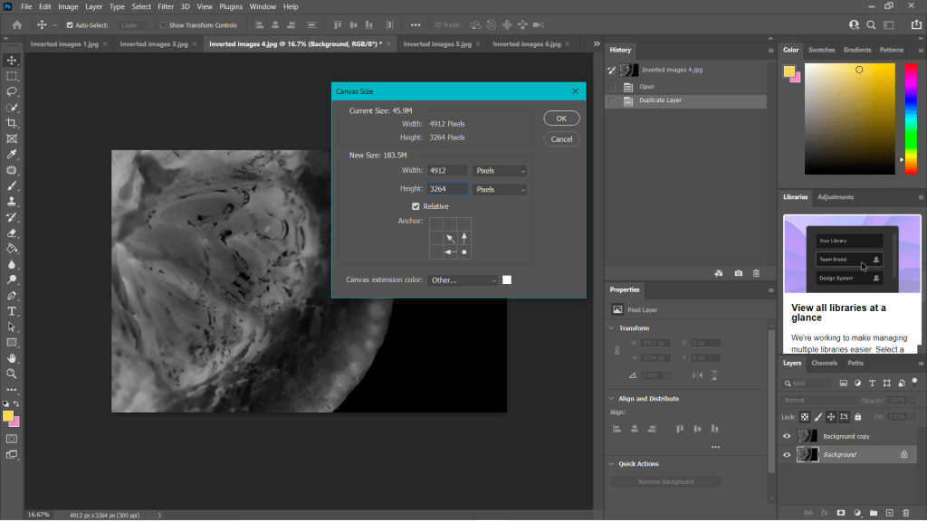
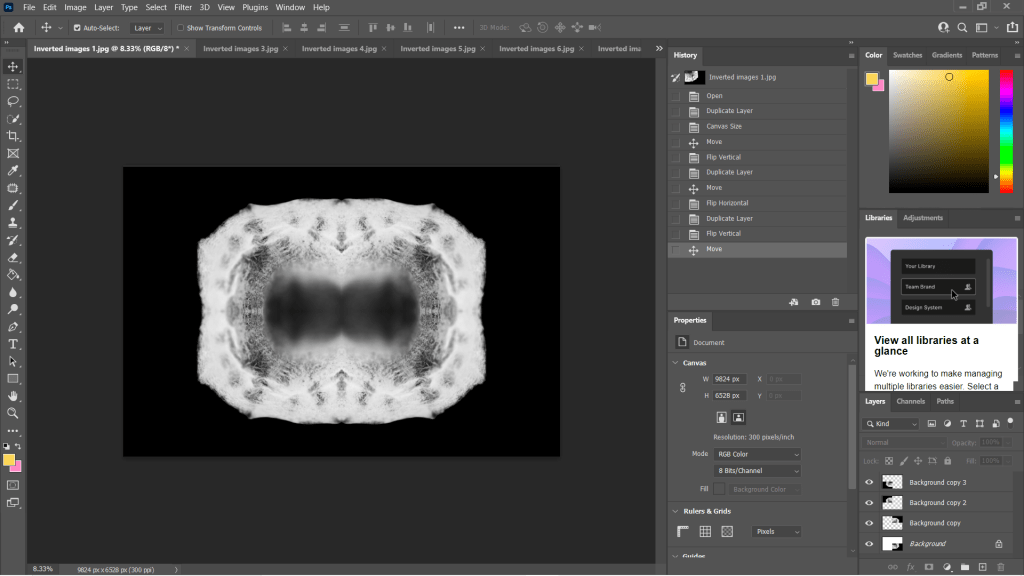
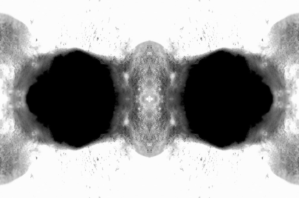
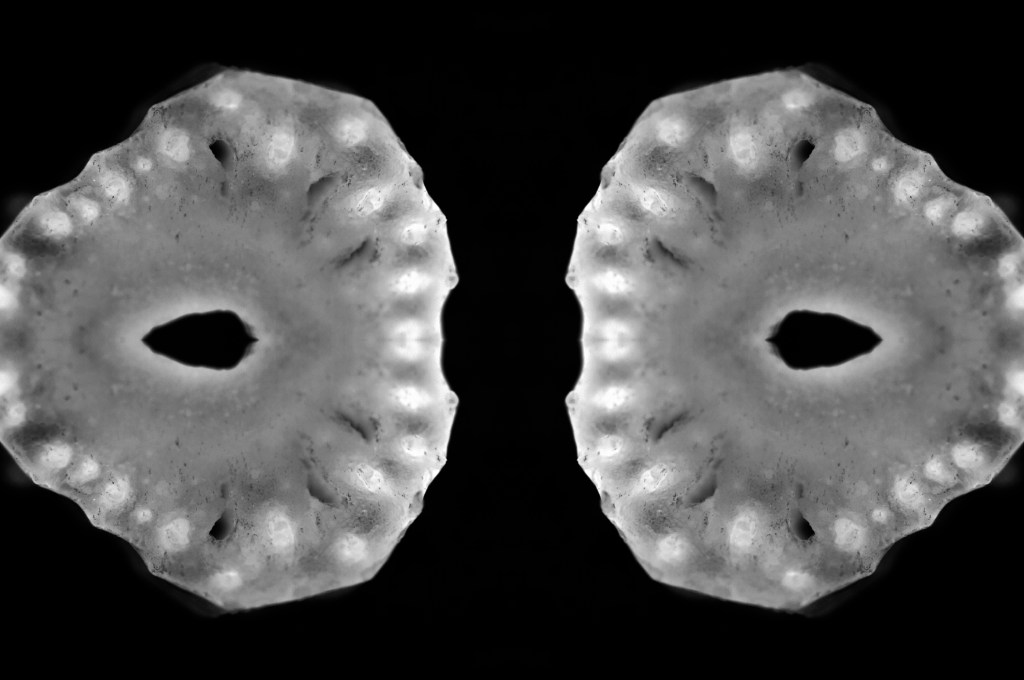
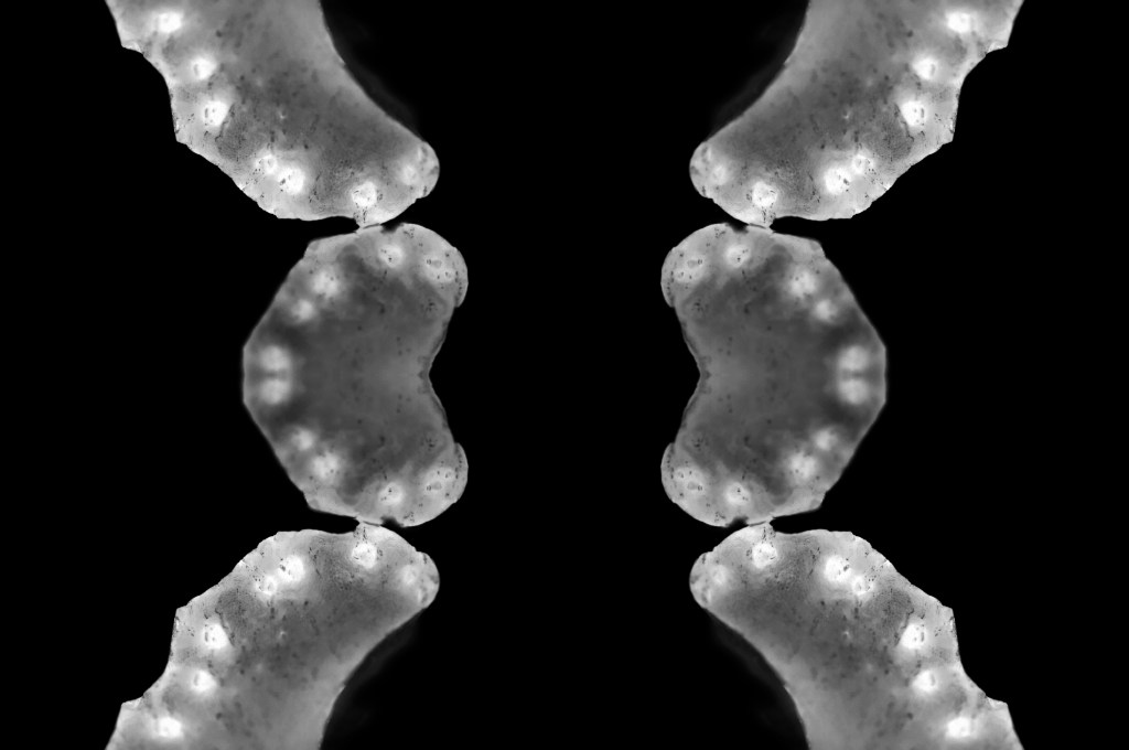
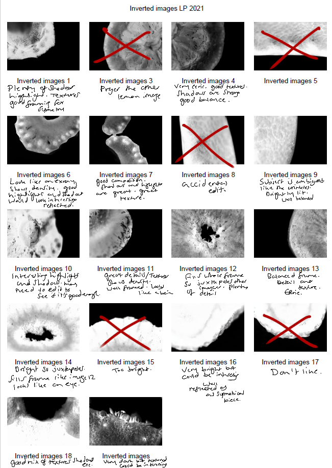
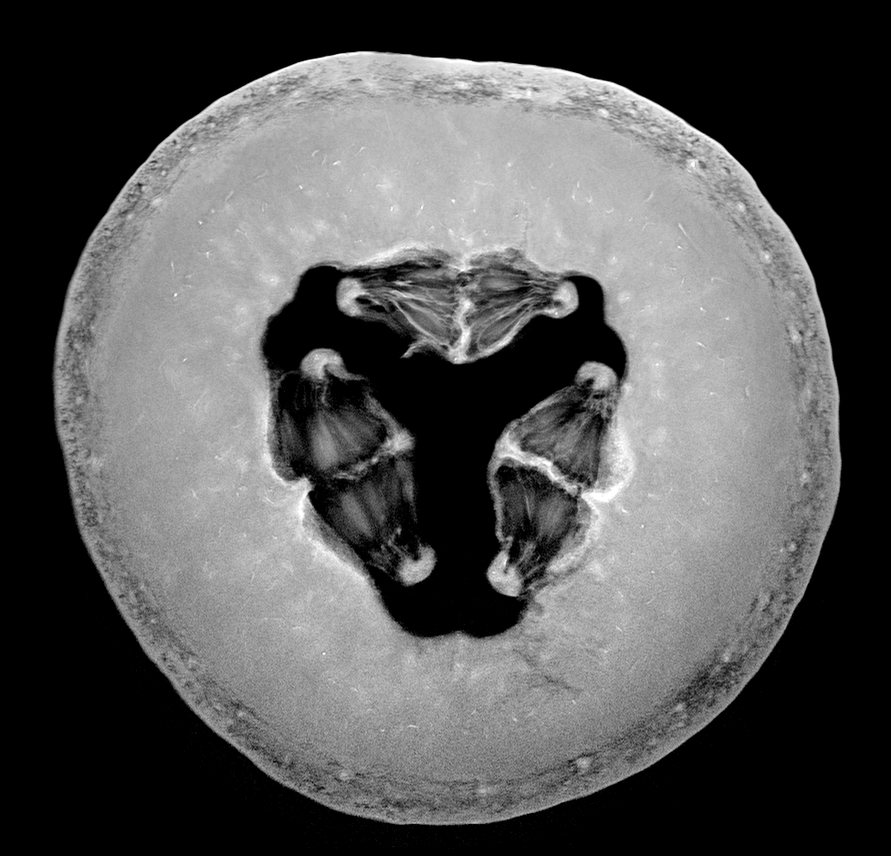
To create my final images I took my black and white inverted shots, enlarged the canvas by 4 (See Fig. 1), before creating three duplicates of the photographs and changing the orientations of each to mirror one another (See Fig. 2). As a result, this created multiple 360-degree pieces out of what was one image. The inspiration for these compositions came from Andy Ellison, an MRI technician who scanned fruits and vegetables as a way to test his MRI machine settings (Insider, 2013). Ellison’s work influenced me to produce a photograph that looked ‘beautiful, ghostly … like they could be part of the human body’ (Powell, 2021).
Fig. 1. Canvas (2021)
Fig. 2. Duplications (2021)
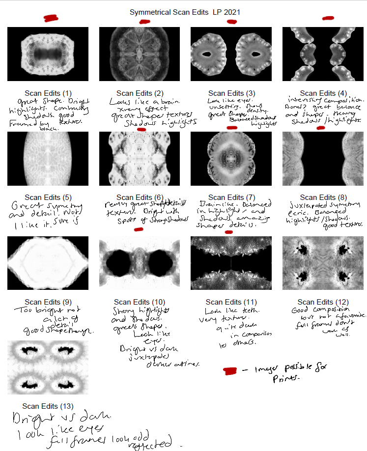
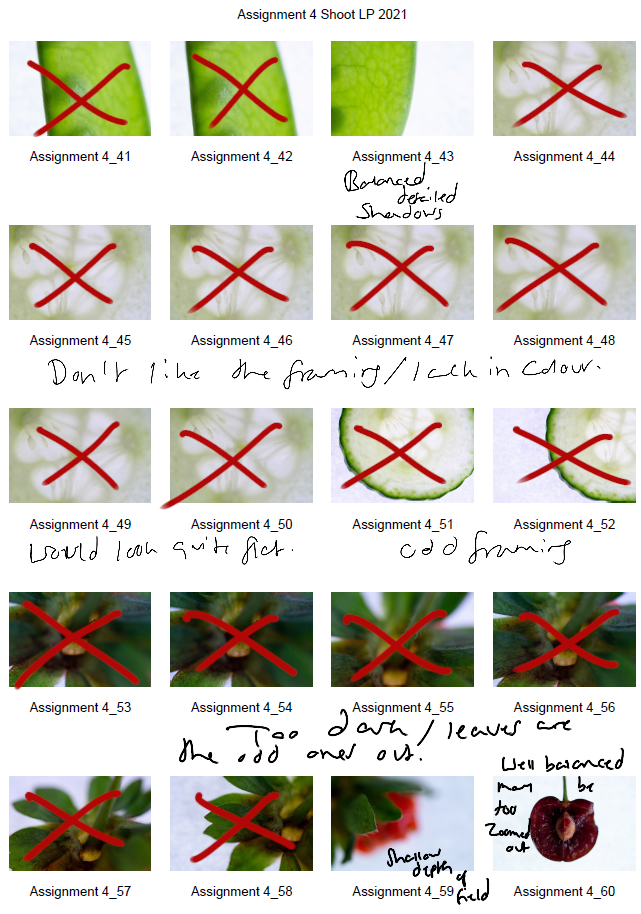
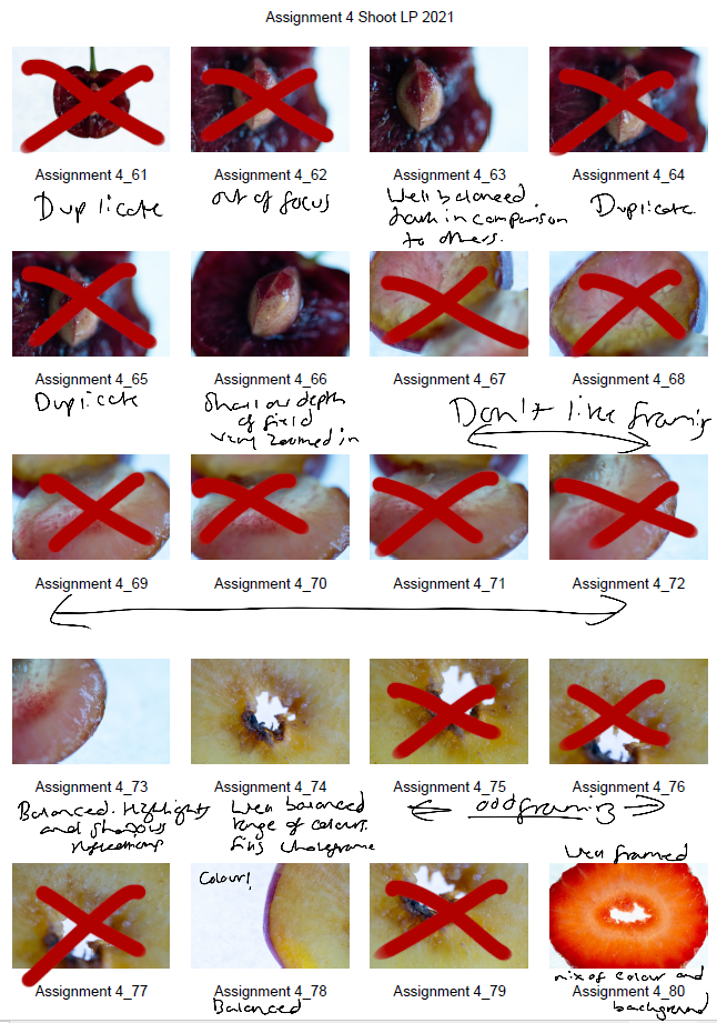
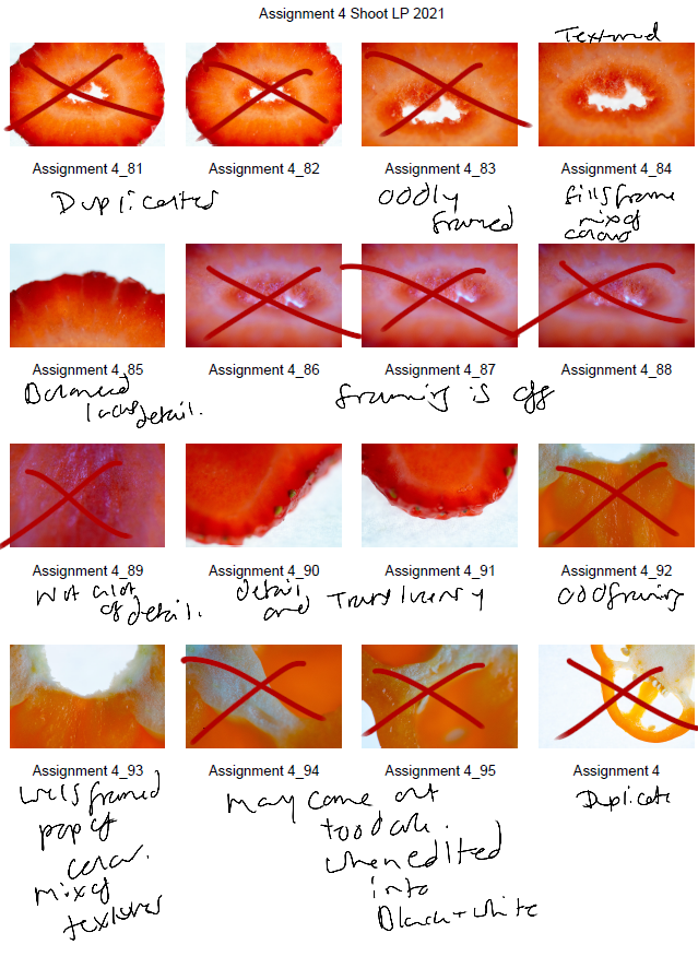
Some of the individual images weren’t strong enough when duplicated and turned into a mirrored image, as can be seen in my annotated contact sheet for these edits (See Fig. 3). Scan edit 5, was interesting in terms of texture and symmetry but wasn’t as exciting as the others due to the lack of shape, contrast and detail. On the other hand, scan edit 9 was overexposed, lacked texture and detail but had an interesting eye shape. Edits 12 and 13 were good composition-wise as the frame was full, juxtaposing the other images and documenting highlights more so than shadows. However, those particular images wouldn’t have been fitting when presented with the rest of the group because of this big difference; it would be quite jarring to look at.
The pieces with the red above them are the images I felt are the best of the collection, not only because of their comparisons contrast and details wise, but they each look like an individual body part. The similarities pull them together as a set, but the shapes and subjects allow them to be unique enough to tell their own story.
Fig. 3. Contact Sheet (2021)
Final images
Fig. 4. Scan 1 (2021)
Fig. 5. Scan 2 (2021)
Fig. 6. Scan 3 (2021)
Fig. 7. Scan 4 (2021)
Fig. 8. Scan 5 (2021)
Fig. 9. Scan 6 (2021)
Fig. 10. Scan 7 (2021)
This assignment requires 6-10 high-quality photographic prints if you’re planning to submit for assessment, therefore, the editing for this particular set of images is important. The way your images are presented could heavily influence the way a viewer looks at the pieces and what they get from them. If you pick an art piece that isn’t as strong as the rest, the entire group could be less impactful and draw fewer people in.
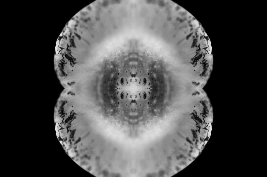
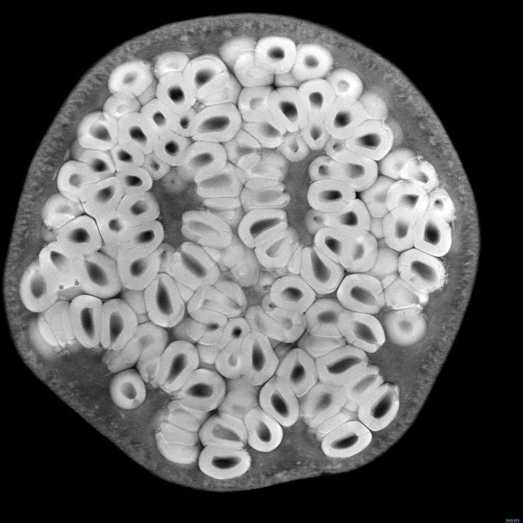
I chose the presentation, and the order of my photographs was by referring back to my practitioner research and shoot plans. I wanted to explore the ‘aesthetic’ of film negatives, lumen prints and how ghostly they look after development. Instead of producing an image that reflected a typical black and white photographic print, the edits were inverted to represent an enlarged version of a negative film or black and white lumen print. The final edits reflected my study of MRI scans from Andy Ellison that document the thin and dense areas of the subject via heavy contrasts. Scans can ‘show the thicker areas that are blocking out most of the light or rays via a white or light grey image … ‘ (Powell, 2021) but aren’t limited to this, as denser areas can be darker while the thin areas remain whiter in some MRI’s or x-rays.
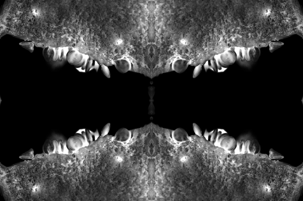
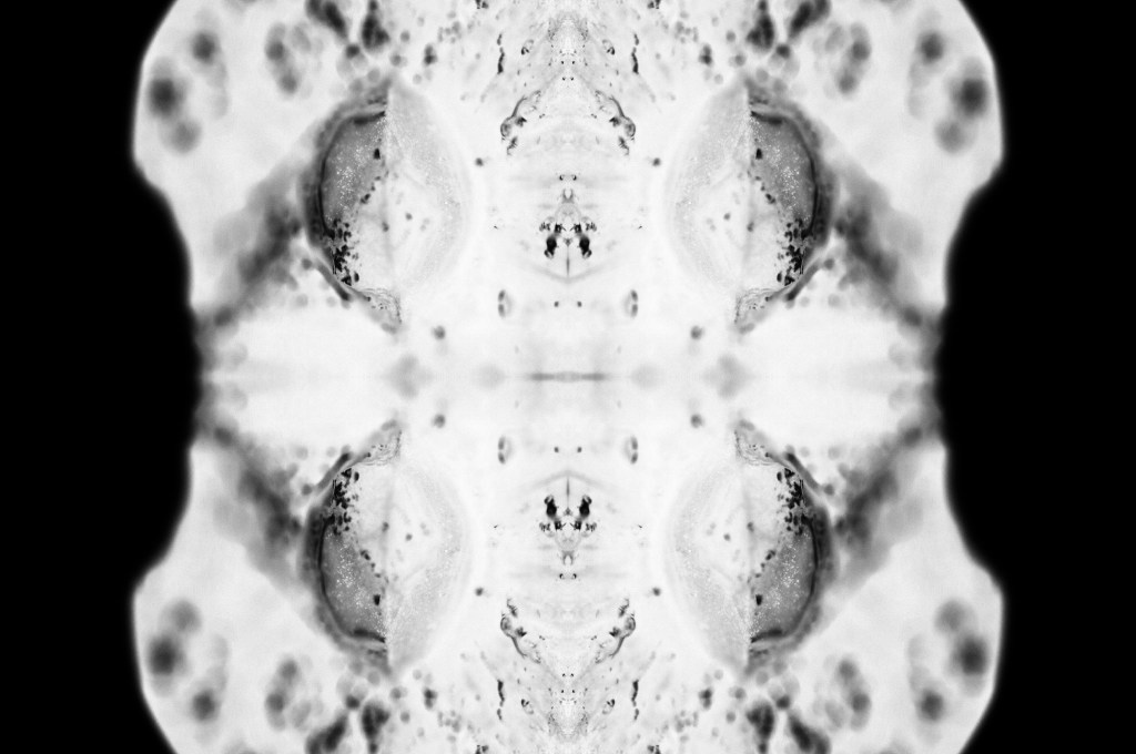
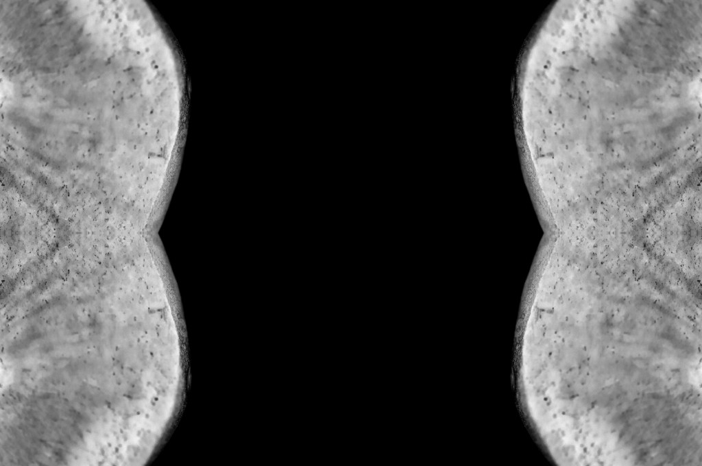
While looking at the final images, I noticed how much they looked like body parts or at least a mutated version of a body part. Printing the chosen images off allowed me to arrange the photographs in multiple orders to see what worked best and why. Eventually, I decided on the order shown above and sat with it for a few days before confirming that this was the arrangement I felt was suitable for this set. From the top downwards, we have images that look like the brain, eyes, a set of teeth, spine, torso, hips and legs.
The final set is balanced with shadows and highlights, full of detail, a range of textures and shapes. The shallow depth of field enhances the eerie effect seen throughout each image, especially in Scan 1 (see Fig. 4). There is a soft grey area just below all the crackled black areas around the edge of the fruit, that frames the middle of the image, enhancing the details within that area and the surrounding edges. Smudgy dark marks can be seen on the outer edges of Scan 4 (see Fig. 7) that look like an inkblot painting, bleeding into the paper and symmetrical all around. Scan 3 (see Fig. 6) is the strongest piece in my opinion, due to the range of tones throughout, bright highlights, dark shadows and mid-grey’s. The shapes look sharp in some places and blunt in others, the block of black in the middle of the frame intensifies the scary form of the fruit. Grooves and dents within the subject, give the image a fleshy texture, as a result providing some context as to what the object may be or how it may feel.
Reflection
This assignment has been interesting to explore as I pushed myself out of my comfort zone, experimented with controlled light and the results that could be achieved. I have managed to combine the use of lightbox and macro photography techniques from McKinlay’s tutorial, Ellison’s MRI scans and presenting them as individual prints like Gomez’ lumen prints; while keeping it unique and making it my work by taking influence from a past light project of mine from 2015.
The final images are strong, complement one another and present an interesting idea that doesn’t have a lot of context to it, unless you knew what the subject was and how the pieces were put together. This set allows the mind to analyse what is happening, inspect all of the details and paths within the photographs and the meaning behind them. It is a complex group of pieces that challenge the stereotypical use of controlled light and studio photography.
– Described my shoot setup, the camera settings I used and any issues faced.
– Provided annotated contact sheets for the images taken for this photoshoot
– Before briefly explaining the annotations and why I chose those images to edit
– Included the contact sheets for the images I selected to convert into black and white
– As well as screenshots to show how it was done, referring back to my previous research
– Finishing the post off with a brief reflection on the images I shot and what I intend to do going forward
Shoot setup
For this shoot I initially intended to set my camera up on a tripod to keep the camera steady as the macro lens is quite heavy, however, this meant that the camera wasn’t as close to the cross-sections as I wanted them to be. As a result, I boosted the ISO to 1600 to allow for a faster shutter speed and a brighter exposure level. The weight of the lens made the process slightly more challenging as I had to manual focus too, but it was thankfully successful. To make the focal points more prominent when photographing any details the aperture was F/2.8 to allow for a shallow depth of field if taken at an angle to blur any background features. Overexposing the images slightly enhanced the brightness of the white background, like Doug McKinlay, suggested in his lightbox tutorial Light Box Art: Stay Focused (2017), preventing the image from looking dull and textured from the paper underneath.
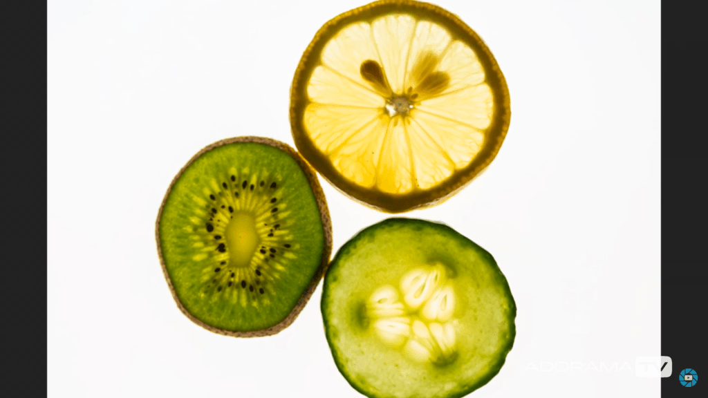
Rather than using a large lightbox, I purchased an A4 light pad which is much smaller and thinner, but bright enough to do the job. A variety of fruits and vegetables were bought in advance and sliced to provide me with a range of colours, shapes, textures to play around with when composing the image.
Contact sheets for photoshoot
Fig. 1. Contact sheet 1 (2021)
Fig. 2. Contact sheet 2 (2021)
Fig. 3. Contact sheet 3 (2021)
Fig. 4. Contact sheet 4 (2021)
Fig. 5. Contact sheet 5 (2021)
The first set of contact sheets are for the shoot itself, including brief annotations to explain what I like about each particular shot, why I have crossed a majority out and what may become of them in post-production. After annotating and selecting my favourites from the entire photoshoot, I then took these images into photoshop and edited them to see what they would look like in black and white.
The images are as follows:
Contact sheet for edits
Fig. 6. Contact sheet 6 (2021)
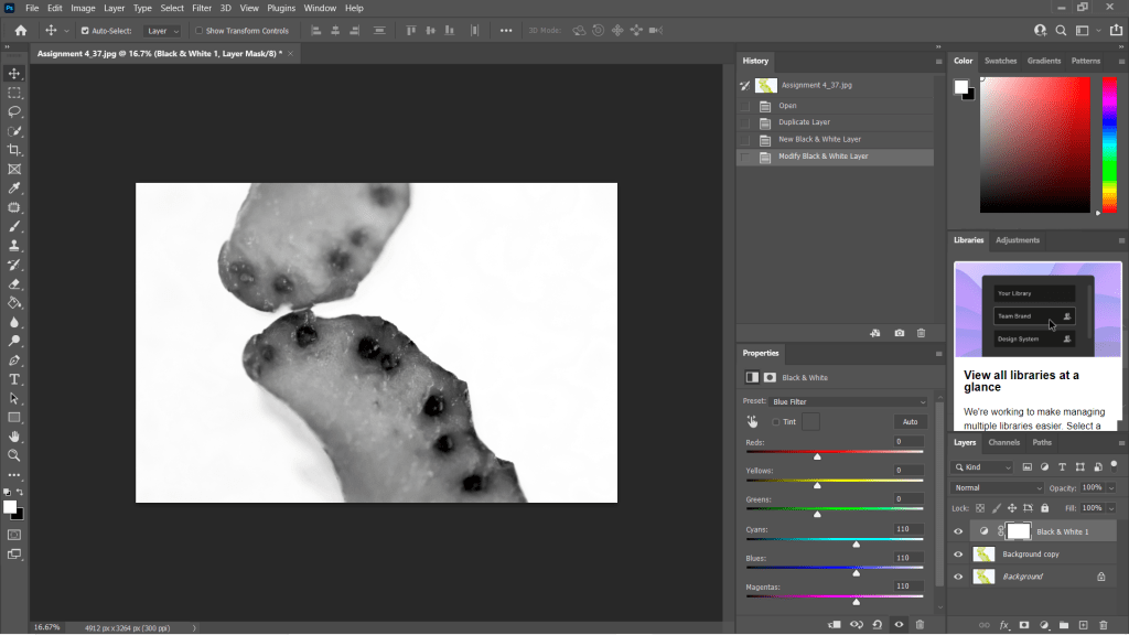
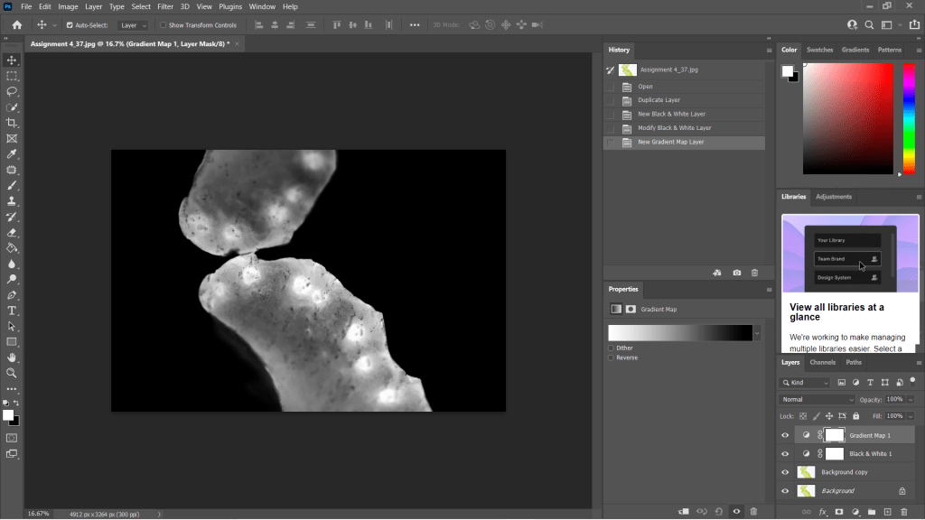
To get the results shown in my contact sheets, I lightly corrected some of the shadows and highlights in the images that needed retouching before converting them to black and white. To change the colour is used the B&W tool and selected ‘blue filter’ (See Fig. 1) to enhance the contrast. To mimic an inverted image and MRI, I then used the gradient tool in reversed black and white (See Fig. 2).
Fig. 7. Black and White (2021)
Fig. 8. Gradient Map (2021)
I wanted to choose a range of images to use in my final image edits, so I made sure to select shots that were heavily black in some areas and bright white in others, highly detailed or minimally textured for the remaining few. This gave me a wide selection to experiment with and create strong symmetrical compositions from. Showing variety was important to me for this photoshoot, appreciating multiple fruits and vegetable structures and juxtaposing between the imagery and reference the different kinds of scans as discussed in my previous research, ‘some scans may vary and present the denser areas in black or grey…’ (Powell, 2021).
Reflection
This photoshoot helped me appreciate the structures of the food we grow and eat, the minuscule details within them and how beautiful they are. I was able to be flexible with my plans for this shoot, not letting the weight of my camera ruin the imagery and changing the settings to work with what I had. Reviewing the images shown on my contact sheets allowed me to reduce the number of photographs needed in the initial post-production process and once again after they’d been edited to black and white.
Understanding the process in detail before doing the shoot, rather than briefly researching a concept and making things up as I go, helped this project to flow a lot smoother and resulted in some powerful images.
The final images will be in a separate post from this one, but I am thrilled with the selection chosen.
References
McKinlay, D (2017). (2017) Light Box Art: Stay Focused with Doug McKinlay [YouTube, screenshot] Available at: https://www.youtube.com/watch?v=kWiL5N-b4YM (Accessed 28 May 2021).
– Discussed lightbox and food photography, following a short YouTube tutorial from Doug McKinlay
– Explored the details of his shoot set-up, camera settings and lighting choices
– Suggested the differences I would make if I were shooting this project and the type of subjects that can be used
– Before briefly analysing a screenshot of his work from the lightbox shoot.
– Researched the concept of MRI’s scans and the use of fruit and vegetable cross-sections
– Discussed the idea behind Andy Ellison’s scans and why he did them
– Explained the similarities between MRI’s and negative film, what they pick up and the differences we can find
– With a brief analysis of Ellison’s work and the contrasts between the two.
– Explored the technical approach for symmetrical and asymmetrical images, the balance and elements that make them what they are.
– While referencing a past project I did in 2013 and analysing an image from it to explain my understanding of the technique.
– Provided bullet points for my shoot plan for this assignment and a reflection on this post as a whole
– What it taught me and what I’d like to implement in my work.
Lightbox and food photography
Following my techniques research where I looked at macro, abstract photography and lumen prints, I decided to focus on lightbox photography and using a macro lens to explore my chosen subject in a more intimate, up close and personal way.
Doug McKinlay, a UK based photographer released a short YouTube tutorial in March of 2017, exploring lightbox art and ways to achieve some impressive shots from the comfort of your home. McKinlay’s set-up consisted of a large lightbox, placed on a few stools to avoid the camera being too close to the subjects, in turn causing the macro lens to struggle with focus. He gathered a variety of fruit and veg, sliced them into thin pieces and arranged them in a way that he felt was great for a strong composition. Using transparent or translucent items are ideal for this project, as light can pass through and highlight the details, rather than blocking light and becoming solid shapes.
McKinlay decided to set the aperture on his camera to F/8 allowing the depth of field to be even across the frame, however, suggested if the shutter speed isn’t high enough to shoot handheld then boost the ISO slightly without causing too much grain. I would use a tripod to steady the camera if the aperture was slightly wider and the shutter speed too slow to avoid handheld motion blur. Another tip that was suggested was overexposing by 1 or 2 stops, to avoid the camera light meter from turning the bright white light into a duller grey (McKinlay, 2017).
Depending on what you decide to photograph, their makeup and the thickness will influence the end product in a variety of ways, as can be seen in the screenshot I took from McKinlay’s tutorial (see Fig.1). The denser areas are darker and lack texture, whereas the thinner, more translucent elements of the fruit are lighter and full of texture, detail and colour. Being able to capture the tiny details and structure of the subject is fascinating, as it allows you to appreciate what it is made up of, how it holds itself together and what it might feel like if you weren’t already aware. In terms of composition, this isn’t my favourite as the layout isn’t the most exciting, however, the cold citrus colours and asymmetric segments, seeds and shapes make up for quite a simple subject placement. Overexposing the shot helped the background be crisp and white, preventing the background from looking dull and affecting the fruit slices as a result.
If I were doing this project, I would get closer to the subject, focus on the smaller details within the frame rather than the slices as a whole. Exploring the areas we don’t normally look at in much detail, removing context from the composition by cropping out some familiar elements with the lens, may encourage the viewer to appreciate what they are viewing for a little while longer.
Fig 1. Light Box Art (2017)
MRI’s on fruit and veg research
Andy Ellison is an MRI technician at Boston University Medical School, who has produced multiple scans of the cross-sections of fruit and vegetables, following an MRI machine settings test with an orange slice (Insider, 2013). While fruit and vegetables aren’t at risk of tumours or bleed as a brain maybe, they’re still complex, held together by their fibres and flesh much like the human body. Lemons, for example, are made up of segments and have little fleshy pockets of juice within, while human skin is made up of cells that are all connected to create many thin layers to protect us.
Ellison’s scans are beautiful, ghostly and look like they could be part of the human body which wonderful to see how incredible nature is and the patterns that can be found within something that has grown from a tiny seed.
Much like photographic negatives, MRI’s I’ve briefly googled, tend to show the thicker areas that are blocking out most of the light or rays via a white or light grey image, while the more exposed areas show up as dark grey or black. Some scans may vary and present the denser areas in black or grey, while the emptier or thinner areas are represented with light grey or white, similar to a developed film print.
As seen in the scan of the pomegranate (see Fig. 2) the fleshier, cell-like seeds are bright white, while the thicker skin is grey. The shape of the fruit is asymmetric, defined, full of texture and detailed around the outer edges especially. Heavy shadows within the translucent seeds imply that there is a small yet thicker seed or pip inside. Removing colour allows the viewer to come up with their conclusion as to what is in front of them.
The MRI of the melon is the complete opposite (See Fig. 3) as the tougher, opaque part of the fruit is a lighter white whereas the transparent seeds in the middle remain dark black to imply overexposure. There are tiny veins that can be seen if you look at this photograph closely, something that makes the composition more exciting as the details are subtle, allowing the eyes to look further. The middle section of the melon seems to reflect itself too which may be an interesting concept to look into.
Fig 2. Pomegranate (n.d)
Fig 3. Melon (n.d)
Symmetry and reflection examples
As previously mentioned above symmetry and asymmetry is an interesting concept to consider within photography as it creates a sense of balance and intrigue to the composition. It would be possible to explore either one or both of these techniques when photographing fruits, flowers and any other object that naturally features a constant similarity pattern throughout.
Symmetrical photography is pretty straightforward and explains itself. The image is equally balanced all around, each section complimenting the other without having to be identical in detail all the time. For example, one half has a different shaped window frame to the one on the right-hand side of the image, but it’s still balanced and appealing.
Asymmetrical photography is a lot more clever and isn’t noticed straight away, which makes it more effective in my opinion. Helen Kantilaftis wrote for the New York Film Academy about photographic balance. They explained that despite an image having differences in shape and size, it is still balanced via the highlights, shadows and interesting use of filling space, making it an asymmetrically balanced image (Kantilaftis, 2014).
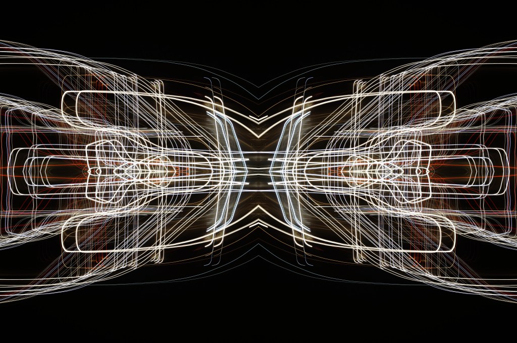
I’ve explored symmetrical photography in post-production (see Fig. 4), for a project that featured light paths from moving cars at night. After enhancing the highlights and shadows within the original image, boosting the contrast of the blacks and coloured lights, I copied it 3 more times and changed the orientation to create a 4 way mirrored image. This drew more attention to the shapes, curves of the light and the various colours, turning it into a bigger photographic light drawing. Negative space framed the busier details, preventing the composition from being too energetic and balancing it back out. Contrast is the ratio between the highlights and shadows, an element that is also levelled out within this photograph to avoid the lights being over or underexposed. If the original image hadn’t been mirrored, it would most like be asymmetric or diagonal in symmetry due to the negative space in the other half of the image.
Fig. 4. Symmetry I (2015)
Shoot plan:
– Take images of the cross-section of fruits and vegetables, backlit by a light pad or lightbox to emphasise the shape, details and light passing through the translucent areas.
– Focus on the details and lesser photographed elements of the subject with a macro lens set to manual.
– Maybe use a tripod to stabilise the camera, but make a judgement while shooting.
– Place white paper underneath the objects to enhance the background and prevent the camera from focusing on the reflection of the glass from the lightbox/pad.
– Set up the shoot in the conservatory on the floor to allow for different focal distances to be achieved, without having to stand on steps if it were shot on a higher surface.
– Edit the images in photoshop to black and white, before inverting the image or adding a gradient to mimic an MRI or X-Ray.
– Once the original image has been edited, copy and paste the photograph to create a quadruple mirrored image, to see what exciting results I can get.
Reflection
All of the research above has solidified what images I want to shoot, the subject I want to use and how I am going to use controlled light to create some strong compositions at the end of this assignment. The set-up may be fairly easy and cheap in terms of equipment, but planning and composing the image to draw the eyes in will take a lot of thinking, experimenting and technical knowledge to succeed. Pushing myself further by using a macro lens alongside a ‘studio’ light is going to help me grow both creatively and technically moving forward. In terms of presentation for this assignment, we are required to provide high-quality digital prints, so making sure I pick the correct images and layout will be something I’ll have to look into in more depth once the shoot is done.
– Explained how my preferred concepts led me to research via YouTube and books
– Before explaining three techniques, how they’re done and the results you can get
– Including screenshots and scans of the examples from the research
– Finishing the post with a short reflection about these techniques and what I plan to do as a project.
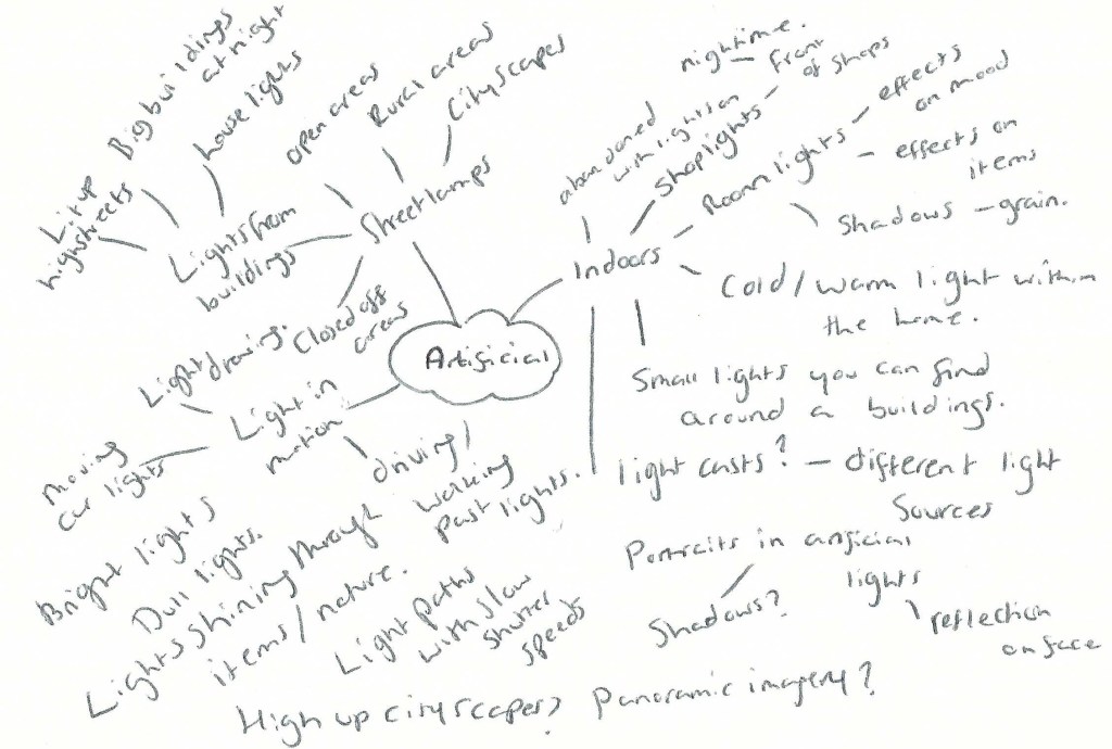
In my last post, I briefly discussed my mind-maps for both artificial light and controlled light, the multiple techniques, concepts and possible subjects that could be explored, along with their pros and cons. The ideas ranged from cityscapes to light casts, streetlamps and their shadows, light drawings, spotlight photography, commercial and lightbox photography.
As mentioned in my initial thoughts I sat with the ideas I was interested in most, which were silhouette and lightbox photography. While these ideas were in the foreground of my mind, I searched YouTube for further ideas and tutorials for lightbox, abstract and macro photography, as well as referring to an experimental photography book. This helped me figure out the direction I want to take for this assignment while pushing me to explore techniques I’d not done before or in a long time.
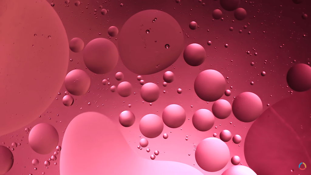
Oil and water
One of the first concepts I thought of when exploring the idea of using a lightbox, was oil and water macro photography, a simple set-up with incredibly unique results. Lighting the subject from behind (or below if it’s flat on a surface) and lifting the subject high above the light source intensifies the shallow depth of field, diffusing the colours below and making sure the main focal point is the bubbles in the frame. You can adjust the colours used underneath, the direction they’re pointing and the shape of the oil bubbles by stirring it and manipulating the mixture (Adaptalux, 2019). Ben from Adaptalux inserted videography of his results at the end of the YouTube tutorial, which I was able to take a screenshot of (See Fig. 1) for future reference.
Having more control over the process, can result in some incredible shots and allow you to get the exact outcome you’re looking for, however, it is possible to let gravity and chemistry take control of the subject while you focus on the light. This technique is full of flexibility, depending on what you prefer to do, but not so much so that you don’t have to plan or take control of what is going on. While this would be perfect to use for a controlled light project, it is also a concept I’ve explored myself in the past, so isn’t ideal for pushing myself further. The set-up and technical information regarding light placement, filters and stability for the camera/subject from this specific tutorial have still been beneficial for me to consider for this assignment, so worth the watch and research time.
Fig. 1. Oil and Bubble (2019)
Abstract paper photography
Another tutorial I saw from Adaptalux on YouTube, was an abstract photography project with nothing but lighting and paper. Much like the previous project with the oil and water the lighting is coming from underneath the subject (backlit when it’s flat on a surface) via the use of a lighting arm and some diffusion filters for additional colour. Before shooting, the camera is set up on a tripod and the focus is set beforehand so all that has to be changed is the paper folds, positioning or lighting direction/colour. The height of your camera and the focal range of your lens can result in an extremely close frame or a wider shot depending on your preference, making this another flexible technique to try out (Adaptalux, 2020). You can either fold the paper, roll it up, use one sheet or multiple sheets and manipulate their shape to get a variety of styles to shoot. Despite being lit from below, due to the curves in the paper, soft shadows are captured as opposed to a silhouette or flat image of the item in the frame.
Shooting the cross-section of paper is much more interesting than I first imagined it would be, as it cuts the camera frame into multiple sections and is ambiguous in terms of the subject (see Fig. 2). Abstract art is meant to be ambiguous and cause questions to be asked, in turn making it a much more complex idea to explore and play around with.
I’ll definitely consider exploring this particular technique, even if it’s not chosen for this assignment.
Fig. 2. Abstract photography with paper (2020)
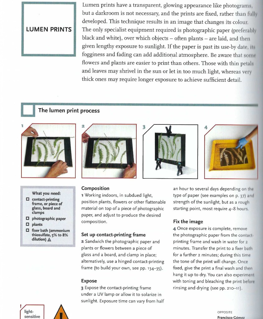
Lumen prints
Despite not having the products needed for this particular experiment, looking through Thames & Hudson’s book Experimental Photography (Bendandi et al., 2015) gave me something to think about in terms of photographic presentation and technical choices made in photography. The contact printing frame used for this experiment (see Fig. 3) looked similar to a light pad, a thin LED glass pad used for tracing for art and other such things, while the lumen print Francisco Gomez managed to produce (see Fig. 4), reminded me of a photographic film after they’ve been developed. Placing the leaves on a piece of photographic paper, blocked those specific areas from the light, much like objects do when shooting with film. The denser subject is shown via a ghostly silhouette; with a few shadows to define the details where light has seeped through, while the open areas are much darker to show how much light the paper was subjected to during the experiment. By ‘inverting’ the print with Photoshops gradient map, the image looks like a typical sepia print, which has got me thinking about the possibility of creating digital ‘negatives’ for this assignment and how light can affect the results of an image.
Fig. 3 Lumen Prints (2015)
Fig. 4 Lumen Print (2013)
Reflection
The techniques explored in this post have helped me understand a variety of techniques that can be used for this particular assignment, including macro photography, inverting photographs and experimenting with light, colour and its subjects. Abstract photography is unique and results in a never-ending list of outcomes, especially if the subject is constantly moving, such as oil bubbles in the water. Despite having total control of the light it doesn’t mean that you are in control of everything which I like. Lumen prints could be similar if you measure the exact amount of time the paper is exposed for, but the subjects used to make the composition are most likely to be different, even by a millimetre.
This has me thinking about film photography and how you have a restricted amount of time to get the desired image. Over or underexposure could make or break an image, influencing the mood or details of the subject. One second out, or one wrong move and you could’ve missed the ‘perfect’ composition. Light levels are shown on a negative via the translucent and opaque areas; the lighter areas are caused by denser objects that have been less exposed to light, in comparison to the darker areas such as a clear sky or another strong light source.
For my Languages of light assignment, I may explore the use of a light pad or lightbox to illuminate subjects from the bottom, how lens filters or gels could affect the overall image and how to create digital ‘negatives. Further research is needed to make this decision.
– Listed my initial thoughts, reasonings for choosing a specific path
– Before attaching two mind-maps with various ideas/concepts
– Then listing the pros and cons for each technical approach
– With a short reflection on my ideas and how I will come to decide what I want to do for Languages of Light.
Brief
‘Revisit one of the exercises on daylight, artificial light or controlled light from Part Four (Ex4.1, Ex 4.2 or Ex 4.3) and develop it into a formal assignment submission. The submissionrequirement for this assignment is a set of between six and ten high-quality photographicprints‘ (Bloomfield, 2018).
Initial thoughts
As I’ve used natural light a lot for personal work and past assignments, I feel it’s necessary to push myself out of my comfort zone and explore either artificial or controlled light for this particular assignment. Both 4.2 and 4.3 were interesting to do as well as the analysis of the results and what they taught me, so choosing the exercise I would like to revisit may take a little longer than anticipated.
I’ve gathered together multiple ideas for each technical approach and formulated two individual mind-maps, allowing me to figure out the subjects or projects that stand out to me most over the next few days. I plan to sit with these ideas for 2-3 days, see which ones come back to mind most and begin researching the different techniques or approaches, before exploring the chosen project in more detail.
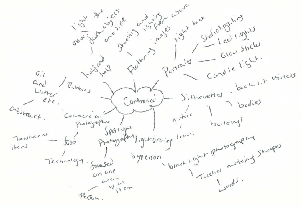
Mindmaps
Fig. 1 Controlled (2021)
Fig. 2 Artificial (2021)
Artificial light
– Shooting with artificial light will remove the option for me to control how the light falls, forcing me to capture it in an interesting way from what is available.
– Working outside would be more realistic currently, given the slow ease of lockdown restrictions.
– If I didn’t want to go outside, there is always the possibility to explore artificial light within the home e.g. lamps, lights from house windows, lights from technology etc.
– Shooting during the night would mean fewer people around so wouldn’t have to worry about social distancing and could capture shop windows/high streets in a way we may not see usually. Ghosttown-esque?
– Could experiment with light paths by capturing images from a moving vehicle or by moving around the light source. Abstract?
– Capturing cityscapes and working at night isn’t something I usually do so would be interesting to explore.
– Portraits would be interesting to take at night, as I’ve never done that before and could result in some really interesting shots depending on location and light source.
– It’s nearing summertime so would have to work much later than expected, which isn’t as ideal.
– May have to travel to photograph cityscapes or highstreets, so would have to plan transport.
– Lighting within the home is possible, but more restrictive and not pushing myself further.
Controlled light
– I have control of the light and how it falls on the subject, which could result in some really interesting shots.
– Would push me far out of my comfort zone, having avoided studio lighting for many years.
– Trying out various light sources would be interesting and provide me with much more knowledge than before.
– Could work within the home which is ideal for social distancing purposes and removing the need to travel.
– Silhouette work would be interesting to explore, as they may have the ability to be much more defined than if I were to shoot using a duller artificial light.
– I could make a set-up within the home or garden, which is easier to do than setting up outside with no electrical sources etc.
– Lightbox photography is something I’ve explored briefly before and could link in with silhouette photography, combining multiple ideas.
– If I wanted to use a model for this project, I would have to consider social distancing still if the set-up was indoors.
– Space would be more restrictive working within the home which may not be ideal, depending on what I decide to shoot.
– May have to invest in more lights for this project, as I have very limited options in my pre-existing kit.
Reflection
There are pros and cons for each exercise, ranging from lack of kit to the planning of travel and considering the time of day. Despite all of this, there are some strong ideas that I’d be more than happy to explore and willing to take the time to gather equipment or plan. Silhouette photography, the use of a lightbox and creating abstract images are currently the strongest contenders for me. If I wanted to use a model for this assignment and work around social distancing, I could either model myself with a tripod set up or ask a family member. Sourcing a variety of lights is also possible with a little bit of research and asking around, but still doable.
Any struggles that may occur during this assignment are making me more excited to explore and shoot for Languages of light, as it will push me to work with what I’ve got, find a way around the difficult stages and grow from it.
Still undecided on whether to use artificial or controlled light, but I have plenty of ideas to think about and research in the meantime. Looking forward to this assignment and what results will come from it.
I have received formal feedback from my tutor for my third assignment ‘The Decisive Moment’. Considering this particular assignment took a long time to complete due to personal situations, I am happy with the response I got.
Here is a summary of the comments received via email:
Strengths:
– Strong interpretation of the ‘ongoing’ (in)decisive moment through the representation of time in the still life flower. – Using the domestic setting shows a strategic conceptual documentation of the private and quotidian, rather than the public realm of most decisive work. – Good references about technical approaches. – Explores the technical/conceptual and how it alludes to still life.
Weaknesses:
– Define critical terms right away concisely with a firmer introduction to the assignment. – Show the subject, presentation and give context to the approach, so tell them rather than let them find out themselves. – Link what I’ve found via references but be clear on the subject to start with. – Expand my points further with ‘whys’ with references to show how I’ve done something.
Areas of development:
– Attach annotated contact sheets to show how I got to a certain technical decision etc. – Explain concept initially and expand later one in more detail. – Lead reader into the subject and reference my evidence to back it up. – Reference influences and how I interpreted the assignment.
Reflection:
Once again, I need to work on being more concise but avoid being too vague by referencing and explaining my approaches in more detail. Write about what’s relevant and the influences I used within my own work is important. I need to lead my readers into the subject and further expand with evidence at a later point. Overall, I have the ideas there and the strong images to show that I’ve understood the assignment, however, my written work needs to be clearer and reflect exactly what I discovered. They’ve noted that it’s difficult to do, but worth getting the hang of early on.
The indecisive moment challenges the belief that a singular extraordinary moment is the most important and unique to capture, by recording periods of chaos and uncertainty, in turn, allows the viewer to explore multiple paths within an image. The decisive moment requires patience to document that once in a lifetime shot, showing balance and well thought out composition.
The unpredictability that took place during this assignment; pushed me to explore the indecisive moment. The in-decisive felt like the most fitting approach to pursue, despite my initial interest in the decisive.
Lockdown restrictions meant that plans had to change due to social distancing and the inability to travel far from home. Shooting in a domestic environment, where I could control what was happening, seemed like the most logical and achievable. Formulating a mindmap allowed me to figure out the best and most achievable photoshoot to explore within the home. Ideas such as, but not limited to, capturing the ordinary, invisible, empty moments, or documenting people within the home, while removing expression and gesture to reflect on Thomas Ruffs ‘Dead Pan’ approach, to ‘confound our expectations of discovering a person’s character through their appearance’ (Cotton, 2014, p. 106). Face masks remove facial expressions, forcing us to come up with a conclusion about the person beneath with very little information.
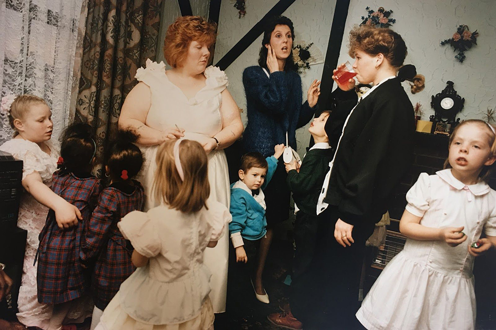
Nick Waplington perfectly captured the reality of life and the sporadic moments that occur from day to day by taking snapshots of families during their most intimate and personal periods using his film camera. Removing the context within his images allows the mind to create theories about what is taking place. ‘Living Room’ (1991) is a perfect example of this and one that I analysed well to understand what an indecisive moment could be. ‘A time full of uncertainty and disorganisation, mixed emotions and lack of stability in the area. Waplington’s use of a fast shutter speed has frozen at least eight different moments in time, if not more that we cannot see directly’ (Powell, 2021).
However, living in a small household made these sporadic and busy moments more unlikely to achieve. As a result, I took the idea of ‘isolation’ and capturing invisible moments, as Michael Wesely did by capturing double exposures of flowers and fruits decaying over time, as discussed in my Durational Space (Powell, 2020) research earlier on in the assignment. Life and death are inevitable but is not something we physically see happening unless we slow time down. Keeping the camera open while things continue to decay is one way of achieving this.
Martin Dietrich’s black and white double exposures of people in the project The Ghosts That Carried Us Away (2014) are both abstract and minimalist in nature. The ghostly figures of movement that occurred while the shutter was open paint a path of indecision and lack of freezing one moment as it happened. The removal of colour and location allows the audience to decide the story, mood and context of the image.
Nigel Shafran took snapshots of the same kitchen across various time frames, showing indecisiveness and proving that each moment is just as important as the last as it shows life.
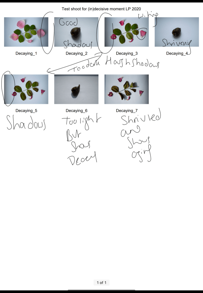
Combining the discussed techniques and approaches, along with Shafran’s interest in the mundane and every day, encouraged me to do a test shoot and follow the life/death of perishable goods.
A quick test shoot using my Sony A57 allowed me to decide whether this was the type of project I wanted to do and what to change if anything. Direct sunlight caused my images to have vignettes due to the harsh shadows surrounding the subject and blowing out the exposure. As a result, I decided to set my final image items up in a location where the sunlight would not be too strong and ruin the compositions. I felt as if the decaying would be more visible if the items were upright and shot from the front rather than from above, allowing gravity to help with the wilting process.
Reflecting on my final images, I believe that I have understood the indecisive moment well. Hand-picking the items, organising the setup and photography timeframes; helped me to create unique and extraordinary moments of my own. I caught moments that usually go unseen, such as the movement and appearance changes during the decaying process, before overlapping the multiple images in Photoshop to create ‘double exposures’ like Wesely and Dietrich. Post-processing allowed me to enhance the shadows, textures and shapes within each layered image, formulating photographs full of movement, colour and grain similar to Waplington’s film photography. Examples of this are the most prominent in images Four, Six, Eight and Twelve, where the colours are highly saturated and dark compared to 4, 8 and 12 (Powell, 2021). The ordinary and every day is beautiful, as is the natural process of life and death, which isn’t the same for everyone, making each cycle just as valuable and unique.
This assignment has taught me the importance of composition, the beauty of the mundane, helping me ‘understand both the decisive and (in)decisive moment in a much clearer way and the differences between the two, albeit it is small’ (Powell, 2021).
References:
Cotton, C. (2014) The Photograph as Contemporary Art. 3rd ed. London: Thames & Hudson.
– Included my annotated contact sheets for my final shoots, including the images I don’t want to use, what images are good and what needs editing if necessary. – Briefly referred to my shoot plan and explained how I set up my shoot. – Included camera settings and changes made throughout. – Explained my timescale choices in more detail and discussed what I learnt about each shoot. – Mentioned my weaker images and why. – Discussed post-processing and how I came up with my final images. – Briefly covered what these shoots have taught me. – Included my final images, what I liked about them, the techniques I used, the artists who inspired me and what I liked about the (in)decisive moment. – Wrote a brief reflection in bullet points about this process.
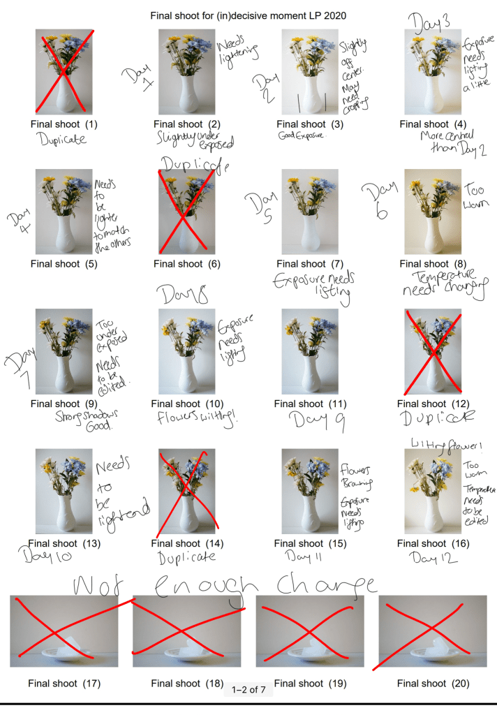
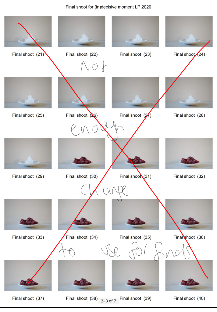
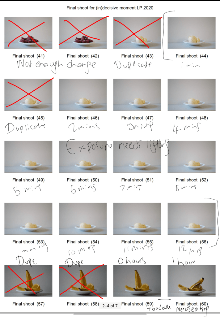
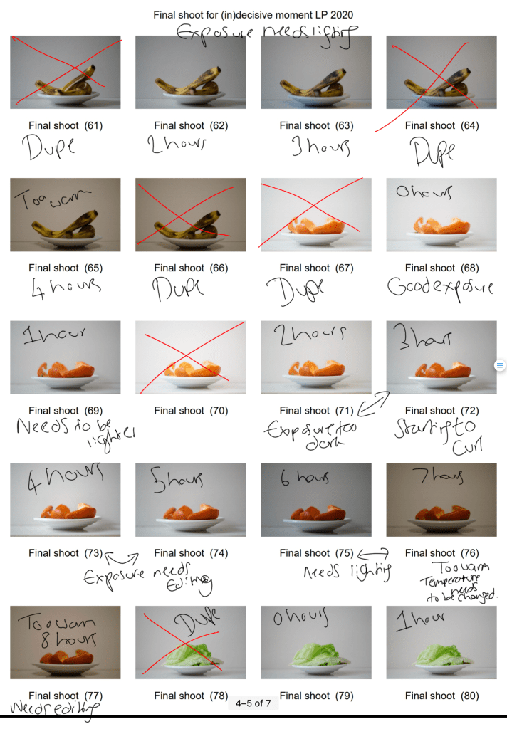
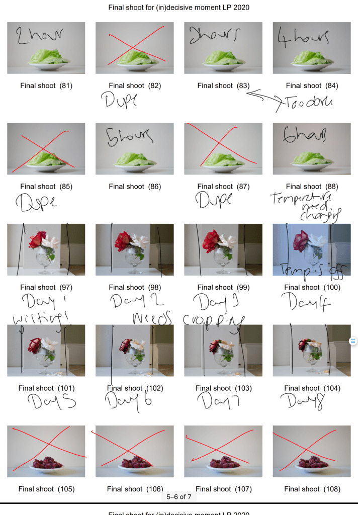
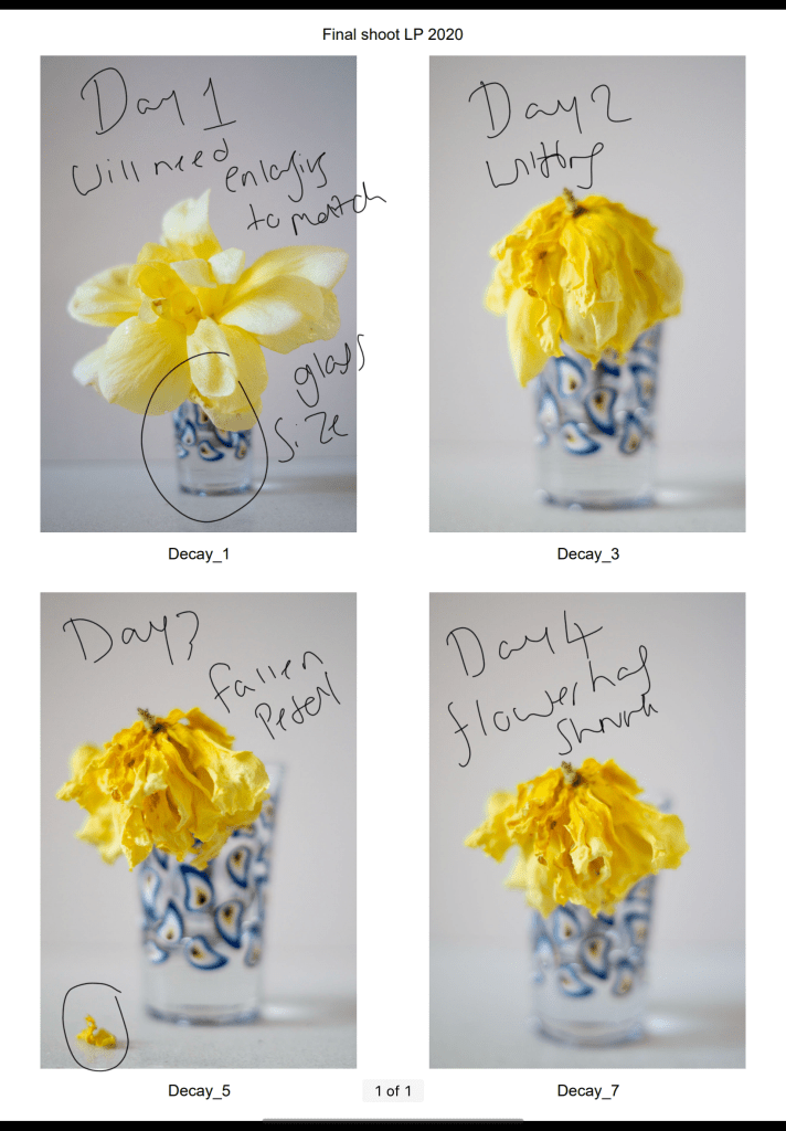
Before editing and analysing my final images, I made contact sheets, annotated and analysed them to find images strong enough to create multiple double exposures in the post-processing stage.
Fig. 1. Contact sheet 1 (2020)
Fig. 2. Contact sheet 2 (2020)
Fig. 3. Contact sheet 3 (2020)
Fig. 4. Contact sheet 4 (2020)
Fig. 5. Contact sheet 5 (2020)
Fig. 6. Contact sheet 6 (2020)
As stated in my shoot plan, I wanted to isolate a variety of perishable goods within the camera frame, across the space of a few minutes, hours, days or weeks. Setting the camera up in a domestic environment meant that I had to consider people walking around and moving items within the house during the photoshoots. With these thoughts in mind, I made sure to pick an area suitable for this project without the possibility of knocking the camera or subject between shooting.
The items were also in an area that wouldn’t be affected by direct sunlight, another interference I wanted to avoid, in turn, preventing the chances of the final image blowing out from the light.
After shooting the images ‘Final shoot 97-104′ (see Fig. 5), I decided to put a white piece of cardboard behind the items, as the wall and fireplace took away from the beauty of the flowers in the shot, distracting the eyes and overall ruining the images. Thankfully I was able to crop the image down in photoshop to save the image.
Due to the changes in light that would naturally occur throughout the day, the shutter speed was ever-changing; to avoid under or over-exposure. The distance between the subject and my Sony A57 stayed the same, as I didn’t touch either item besides the shutter button during the shooting process. Another consistency throughout these shoots was the aperture (F/1.8) and ISO (400). Using a shallow depth of field meant that the focus was entirely on the subject in the frame, while the background was soft and un-disturbing.
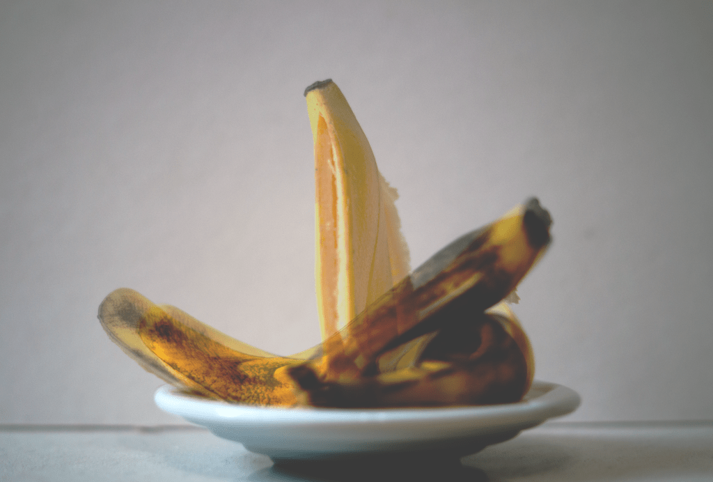
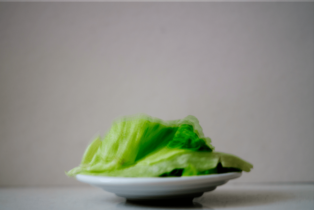
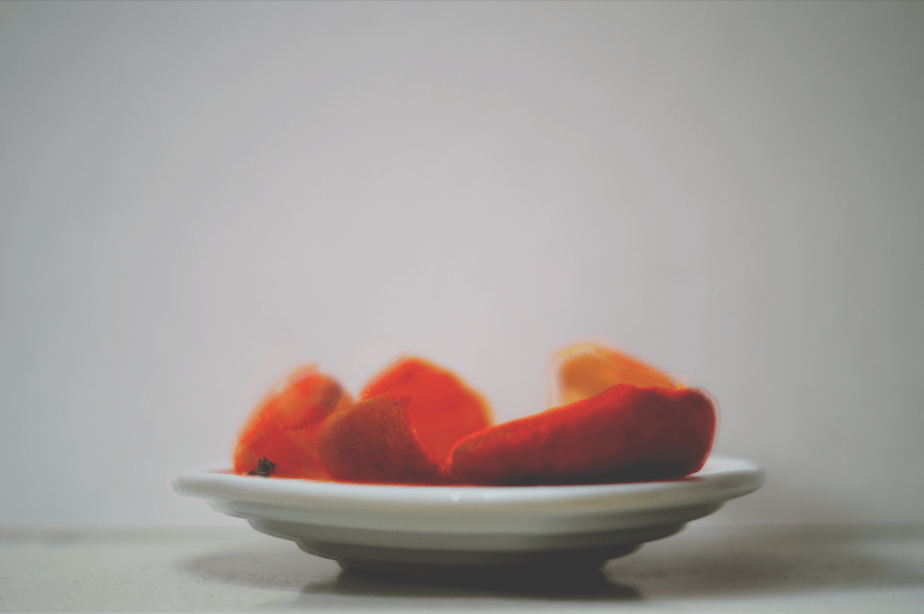
The time scales for this project were determined by the perishable goods I chose and the amount of time that seemed suitable enough to show signs of decay. Fruit peels and fresh foods tend to perish quickly once the air gets to them, so I decided to capture a selection of 3 perishable foods across 4, 6 and 8 hours (see Fig. 10., Fig. 11., and Fig. 12). As seen in the contact sheets the foods began to curl, wilt and show signs of oxidisation within the first hour, the exact changes I wanted to document. Overlapping these pictures in photoshop allowed me to show the process items went through across their chosen timeframes, something we don’t usually see all at once. To the naked eye, we see signs of decay very slowly, not necessarily seeing all the tiny changes as they’re happening, so being able to capture the ‘invisible’ and see all of the changes, big or small is fascinating. Double exposures are ghostly in appearance, as can be seen in my research on Martin Dietrich. Despite my images not being taken within the camera, I wanted to achieve the same ghostly paths of time that Dietrich managed to produce without removing the colour to keep a sense of life within the photograph.
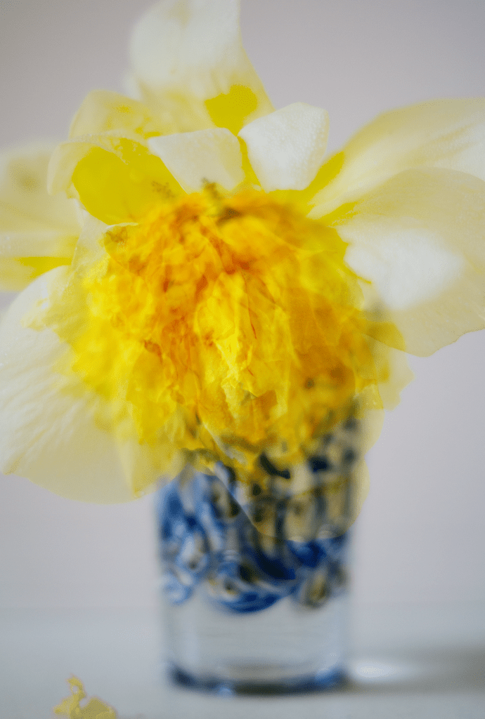
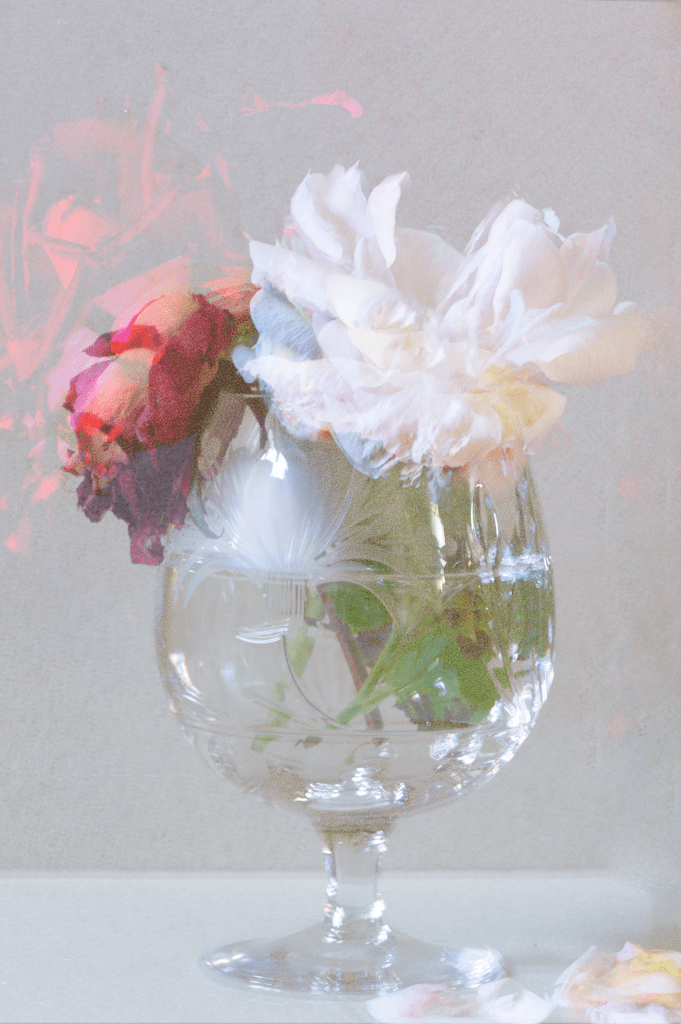
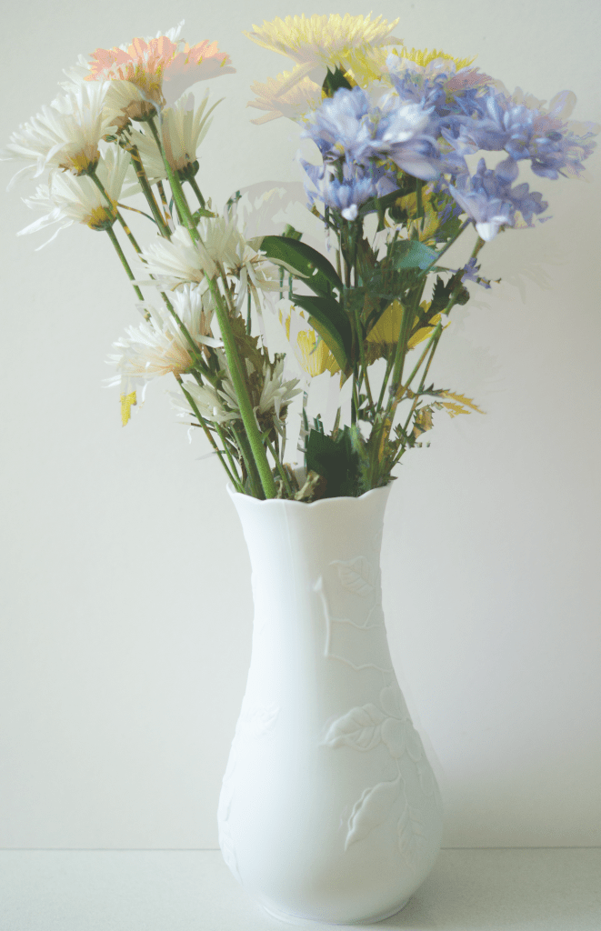
Flowers take a fair amount of time to wilt, depending on when they were picked and preserved, allowing me extra time to document the changes within them. The timescale for the flower images were 4, 8 and 12 days. Increasing the number of flowers showed the differences between each variety and their life expectancies. 12 (see Fig. 9) was taken across the space of 4 days, with no water to keep them fed, so the time it took to wilt was almost immediate compared to the other flower images, both of which had more foliage and water to prolong their life.
After adjusting the exposure levels and temperatures, I used various blending modes to create my desired imagery. ‘Lighten’ allowed the images to become slightly transparent and ghost-like, lifting the exposure slightly, doubled up with ‘multiply’ brought back the shadows and textures within the overlapped images. Alternating blends and opacity levels allowed each image to be seen throughout the image while documenting various textures, shapes, colours and life paths.
As seen in the contact sheets, I also attempted to take pictures of frozen foods melting across a few minutes, however, it was unsuccessful. There wasn’t enough time between the shots, to show any changes and present the desired outcome in post-processing.
Capturing the ordinary and overlooked items we see around us every day, whether that be the food that feeds us or the flowers that make our homes looks pretty, makes you realise how beautiful they are too. Taking influence from Nigel Shafran, who shot a lot of his work in a domestic environment and took the imagery of mundane subjects we have learnt to ignore, has allowed me to respect the life and death of the things around us. Not everything lasts forever; items eventually break down and become nothing, which is why the mundane is special and no less important than the most extraordinary subjects. Each life cycle is unique, neither two are the same; this alone makes the project indecisive, numerous images and moments are involved.
Final Images
Fig. 7. 4 (2020)
Fig. 8. 8 (2020)
Fig. 9. 12 (2020)
Fig. 10. Four (2020)
Fig. 11. Six (2020)
Fig. 12. Eight (2020)
Reflecting on my initial thoughts surrounding the (in)decisive moment, I feel as if I have successfully explored what it means to me. Removing context; like many artists have done when capturing their own (in)decisive moments, allow the viewer to come up with their theories, what one person may think about this set of images may be different to somebody else. The decisive moment felt black and white and straightforward to me, almost telling the story to those viewing it. (In)decisive moments, however, show a multitude of paths and moments, all of which are unique and wonderful. The varying opacities throughout this set show movement and colour changes. Highlights and shadows capture the transitions from each minute, hour or day and the changes in light, textures in the shot, fallen petals or gatherings of dust. Centralising the subject, removing the background and fixing the frame isolates the focal point, with very little to distract the eye from it. There is so much happening mid-frame that you do not need the hustle and bustle of a busy street to document a unique and extraordinary image. The grain and pops of colour within the images create a vintage and film-like finish, much like Nick Waplington’s works of art, saturated in some areas and desaturated in others.
Reflection:
– I’m proud of the images I have ended up with and the process I took to get them.
– The research I did, has helped me understand both the decisive and (in)decisive moments in a much clearer way and the differences between the two, albeit small.
– These shoots have made me more appreciative of the mundane, as well as the life and death cycles of nature.
– It’s inspired me to explore double exposures in further detail and perhaps take some of my own in-camera sometime in the future.
– I’ve become more aware of the importance of composition and the set-up of a shoot, removing items in the background e.t.c.
List of images:
Figure. 1. Powell, L. (2020) Contact sheet 1 [pdf, screenshot] In possession of: Lauren Powell: Eastleigh.
Figure. 2. Powell, L. (2020) Contact sheet 2 [pdf, screenshot] In possession of: Lauren Powell: Eastleigh.
Figure. 3. Powell, L. (2020) Contact sheet 3 [pdf, screenshot] In possession of: Lauren Powell: Eastleigh.
Figure. 4. Powell, L. (2020) Contact sheet 4 [pdf, screenshot] In possession of: Lauren Powell: Eastleigh.
Figure. 5. Powell, L. (2020) Contact sheet 5 [pdf, screenshot] In possession of: Lauren Powell: Eastleigh.
Figure. 6. Powell, L. (2020) Contact sheet 6 [pdf, screenshot] In possession of: Lauren Powell: Eastleigh.
Figure. 7. Powell, L. (2020) 4 [image] In possession of: Lauren Powell: Eastleigh.
Figure. 8. Powell, L. (2020) 8 [image] In possession of: Lauren Powell: Eastleigh.
Figure. 9. Powell, L. (2020) 12 [image] In possession of: Lauren Powell: Eastleigh.
Figure. 10. Powell, L. (2020) Four [image] In possession of: Lauren Powell: Eastleigh.
Figure. 11. Powell, L. (2020) Six [image] In possession of: Lauren Powell: Eastleigh.
Figure. 12. Powell, L. (2020) Eight [image] In possession of: Lauren Powell: Eastleigh.
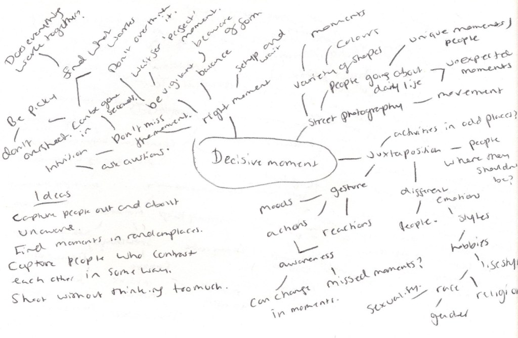
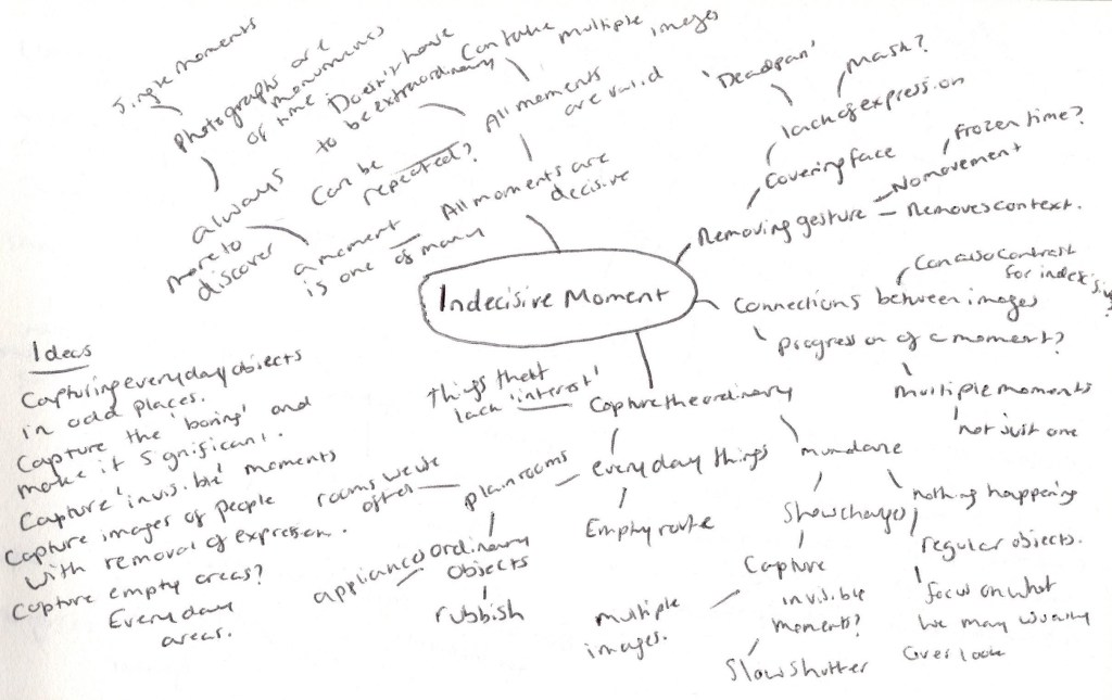
– Included the assignment brief for the (in)decisive moment. – Explained briefly that I have researched both moments in further details and considered the ability to shoot during lockdown. – Discussed why I am heading more towards the (in)decisive moment and working in a domestic environment. – Included photocopies of my mind maps for both in decisive and (in)decisive moment. – Written bullet points for each map, covering what I would achieve or find difficult with this particular approach. – Briefly touched upon my test shoot, including a contact sheet of the images and explored where I’m headed with my final shoot plan.
‘The (in)decisive moment’:
‘The decisive moment is not a dramatic climax but a visual one: the result is not a story but a picture.’ (Swarkowski, 2007, p.5) ‘You know it’s funny. You come to someplace new, and everything looks just the same.’(Eddie in Stranger Than Paradise, Dir. Jim Jarmusch, 1984)
Brief
Create a set of between six and ten finished images on the theme of the decisive moment. You may choose to create imagery that supports the tradition of the ‘decisive moment’ or you may choose to question or invert the concept by presenting a series of ‘indecisive’ moments. Your aim isn’t to tell a story, but in order to work naturally as a series there should be a linking theme, whether it’s a location, event or particular period of time. (Bloomfield, 2018)
Thoughts
Having researched further about both the decisive and (in)decisive moment, test shoots and taking into consideration that we have gone into another lockdown, I am heading more towards the (in)decisive moment, due to the fact street photography doesn’t feel like the safest option currently. The (in)decisive moment will allow me to capture imagery from a domestic environment, without feeling too restricted in terms of where I can go, what I can document, as well as who.
After completing a mind-map for both routes, there are clearer ideas for the (in)decisive one in comparison to the decisive, this, in turn, helps me understand what I am more comfortable with in regards to concepts, subjects, approaches and results.
Fig. 1. Decisive Moment (2020)
Reflection on decisive moment mind map (see Fig. 1).
– Would be out of my comfort zone as street photography isn’t something I do often. – Would have a variety of people and locations to work with and look out for. – More opportunities to capture something unique or unexpected. – It would push me to be more selective and intuitive about my shooting process. – Could play around with expressions, movement and context surrounding them. – Decisive moments would allow me to be more patient and aware of my surroundings, subjects, timing etc. – Perhaps more flexibility regarding the ability to create or capture juxtapositions. – Wouldn’t be safe to do so currently with the global pandemic. – Restricted on where I can go, travel or enter. – May not be as many people around due to the pandemic.
Fig. 2. Indecisive Moment (2020)
Reflection on (in)decisive moment mind map(see Fig. 2).
– I have more control of the composition and what I’m capturing. – Can remove context if necessary to create questions and tension. – Would be able to gather together multiple subjects within a safe environment. – Would link back to my preferred coursework “slow shutter speed”. – Playing around with the ordinary and bringing focus to the things we are used to is an interesting concept. – Could play around with empty areas, without breaking covid guidelines. – Allows me to have multiple chances to get an image I like, rather than missing a moment. – Maybe not outside of my comfort zone, so would have to figure out a way around it. – Restricted in terms of unique, unpredictable moments. – Restricted to my home which in some ways, will reduce the amount of opportunities I may be able to capture. – Would have to consider what I’m capturing, as I share a home with family.
Fig. 3. Test Sheet (2020)
Following my test shoots where I captured the gradual decay of fruits and flowers (see Fig. 3), I’ve decided to use this idea for my final shoot. Placing an object in isolation to something else would represent our current lockdown situation, without directly shooting images surrounding it. A play on words and subject if you will. Playing around with time, subjects and showing what is invisible, much like the research I did for coursework. I am planning this shoot, have set up a frame as well as time scale I will be shooting these images across, therefore these aren’t spontaneous moments as such as I am in control of them unlike decisive moments. Capturing the mundane indoors, rather than street photography. The removal of context by not having a background involved.
Shoot plan
– Capture the mundane and perishable goods. – Set up camera up in front of the item to decide the desired frame and adjust the focal length to assure an in focus end result. – Set up the item and leave it untouched until all images are shot. – Be aware that camera settings may have to be changed throughout the day depending on light changes. – Keep out of direct sunlight to avoid harsh light and shadows, as seen in my test shoot. – Keep shooting at pre-chosen times to document the changes that occur across a set amount of hours or days, before overlapping each picture in Photoshop. – Explore the idea of invisible time by creating a ‘double exposure’. We know time is passing each minute, but when can’t necessarily see it unless we isolate it. Metaphor for life and death?
– Researched the (in)decisive moment and compared it to the decisive moment.
– Summarised the differences and similarities between the two moments.
– Written about Nick Waplington, Martin Dietrich and Nigel Shafran, their lives, careers and approaches to their work.
– Analysed one of each image from each practitioner, exploring the techniques and messages I have gathered from their work.
– Reflected on the research as a whole.
Indecisive moment:
Unlike Henri Cartier-Bresson’s ‘Decisive Moment’, the (in)decisive moment seems to challenge the belief of a singular moment being the most important and unique by exploring the idea that all moments are just as important as the other and no less unique. Even if the moment doesn’t capture the most exciting of moments, as long as it means something and shows a passage of time, it’s still special.
Another difference between the two moments is that the (in)decisive moment tends to remove expression and gesture, by documenting “deadpan” moments, or the banalest of subjects. The lack of clear emotion may cause more questions to arise from the viewer as it may not be as clear as to how the subject is feeling or what is happening. ‘..the works’ bland expressions and lack of visual triggers, such as gesture, confound our expectations of discovering a person’s character through their appearance’ (Cotton, 2014, p. 106). For me, this ability to form questions, makes the imagery more flexible and interesting than a decisive moment, that more often than not, cuts straight to the point in terms of context and meaning.
While some planning takes place for a decisive moment, for example, setting up the camera in preparation for the perfect moment to fall within the frame at any given point, the photographer doesn’t have much control over the event or outcome of the image. The (in)decisive moment, however, feels like a more hands-on and regimented approach, whether that is through manipulation of movement, poses, expression, location or amount of images taken within a particular time.
Despite these differences, the two moments appear to be interchangeable and overlap in concept, for example, both require some form of planning and awareness of the outcome you’re hoping for, as well as the active decision to press the camera shutter at a specific time rather than spontaneously. Bearing these things in mind, I’m not sure if they can be considered two separate approaches or not?
Nick Waplington – (1965- )
Nick Waplington is a British artist; based between London and New York, mostly known for his contemporary photography practises but not limited to, as a painter, sculptor and has explored the world of video. Boundaries have been pushed and explored throughout his work, shown by the juxtaposition of traditional and new media (1972 Agency, 2020). Waplington’s collaborations with artists such as Alexander McQueen, Miguel Calderón and David Shrigley, further confirm this desire to create and work with those who produce something out of the ordinary.
The topics documented throughout his work, range from the daily lives of working-class people, youth culture, his family, businesses or organisations expanding globally (1972 Agency, 2020). Subjects like these may seem mundane to some but are without a doubt, impactful once you start to analyse the meaning or feelings Waplington is trying to portray.
Living Room (1991) is the first project Waplington published as a young man, shortly followed by an exhibition in 23rd Street Gallery, New York and then globally for a few years after. The prints were put into storage and requested to be destroyed, ‘having moved on to new projects’ (Juxtapoz, 2019). However, it was discovered in 2018 that Waplington’s gallerist Holly Solomon never got rid of the prints, were still in possession of her son Thomas and have since been presented by Little Big Man for the first time in 26 years.
Fig. 1. Living Room (1991)
Living Room (1991), is a series of images taken across four years, documenting the daily life of two families who lived on the same council estate as his grandparents in Nottingham.
It gives us an insight into the lives of people we have no connection with, as well as capturing the struggles and differences that families faced due to industry collapse, unemployment and poverty caused by a decade of a neglectful conservative government (Bint photoBooks, 2016).
The chaos portrayed (see Fig. 1) encapsulates the historical turmoil going on at the time. A time full of uncertainty and disorganisation, mixed emotions and lack of stability in the area. Waplington’s use of a fast shutter speed has frozen at least eight different moments in time, if not more that we cannot see directly. The child on the right, has a deadpan expression, distracted by something out of the frame, are they talking to somebody? Has someone caught their attention? We aren’t aware of the cause, allowing us as the audience to explore further and try to put the pieces together, using the rest of the picture as context. Midframe, we have someone who seems to be in conversation with another person, again, outside of the frame, but it isn’t clear how they are feeling or whether they are aware of the two children trying to either get their attention or grab the bag that is at an arms reach. The worried face of the child to the left is somewhat humorous. It feels as if they are trying to prevent the curtains from being pulled down or other mischievous events occurring while the adults are distracted by other things. There is a faint orb-like blur to the bottom right of the image, perhaps created by a light source just outside of the frame, smoke from the right, a smudge on the lens, or a small imperfection with the film or printing process. Waplington has shot this image at a very slight angle; whether that is intentional or not, the tilt enhances the mayhem shown in the photograph, ‘imperfect’ and unbalanced, much like daily life. Saturated colours and the grainy nature of film photography, not only shows the difference in photography practises and cameras from just a few decades ago, but makes the images feel much more intimate, soft and nostalgic. They’re not crisp, vibrant pieces that uniquely grab the viewers eye. Instead, the imagery is natural, full of life and movement, but still unique.
Martin Dietrich – (1980’s – )
Martin Dietrich is a Fine Art Photographer based in Frankfurt, Germany, mostly known for his architectural and street photography. Dietrich’s journey with photography started in 2009, as a way to balance his day to day job which is ‘full of numbers’ as a tax auditor (Dietrich, 2016), something that has only continued to grow and help other young artists besides himself with the Neoprime International Fine Arts label, founded in 2014.
Abstract, minimalism and geometrics within nature, are Dietrich’s main focus areas, continually explored through his architectural and street photography. Exploring the locations in question, inspires him to come up with concepts that may not be suitable for the chosen surroundings, in turn creating abstract compositions that allow multiple and endless paths for the viewer to explore. According to Dietrich, removing a subject out of its usual context can hide the original story or meaning behind the image, therefore creating a whole new picture, whereas minimalist images are straight forward, reduced to one subject or exciting element, a complete juxtaposition to his abstract work (Dietrich, 2016).
Growing up in a city has meant that urban life is extremely familiar and has fascinated him for years. Street photography documents real moments ‘frozen in time forever and yet offers so many different interpretations, stories and meanings. Street Photography is by no means artificial, it’s the real world, with real characters and real moments’ (Dietrich, 2016).
Dietrich’s double exposures have been created by using slow shutter speeds, in combination with moving the camera to create what he calls an ‘abstract sketch’ (Dietrich, 2016).
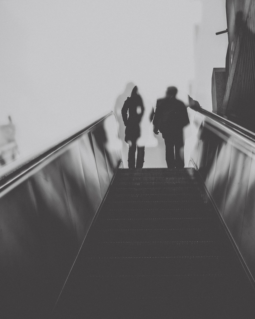
The Ghosts That Carried Us Away (2014), consists of 7 black and white double exposures of various people riding an escalator and climbing the stairs, documenting movement, time and indecisiveness. All double exposures were shot in-camera using a Fujifilm X-Pro 1.
Fig. 2. The Ghosts That Carried Us Away (2014)
This image (see Fig. 2) combines both abstract and minimalism into one complete frame. The lack of expression and context given from the blurred silhouettes in the background, due to their backs facing the camera, formulates a list of questions. Are they a couple? Are they strangers? Are they happy? Angry? In conversation? What are they doing? Where are they going?
Dietrich has perfectly backed up his view of abstract work and how removing part of a subject, can carve out multiple paths for the viewer to go down and explore. Black and white photography, not only enhance the highlights and shadows, the textures and shapes within the frame, but it also removes the influence that colour may have on the picture. It could be a beautiful sunny day, but without the help of colour, for me, this composition documents a gloomy day, in what feels like a silent city.
By isolating the escalator, a small part of a building and capturing the negative space surrounding them on the left, allows me to understand that the subjects are in an urban location and shows the minimalist elements within the photograph.
However, the position of the camera in comparison to the people prevents us from seeing anything else beyond that. We could assume they’re on top of a building or walking into a mall, but we cannot be sure without further information, that’s what makes it so interesting. The rule of thirds and leading lines work perfectly together, as the eyes are drawn from the bottom of the frame, right up to the main focal point at the top, taking you on a journey and moving the viewer through the image as an escalator would do. Slow shutter speeds don’t freeze a moment, they follow the moment and capture the path taken during the time the shutter is open, so instead documents multiple ‘invisible’ moments in one frame and is something I would consider to be indecisive.
Nigel Shafran – (1964 – )
Nigel Shafran is a well-known photographer and artist based in the UK, having established himself as one of the most respected fashion photographers in the 1990s (James Hyman Gallery, n.d). Much like Nick Waplington, Shafran is passionate about capturing day-to-day life, the ordinary and overlooked subjects that surround us. Unlike most photographers who have explored the decisive moment and aim to capture the unique, the extraordinary and ‘never to be seen again’ moments in time, Shafran explores the beauty in the mundane and accepting what we have around us.
His work is so casual, so familiar and domestic but still beautiful, full of life and uniqueness.
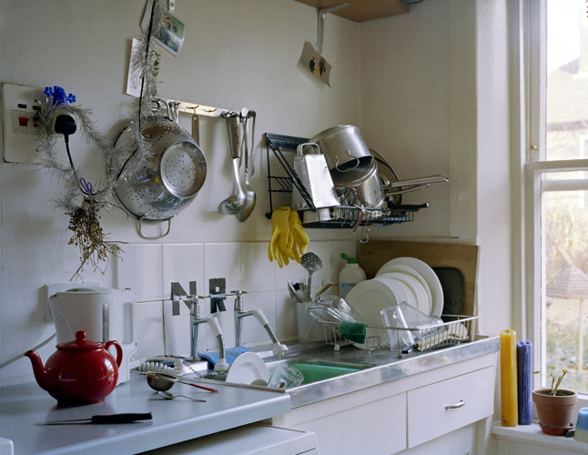
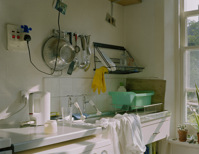
Washing up (2000) is a series of images taken across an unknown time, capturing the chaos and daily findings of a kitchen. Something all of us can relate to and find comfort in, making this project somewhat personal without it being so.
Fig. 3. 001washing_up (2000)
Fig. 4. 013washing_up (2000)
The consistent framing between these two images implies that a tripod was used, or some form of stable surface for the camera to sit on to document the changes within this kitchen without having to change location or composition. They are very much the same, yet different.
001washing_up see Fig. 3) looks to have been taken while the sun was fully out and out of reach of the window, creating a cold atmosphere due to the lack of sunbeams, blue tones and grey shadows within the picture. Tinsel is hanging off of the wires, just above the red teapot, enhancing the fact that this photograph could’ve been taken on a cold winters day. To the right, is a potted plant that seems to be dormant and withering away, the natural circle of life. There is crockery everywhere, in the sink, on the draining board, a knife has been left out on the side and the pots and pans in the top right are screaming indecisiveness and chaos.
013washing_up (see Fig. 4) is slightly more organised, tidier and warm. In comparison to Fig. 3. this image appears to have been taken during the morning, just as the sun is rising. Shadows in this composition are soft, as is the light on the walls and surfaces, making it feel more homely and welcoming. Despite the differences between the two photographs, the mess, the lack of decision making and the reality of the busy lives we lead, the pictures on the walls are still the same, the blue figurine on the plug socket is still in its usual place, the kettle and rubber gloves are where they belong.
They may not be the most outstanding photographs taken, but they document life, the changes that we make, the life and death of nature, the rise and fall of the sun. These pictures have captured time and how it evolves, which I think is just as important as capturing one unique moment in time.
Reflection:
– The (in)decisive moment doesn’t have to be something extraordinary or unique and is very much similar to the decisive moment, in terms of planning and setting the camera up to capture the moments.
– The ordinary can be the most beautiful and interesting subjects to capture and explore.
– No one moment is unique and all capture important moments in time.
– The ‘Decisive’ moment is the moment you decide to capture, when and where.
– The (in)decisive moment doesn’t mean you don’t have to prepare and look for fruitful moments.
– The (in)decisive moment captures a period or path of time, rather than one moment.