
For this assignment, we had to revisit one of the exercises from part four of this course and develop it into a formal piece. The exercises explored natural light, artificial light or controlling light, from which I chose the last. Photographers can use the light provided to them at the time or take it into their own hands to get the shadows and highlights they require.
The final images for my assignment were black and white, 360-degree mirrored images of the cross-sections of fruit and vegetables. I took the techniques from exercise 4.3, ‘Egg or stone’, lit the subjects from underneath with a light pad to create a highly contrasted yet 2D image full of detail to prevent the work from being flat and lifeless.
Doug McKinlay made a tutorial on capturing slices of fruit, vegetables, flowers and other translucent items with a lightbox and macro lens. Overexposing the images by one or two stops prevents the background from being dull and grey (McKinlay, 2017), enhancing the bright whites and colours of the subject. McKinlay shot his images without a tripod by bumping the ISO up enough to allow for a fast shutter speed, avoiding camera shake. I intended to use a tripod for my photoshoot to prevent any blur, yet, the lens was not close enough to the slices, forcing me to go handheld and use the advice from the YouTube tutorial.
Andy Ellison is an MRI technician who tested his MRI scanner settings by scanning the cross-section of an orange. He was so impressed by the results that he created an entire series of images from fruits and vegetables, both static and animated Gifs of the scans. The scans inspired me to explore the idea of black and white film negatives, but on a much larger scale. Film negatives are the opposite of a fully developed print, ghostly yet beautiful. The denser areas are white or light grey, while exposed areas are dark grey or black, much like medical scans.
I combined ‘the use of lightbox and macro photography technique from McKinlay’s tutorial, Ellisons MRI scans and presenting them as individual prints like Gomez’ lumen prints; while keeping it unique’ (Powell, 2021). My SONY A57 settings were manual, with an ISO of 1600, aperture of F/2.8., a range of shutter speeds depending on the subject and the light intensity.
The light source for the photoshoot was an A4 LED light pad, set to the highest setting and covered by a sheet of white paper to block out the dots on the surface. Overexposing the image like McKinlay suggested prevented the background from going grey and dulling the slices of food. Shooting from above flattened the subject while keeping the shadows and highlights balanced. Using a shallow depth of field caused the camera to focus on the areas closer to the lens. As a result, it created a soft eerie effect on some of the images when converted to black and white. The macro lens allowed me to examine the fruit and vegetables more intimately, enhancing the small details within the flesh and how they are grown.
Using photoshop to invert the images and convert them to black and white using a B&W filter and gradient map allowed me to achieve the ‘negative film’ and scan effect that I was hoping to replicate. Enlarging the canvas and duplicating the individual shots to create a 360-degree symmetrical piece intensified the details and shapes within the photographs selected from my shoot.
The final images are complex, highly contrasted, full of texture and shapes, much like an MRI scan or x-ray would be of the body. The context for these pieces is limited. Viewers can analyse and come to their conclusions about the images, what they mean, what the subject is, similar to Hermann Rorschach’s inkblot tests where people describe what they see within the abstract art. Each response is different depending on the person, making the art more captivating.
Presenting the photographs as strong individuals allows each piece to be appreciated, rather than a pair of average images complementing one another to create a set. The vertical order of the pictures enables the collection to become a powerful group of ‘scans’ from head to toe.
The most compelling images for me are Scan 1 and Scan 3, as they are ripe with texture, contrast, shapes and details. They look like flesh, with the addition of tougher and denser areas throughout, balancing the composition as a result. Heavy black areas represent the bright white areas created by the light pad placed underneath the translucent slices. Intense white areas show the thicker and less exposed elements within the fruits and vegetable makeup. Even though the photographs are flat and two-dimensional, the artificial arrangement of the images creates a complex and exciting art piece from what were individual shots.
Taking images of the fruits and vegetable so closely filled the frame and included little background, causing some of the photographs to be too bright when inverted and providing little or no dark areas to frame the subject like most of my final pieces. Making sure the arrangements balanced before pressing the shutter, resulting in a better finish. Taking a little more time to compose is something I would consider doing more if I were to do this shoot again.
This assignment has been fascinating to explore as I pushed myself out of a comfort zone, experimented with controlled light and discovered the incredible results it could achieve. Every light source is just as good as the other if you know how to use each one efficiently.
References:
McKinlay, D. (2017) Light Box Art: Stay Focused with Doug McKinlay [Video] Available at: https://www.youtube.com/watch?v=kWiL5N-b4YM (Accessed 28th May 2021).
Powell, L. (2021) Further research and shoot plan [Blog post] Available at: https://laurenpowelloca.photo.blog/2021/06/07/further-research-and-shoot-plan/ (Accessed 7th June 2021).
Month: June 2021
Final image analysis and contact sheets
Assignment 4, Reflection on assignmentsSummary
In this post I
– Discussed the post-processing that took place to edit my final images, how it was achieved and why
– Included screenshots of the editing process before discussing which images were stronger and the weaknesses of others
– Inserted the annotated contact sheet including the final image edits and the pictures I was considering for presentation
– Included all of the final images as individuals in vertical order, allowing the images to be viewed as a group.
– Explored my reasoning for presentation, where my inspiration for the final pieces came from and the strengths and weaknesses in a short analysis
– Before reflecting on the process as a whole.
Post-processing
To create my final images I took my black and white inverted shots, enlarged the canvas by 4 (See Fig. 1), before creating three duplicates of the photographs and changing the orientations of each to mirror one another (See Fig. 2). As a result, this created multiple 360-degree pieces out of what was one image. The inspiration for these compositions came from Andy Ellison, an MRI technician who scanned fruits and vegetables as a way to test his MRI machine settings (Insider, 2013). Ellison’s work influenced me to produce a photograph that looked ‘beautiful, ghostly … like they could be part of the human body’ (Powell, 2021).
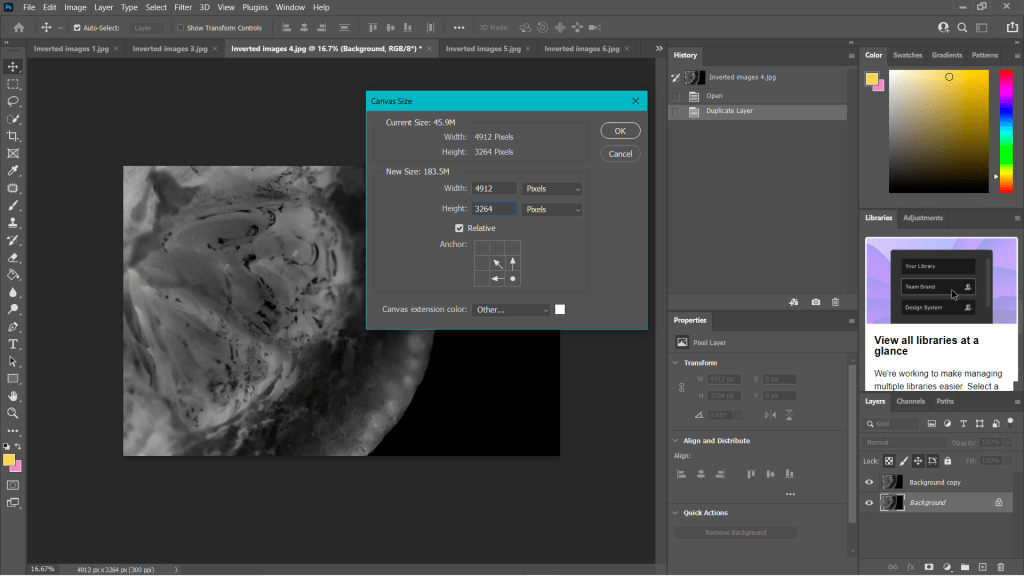
Fig. 1. Canvas (2021) 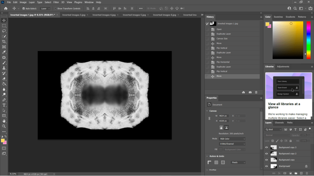
Fig. 2. Duplications (2021)
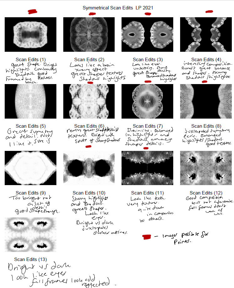
Some of the individual images weren’t strong enough when duplicated and turned into a mirrored image, as can be seen in my annotated contact sheet for these edits (See Fig. 3). Scan edit 5, was interesting in terms of texture and symmetry but wasn’t as exciting as the others due to the lack of shape, contrast and detail. On the other hand, scan edit 9 was overexposed, lacked texture and detail but had an interesting eye shape. Edits 12 and 13 were good composition-wise as the frame was full, juxtaposing the other images and documenting highlights more so than shadows. However, those particular images wouldn’t have been fitting when presented with the rest of the group because of this big difference; it would be quite jarring to look at.
The pieces with the red above them are the images I felt are the best of the collection, not only because of their comparisons contrast and details wise, but they each look like an individual body part. The similarities pull them together as a set, but the shapes and subjects allow them to be unique enough to tell their own story.
Final images
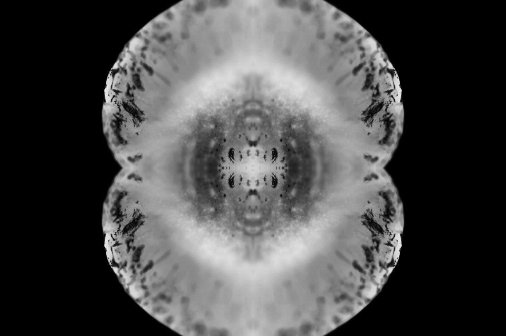
Fig. 4. Scan 1 (2021) 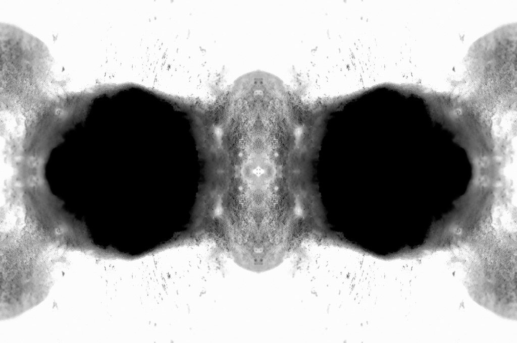
Fig. 5. Scan 2 (2021) 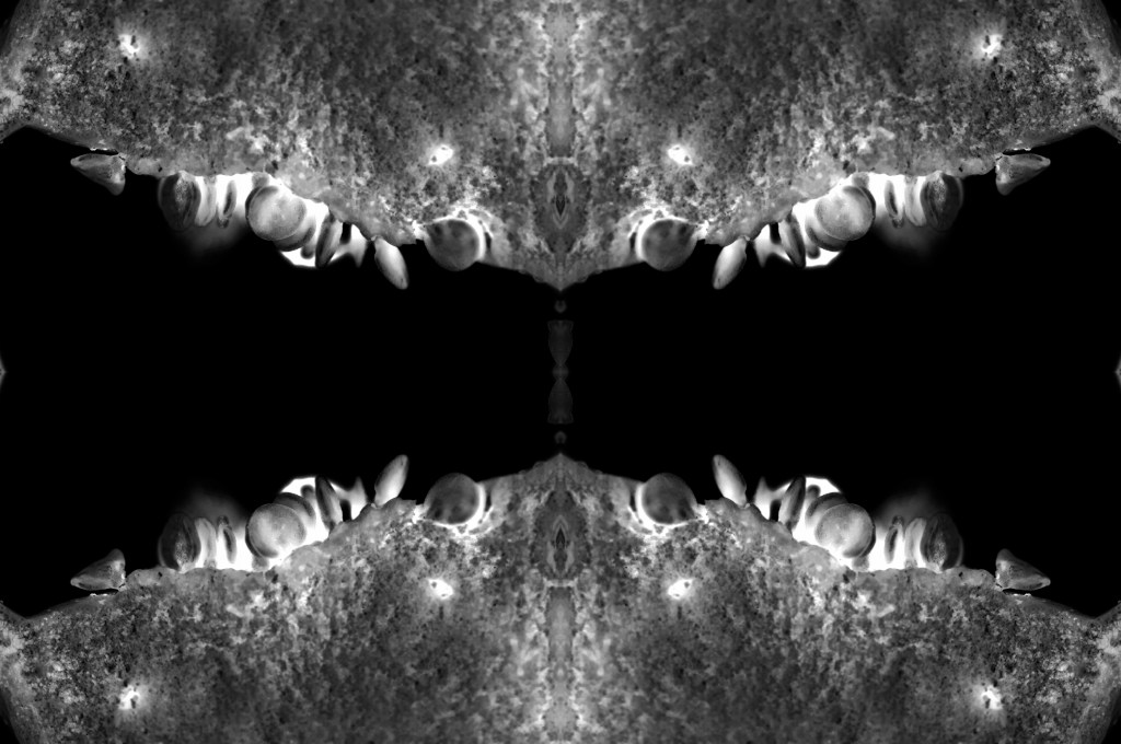
Fig. 6. Scan 3 (2021) 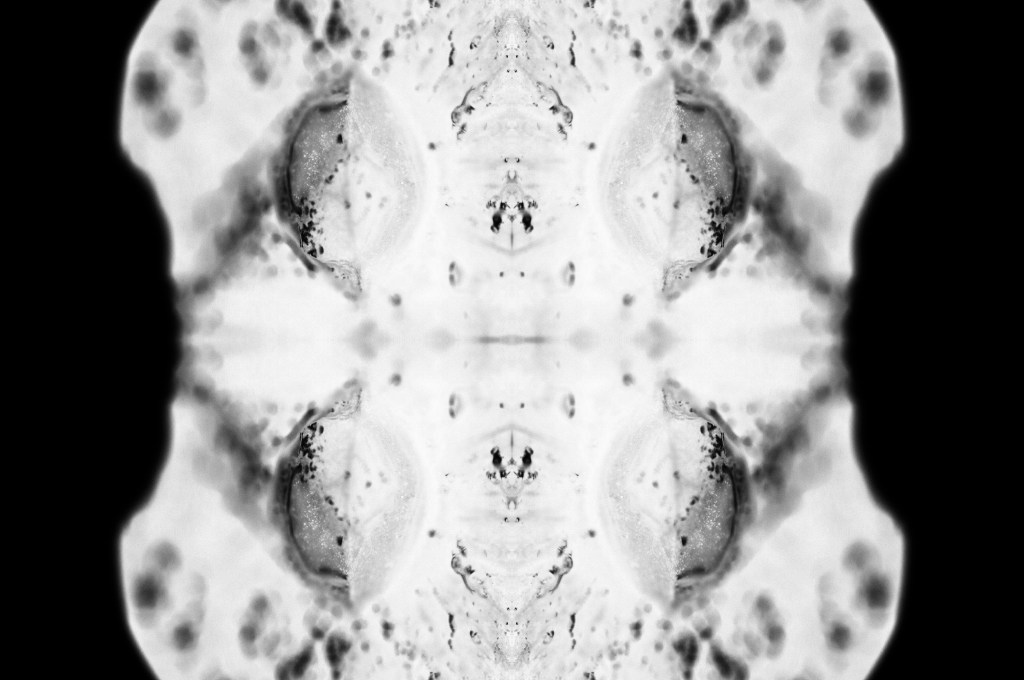
Fig. 7. Scan 4 (2021) 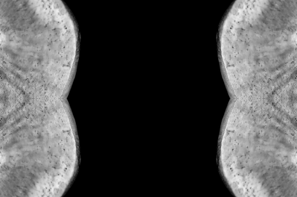
Fig. 8. Scan 5 (2021) 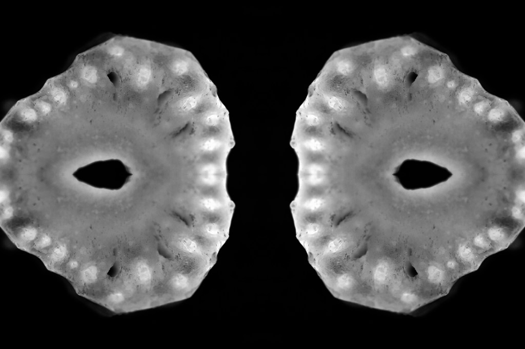
Fig. 9. Scan 6 (2021) 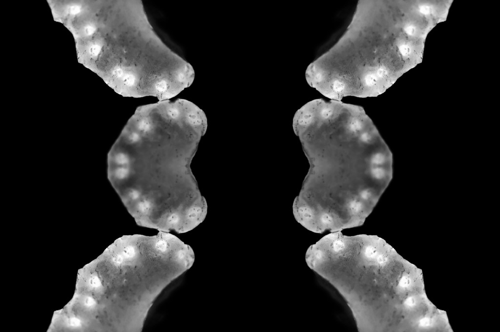
Fig. 10. Scan 7 (2021)
This assignment requires 6-10 high-quality photographic prints if you’re planning to submit for assessment, therefore, the editing for this particular set of images is important. The way your images are presented could heavily influence the way a viewer looks at the pieces and what they get from them. If you pick an art piece that isn’t as strong as the rest, the entire group could be less impactful and draw fewer people in.
I chose the presentation, and the order of my photographs was by referring back to my practitioner research and shoot plans. I wanted to explore the ‘aesthetic’ of film negatives, lumen prints and how ghostly they look after development. Instead of producing an image that reflected a typical black and white photographic print, the edits were inverted to represent an enlarged version of a negative film or black and white lumen print. The final edits reflected my study of MRI scans from Andy Ellison that document the thin and dense areas of the subject via heavy contrasts. Scans can ‘show the thicker areas that are blocking out most of the light or rays via a white or light grey image … ‘ (Powell, 2021) but aren’t limited to this, as denser areas can be darker while the thin areas remain whiter in some MRI’s or x-rays.
While looking at the final images, I noticed how much they looked like body parts or at least a mutated version of a body part. Printing the chosen images off allowed me to arrange the photographs in multiple orders to see what worked best and why. Eventually, I decided on the order shown above and sat with it for a few days before confirming that this was the arrangement I felt was suitable for this set. From the top downwards, we have images that look like the brain, eyes, a set of teeth, spine, torso, hips and legs.
The final set is balanced with shadows and highlights, full of detail, a range of textures and shapes. The shallow depth of field enhances the eerie effect seen throughout each image, especially in Scan 1 (see Fig. 4). There is a soft grey area just below all the crackled black areas around the edge of the fruit, that frames the middle of the image, enhancing the details within that area and the surrounding edges. Smudgy dark marks can be seen on the outer edges of Scan 4 (see Fig. 7) that look like an inkblot painting, bleeding into the paper and symmetrical all around. Scan 3 (see Fig. 6) is the strongest piece in my opinion, due to the range of tones throughout, bright highlights, dark shadows and mid-grey’s. The shapes look sharp in some places and blunt in others, the block of black in the middle of the frame intensifies the scary form of the fruit. Grooves and dents within the subject, give the image a fleshy texture, as a result providing some context as to what the object may be or how it may feel.
Reflection
This assignment has been interesting to explore as I pushed myself out of my comfort zone, experimented with controlled light and the results that could be achieved. I have managed to combine the use of lightbox and macro photography techniques from McKinlay’s tutorial, Ellison’s MRI scans and presenting them as individual prints like Gomez’ lumen prints; while keeping it unique and making it my work by taking influence from a past light project of mine from 2015.
The final images are strong, complement one another and present an interesting idea that doesn’t have a lot of context to it, unless you knew what the subject was and how the pieces were put together. This set allows the mind to analyse what is happening, inspect all of the details and paths within the photographs and the meaning behind them. It is a complex group of pieces that challenge the stereotypical use of controlled light and studio photography.
References
Insider (2013). Andy Ellison X-Ray Scans of Food. [online] Available at: https://www.businessinsider.com/andy-ellison-x-ray-scans-of-food-2013-3?r=US&IR=T (Accessed 28 May 2021).
Powell, L (2021). Further research and shoot plan. [online] Available at: https://laurenpowelloca.photo.blog/2021/06/07/further-research-and-shoot-plan/ (Accessed 7 June 2021).
List of images
Figure. 1. Powell, L. (2021) Canvas [Photoshop, screenshot] In possession of: Lauren Powell: Eastleigh.
Figure. 2. Powell, L. (2021) Duplications [Photoshop, screenshot] In possession of: Lauren Powell: Eastleigh.
Figure. 3. Powell, L. (2021) Contact Sheet [Adobe Bridge, screenshot] In possession of: Lauren Powell, Eastleigh.
Figure. 4. Powell, L. (2021) Scan 1 [image] In possession of: Lauren Powell, Eastleigh.
Figure. 5. Powell, L. (2021) Scan 2 [image] In possession of: Lauren Powell, Eastleigh.
Figure. 6. Powell, L. (2021) Scan 3 [image] In possession of: Lauren Powell, Eastleigh.
Figure. 7. Powell, L. (2021) Scan 4 [image] In possession of: Lauren Powell, Eastleigh.
Figure. 8. Powell, L. (2021) Scan 5 [image] In possession of: Lauren Powell, Eastleigh.
Figure. 9. Powell, L. (2021) Scan 6 [image] In possession of: Lauren Powell, Eastleigh.
Figure. 10. Powell, L. (2021) Scan 7 [image] In possession of: Lauren Powell, Eastleigh.
Contact sheets for photoshoot and edited images
Assignment 4, Notes, Reflection on assignmentsSummary
In this post I
– Described my shoot setup, the camera settings I used and any issues faced.
– Provided annotated contact sheets for the images taken for this photoshoot
– Before briefly explaining the annotations and why I chose those images to edit
– Included the contact sheets for the images I selected to convert into black and white
– As well as screenshots to show how it was done, referring back to my previous research
– Finishing the post off with a brief reflection on the images I shot and what I intend to do going forward
Shoot setup
For this shoot I initially intended to set my camera up on a tripod to keep the camera steady as the macro lens is quite heavy, however, this meant that the camera wasn’t as close to the cross-sections as I wanted them to be. As a result, I boosted the ISO to 1600 to allow for a faster shutter speed and a brighter exposure level. The weight of the lens made the process slightly more challenging as I had to manual focus too, but it was thankfully successful. To make the focal points more prominent when photographing any details the aperture was F/2.8 to allow for a shallow depth of field if taken at an angle to blur any background features. Overexposing the images slightly enhanced the brightness of the white background, like Doug McKinlay, suggested in his lightbox tutorial Light Box Art: Stay Focused (2017), preventing the image from looking dull and textured from the paper underneath.
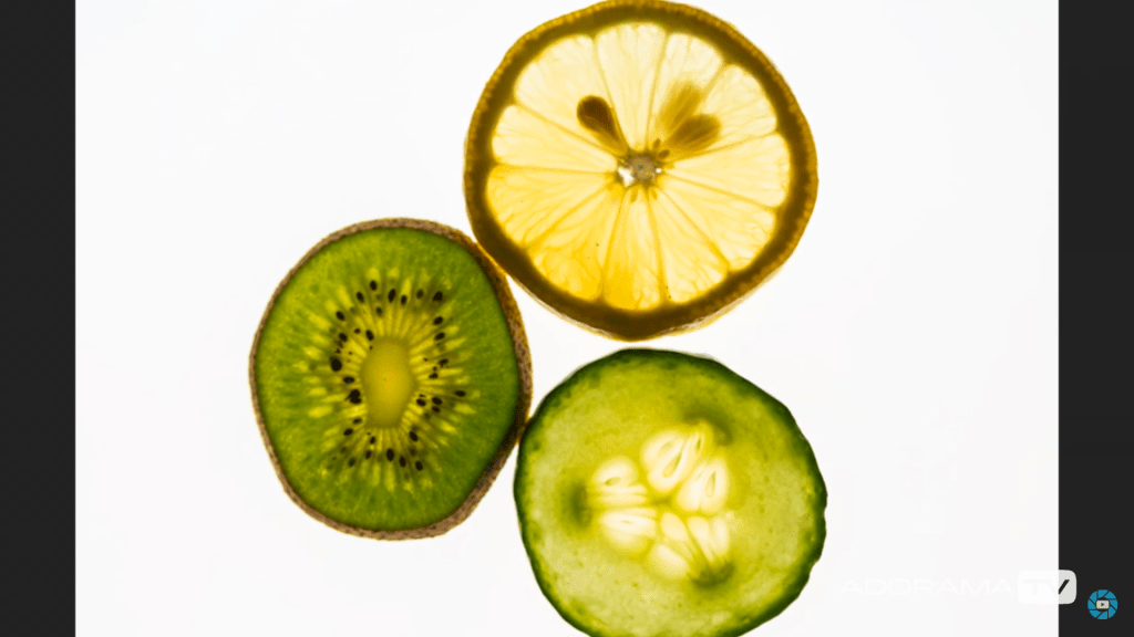
Rather than using a large lightbox, I purchased an A4 light pad which is much smaller and thinner, but bright enough to do the job. A variety of fruits and vegetables were bought in advance and sliced to provide me with a range of colours, shapes, textures to play around with when composing the image.
Contact sheets for photoshoot
Fig. 1. Contact sheet 1 (2021) 
Fig. 2. Contact sheet 2 (2021) 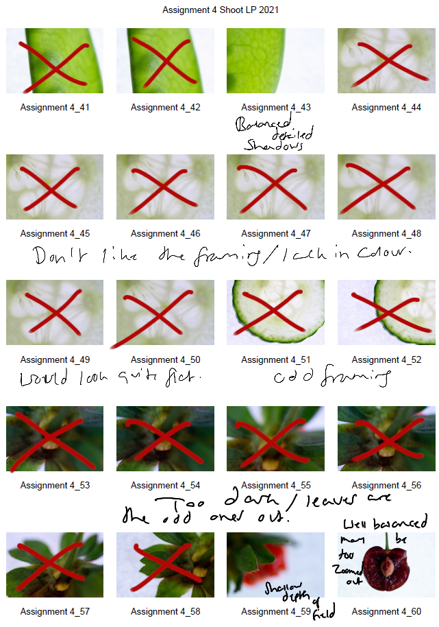
Fig. 3. Contact sheet 3 (2021) 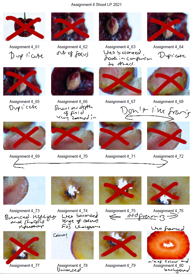
Fig. 4. Contact sheet 4 (2021) 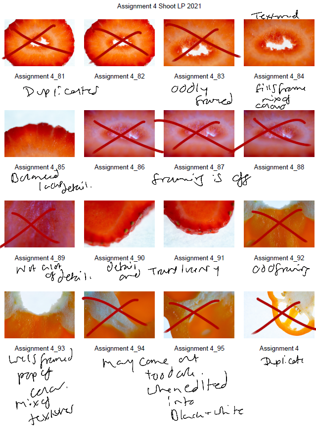
Fig. 5. Contact sheet 5 (2021)
The first set of contact sheets are for the shoot itself, including brief annotations to explain what I like about each particular shot, why I have crossed a majority out and what may become of them in post-production. After annotating and selecting my favourites from the entire photoshoot, I then took these images into photoshop and edited them to see what they would look like in black and white.
The images are as follows:
Contact sheet for edits
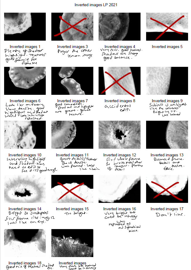
Fig. 6. Contact sheet 6 (2021)
To get the results shown in my contact sheets, I lightly corrected some of the shadows and highlights in the images that needed retouching before converting them to black and white. To change the colour is used the B&W tool and selected ‘blue filter’ (See Fig. 1) to enhance the contrast. To mimic an inverted image and MRI, I then used the gradient tool in reversed black and white (See Fig. 2).
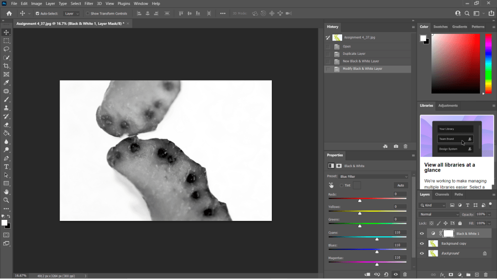
Fig. 7. Black and White (2021) 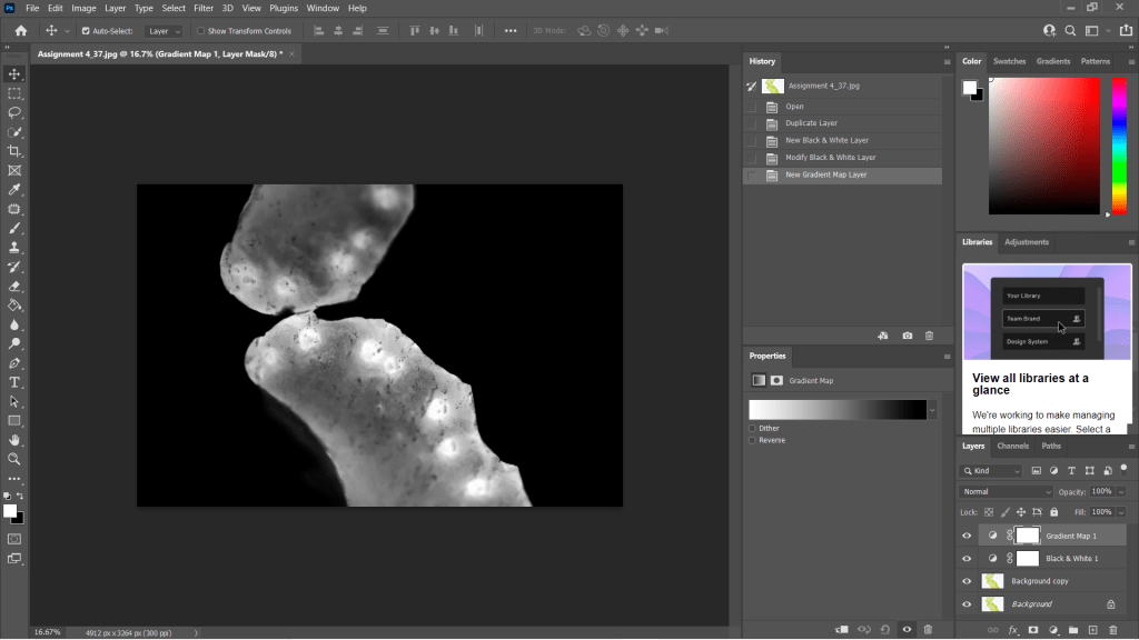
Fig. 8. Gradient Map (2021)
I wanted to choose a range of images to use in my final image edits, so I made sure to select shots that were heavily black in some areas and bright white in others, highly detailed or minimally textured for the remaining few. This gave me a wide selection to experiment with and create strong symmetrical compositions from. Showing variety was important to me for this photoshoot, appreciating multiple fruits and vegetable structures and juxtaposing between the imagery and reference the different kinds of scans as discussed in my previous research, ‘some scans may vary and present the denser areas in black or grey…’ (Powell, 2021).
Reflection
This photoshoot helped me appreciate the structures of the food we grow and eat, the minuscule details within them and how beautiful they are. I was able to be flexible with my plans for this shoot, not letting the weight of my camera ruin the imagery and changing the settings to work with what I had. Reviewing the images shown on my contact sheets allowed me to reduce the number of photographs needed in the initial post-production process and once again after they’d been edited to black and white.
Understanding the process in detail before doing the shoot, rather than briefly researching a concept and making things up as I go, helped this project to flow a lot smoother and resulted in some powerful images.
The final images will be in a separate post from this one, but I am thrilled with the selection chosen.
References
McKinlay, D (2017). (2017) Light Box Art: Stay Focused with Doug McKinlay [YouTube, screenshot] Available at: https://www.youtube.com/watch?v=kWiL5N-b4YM (Accessed 28 May 2021).
Powell, L (2021). Further research and shoot plan [online] At: https://laurenpowelloca.photo.blog/2021/06/07/further-research-and-shoot-plan/ (Accessed 28 May 2021).
List of images
Figure. 1. Powell, L. (2021) Contact sheet 1 [pdf, screenshot] In possession of: Lauren Powell: Eastleigh.
Figure. 2. Powell, L. (2021) Contact sheet 2 [pdf, screenshot] In possession of: Lauren Powell: Eastleigh.
Figure. 3. Powell, L. (2021) Contact sheet 3 [pdf, screenshot] In possession of: Lauren Powell: Eastleigh.
Figure. 4. Powell, L. (2021) Contact sheet 4 [pdf, screenshot] In possession of: Lauren Powell: Eastleigh.
Figure. 5. Powell, L. (2021) Contact sheet 5 [pdf, screenshot] In possession of: Lauren Powell: Eastleigh.
Figure. 6. Powell, L. (2021) Contact sheet 6 [pdf, screenshot] In possession of: Lauren Powell: Eastleigh.
Figure. 7. Powell, L. (2021) Black and White [Photoshop, screenshot] In possession of: Lauren Powell: Eastleigh
Figure. 8. Powell, L. (2021) Gradient Map [Photoshop, screenshot] In possession of: Lauren Powell: Eastleigh
Further research and shoot plan
Assignment 4, Online Research, Reflection on assignments, Thoughts & IdeasSummary
In this post I
– Discussed lightbox and food photography, following a short YouTube tutorial from Doug McKinlay
– Explored the details of his shoot set-up, camera settings and lighting choices
– Suggested the differences I would make if I were shooting this project and the type of subjects that can be used
– Before briefly analysing a screenshot of his work from the lightbox shoot.
– Researched the concept of MRI’s scans and the use of fruit and vegetable cross-sections
– Discussed the idea behind Andy Ellison’s scans and why he did them
– Explained the similarities between MRI’s and negative film, what they pick up and the differences we can find
– With a brief analysis of Ellison’s work and the contrasts between the two.
– Explored the technical approach for symmetrical and asymmetrical images, the balance and elements that make them what they are.
– While referencing a past project I did in 2013 and analysing an image from it to explain my understanding of the technique.
– Provided bullet points for my shoot plan for this assignment and a reflection on this post as a whole
– What it taught me and what I’d like to implement in my work.
Lightbox and food photography
Following my techniques research where I looked at macro, abstract photography and lumen prints, I decided to focus on lightbox photography and using a macro lens to explore my chosen subject in a more intimate, up close and personal way.
Doug McKinlay, a UK based photographer released a short YouTube tutorial in March of 2017, exploring lightbox art and ways to achieve some impressive shots from the comfort of your home. McKinlay’s set-up consisted of a large lightbox, placed on a few stools to avoid the camera being too close to the subjects, in turn causing the macro lens to struggle with focus. He gathered a variety of fruit and veg, sliced them into thin pieces and arranged them in a way that he felt was great for a strong composition. Using transparent or translucent items are ideal for this project, as light can pass through and highlight the details, rather than blocking light and becoming solid shapes.
McKinlay decided to set the aperture on his camera to F/8 allowing the depth of field to be even across the frame, however, suggested if the shutter speed isn’t high enough to shoot handheld then boost the ISO slightly without causing too much grain. I would use a tripod to steady the camera if the aperture was slightly wider and the shutter speed too slow to avoid handheld motion blur. Another tip that was suggested was overexposing by 1 or 2 stops, to avoid the camera light meter from turning the bright white light into a duller grey (McKinlay, 2017).
Depending on what you decide to photograph, their makeup and the thickness will influence the end product in a variety of ways, as can be seen in the screenshot I took from McKinlay’s tutorial (see Fig.1). The denser areas are darker and lack texture, whereas the thinner, more translucent elements of the fruit are lighter and full of texture, detail and colour. Being able to capture the tiny details and structure of the subject is fascinating, as it allows you to appreciate what it is made up of, how it holds itself together and what it might feel like if you weren’t already aware. In terms of composition, this isn’t my favourite as the layout isn’t the most exciting, however, the cold citrus colours and asymmetric segments, seeds and shapes make up for quite a simple subject placement. Overexposing the shot helped the background be crisp and white, preventing the background from looking dull and affecting the fruit slices as a result.
If I were doing this project, I would get closer to the subject, focus on the smaller details within the frame rather than the slices as a whole. Exploring the areas we don’t normally look at in much detail, removing context from the composition by cropping out some familiar elements with the lens, may encourage the viewer to appreciate what they are viewing for a little while longer.
MRI’s on fruit and veg research
Andy Ellison is an MRI technician at Boston University Medical School, who has produced multiple scans of the cross-sections of fruit and vegetables, following an MRI machine settings test with an orange slice (Insider, 2013). While fruit and vegetables aren’t at risk of tumours or bleed as a brain maybe, they’re still complex, held together by their fibres and flesh much like the human body. Lemons, for example, are made up of segments and have little fleshy pockets of juice within, while human skin is made up of cells that are all connected to create many thin layers to protect us.
Ellison’s scans are beautiful, ghostly and look like they could be part of the human body which wonderful to see how incredible nature is and the patterns that can be found within something that has grown from a tiny seed.
Much like photographic negatives, MRI’s I’ve briefly googled, tend to show the thicker areas that are blocking out most of the light or rays via a white or light grey image, while the more exposed areas show up as dark grey or black. Some scans may vary and present the denser areas in black or grey, while the emptier or thinner areas are represented with light grey or white, similar to a developed film print.
As seen in the scan of the pomegranate (see Fig. 2) the fleshier, cell-like seeds are bright white, while the thicker skin is grey. The shape of the fruit is asymmetric, defined, full of texture and detailed around the outer edges especially. Heavy shadows within the translucent seeds imply that there is a small yet thicker seed or pip inside. Removing colour allows the viewer to come up with their conclusion as to what is in front of them.
The MRI of the melon is the complete opposite (See Fig. 3) as the tougher, opaque part of the fruit is a lighter white whereas the transparent seeds in the middle remain dark black to imply overexposure. There are tiny veins that can be seen if you look at this photograph closely, something that makes the composition more exciting as the details are subtle, allowing the eyes to look further. The middle section of the melon seems to reflect itself too which may be an interesting concept to look into.
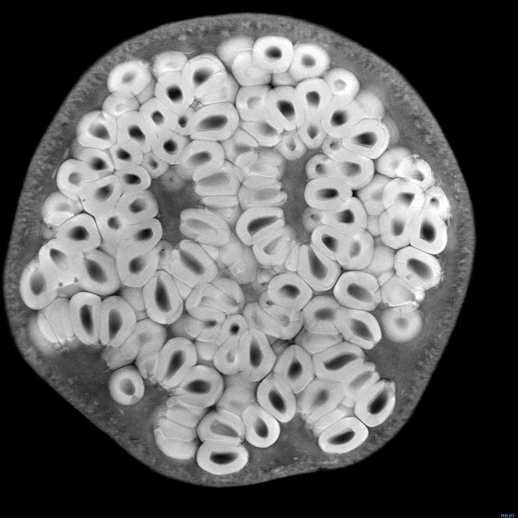
Fig 2. Pomegranate (n.d) 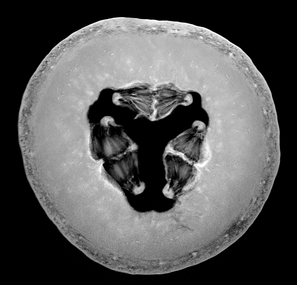
Fig 3. Melon (n.d)
Symmetry and reflection examples
As previously mentioned above symmetry and asymmetry is an interesting concept to consider within photography as it creates a sense of balance and intrigue to the composition. It would be possible to explore either one or both of these techniques when photographing fruits, flowers and any other object that naturally features a constant similarity pattern throughout.
Symmetrical photography is pretty straightforward and explains itself. The image is equally balanced all around, each section complimenting the other without having to be identical in detail all the time. For example, one half has a different shaped window frame to the one on the right-hand side of the image, but it’s still balanced and appealing.
Asymmetrical photography is a lot more clever and isn’t noticed straight away, which makes it more effective in my opinion. Helen Kantilaftis wrote for the New York Film Academy about photographic balance. They explained that despite an image having differences in shape and size, it is still balanced via the highlights, shadows and interesting use of filling space, making it an asymmetrically balanced image (Kantilaftis, 2014).
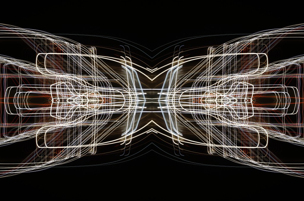
I’ve explored symmetrical photography in post-production (see Fig. 4), for a project that featured light paths from moving cars at night. After enhancing the highlights and shadows within the original image, boosting the contrast of the blacks and coloured lights, I copied it 3 more times and changed the orientation to create a 4 way mirrored image. This drew more attention to the shapes, curves of the light and the various colours, turning it into a bigger photographic light drawing. Negative space framed the busier details, preventing the composition from being too energetic and balancing it back out. Contrast is the ratio between the highlights and shadows, an element that is also levelled out within this photograph to avoid the lights being over or underexposed. If the original image hadn’t been mirrored, it would most like be asymmetric or diagonal in symmetry due to the negative space in the other half of the image.
Shoot plan:
– Take images of the cross-section of fruits and vegetables, backlit by a light pad or lightbox to emphasise the shape, details and light passing through the translucent areas.
– Focus on the details and lesser photographed elements of the subject with a macro lens set to manual.
– Maybe use a tripod to stabilise the camera, but make a judgement while shooting.
– Place white paper underneath the objects to enhance the background and prevent the camera from focusing on the reflection of the glass from the lightbox/pad.
– Set up the shoot in the conservatory on the floor to allow for different focal distances to be achieved, without having to stand on steps if it were shot on a higher surface.
– Edit the images in photoshop to black and white, before inverting the image or adding a gradient to mimic an MRI or X-Ray.
– Once the original image has been edited, copy and paste the photograph to create a quadruple mirrored image, to see what exciting results I can get.
Reflection
All of the research above has solidified what images I want to shoot, the subject I want to use and how I am going to use controlled light to create some strong compositions at the end of this assignment. The set-up may be fairly easy and cheap in terms of equipment, but planning and composing the image to draw the eyes in will take a lot of thinking, experimenting and technical knowledge to succeed. Pushing myself further by using a macro lens alongside a ‘studio’ light is going to help me grow both creatively and technically moving forward. In terms of presentation for this assignment, we are required to provide high-quality digital prints, so making sure I pick the correct images and layout will be something I’ll have to look into in more depth once the shoot is done.
References
Insider (2013). Andy Ellison X-Ray Scans of Food. [online] Available at: https://www.businessinsider.com/andy-ellison-x-ray-scans-of-food-2013-3?r=US&IR=T (Accessed 28 May 2021).
Kantilaftis, H (2014). Five Kinds of Photography Balance You Need To Understand. [online] Available at: https://www.nyfa.edu/student-resources/five-kinds-photography-balance-you-need-to-understand/ (Accessed 28 May 2021).
McKinlay, D (2017) Light Box Art: Stay Focused with Doug McKinlay [online video] Available at: https://www.youtube.com/watch?v=kWiL5N-b4YM (Accessed 28 May 2021).
List of images
Figure. 1. McKinlay, D. (2017) Light Box Art: Stay Focused with Doug McKinlay [YouTube, screenshot] Available at: https://www.youtube.com/watch?v=kWiL5N-b4YM (Accessed 28th May 2021).
Figure. 2. Ellison, A. (n.d.) Pomegranate [image] Available at: http://insideinsides.blogspot.com/p/high-resolution-still-images.html (Accessed 28th May 2021).
Figure. 3. Ellison, A. (n.d.) Melon [image] Available at: http://insideinsides.blogspot.com/p/high-resolution-still-images.html (Accessed 28th May 2021).
Figure. 4. Powell, L. 2015. Symmetry I [image] In possession of: Lauren Powell: Eastleigh.
