
Summary
In this post I
– Discussed the post-processing that took place to edit my final images, how it was achieved and why
– Included screenshots of the editing process before discussing which images were stronger and the weaknesses of others
– Inserted the annotated contact sheet including the final image edits and the pictures I was considering for presentation
– Included all of the final images as individuals in vertical order, allowing the images to be viewed as a group.
– Explored my reasoning for presentation, where my inspiration for the final pieces came from and the strengths and weaknesses in a short analysis
– Before reflecting on the process as a whole.
Post-processing
To create my final images I took my black and white inverted shots, enlarged the canvas by 4 (See Fig. 1), before creating three duplicates of the photographs and changing the orientations of each to mirror one another (See Fig. 2). As a result, this created multiple 360-degree pieces out of what was one image. The inspiration for these compositions came from Andy Ellison, an MRI technician who scanned fruits and vegetables as a way to test his MRI machine settings (Insider, 2013). Ellison’s work influenced me to produce a photograph that looked ‘beautiful, ghostly … like they could be part of the human body’ (Powell, 2021).
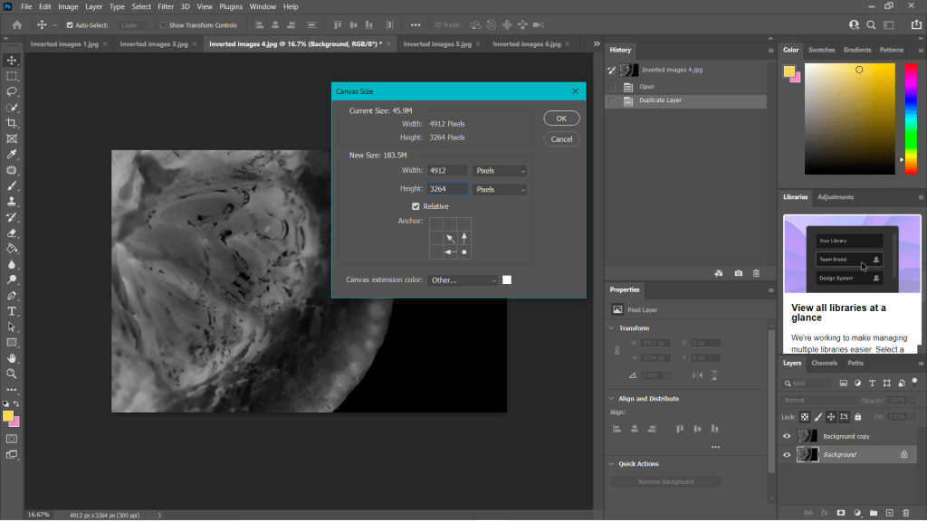
Fig. 1. Canvas (2021) 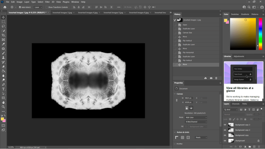
Fig. 2. Duplications (2021)
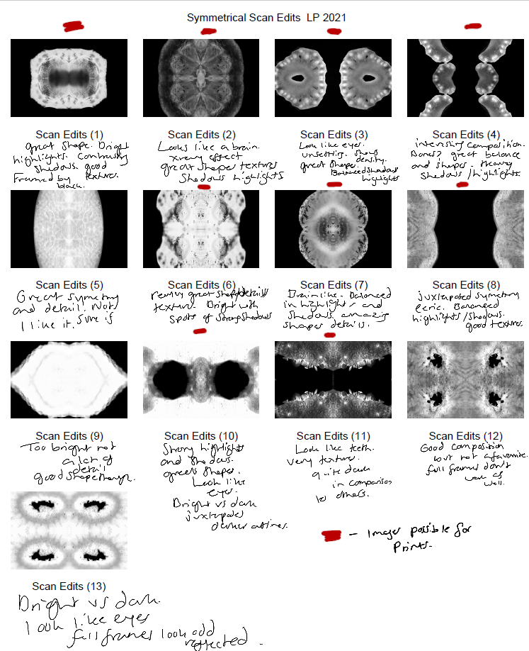
Some of the individual images weren’t strong enough when duplicated and turned into a mirrored image, as can be seen in my annotated contact sheet for these edits (See Fig. 3). Scan edit 5, was interesting in terms of texture and symmetry but wasn’t as exciting as the others due to the lack of shape, contrast and detail. On the other hand, scan edit 9 was overexposed, lacked texture and detail but had an interesting eye shape. Edits 12 and 13 were good composition-wise as the frame was full, juxtaposing the other images and documenting highlights more so than shadows. However, those particular images wouldn’t have been fitting when presented with the rest of the group because of this big difference; it would be quite jarring to look at.
The pieces with the red above them are the images I felt are the best of the collection, not only because of their comparisons contrast and details wise, but they each look like an individual body part. The similarities pull them together as a set, but the shapes and subjects allow them to be unique enough to tell their own story.
Final images
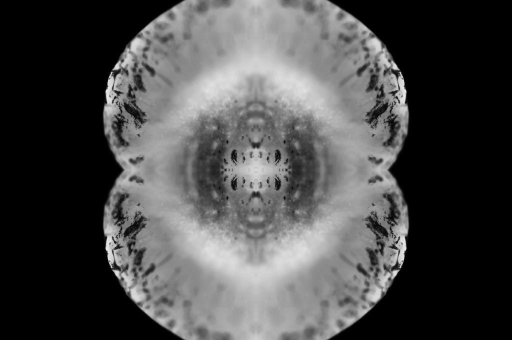
Fig. 4. Scan 1 (2021) 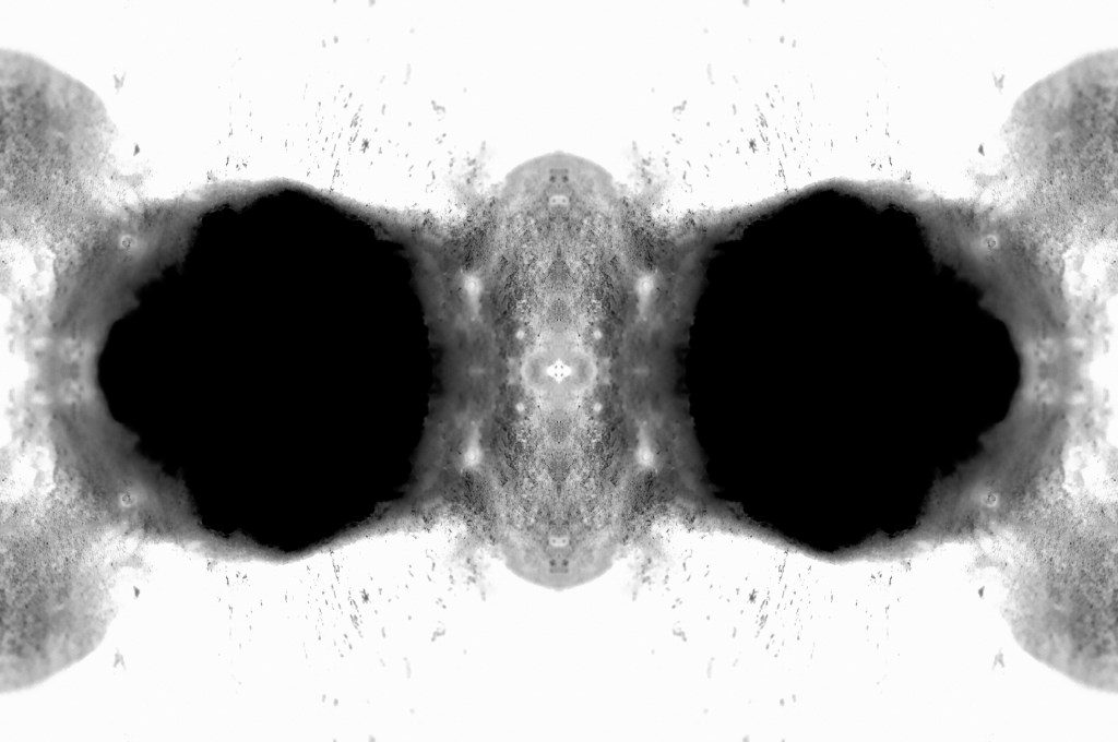
Fig. 5. Scan 2 (2021) 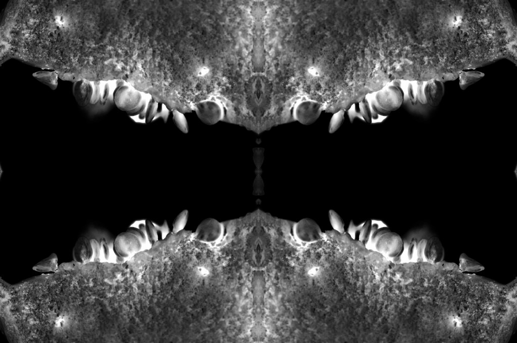
Fig. 6. Scan 3 (2021) 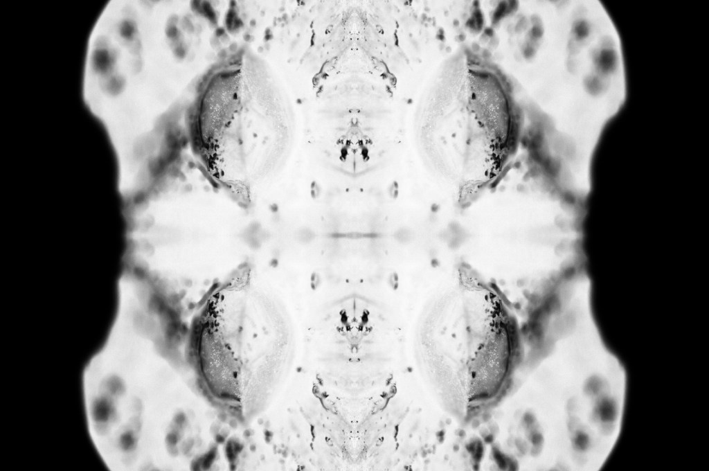
Fig. 7. Scan 4 (2021) 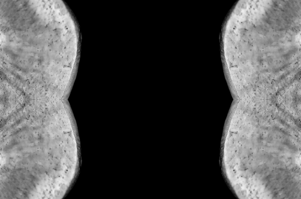
Fig. 8. Scan 5 (2021) 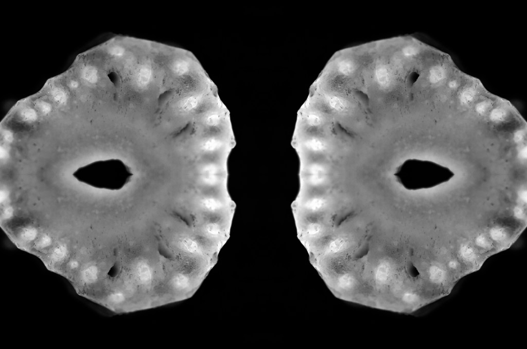
Fig. 9. Scan 6 (2021) 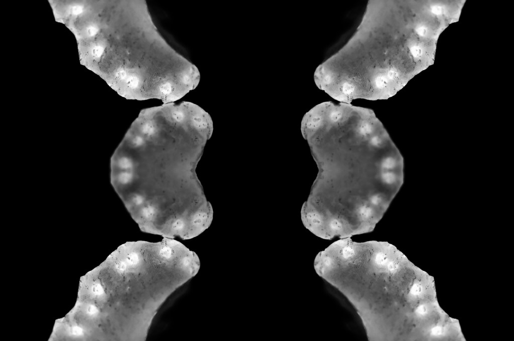
Fig. 10. Scan 7 (2021)
This assignment requires 6-10 high-quality photographic prints if you’re planning to submit for assessment, therefore, the editing for this particular set of images is important. The way your images are presented could heavily influence the way a viewer looks at the pieces and what they get from them. If you pick an art piece that isn’t as strong as the rest, the entire group could be less impactful and draw fewer people in.
I chose the presentation, and the order of my photographs was by referring back to my practitioner research and shoot plans. I wanted to explore the ‘aesthetic’ of film negatives, lumen prints and how ghostly they look after development. Instead of producing an image that reflected a typical black and white photographic print, the edits were inverted to represent an enlarged version of a negative film or black and white lumen print. The final edits reflected my study of MRI scans from Andy Ellison that document the thin and dense areas of the subject via heavy contrasts. Scans can ‘show the thicker areas that are blocking out most of the light or rays via a white or light grey image … ‘ (Powell, 2021) but aren’t limited to this, as denser areas can be darker while the thin areas remain whiter in some MRI’s or x-rays.
While looking at the final images, I noticed how much they looked like body parts or at least a mutated version of a body part. Printing the chosen images off allowed me to arrange the photographs in multiple orders to see what worked best and why. Eventually, I decided on the order shown above and sat with it for a few days before confirming that this was the arrangement I felt was suitable for this set. From the top downwards, we have images that look like the brain, eyes, a set of teeth, spine, torso, hips and legs.
The final set is balanced with shadows and highlights, full of detail, a range of textures and shapes. The shallow depth of field enhances the eerie effect seen throughout each image, especially in Scan 1 (see Fig. 4). There is a soft grey area just below all the crackled black areas around the edge of the fruit, that frames the middle of the image, enhancing the details within that area and the surrounding edges. Smudgy dark marks can be seen on the outer edges of Scan 4 (see Fig. 7) that look like an inkblot painting, bleeding into the paper and symmetrical all around. Scan 3 (see Fig. 6) is the strongest piece in my opinion, due to the range of tones throughout, bright highlights, dark shadows and mid-grey’s. The shapes look sharp in some places and blunt in others, the block of black in the middle of the frame intensifies the scary form of the fruit. Grooves and dents within the subject, give the image a fleshy texture, as a result providing some context as to what the object may be or how it may feel.
Reflection
This assignment has been interesting to explore as I pushed myself out of my comfort zone, experimented with controlled light and the results that could be achieved. I have managed to combine the use of lightbox and macro photography techniques from McKinlay’s tutorial, Ellison’s MRI scans and presenting them as individual prints like Gomez’ lumen prints; while keeping it unique and making it my work by taking influence from a past light project of mine from 2015.
The final images are strong, complement one another and present an interesting idea that doesn’t have a lot of context to it, unless you knew what the subject was and how the pieces were put together. This set allows the mind to analyse what is happening, inspect all of the details and paths within the photographs and the meaning behind them. It is a complex group of pieces that challenge the stereotypical use of controlled light and studio photography.
References
Insider (2013). Andy Ellison X-Ray Scans of Food. [online] Available at: https://www.businessinsider.com/andy-ellison-x-ray-scans-of-food-2013-3?r=US&IR=T (Accessed 28 May 2021).
Powell, L (2021). Further research and shoot plan. [online] Available at: https://laurenpowelloca.photo.blog/2021/06/07/further-research-and-shoot-plan/ (Accessed 7 June 2021).
List of images
Figure. 1. Powell, L. (2021) Canvas [Photoshop, screenshot] In possession of: Lauren Powell: Eastleigh.
Figure. 2. Powell, L. (2021) Duplications [Photoshop, screenshot] In possession of: Lauren Powell: Eastleigh.
Figure. 3. Powell, L. (2021) Contact Sheet [Adobe Bridge, screenshot] In possession of: Lauren Powell, Eastleigh.
Figure. 4. Powell, L. (2021) Scan 1 [image] In possession of: Lauren Powell, Eastleigh.
Figure. 5. Powell, L. (2021) Scan 2 [image] In possession of: Lauren Powell, Eastleigh.
Figure. 6. Powell, L. (2021) Scan 3 [image] In possession of: Lauren Powell, Eastleigh.
Figure. 7. Powell, L. (2021) Scan 4 [image] In possession of: Lauren Powell, Eastleigh.
Figure. 8. Powell, L. (2021) Scan 5 [image] In possession of: Lauren Powell, Eastleigh.
Figure. 9. Powell, L. (2021) Scan 6 [image] In possession of: Lauren Powell, Eastleigh.
Figure. 10. Powell, L. (2021) Scan 7 [image] In possession of: Lauren Powell, Eastleigh.
