
Summary
In this post I
– Described my shoot setup, the camera settings I used and any issues faced.
– Provided annotated contact sheets for the images taken for this photoshoot
– Before briefly explaining the annotations and why I chose those images to edit
– Included the contact sheets for the images I selected to convert into black and white
– As well as screenshots to show how it was done, referring back to my previous research
– Finishing the post off with a brief reflection on the images I shot and what I intend to do going forward
Shoot setup
For this shoot I initially intended to set my camera up on a tripod to keep the camera steady as the macro lens is quite heavy, however, this meant that the camera wasn’t as close to the cross-sections as I wanted them to be. As a result, I boosted the ISO to 1600 to allow for a faster shutter speed and a brighter exposure level. The weight of the lens made the process slightly more challenging as I had to manual focus too, but it was thankfully successful. To make the focal points more prominent when photographing any details the aperture was F/2.8 to allow for a shallow depth of field if taken at an angle to blur any background features. Overexposing the images slightly enhanced the brightness of the white background, like Doug McKinlay, suggested in his lightbox tutorial Light Box Art: Stay Focused (2017), preventing the image from looking dull and textured from the paper underneath.
Rather than using a large lightbox, I purchased an A4 light pad which is much smaller and thinner, but bright enough to do the job. A variety of fruits and vegetables were bought in advance and sliced to provide me with a range of colours, shapes, textures to play around with when composing the image.
Contact sheets for photoshoot
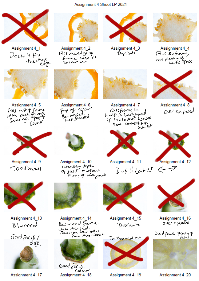
Fig. 1. Contact sheet 1 (2021) 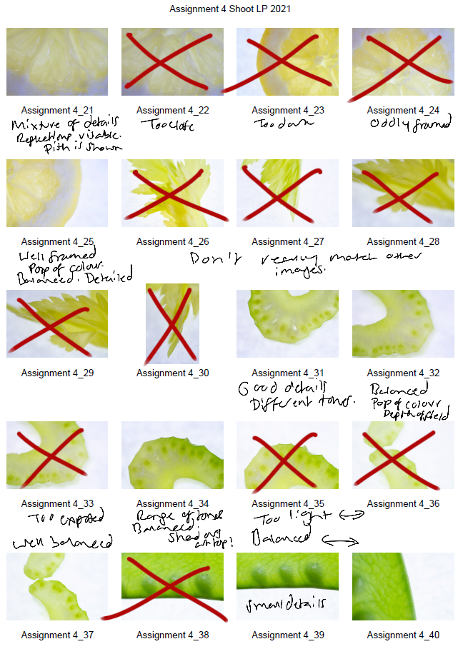
Fig. 2. Contact sheet 2 (2021) 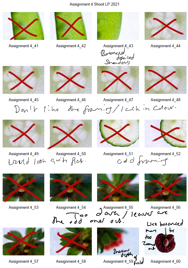
Fig. 3. Contact sheet 3 (2021) 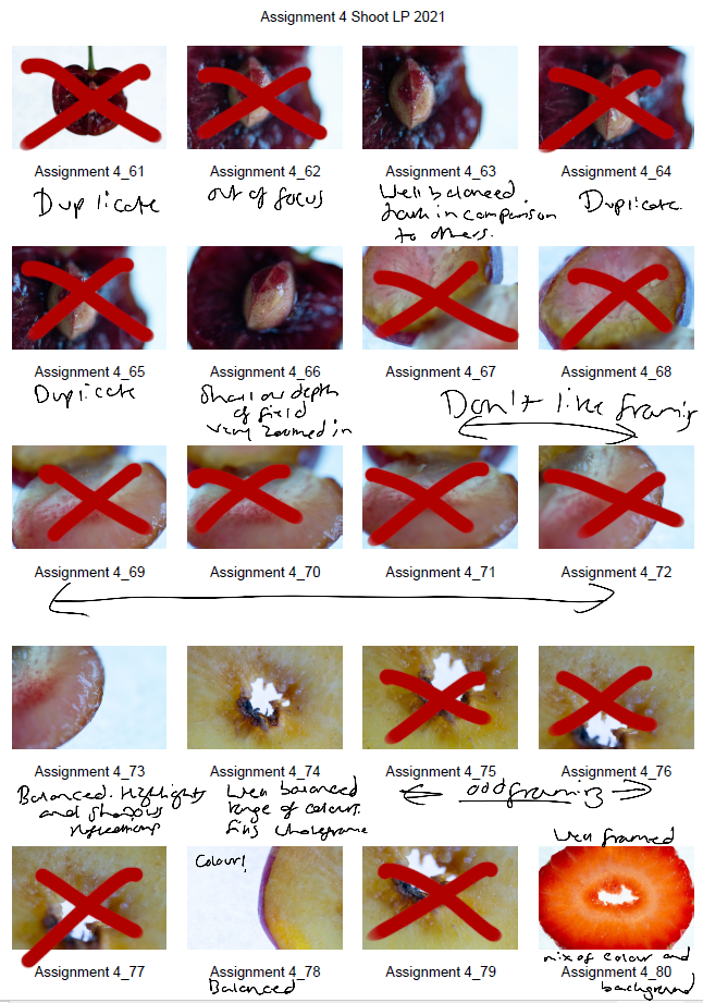
Fig. 4. Contact sheet 4 (2021) 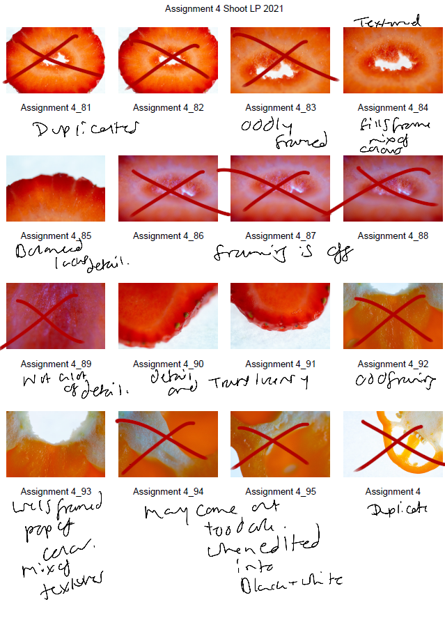
Fig. 5. Contact sheet 5 (2021)
The first set of contact sheets are for the shoot itself, including brief annotations to explain what I like about each particular shot, why I have crossed a majority out and what may become of them in post-production. After annotating and selecting my favourites from the entire photoshoot, I then took these images into photoshop and edited them to see what they would look like in black and white.
The images are as follows:
Contact sheet for edits
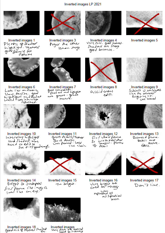
Fig. 6. Contact sheet 6 (2021)
To get the results shown in my contact sheets, I lightly corrected some of the shadows and highlights in the images that needed retouching before converting them to black and white. To change the colour is used the B&W tool and selected ‘blue filter’ (See Fig. 1) to enhance the contrast. To mimic an inverted image and MRI, I then used the gradient tool in reversed black and white (See Fig. 2).
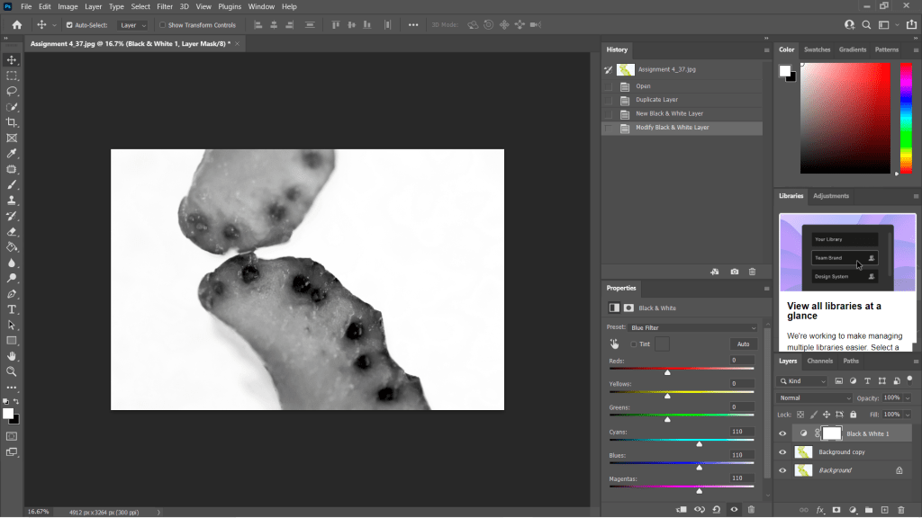
Fig. 7. Black and White (2021) 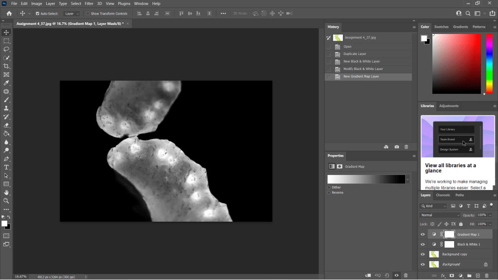
Fig. 8. Gradient Map (2021)
I wanted to choose a range of images to use in my final image edits, so I made sure to select shots that were heavily black in some areas and bright white in others, highly detailed or minimally textured for the remaining few. This gave me a wide selection to experiment with and create strong symmetrical compositions from. Showing variety was important to me for this photoshoot, appreciating multiple fruits and vegetable structures and juxtaposing between the imagery and reference the different kinds of scans as discussed in my previous research, ‘some scans may vary and present the denser areas in black or grey…’ (Powell, 2021).
Reflection
This photoshoot helped me appreciate the structures of the food we grow and eat, the minuscule details within them and how beautiful they are. I was able to be flexible with my plans for this shoot, not letting the weight of my camera ruin the imagery and changing the settings to work with what I had. Reviewing the images shown on my contact sheets allowed me to reduce the number of photographs needed in the initial post-production process and once again after they’d been edited to black and white.
Understanding the process in detail before doing the shoot, rather than briefly researching a concept and making things up as I go, helped this project to flow a lot smoother and resulted in some powerful images.
The final images will be in a separate post from this one, but I am thrilled with the selection chosen.
References
McKinlay, D (2017). (2017) Light Box Art: Stay Focused with Doug McKinlay [YouTube, screenshot] Available at: https://www.youtube.com/watch?v=kWiL5N-b4YM (Accessed 28 May 2021).
Powell, L (2021). Further research and shoot plan [online] At: https://laurenpowelloca.photo.blog/2021/06/07/further-research-and-shoot-plan/ (Accessed 28 May 2021).
List of images
Figure. 1. Powell, L. (2021) Contact sheet 1 [pdf, screenshot] In possession of: Lauren Powell: Eastleigh.
Figure. 2. Powell, L. (2021) Contact sheet 2 [pdf, screenshot] In possession of: Lauren Powell: Eastleigh.
Figure. 3. Powell, L. (2021) Contact sheet 3 [pdf, screenshot] In possession of: Lauren Powell: Eastleigh.
Figure. 4. Powell, L. (2021) Contact sheet 4 [pdf, screenshot] In possession of: Lauren Powell: Eastleigh.
Figure. 5. Powell, L. (2021) Contact sheet 5 [pdf, screenshot] In possession of: Lauren Powell: Eastleigh.
Figure. 6. Powell, L. (2021) Contact sheet 6 [pdf, screenshot] In possession of: Lauren Powell: Eastleigh.
Figure. 7. Powell, L. (2021) Black and White [Photoshop, screenshot] In possession of: Lauren Powell: Eastleigh
Figure. 8. Powell, L. (2021) Gradient Map [Photoshop, screenshot] In possession of: Lauren Powell: Eastleigh
