– Provided annotated contact sheets of my final shoot to show the images I preferred or eliminated, along with any changes I’d like to make like cropping. – Explained how I executed this shoot, including camera type and settings, before exploring how the various techniques helped or hindered my imagery. – Drawn on the influence I gathered from Barry Rosenthal and Sam Oster, explaining why. – Stated how my selection process went, what programmes I used, and the minor changes made to improve the quality of the work, – Before explaining the reasoning of my grid work and the groups made what messages they may imply for the viewer. – Briefly reflected on what I felt worked well during the shoot and selection process, as well as my thoughts on the final selection.
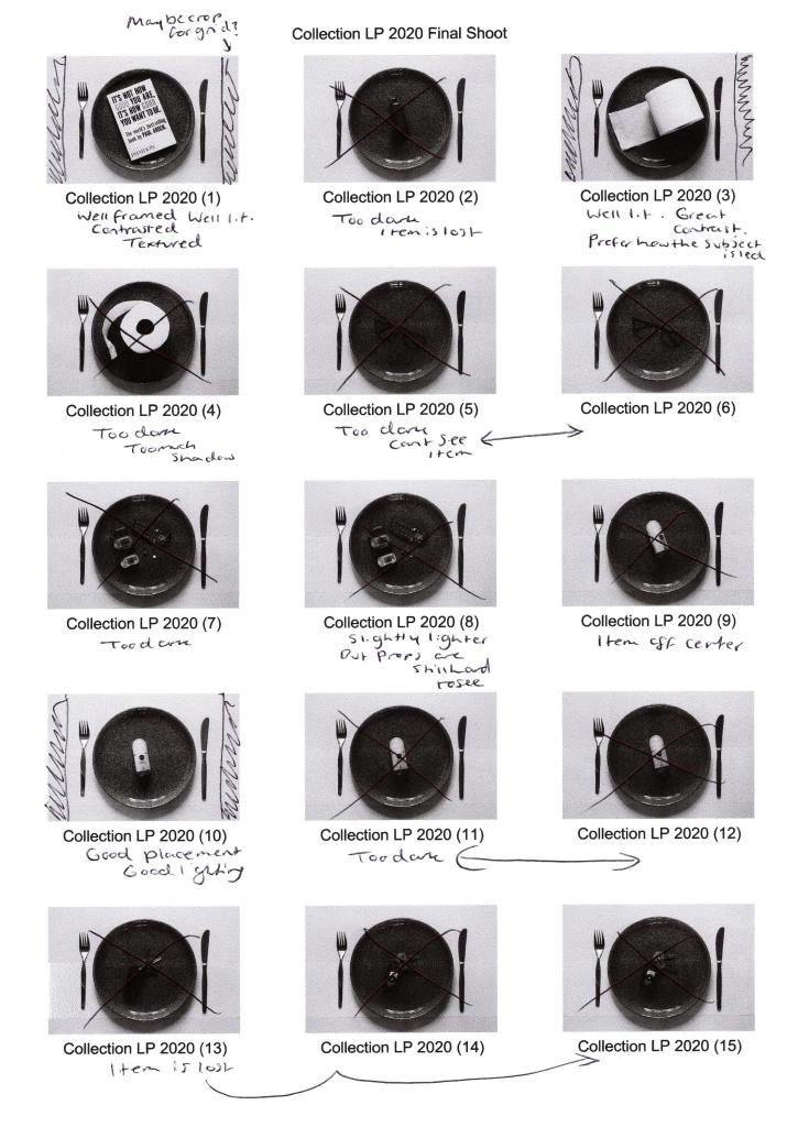
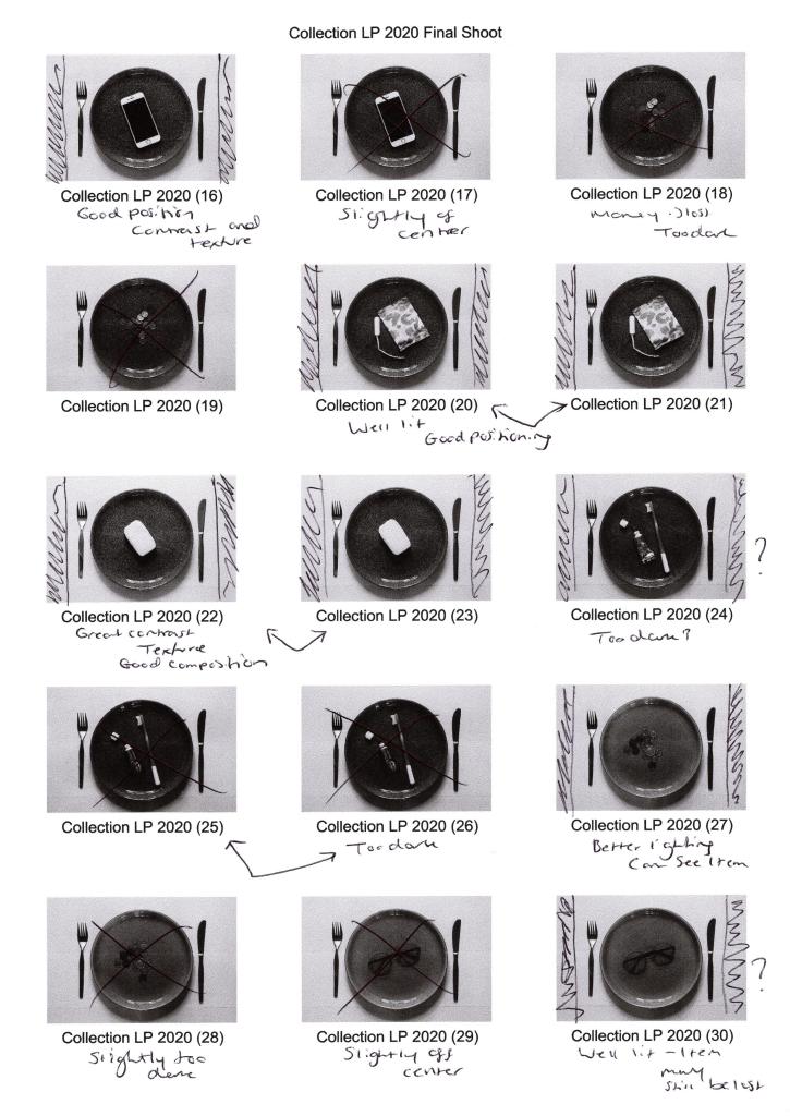
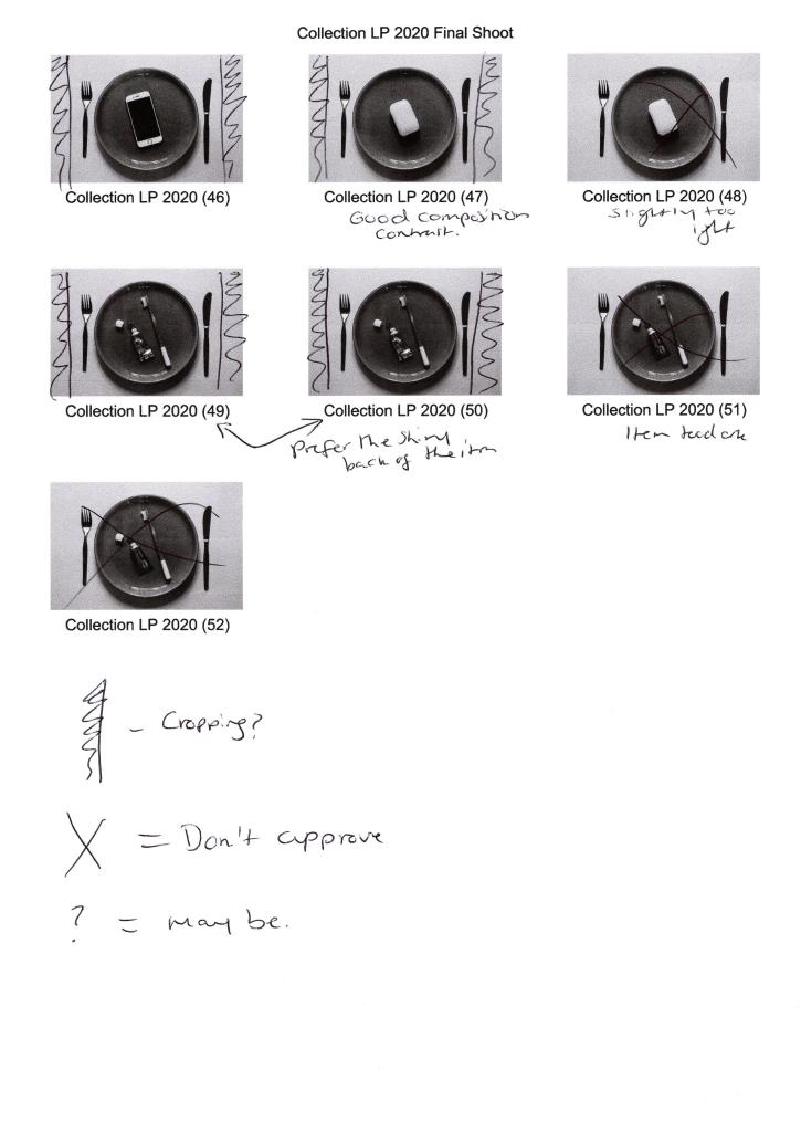
Before selecting my final images the contact sheets were printed off, annotated and analysed to figure out which shots were strongest visually, technically and conceptually when placed together as a group.
Fig. 1. Contact sheet 1 (2020)
Fig. 2. Contact sheet 2 (2020)
Fig. 3. Contact sheet 3 (2020)
Fig. 4. Contact sheet 4 (2020)
While shooting, I made sure to refer to the techniques listed on my shoot plan to make sure I shot my images as intended and the camera settings were suitable for the lighting.
Setting my Sony A57 to manual focus allowed me to make sure everything was as crisp and accurate as possible. At the same time, a narrow aperture of F/14 prevented unwanted blur and provided enough light. I did use an ISO of 400 to boost the light levels slightly, enabling me to use the slowest shutter speed of 1/4 to get a well-lit shot, avoiding bulb mode or a wider aperture.
Placing my camera on a tripod meant the framing was consistent and stable throughout, while everything was in the frame when using a focal length of 35mm. Backlighting my images was a wise decision, as it enhanced the 3D form, however, due to uncontrollable natural light coming from behind, the images were lacking in shadows or became too dark, exampled in Collection LP 2020 (2) and Collection LP 2020 (36) (see Fig. 1. and Fig. 3).
Using the High Contrast B&W setting in camera provided the definition and contrast I wanted to achieve, some subjects, however, were difficult to decipher and can be seen with Collection LP 2020 (2), Collection LP 2020 (5) and Collection LP 2020 (18) (see Fig. 1. and Fig. 2). This camouflaging was due to the plate colour, so experimenting and shooting the items on both plates was vital to give me a chance to capture each subject successfully.
Taking inspiration from Barry Rosenthal and collecting various items allowed me to experiment with different textures such as smooth, soft, wet, rough and hard, which juxtapose one another. However, as a whole, the subjects contextually link together when it comes to theme and functionality, such as electrical, health and hygiene. It also gave a more extensive range of products to choose from when selecting my final images and didn’t restrict in any way that concerned me as I wanted the set to be cohesive yet unique.
Making sure the plate was in the same place throughout and placing the subjects as close to the centre as possible, decreasing the chance of the set flow being distracted by a sudden change in composition. It also created a controlled and cold mood that compliments the crisp black and whites, making the images look profound.
After analysing the contact sheets and selecting the best images, I went into Photoshop to crop and tidy up some blemishes the could be seen on the white background when enlarged on the screen. Cropped photos provided a suitable amount of negative space to frame the subject while emphasising the importance of the items in the shot. Enlarging the canvas and adding a solid 1-inch frame around the image reflect Sam Oster’s use of white boxes in her typologies which appealed to me.
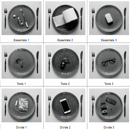
Adobe Bridge enabled me to create a grid and rearrange my edited images to form a cohesive set of images, split into three groups juxtaposing in type and functionality. On the other hand, they complement one another in terms of concept, contrast and composition, forming a solid link between the collection.
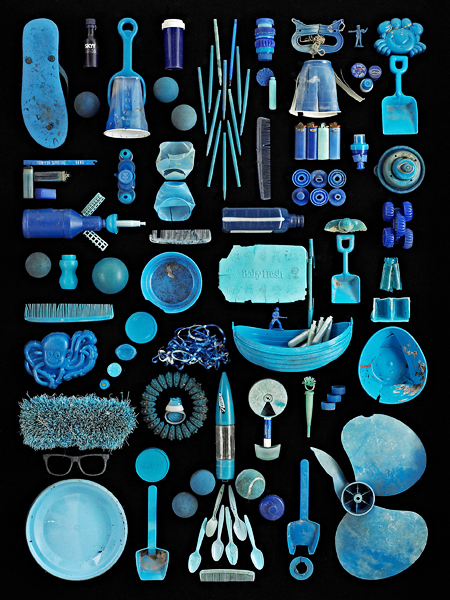
Fig. 5. Typology (2020)
Inspiration from Sam Oster and Barry Rosenthal lead me to experiment with a narrow aperture to achieve a sharp focus. B&W photography enhanced the details and shooting overhead instead of straight on. These techniques pushed me beyond my comfort zone and tested my ability to be selective when creating a typology.
Visually this set is powerful due to the variety of tones providing depth to the composition, contrasting highlights and shadows emphasise the subjects 3D form, allowing them to be more prominent. Keeping the product placement consistent creates repetition but stays fresh due to the change in object and colour of the plates. Balance is maintained by using an even amount of background to frame the items and being evenly cropped. Artificial lighting creates harsh shadows that define the details within the plate and products; a cooler colour temperature intensifies the white background preventing the image from being flat with grey tones. Providing a focal point enables the viewer’s eyes to be drawn to the middle of the frame, focusing on the chosen objects that form a narrative when connected, varying between each individual.
The use of black and white restricts the viewer from being distracted by any colours that may confuse their overall understanding of the set, created a conflict between calm and danger, warm and cold, sadness and happiness. Enhancing the forms, textures, details allows the viewer to focus on and explore the purpose of the object rather than how it makes them feel.
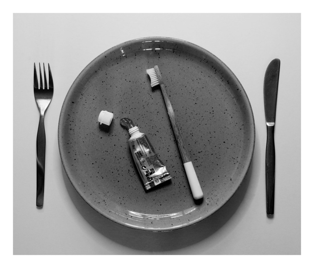
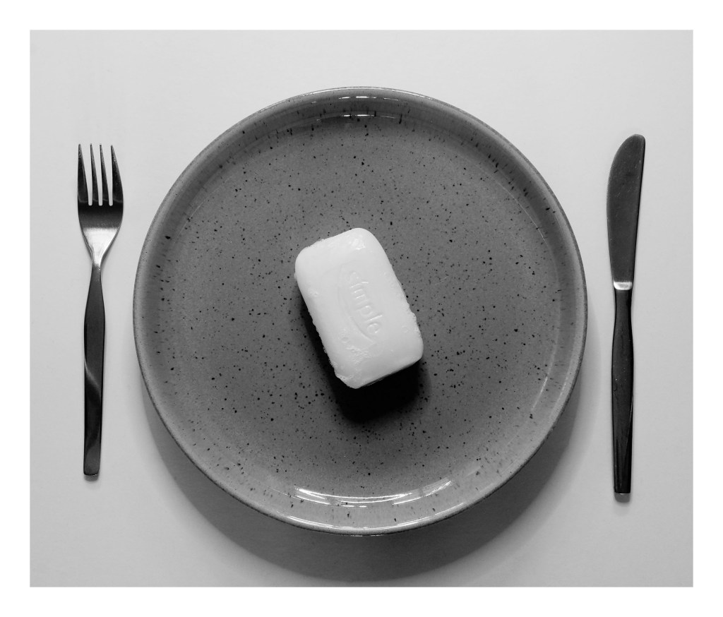
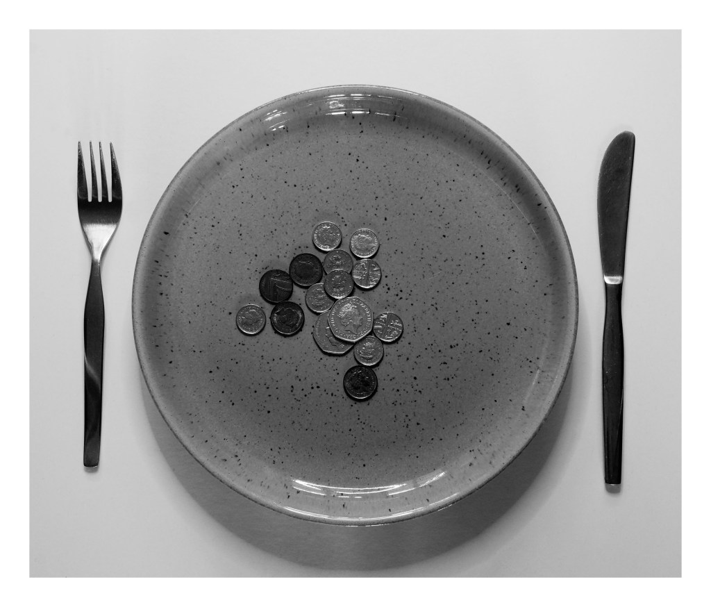
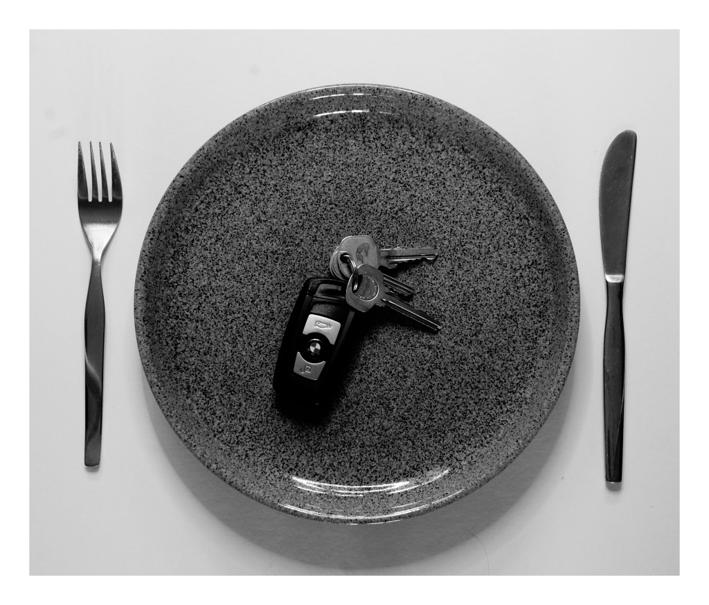
Looking at the groups that have emerged, there is a set of three hygiene products, three tangible metal items and three objects that are all completely different in functionality (see Fig. 5). They are all “things” that people use which is what connects them as a set, however, are they all a necessity? Are there some items that you feel are a luxury? Do you use all of these items, and if so what do they mean to you if anything? Do you see this set as everyday, ordinary items or do they represent a particular message for you?
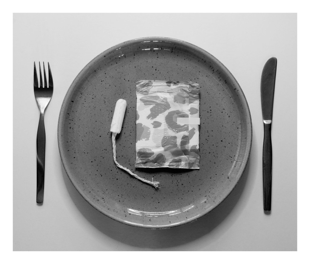
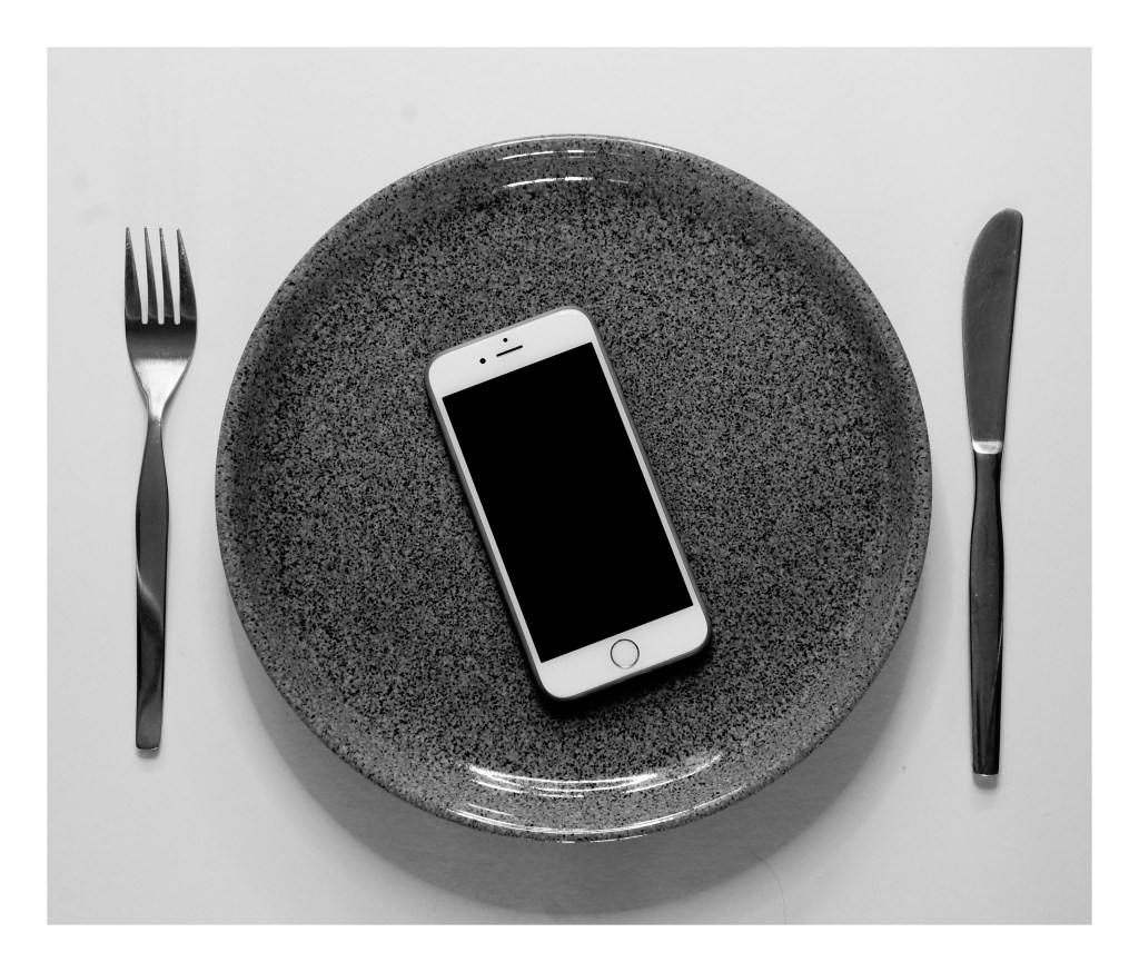
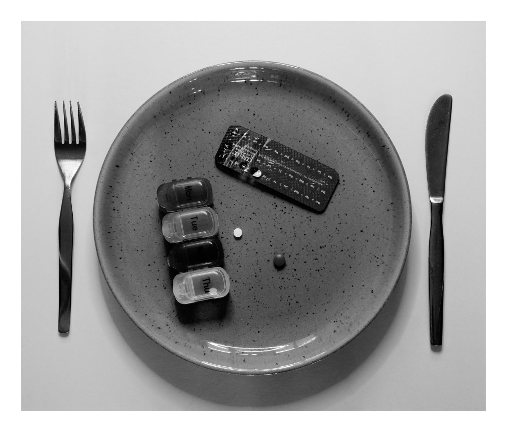
Fig. 6. Divide 1 (2020)
Fig. 7. Divide 2 (2020)
Fig. 8. Divide 3 (2020)
Fig. 9. Essentials 1 (2020)
Fig. 10. Essentials 2 (2020)
Fig. 11. Essentials 3 (2020)
Fig. 12. Tools 1 (2020)
Fig. 13. Tools 2 (2020)
Fig. 14. Tools 3 (2020)
I feel positive about my final selection and have enjoyed exploring the different collections that we can find around us, even if it isn’t as apparent at first glance. The one issue I did have with this shoot was the influence the natural light had on my imagery, meaning I had less to choose from, however did not ruin the whole selection.
List of images:
Figure. 1. Powell, L. (2020) Contact sheet 1 [scanned document] In possession of: Lauren Powell: Eastleigh.
Figure. 2. Powell, L. (2020) Contact sheet 2 [scanned document] In possession of: Lauren Powell: Eastleigh.
Figure. 3. Powell, L. (2020) Contact sheet 3 [scanned document] In possession of: Lauren Powell: Eastleigh.
Figure. 4. Powell, L. (2020) Contact sheet 4 [scanned document] In possession of: Lauren Powell: Eastleigh.
Figure. 5. Powell, L. (2020) Typology [pdf, screenshot] In possession of: Lauren Powell: Eastleigh.
Figure. 6. Powell, L. (2020) Divide 1 [image] In possession of: Lauren Powell: Eastleigh.
Figure. 7. Powell, L. (2020) Divide 2 [image] In possession of: Lauren Powell: Eastleigh.
Figure. 8. Powell, L. (2020) Divide 3 [image] In possession of: Lauren Powell: Eastleigh.
Figure. 9. Powell, L. (2020) Essentials 1 [image] In possession of: Lauren Powell: Eastleigh.
Figure. 10. Powell, L. (2020) Essentials 2 [image] In possession of: Lauren Powell: Eastleigh.
Figure. 11. Powell, L. (2020) Essentials 3 [image] In possession of: Lauren Powell: Eastleigh.
Figure. 12. Powell, L. (2020) Tools 1 [image] In possession of: Lauren Powell: Eastleigh.
Figure. 13. Powell, L. (2020) Tools 2 [image] In possession of: Lauren Powell: Eastleigh.
Figure. 14. Powell, L. (2020) Tools 3 [image] In possession of: Lauren Powell: Eastleigh.
– Stated why I decided to do a test shoot before my final shoot for this assignment and what I tested during this process. – Included the camera and lens used for this photoshoot. – Provided annotated contact sheets to show the different tests taken, as well as the strengths and weaknesses found throughout. – Reflected on how I achieved the shots, the image editing and the reasons for the choices made. – Provided a summary for my final shoot plan, following the analysis of the contact sheets, stating the most beneficial techniques found.
Before shooting my final images, I wanted to test different camera settings and prop choices to decide what visual and technical styles I preferred. Tested settings consisted of changing focal length, changing the artificial light colour, changing aperture, experimenting with camera effects such as Black and White and plate colours. Using a tripod allowed the framing to be consistent throughout and prevented motion blur from an unsteady camera if handheld.
Below are the annotated contact sheets.
Equipment used – Sony A57 and SONY 18-55 3.5-5.6 SAM lens.
Fig. 1. Contact sheet 1 (2020)
Fig. 2. Contact sheet 2 (2020)
Fig. 3. Contact sheet 3 (2020)
Reflection:
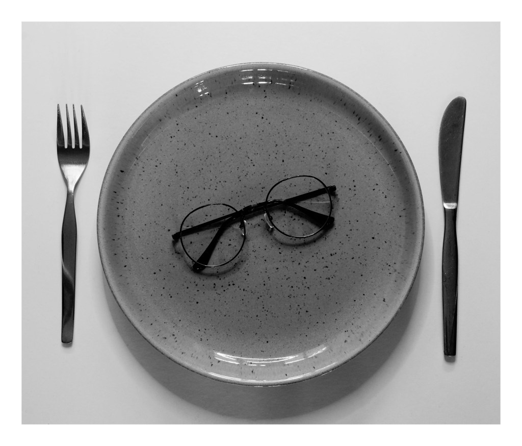
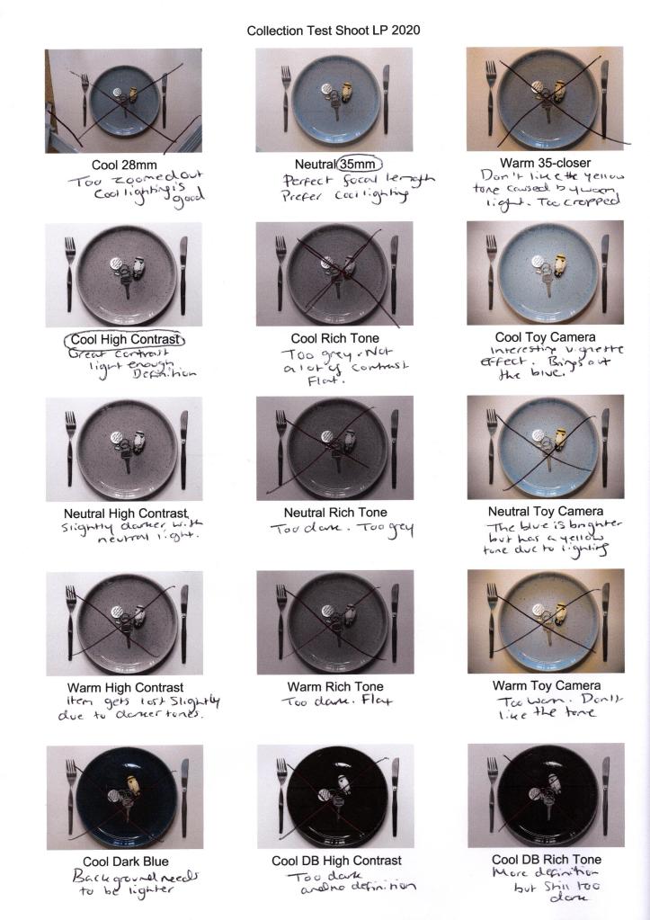
Cool 28mm, Neutral 35mm and Warm 35-Closer (see Fig. 1.) tested both focal length and artificial light temperature, which was the most straightforward test shoot to decide what elements I preferred. A focal length of 28mm was too short as the tripod legs and carpet were in the frame, as well as, making it difficult to see the subject as a whole. On the other hand, the cropped version of 35mm was too long, causing the plate to sit far too tight in the frame. 35mm allows for the tripod to be out of the shot, a decent focal length for the subject to be clear and crisp while providing some negative space to open the image up slightly and feel less suffocated.
Backlighting the plate with a 10.5″ ring light formed some soft shadows, preventing the image from being 2D and lacking in contrast. While cool and neutral light is very similar in tone, choosing a cooler bulb setting made the whites brighter and defines. The warmer bulb temperature made the shadows stronger but flattened the image with an unappealing muddy pink-yellow tone. A crisp whiter background is more fitting for the props used, so a cooler light is most appropriate for these shots.
The images following the previous three discussed tested the different camera effects available on my Sony A57, such as High Contrast B&W, Rich-Tone B&W and Toy Camera, comparing the differences the lighting would have on these settings. Using High Contrast B&W with cool and neutral light, were the most successful combinations as the contrasts were sharp and added plenty of definition, as opposed to using Rich Tone B&W that flattened the subject with the greys due to the lack of tonal variations. Cool Toy Camera (see Fig. 2)has an added vignette effect, forming a halo around the plate which highlights and directs the eyes inwards while intensifying the various blues within the plate design that aren’t in the other shots.
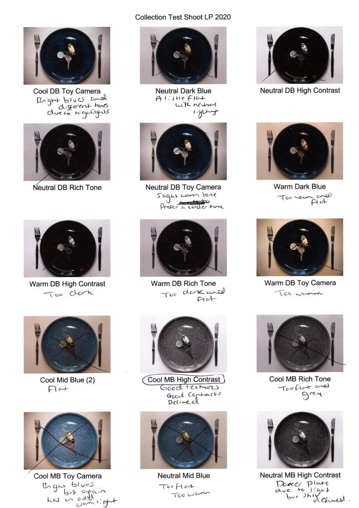
Finally, I tested all of the plates to figure out which colour worked best with the settings. The dark blue plate was too dark and became a solid block of black with the B&W filter, no matter the light temperature. Although Cool DB Toy Camera (see Fig. 2) had various blue tones that added depth, it wasn’t impactful enough to use in the final shoot.
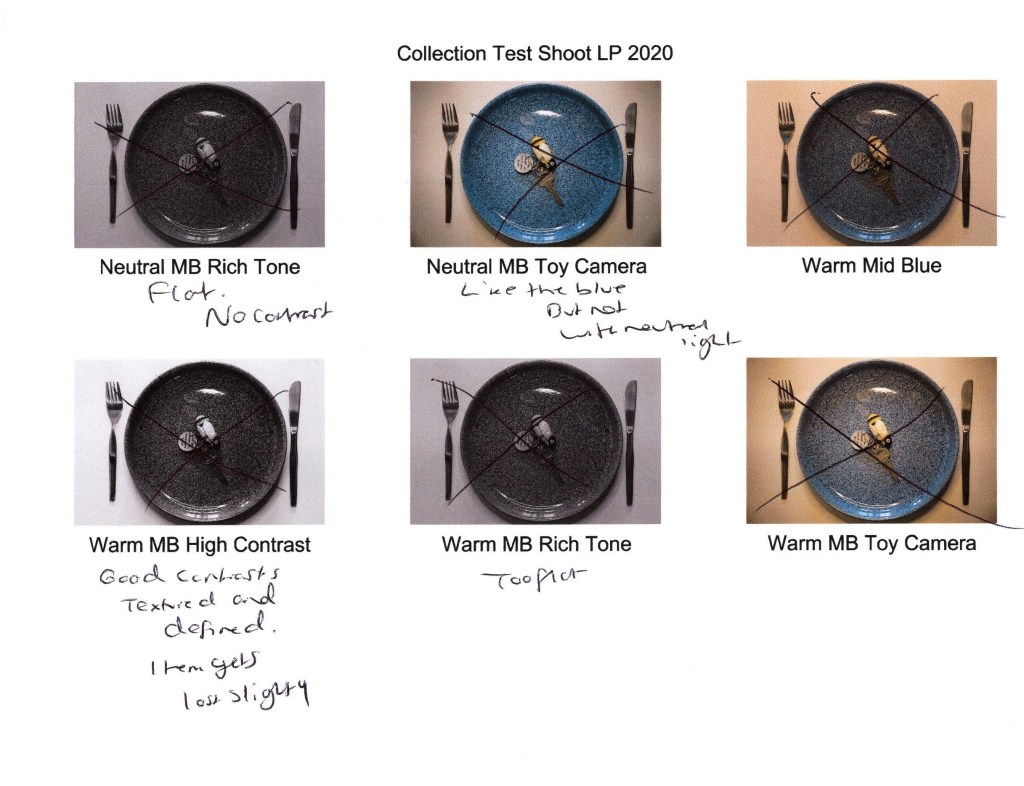
The design of the mid-blue plate adds an extra layer of texture to the image and enhances the contrast due to the dark flecks of paint. Cool MB High Contrast, Neutral MB High Contrast and Neutral MB Toy Camera (see Fig. 2. and Fig. 3) have the most depth out of all of the images due to the intense highlights, shadows and tonal differences in the blue, making the mid-blue plate bolder than the others. However, darker items may get lost in the composition due to the busy plate texture, so I will consider this when shooting my final images.
Final shoot plan:
– Collect as many items listed on the survey results and personal list to have varying shots. – Use 35mm Focal Length. – Use a tripod to steady the camera and keep framing consistent. – Keep the plate position identical throughout to create a fluid transition between each final image. – Use the lighter plate and mid-blue plate to avoid a dark block of colour. – Use cool lighting to brighten the whites and darken the blacks. – Use High Contrast B&W camera effect for depth. – Backlight the subject.
List of images:
Figure. 1. Powell, L. (2020) Contact sheet 1 [scanned document] In possession of: Lauren Powell: Eastleigh.
Figure. 2. Powell, L. (2020) Contact sheet 2 [scanned document] In possession of: Lauren Powell: Eastleigh.
Figure. 3. Powell, L. (2020) Contact sheet 3 [scanned document] In possession of: Lauren Powell: Eastleigh.
– Stated Walter Benjamin’s view on what a collection is for future reference to see if I agree with this after researching various artists.
– Drew on the work of Barry Rosenthal, a fine art photographer and sculptor who collects rubbish found on the shore before organising them into groups and bringing them back to life in the studio.
– Briefly analysed Rosenthal’s work to explore what concepts I could find within his imagery and the techniques I felt he used, such as deep depth of field and studio lighting.
– Explored the work of Sam Oster, who uses medium black and white film to shoot typologies (inspired by the Becher’s) of abandoned electrical equipment to emphasise the relationship between humans and their electronic consumption.
– Analysed both her typologies and moving images to gather inspiration from her visual and technical approaches, such as the use of form, texture and various depths of field.
– Studied the work of Jim Golden, a still life photographer who shoots for commercial companies by stripping the products down to their most natural forms.
– Analysed his bold compositions to understand his use of bold colours, organised arrangements and studio lighting to enhance the collections he is shooting.
– Reflected on each artist and how they both compare or differ, visually, technically and conceptually.
– Stated whether I believe these artists reflect the views of Walter Benjamin, as well as
– Summarising my test shoot plan and how I’d like to implement the inspiration gathered by the chosen photographers.
‘Fragments of a vessel which are to be glued together must match one another in the smallest details although they need not be like one another.’ (Walter Benjamin, [1936] 1999, p.79).
Walter Benjamin expresses that although a collection should link in concept and small details, they don’t have to be identical. Therefore making sure there are differences throughout, subtle or keep a collection exciting and engaging.
Using this idea as a guideline, I have decided to research a selection of photographers who have shot a collection of various items to see how they have executed it to see whether their artistic approach differs from the view of Benjamin. Taking influence from these artists will help me decide on how this assignment develops.
Barry Rosenthal
Barry Rosenthal is a fine art photographer and sculptor who has become well known globally for his “Found in Nature” work. The project began in 2007 as a side-project to his Botanical series. It has since developed from a small collection of objects found on the ocean shore into a series of large scale images that capture and display the impact littering has on the planet (Rosenthal, 2012).
After collecting trash from the shore of New York Harbour, Rosenthal separates the items into groups, determined by colour, theme, type, or otherwise, bringing objects that have been beaten out of shape and have lost their purpose back to life in his studio. Using a combination of photography and sculpting, he can form a narrative that confronts the viewer with ‘the way humanity is managing its relationship with nature and the oceans in particular’ (Rosenthal, 2012).
Fig. 1. Blue Ocean (2013)
Fig. 2. Clear Glass Jars and Bottles (2012)
Rosenthal appears to use a deep depth of field as the objects are crisp, and there is no focal point to direct the viewer around the frame. The use of a plain background helps the textures, shapes, colours stand out on their own. The reflections and shadows on the items suggest side lighting by artificial lighting such as studio lights. A birds-eye view flattens the object’s form allowing the viewer to focus on the narrative told via the arrangement, something that may not have been achieved if shot at an angle. The shapes and sizes of each item complement one another without the collection becoming cluttered and unorganised. Subtle changes are made throughout his series, keeping the images fresh, unique yet consistent in concept.
Sam Oster
Sam Oster is an Australian based photo-media artist who has experience in stills photography, moving images, lecturing, film and documentaries.
Oster has exhibited in both solo and group shows across the years including Art Images Gallery, Adelaide (2014); Shimmer Photographic Biennale, Southern Australia (2012) and Duckspool Photographic Centre, England (2001).
‘Short Circuit‘ was created in 2009 to investigate the consumption of electrical items and the ever-growing issue of consumerism and competition between companies, which can create a conflict between what is ‘trash and treasure’ (Oster, 2019).
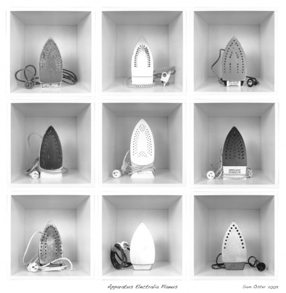
Bernd and Hilla Becher’s typologies of industrial buildings and structures heavily inspired her; however, Oster used portable electrical items as her subject instead of permanent structures.
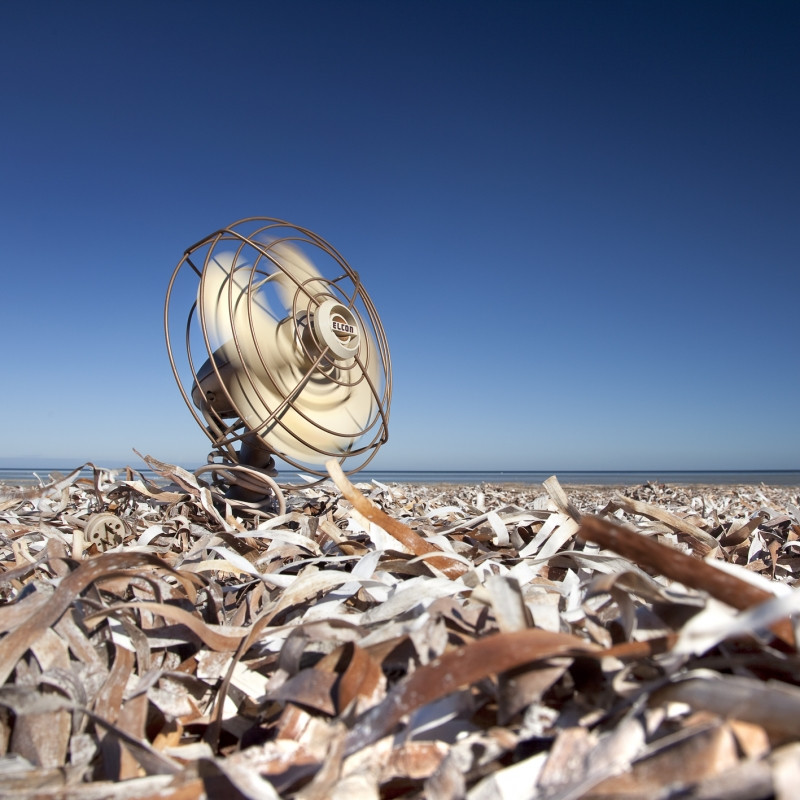
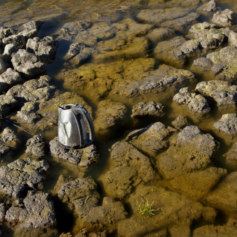
Oster captured electrical items found in rubbish dumps, neatly arranged in individual cabinets to examine the form and function of the objects in the grid. However, the moving image time-lapses represent the idea of electrical dependency and its impact on the environment, for example, a fan placed in a sea of metal in front of an ocean’s horizon (Oster, 2019).
The work shot on a medium format black and white film are hand processed and printed. These pieces have the same grainy post-industrial effect the Becher’s achieved.
Fig. 3. Apparatus Electralia Planus (2009)
A collection of discarded irons (see Fig. 3.) are framed centrally in a square cabinet, forming a grid of 9. This composition cleverly splits the image into sections without having to take individual photographs. There is an even contrast between light and dark, shown through the metal, scratches, age marks, shape of the subject and the plugs. The lighter irons are aligned down the middle of the collection, framed by different tones of grey and black. While they are the same in function, their forms, the impact of time and usage make them unique, providing the viewer with change. A deep depth of field may have been used for this image, as the items, geometric lines, and the extent of the cabinets are clear.
Fig. 4. Cooling Down (2009)
Fig. 5. Boiling Over (2009)
Unlike the typologies, these moving-image time-lapses feature one item each, however, once paired they form a collection of discarded electrical items in various landscapes. A shallow depth of field may have been used in Cooling Down (see Fig. 4.) due to the subtle blur in the foreground directing the viewer’s eyes to the fan. Deep depth of field seems to have been used to shoot Boiling Over (see Fig. 5.); however, the kettle placed slightly off centre on a rock in the muddy water creates a focal point and direction. These small details call back to the idea of electrical dependency impacting the earth, global warming and the loss of lush green growth, clear waters and land.
Jim Golden
Jim Golden is a still-life and product photographer based in Portland and shoots subjects in their purest forms to avoid applying artificial beauty. Golden is artistic and stylistic in his photography, capturing inanimate objects in a bold or quirky way while keeping the subject accurate to what it is.
He learnt photography by joining the fast-paced world of New York advertising, specialising in high-end retouching and visual effects (Jim Golden Studio, n.d.).
Golden’s enthusiasm and ‘sense of humour’ (Jim Golden Studio, n.d.) reflects throughout via bright colours, exciting subjects, and thorough planning.
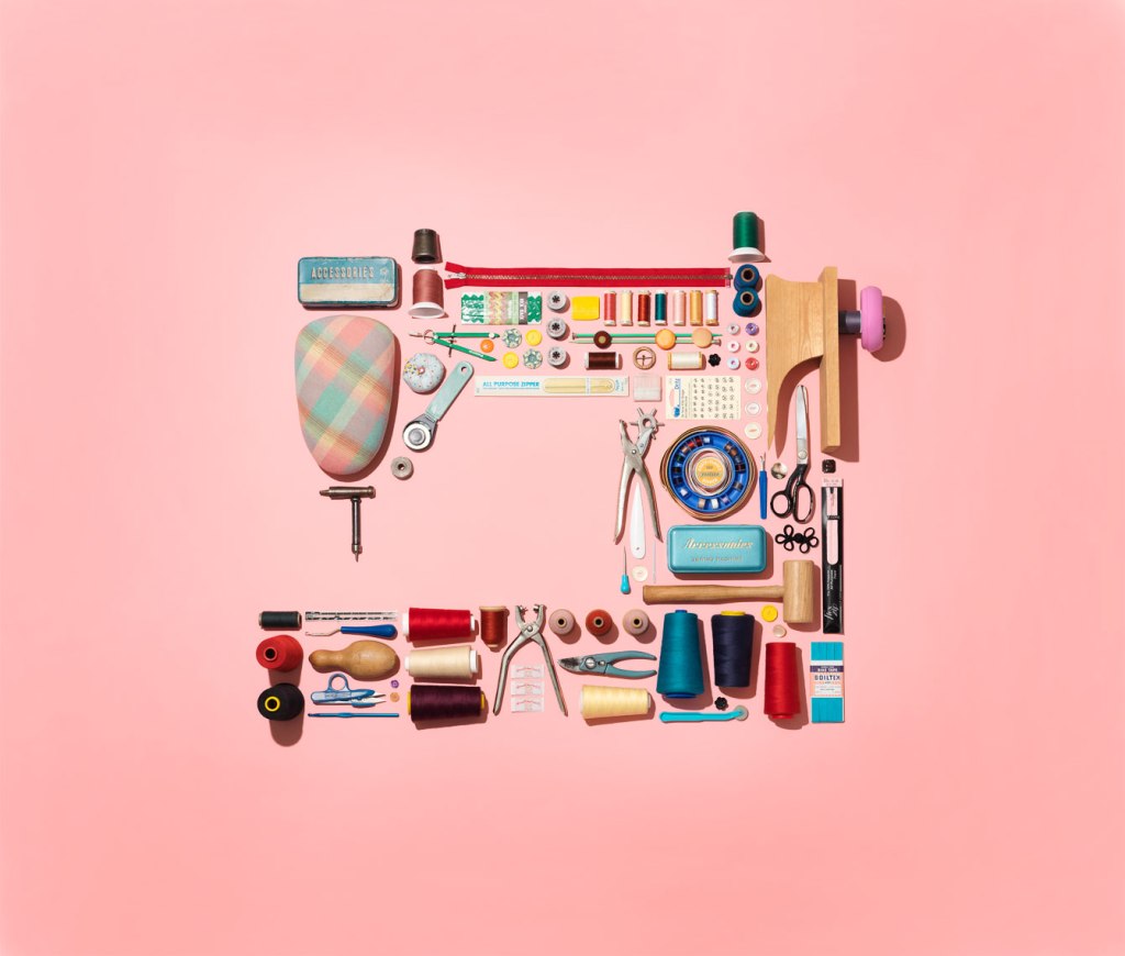
Fig. 6. collection of sewing stuff in shape of a sewing machine (2019)
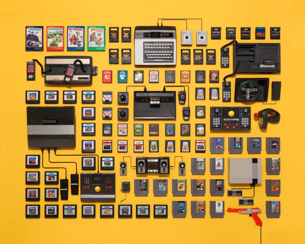
Fig. 7. vintage video game consoles and cartridges on a yellow background (n.d.)
Golden may use deep depth of field in his work due to the sharp, crisp and geometric forms created by the arrangement of the items. There are many leading lines throughout the imagery, the spaces between the subjects outline the shapes and sizes of each item, allowing the viewer’s eyes to follow around the composition with no end to the line. Like Rosenthal, Golden shoots his subjects from above from a height or using a wide-angle lens, using studio lighting to light the items. A soft halo in the middle of collection of sewing stuff (see Fig. 6.) and the few harsh shadows in both images caused by taller items may imply lighting from above or behind. Creating shapes that relate to the collected items, using the products and making the image pop with intense colour may represent happiness, playfulness, love or other positive emotions.
Overall thoughts:
All of the artists above vary from one another visually. Oster uses a mixture of B&W film and coloured imagery, using the background to frame the items. Rosenthal uses monochrome backgrounds and uses the collection to add colour and depth. In contrast, Golden uses bold colours, leading lines and negative space to enhance the objects.
However, they are alike technically as their images are crisp and in focus, suggesting a deep depth of field. Sharp shadows and bright highlights imply artificial lighting, and they all share a meticulous approach to the composition and framing of their subjects.
Contextually Rosenthal and Oster focus on political issues, such as the impact of human nature and consumerism on the planet. The way they execute this is by collecting disposed electrical products, plastic from the ocean and dumps. Oster’s choice to shoot with B&W film creates a raw emotion by enhancing the aged and shiny, textural details on the metal irons, while the rusty browns and muddy waters evoke thoughts of decay and neglect. Her choice of discarded electrical items reflects the waste caused by a lack of appropriate recycling resources. Rosenthal’s use of a black background creates a contrast between the colourful plastics and their battered forms, helping them stand out; this shows how time has affected the product’s shape but is mostly still intact and beautiful. The way items form shapes such as a man on a boat, link back to humanity’s relationship with the ocean. These elements, when combined, form a narrative about the negative correlation between land and ocean pollution, and human activity.
On the other hand, Golden shoots a selection of brand new goods and electronics, documenting products that show human progress, and a positive, appealing side to consumerism. The use of vibrant colours and shapes brings playfulness, contrast the vintage products, implying how style and inventions have evolved. Arranging individual components when put together become a working product, for example, the gaming cartridges wouldn’t be playable without the console, which wouldn’t be functional without the wiring, celebrates human creativity and growth.
Each artist has formed a cohesive series by keeping visual changes to a minimum or at least make sure they are complimentary to avoid jarring the viewer and being consistent with the overall concept, and in turn support Walter Benjamin’s view on collections very well.
After researching these practitioners and the concepts behind their work I have decided to explorewhat ‘necessity’ means. I will develop on this by collecting various items based on the responses gathered in my online survey and personal list group them by theme, form or function if possible, before looking for juxtapositions or similarities within the collection.
Keeping the framing and position of the subject consistent, as Oster does in Apparatus Electralia Planus, is something I will apply when composing my shoot to avoid breaking the fluidity. The choice of black and white or colour can impact the overall mood of the images; therefore I will experiment with the use of colour to decide how I want to evoke emotion or enhance details in the shot. Shadows and highlights can affect the form of a subject as well as the depth so I will consider using artificial light during my test shoot to decide whether I’d like to achieve a soft or sharp visual style. Shooting from a birds-eye view isn’t something I do very often and is something I would like to try out for this assignment, taking influence from Rosenthal and Golden as a guide for creating successful compositions. Deep depth of field assures that everything in the frame is crisp and in focus, so even though I would like the items to stand out, the rest of the composition will be just as essential to provide context; therefore, I will use a narrow aperture.
The final selection of images can make or break the set and how they knit together, so I will be meticulous when it comes to formulating the collection as a whole. During my test shoots, I would like to take influence from Oster and experiment with grid work and typologies; this may determine how I present my final selection.
Summary of the shoot plan :
– Experiment with B&W and colour.
– Vary the lighting used to see what works best.
– Test different angles, focal lengths and apertures.
– Consider the framing and positioning of the selected items.
– Play around with cropping and grid work.
– Be thorough when choosing final camera settings.
– Consider the relationship between each image when it comes to the final selection.
References:
Benjamin, W. ([1936]1999) Illuminations. London: Pimlico
– Briefly explained my reasoning for gathering anonymous responses for this assignment and – Provided the results of the online survey via screenshots. – Listed my research, taken over the space of a few days to see how they correlated with the online survey results. – Reviewed the collection of results as a whole, explored what I was surprised and glad to see from the responses – Before suggesting a few areas I may look further into throughout this assignment like privilege, luxury and necessity e.t.c.
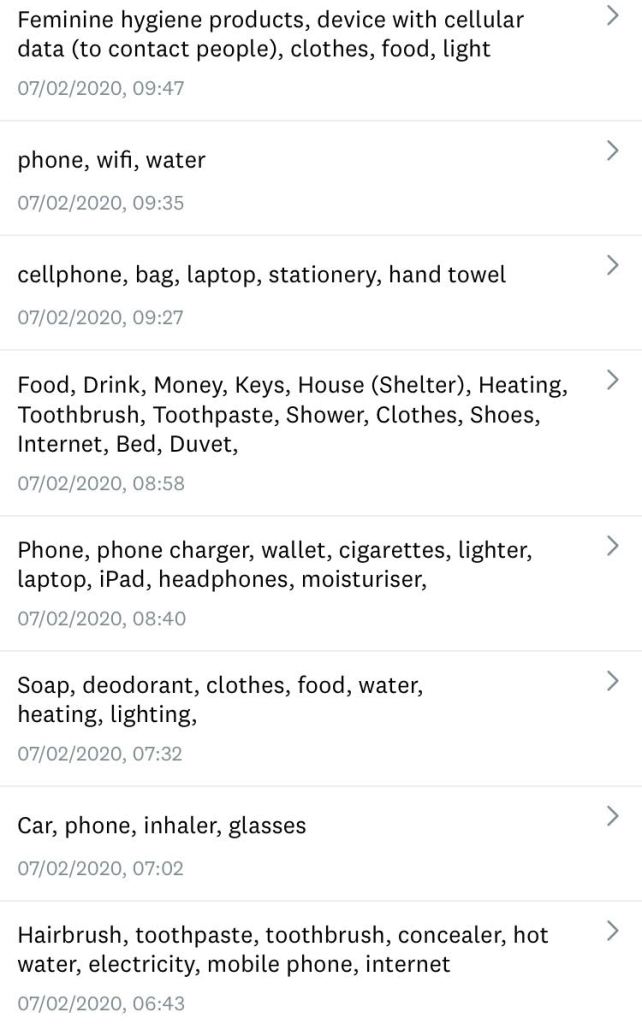
Instead of solely relying on my own opinions and views about the necessities in life, I wanted to see what others felt were necessary items in their daily life to hopefully build selection to experiment with when it comes to shooting my imagery. Therefore, as part of my research for this assignment, I decided to gather some non-biased responses from anonymous persons using an online survey by asking ‘What everyday items do you consider are a necessity? (Something you need)’ (Powell, 2020).
Here are the responses:
Fig. 1. Survey Monkey 1 (2020).
Fig. 2. Survey Monkey 2 (2020).
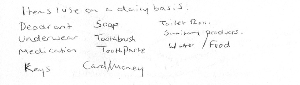
I also took part in the research, noting down items I used daily and what I considered a necessary item (see Fig. 3) before comparing it with the survey responses. The note-taking was quite interesting for me to do, as it made me more aware of what I use and how often, something we don’t necessarily tend to do when items become a part of daily life.
Here is my response to the question:
Fig. 3. Necessity List (2020)
Review of the responses:
After comparing the two sets of responses (see Fig. 1. and Fig. 2), it is clear that there is a common theme of items to work with, such as clothing, money, keys, hygiene products, medication as well as a few extras that I hadn’t thought about.
Initially, I didn’t expect to see so many people list phones, laptops and other electrical items as a necessity, however, it does make sense when you consider the modern way of communication, technology in careers and education. Without technology, many people would struggle to contact loved ones, reach emergency services or access their money due to banks going digital. Even hospitals use technology to save people’s lives, so while we may feel phones and such are a luxury, they are becoming a necessity more and more.
Those with good health may not have to be concerned about glasses or medications, however, some people wouldn’t be able to navigate safely or survive comfortably without such items that show privilege by not having to rely on prescriptions.
One item that reflected my research in the survey responses is sanitary products for those who have periods (see. Fig. 2). There has been controversy surrounding the tampon tax and free sanitary products in bathrooms, schools and shops for those who cannot afford it. Periods are a part of nature and cannot be prevented without the pill or other forms of contraception, therefore sanitary products should be widely accessible for people so they can go about their daily life comfortably and cleanly. It shouldn’t be a case of who has money or not, as it isn’t a matter of choice that highlights areas of inequality in society.
Other items that were interesting to see were cigarettes, a lighter and concealer (see. Fig. 2.). A lot of people would probably consider these items as unnecessary, however, without being in that person’s shoes you have no idea why these products are essential whether you agree with it or not. This may be due to situations such as addiction, insecurities, social pressures or self-satisfaction.
Final thoughts:
This research has given me a wide range of paths to experiment with and explore, such as politics, privilege and equality. Depending on my artist research I may decide to group up items that share the same concept, visuals and technical approaches but conflict with one another when placed together as a collection e.g Luxury vs Necessary, or Electrical vs Manual. The overriding theme that has been discovered through this research is that necessities are subjective and highlights individuality and diversity. This will allow me to form a cohesive concept for the images I wish to shoot, which I am yet to decide on.
‘Fragments of a vessel which are to be glued together must match one another in the smallest details although they need not be like one another’ (Walter Benjamin, [1936] 1999, p.79).
‘The Walter Benjamin quote above expresses the idea that a collection should reflect a single coherent idea, but you’ll also need technical rigour to match the photographs to each other ‘in the smallest details’. Start by choosing your focal length, aperture and viewpoint combination in advance. Visually, similarities correspond so they’re easy to look at, but be careful of duplicates because repetition is boring. Differences are interesting because they contrast, but randomly changing your framing or allowing a confusion of detail into your backgrounds will distract from the viewing.
Brief:
‘Create a series of between six and ten photographs on one of the following subjects: • Things • Views • Heads’ (Bloomfield, 2018).
Initial thoughts:
– Excited to be challenged by creating a collection of images that are consistent in terms of concept but unique in appearance, albeit small. – Enjoy the idea of being able to branch out from a single word, allowing the assignment to be broad and open right from the beginning. – Slightly wary about creating ‘duplicates’ and creating a jarring set, so I will have to plan thoroughly to avoid this. – Concerned about going off-piste from the brief due to the variety of ideas, so will regularly refer to it throughout each stage to make sure everything is on track.
Initial plan for the brief:
– Create a list of ideas that link with each word. – Choose one subject and start exploring the ideas within in more detail. – Research practitioners for further ideas to help with the concept choice. – Use a tripod to keep the framing as accurate as possible. – Experiment with a deep depth of field, instead of shallow depth of field which I am comfortable with. – Experiment with focal lengths to see what works best. – Make sure the set is coherent, yet individual. – Explore what makes me uncomfortable e.g different camera settings, framing and lighting.
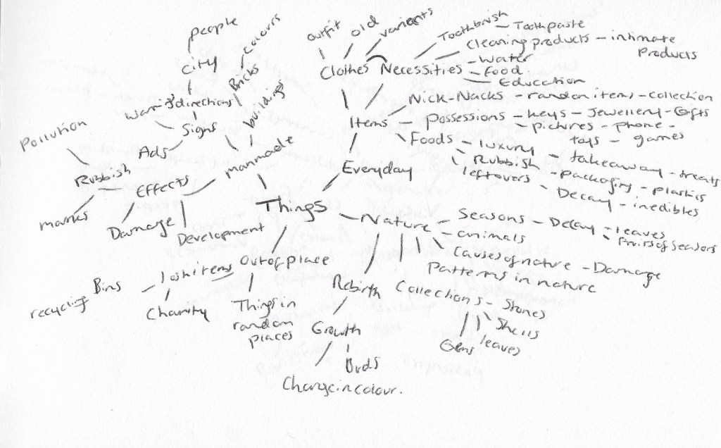
Fig. 1. Things (2020)
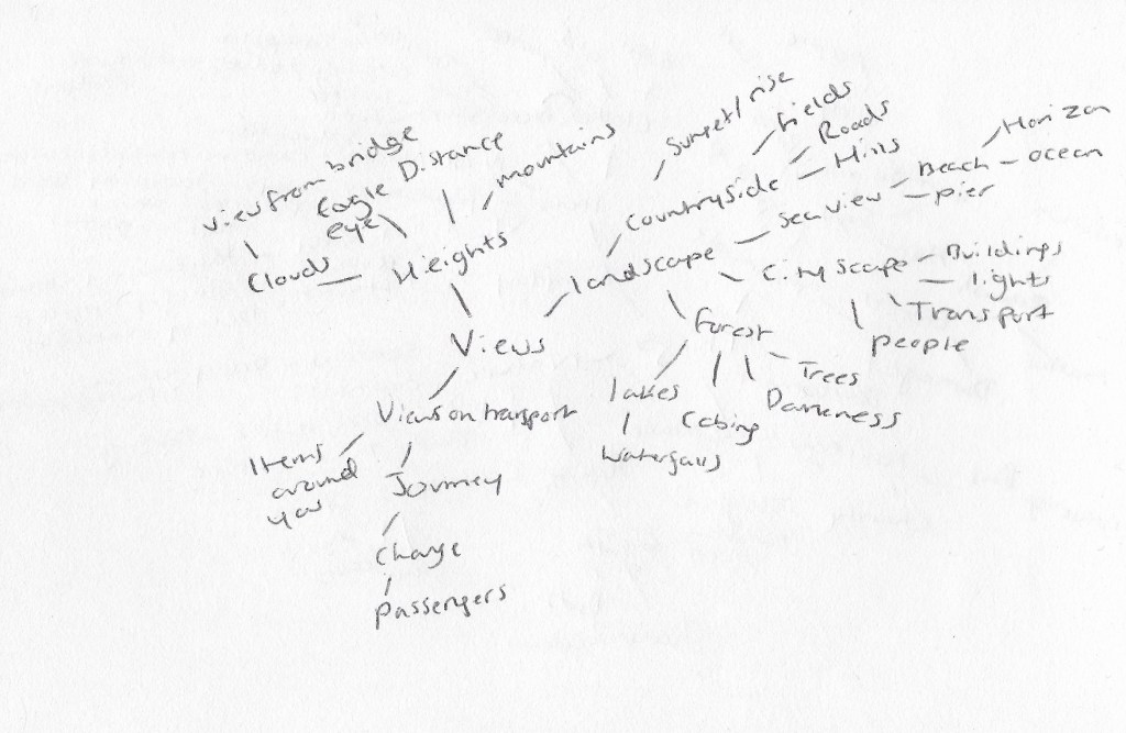
Fig. 2. Views (2020)
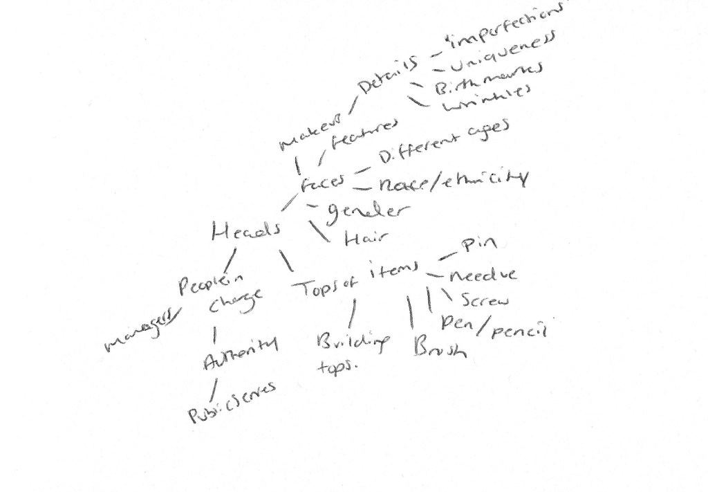
Fig. 3. Heads (2020)
Reflection on mind-maps:
– Wide variety of concepts for me to explore and experiment with. – Plenty of ideas linked with ‘Things’ which will allow me to fall back on another idea if my initial plan doesn’t work. – Also, like the idea of exploring facial features in the ‘Heads’ (see Fig. 3.) subject, but don’t have many back up ideas if that doesn’t work, hence my appeal to focus on ‘Things’ (see Fig. 1.). – Plenty of ideas to push me out of my comfort zone and potentially collaborate with others to shoot or gather opinions. E.g. asking someone for their most important possessions, asking to shoot with someone I don’t know well, or figuring out what everyday items people would count as a “necessity”. – Don’t enjoy the ‘Views’ subject as much due to the lack of different ideas and potential struggles with keeping the images cohesive.
After formulating a selection of ideas and concepts for the three subjects, sitting with them and going about daily life to see which ideas remain in my head, has been really helpful with deciding with routes I want to go down first. Currently, the necessities of life mentioned in the ‘Things’ mind-map (see Fig. 1.) is standing out for me, therefore will begin to note down the items I use on a daily basis across the space of a few days, as well as gathering anonymous responses via an online survey about “necessary” everyday items. I will also begin artist research to understand what a ‘collection’ can mean when it comes to photography.
– Draw on the work of Wim Wenders, who shoots dynamic imagery to document history and signs of civilisation by using a deep depth of field to capture fully focused shots. – Challenge the view that deep depth of field prevents the viewer from focusing on one point, by providing evidence of specific focal points in Wenders work. – Analyse how the specific aesthetic codes may affect how the image is interpreted as well their ability to enhance the work. – Draw on the work of Mona Kuhn, who uses shallow depth of field to provide a sense of intimacy within her imagery. – Analyse how her compositions reflect her ability to connect with the subject and create a comfortable atmosphere, that even the viewer can feel through her delicate series of photographs. – Draw on the work of Guy Bourdin who creates images that are sexual and shocking in nature, to grab the viewers attention and make them question the concept of an advertisement. – Reflect on his use of deep depth of field and meticulous planning of compositions, what they may portray and why. – Selected an image from my personal archives to show the aesthetic code of intimacy, much like Mona Kuhn, an aesthetic choice I made at the time to enhance the warmth of the fire and coziness of being wrapped up on a winters night.
Brief:
‘Read around the photographers above and try to track down some of the quotations. Write up your research in your learning log‘ (Bloomfield, 2018)
This research point explores how the different depths of field can influence how an image is perceived. For example, a photographer may choose to shoot a portrait in a busy town with a shallow depth of field to direct the viewers eyes to the focal point and provide tension between the subject and blurry background, or instead use a deep depth of field to prevent the eyes from focusing on one specific point in the image and allowing the viewer to take control of their journey through the image.
These different aesthetic codes could be used to explore the idea of memory, politics, imagination for the viewer, intimacy and history, whether the artist is aware of that at the time or not.
Photographer research:
Wim Wenders
Wim Wenders, born August 14, 1945, was one of the first to venture into New German Cinema and is one of the most well-known figures for contemporary German film. Wenders specialities consist of scriptwriting, directing, producing, photography and being an author, which has led to a substantial collection of work in the form of ‘documentaries, photo exhibitions, monographs, films and books’ (Royal Academy, 2018).
A broad collection of Wenders’ photographic works have been exhibited in multiple galleries across the world such as the Ronald and Rita McAulay Gallery, London (2019); the Museum of Contemporary Art, Sydney (2003); Museum of Contemporary Photography, Thessaloniki, Greece (2006); and in his birth city, Museum Kunstpalast, Düsseldorf, Germany 2015.
A recurring concept throughout the photography Wenders shoots, is a sense of journey, memory and life, either through the subjects captured in the frame or the composition of imagery. For example, a summary of the time capsules. by the side of the road (Wenders, 2015) exhibition Germany suggests, the imagery ‘alludes to the relationship between memory and photography’ (Blain Southern, 2015), therefore showing how photography is a powerful medium that can capture a moment in time and keep it preserved for the future.
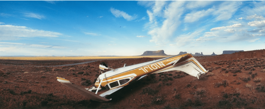
America and Germany are locations that are important to Wenders due to how much time he has spent between the two for both work and living. Being able to document the changes, events and effects of human nature seem to be something that drives Wenders in his work as he claims ‘in those landscapes, German or American, I’m still looking for the traces of civilization, of history, or people’ (Wenders, 2015). A great example of Wenders capturing traces of history and the effects of human activity is shown below (see Fig. 1.)
Fig. 1. time capsules. by the side of the road (2015).
As quoted by Broomberg and Chanarin in 2008, directly from the book The Act of Seeing: Essays and Conversations, Wenders states that ‘The most political decision you make is where you direct people’s eyes.’ (Wenders, 1997).
While he doesn’t use a shallow depth of field to direct the viewer’s eyes to a focal point, the centralisation of the fallen aircraft enhances it’s prominence in the foreground, almost teasing the viewer as to what the most important part of the image is, similar to politics. Another visual element that draws the eyes towards the centre, is the contrast between the deep red of the desert land and the bright whites in the paintwork, highlighting the clean and aerodynamic shapes of the plane in amongst the dirt and dust, helping it stand out from the rest. Wenders’ choice to shoot this image as a panorama expands the shot and provides the viewer with more context by being able to explore the environment behind the aircraft. The dry clumps of grass, the empty road curved by the panorama, the vast plains and rocky mountains in the background, emphasise how abandoned the area may be. We as the viewer don’t know how this crash occurred, or what happened to the remains after this shot was taken which goes back to the idea that the relationship between memory and photography can be very important when it comes to preserving the past and showing signs of civilisation or lack thereof.
Despite his use of deep depth of field, there is seems to be a clear focal point, which challenges the idea that fully focused and sharp images ‘remove that direction.’ (Bloomfield, 2018).
Mona Kuhn
‘I like to cherish the body as a source of inspiration, as a platform for metaphors, for intimacy and complexities of human nature, hoping to use the visual impact of provoking the viewer’s imagination to encourage thoughts beyond what is revealed. – MK’ (Kuhn, 2013).
Mona Kuhn was born in São Paulo, Brazil, 1969 and is of German descent. Currently residing in the US, having moved in 1989 to start her higher education at The Ohio State University and the San Francisco Art Institute.
Kuhn is well known for her large-scale photographs of the human body, capturing people in their most natural state and presenting the nude as a ‘contemporary canon of art’ (Kuhn, 2013). A consistency throughout her work is the reflection and encapsulation of the need for human connection and being united, which is beautifully achieved due to Kuhn’s close relationships with the subjects. This allows them to be intimate and comfortable in their skin, which is incredibly inspiring due to the negativity that has surrounded nudity.
Using a shallow depth of field and translucency as a visual choice, challenges the viewer’s ability to connect to the environment, those within it and what is happening (Kuhn, 2013). However, due to how soft and comfortable the compositions are, the tension doesn’t feel uncomfortable in any way, portraying Kuhn’s strong ability to respect and form an attachment with the subject and present that throughout her work.
A wide collection of Kuhn’s work is displayed both publicly and privately across the world such as the Flowers Gallery, New York; Jackson Fine Art, Atlanta, Georgia; Camerawork, Berlin, Germany; Elkis Gallery, São Paulo, Brazil and many more.
Kuhn not only forms a connection between the people in her series but also with the environment, the colours, different elements of nature and in turn creating metaphors from the imagery. This can be seen in her Native series, shot in Brazil.
Fig. 2. Spring (2009)
Fig. 3. Marina (2009)
By using a shallow depth of field, the focal point is brought forward in the frame and the case of Spring (see Fig. 2.). It shows the delicacy of the curling leaves and thin twigs, gently lit by the natural light in what looks like a tropical forest, however, slightly unsure due to the blurred background. This forms a tension between the subject, background and viewer and forces a little bit of imagination to be able to connect with the image. The pale greens are subtle and fresh, signifying the lushness of nature and potentially a metaphor for the start of new beginnings. The inconsistencies in the leaves and direction of the growth exhibit how different and unique nature can be. Much like the model in Marina (see Fig.3.) who we may assume, however, cannot confirm, is an indigenous person whose facial features and complexion differ from those of a different ethnicity or race, which is a beautiful thing. Her bare torso stands out and warms what is a crisp and cold background, the blur created by a wide aperture compliment the fragility and softness of the skin.
While intimacy isn’t shown through the appearance of breasts and genitals, instead it is presented by the lack of makeup and clean skin, therefore showing vulnerability and openness. The model’s gentle gaze and deep brown eyes almost draw the viewer in to connect with her soul, more so than her appearance, which is a whole different level of human understanding.
As previously mentioned, not all images show a connection between a group of people, but the similarities between the natural growth of plants and humans. They share imperfections, there are different shapes, sizes and textures throughout. The compatibility of greens, whites, golds and browns, mix and pair up so naturally. Both images are simple, draw the eyes directly to a focal point to help you form a relationship with the subject.
The series as a whole is comforting and celebrates the beauty of people of colour, their home and the importance of connecting with those from all walks of life regardless of our differences.
Guy Bourdin
French fashion photographer Guy Louis Banarès, widely known as Guy Bourdin was born in Paris, in 1928 and was one of the most ‘radical and influential fashion photographers of the twentieth century’ (Michael Hoppen Gallery, 2015).
Bourdin pushed the boundaries of standard advertisements by creating sexual and shocking imagery, to draw the viewer in, steering away from the common product shot and instead exploring surrealism to create discomfort and intrigue. He understood that fashion seduces people, as does the fantasy of it, which I believe refers to the ability to turn into someone or something completely new through the clothes worn (Michael Hoppen Gallery, 2015). Therefore his provocative compositions marry together with the feeling fashion creates.
Due to the lack of digital advances we have today, Bourdin had to plan in great depth to make sure his work fit the format of the printed page, as well as pushing the models and himself to the limits to capture the desired effect (Michael Hoppen Gallery, 2015).
He was one of the first to tell stories through imagery, putting more emphasis on the importance of the image than the product being advertised. The thoroughly planned compositions, interesting cropped elements, both in black & white and bold colour sometimes made it difficult for the viewer to understand and distinguish what the narrative was trying to say, which made Bourdin’s work even more ludicrous (Louise Alexander Gallery, 2014).
Fig. 4. Vogue Paris, August 1975 (1975)
“Thanks to depth of field, at times augmented by action taking place simultaneously on several plane, the viewer is at least given the opportunity in the end to edit the scene himself, to select the aspects of it to which he will attend” (Bazin (1948) quoted in Thompson & Bordwell, 2007).
At first glance, it seems as if the image has a particular direction set in place due to the bright red dress, therefore providing a potential focal point. However, the white graffiti to the right of the models creates some sort of distraction and breaks the direction, causing the eye to start exploring the various leading lines in the composition such as the pathway, the white pole to the left, the edges of the brickwork and the framing of the windows. Due to the way the camera has been positioned, there are subtle angle differences that can be seen between the path and the top of the wall causing an uncomfortable illusion for the eye and forms questions. Are the models going uphill, downhill or neither?
The unsettling feeling Bourdin wanted to create, stands out through the motion blur of the two models, in comparison to the sharp surroundings. The viewer is unaware as to why they are moving, whether they’re running, being pushed or what they look like as their faces cannot be seen clearly which can be anxiety-inducing or confusing for some. Red is the colour of danger and lust, so this scene could potentially represent two lovers either parting ways or reuniting, making a nod to the use of sexual imagery, or representative of the danger that can occur when you’re not looking.
Bourdin’s use of deep depth of field allows the viewer to explore the whole image as they wish, in detail and gather their own story from it. For example, I got distracted by the graffiti and started looking around the image from there, however, this may be different for the next viewer. The image isn’t too busy, which can be an issue with some images shot with a narrow aperture, however, enough is going on to keep the eyes from being drawn to one area.
Research point continued :
‘Now look back at your personal archive of photography and try to find a photograph to illustrate one of the aesthetic codes discussed in Project 2. Whether or not you had a similar idea when you took the photograph isn’t important; find a photo with a depth of field that ‘fits’ the code you’ve selected. Add a playful word or title that ‘anchors’ the new meaning‘ (Bloomfield, 2018).
When it comes to personal work, I use a shallow depth of field very often, therefore, have begun to understand how the aesthetic code of intimacy can be applied, whether that is presented through the people in the shot, the pose, clothing, surroundings or by the deeper message.
The image of choice from my archives, now named Fireside (see Fig. 5.) was shot a few years ago during Christmas which for most, but not all, is a comforting time of year to reconnect with loved ones, as well as looking after oneself. The shallow depth of field directs the viewer to the thick winter socks on the feet of the subject, complemented by the soft outline of a fire in the background. While you don’t see the subjects face, the dimmed lighting, haziness of the background and cropped framing provides that sense of sleepiness, intimacy and warmth, which a lot of people can associate with.
– Noted the restrictions caused due to the space available to me in my chosen location and how the camera settings were changed to deal with this minor issue. – Documented the variety of camera settings used and how I took the images, for example, resting the camera on my knees to reduce camera shake and maintain the framing, – Analysed the visual differences between each shot, how the different focal ranges helped enhance certain details that couldn’t be seen in the other. – As well as exploring the lack of focus caused by using a small aperture and focusing on a midpoint, making the composition quite messy. – Acknowledged the importance of a focal point and aperture, depending on the kind of image you’re trying to achieve.
Brief :
‘Find a subject in front of a background with depth. Take a very close viewpoint and zoom in; you’ll need to be aware of the minimum focusing distance of your lens. Focus on the subject and take a single shot. Then, without changing the focal length or framing, set your focus to infinity and take a second shot.
As you review the two shots, how does the point of focus structure the composition? With a shallow depth of field the point of focus naturally draws the eye, which goes first of all to the part of the image that’s sharp.
Again without moving the camera, select a very small aperture (perhaps one stop above the minimum to avoid diffraction) and find a point of focus that will give you acceptable sharpness throughout the entire field, from foreground to infinity. Take a third shot and add it to the first two to make a set.’ (Bloomfield, 2018)
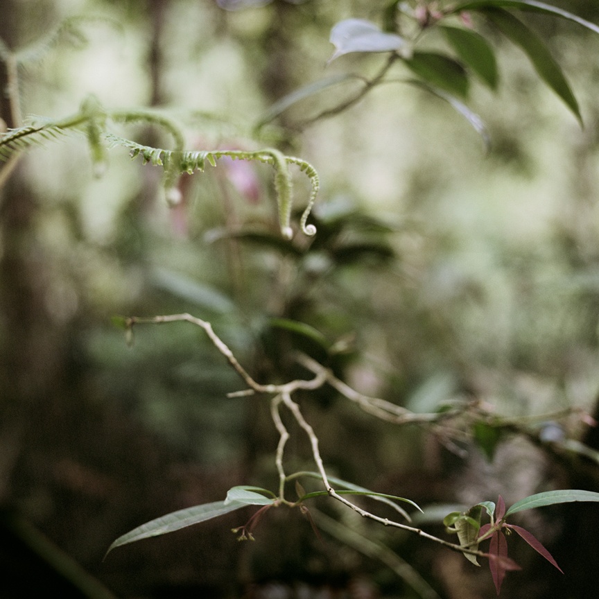
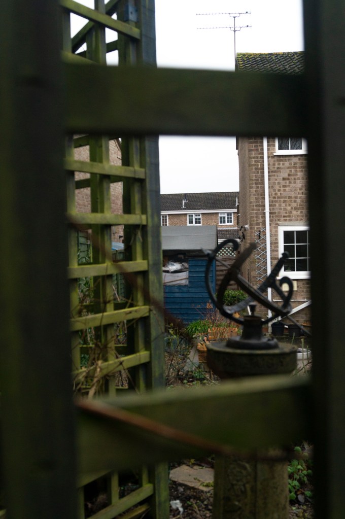
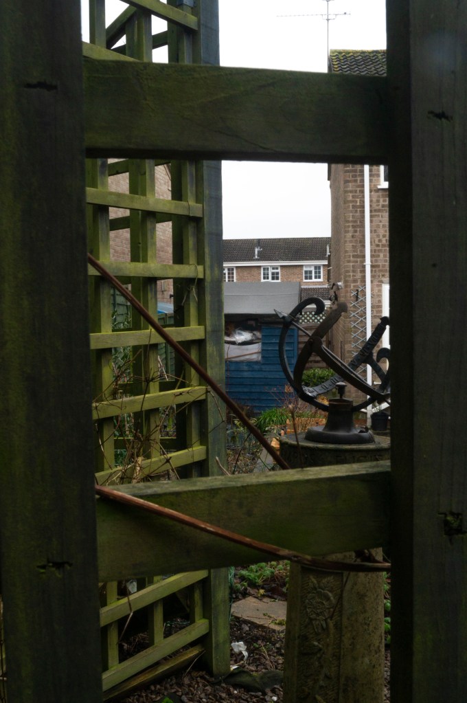
Due to the lack of space between the subject and I, the longest the focal length could be with the SONY 18-55 3.5-5.6 SAM lens was 26mm keeping in mind the minimum focal distance and being able to frame the fence appropriately. The aperture on my Sony A57 was set to it’s widest at f/5.6 to provide a clear difference between the foreground and background. To assure the framing was consistent, the camera was balanced on my knees as there was no space for a chunky tripod.
1/250 sec; f/5.6; ISO 400; 26mm Fig. 1. Focus on subject (2020)
1/250 sec; f/5.6; ISO 400; 26mm Fig. 2. Infinity (2020)
Focusing on the subject means that the eyes are drawn towards the outer edges of the frame as the trellis fence fills the space (see Fig. 1). We are also able to see the grain of the wood, the moss and twigs that cover and intertwine the fence, which cannot be seen when the focus is set to infinity. The fence also frames the blurred background and creates a balanced composition by cutting the scene into individual sections. Infinity mode draws the eyes into the image and through the frame, rather than around it. This provides more depth due to the layering of objects and buildings behind one another. More detail can be seen in Infinity (see Fig. 2), making it interesting for the eye as the individual sections provide more context, texture and colour than the first image. Despite the busy background, the composition remains balanced due to the blurred foreground dividing the frame.
For the final image (see Fig. 3), I set the aperture to f/25 and made sure that as much of the image was in focus as possible. This took a couple of attempts as the camera was set to manual focus, meaning it is very easy to be slightly out of focus when adjusting it by hand.
Comparing this image to the previous two, I can see quite clearly how important aperture, viewpoint and focal length can be when composing a shot. This is an extremely busy image, too much is going on for the eyes to take in and feels messy as a whole. The balance between foreground and background achieved in the first set is much more comfortable for the eye than this shot as everything just blends, so the depth is lost.
– Mentioned the choice of location and my reasoning for changing positions, in terms of safety while making sure I still covered what was asked in the brief. – Stated the camera settings and my approach to the task by adjusting my focal lengths, in addition to my own personal distance from the model. – Analysed the images briefly to understand the visual elements created by the various settings before – Reflecting on the task as a whole, the difficulties faced while executing it and the importance of going out of you comfort zone.
Brief:
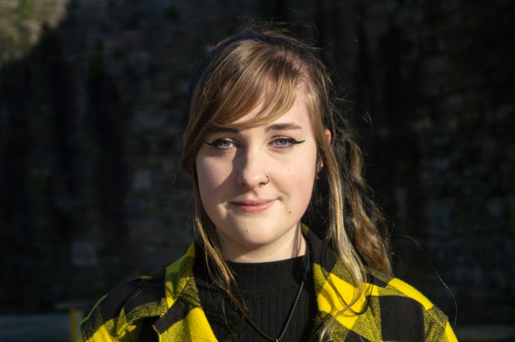
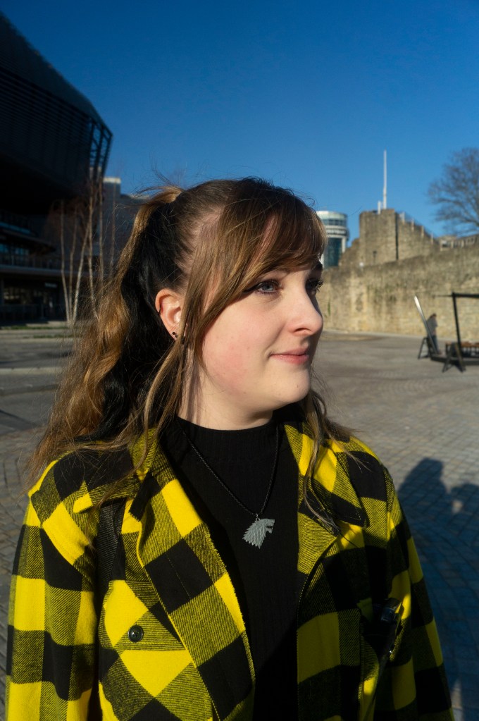
‘Find a location with good light for a portrait shot. Place your subject some distance in front of a simple background and select a wide aperture together with a moderately long focal length such as 100mm on a 35mm full-frame camera (about 65mm on a cropped-frame camera). Take a viewpoint about one and a half metres from your subject, allowing you to compose a headshot comfortably within the frame. Focus on the eyes and take the shot.‘ (Bloomfield, 2018)
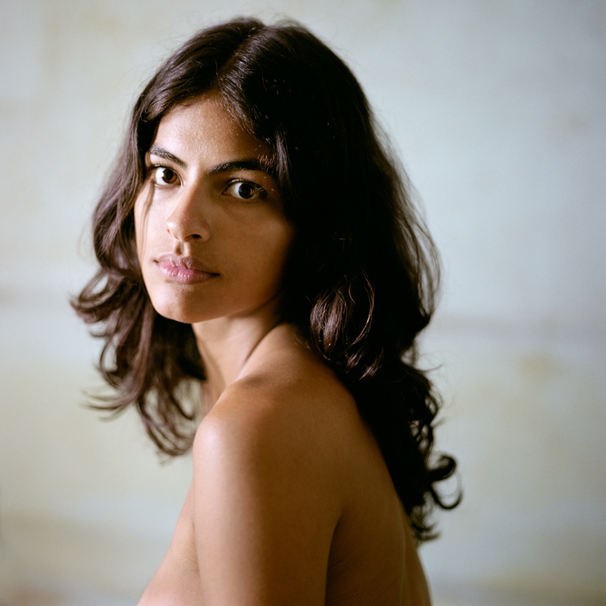
Taking into consideration I had to focus on the subject’s eyes, I adjusted her position so the direct sunlight was shining on the side of her face to avoid eye strain, yet providing enough light for the portrait. My SONY A57 was already set at a wide aperture of f/5.6 from the previous exercise, the SONY 18-55 3.5-5.6 SAM lens only reaches 55mm so, unfortunately, it was the longest the focal length could be. Therefore I stood about a metre away instead of one and a half to make sure she was framed appropriately.
Fig. 1. Focus (2020) 1/4000 sec; f/5.6; ISO 400; 55mm
The model was positioned roughly 3 metres away from an old brick wall at the bottom of our local town, which towers over a pathway and forms a heavy shadow. As well as the background being soft and blurred due to the wide aperture and distance between the subject, the intensity of the sunlight and the dark shadows help the subject stand out even more, making sure she is the main focal point.
It’s interesting how the soft focus creates an illusion of the background being a studio backdrop right behind the model, however, in reality, it is quite a distance away. While you can see subtle shapes and colours, it’s difficult to decipher what is behind the subject which creates a little bit of surface tension between the two.
Reflection:
I use a wide aperture regularly for personal work, so I knew what kind of effect this exercise was meant to achieve. However, direct sunlight isn’t something I have challenged myself with before due to how intense the highlights and shadows can be. These exercises are all about testing your abilities and pushing your comfort zone, which is why I decided to shoot at midday and stop avoiding the fear of intense light.
While it took a little while to figure out which position was best for the model and me, in the end, it worked out better than I expected. In conclusion, exploring different locations, lighting and subjects is something I need to do more.
– Documented the camera and lens type, along with the settings used.
– Explained the process taken to take these images, the use of direct sunlight and the difficulties faced.
– Briefly analysed the various shots to compare the differences in background, depth of field and distortion.
– Reflected on the difficulty of remembering the difference between long and short focal length, how I handled this and noted the contrasts between the two compositions.
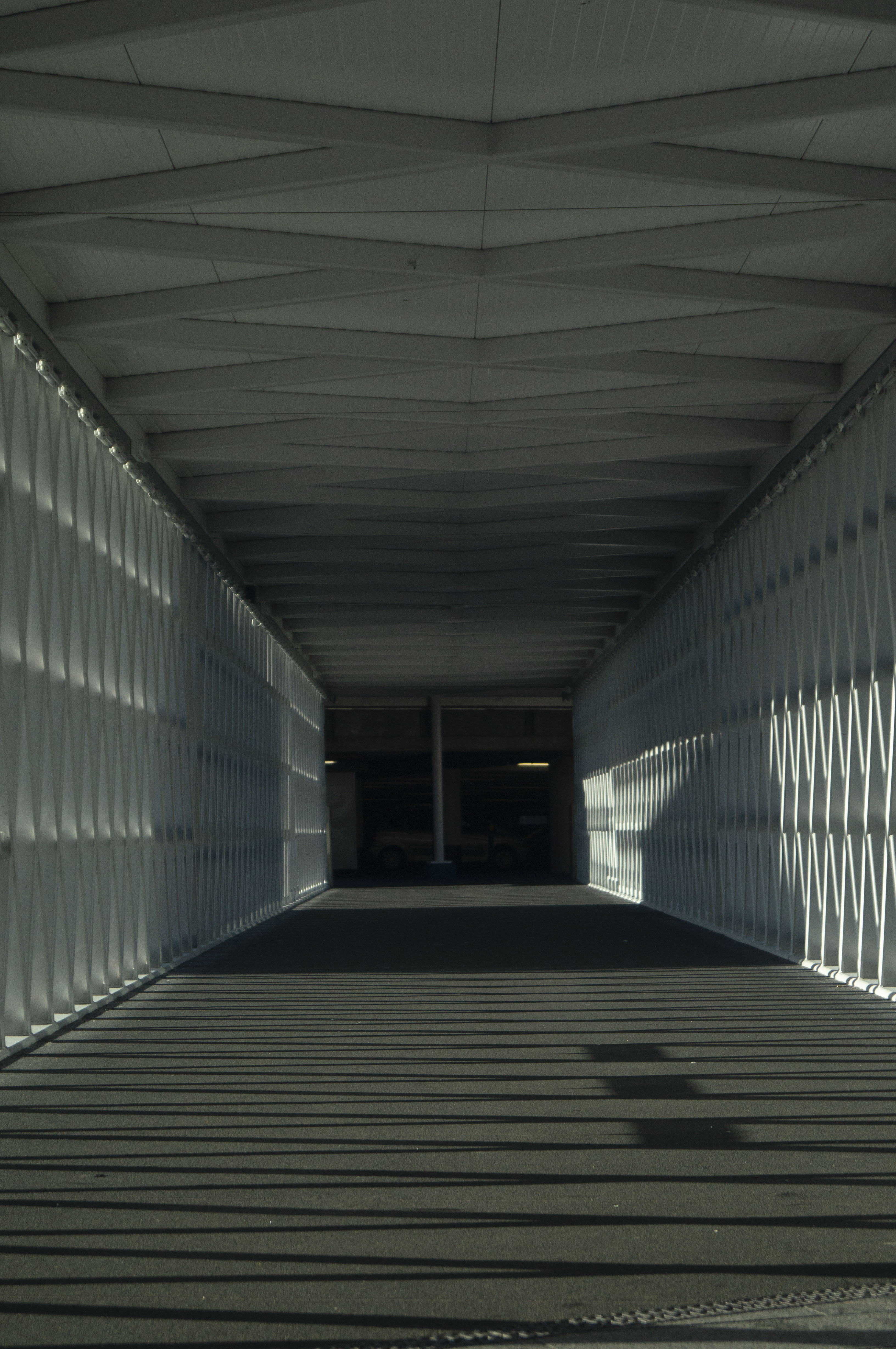
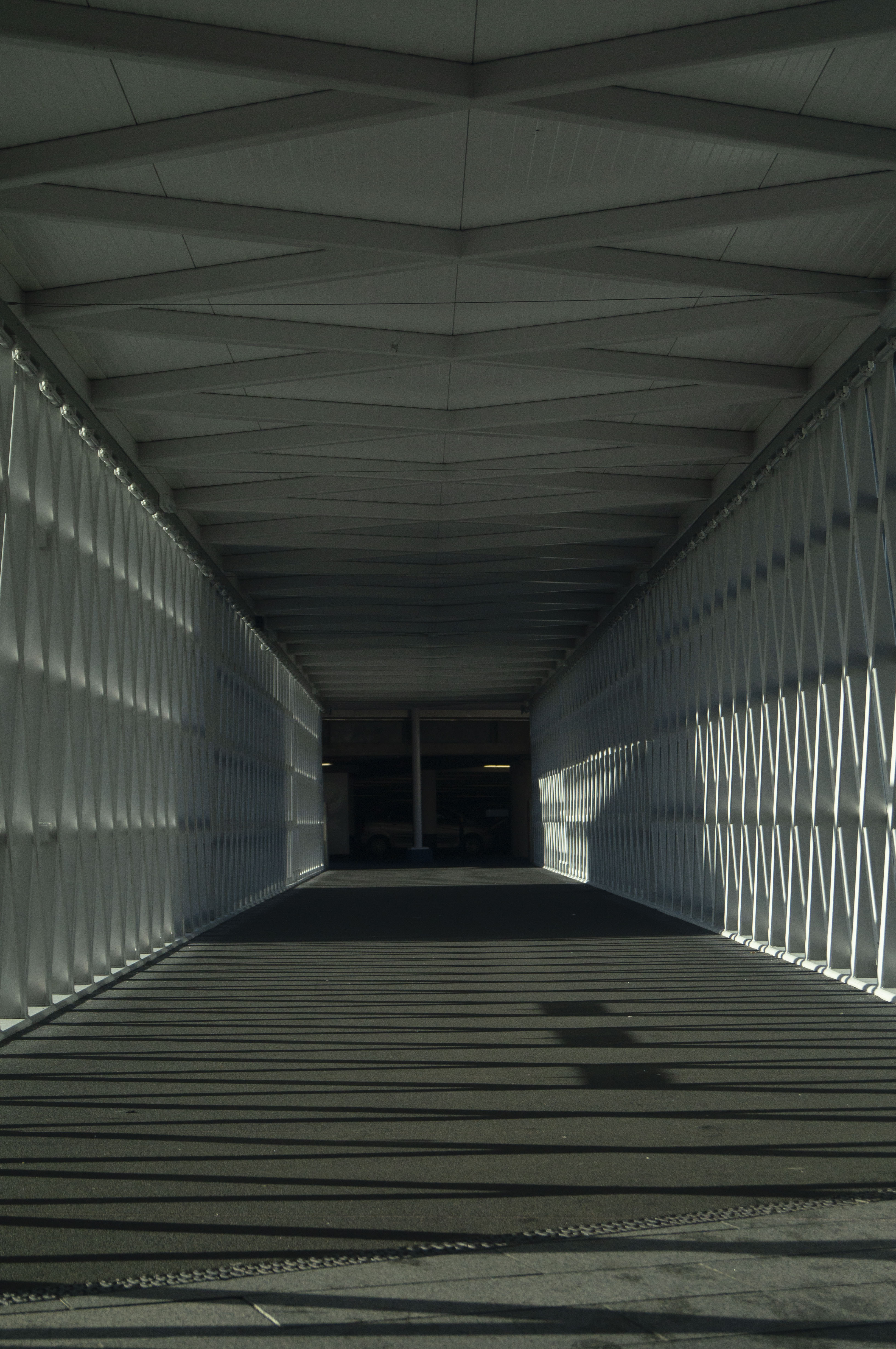
Brief
‘Select your longest focal length and compose a portrait shot fairly tightly within the framein front of a background with depth. Take one photograph. Then walk towards your subjectwhile zooming out to your shortest focal length. Take care to frame the subject in preciselythe same way in the viewfinder and take a second shot. Compare the two images and makenotes in your learning log.‘ (Bloomfield, 2018)
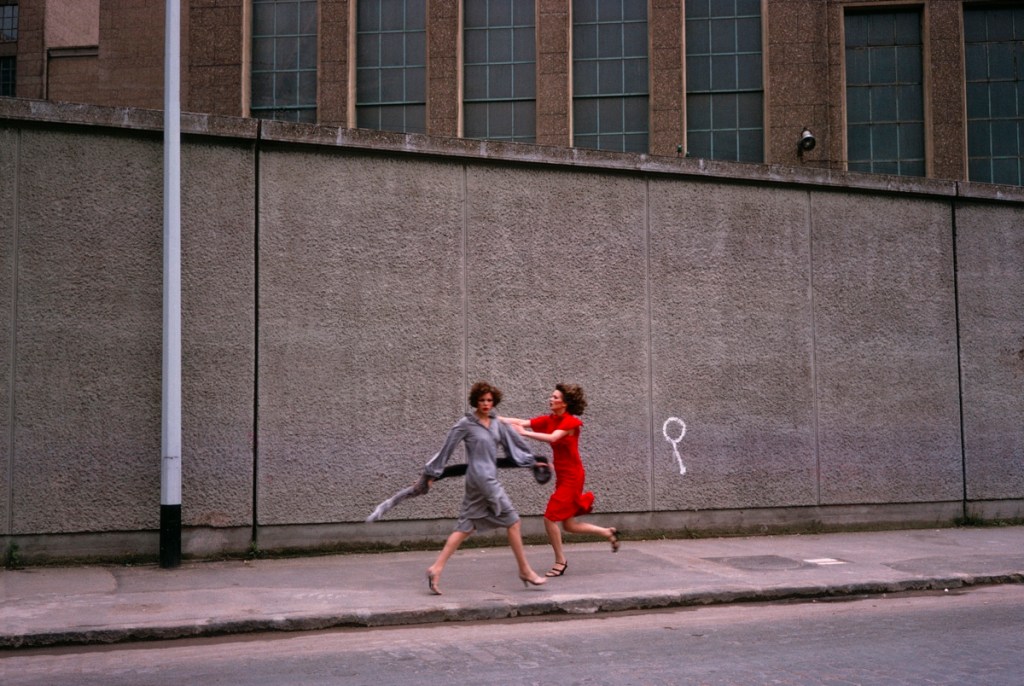
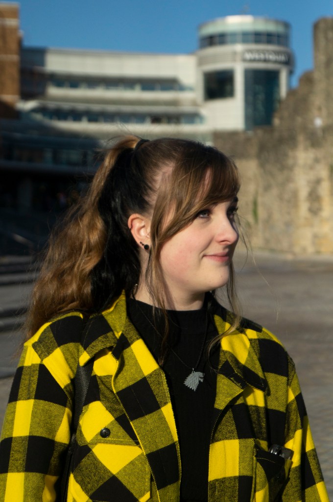
Just like the previous exercise, I used a SONY A57 with the SONY 18-55mm 3.5-5.6 SAM lens, set the aperture to a wide aperture of f/5.6 to provide a subtle blur behind the model and kept the camera on manual focus to avoid relying on autofocus for a crisp image.
These images were taken in direct sunlight, as all other areas of the town were too dark to capture a crisp portrait, which is why my model is looking sideways rather than forwards. While I preferred the eyes facing the lens, we had to consider eye safety first.
For Viewpoint 1 (see Fig. 1), I zoomed the lens all the way in at 55mm, standing roughly a metre or so away from the model and making sure her upper torso fit tightly within the frame. The background is close yet soft and out of focus, assuring that the person in the frame is the primary focus with minimal distractions from the surroundings. The wall subtly frames the model and doesn’t “cut” through her head. You can see that the image is at eye level, not from above or below, meaning the models face isn’t warped in any way.
For Viewpoint 2 (see Fig. 2), I zoomed out to 18mm and had to stand extremely close to the model to frame the image as accurately as I could to match the previous shot. Despite the wide aperture, the background is much clearer and more in focus than its partner. The buildings are much further away, showing even more of the wall to the right and featuring a whole new building to the left. Unlike the first image, this shot looks as if it has been shot from a lower angle and has distorted the models face in a way a fisheye lens would.
Reflection:
It was difficult for me to actively remember the difference between long and short focal length while taking these images. Usually, I refer to it as zooming in or out. Therefore, I noted that longest = the large number, shortest = the smaller number. These exercises are helping me to push my technical knowledge even further, which is helpful when it comes to comparing the imagery.
The differences between the two images are immense, which I wasn’t expecting even after looking at the example images provided with the brief. It was intriguing to see how small changes can impact the subject and its surroundings in a way that results in two opposing shots.
Hopefully, this experience will challenge me to be more aware of my camera settings and the viewpoint I take an image from, experimenting a little if initially they don’t work out or look ‘right’.
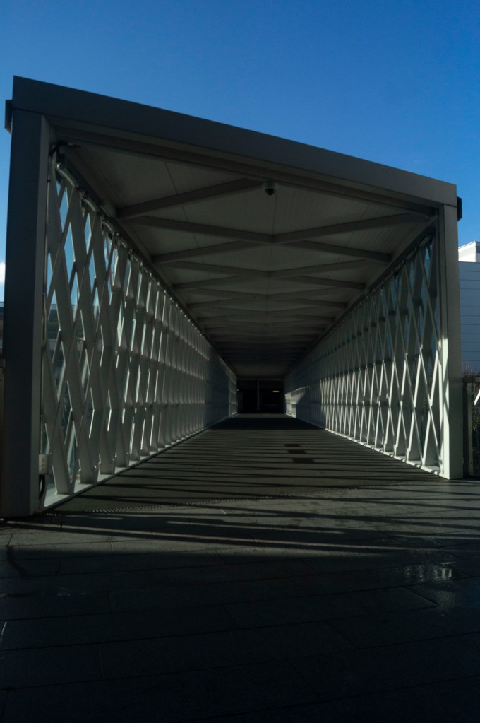
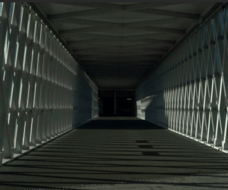
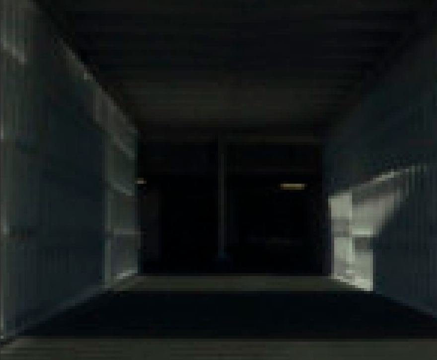
– Stated the settings used on my camera, the camera and lens type, as well as – Explaining where the images were shot and how they were taken, including the variety of focal length settings. – Briefly covered the difficulties faced while shooting in a busy environment and the knowledge I have gained by completing this task, such as the impact zoom has on the depth of an image. – Analysed the imagery taken, documenting what I found within each shot visually alongside the technical strengths. – Inserted a slideshow to show the idea of moving through a scene without actually moving. – Cropped an image to show how zoom can affect the context of an images, before exploring – The history of pixel art in gaming and the comparison between peoples preference for clearer graphics in games and sharp HD images in digital photography, versus nostalgia and aesthetics. – Made notes on the power of a pixel within an image and they importance of the detail within an image before – Reflecting on the exercise as a whole and what I found both difficult, or interesting.
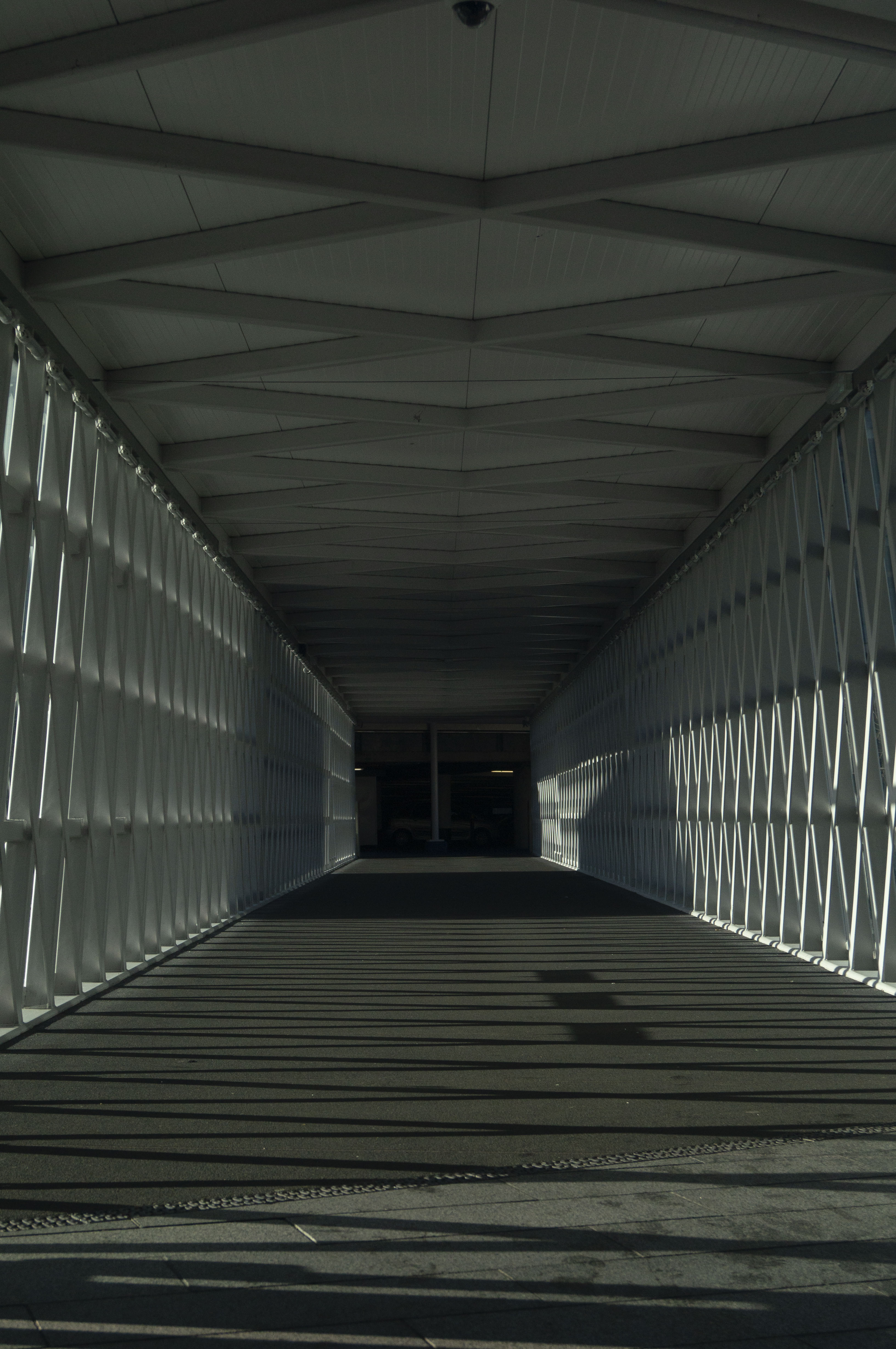
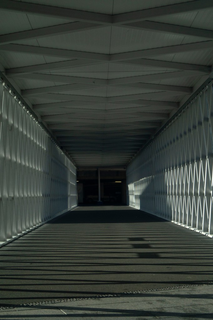
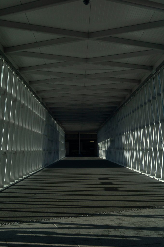
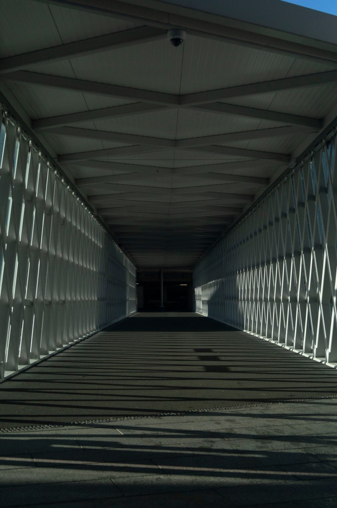
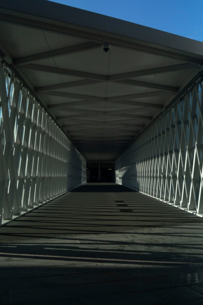
Brief:
‘Find a scene that has depth. From a fixed position, take a sequence of five or six shots at different focal lengths without changing your viewpoint. (You might like to use the specific focal lengths indicated on the lens barrel.) As you page through the shots on the preview screen it almost feels as though you’re moving through the scene. So the ability to change focal lengths has an obvious use: rather than physically move towards or away from your subject, the lens can do it for you. But zooming is also a move towards abstraction, which, as the word itself tells us, is the process of ‘drawing things away’ from their context.‘ (Bloomfield, 2018)
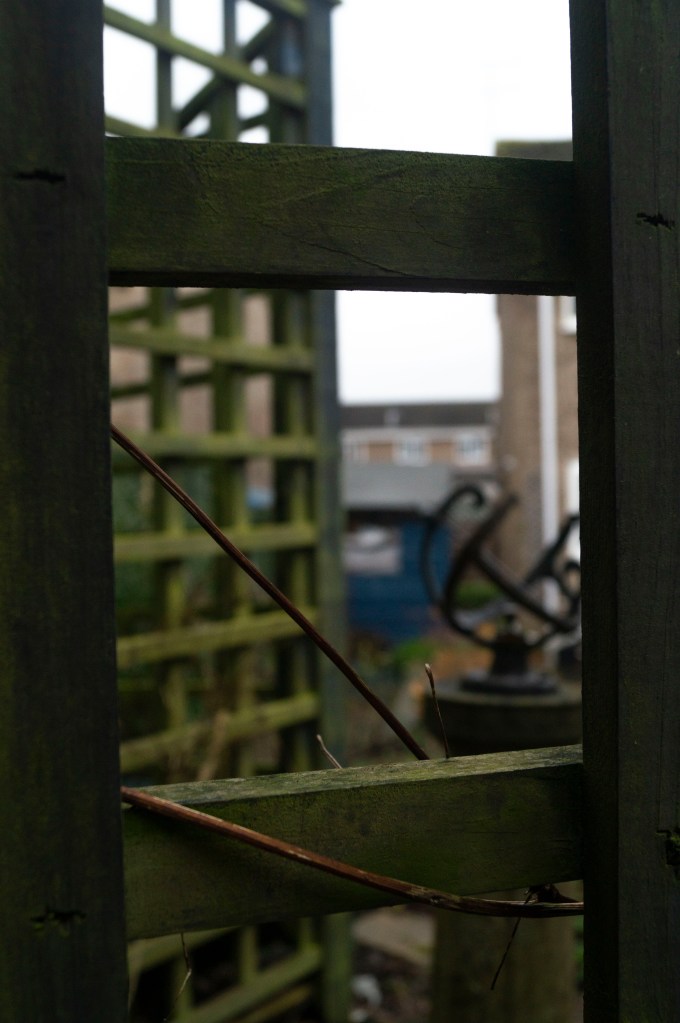
Before starting this exercise, I made sure that my Sony A57 was set to aperture priority mode as requested at the start of Imaginative Spaces, as well as switching the SONY 18-55 3.5-5.6 SAM lens and camera body to manual focus, to avoid relying on autofocus to sharpen the image correctly.
I decided to take these images while out and about in my local town, therefore I didn’t have a tripod with me purely out of convenience. However, to make sure the position was fixed I crouched to keep my feet firmly in one place and used my knees to keep the camera balanced. Due to how busy the environment was, a few attempts had to be made, as members of the public were walking in and out of the frame, blocking the main focal point at the end of the walkway and disturbing the abstraction.
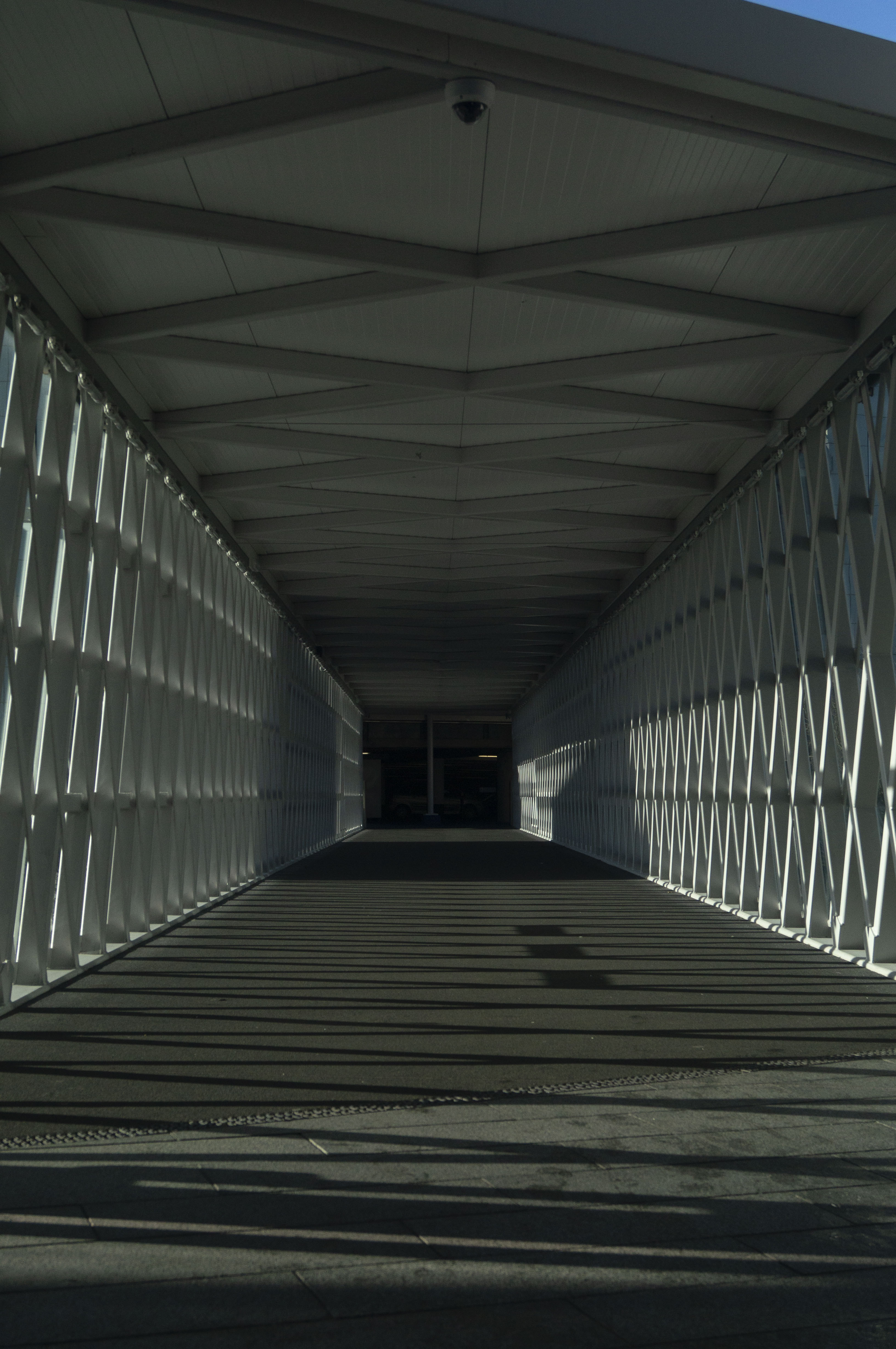
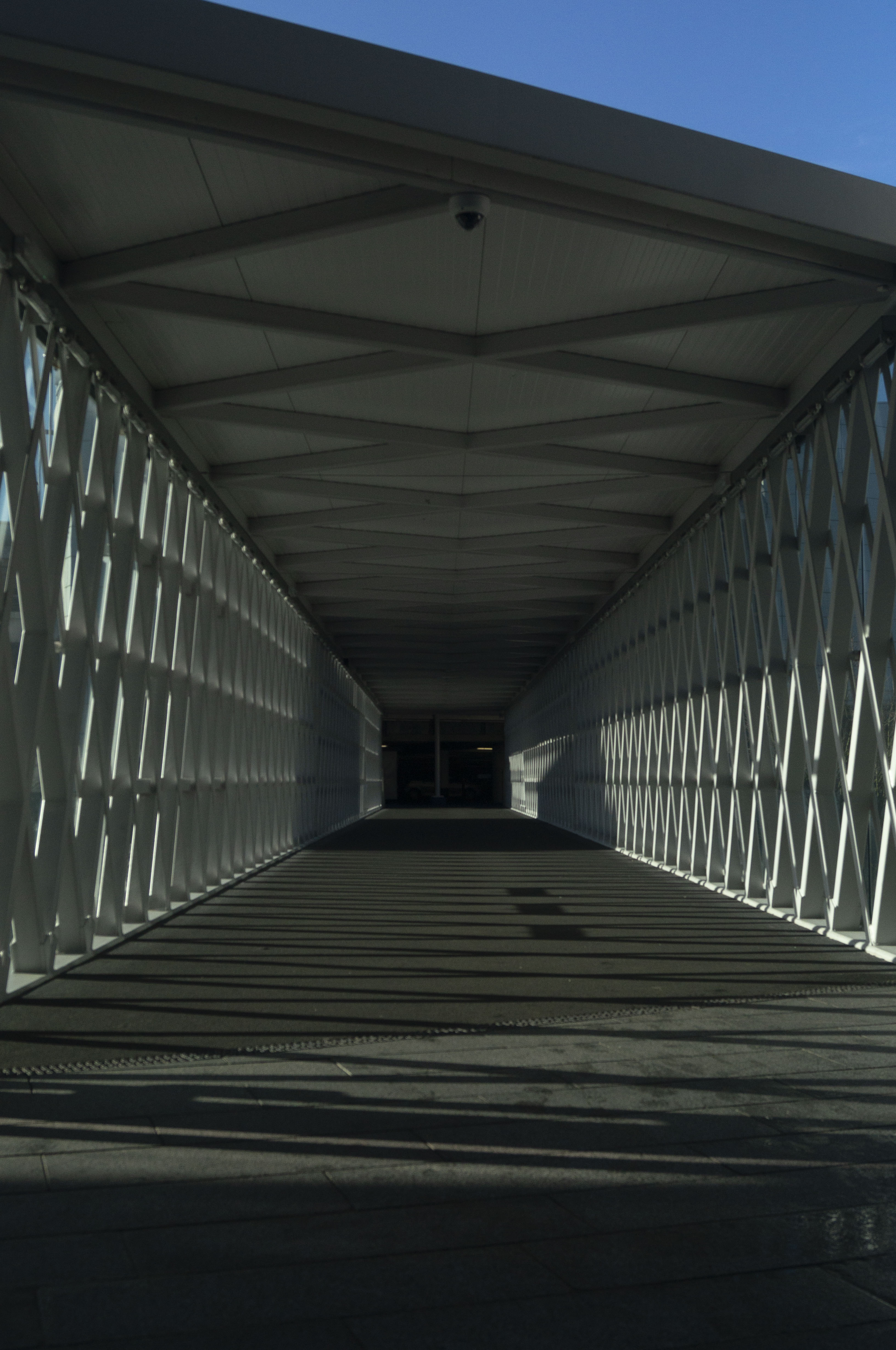
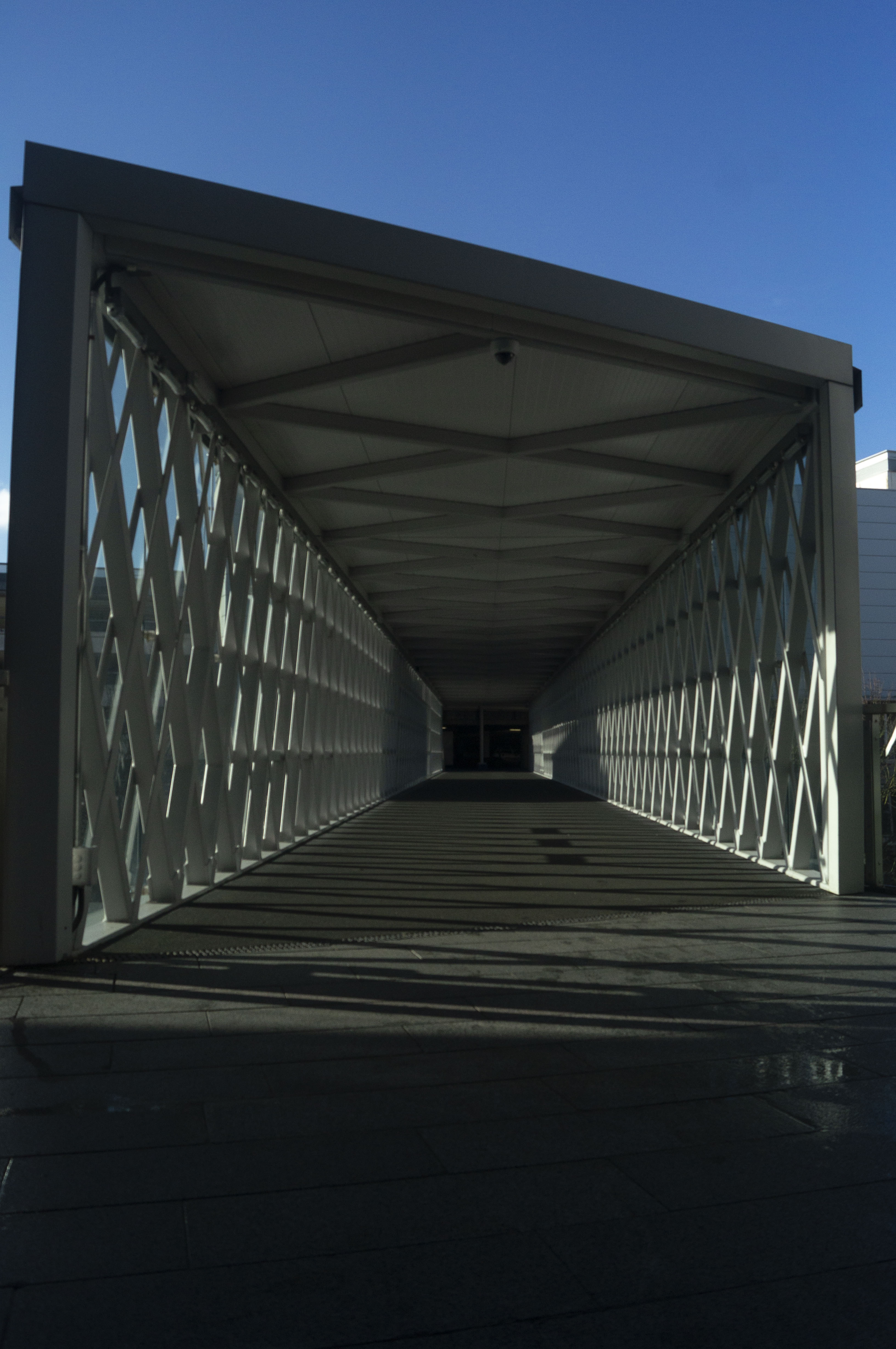
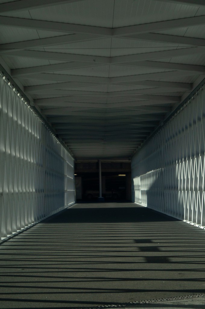
There are 5 focal lengths labelled on the lens ring (55mm, 35mm, 28mm, 24mm, 18mm) however I used these as a rough guide to show a gradual difference in the zoom settings. The focal lengths used were 55mm, 45mm, 35mm, 30mm, 26mm and 18mm, which created a fairly even spread as can be seen below.
For a few years I have been using prime lenses and have learned the importance of being able to move your body to get the image you want, therefore switching back to a zoom lens and being able to ‘move’ through a scene via the lens has reminded me of the difference perspectives you can achieve if you vary the lenses and settings.
The longer the focal length is, the more cropped and out of context the subject (see Fig. 1.) becomes having eliminated the true length of the walkway. However, you can find much more detail within the scene such as the walls and poles in the car park that you can’t see as clearly with the shorter focal length. As you pan through each image, the shorter the focal length gets the more it creates the sense of backing out of the small box of darkness at the end of the tunnel, into a bright and open space showing the true extent of the path. The shot taken at 26mm (see Fig. 5) is the most accurate portrayal of what I could see in person, a combination of shadows and highlights from the midday sun, a clearer view of the latticed walls, the true length of the path and a small slither of blue sky, therefore looking at how much detail is captured in the 18mm shot shows how powerful zoom can be. The last image (see Fig. 6) is an expanded shot, almost like a vertical panorama showing more of the sky, bringing more colour and light into the frame than could be seen in person, bringing the viewer about 2 metres further back from the position of the camera, providing more height to the image and showing the full framework of the walkway.
1/1600 sec; f/5.6; ISO 400; 55mm
1/2000 sec; f/5.6; ISO 400; 45mm
1/2000 sec; f/5.6; ISO 400; 35mm
1/2500 sec; f/5.6; ISO 400; 30mm
1/2500 sec; f/5.6; ISO 400; 26mm
1/3200 sec; f/5.6; ISO 400; 18mm
Considering my camera lens couldn’t zoom in any further than 55mm, I created the last image in Photoshop by repeatedly zooming in and cropping the image shot at 18mm, taking screenshots of the process. This created a very abstract final product, focusing more on the details of the images up close than as a whole.
Fig. 7. Cropped (2020)
Fig. 8. Cropped and zoomed (2020)
Fig. 9. Cropped, zoomed and cropped again (2020)
This process reminded me of pixel art and how the early era of game producers, used this style despite the lack of technology and experience, to create simple yet fun games by using simple shapes to represent certain objects or characters, relying on the ‘imagination of players to fill in the blanks’ (Griffiths, 2017).
Over the years the style evolved due to the advance in technology, while they were still restricted, 8-bit games such as Super Mario Bros. 3 (see Fig. 10) explored the idea of turning pixel blocks into more recognisable characters, as well as including backgrounds and inserting cut scenes, ultimately fleshing out the game and making it more interactive and immersive as a whole (Griffiths, 2017).
Fig. 10. Super Mario Bros. 3 (1988) : Level 5-3 (2013)
In modern times, however, pixel art is mostly used for the retro aesthetic and challenging imagination more so than a technical choice, mainly because games with higher graphics and 3D elements seem to be more appealing to most players due to the realism.
This is very similar to the development of digital cameras and lenses, to help capture more high definition imagery via digital pixels, in comparison to pinhole and film cameras which are instead made up of noisy grains. Much like old games, “vintage” cameras are used by a lot of people these days for nostalgic and visual purposes rather than the technical elements.
More and more people are becoming interested in the latest technology and capturing more detailed and crisp photographs, almost as if you were looking at it in person, however at the end of the day no matter how high the resolution may be, the closer you zoom into the details you will see that every image is made up of individual pixels or grains. The final image I have created may not be the most appealing to the eye, but the distorted out of context blocks all add up to create the full photograph in a frame. Not every image has to be clear or aesthetically pleasing, as long as you have the imagination to see the deeper details within a simpler, abstracted piece.
Reflection
Despite the fact this exercise took a few attempts to get right, I’m pleased that it allowed me to re-explore the power of zoom lenses, what details can be captured in the frame, what changes and how the perspective can be altered just by changing the focal length. The position of the camera within a scene, the settings you choose and the lens you pick, can affect the outcome of an image which is something I had forgotten due to the restrictions of fixed focal lengths.
It also helped me look at my images in closer detail, by experimenting with extreme zoom and cropping to discover the tiny details that build the whole image.