
Summary:
– This research point was difficult to complete due to intellectual text overpowering Campany’s review of the work.
– Campany helped me understand how Ruff works and the importance of archives but didn’t get a feel for how they viewed the work as a whole.
– Colberg’s review was much easier to process and got straight to the point.
– Explained what they did and didn’t like, without dismissing other’s opinions on how the work was presented.
– I agree with Colberg’s view that an image can be beautiful on its own, without having a complex concept behind it.
Brief:
‘Read the reviews by Campany and Colberg and, if you haven’t already done so, use them to begin the Research section of your learning log. Try to pick out the key points made by each writer. Write about 300 words.
If you wish, you could add a screengrab of an image from Ruff’s jpeg series, and one or two of your own compressed jpegs (taken on auto mode of course). You can achieve the effect quite easily by re-sizing a photograph to say, 180 x 270 pixels, and saving at ‘zero quality’ compression. If you use Photoshop’s ‘save for web’ you can see the effect immediately without having to save, close and reopen the file.‘ (Bloomfield, 2018)
Review 1 – David Campany – Thomas Ruff: Aesthetic of the Pixel, IANN MAGAZINE NO. 2, 2008
Campany describes Ruff’s work as being ‘cold and dispassionate’, yet surprisingly beautiful at times. They also state that Ruff’s art can ‘solicit individual and global responses’ that cannot be completely agreed upon (Campany, 2008) .
All photographic images come from archives, which has shaped Photography and how it developed over time. Photographic prints, family albums, computerised image files and gallery work are all forms of archives, all unique in their way but still forms of photography.
We cannot tell which archives Ruff’s JPEGs have come from, simply by looking at them. However Ruff does mention that the images come from the internet, as he searched for images, going from link to link and finding imagery through a route (Campany, 2008).
Campany believes that Ruff has made a great impact on introducing the ‘art of the pixel’, into photographic art, allowing us to view the pixel at a base level, both aesthetically and psychologically (Campany, 2008) .
While analogue photography was created using film and the prints being made up of grains, in the modern-day these grains are now replaced by pixels.
They suggest that Ruff’s JPEGs are not organised or planned like pixels which are evidence that our view of the pixel is changing and may not be as regimented as we first thought (Campany, 2008) .
Review 2 – Joerg Colberg – Review: jpegs by Thomas Ruff
Colberg believes that Thomas Ruff may be one of the most ‘creative and inventive photographers of all time’, however, they also acknowledge the fact that many people may debate whether his work can be classed as photography at all (Colberg, 2009).
Despite how you view the work and what you believe the art form is, Colberg, realises the importance of what the work does, more so than what the work is.
Colberg states that the images work well in book form, in comparison to the large physical prints at the Zwirner gallery, where they felt it was a ‘tad too pretentious’. While they understand the importance of physical interaction from the viewer, in their opinion the detail in the images weren’t large enough to justify the size of the prints in the gallery (Colberg, 2009) .
Despite all of the positive feedback, Colberg feels slightly uneasy about Ruff’s work as the images are great, but they feel as if the concepts rely too much on the techniques involved (Colberg, 2009) .
References :
Bloomfield, R., 2018. Photography 1: Expressing your Vision. 4th ed. [pdf] Barnsley: OCA, p.33. Available at: https://www.oca-student.com/course/photography-1-expressing-your-vision [Accessed 7 November 2019].
Campany, D. (2008) ‘Thomas Ruff: Aesthetic of the Pixel, IANN MAGAZINE NO. 2, 2008‘. [online] At : https://davidcampany.com/thomas-ruff-the-aesthetics-of-the-pixel/ ( Accessed 7 November 2019).
Colberg, J. (2009) ‘Review: jpegs by Thomas Ruff’. [online] At: http://jmcolberg.com/weblog/2009/04/review_jpegs_by_thomas_ruff/ (Accessed 7 November 2019).
Month: November 2019
Exercise 1.4 Frame
Notes, Part 1, Reflection on coursework, Thoughts & IdeasSummary:
For the final exercise in this project I have;
– Documented my initial thoughts about the exercise.
– Stated how I was out of my comfort zone and the difficulties faced while using the grid, alongside the knowledge gained from it.
– Explored my process for shoot and my lack of a fixed plan to encourage a natural exploration, as well as the steps I took to select my final images.
– For example, I cut out the images and arranged them in a grid to find the best combination.
– Provided a PDF version of the contact sheet for this task, along with the final images for the Gestalt and the technical settings for each.
– Reflected on my recurring theme of city life and the use of different signs, in addition to the visual elements documented throughout, such as colour, texture and signs of life.
Brief:
‘Take a good number of shots, composing each shot within a single section of the viewfinder grid. Don’t bother about the rest of the frame! Use any combination of grid section, subject and viewpoint you choose.
When you review the shots evaluate the whole frame not just the part you’ve composed. Looking at a frame calmly and without hurry may eventually reveal a visual coalescence, a ‘gestalt’.
Gestalt: an organised whole perceived as more than a sum of its parts. (Google Search using the define: operator)
Select six or eight images that you feel work both individually and as a set and present them as a single composite image. Add to your learning log together with technical information such as camera settings and two or three lines containing your thoughts and observations.‘ (Bloomfield, 2018)
Much like the rest of the exercises, I was challenged when it came to this brief because I rarely use the grid feature on my camera. However, this pushed me out of a comfort zone while shooting and allowed me to think about what was in the particular section.
Capturing these images in a busy city made it rather difficult to ignore the rest of the frame while picking out one area of the grid, mainly due to the fact I have trained myself to be aware of everything that is in the viewfinder to avoid any unwanted objects. Eventually, however, I forced myself to keep my eye on the area I was shooting and ignore the hustle and bustle going on around it which provided me with some really good shots.
In terms of what I wanted to take photographs of, there wasn’t a clear plan, forming a more natural process as I could explore and find things to capture, instead of it being regimented and restrictive. The only plan I had set in place was to start at the top of the city and work my way down.
I used Adobe Bridge to scan through all of the photos and select the best, before creating a contact sheet of 116 images.
After reviewing the contact sheets once more, I printed a selection of images that featured both city life AND text. This decision was made due to the fact a variety of different signs were placed around the city, therefore it seemed like the most logical subject to create a complementary set from. The selection of images were then cut up and arranged in a grid of 9 to see which layout worked the best. The final arrangement can be seen below.
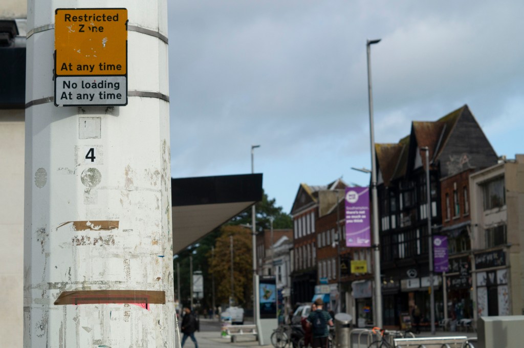
Fig. 1. Frame 2019 85 (2019)
1/2000 sec ; f/5 ; ISO 400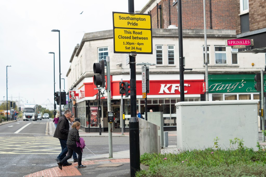
Fig. 2. Frame 2019 149 (2019)
1/500 sec ; f/5 ; ISO 400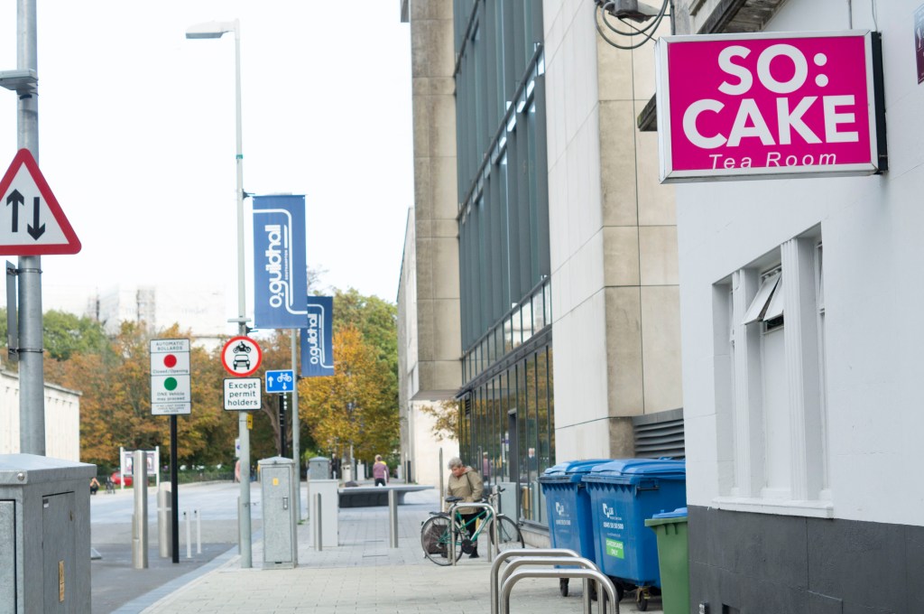
Fig. 3. Frame 2019 49 (2019)
1/500 sec ; f/5 ; ISO 400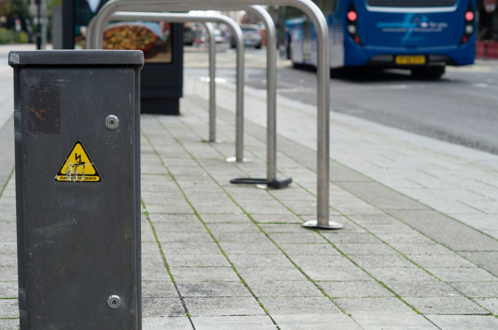
Fig. 4. Frame 2019 115 (2019)
1/500 sec ; f/5 ; ISO 400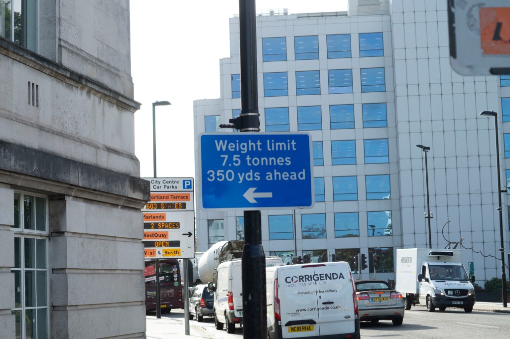
Fig. 5. Frame 2019 39 (2019)
1/1250 sec ; f/5 ; ISO 400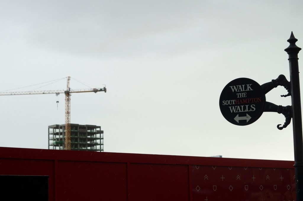
Fig. 6. Frame 2019 289 (2019)
1/400 sec ; f/5 ; ISO 400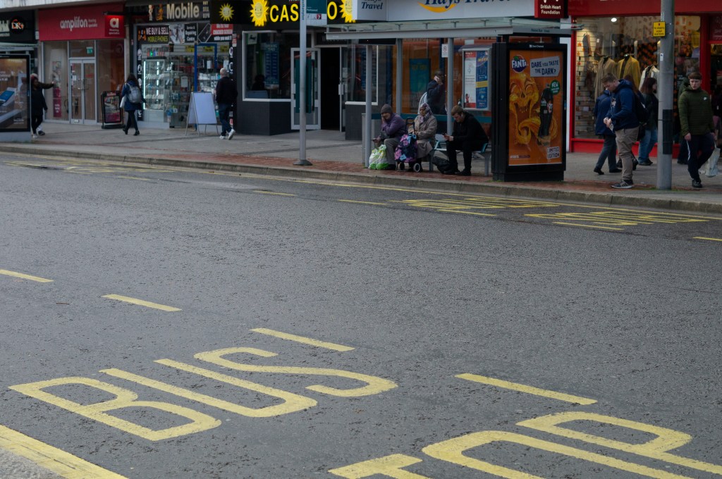
Fig. 7. Frame 2019 227 (2019)
1/640 sec ; f/5 ; ISO 400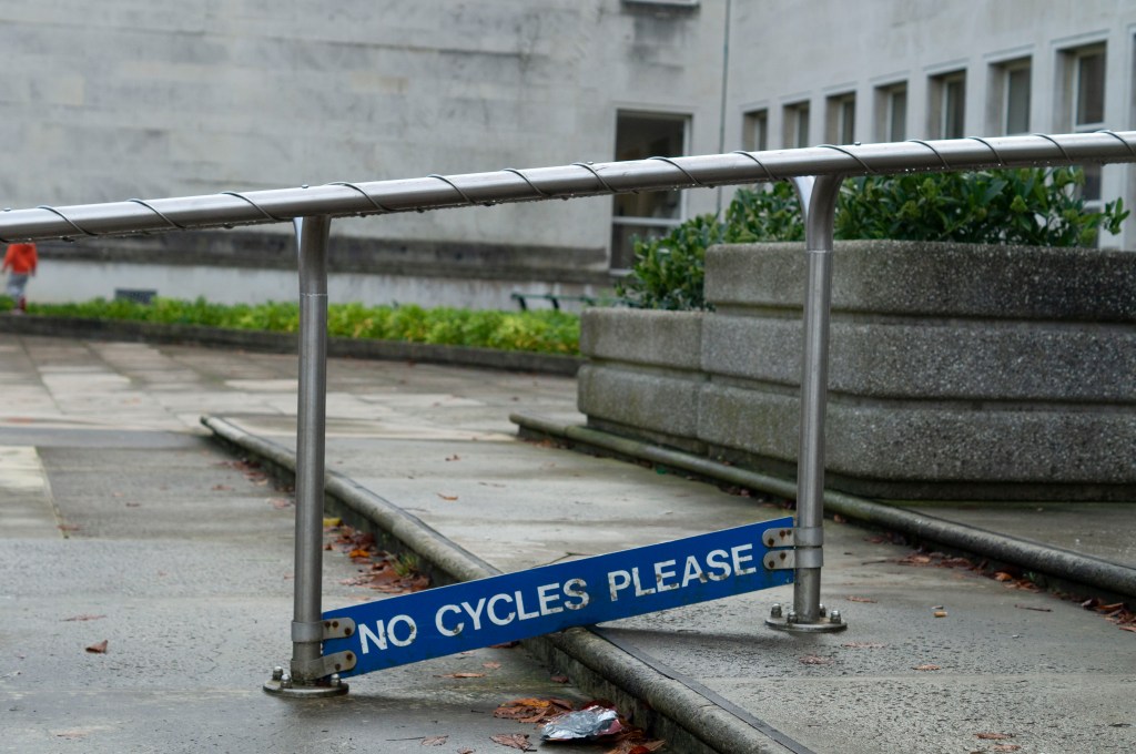
Fig. 8. Frame 2019 28 (2019)
1/640 sec ; f/4.5 ; ISO 400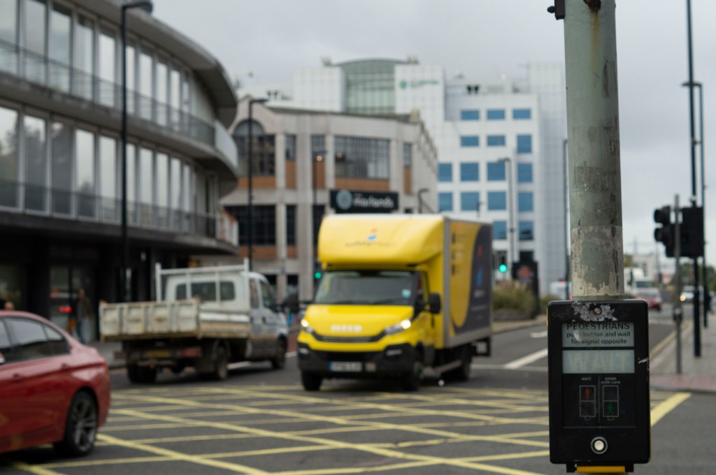
Fig. 9. Frame 2019 165 (2019)
1/800 sec ; f/5 ; ISO 400
Reflection:
As briefly mentioned above, a recurring theme I found throughout my shoot was the use of signs, whether that was to provide a warning, an instruction, a direction or a name. Therefore I wanted to form a set of images that explored all of the different kinds found through the city.
The tones within the imagery are very neutral, with the occasional burst of colour to bring life to the frame which is pleasing to the eye, it’s not too much, nor is it too little that the images become flat.
Each image shows the grime and age of the city, caused by footfall, human littering and natural causes, it doesn’t feel or look fresh which gives character.
City life is another constant factor, showing transportation of all forms, buildings of all kinds, the work-life of various sorts and the ongoing business of the place.
While the gestalt isn’t the most appealing or prettiest to look at, it is a cohesive set and captures the life and the effects of it which is what photography is about. Capturing what is there and how it changes, in a short second.
References :
Bloomfield, R., 2018. Photography 1: Expressing your Vision. 4th ed. [pdf] Barnsley: OCA, p.29. Available at: https://www.oca-student.com/course/photography-1-expressing-your-vision [Accessed 12 November 2019].
Powell, L., 2019. frame-contact-sheet [pdf] In possession of: Lauren Powell: Eastleigh.
List of images:
Figure. 1. Powell, L. (2019) Frame 2019 85 [image] In possession of: Lauren Powell: Eastleigh.
Figure. 2. Powell, L. (2019) Frame 2019 149 [image] In possession of: Lauren Powell: Eastleigh.
Figure. 3. Powell, L. (2019) Frame 2019 49 [image] In possession of: Lauren Powell: Eastleigh.
Figure. 4. Powell, L. (2019) Frame 2019 115 [image] In possession of: Lauren Powell: Eastleigh.
Figure. 5. Powell, L. (2019) Frame 2019 39 [image] In possession of: Lauren Powell: Eastleigh.
Figure. 6. Powell, L. (2019) Frame 2019 289 [image] In possession of: Lauren Powell: Eastleigh.
Figure. 7. Powell, L. (2019) Frame 2019 227 [image] In possession of: Lauren Powell: Eastleigh.
Figure. 8. Powell, L. (2019) Frame 2019 28 [image] In possession of: Lauren Powell: Eastleigh.
Figure. 9. Powell, L. (2019) Frame 2019 165 [image] In possession of: Lauren Powell: Eastleigh.
Exercise 1.3 Line
Notes, Part 1, Reflection on coursework, Thoughts & IdeasSummary:
In this post I;
– Provided a selection of images that explore the use of lines to create depth and the flattening of space, along with technical settings.
– Analysed the images, noting down their visual strengths, the impact of the lines and angles explored as well as textures and colours.
– Stated my initial concerns, what I have learnt from it and the importance of lines in a composition.
Brief:
‘Take a number of shots using lines to create a sense of depth. Shooting with a wide-angle lens (zooming out) strengthens a diagonal line by giving it more length within the frame. The effect is dramatically accentuated if you choose a viewpoint close to the line.‘ (Bloomfield, 2018)
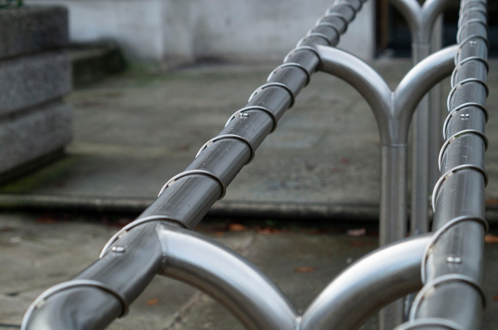
Fig. 1. Line 1 (2019)
1/640 sec; f/4.5; ISO 400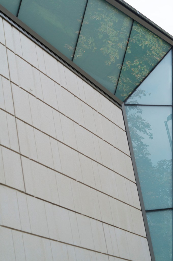
Fig. 2. Line 2 (2019)
1/500 sec; f/4.5; ISO 400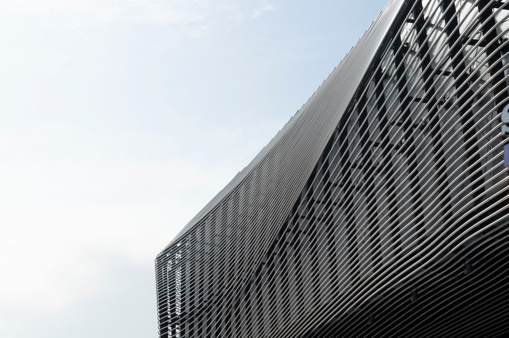
Fig. 3. Line 3 (2019)
1/1600 sec; f/8; ISO 400
After reading the brief, I headed to my local city to explore the different architecture available and the modern public facilities dotted around the area.
As I don’t have a wide-angle lens, I used my 50mm lens while being aware of my position to get better angles and hopefully create the same effect.
The first image (see Fig. 1) is full of various lines, keeping the eyes busy. The length of the handrail leads the eyes from the bottom left corner to the top right, while the wire and the curved structural pieces throughout the middle of the rail provides a circular motion for the viewer while they travel through the frame. Despite the shallow depth of field, you can still clearly see the straight line of the step and the wall to the left; this stops the eyes from heading straight out of the picture.
The depth in the second image (see Fig. 2) stands out the most, mainly due to the unique structure of the building. The camera was as close to the wall as possible to show the sharp angles of the architecture; it goes inwards, drawing your eyes directly into the photograph then leading you back out when the glass windows come outwards. Not only do the faint and deep lines cause your eyes to flick up and down throughout, but the reflections in the glass gives that little bit more texture, as well as tonal variants due to the sunlight, feeding the eyes with more detail to explore bringing you back into the image. Depending on how you look at it and how your eyes adjust, it could create an optical illusion, causing the building to come out of the frame rather than go inwards. It’s all about perspective.
Modern architecture is something to behold, so the third image (see Fig. 3) is an incredible example of this. The curves in this building are beautiful, creating a wave effect for the eyes, very similar to the figure of a whale and its skin details. This composition provides circular motions for the eyes instead of a straight line that draws you from one side of the frame to the next. Not only are there horizontal lines, but much darker vertical lines behind the curved structure too.
Brief continued
‘Now take a number of shots using lines to flatten the pictorial space. To avoid the effects of perspective, the sensor/film plane should be parallel to the subject and you may like to try a high viewpoint (i.e. looking down). Modern architecture offers strong lines and dynamic diagonals, and zooming in can help to create simpler, more abstract compositions.’ (Bloomfield, 2018:25).
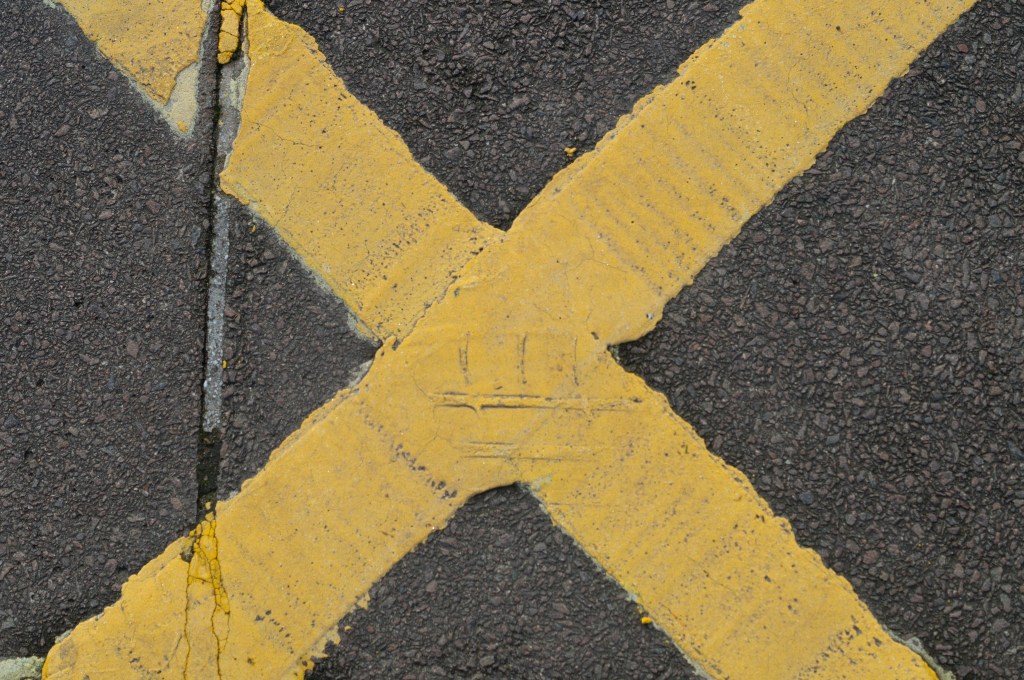
Fig. 4. Line 4 (2019)
1/1600 sec; f/5; ISO 400
Fig. 5. Line 5 (2019)
1/1000 sec; f/5; ISO 400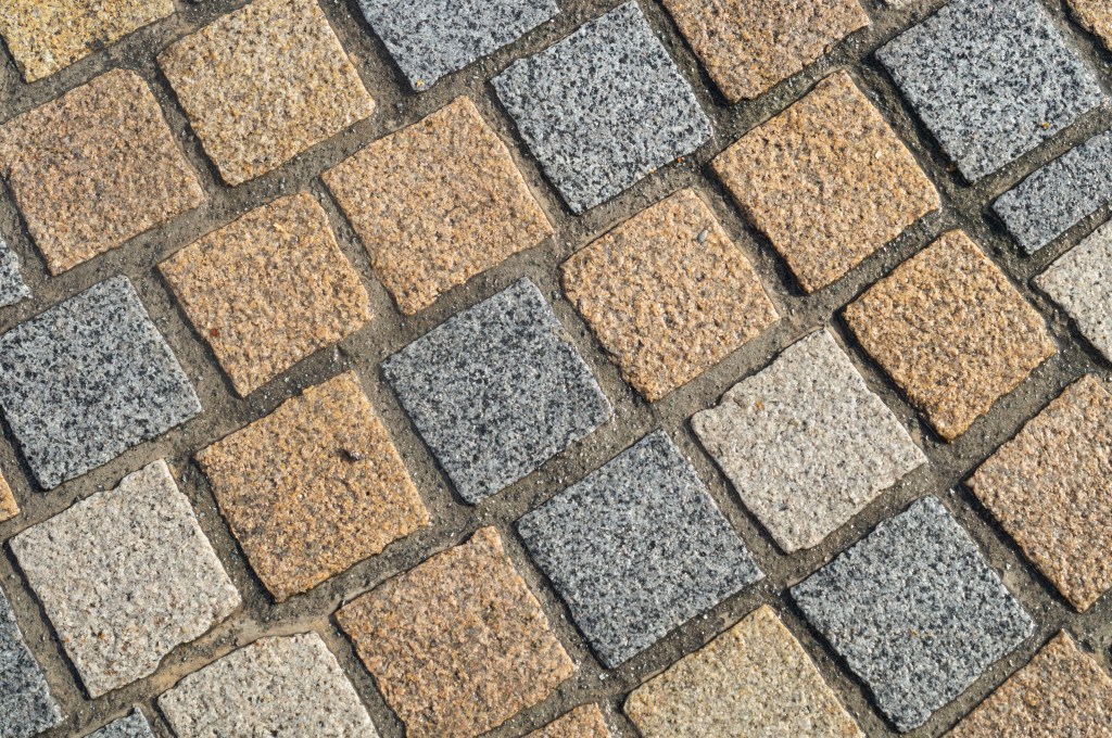
Fig. 6. Line 6 (2019)
1/640 sec; f/8; ISO 400
Finding a high viewpoint and looking down with a fear of heights didn’t seem appealing, so I had to get creative and find something on the ground level.
The bright yellow focal point of the first image (see Fig. 4) not only cuts the image into four sections for the audience to explore, but the eyes also travel across multiple diagonals. While there is no physical depth like the previous images, the contrast between the tarmac and yellow paint lifts the cross out of the frame. The lines are sharp and straight, very geometric and make the picture slightly more dynamic than the perspective lines.
Not only do your eyes go up and down and side to side from exploring the tiles in image Line 5 (see Fig. 5), but the different sizes also expand and shrink the image as the eyes travel through the frame. The dark lines are very sharp and draw the eyes into the frame as it sinks in from the bright white wall, much like a minimalist painting. I like how I shot this wall very closed in and cropped, preventing the composition from being overwhelmed with too many shapes.
I enjoy shooting images at odd angles and going against the idea of a straight horizon, which I applied in Line 6 (see Fig. 6). Not only do the eyes get to jump around the frame to explore the various coloured brickwork, but they are also guided through the image diagonally and around each brick in a diamond-shaped motion. Once again, the highlights and shadows provide a little bit of depth, but not too much.
Review
Despite being a little nervous about this exercise, I am pleased with the results. It made me aware of what is around me, whether it is natural or built by hand. We very often look forwards, rarely looking up at what’s above us or below us besides our feet or our phone. Not only did this help me understand how lines work in photography, how they can shape a composition, give more depth and the effect these features can have on the viewer, it also helped me find the beauty of shapes and structure in person, not just a snapshot.
References :
Bloomfield, R., 2018. Photography 1: Expressing your Vision. 4th ed. [pdf] Barnsley: OCA, p. 24. Available at: https://www.oca-student.com/course/photography-1-expressing-your-vision [Accessed 12 November 2019].
List of images:
Figure. 1. Powell, L. (2019) Line 1 [image] In possession of: Lauren Powell: Eastleigh.
Figure. 2. Powell, L. (2019) Line 2 [image] In possession of: Lauren Powell: Eastleigh.
Figure. 3. Powell, L. (2019) Line 3 [image] In possession of: Lauren Powell: Eastleigh.
Figure. 4. Powell, L. (2019) Line 4 [image] In possession of: Lauren Powell: Eastleigh.
Figure. 5. Powell, L. (2019) Line 5 [image] In possession of: Lauren Powell: Eastleigh.
Figure. 6. Powell, L. (2019) Line 6 [image] In possession of: Lauren Powell: Eastleigh.
Project 2 – Visual Skills – Exercise 1.2 Point
Notes, Part 1, Reflection on coursework, Thoughts & IdeasSummary:
For my second exercise I have;
– Provided the brief for this task and my initial worries about how to I was going to shoot as well as
– My decision to explore flat lays and the visual preferences for this exercise.
– Stated the choice of subject and why they helped with the overall balance of the shot.
– Inserted the images taken for this exercise, explaining the different choices made and a short analysis of how I feel they fit the brief along with
– Selecting the strongest example.
– Explored the shots taken without the rules applied and why they aren’t the strongest
– While noting the few strengths they provide and choosing the best image of the two.
Brief:
‘Take three or four photographs in which a single point is placed in different parts of the frame. When composing the shots use these three rules: the place of the point shouldn’t be too obvious (such as right in the middle), the composition should hold a tension and be balanced (the golden section or rule of thirds) and the point should be easy to see. Evaluate the shots according to these rules and select which one you think works best.
Then take a few more shots without any rules, just being aware of the relationship of the point to the frame. Without the rules, how can you evaluate the shots? That will be a key question throughout the whole degree programme.
Add the photographs to your learning log together with brief observations.‘ (Bloomfield, 2018)
I must admit, when I first saw this exercise I was slightly nervous and didn’t have a clue as to how I was going to execute it, mainly due to the fact I don’t use the grid when I shoot imagery, nor do I actively think about the rule of thirds.
However, I decided to go with a flat lay shoot, as I like the way they look visually and allowed me to have more control over the negative space.
My subjects of choice we’re a pegboard, a succulent and the point being a pair of rings. I feel as if the balance was created by the different sized objects I decided to use, to avoid crowding the frame with “stuff” making the point difficult to find.
Camera settings:
1/80 sec; f/1.8; ISO 400.

Fig. 1. Flatlay 1 (2019)
For the first composition (see Fig. 1), I decided to place the point in the bottom corner of the pegboard to draw your eyes throughout the image in a straight diagonal line, whether you start from the middle and then up, then down OR from the top to bottom and vice versa.
It doesn’t take away from the text, nor is the point out of sight and ignored. Instead, it’s subtle and very natural to my eyes.

Fig. 2. Flatlay 2 (2019)
For the above piece (see Fig. 2), I chose to move the point further into the negative space and closer to the two other objects to create a cosier feel. The placement of the items creates a right-angled triangle when you flick your eyes from each object, which forms an invisible geometric shape to complement the visible geometric shapes within the frame. I found this quite clever in terms of composition, especially as the rings are placed on the 90-degree point which is the most significant part of the triangle. Therefore the point continues to be the most important element of the image without it being obvious.

Fig. 3. Flatlay 3 (2019)
For my last image (see Fig. 3) following the rules, I moved the rings on to the plant to make it a little harder for the audience to see, without it being lost. The point highlights the middle of the succulent and compliments the natural curves of the plant, however, the contrast between green and gold helps the ring stand out, despite it being small.
I feel as if the tension in this particular image is caused by the fact you have to look a little deeper than you did with the other two, which makes it a fun composition to explore and is the strongest of the three in my opinion.

Fig. 4. Flatlay 4 (2019) 
Fig. 5. Flatlay 5 (2019)
I then removed the rules and just shot a couple of images (see Fig. 4. and Fig. 5), without really putting much thought into the composition at all, taking it to the opposite extreme.
While these images aren’t awful, as the colours compliment each other, as do the shapes and sizes, the fact there wasn’t much thought put into the framing or placement of the point, it feels slightly sloppy and unbalanced. The best one out of the two for me is the first image as the angle of the frame cuts up the image slightly, forming more geometric shapes.
Whether you consciously apply the rule of thirds, balance or tension or not, I think it’s important to pay attention to what you’re shooting and where things are in the frame to create a stronger image overall.
References:
Bloomfield, R., 2018. Photography 1: Expressing your Vision. 4th ed. [pdf] Barnsley: OCA, p. 23. Available at: https://www.oca-student.com/course/photography-1-expressing-your-vision [Accessed 9 November 2019].
List of images:
Figure. 1. Powell, L Flatlay 1 [image] In possession of: Lauren Powell: Eastleigh.
Figure. 2. Powell, L Flatlay 2 [image] In possession of: Lauren Powell: Eastleigh.
Figure. 3. Powell, L Flatlay 3 [image] In possession of: Lauren Powell: Eastleigh.
Figure. 4. Powell, L Flatlay 4 [image] In possession of: Lauren Powell: Eastleigh.
Figure. 5. Powell, L Flatlay 5 [image] In possession of: Lauren Powell: Eastleigh.
Exercise 1.1 The Instrument
Notes, Part 1, Reflection on courseworkSummary :
In this post I have;
– Stated the brief for this exercise.
– Provided the images taken, along with the technical settings and histogram screenshots.
– Documented the camera I used, as well as the settings and
– Briefly covered how I executed the exercise, my choice of a static transparent subject and the changes I saw with the naked eye and the histograms for both the indoor and outdoor shoots.
Brief:
‘Take three or four exposures of the same scene. Don’t change anything on the camera and keep the framing the same.
Preview the shots on the LCD screen. At first glance they look the same, but are they? Perhaps a leaf moved with the wind, the light changed subtly, or the framing changed almost imperceptibly to include one seemingly insignificant object and exclude another. Time flows, the moment of each frame is different, and, as the saying has it, ‘you can’t step into the same river twice’.
Now bring up the histogram on the preview screen. The histogram is a graphical representation of exposure – the camera’s sensitivity to light. As you page through the images you can see small variations in the histograms. Even though the pictures look the same, the histogram data shows that in a matter of seconds the world changes, and these subtle differences are recorded by the camera. If you refine the test conditions – shooting on a tripod to fix the framing, moving indoors and closing the curtains to exclude daylight – still the histogram changes. Probably some of the changes are within the camera mechanism itself; still, the camera is a sensitive enough instrument to record them.
Add the sequence to your learning log with the time info from your camera’s shooting data as your first images for Part One.‘ (Bloomfield, 2018)
Before shooting anything, I made sure my SONY SLT-A57 was set to auto as requested in the OCA Expressing Your Vision Course Handbook, as well as making sure my 50mm lens was switched to auto-focus.
Instead of using a solid object, or a ready-made set up, I decided to use a resin art piece as my subject, due to the fact light can pass through it which seemed like an interesting idea to play with.
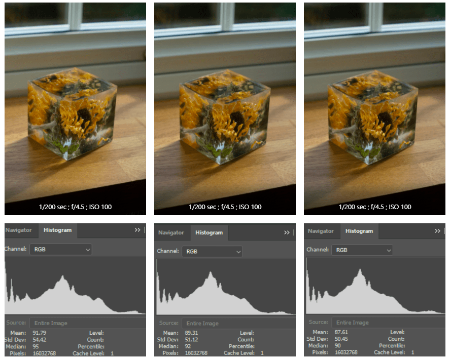
For the first set of images, I decided to begin in a more ‘controlled’ area by placing the piece on the window ledge in my kitchen during mid-morning when the sun was shining through.
While the changes in the images are very slight (see Fig. 1), you can see that the framing shifts slightly where I wasn’t using a tripod to steady the camera.
As shown in the histograms, the shadows in the first image peak slightly higher than the other two, while the mid-tones in the third image peaks significantly in comparison to the first image.
With the naked eye, these light changes are very difficult to see, if not impossible so it’s really interesting to analyse what the camera can detect.
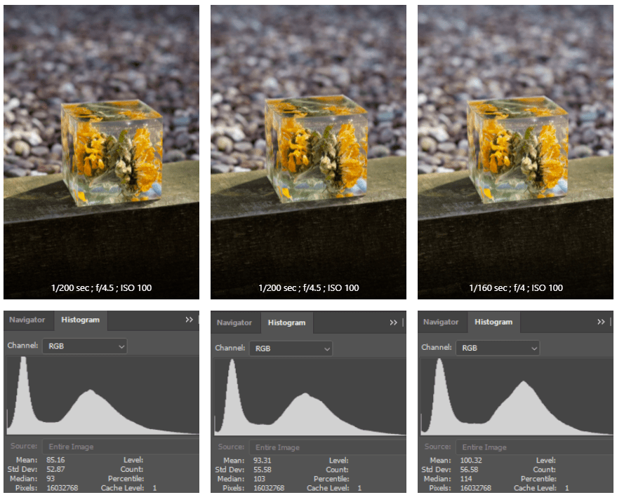
For the second set of images, I decided to head outside with the same piece and place it in direct sunlight to see how the results would differ.
Unlike the first set, I can see the changes in light levels (see Fig. 2). The left is the best of the three (in my opinion) with just enough shadow to define the details within the frame, without being blown out by the highlights. The third picture, however, is significantly brighter and takes away the depth presented in the first.
Once again there are slight differences in the framing due to the lack of tripod for support.
What I’ve found most interesting is the histograms for the images taken outside are much more smooth, with less peaking than the images taken indoors, as well as the fact the shadows are almost if not already clipped off on the histogram.
I would have to do further research on histograms if I wanted to understand why this was the case in much more depth, so I may do this in the future. But what I have taken from this small exercise is the slightest of changes can be picked up, even if you can’t notice it with the naked eye and despite where you capture your imagery.
References :
Bloomfield, R., 2018. Photography 1: Expressing your Vision. 4th ed. [pdf] Barnsley: OCA, p.21. Available at: https://www.oca-student.com/course/photography-1-expressing-your-vision [Accessed 9 November 2019].
List of images:
Figure. 1. Powell, L. (2019) Set 1 [pdf, screenshot] In possession of: Lauren Powell: Eastleigh.
Figure. 2. Powell, L. (2019) Set 2 [pdf, screenshot] In possession of: Lauren Powell: Eastleigh.
